

Unet: a brand to take energy from businesses to families
The rebranding of an electricity distributor that wanted to stop speaking only to businesses. Questions first, then the mark.

In short
Unet was an Italian electricity distributor whose communication was designed for businesses. Between 2022 and 2023 Opificio Lamantini Anonimi redesigned its brand to open it up to the household market, starting from an analysis of identity, tone of voice, competitors and public perception.
Project facts
- Client
- Unet — Energia Italiana
- Sector
- Electricity distribution
- Period
- October 2022 – February 2023
- Goal
- Open the company up to the household market
- Services
- Brand analysis, tone of voice, moodboard, logo restyling, imagery, applications
Unet sold energy to businesses and spoke like a business: technical, distant. When it decided to turn to families, it needed another voice. We didn’t invent it at a desk. We looked for it with 24 questions, an analysis and a moodboard that came back to us full of notes.
The starting point
Where was Unet starting from?
An energy company without a real communication system: what little there was spoke to businesses. The goal was to get into people’s homes, where trust depends on recognition and closeness.
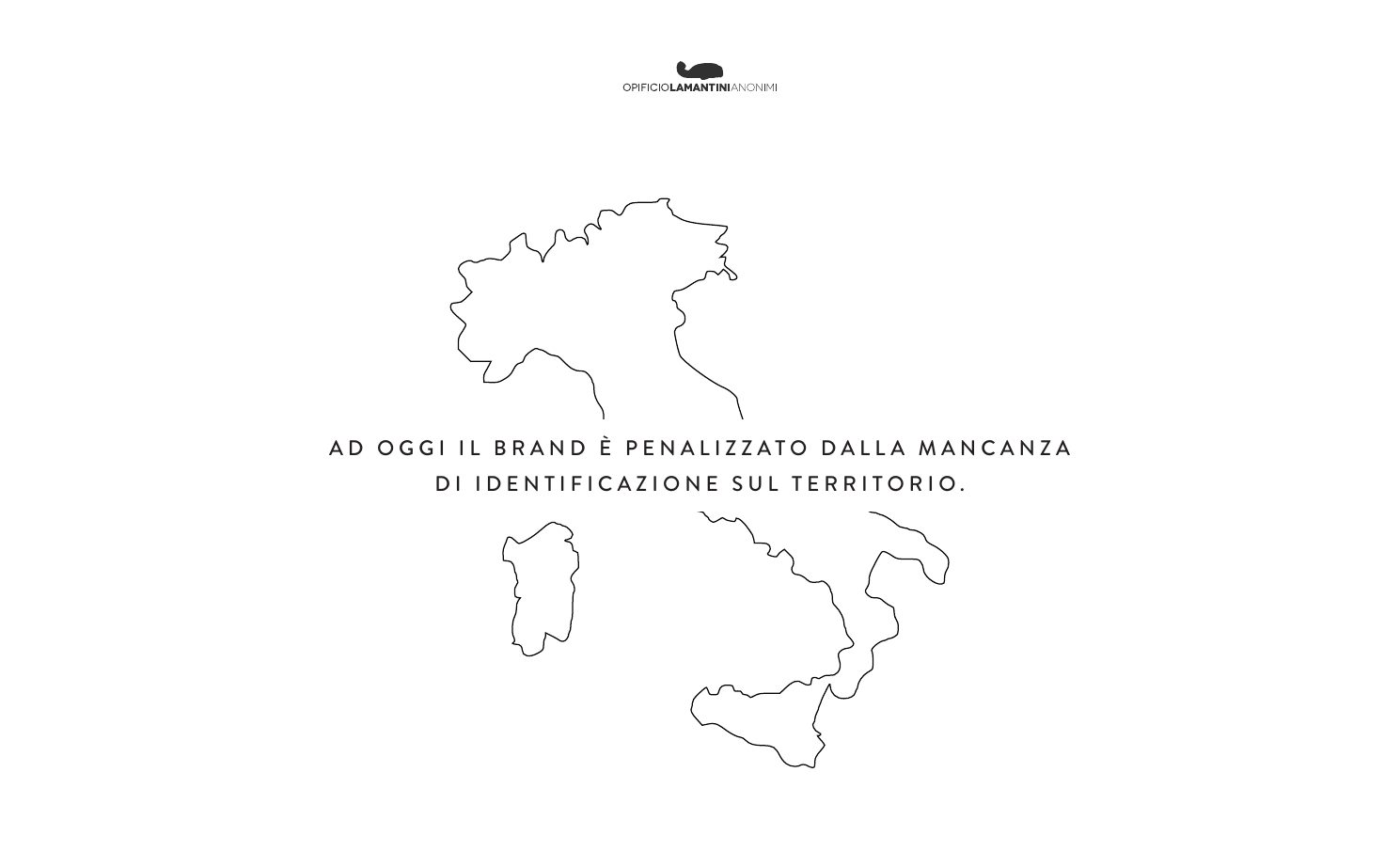
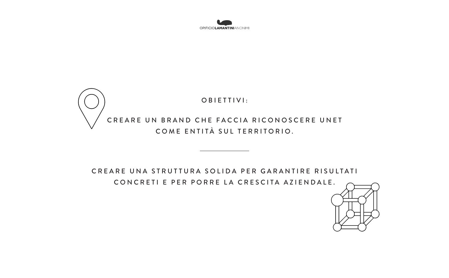
Today the brand is held back by a lack of recognition in its local area.From our analysis for Unet, November 2022
Which questions does a rebranding start from?
The awkward ones too. What don’t you like about your brand? What are you willing to let go of?
Before opening a single design file, we sent Unet a questionnaire: 24 questions across eight areas. Some were there to understand the company. Others to understand what the company no longer wanted to be.
- 01Naming and existing logo
- 02Tone of voice
- 03Values
- 04Competitors
- 05Organisation
- 06Stakeholder
- 07Target
- 08Communication tools
The awkward questions
From the questionnaireWhat is holding your current brand back?
Which parts of the brand are you willing to let go of?
Which meanings must not be attached to the brand?
What should an energy brand say to a family?
The problem wasn’t the logo. It was that nobody in its own area recognised Unet.
The answers led to a three-part analysis: tone of voice, values, position against competitors. There were four values: innovation, development, transparency, respect.
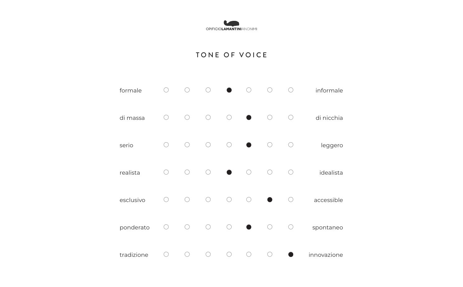
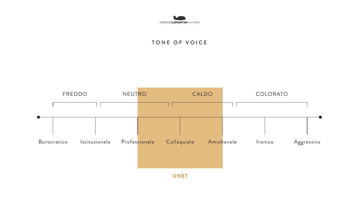
The tone of voice
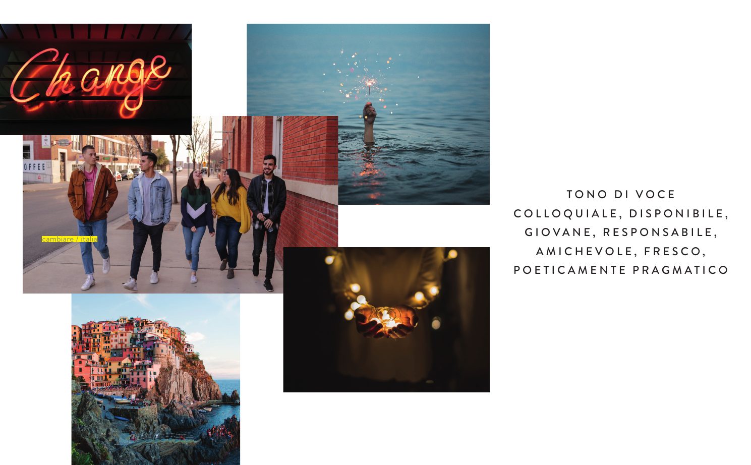
Where Unet sits, between cold and colourfullikeable, helpful, young, responsible, on equal terms, fresh, poetically pragmatic.
The SWOT analysis
November 2022Green energy and an advisory relationship with the customer.
Low recognition and communication that didn’t stand out.
The flexibility of a smaller company.
The large groups in the sector.
The competitors’ colours
To know where not to go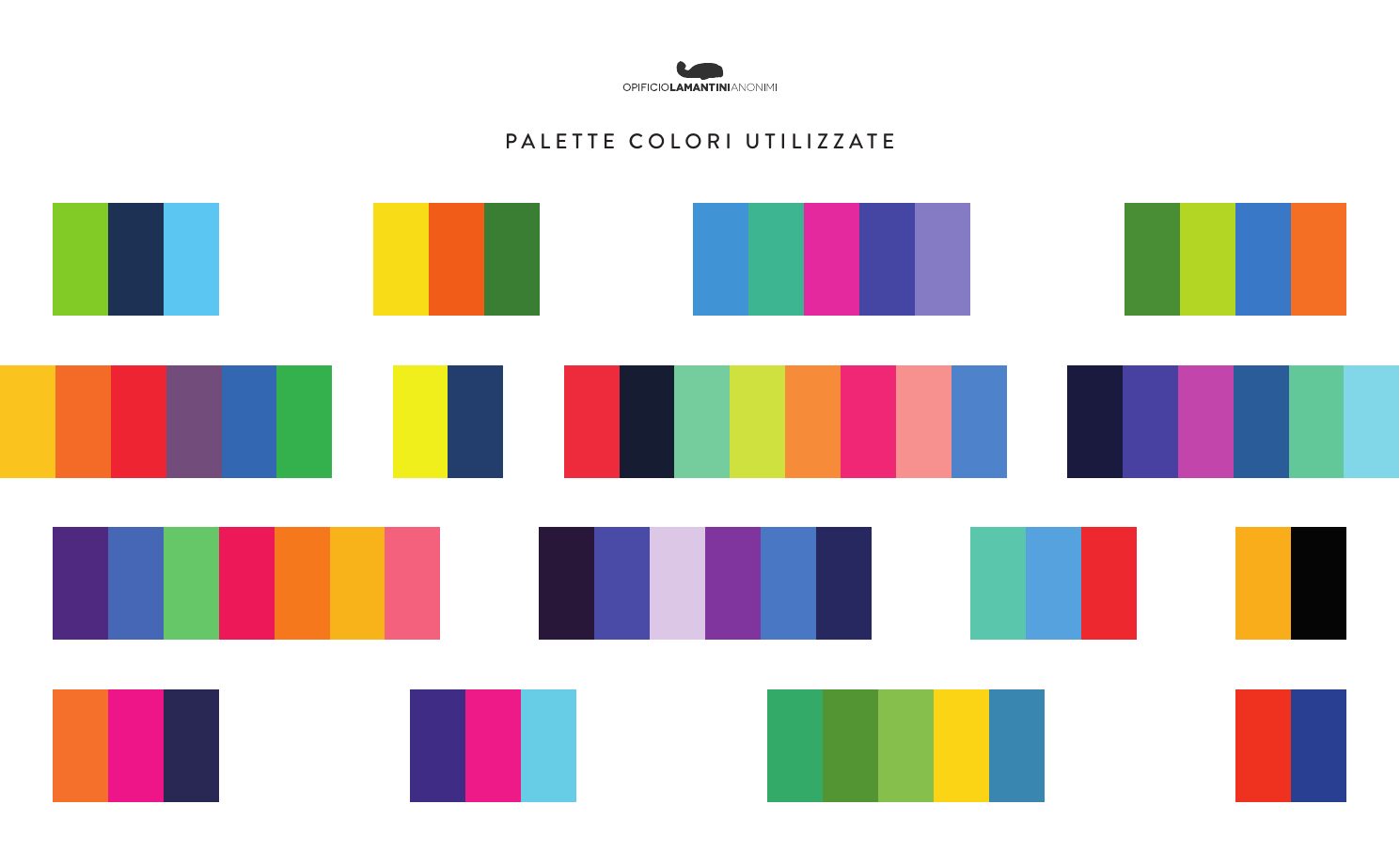
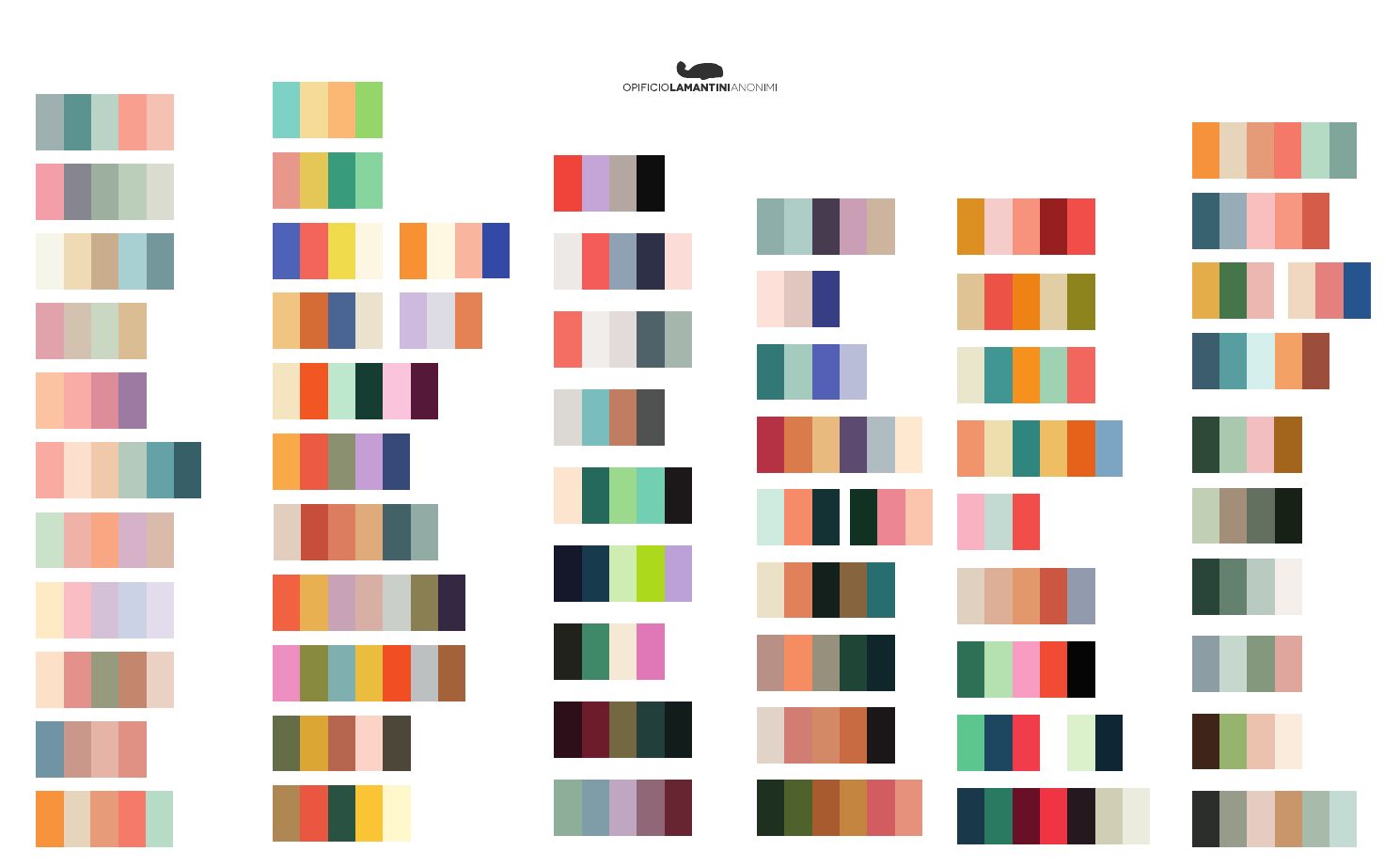
How do you check that a style works before drawing the logo?
The moodboard came back to us annotated by hand, page by page. Every choice was discussed before it became a mark.
Fifty pages of visual directions: texture, illustration, transparencies, patterns, websites. There was only one criterion: how people, not businesses, would perceive Unet.
The visual directions
From the moodboard, December 2022 · scroll →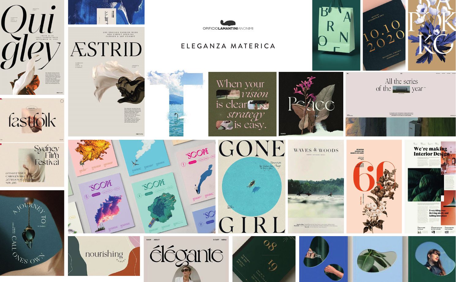
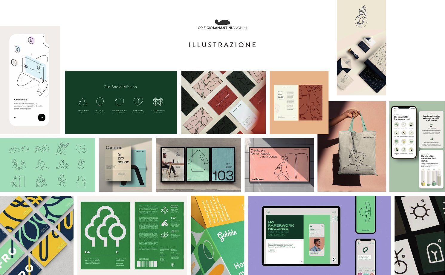
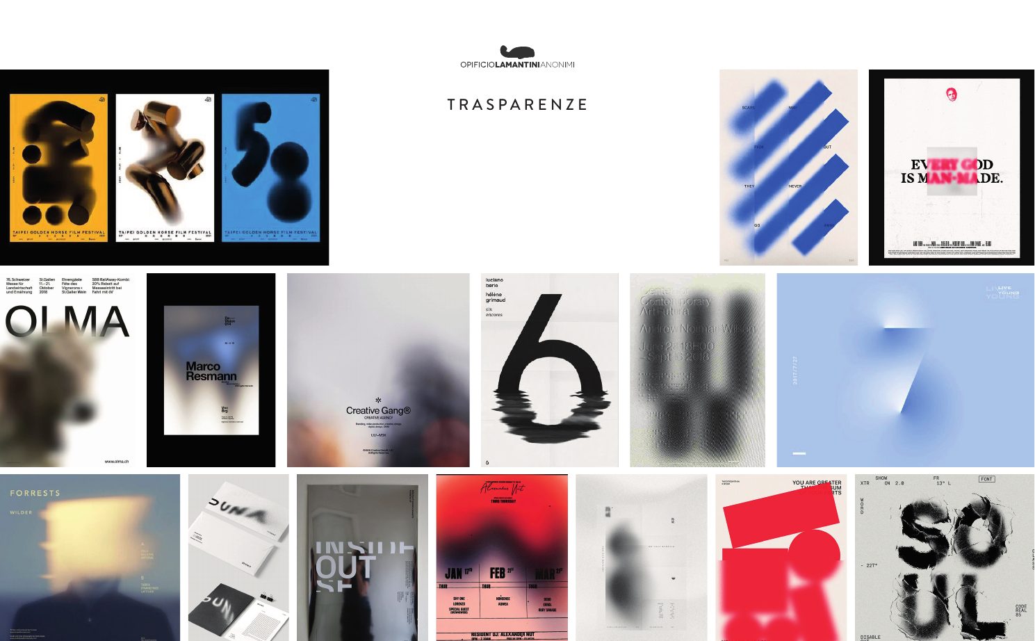
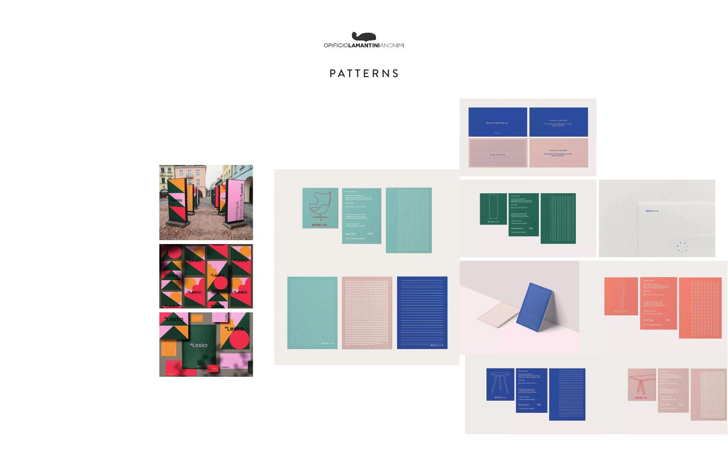
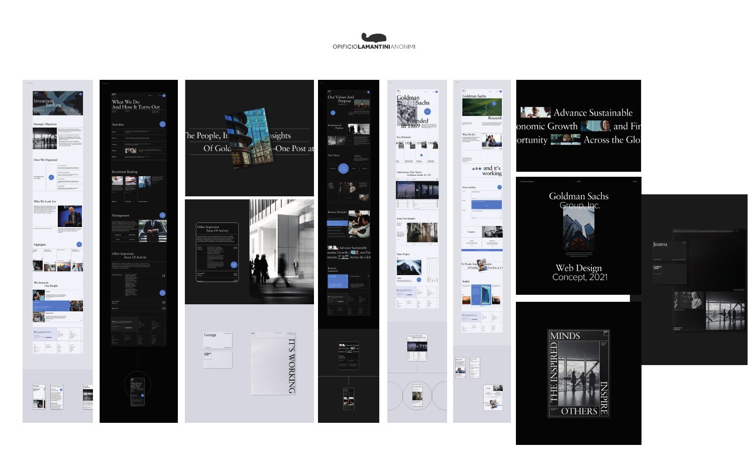
How do you get from a logo designed for businesses to one designed for people?
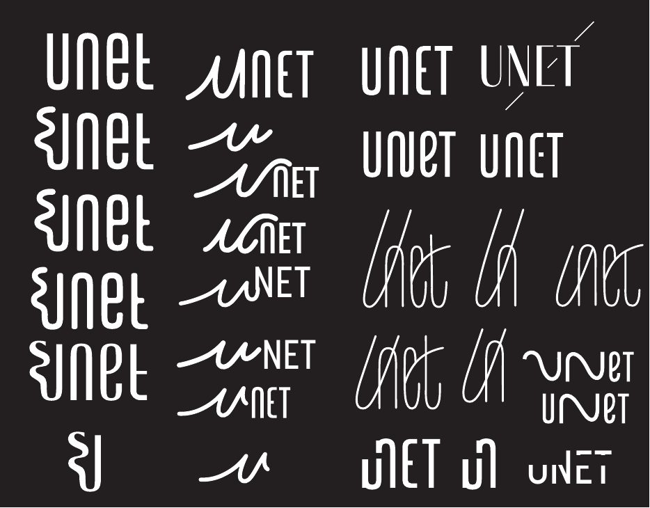
Three rounds of development. Not out of indecision, but to reach a mark that feels close without being casual, responsible without being cold.
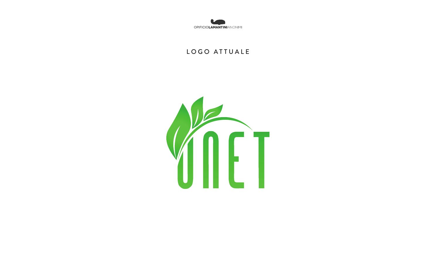
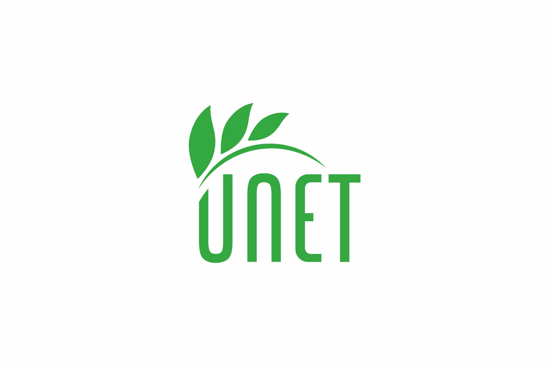
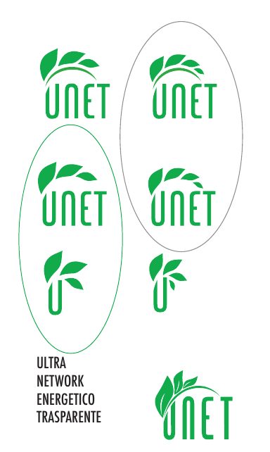
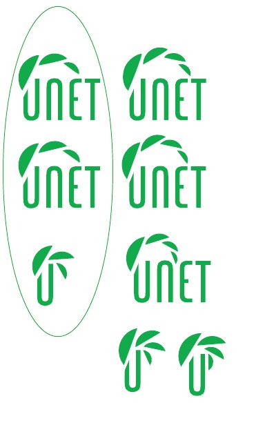
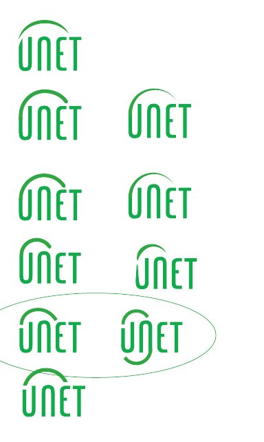
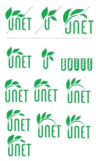
The logo already existed: a leaf and the name. We kept it, because people knew it, and we redrew it. We tried dozens of letterings and leaves, first in black and then in green, until we reached the final one.
Three rounds of development
December 2022 – February 2023 · scroll →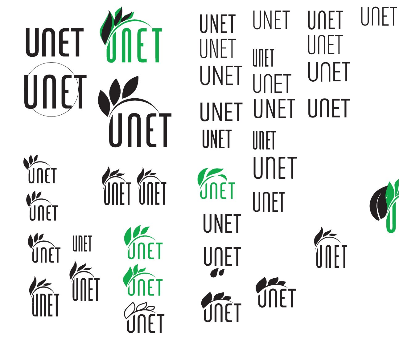
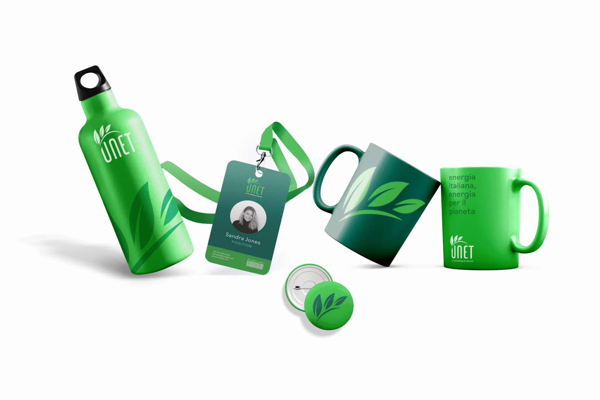
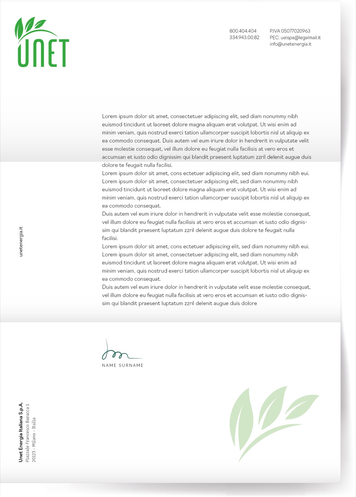
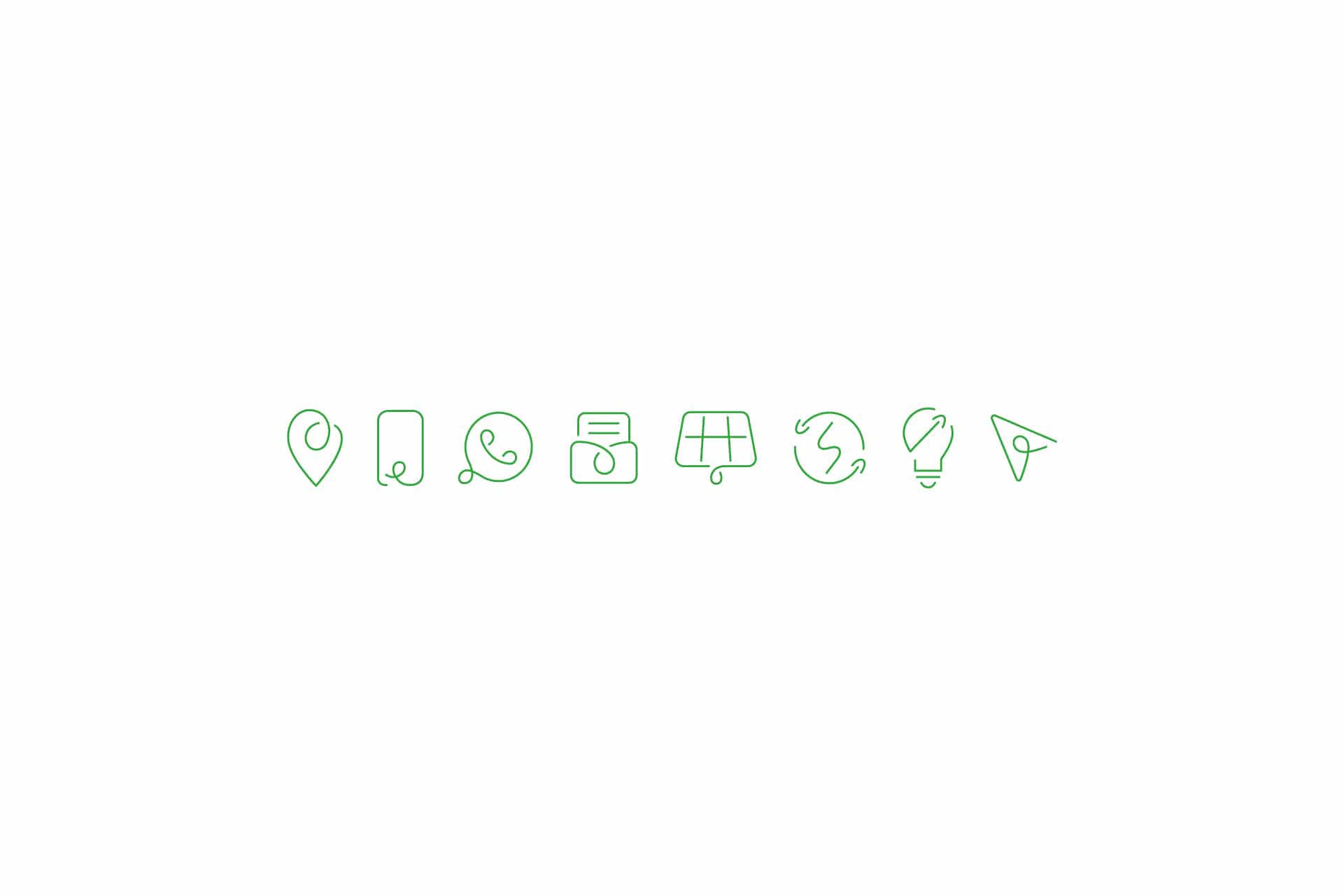
The logo at work
Stationery, icons, objects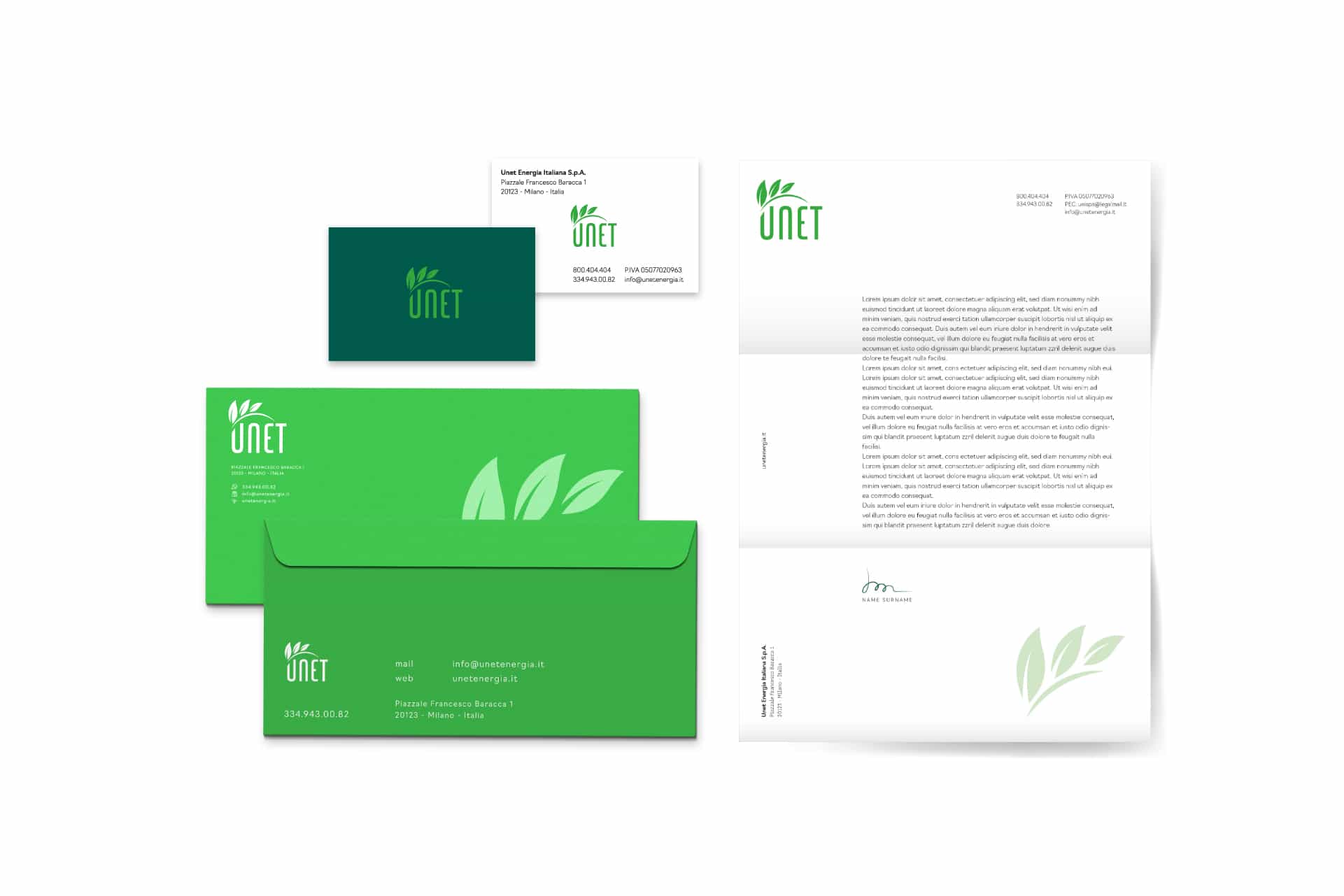
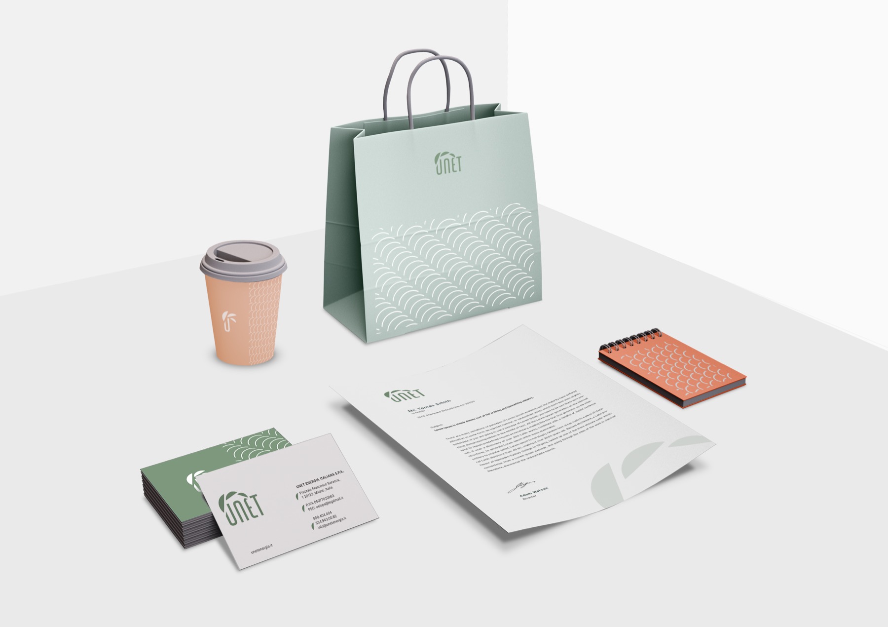
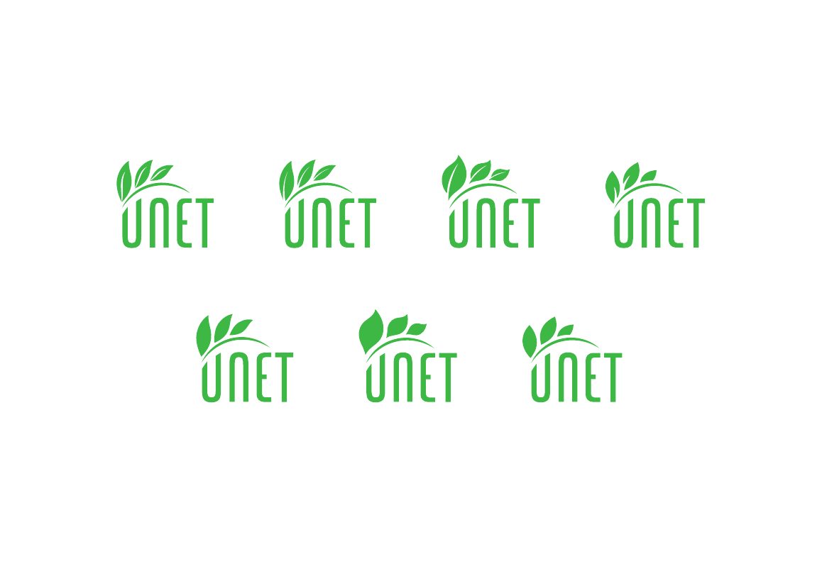
On the left, one of the intermediate directions, later dropped. On the right, the last variants of the logo.
Frequently asked questions
Unet and Opificio, in short.
What did Opificio Lamantini Anonimi do for Unet?
The rebranding: questionnaire, analysis, tone of voice, moodboard and logo restyling, to open the company up to the household market.
How do you build a brand for families from a company created to serve businesses?
By starting from an analysis of who the new audience will be, and testing every choice of style, colour, shape and typography against how that audience will perceive it.
Where does a rebranding by Opificio Lamantini Anonimi start?
With a questionnaire on identity, values, tone of voice, competitors, target audience and communication, followed by an analysis shared with the client and moodboards discussed together before the mark is drawn.
Does Opificio Lamantini Anonimi work in the energy sector?
Yes. For Unet, an electricity distributor, it handled the rebranding between 2022 and 2023.