

Safe: the shape that listens
Brand identity, company profile, corporate identity, website and brand book for Safe – Safety Acoustic Engineering, a Padua company working in workplace safety, acoustics and engineering solutions.
In short
Safe S.r.l. – Safety Acoustic Engineering is a company in Padua, Italy, working in workplace safety, acoustics and engineering solutions for measuring sound and physical agents. Between 2022 and 2024 Opificio Lamantini Anonimi developed its brand identity starting from the existing logo, its company profile, its corporate identity, the design of the safesrl.com website and its brand book.
Project facts
- Client
- Safe S.r.l. – Safety Acoustic Engineering
- Sector
- Workplace safety, acoustics, measurement engineering
- Location
- Padua, Italy
- Period
- July 2022 – March 2024
- Services
- Brand identity, company profile, corporate identity, website design, brand book
- Website
- safesrl.com
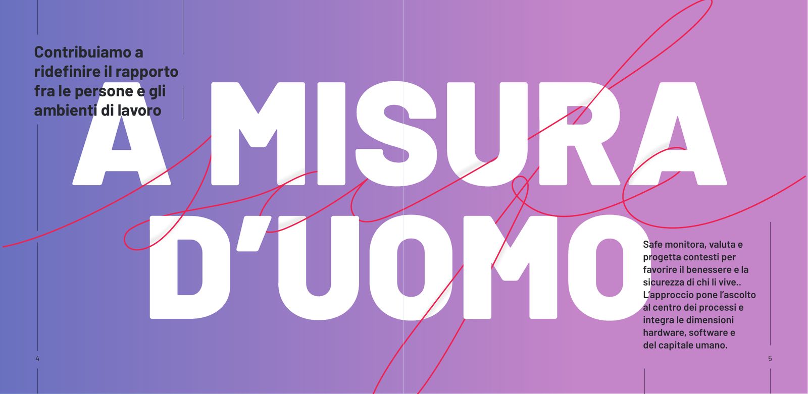
Safe works on something you cannot see. Its company profile opens like this: we work on that precious moment when a noise is understood and stops being noise. In 2022 Safe already had a name, a tagline and a mark. What it lacked was a system to make them speak.
The starting point
Where was Safe starting from?
Four lines of work: workplace safety, acoustics, engineering, training. A red logo, with handwritten lettering and a dodecahedron beside it. In the first presentation, on 11 July 2022, we lined up the eight elements of the identity and decided which ones to work on. Name, shape and tagline stay. Type, colour, imagery, graphic elements and tone of voice are redone.
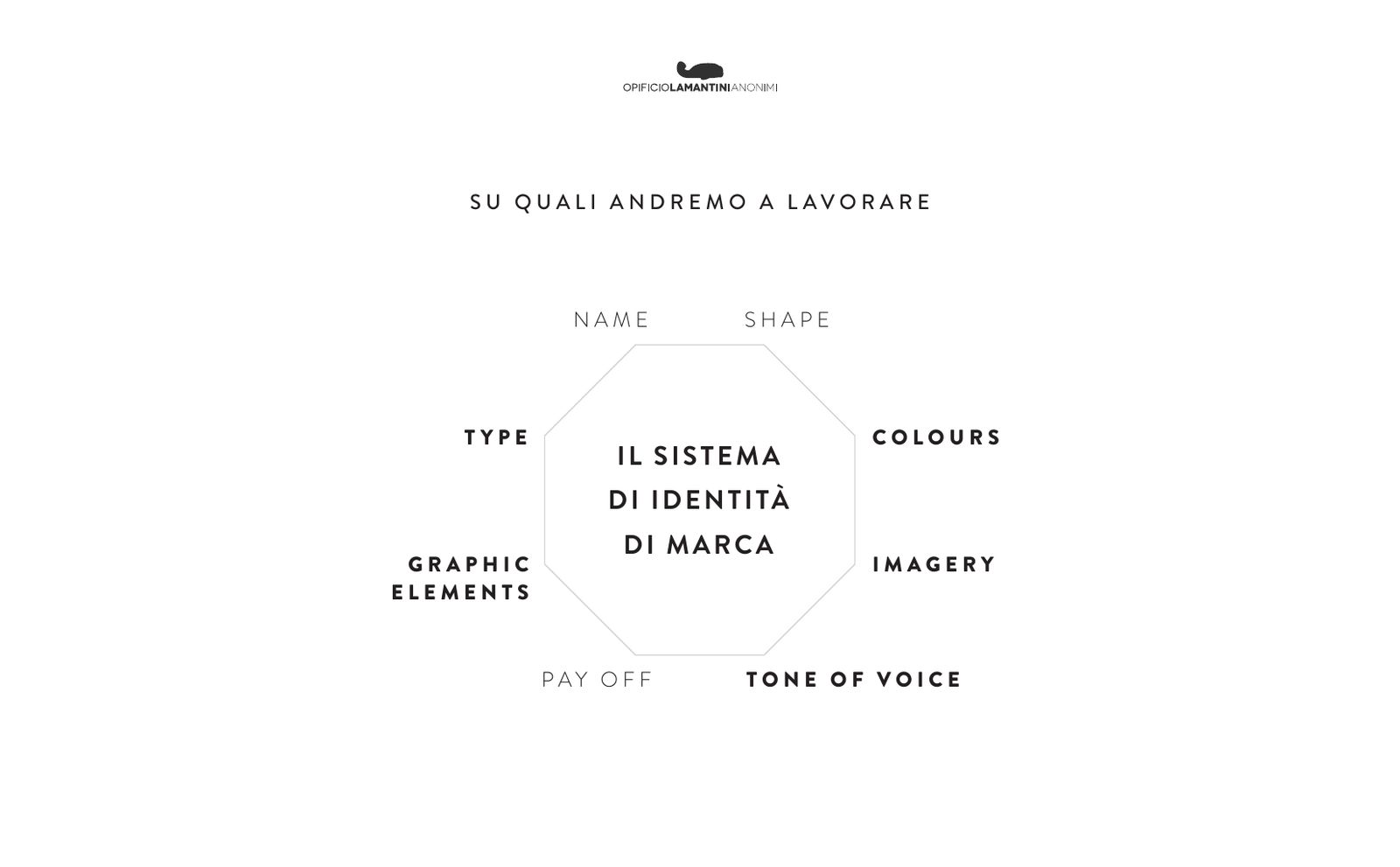
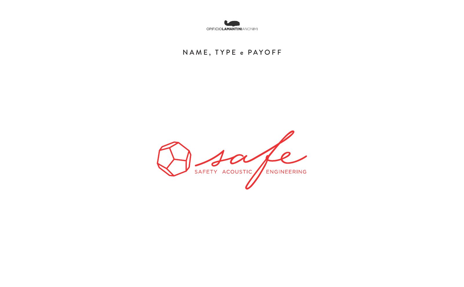
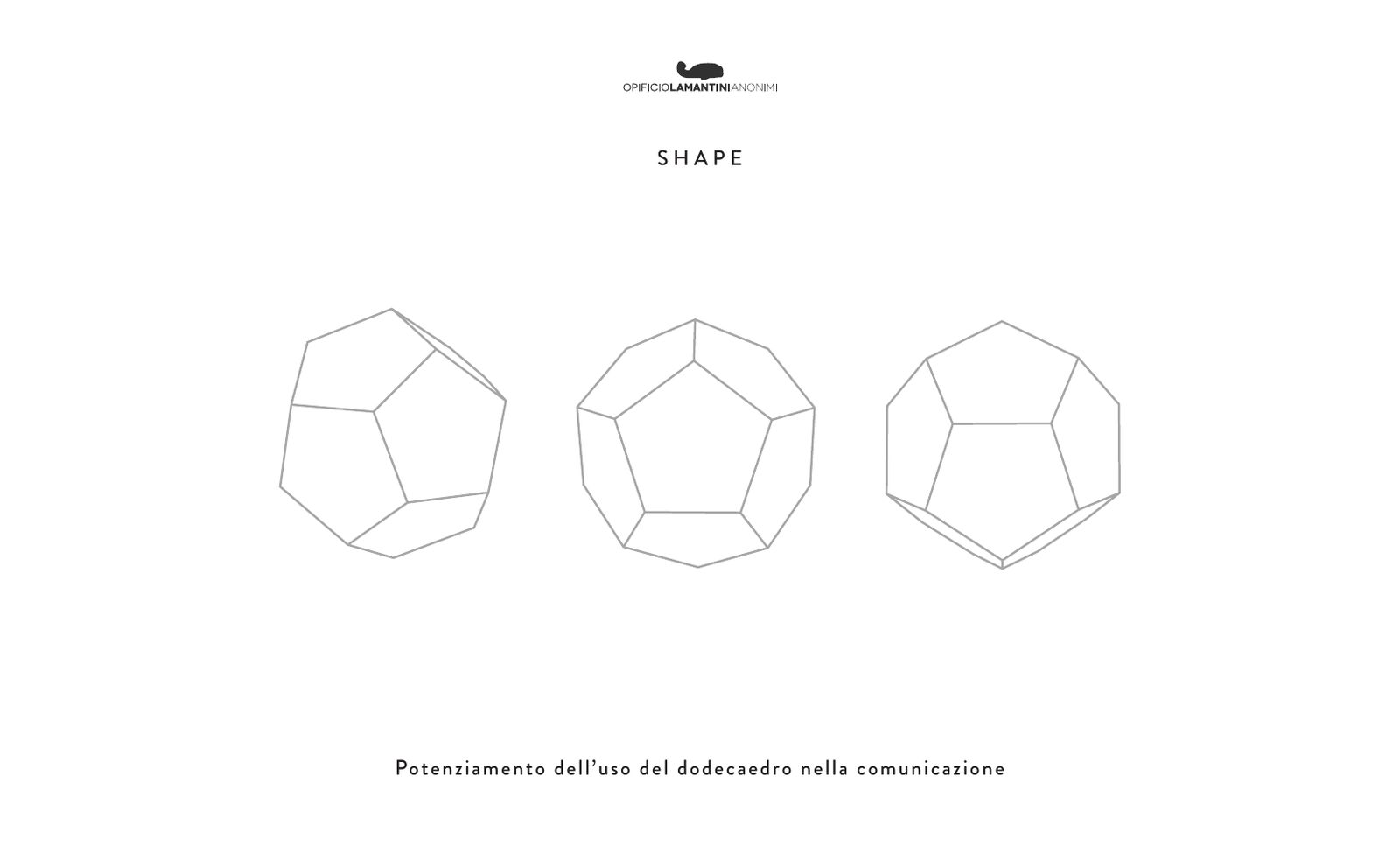
Making more of the dodecahedron in the communication.From our first presentation to Safe, 11 July 2022
Why does a company that measures sound have a dodecahedron in its logo?
Because it is also the shape of the source used to measure sound. The shape was already there: it had to be put to work.
Acoustic measurements use dodecahedral sound sources: twelve loudspeakers, one per face, sending sound in every direction. Safe uses them, and its engineering division makes them. The dodecahedron in the logo was not an ornament. It was a working tool.
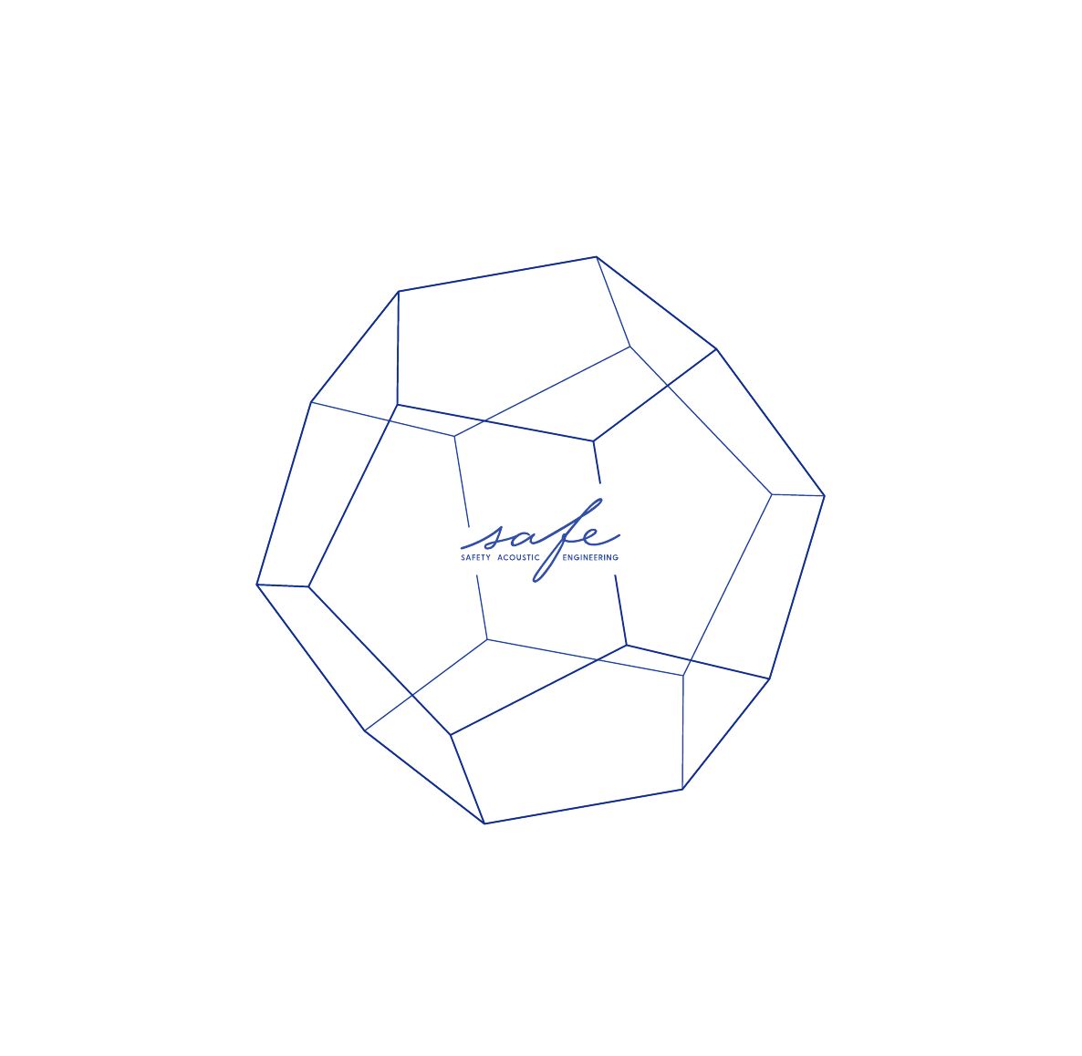
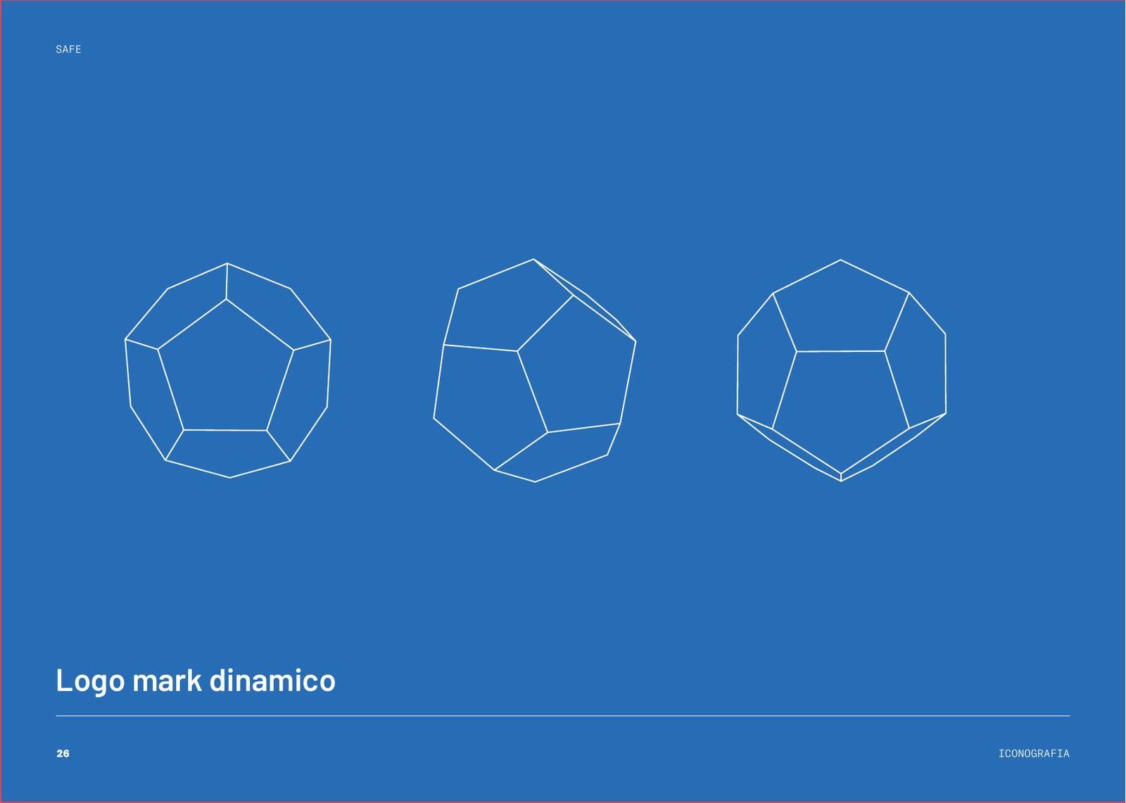
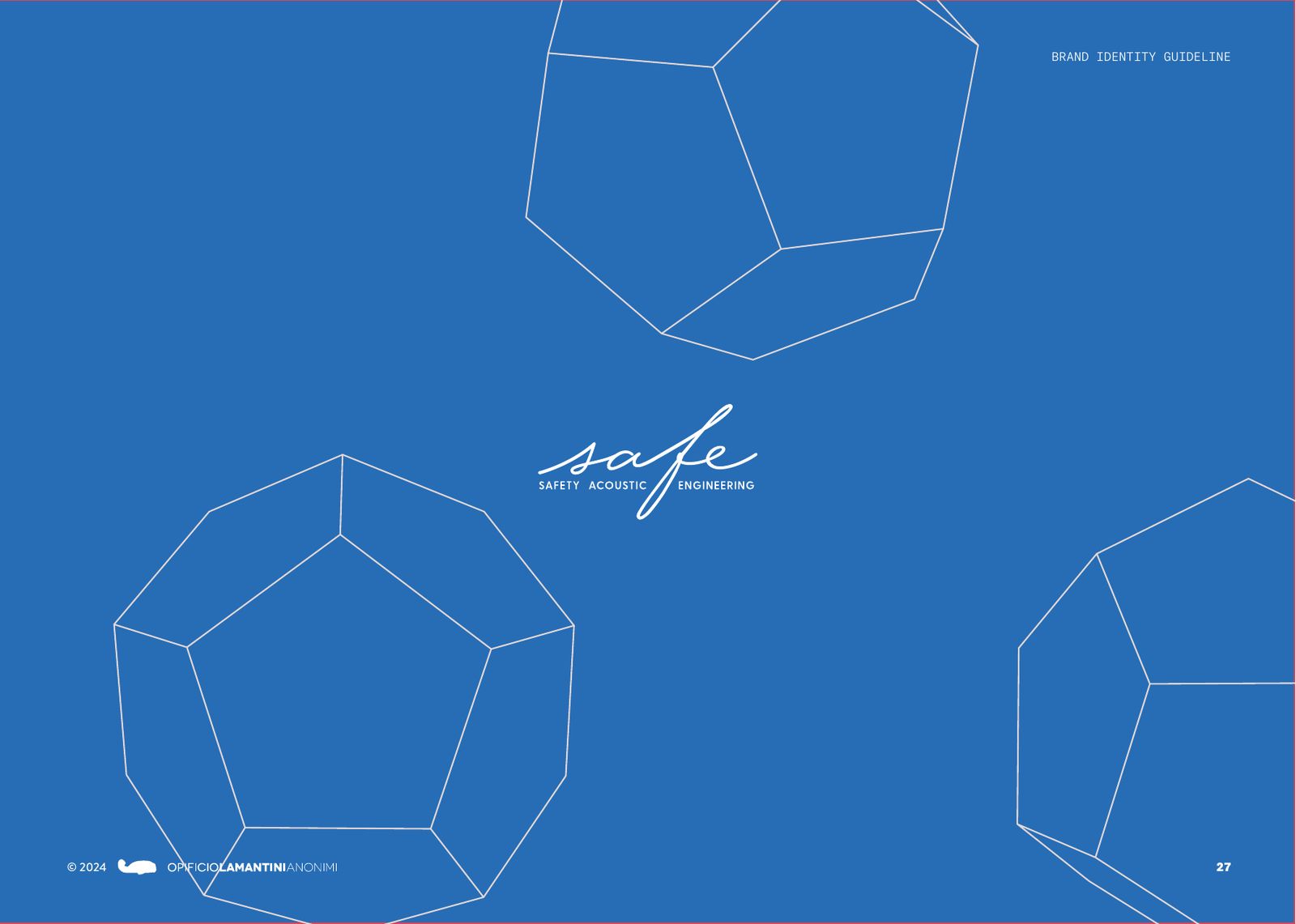
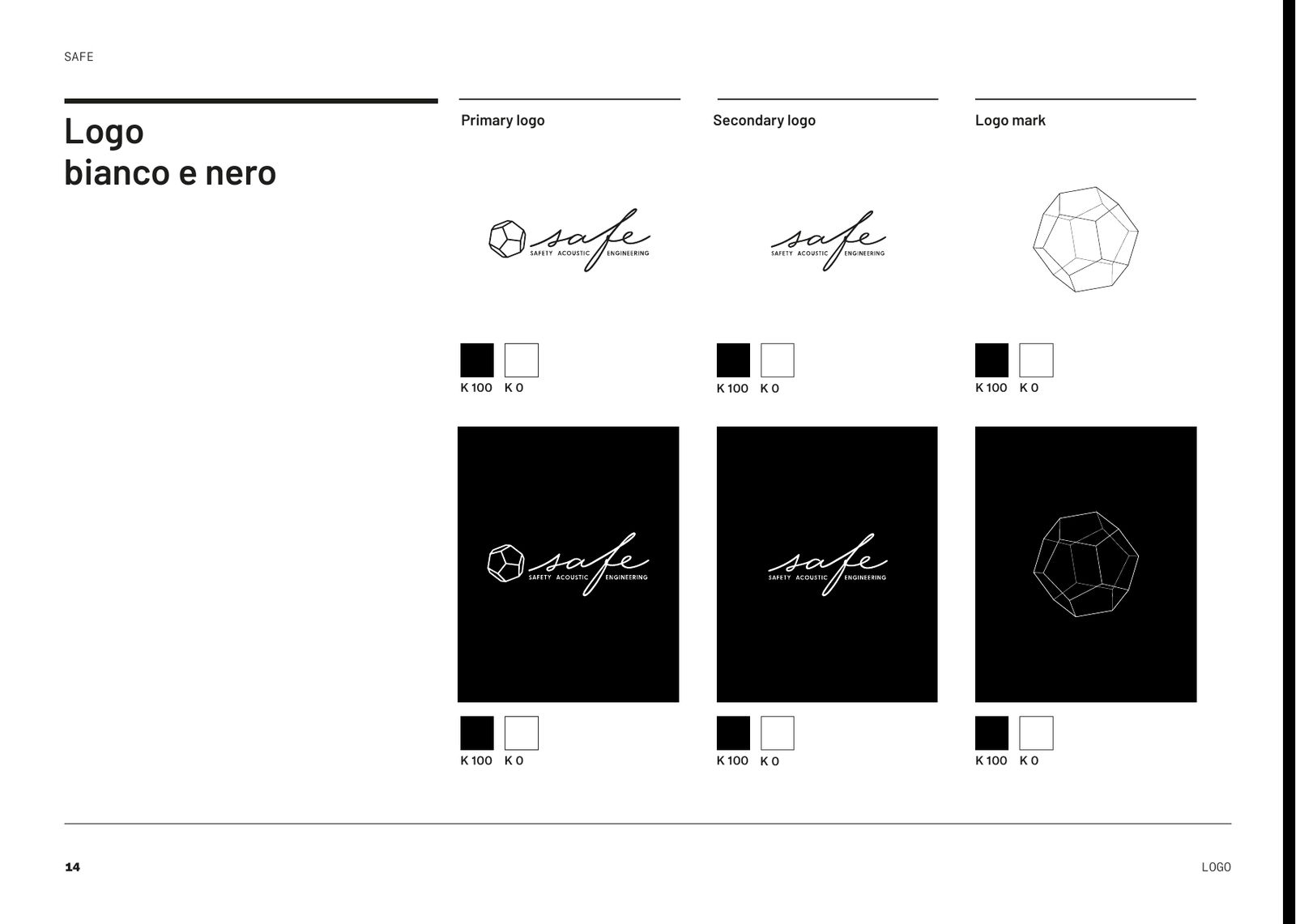
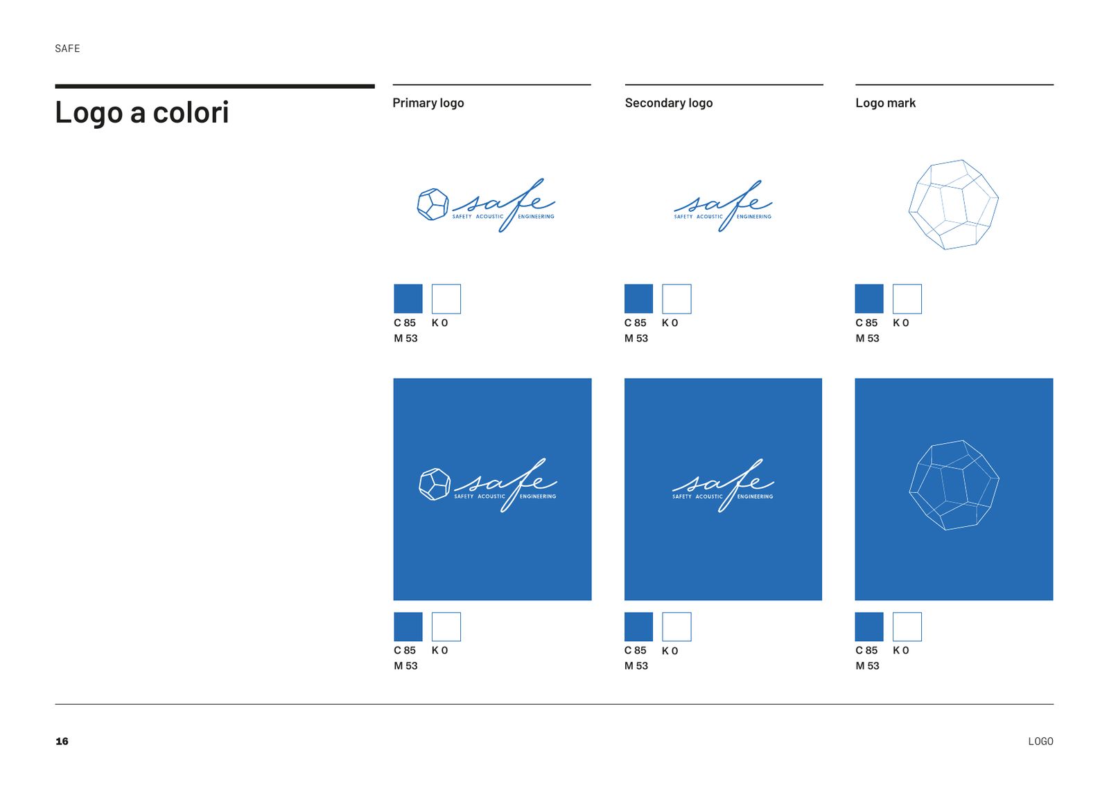
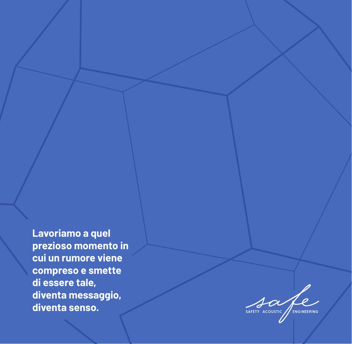
We detached it from the lettering. Drawn as a wireframe and rotated in three views, it becomes a dynamic logo mark: it stands on its own, grows until it runs off the page, turns from one face to the next. The logo stays in three versions: full, lettering only, dodecahedron only.
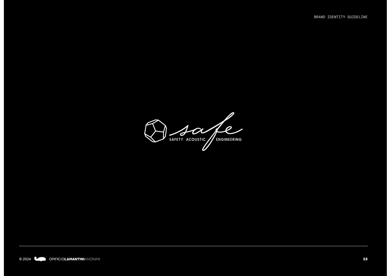
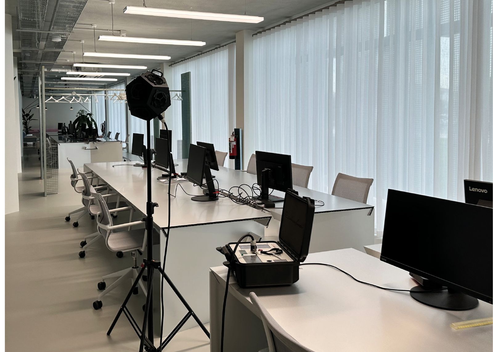
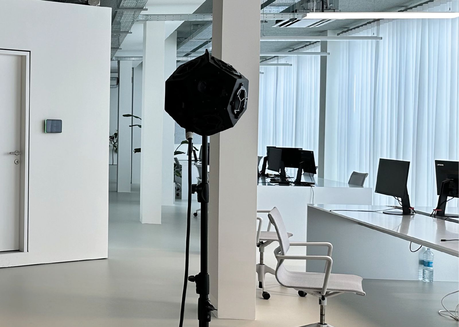
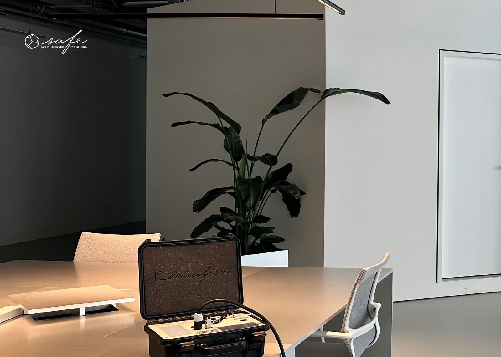
The dodecahedral source, from the brand book photographs: the same shape as the logo.
From shape to logo mark
First presentation, July 2022 · brand book, 2024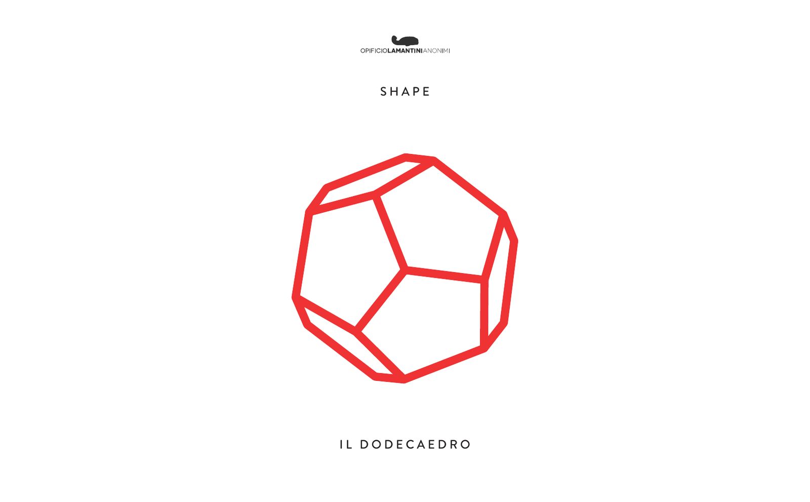
What colour is a company that works in safety?
Of cold and warm tones together: contemporary, safe, dynamic.
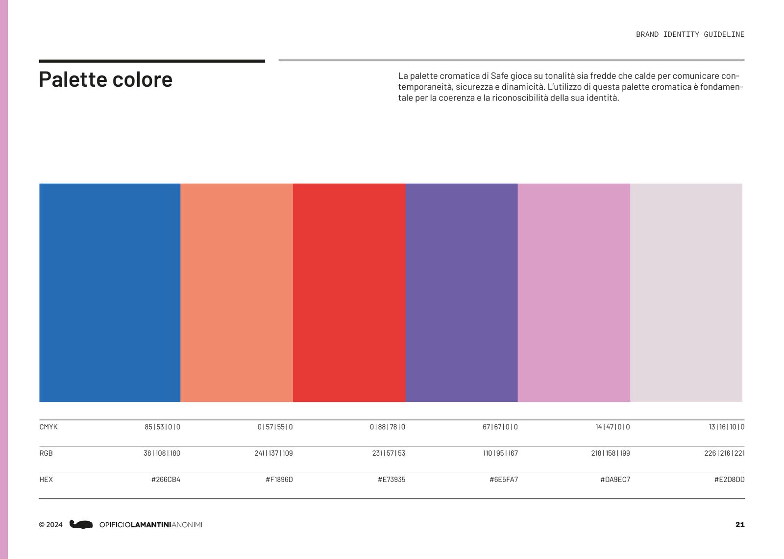
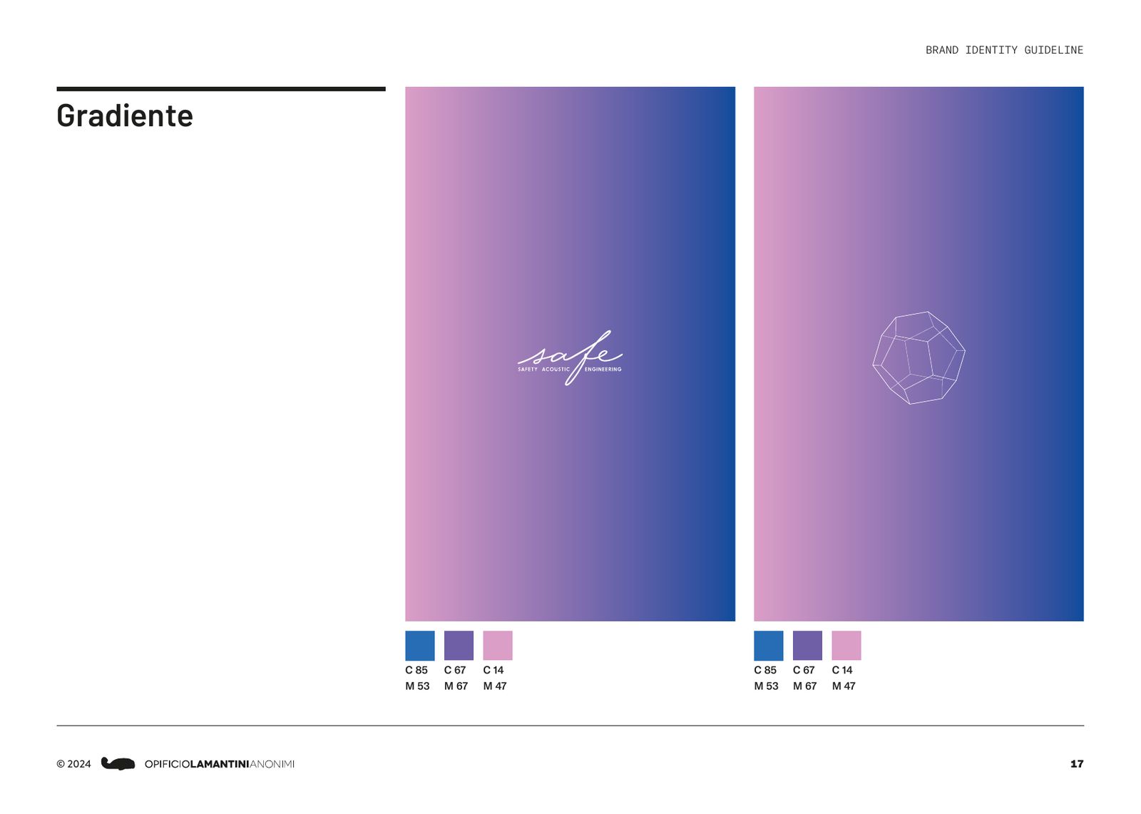
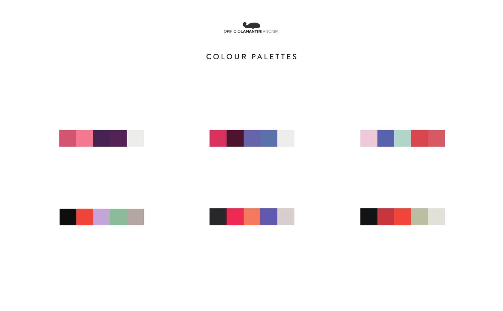
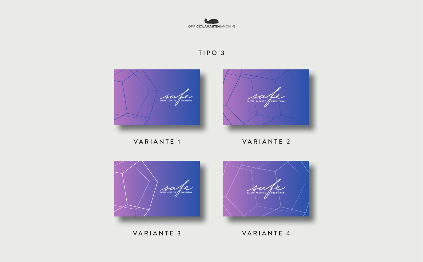
The red of the previous logo gives way to a six-colour palette: a blue as the base, then coral, red, purple, pink and a rosy grey. Blue, purple and pink merge into a gradient, which becomes the recognisable background for covers, cards and website.
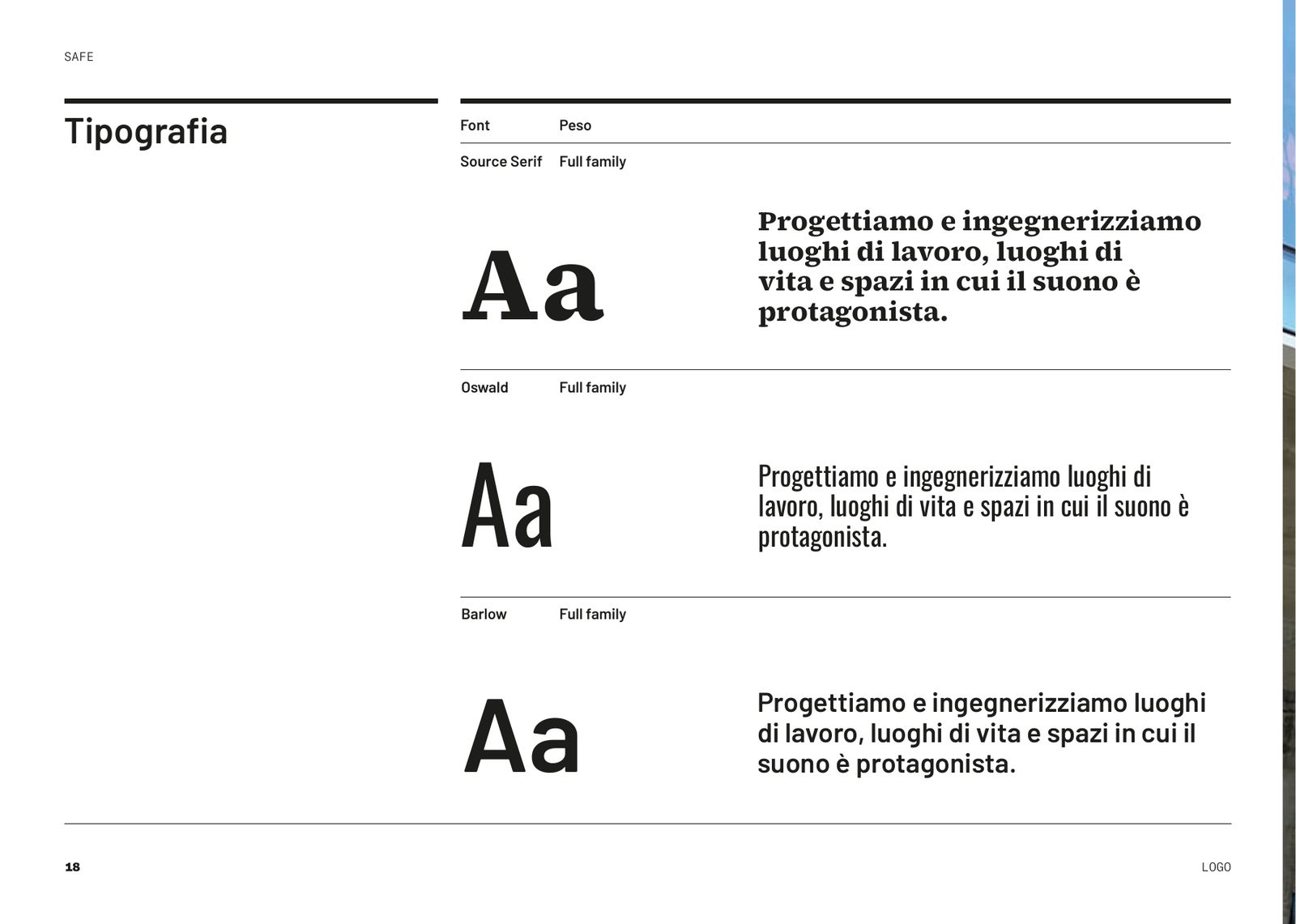
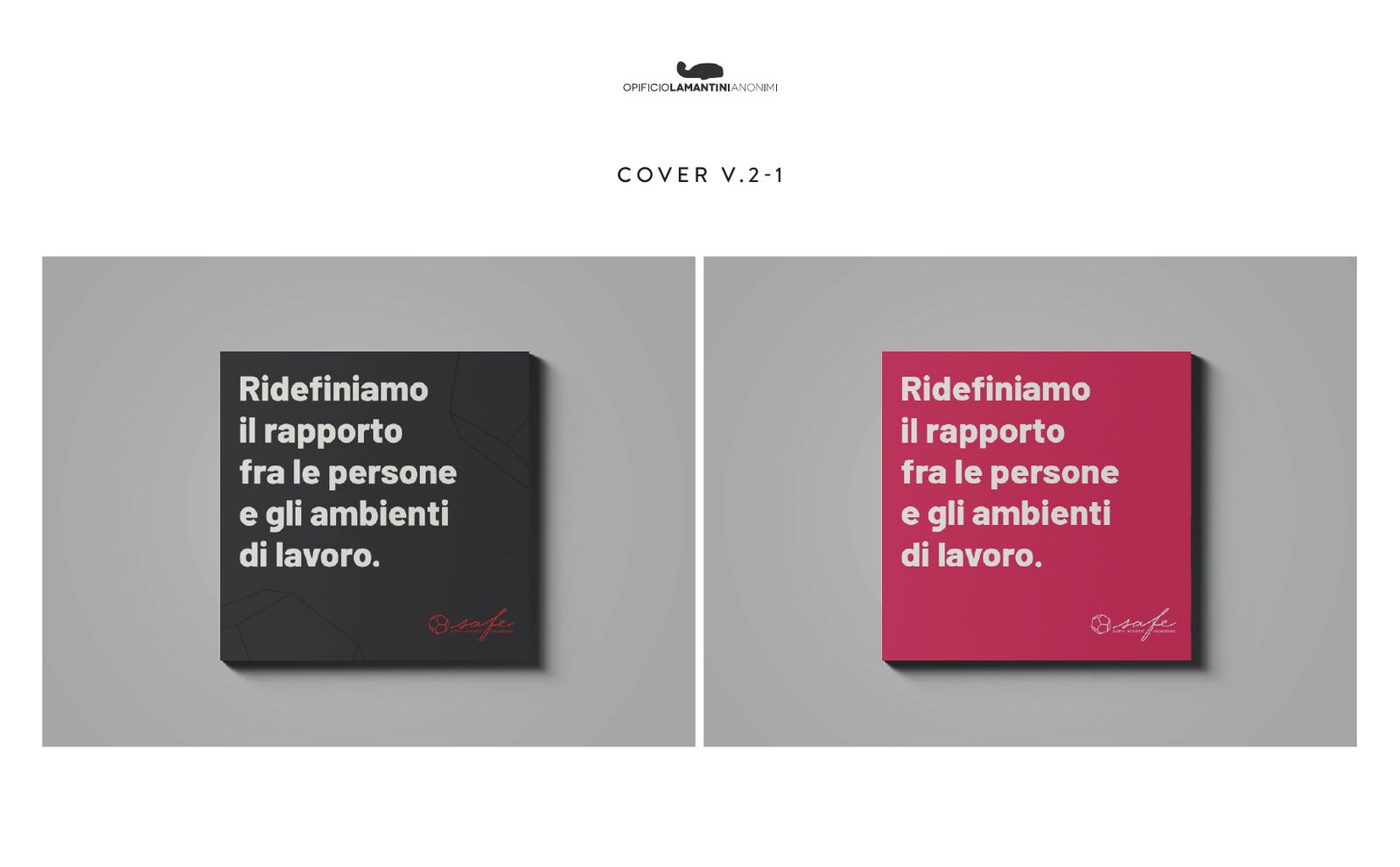
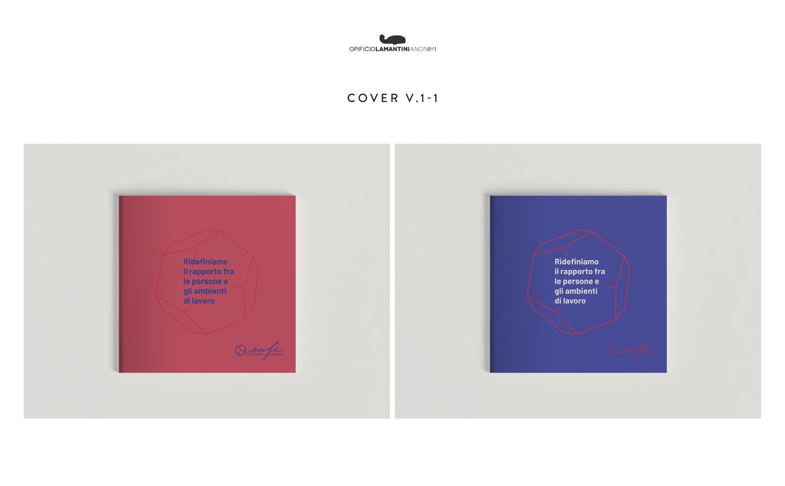
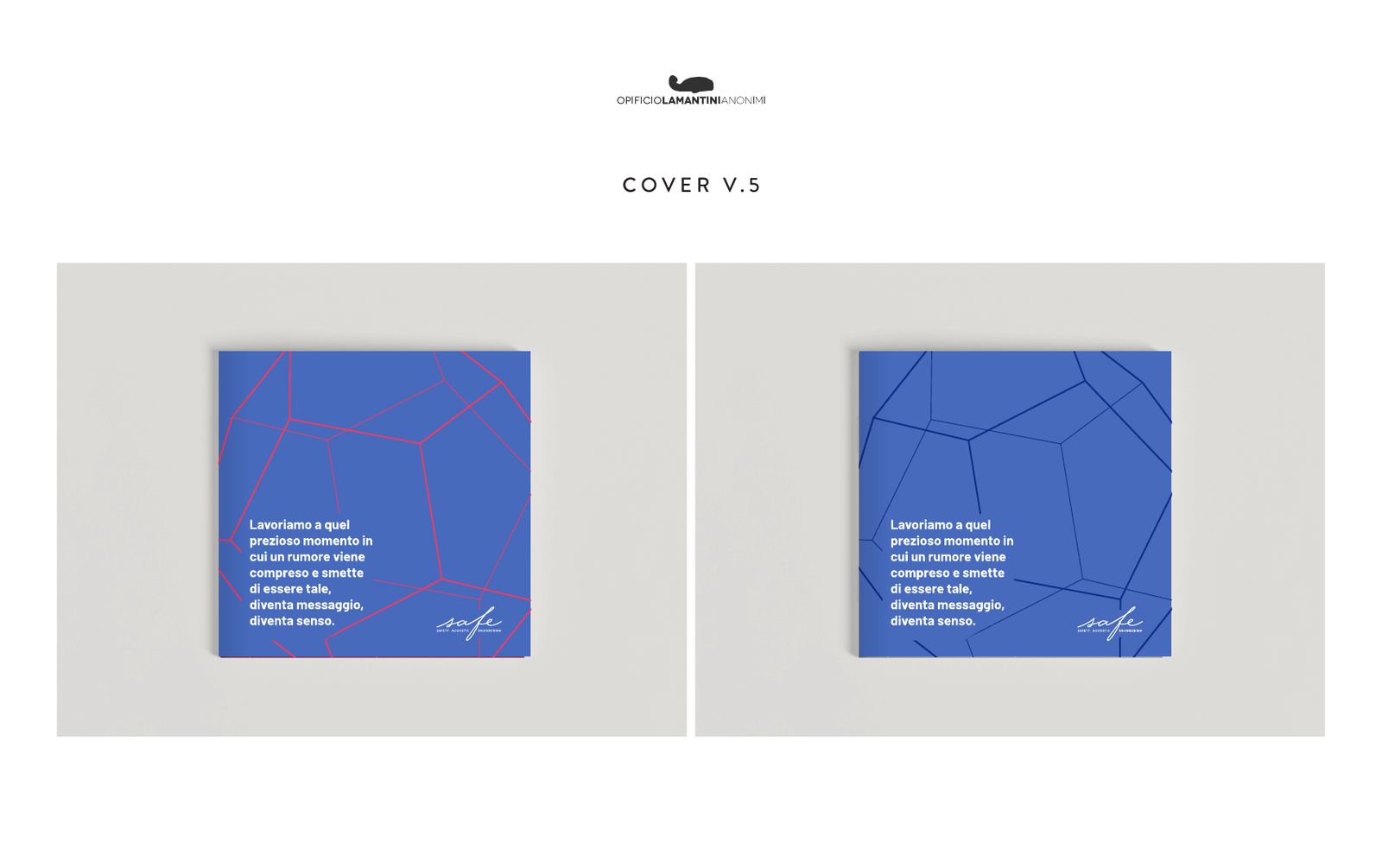
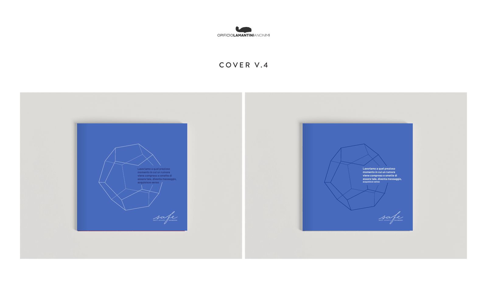
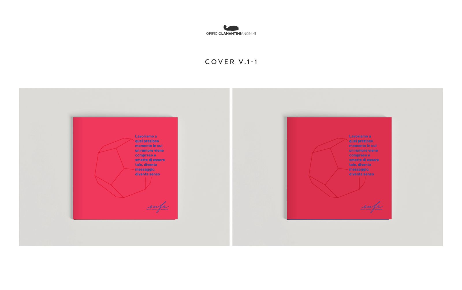
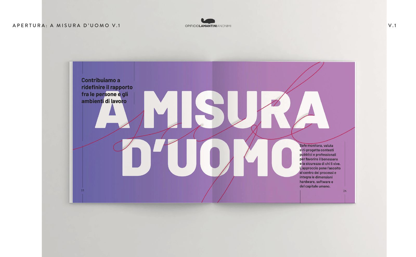
For type we set Greycliff against Barlow, composed straight around the logo. Barlow won, with Oswald for narrow headlines and Source Serif for quotes. The covers went from black to red to blue, until the dodecahedron lines ran off the page.
Type and covers, one test after another
Progress presentations of 27 July, 3 August and 15 September 2022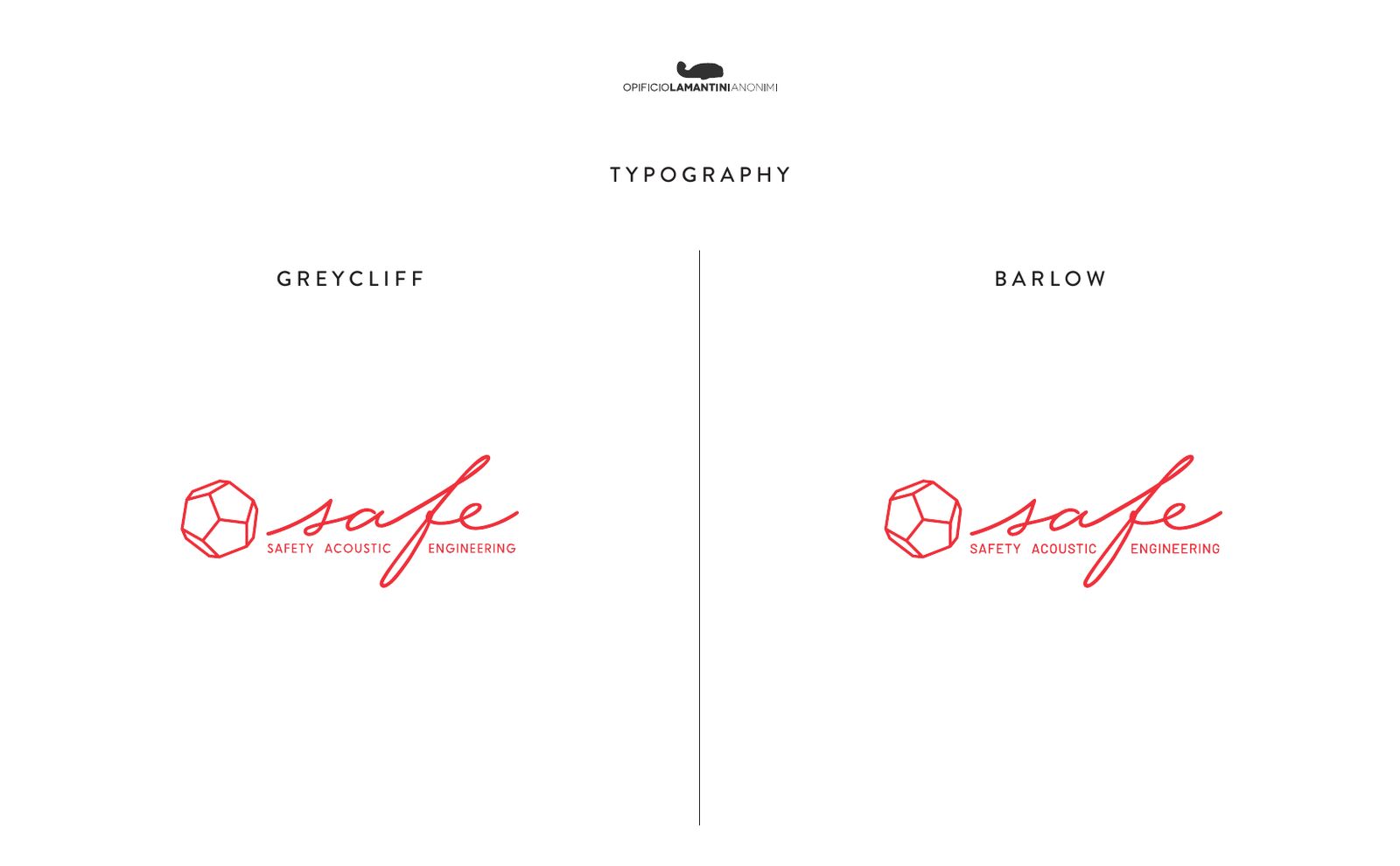
How do you tell the story of a company that works on something you cannot see?
From the moment a noise stops being noise and becomes meaning.
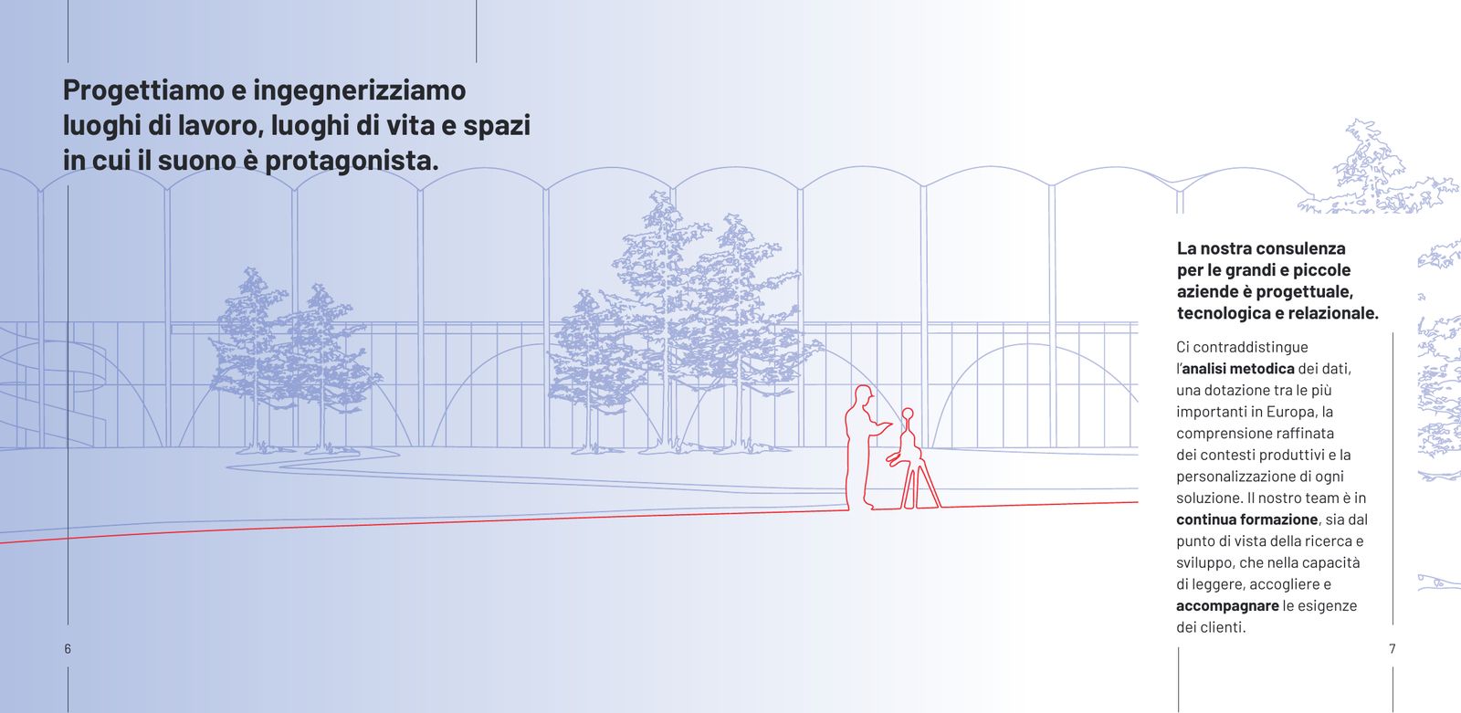
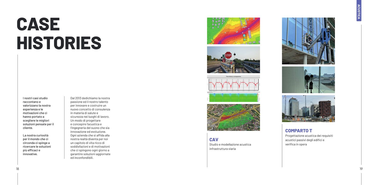
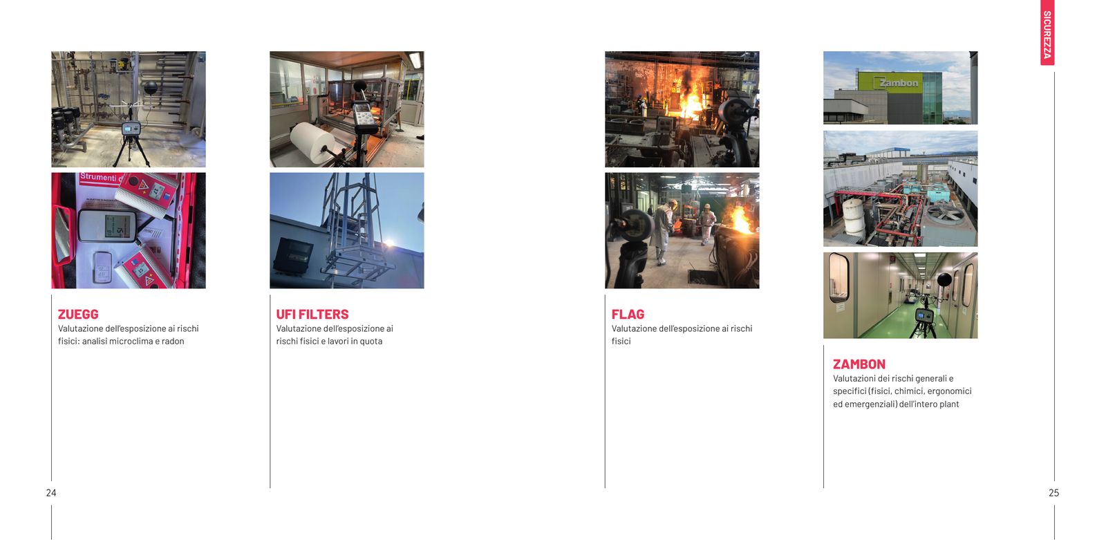
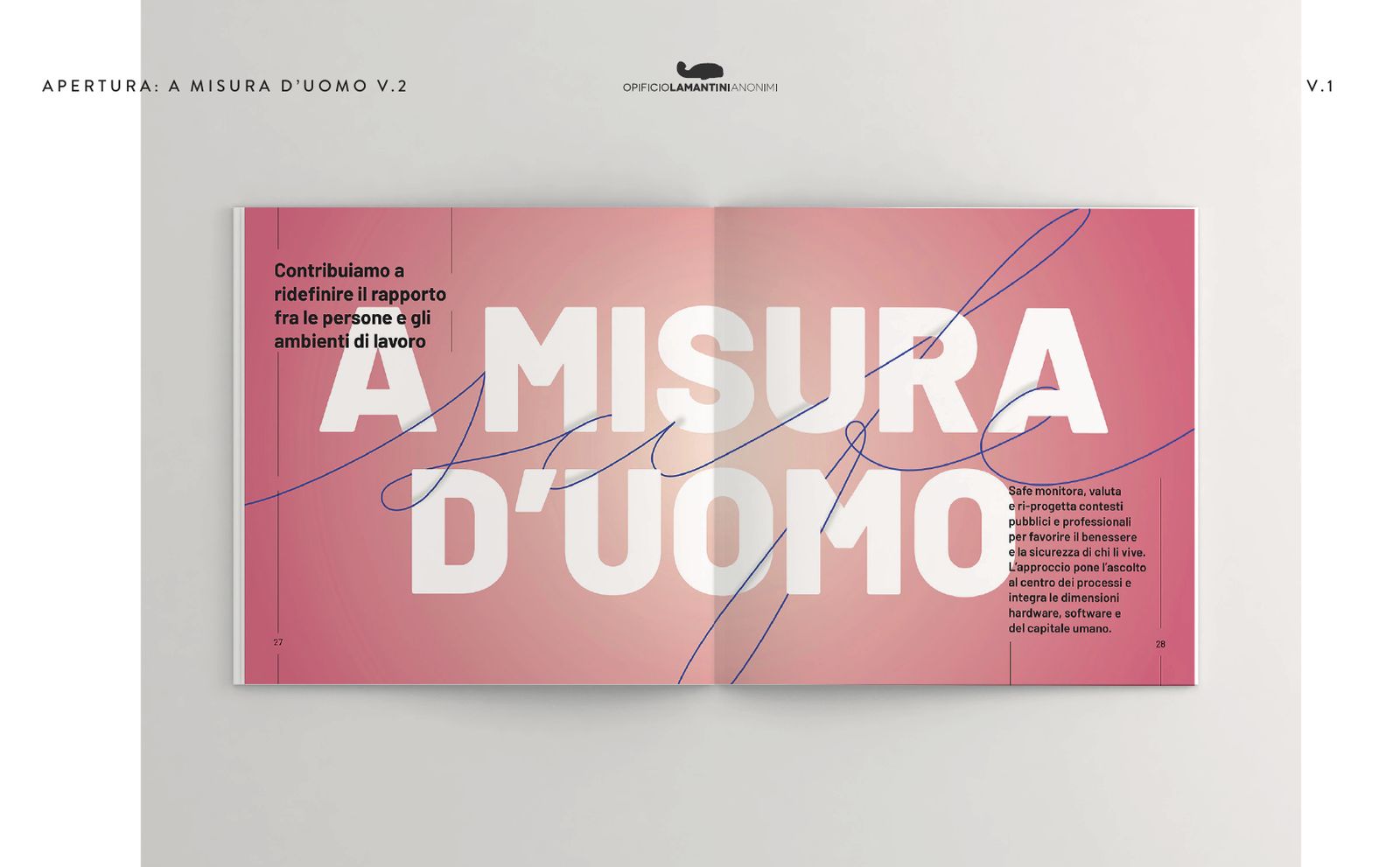
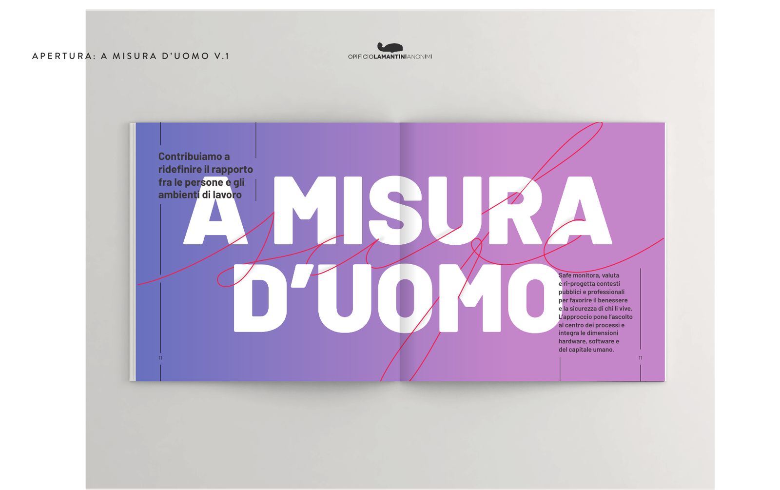
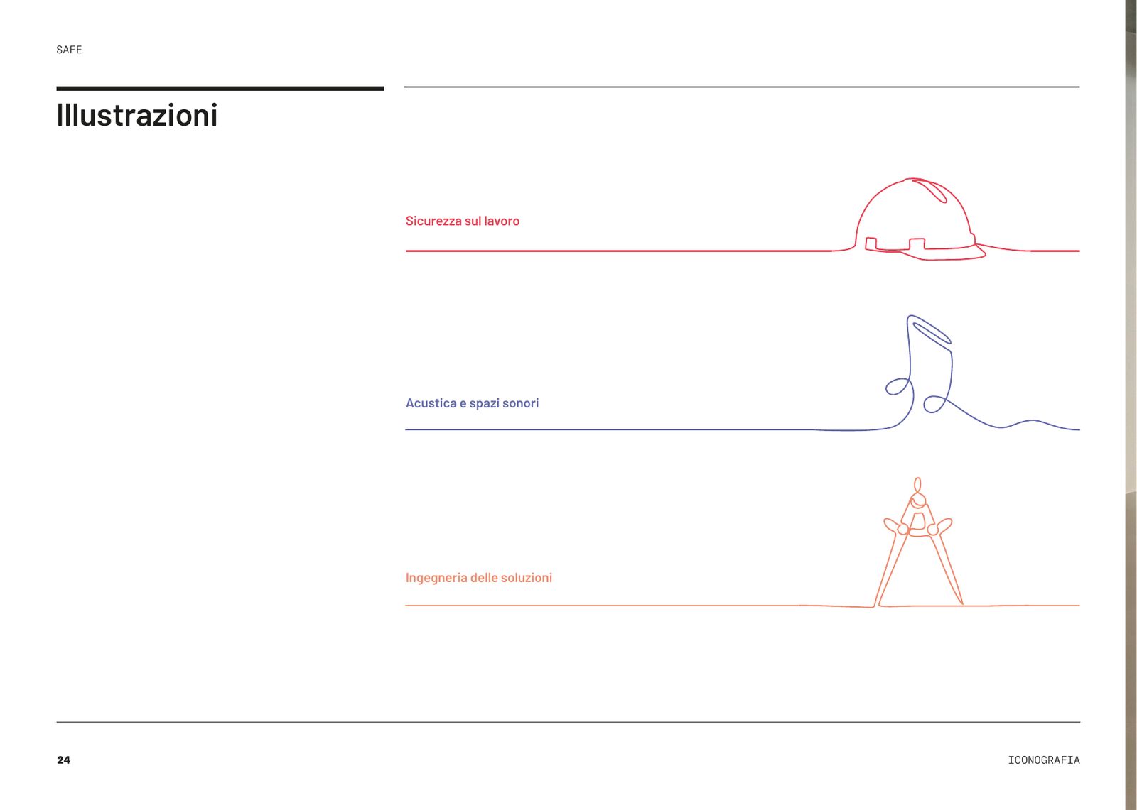
An almost square book. The cover is blue, crossed by the dodecahedron lines, with the opening line. Inside, six chapters: A misura d’uomo (on a human scale), Workplace safety and safety management, Acoustics and sound spaces, Solutions engineering, Training, Case histories. Each line of work has its own colour from the gradient and a line illustration.
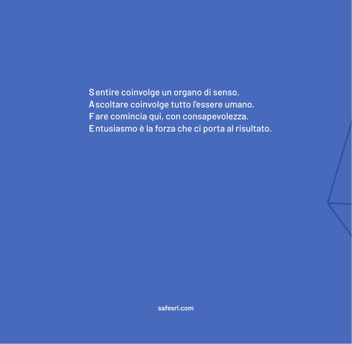
At the end, the four letters of the name, one per line, in Italian: Sentire, hearing, involves one sense organ. Ascoltare, listening, involves the whole person. Fare, doing, starts here, with awareness. Entusiasmo, enthusiasm, is what carries us to the result. The texts are by Davide Pocchiesa. Twelve releases, up to the print file of April 2023.
Six chapters, spread by spread
Company profile, release 12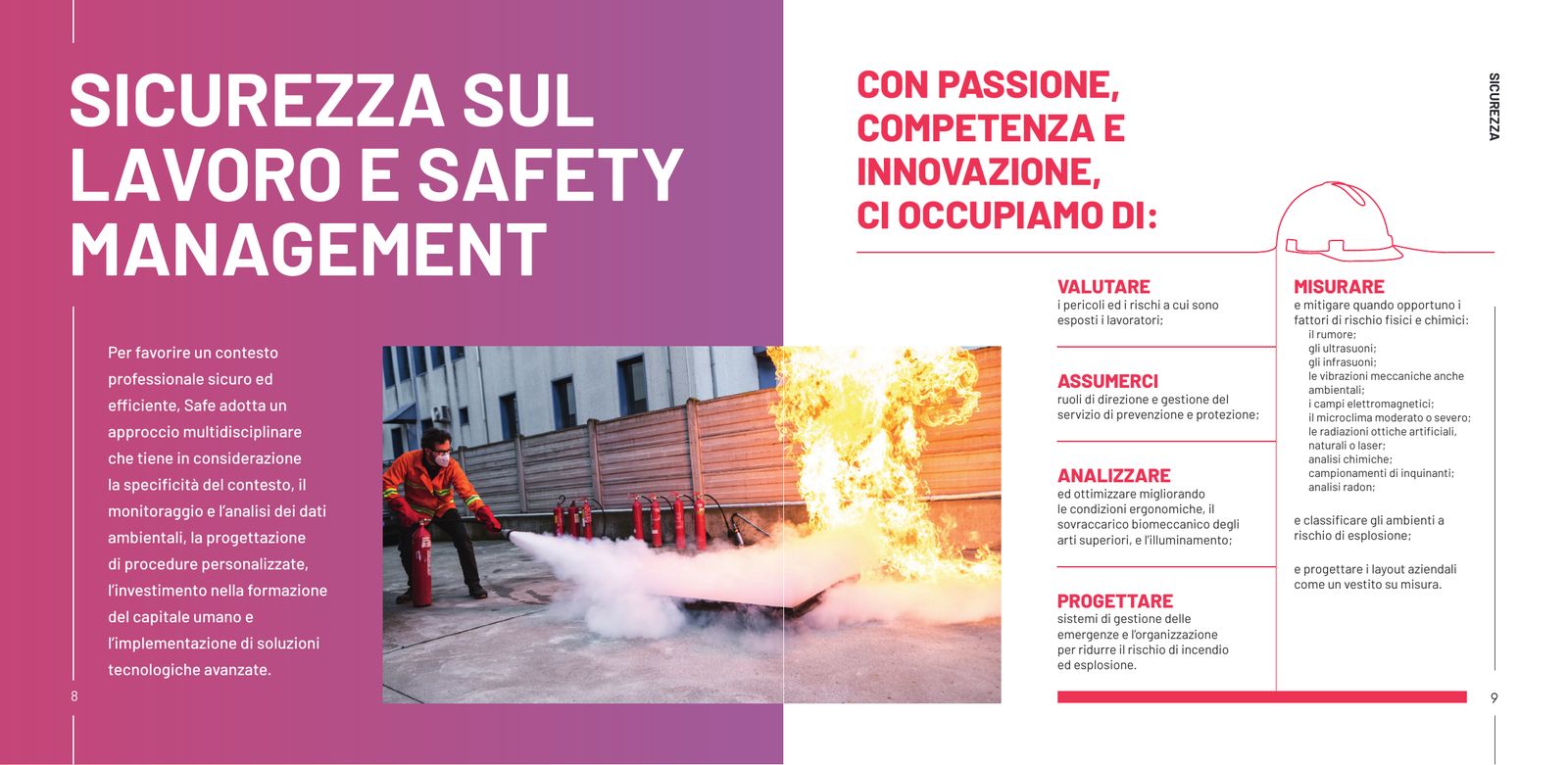
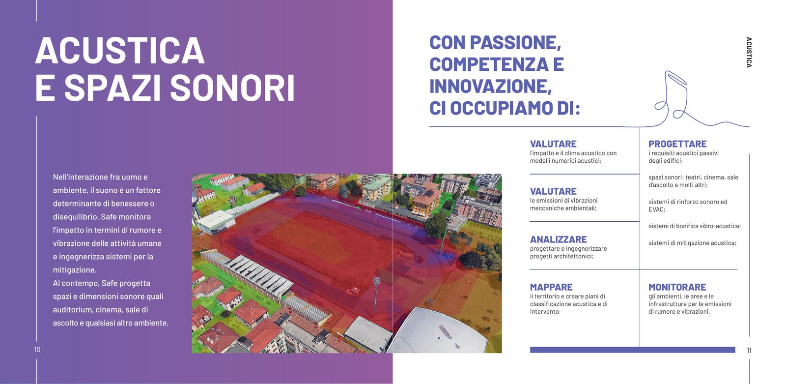
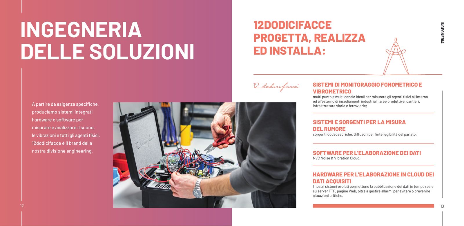
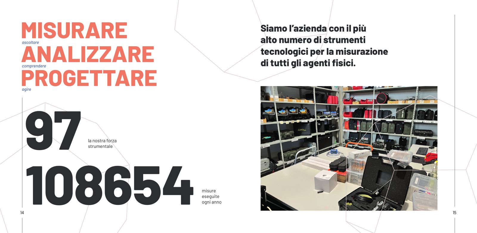
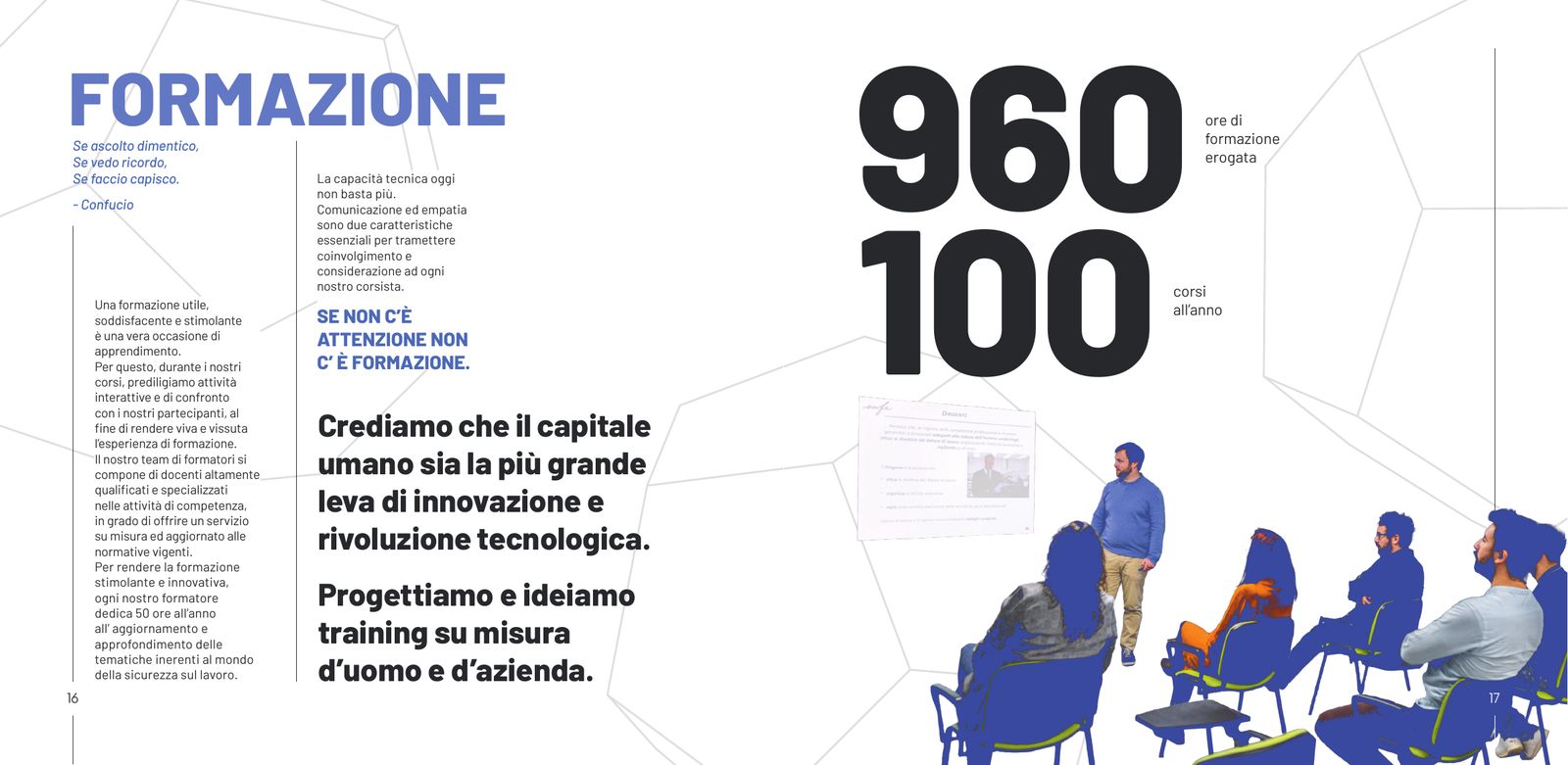
I dreamed of it since I was a child and built this company by putting the quality of the relationships between our people at the centre of everything: because only by fostering the wellbeing of our own organisation can we understand and support the wellbeing and efficiency of our clients.Emiliano Boniotto, CEO and founder of Safe, on the closing page of the company profile
How we got there
Spread tests, July – September 2022 · scroll →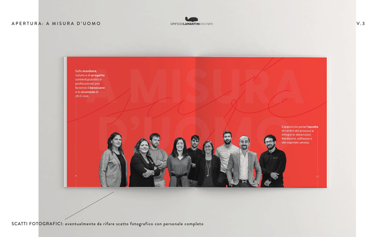
What is left on the client’s desk after a visit?
A card, a folder, a technical report with its cover.
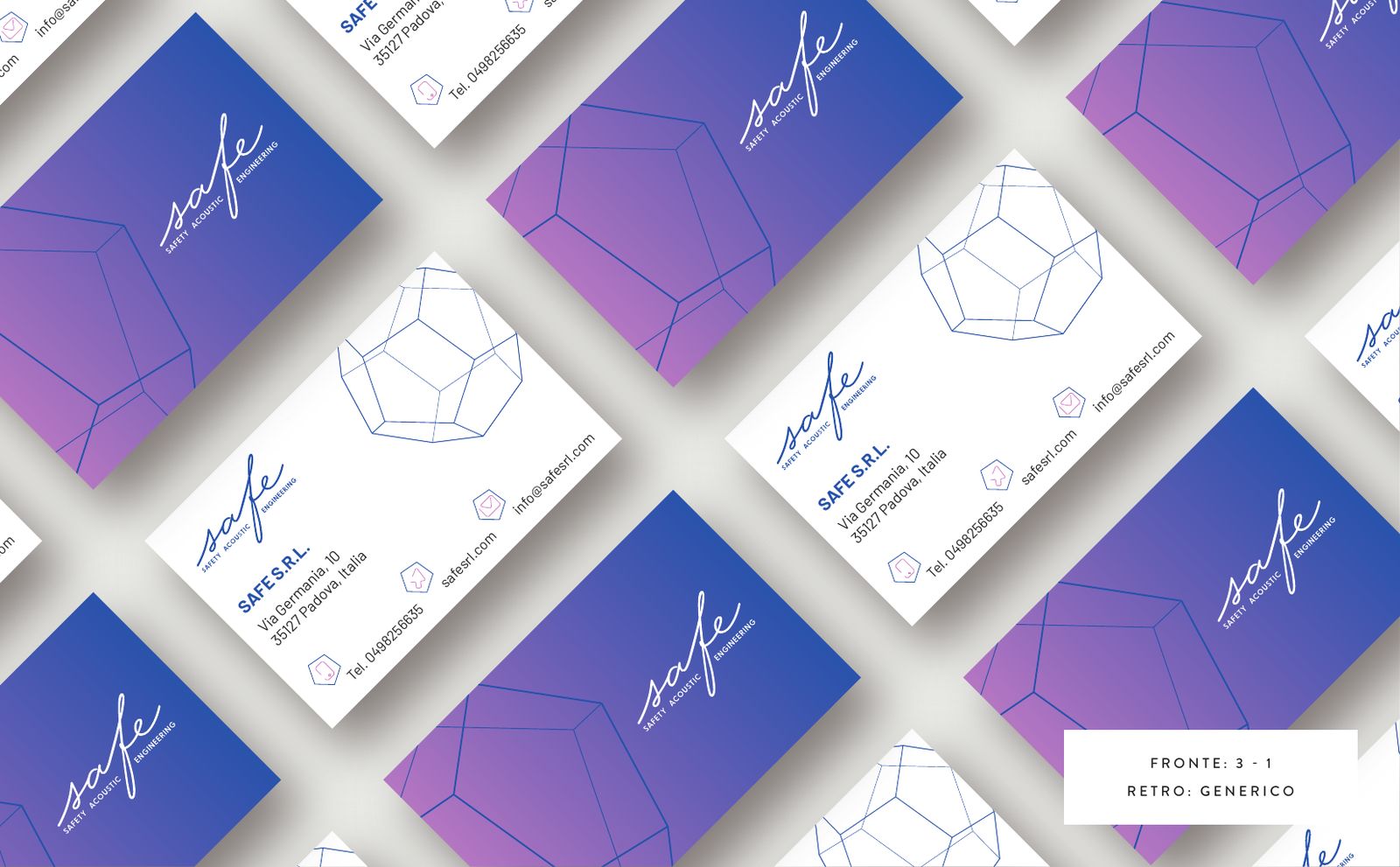
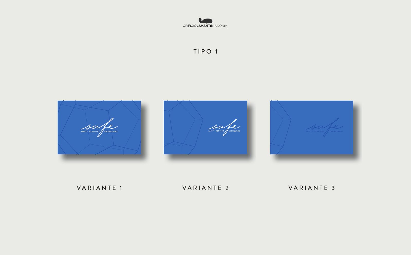
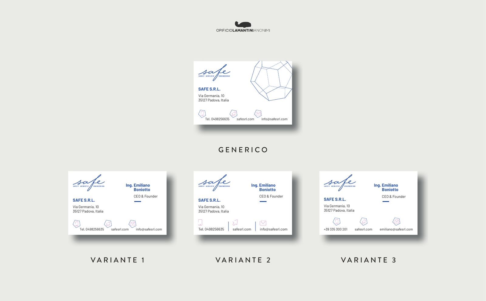
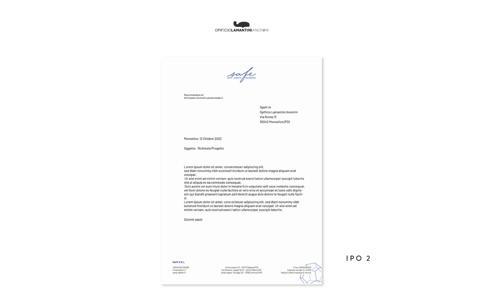
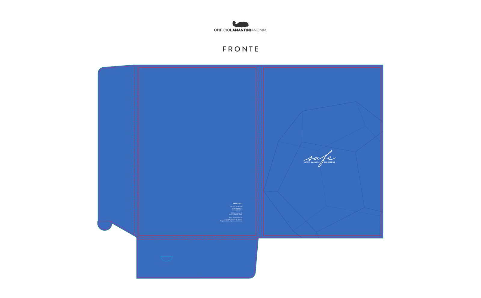
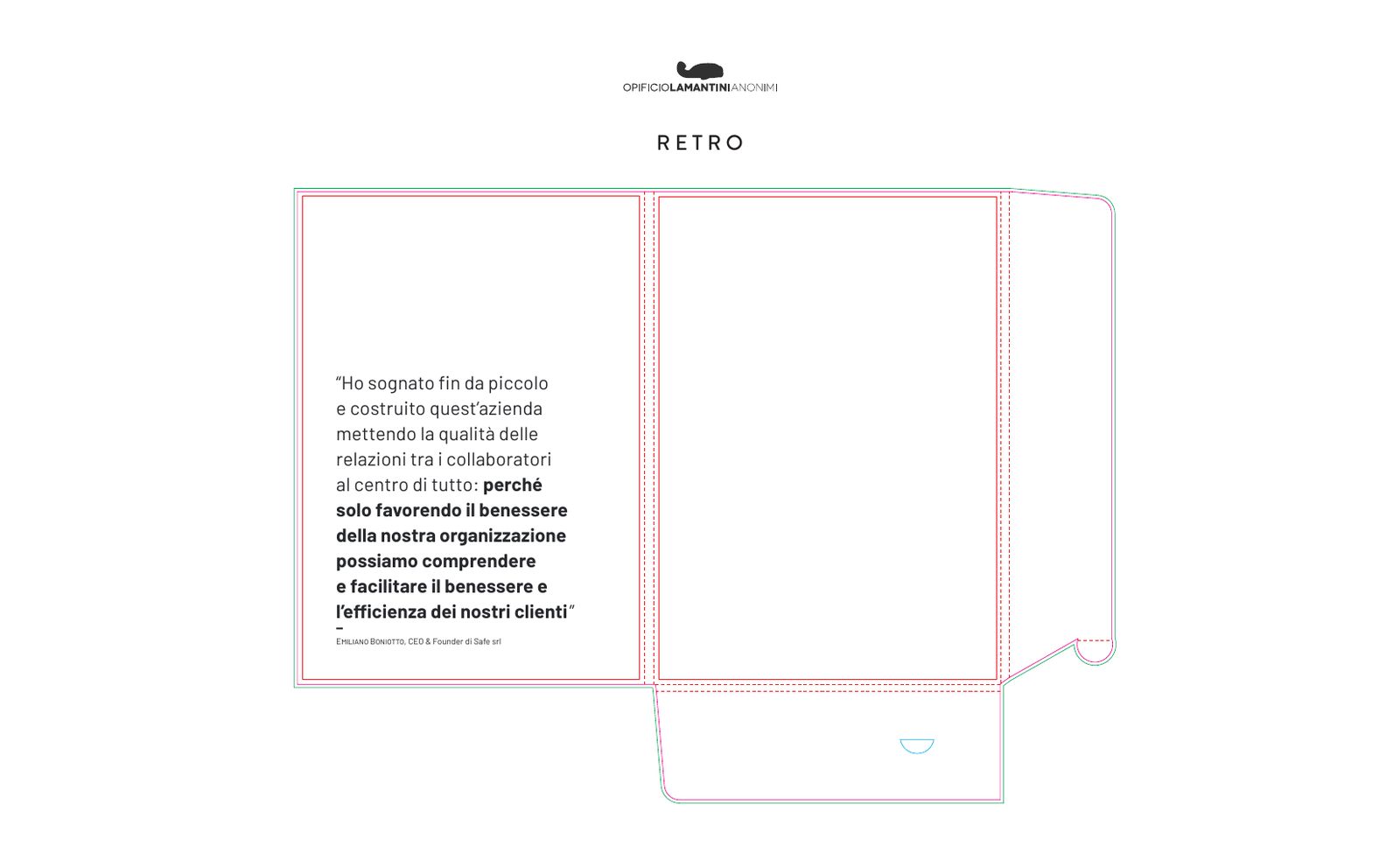
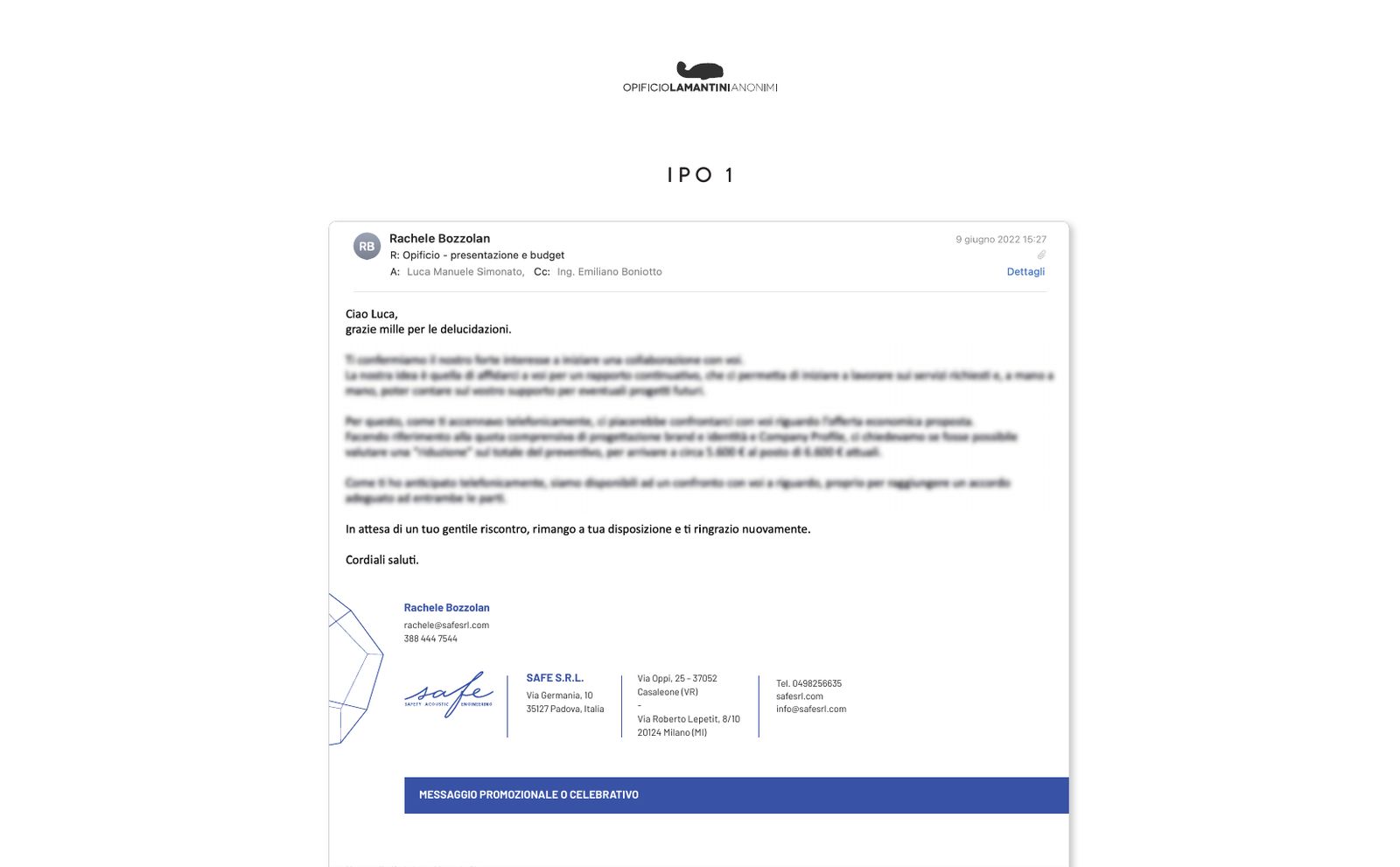
Three types of business card, in solid blue, in blue with the dodecahedron and in the gradient, tried side by side before choosing. Then letterhead, folder and email signatures.
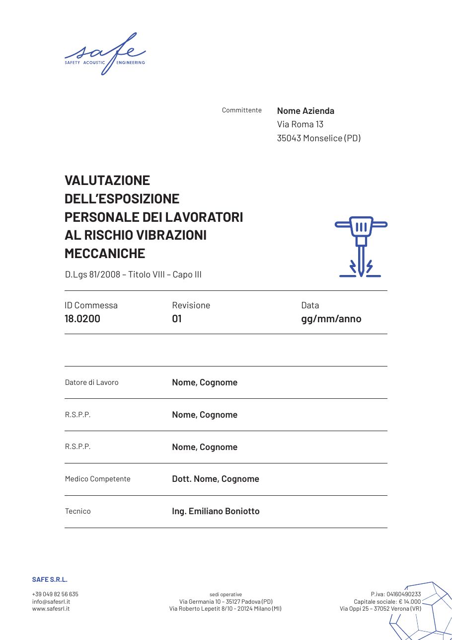
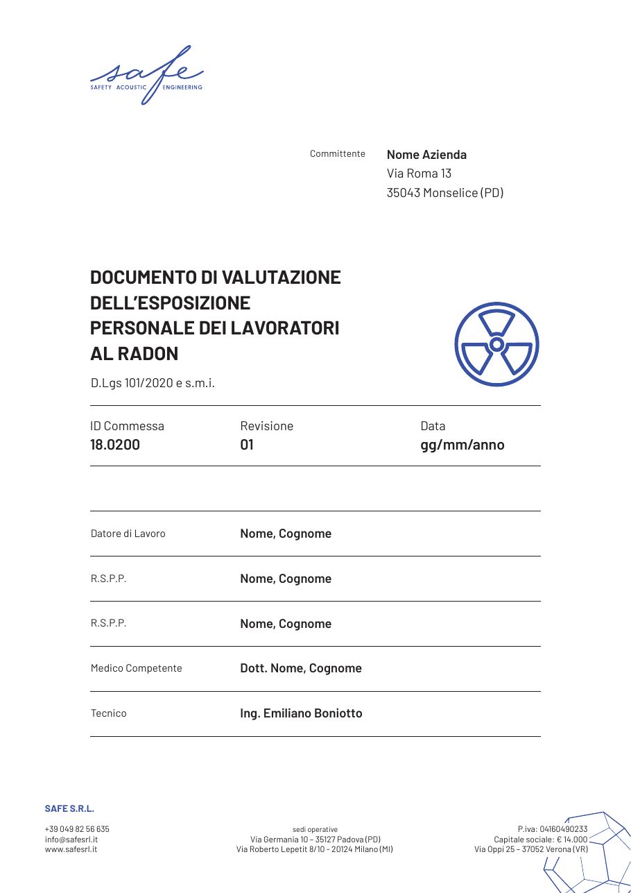
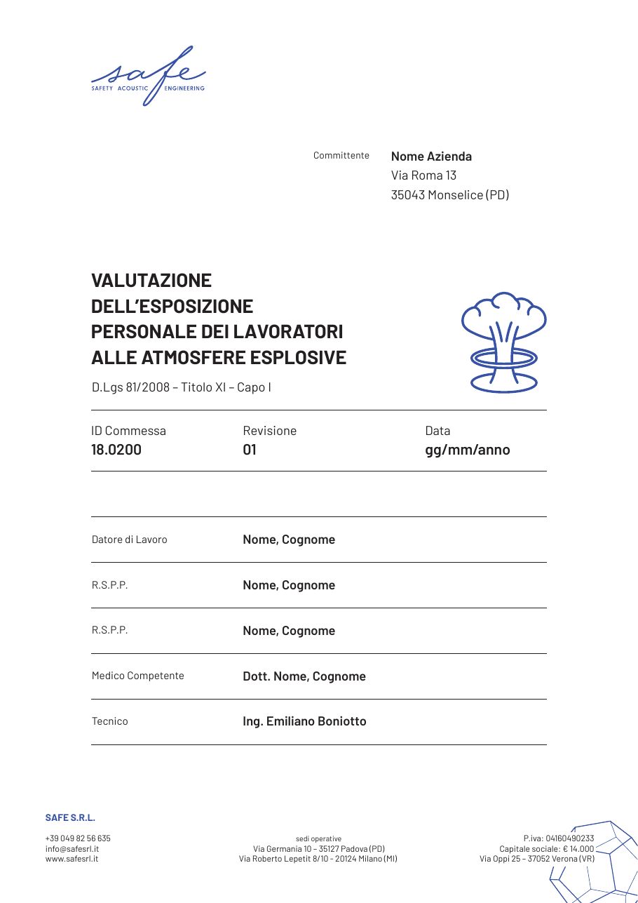
And something Safe hands over every day: the technical report. We designed seventeen cover templates for the assessments, from noise to vibration, from radon to explosive atmospheres. Each has its own line icon, so the document is recognisable before it is opened.
The technical report covers
Seventeen templates, delivered on 2 August 2023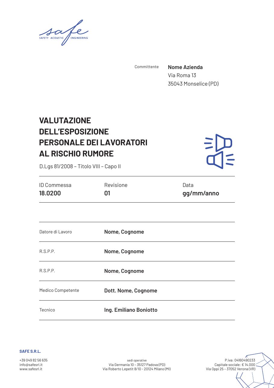
How do you navigate a company with four lines of work?
With a door for each one, right from the home page.
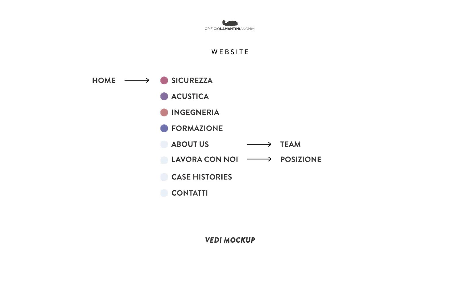
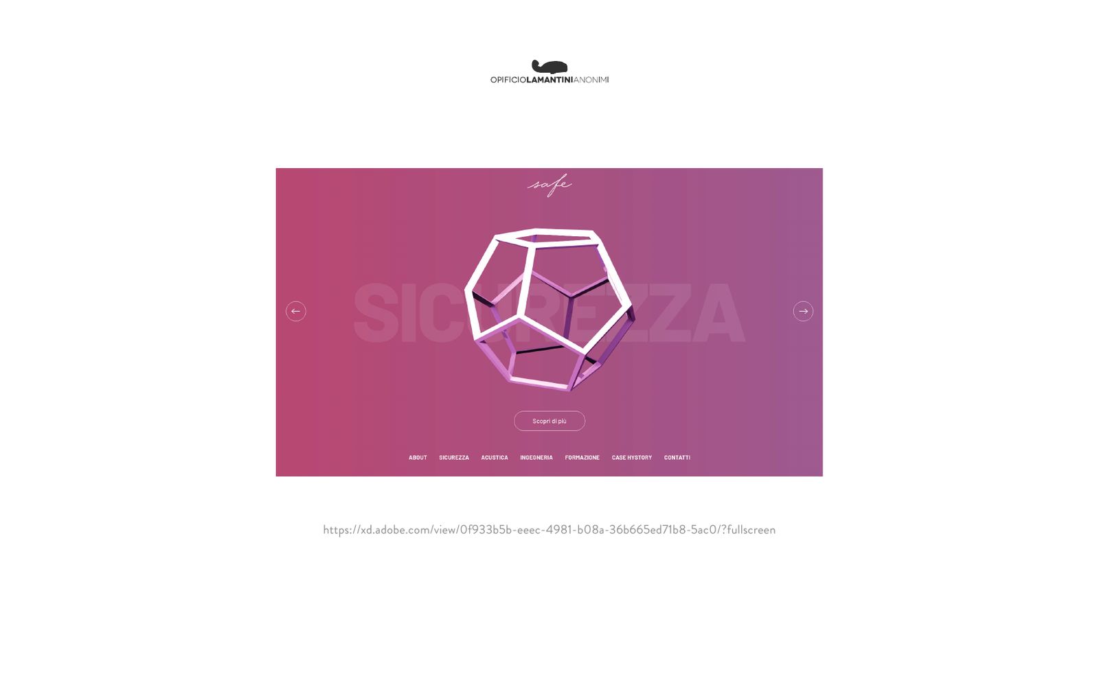
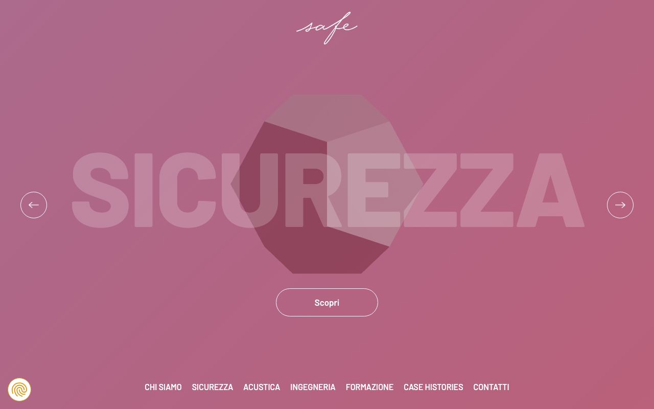
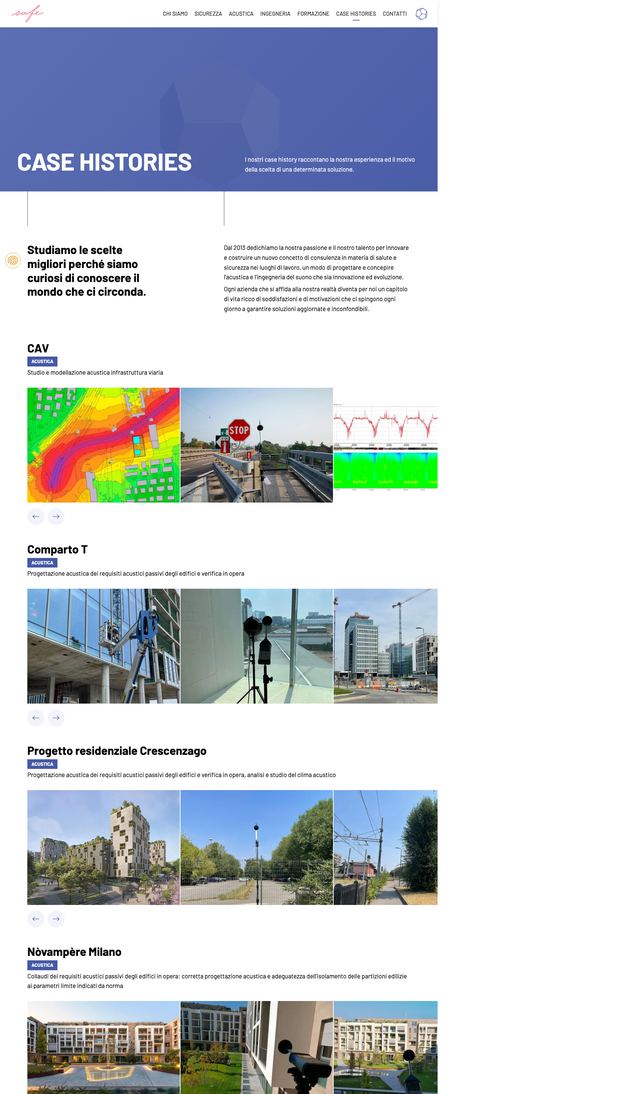
The sitemap puts the four lines of work right below the home page: safety, acoustics, engineering, training. Then about us, the case histories, contacts. On the home page the dodecahedron sits at the centre, the name of each line of work scrolls large behind it.
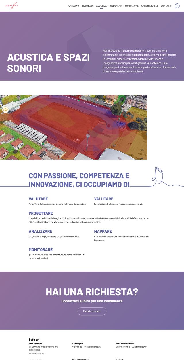
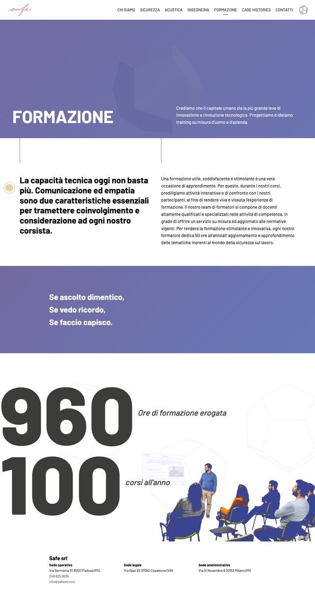
The site is live at safesrl.com. The inner pages follow the company profile: the same headings, the same illustrations, the same colour for each line of work.
The pages for each line of work
Hover to scroll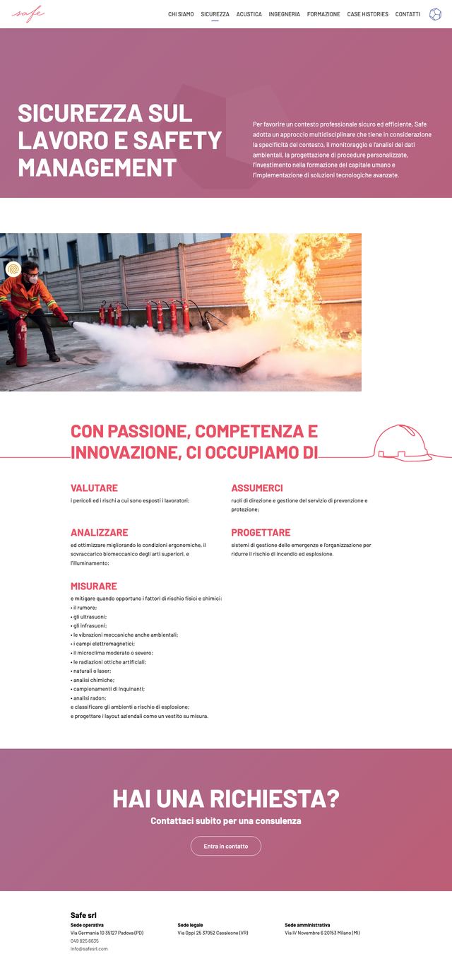
How does it all hold together when we are not in the room?
With a rule book written afterwards, not before: once the things already exist.
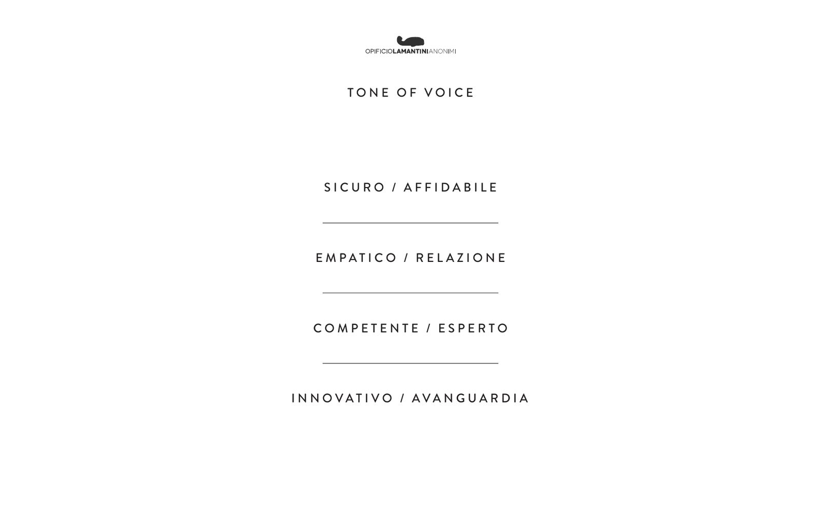
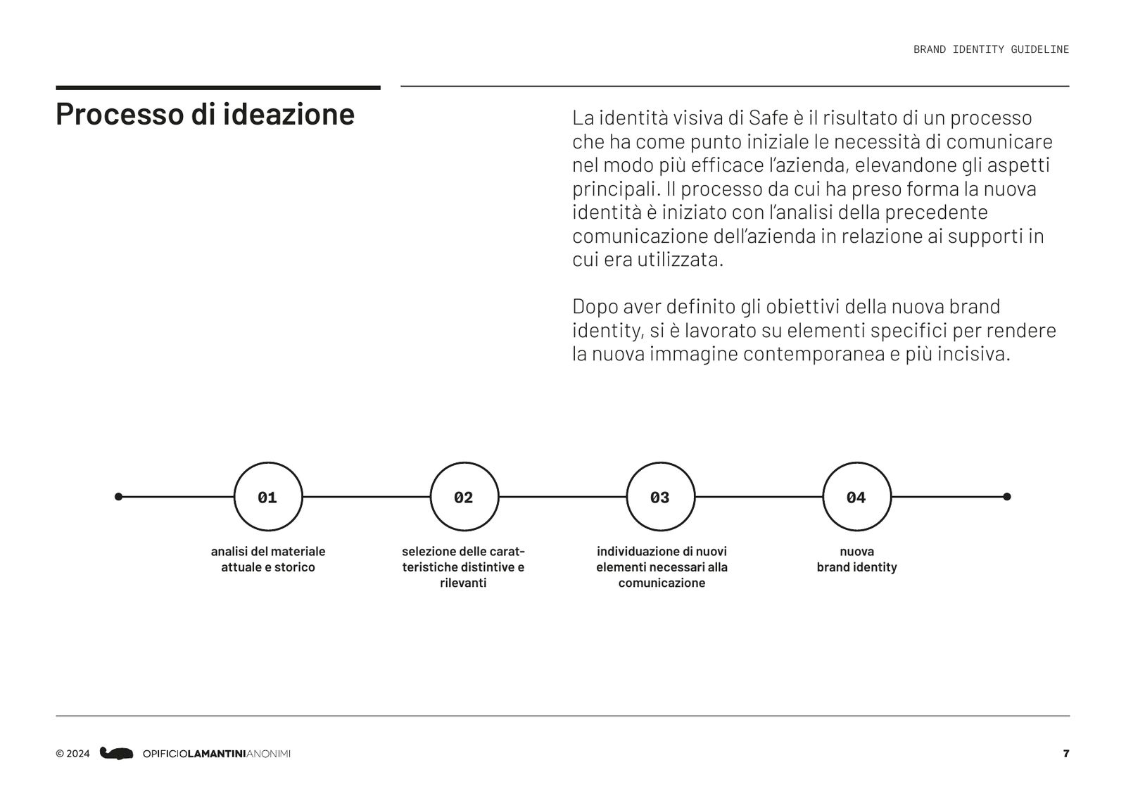
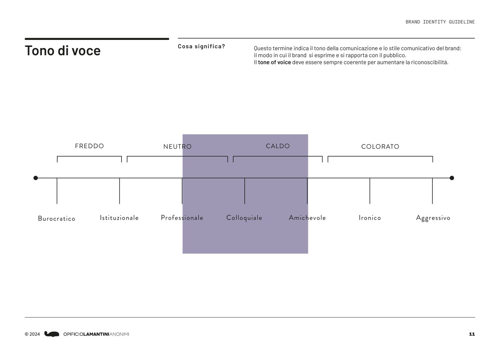
Three releases and a print file, in March 2024. Inside is what we had done over the previous two years, put in order: the values, the imagery, the tone of voice, the logo in its versions, the gradient, the typefaces, the palette, the three illustrations for the lines of work and the dynamic logo mark. The tone sits between professional and friendly, by way of conversational.
The tone of voice
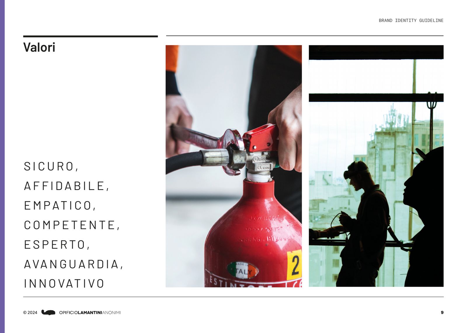
From the brand booksafe, reliable, empathetic, competent, expert, innovative.
The brand book
Print, March 2024 · scroll →
Frequently asked questions
Safe and Opificio, in short.
What did Opificio Lamantini Anonimi do for Safe?
The brand identity starting from the existing logo, the company profile, the corporate identity (business cards, letterhead, folder, email signatures and covers for technical reports), the design of the safesrl.com website and the brand book.
Was the Safe logo redrawn?
No. The safe lettering, the dodecahedron and the tagline Safety Acoustic Engineering already existed. Opificio Lamantini Anonimi worked on colour, typography, graphic elements, imagery and tone of voice, and turned the dodecahedron into a dynamic logo mark.
Why is there a dodecahedron in the Safe logo?
The dodecahedron is also the shape of the dodecahedral sound sources used in acoustic measurements, one of the instruments Safe works with.
Who wrote the texts of the Safe company profile?
Davide Pocchiesa.
Is the Safe website online?
Yes, at safesrl.com.
Does Opificio Lamantini Anonimi work with engineering and technical consultancy firms?
Yes. Safe, in Padua, is one example.