

MCM Marchetti: the spark and the trail it leaves
Logo restyling, brand book, company profile and corporate identity for a precision metalwork company in Este, Italy, in business since 1881.
In short
MCM Marchetti Costruzioni Meccaniche is a company in Este, in the province of Padua, Italy, working in precision mechanical carpentry since 1881. Since 2023 Opificio Lamantini Anonimi has handled its logo restyling, brand guidelines, company profile, brochure and corporate identity, from stationery to interior fittings and vehicles.
Project facts
- Client
- MCM Marchetti Costruzioni Meccaniche S.r.l.
- Sector
- Precision mechanical carpentry: iron, stainless steel, aluminium
- Location
- Este (Padua, Italy)
- Since
- 1881, fifth generation
- Period
- 2023 – ongoing
- Services
- Logo restyling, brand guidelines, company profile, brochure, corporate identity, interior fittings, vehicles, campaign
- Website
- mcmmarchetti.com
In 2023 MCM Marchetti was a hundred and forty-two years old, with five generations behind it and a logo everyone in the area knew. Being recognised was not the problem. The problem was that the company’s image had fallen behind what the company could actually do.
The starting point
Where was MCM Marchetti starting from?
A family company in Este that works iron, stainless steel and aluminium for ten different sectors: electromechanics, plant and machinery, industrial cooling, marine, amusement rides, contract work, oil and gas. And an identity that was no longer keeping up.
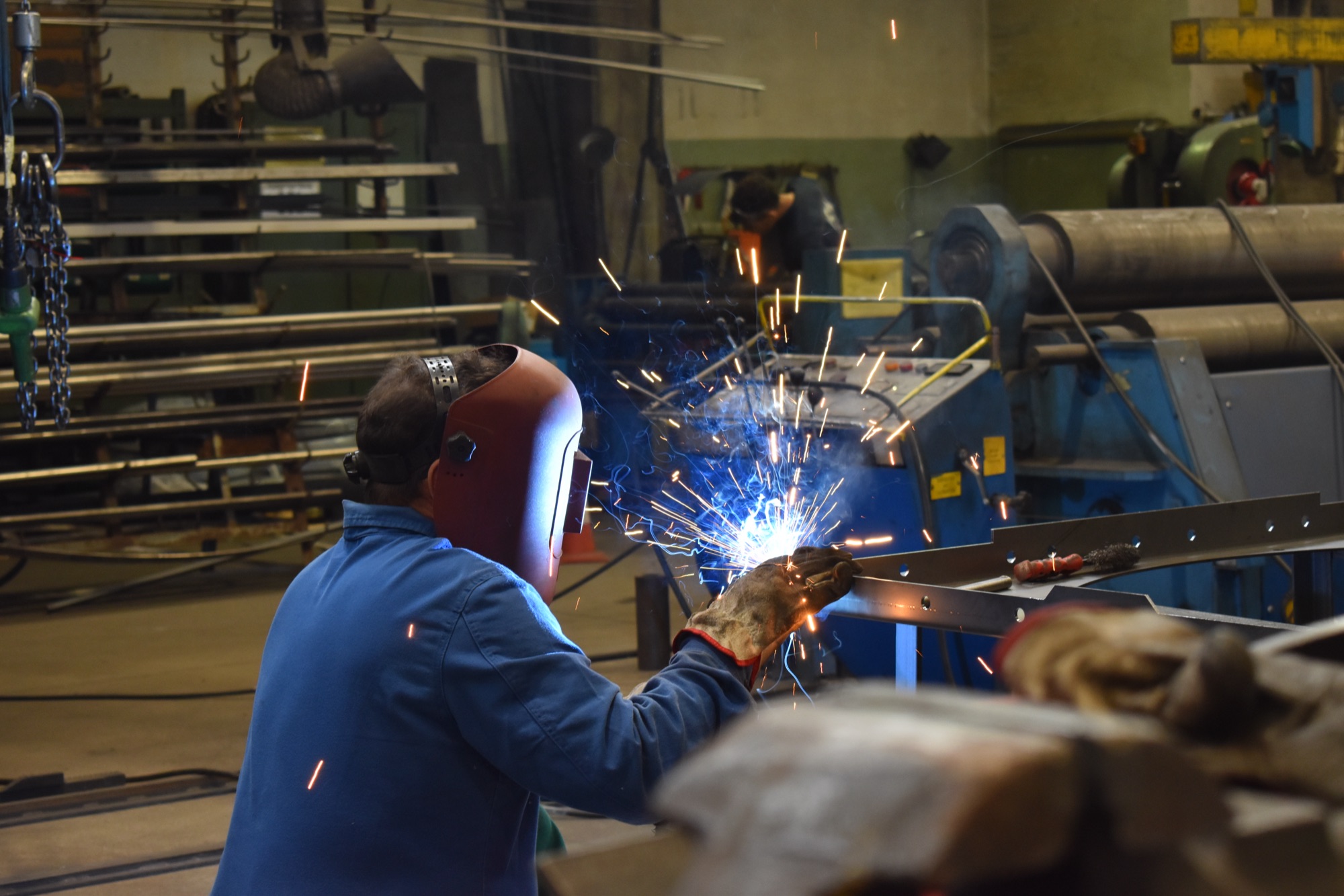
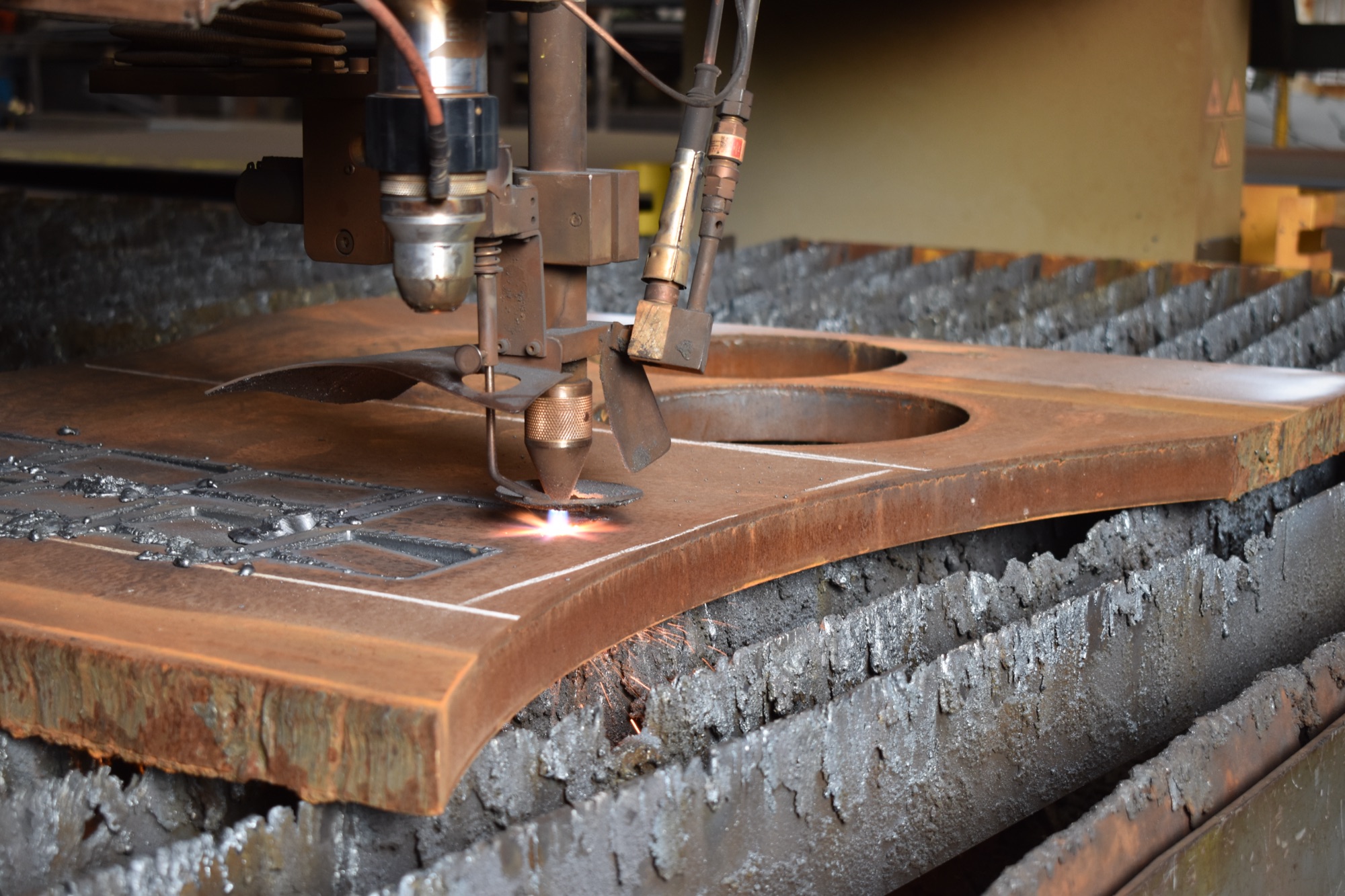
A brand restyling to strengthen the company’s image on the market.From our brand concept for MCM Marchetti, 24 February 2023
What do you keep of a logo that is a hundred and forty years old?
The mark. You keep the mark and put its proportions back in line.
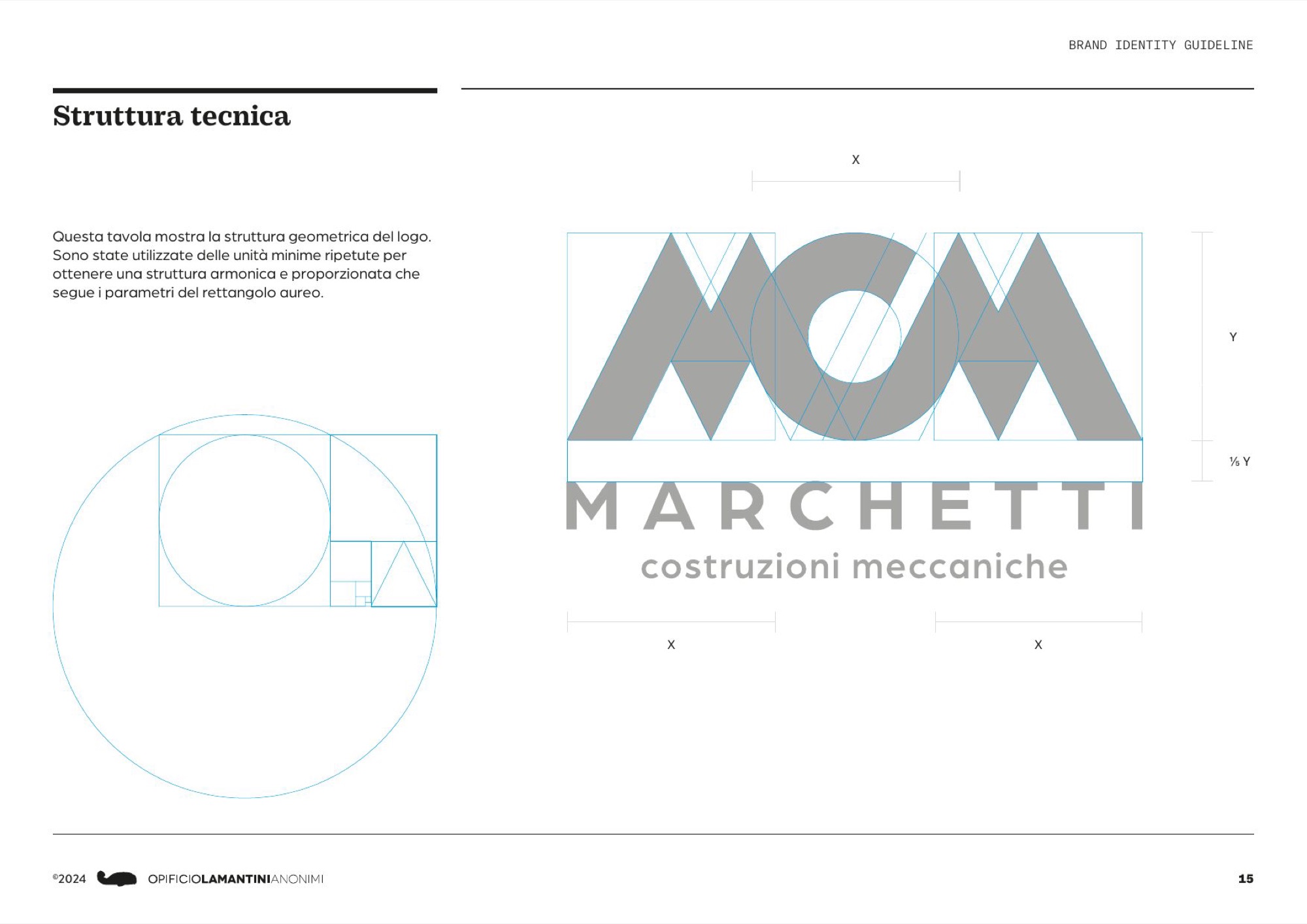
Two rounds of geometric rebuilding on the existing mark, based on repeated minimum units and on the proportions of the golden rectangle. Then the type: seven families tried, one chosen. Arboria Bold for the logotype and the tagline, Practical Serif as the supporting voice. The tagline says what the company does: precision mechanical carpentry.
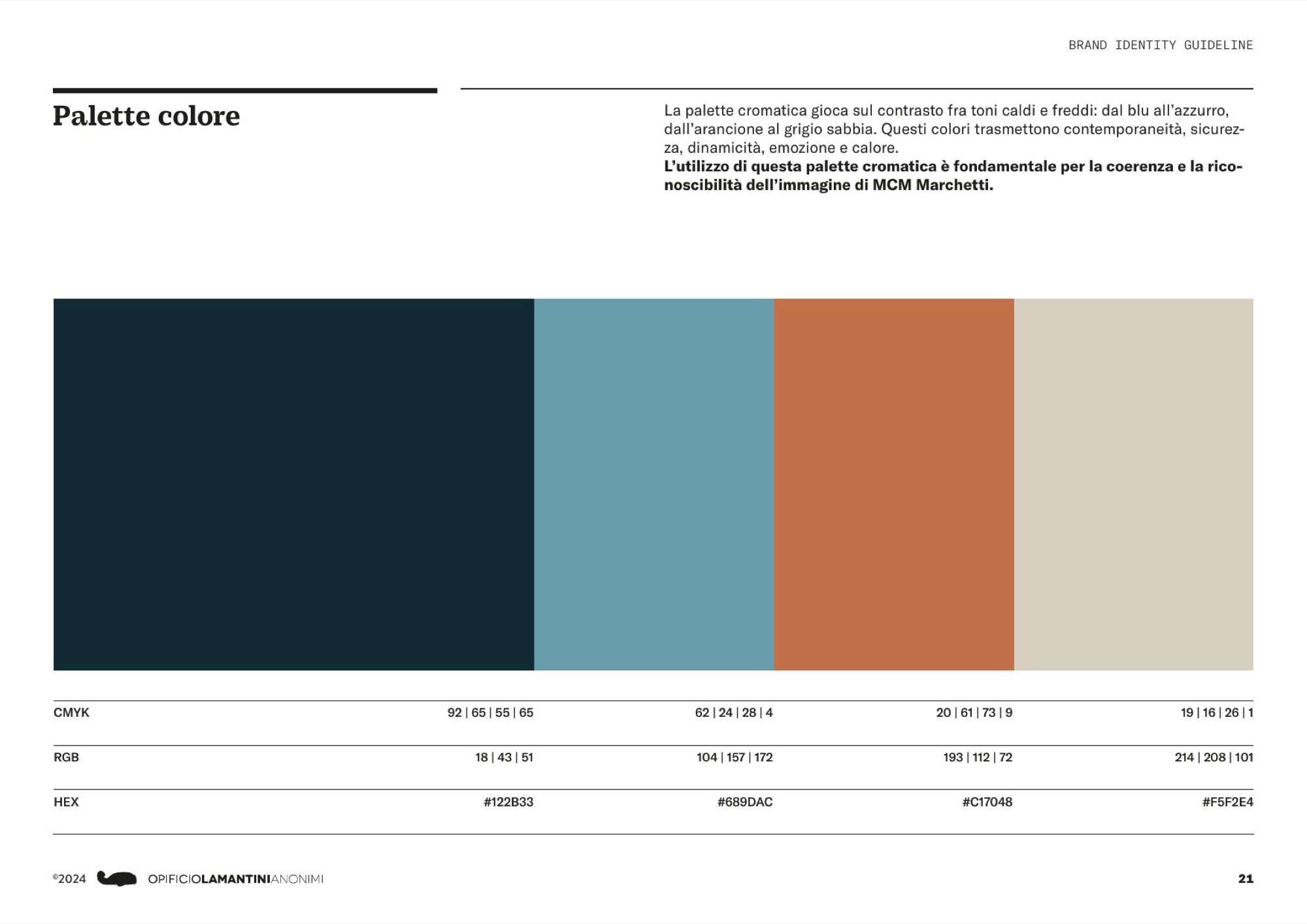
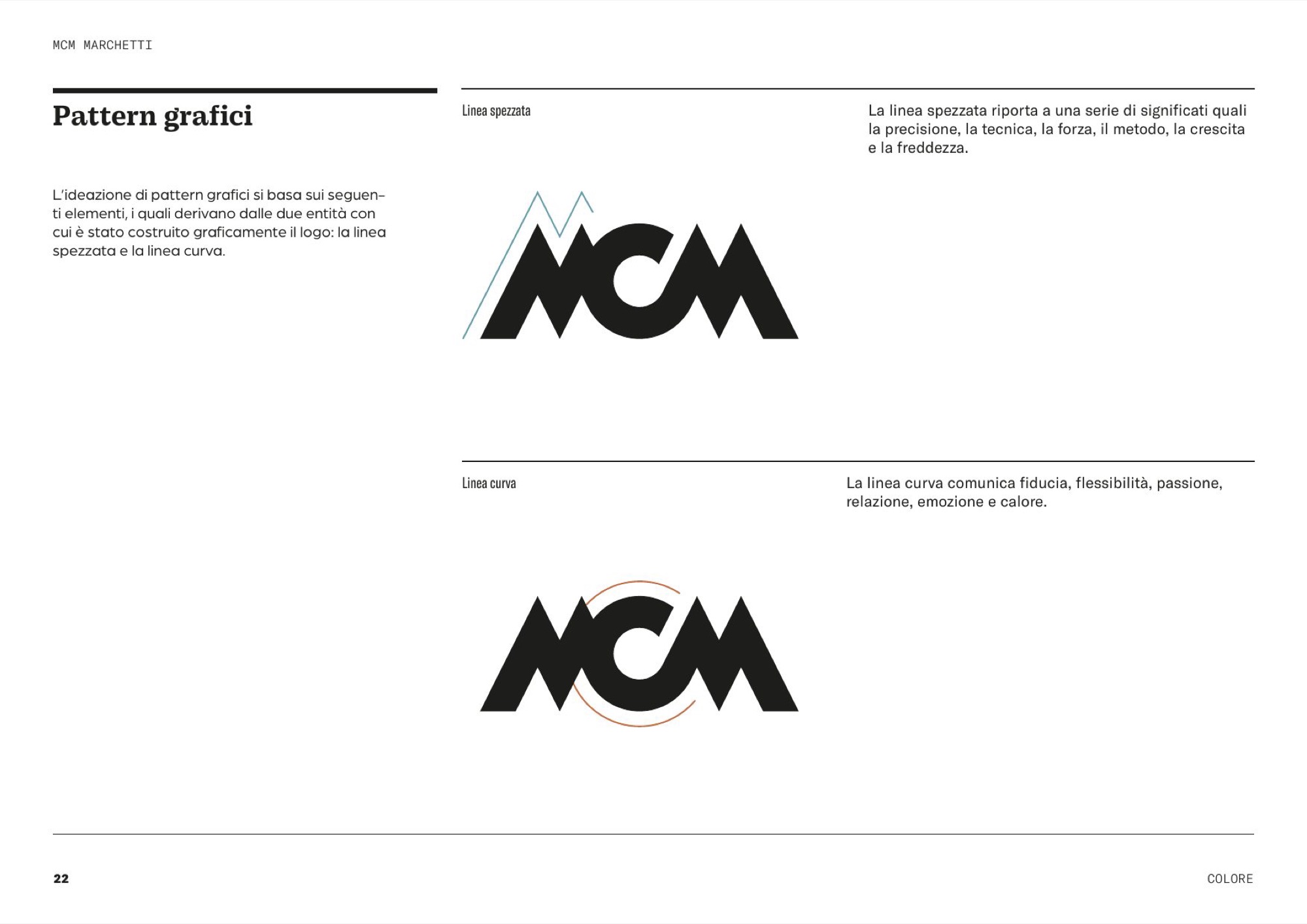
The palette plays on the contrast between warm and cold: deep blue, light blue, terracotta, sand. And out of the mark come two patterns, one for each of the two shapes that build it: the broken line — precision, technique, strength, method — and the curved line — trust, flexibility, passion, relationship.
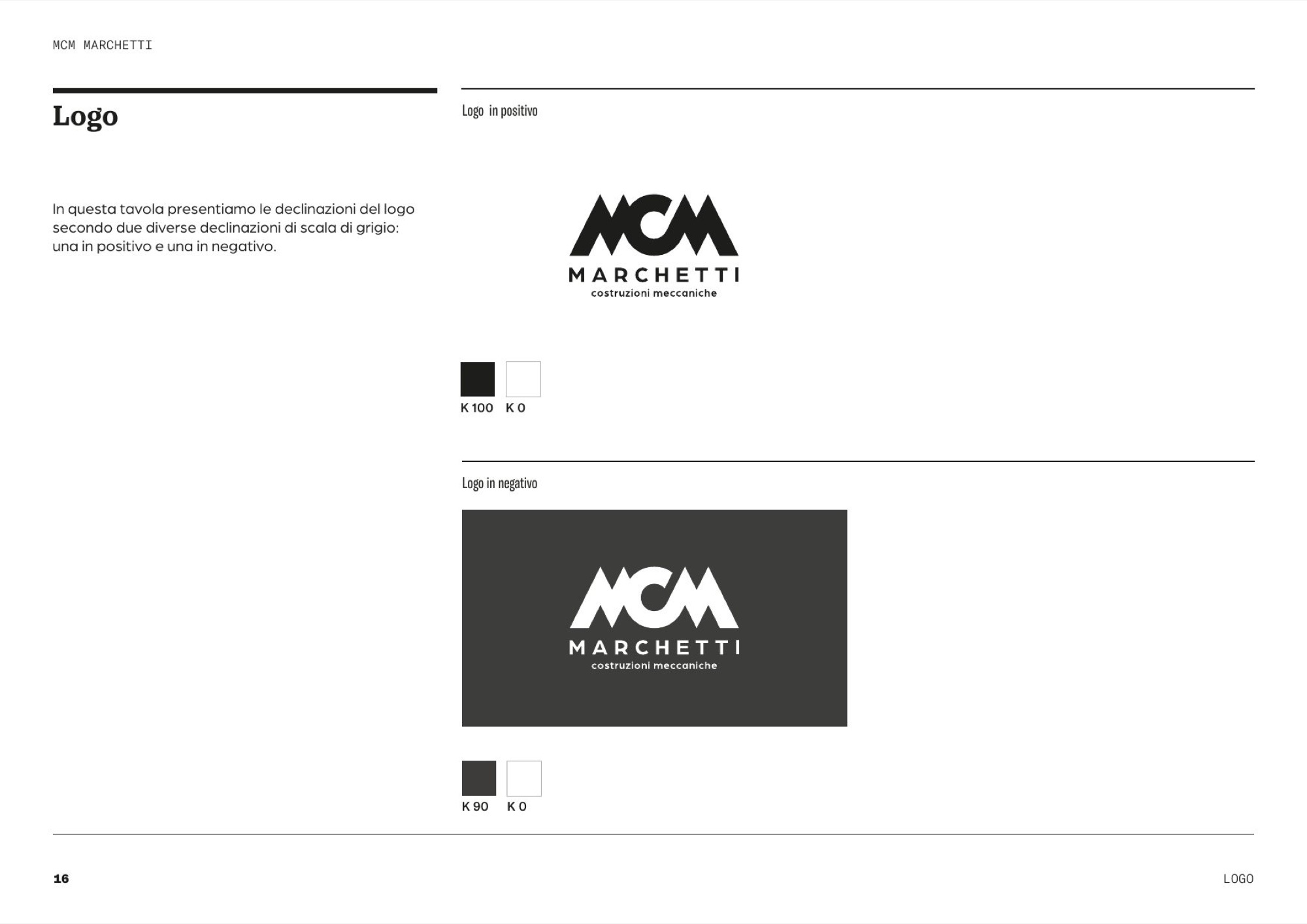
Type, colour, pattern
From the brand guidelines, March 2024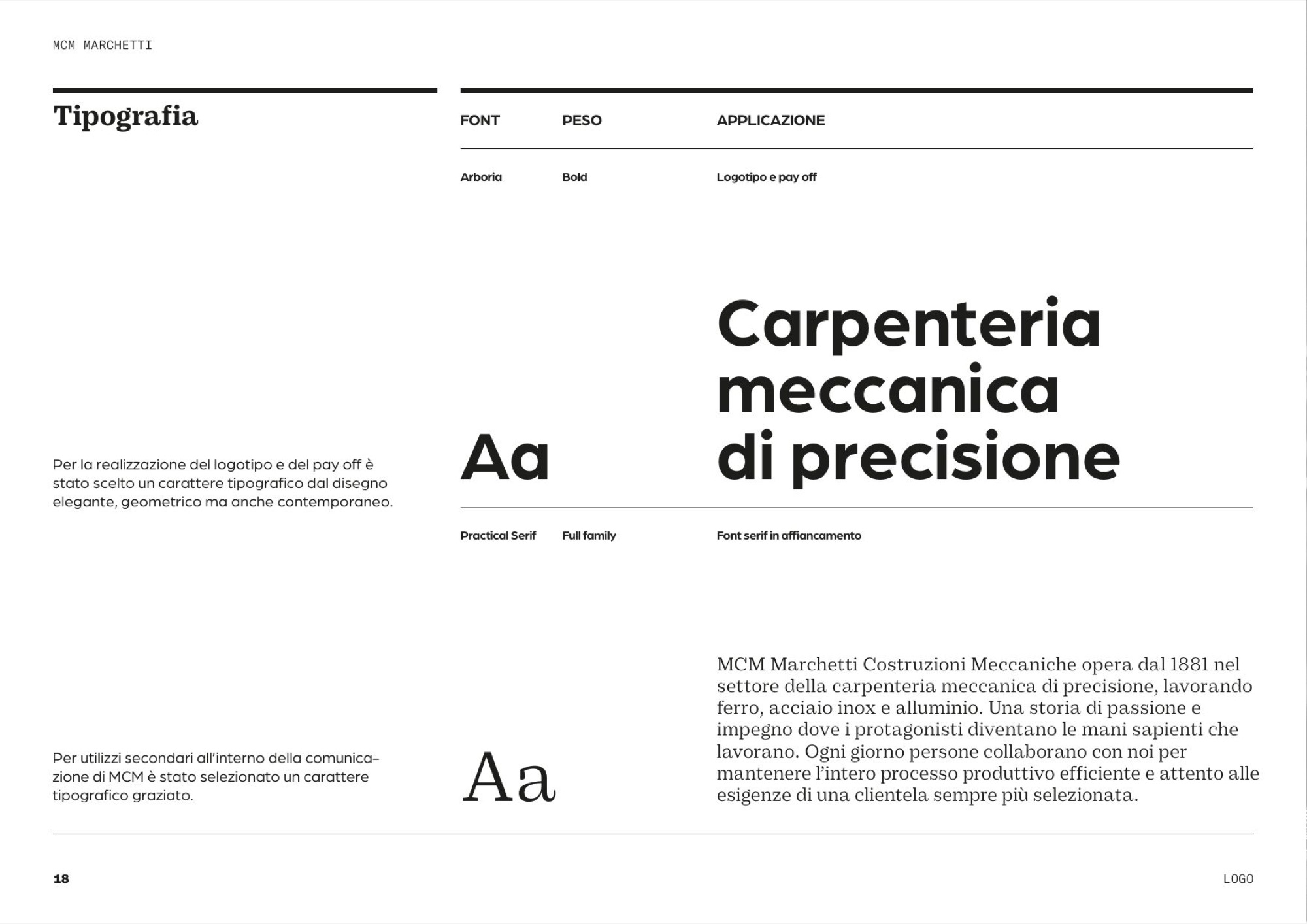
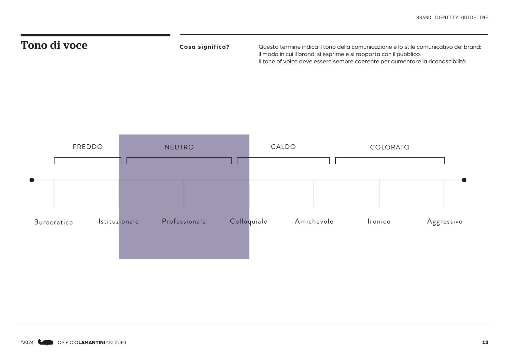
The tone of voice
Five words, from the brand conceptprofessional, competent, responsible, dependable, measured.
The brand book
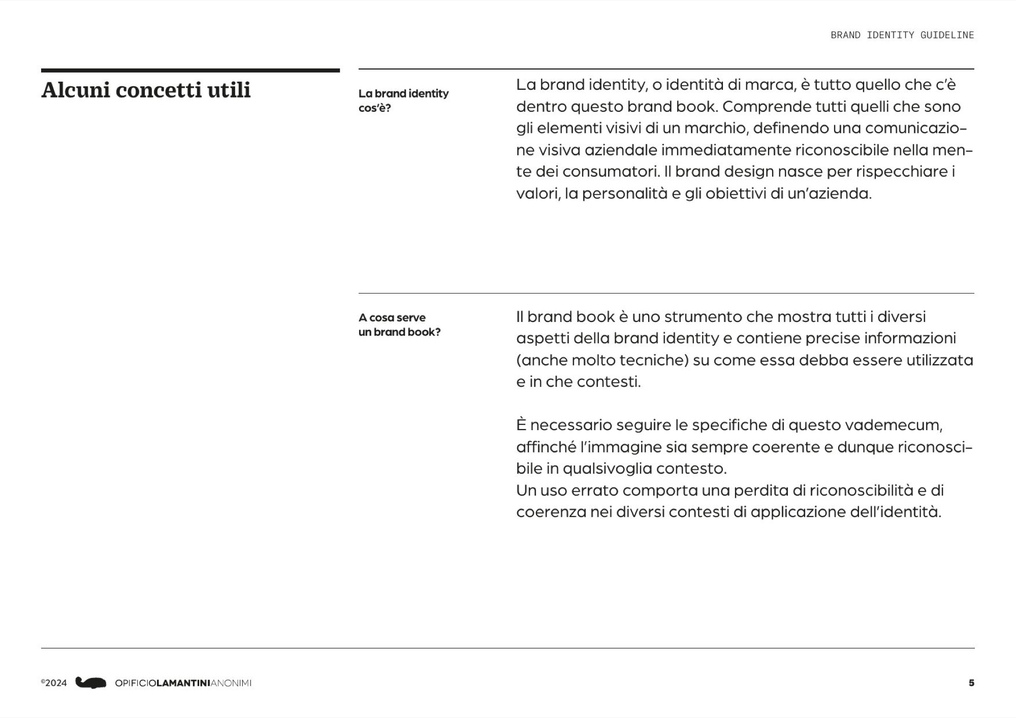
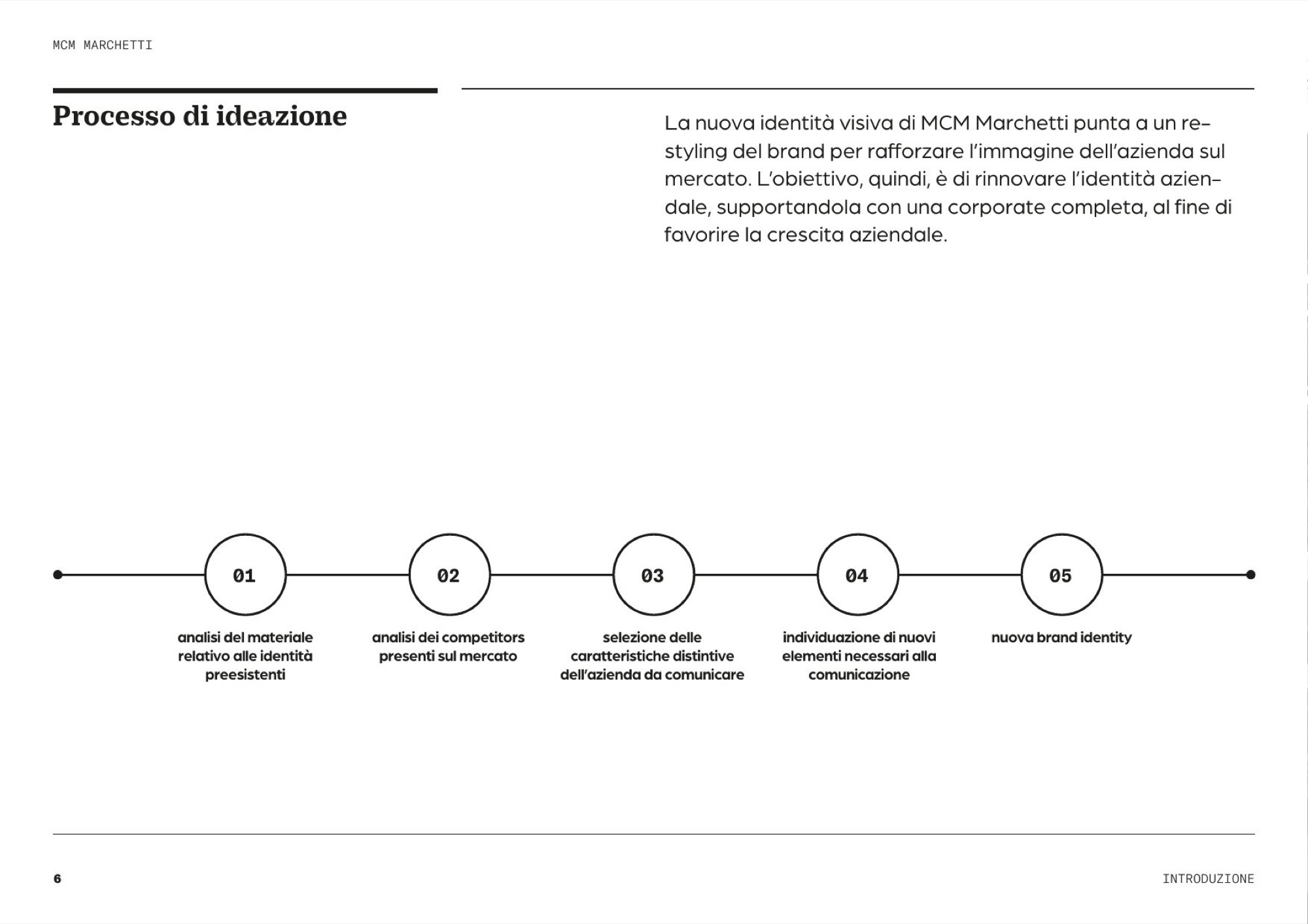
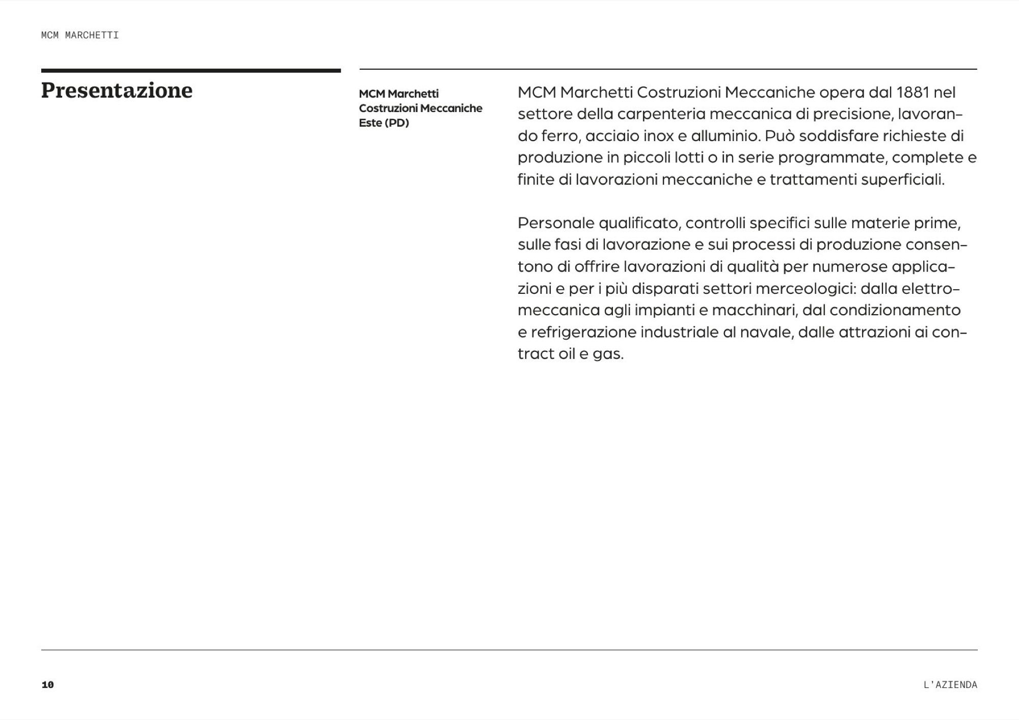
Three releases, Jan – Feb 2024 · scroll →
What is the one image that holds a whole company together?
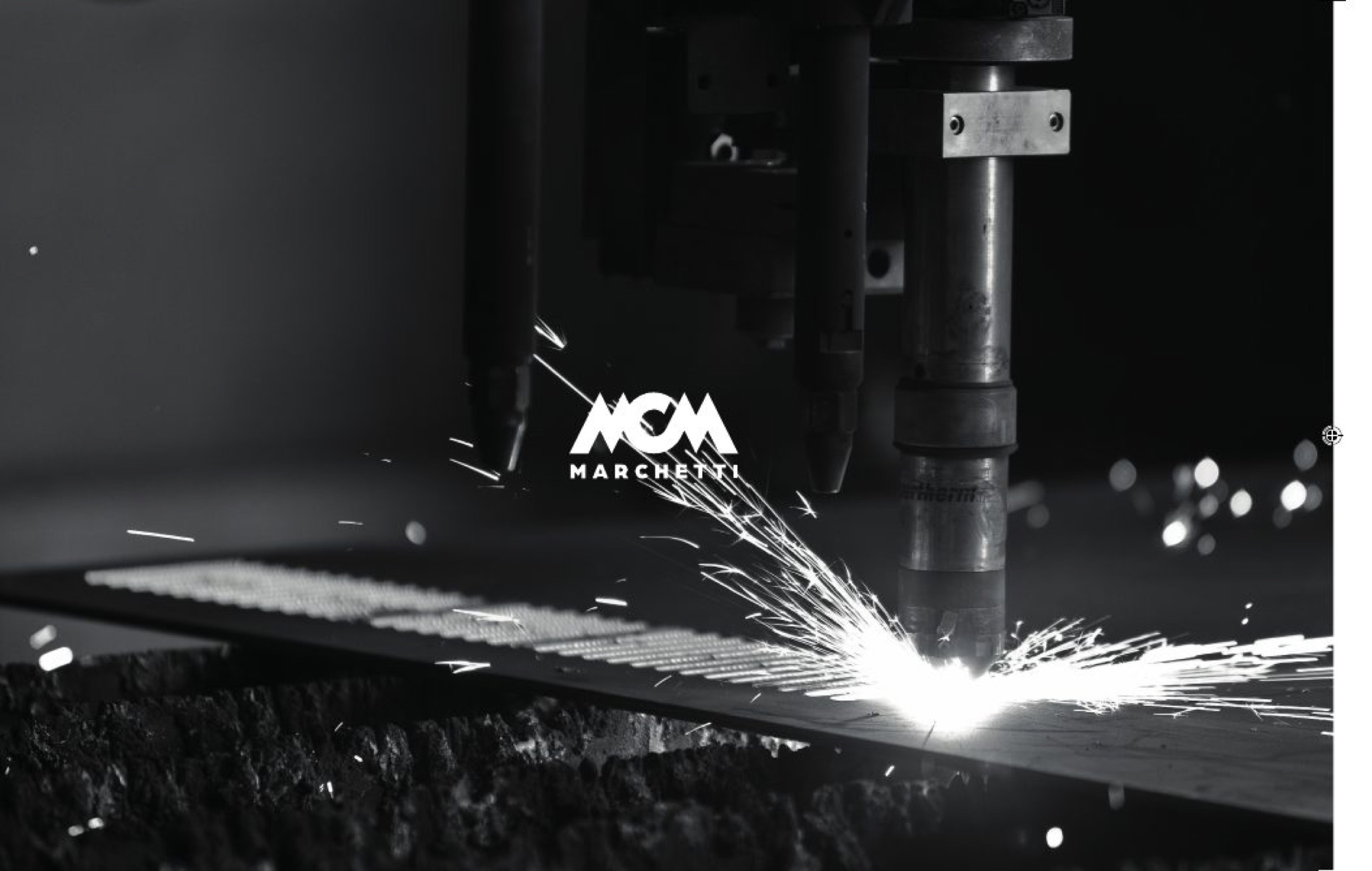
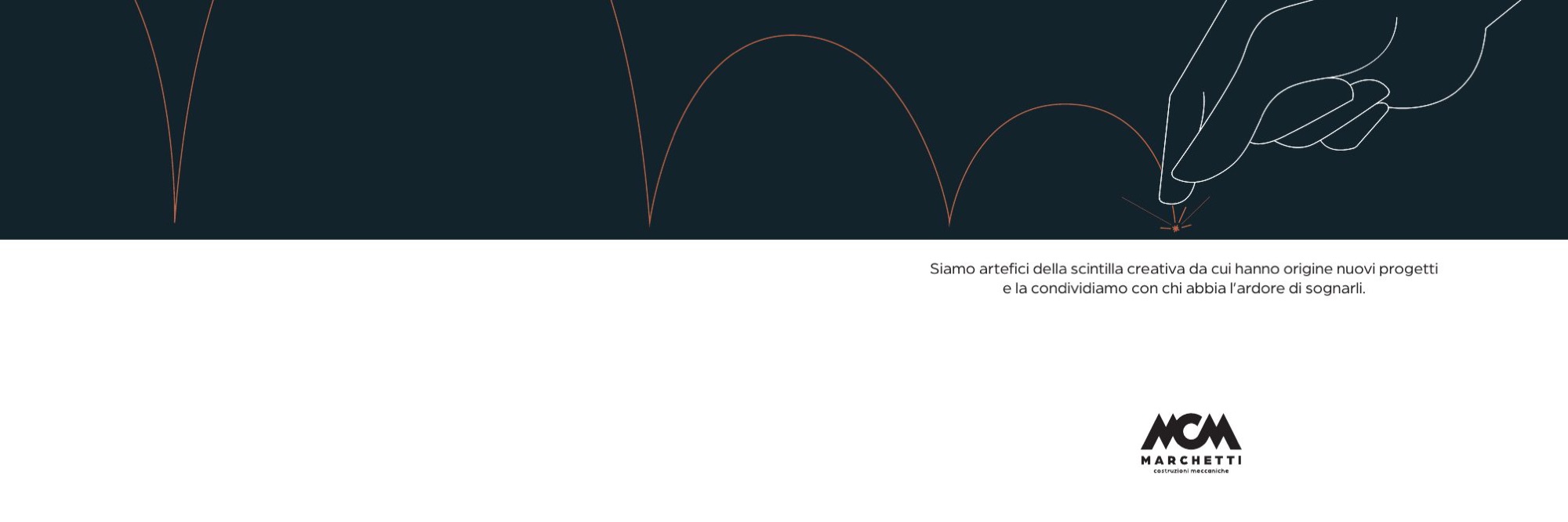
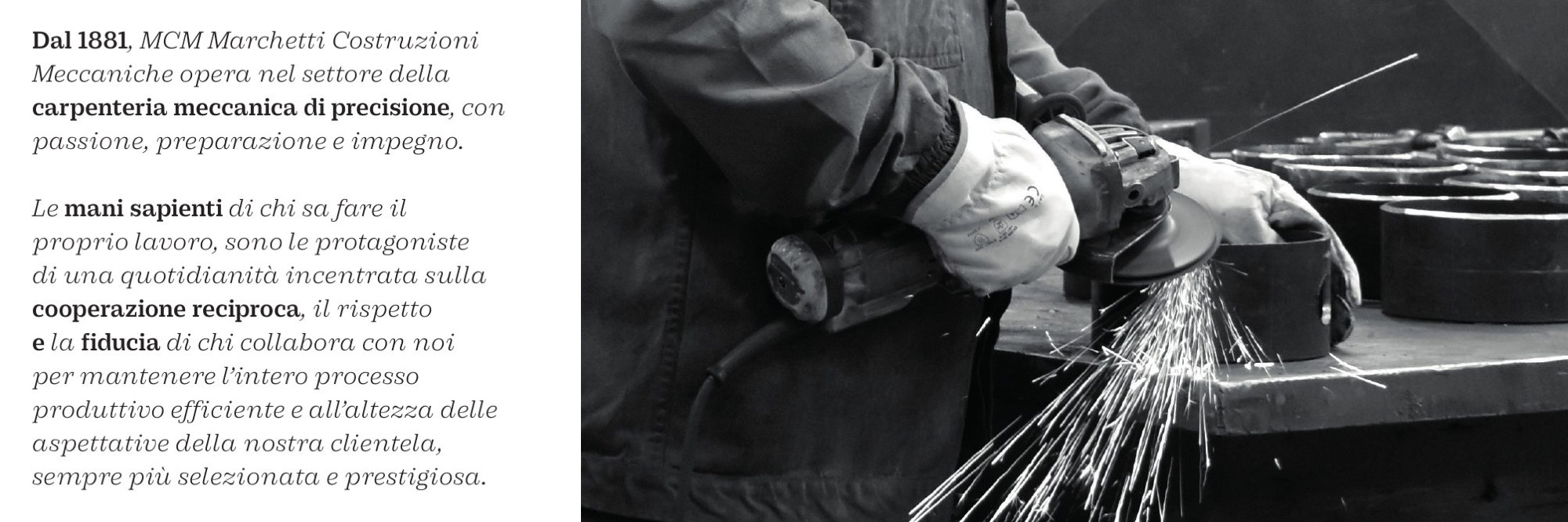
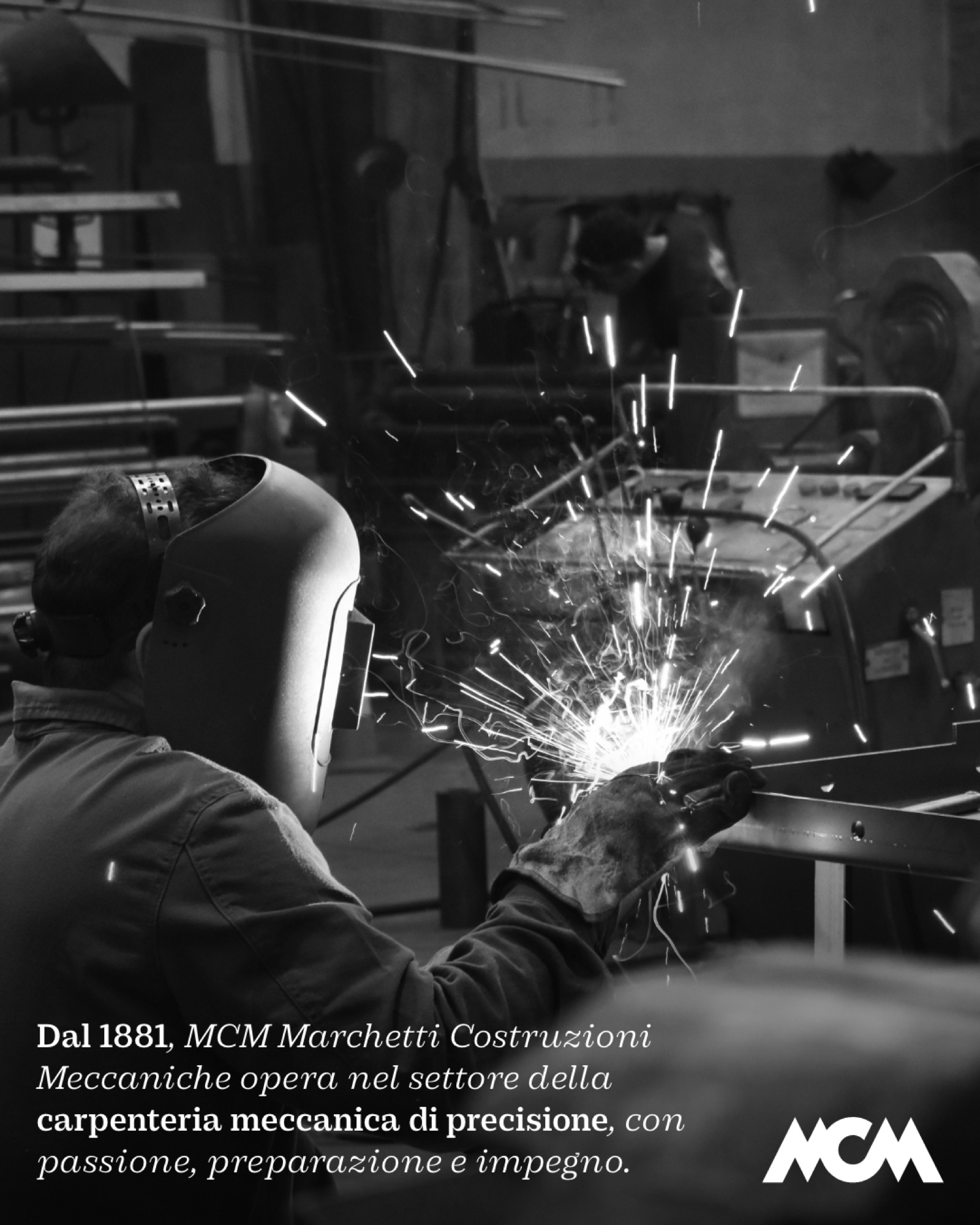
A white-hot spark moving through the air leaves a bright trail behind it.
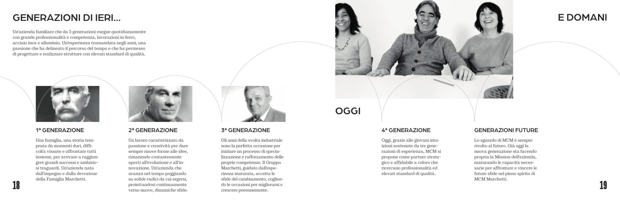
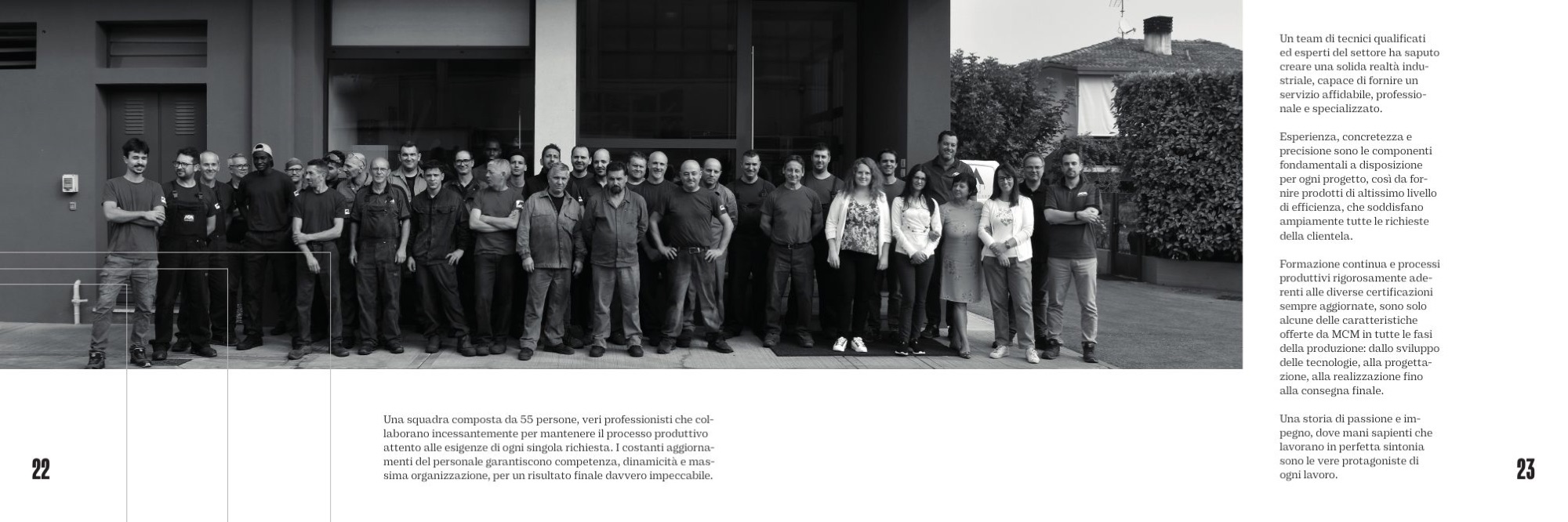
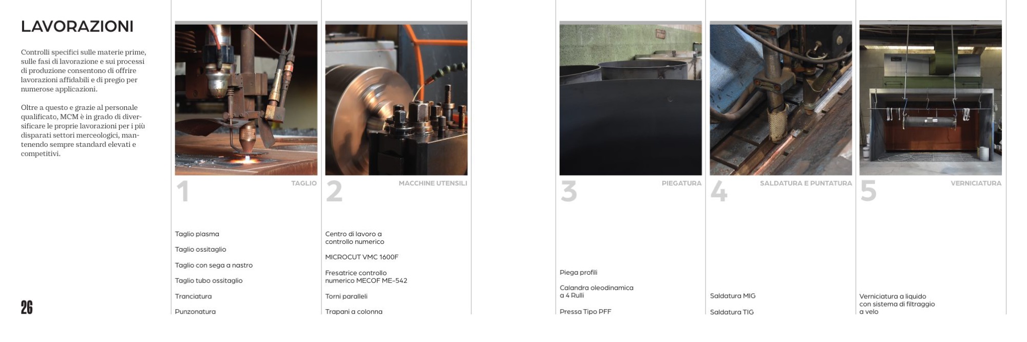
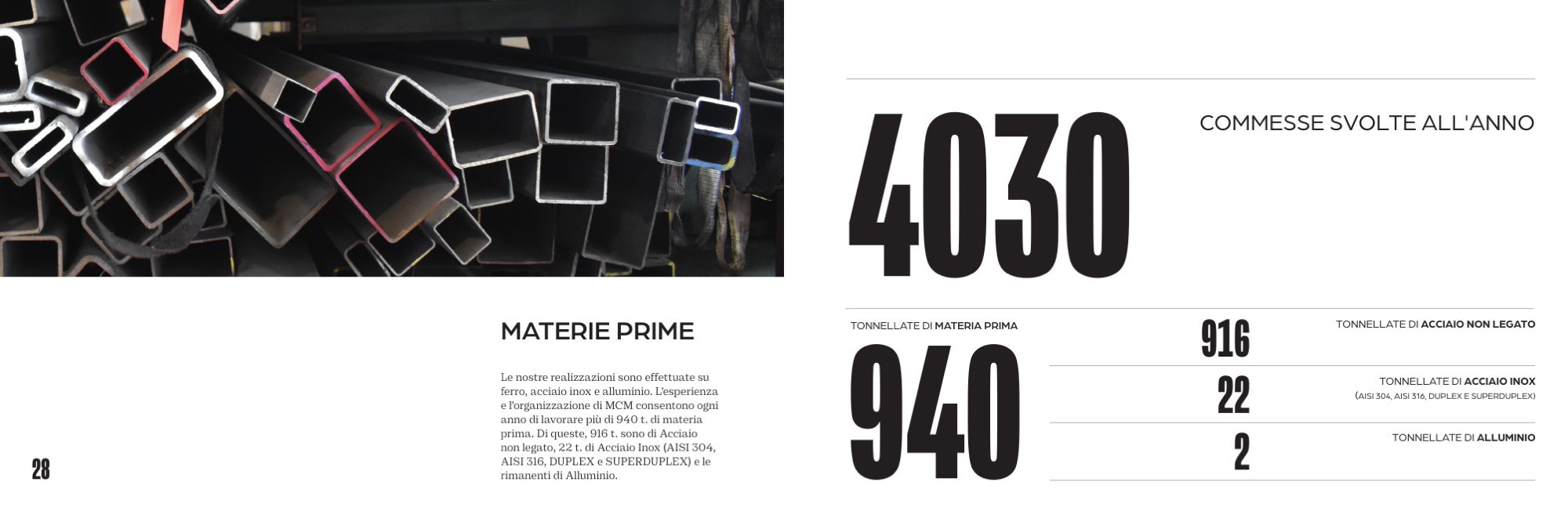
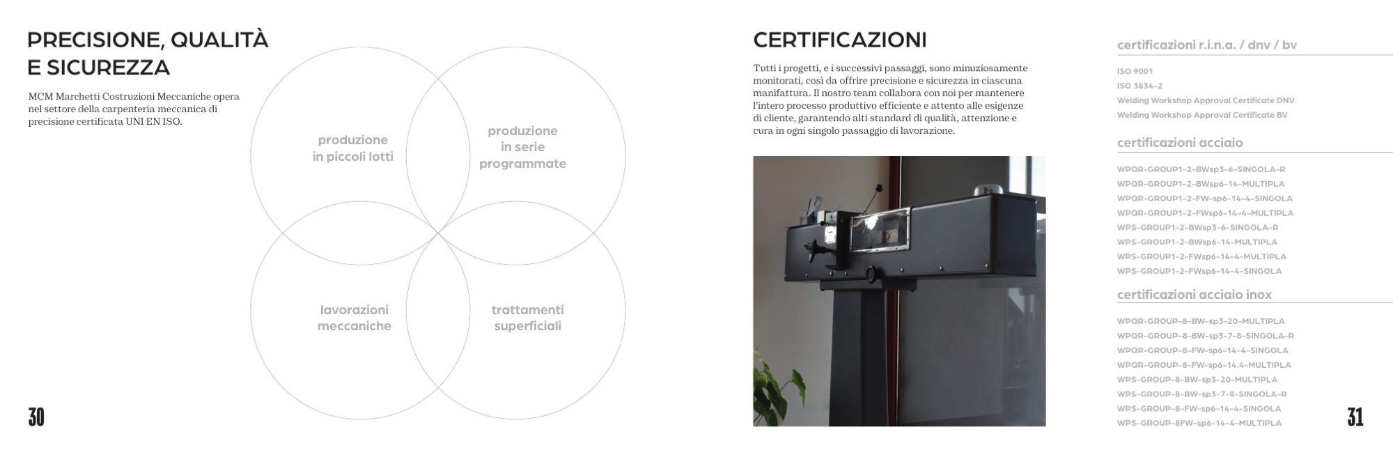
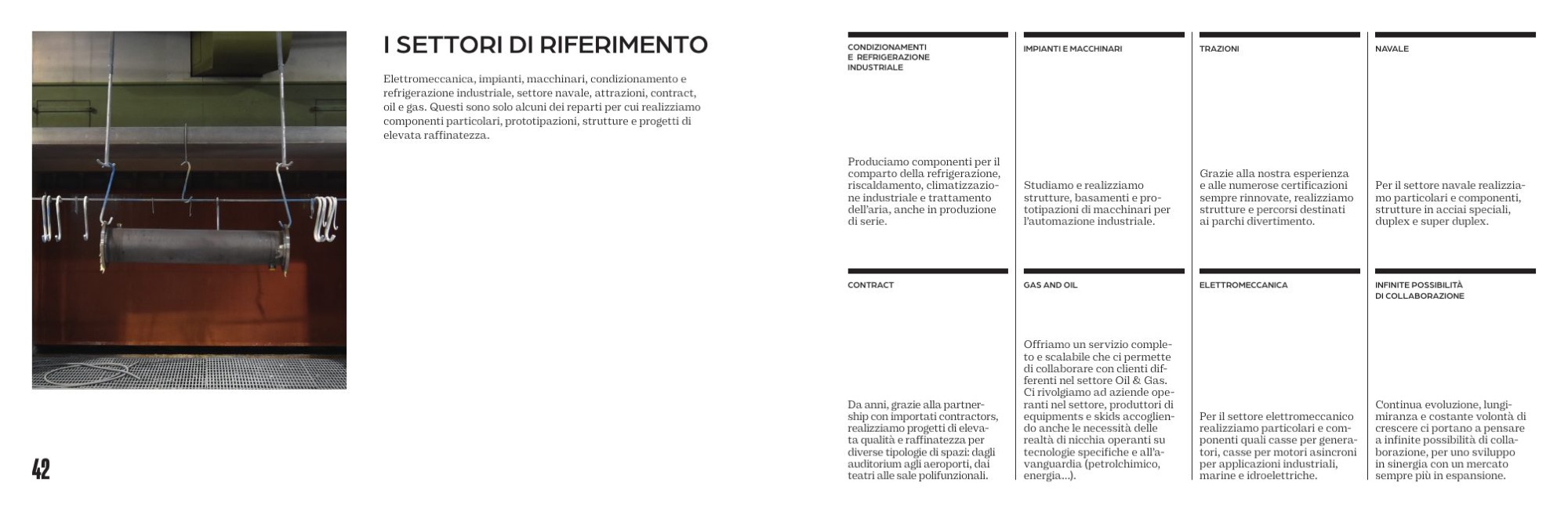
The company profile is landscape, 255 × 170 mm, to leave room for the photographs: a whole day in the workshop, in October 2023. Seven chapters, from Crossing the boundaries of the past to MCM told through the eyes of those who have photographed it over the years.
One line holds the book together: we are the makers of the creative spark from which new projects begin, and we share it with anyone bold enough to dream them. The texts are by Francesca Bux. Nine releases, up to print.
Seven chapters, spread by spread
Company profile, release 9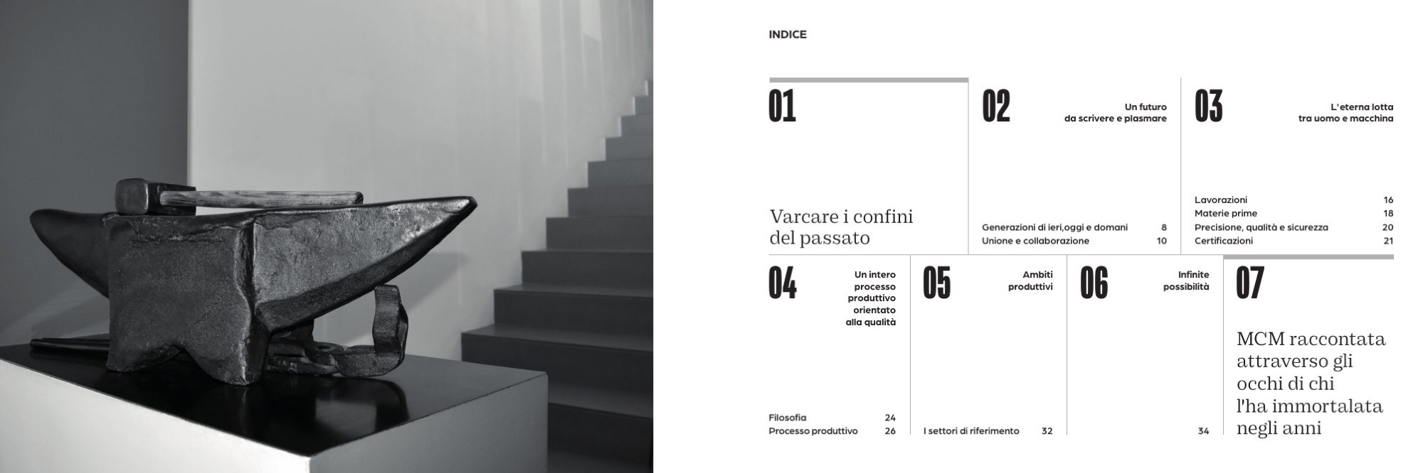
How do you put a company in someone’s pocket?
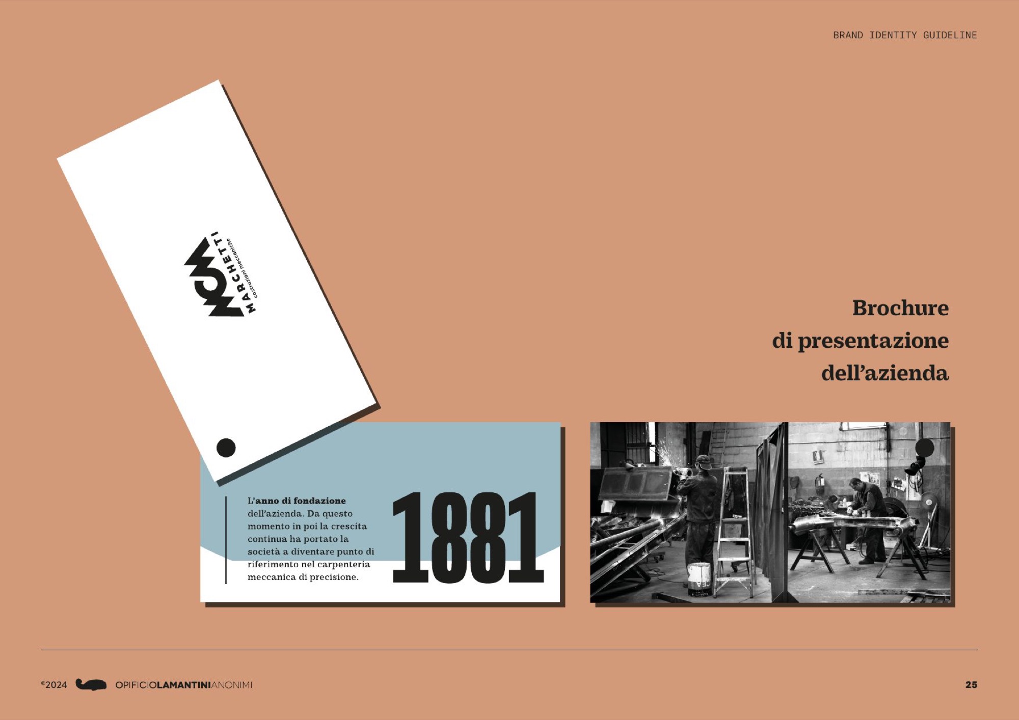
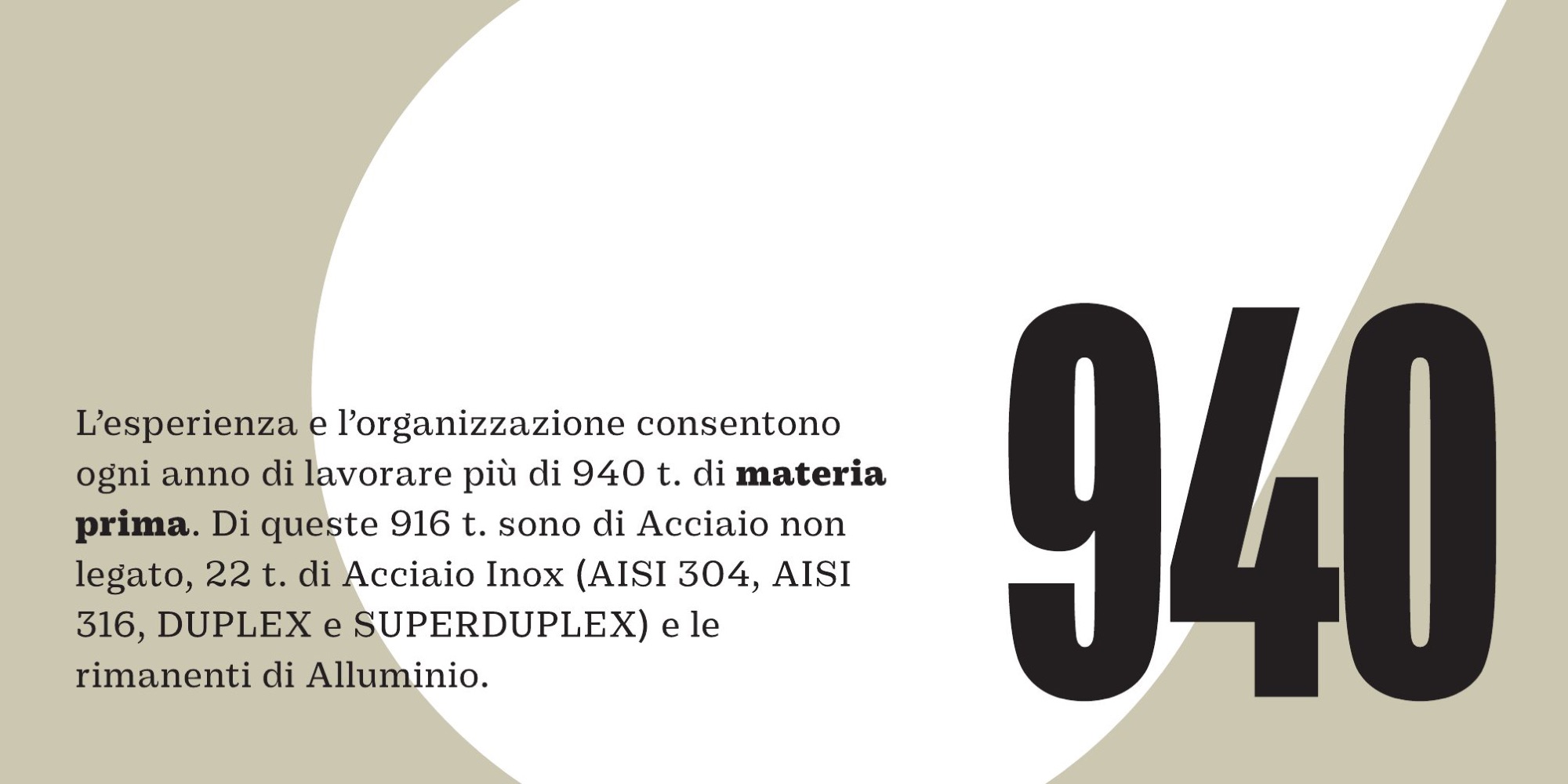
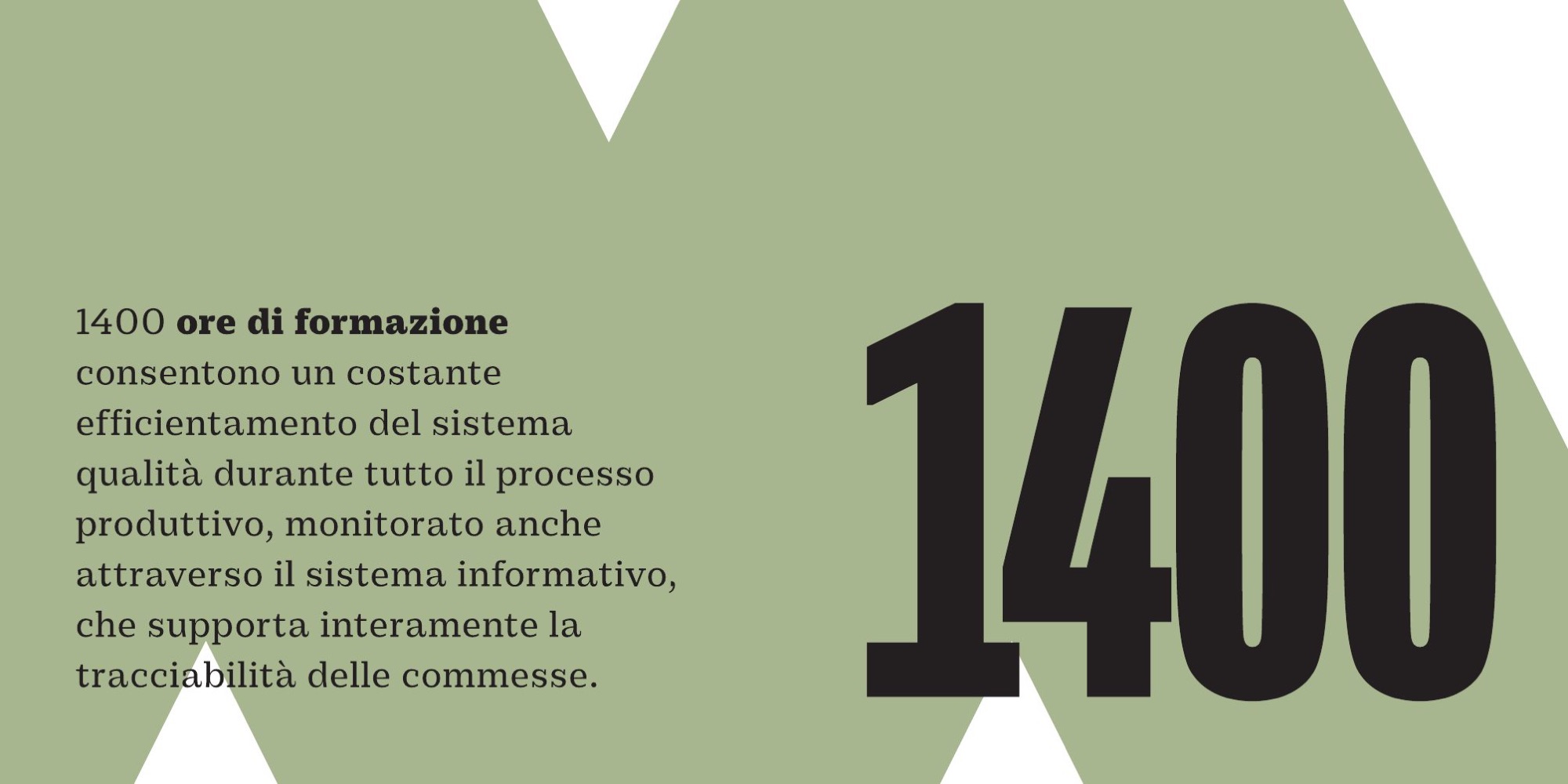
With a brochure you leave behind like a business card. One figure per card.
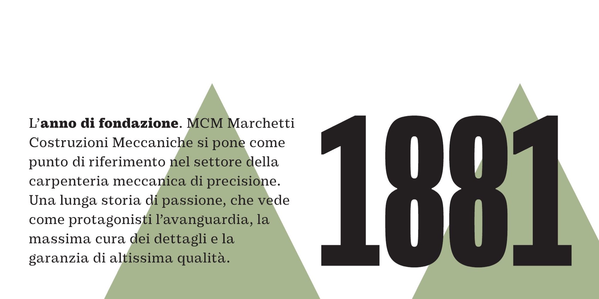
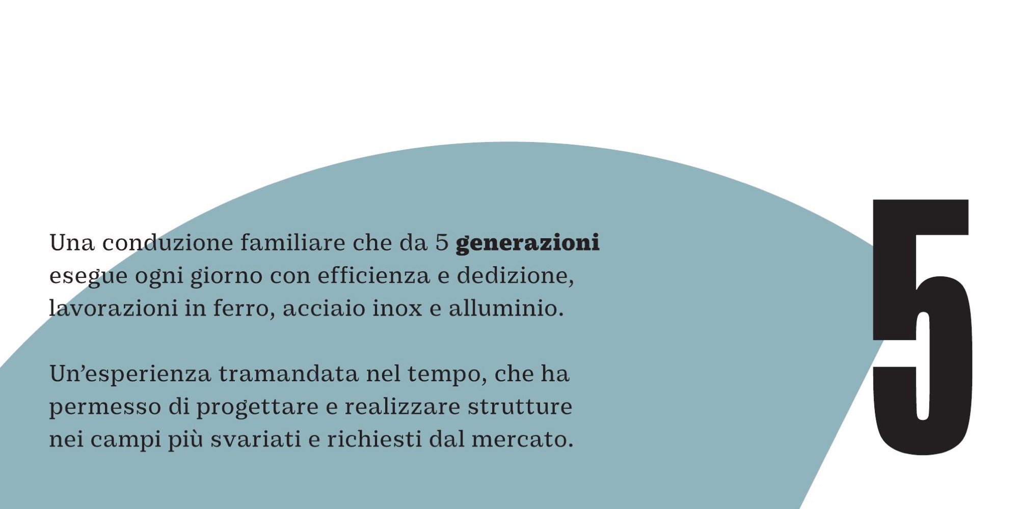
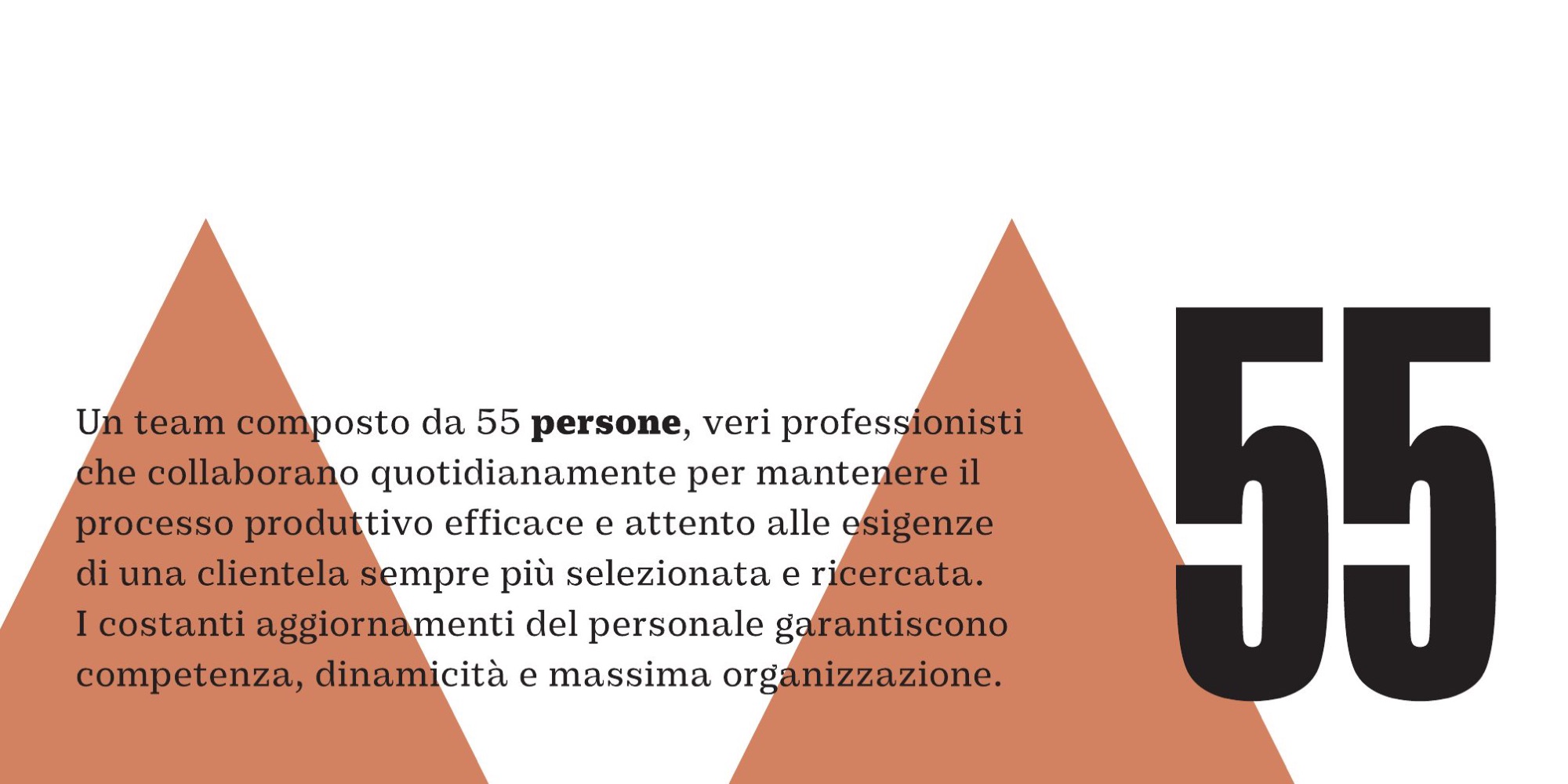
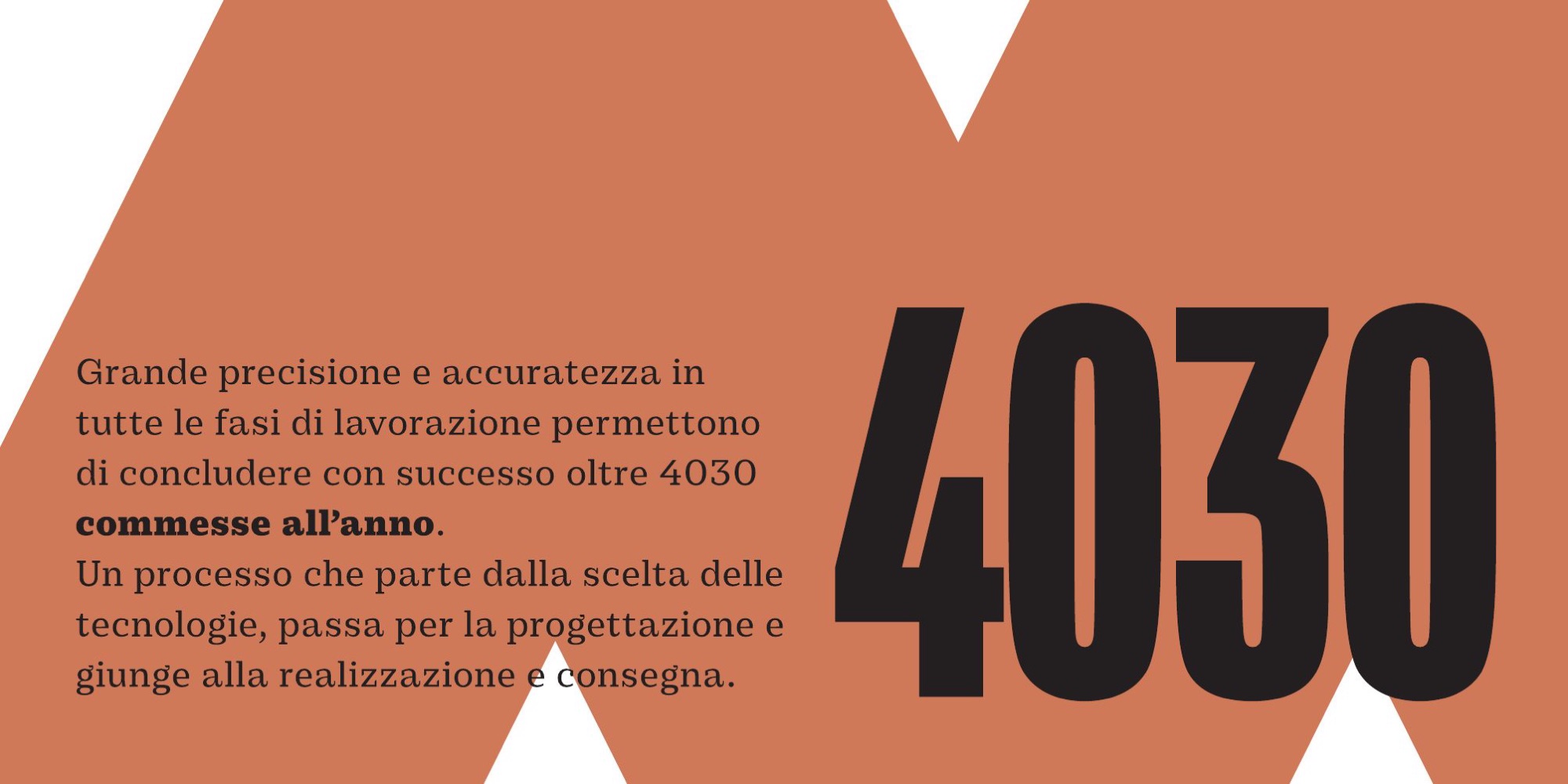
Eight cards, 170 × 85 mm. The logo, then six numbers — the founding year, the generations, the people, the orders, the tonnes, the training hours — and, at the end, the infinity symbol. Every figure sits on a shape from the palette: sage green triangles, blue curves, terracotta chevrons.
What does a logo need in order to live in the company, not just in a book?
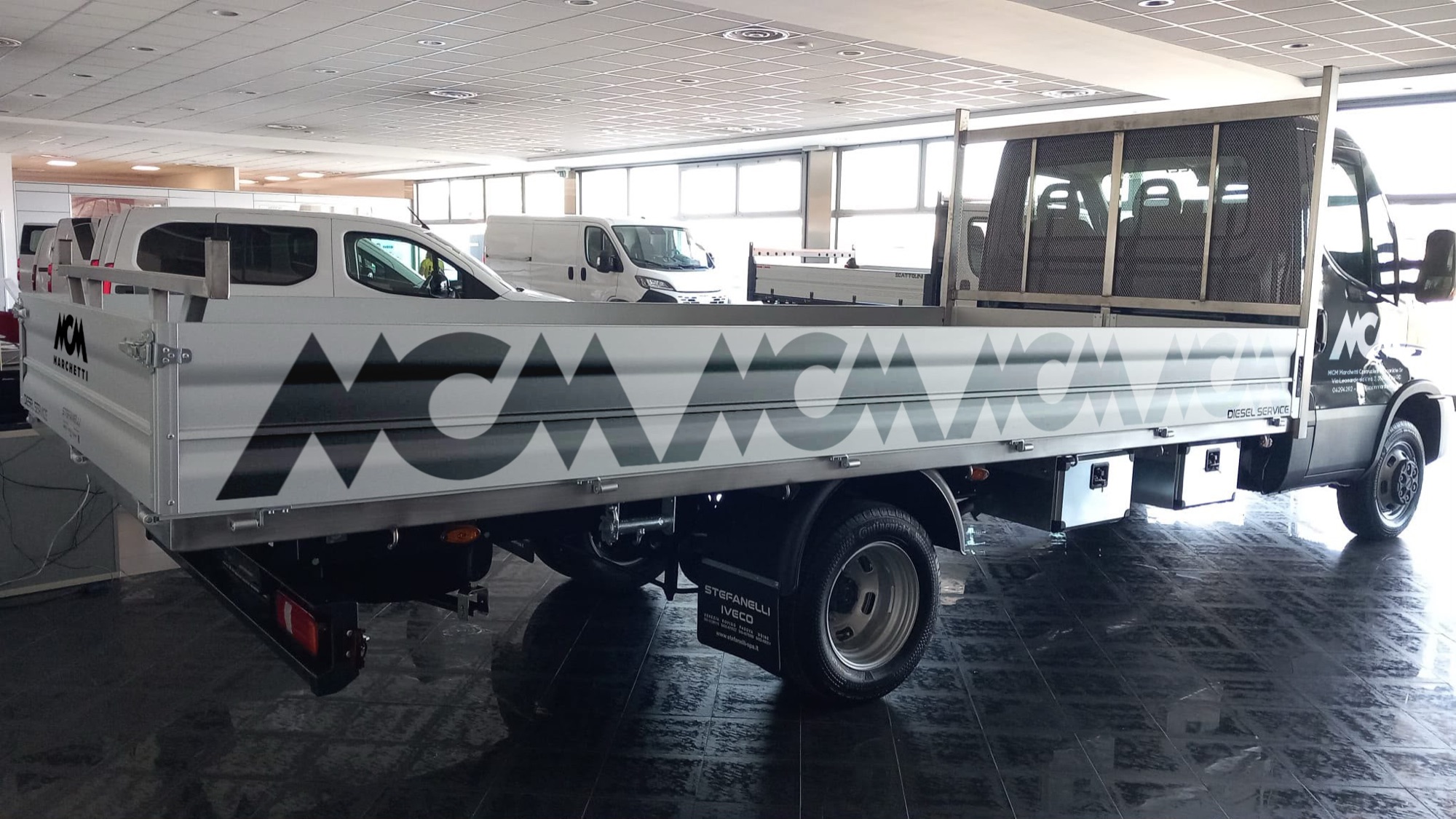
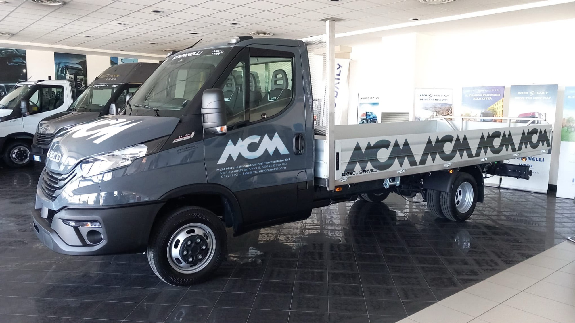
The things you touch: the paper, the wall, the van.
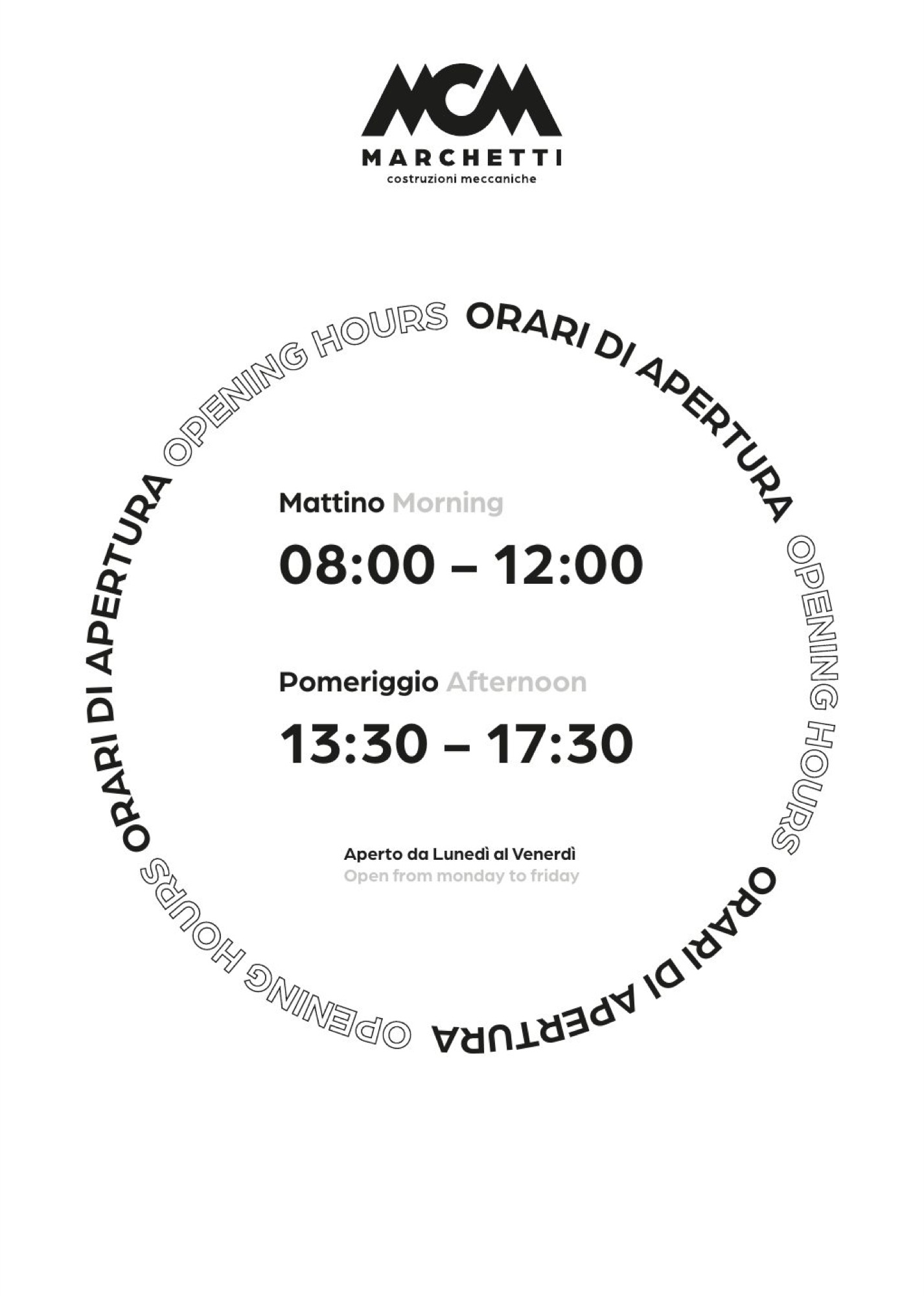
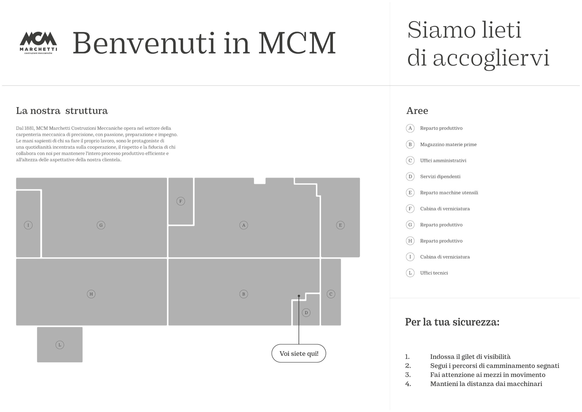
Stationery, table mats for the break, stencils, an opening-hours sign in two languages, Christmas greetings. The welcome panel with the plan of the plant, the coffee area, the hanging banners with the company’s figures. And the vehicles, with the pattern running along the drop side.
The banners and the vehicles
Interior fittings and vehicle livery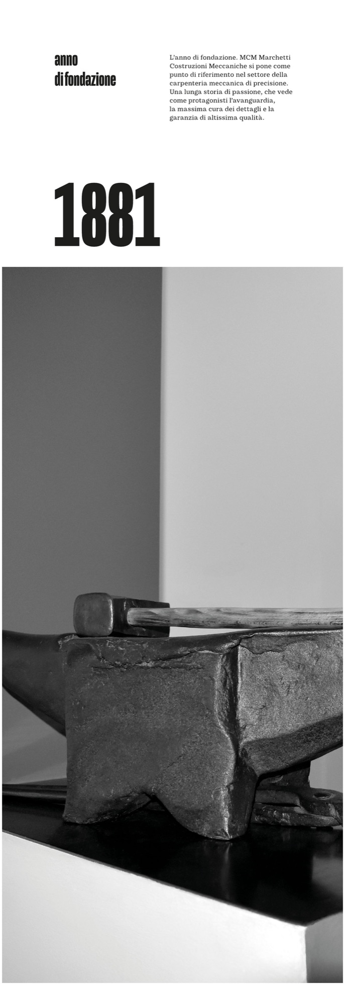
The campaign
Brand awareness 2025, in black and white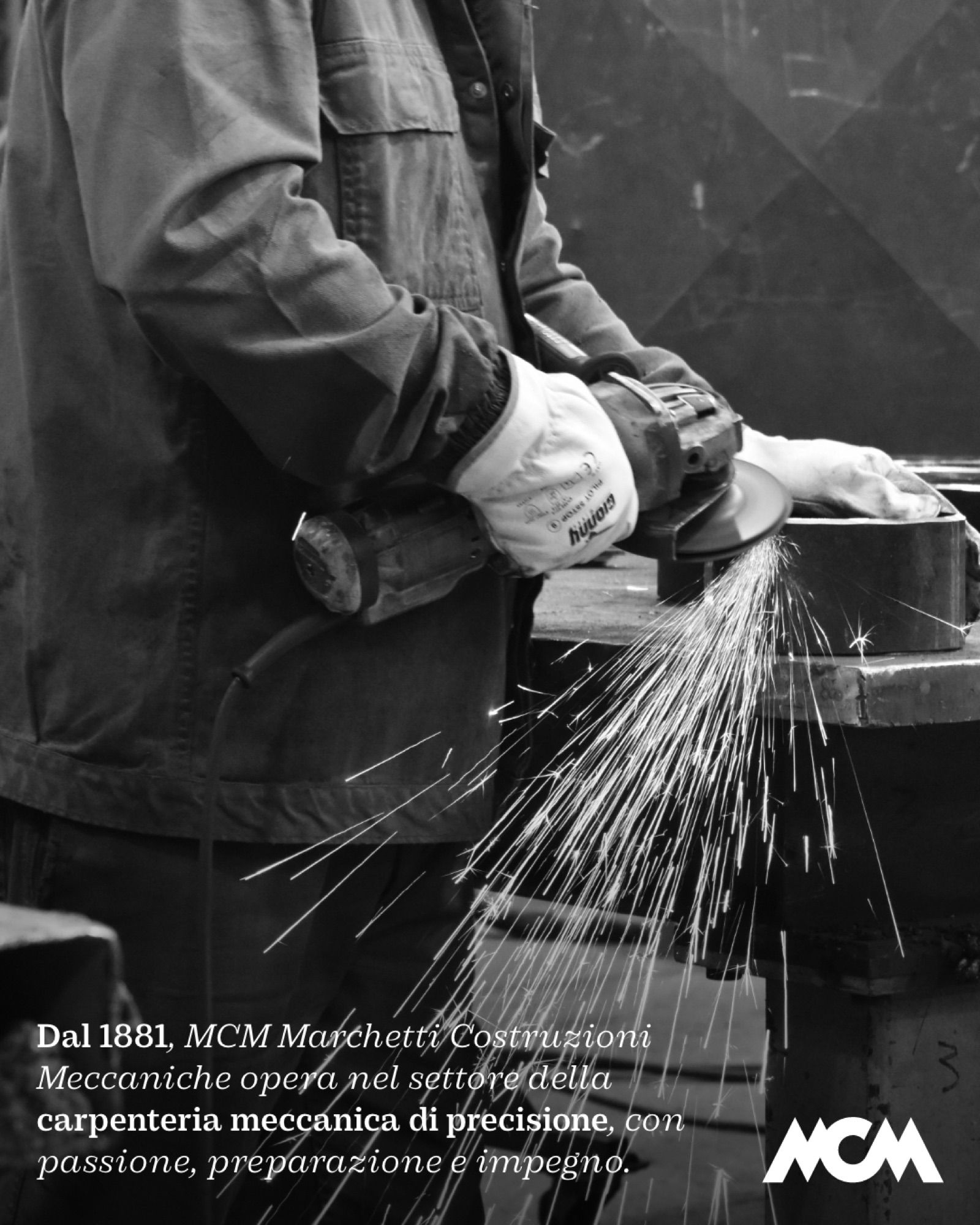
What happens when the logo leaves the company and becomes a building?
It always starts the same way: you try, you compare, you decide afterwards.
Colour studies for the façade of the new plant, tried straight onto the photograph. And a study for the external sign, with the symbol at three width reductions, in dark grey and in corten, to settle the scale before the production drawing.
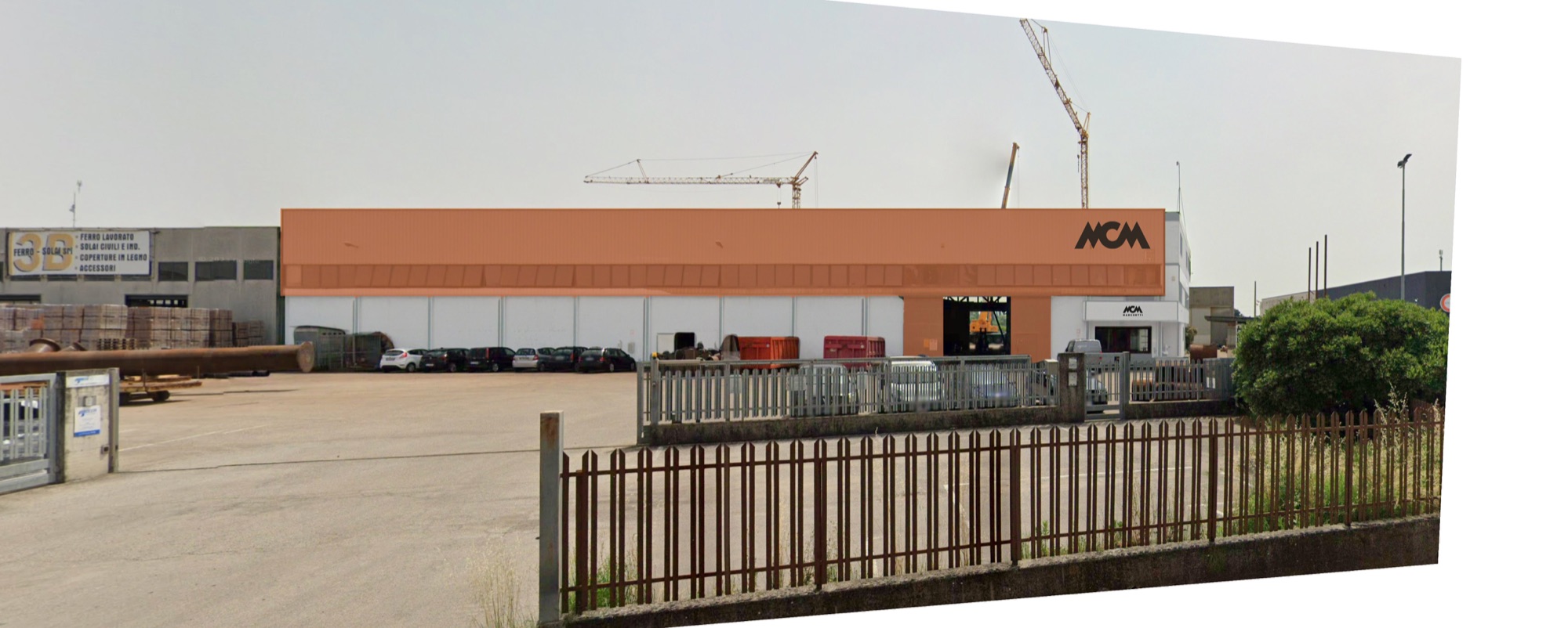
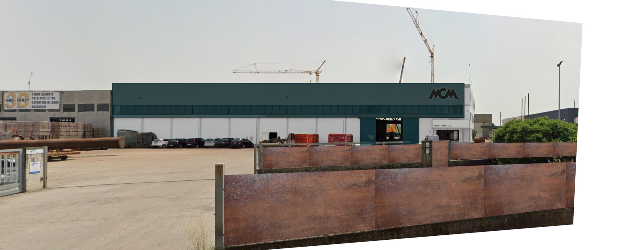
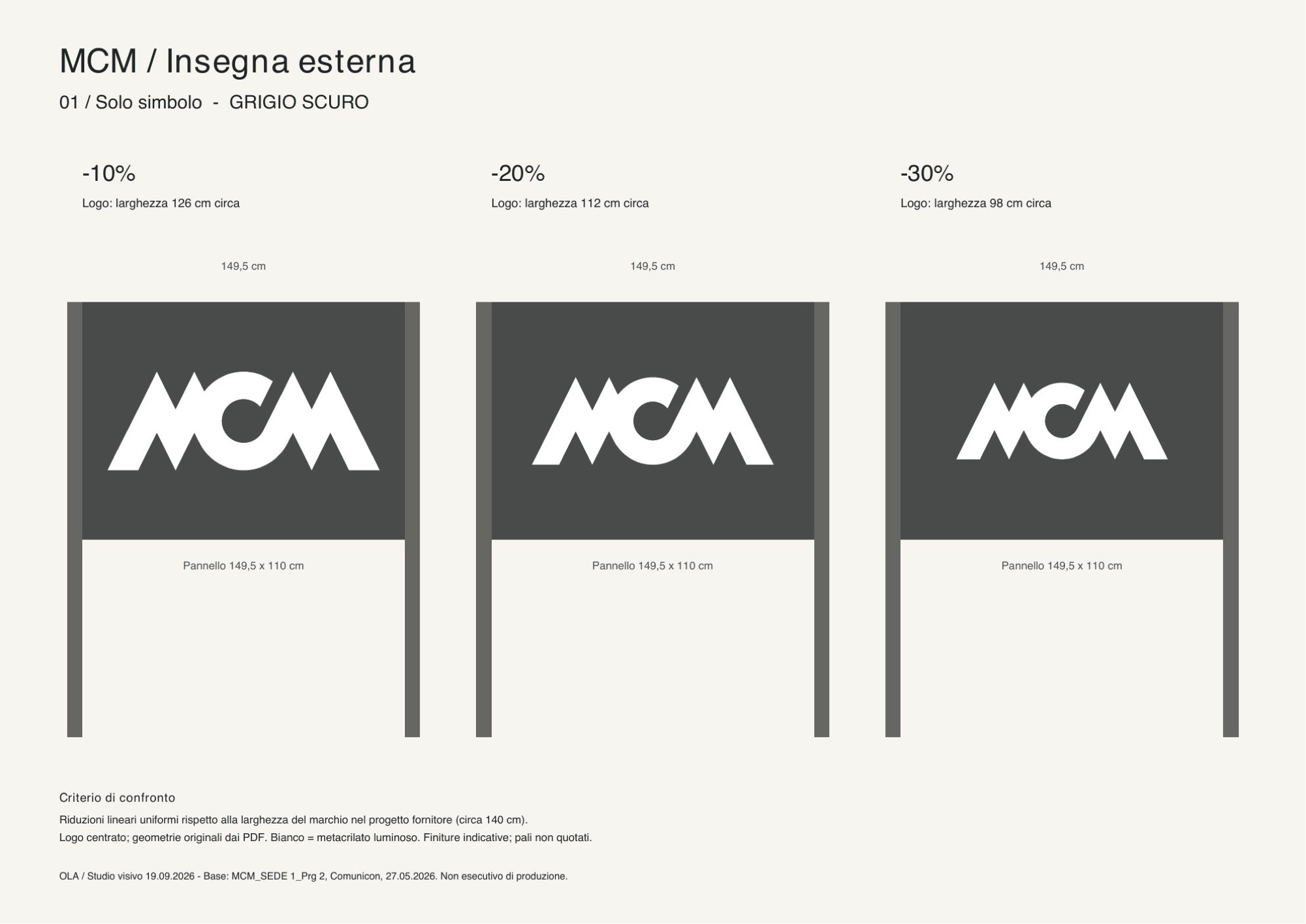
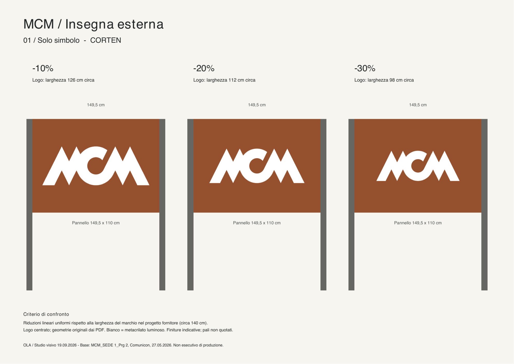
Scale and colour studies: you look at them side by side, and only then you choose.
Frequently asked questions
MCM Marchetti and Opificio, in short.
What did Opificio Lamantini Anonimi do for MCM Marchetti?
The logo restyling, the brand guidelines, the company profile, the brochure and the corporate identity, from stationery to interior fittings and vehicles.
Who designed MCM Marchetti’s current logo?
Opificio Lamantini Anonimi, with the restyling begun in 2023 starting from the existing logo.
How is the MCM Marchetti company profile structured?
In seven chapters, from the company’s origins to its reference sectors, held together by the image of the spark. The texts are by Francesca Bux.
How long has MCM Marchetti been around?
Since 1881, in Este, in the province of Padua, Italy. It is on the fifth generation of the Marchetti family.
Does Opificio Lamantini Anonimi work with engineering and metalwork companies?
Yes. MCM Marchetti, in Este, is one example.