

Rossato: when the product is the same, the brand is the difference
Brand analysis, strategy, identity concepts and website design for a joinery in Este, Italy, making bespoke windows since 1949.
In short
Falegnameria Rossato is a company in Este (Padua, Italy) that has made bespoke wooden windows, doors and furniture since 1949. Since 2025 Opificio Lamantini Anonimi has handled its brand analysis, strategy, visual identity concepts and the design of its new website, with the aim of speaking to architects and designers too.
Project facts
- Client
- Falegnameria Rossato
- Sector
- Bespoke wooden windows, doors and furniture
- Location
- Este (Padua, Italy)
- Trading since
- 1949
- Period
- 2025 – ongoing
- Services
- Brand analysis, strategy, tone of voice, identity concepts, naming, icon design, website design
“Our windows are the same as every other good window on the market. We know it’s the people and the service that make the difference.” They told us that themselves, during the analysis. From then on the job was a single one: to make visible a difference that until then you could only see by working with them.
The starting point
Where was Rossato starting from?
A family joinery, opened in 1949 as a workshop, that today works mainly on the shell of the house: wooden and wood-aluminium windows, shutters, doors, internal doors, bespoke furniture. A logo the company did not feel was its own. And the ambition to be chosen by architects too.
Our windows are the same as every other good window on the market. We know it’s the people and the service that make the difference.From the analysis interviews, 2025
What do you ask a company that says it is the same as everyone else?
You start from what it says about itself. Then you check whether it is true.
A qualitative questionnaire across eight areas, an audit of what can be seen online — Google listing, website, Facebook, Instagram — and a segmentation of the market by type of company and by material: wood, wood-aluminium, aluminium, PVC, steel.
Then the positioning matrix, to work out who is seen as solid and important, who is a generalist and who bets on a single material. And one subject that came back at every turn: architects.
- 01Name and visual audit of what exists
- 02Tone of voice
- 03Values
- 04Competitors and case studies
- 05Workflow
- 06Stakeholders
- 07Audience
- 08Social and communication tools
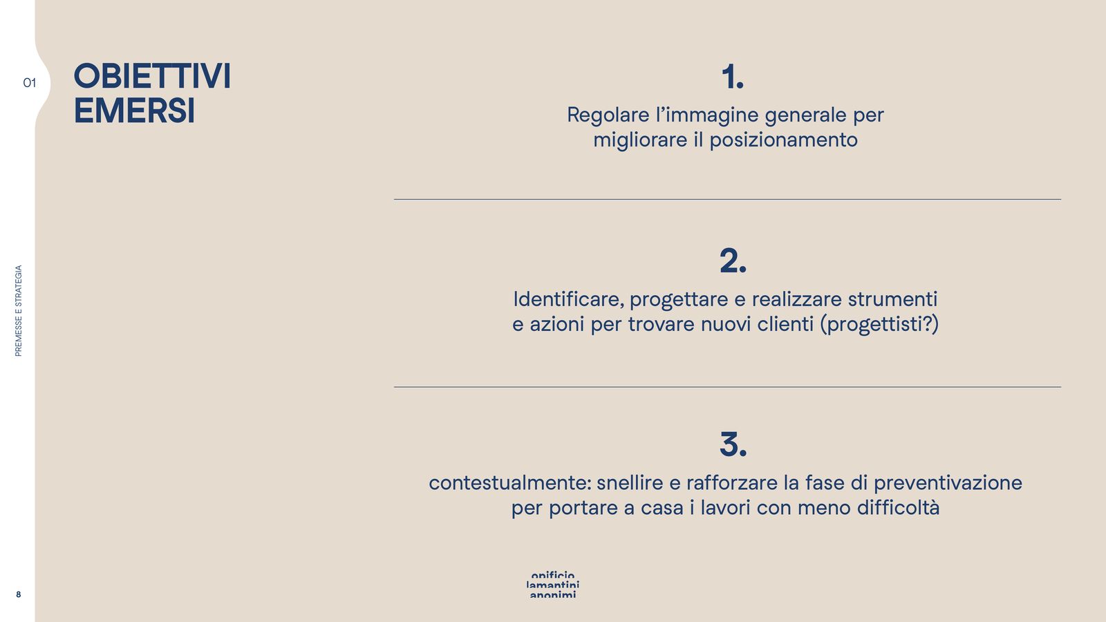
The three goals that came out
From the presentation of 21 March 2025Tune the overall image to improve the positioning.
Design tools and actions to find new clients among architects and designers.
Streamline the quoting stage, to win work with less friction.
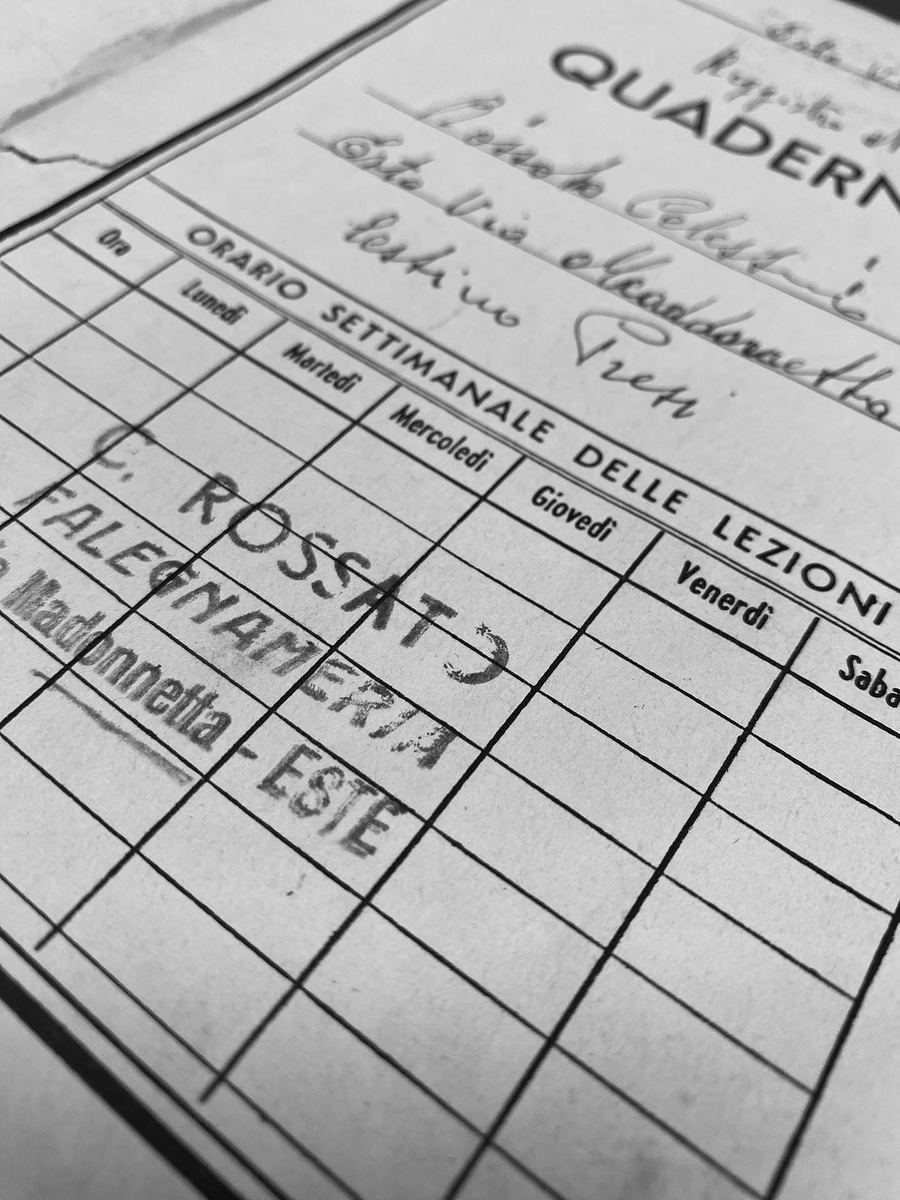
Since 1949
The workshop’s own papers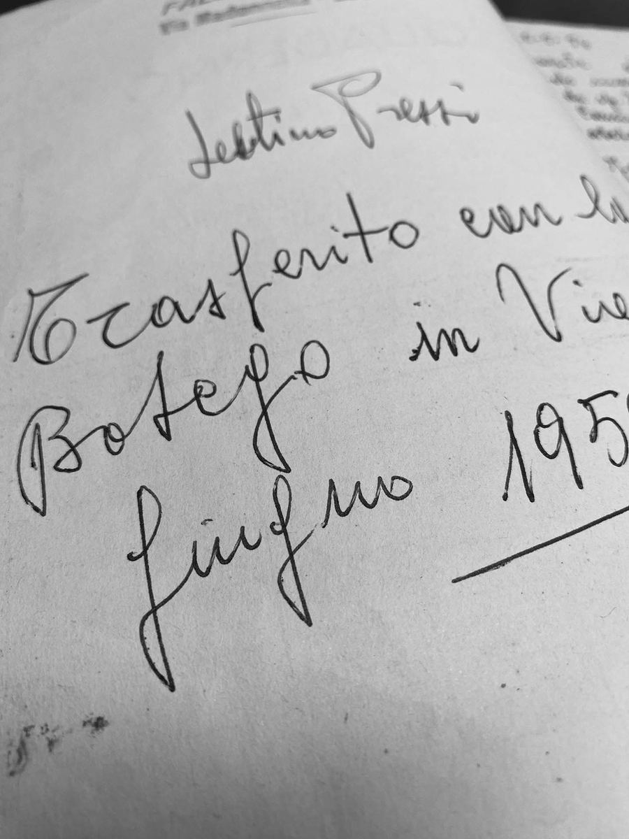
What do we want an architect to feel when they walk out of here?
“I’ve found the supplier I was looking for: people who know their job and who you can actually talk to.”
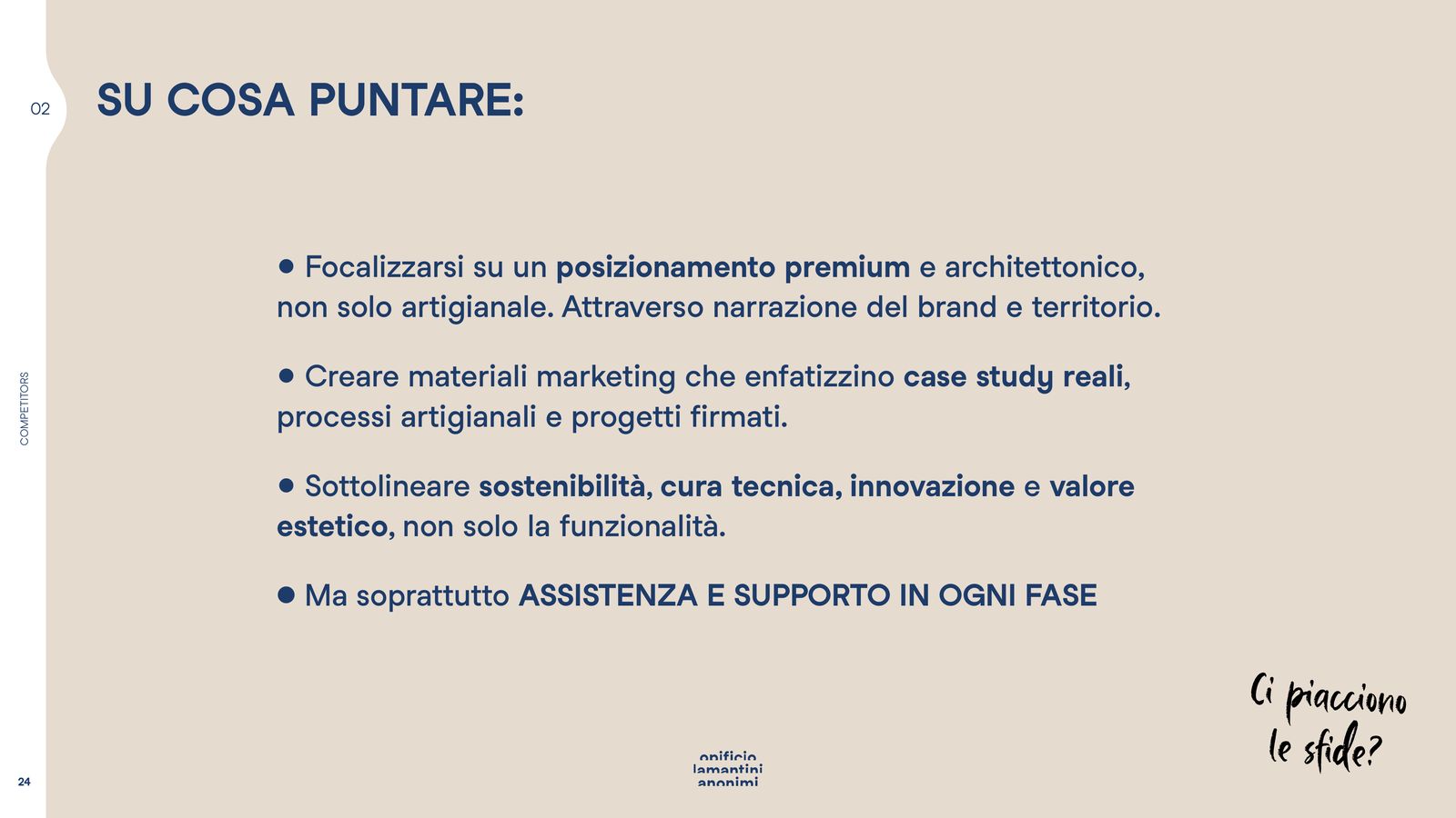
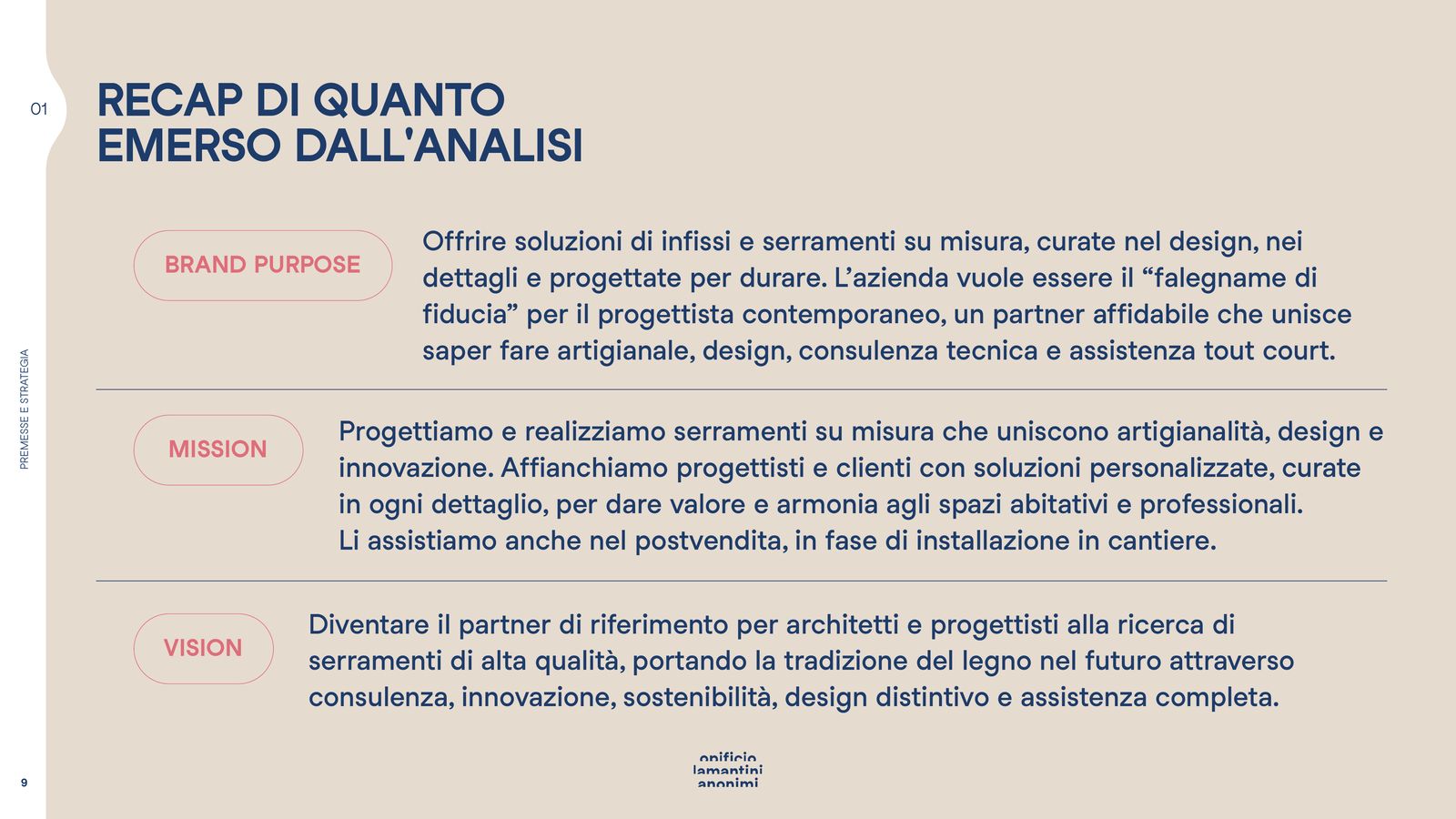
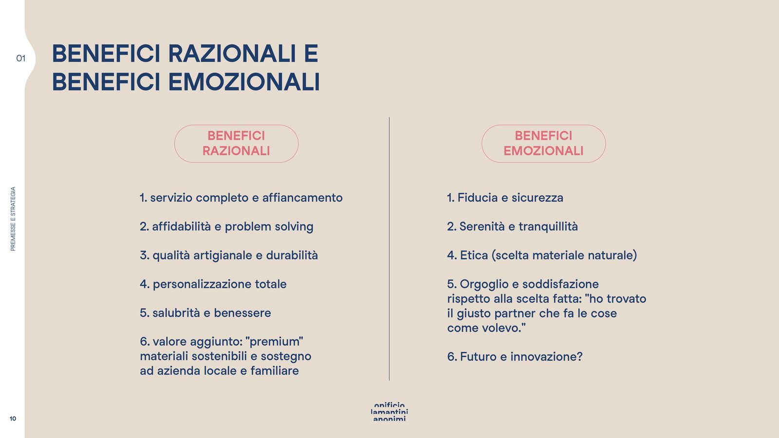
Brand purpose, mission and vision written together. Then the benefits, in two columns: on one side a complete service, reliability, craft quality, full customisation; on the other trust, peace of mind, pride in the choice made.
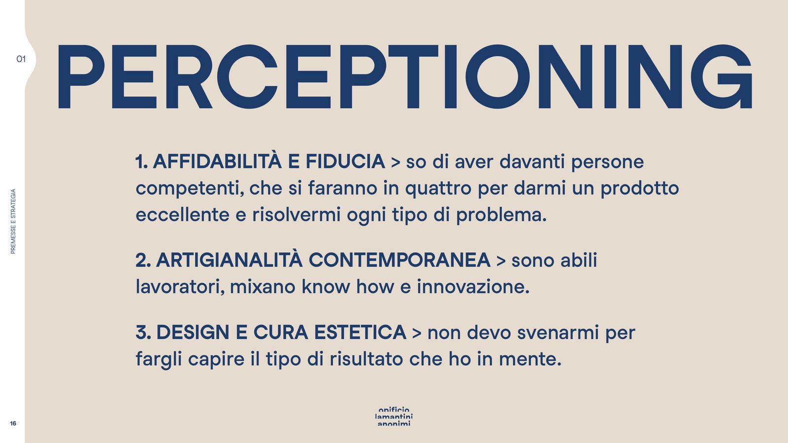
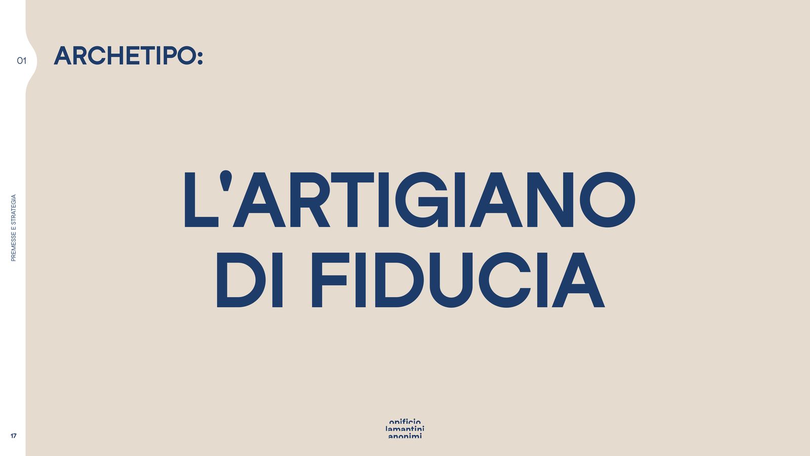
Perceptioning keeps the perception steady over time: three pillars, not one more. And an archetype, the trusted craftsman, holding up everything else.
The repositioning reads as three swaps: not old but expert, not cheap but accessible, not elitist but welcoming.
Not this, but this
The repositioning in three swaps- 01Old → Expert
- 02Cheap → Accessible
- 03Elitist → Welcoming
The three pillars of perception
PerceptioningReliability and trust
I know I am dealing with people who know their job, and who will go out of their way to solve any problem.
Contemporary craft
They are skilled makers, mixing know-how and innovation.
Design and an eye for detail
I don’t have to fight to make them understand the result I have in mind.
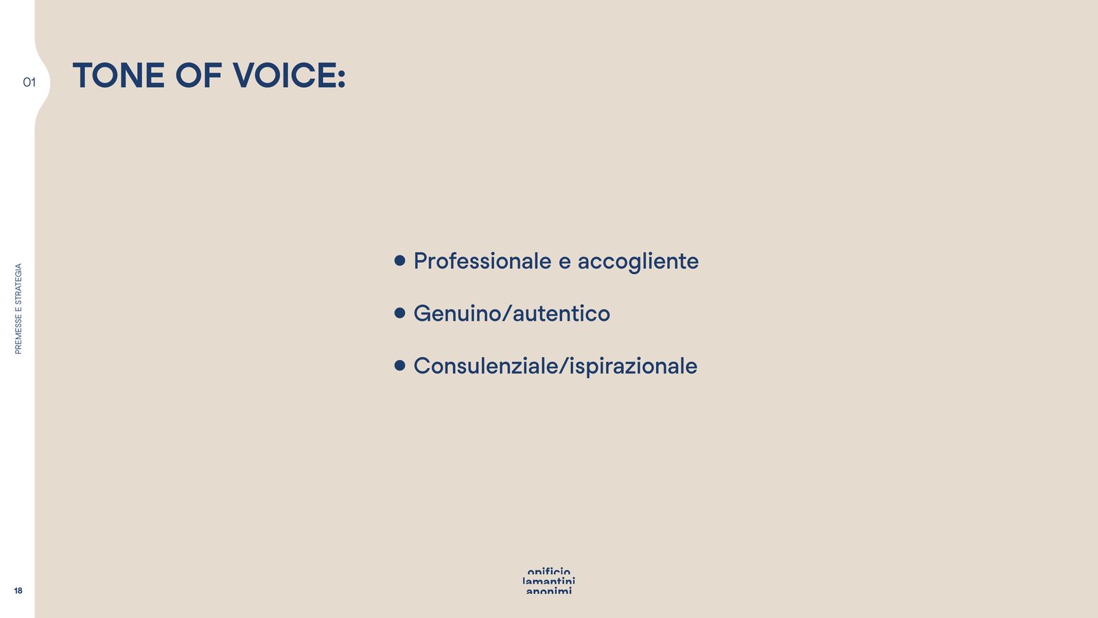
The tone of voice
Three words, held togetherprofessional and welcoming, genuine, advisory.
The concept: one shape
From many shapes to a single one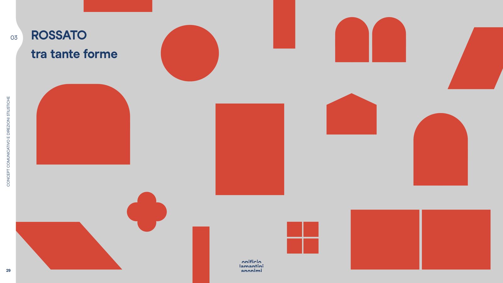
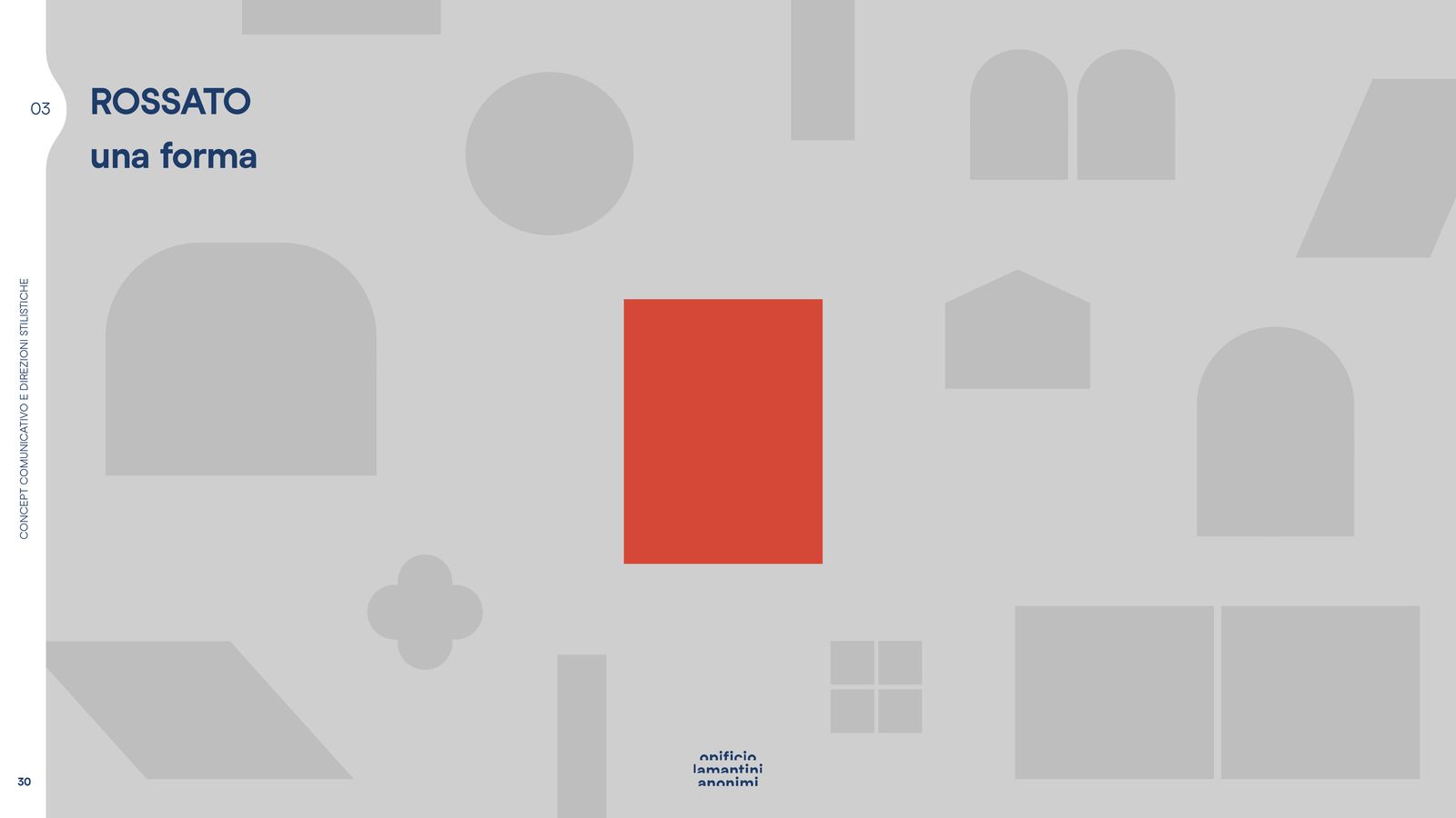
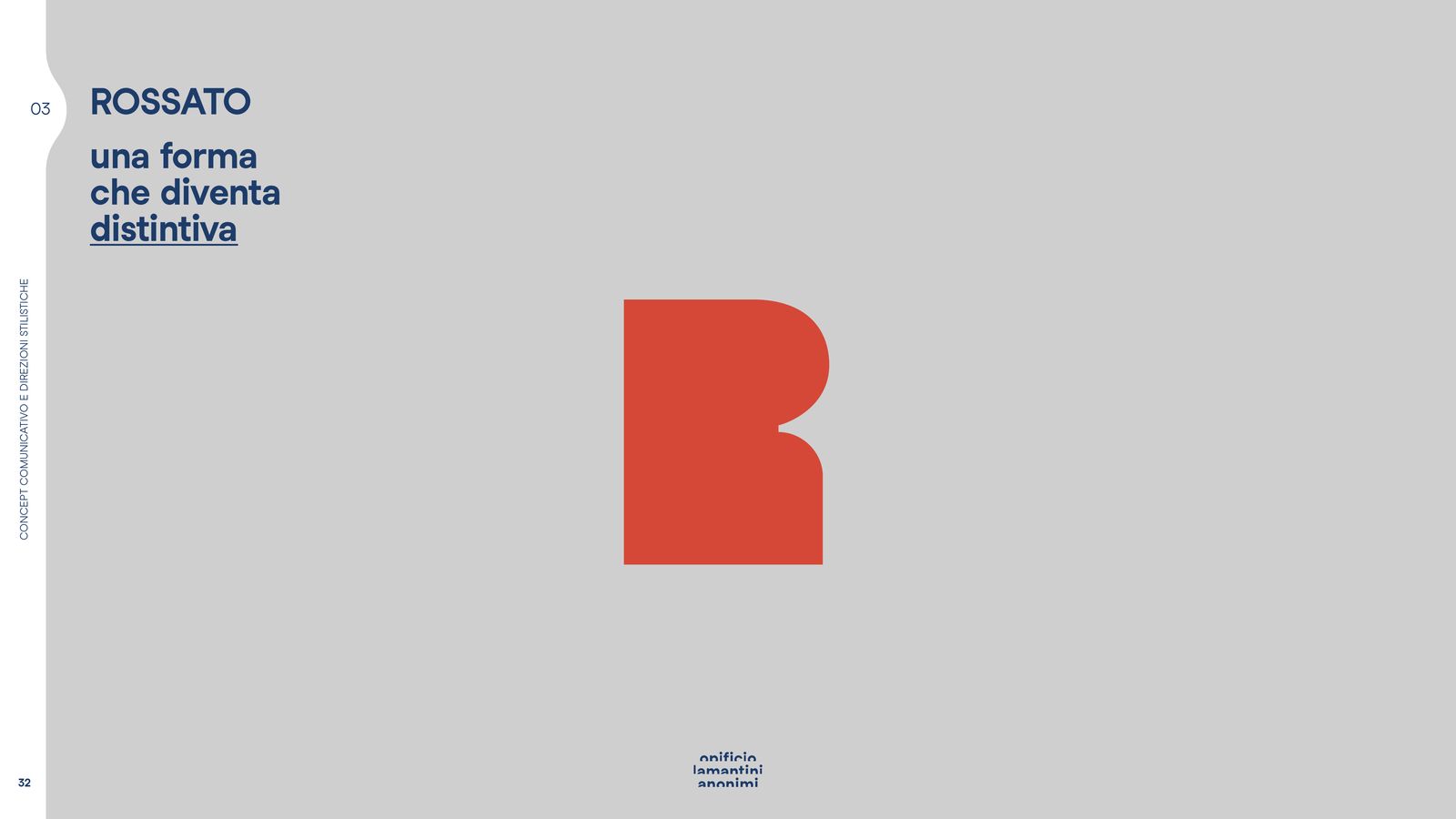
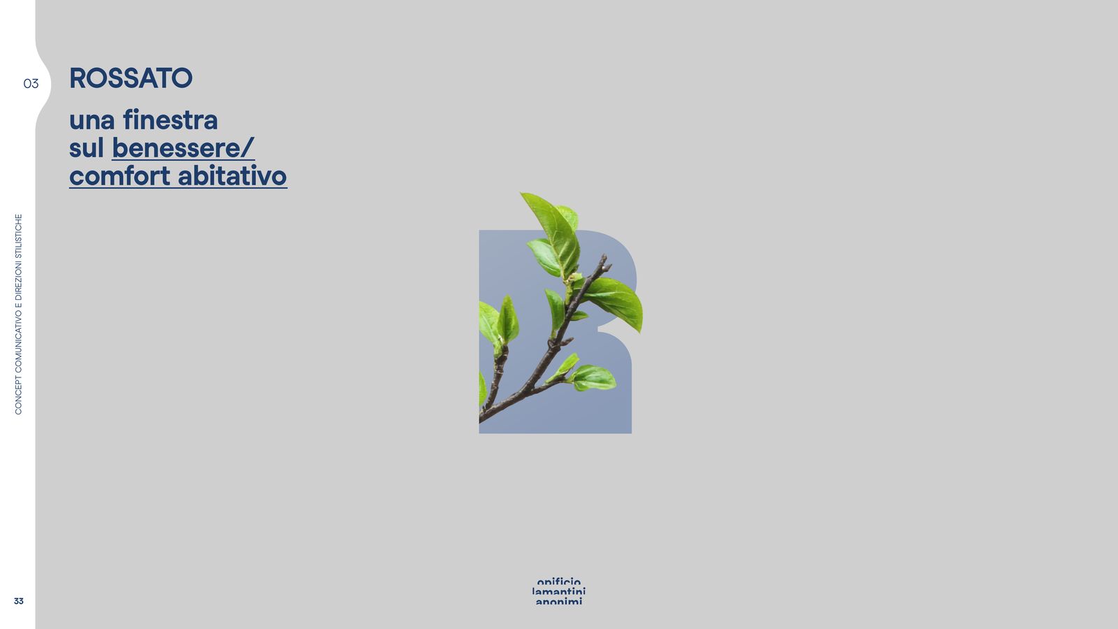
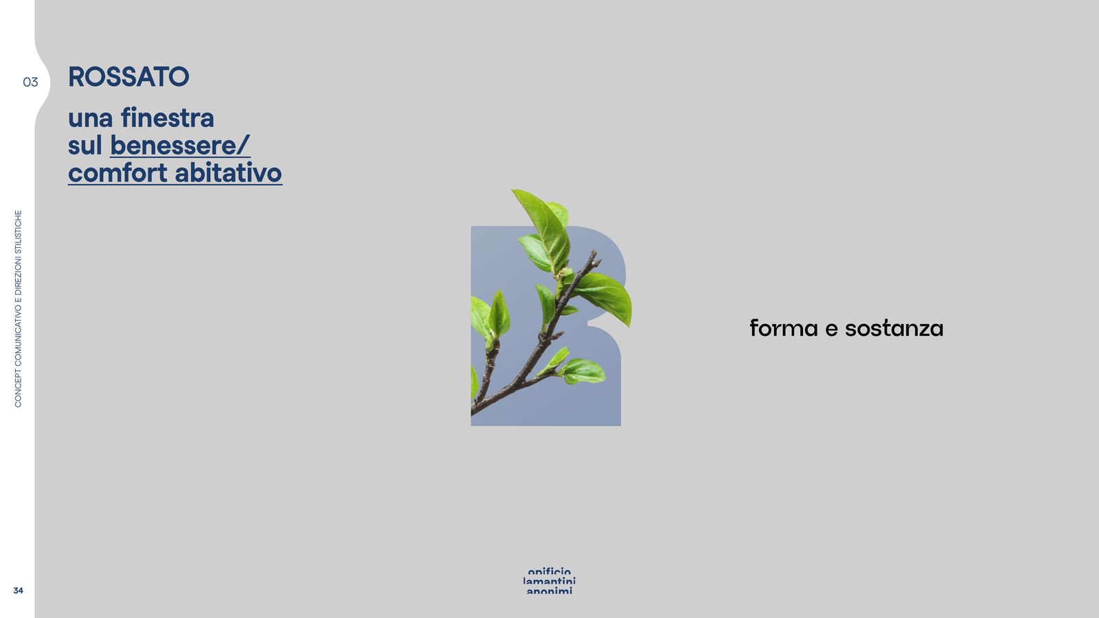
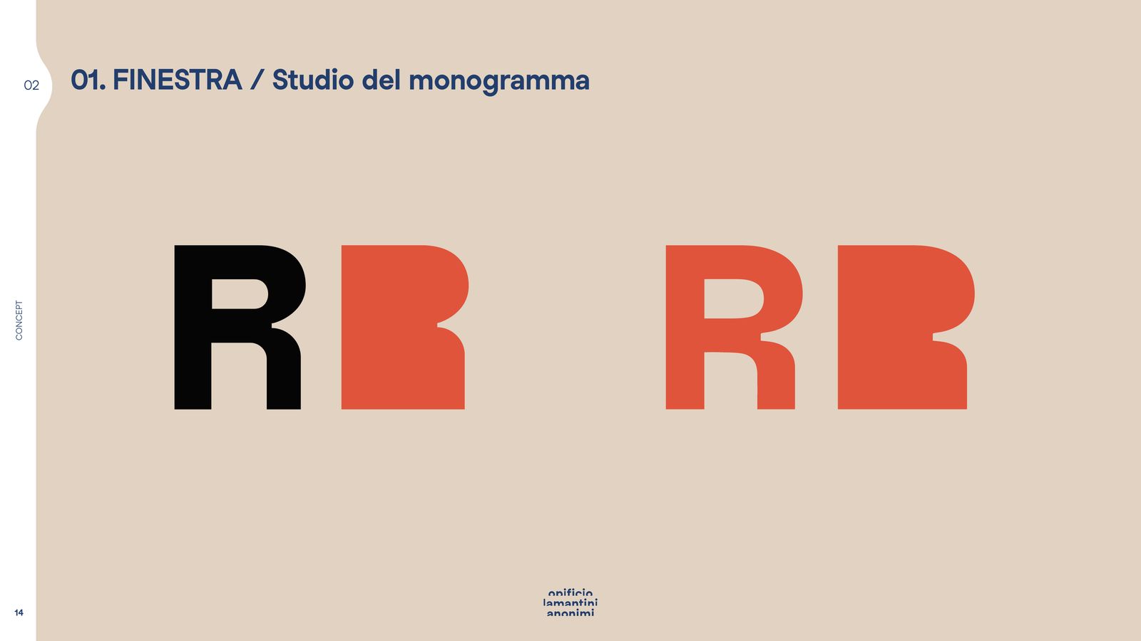
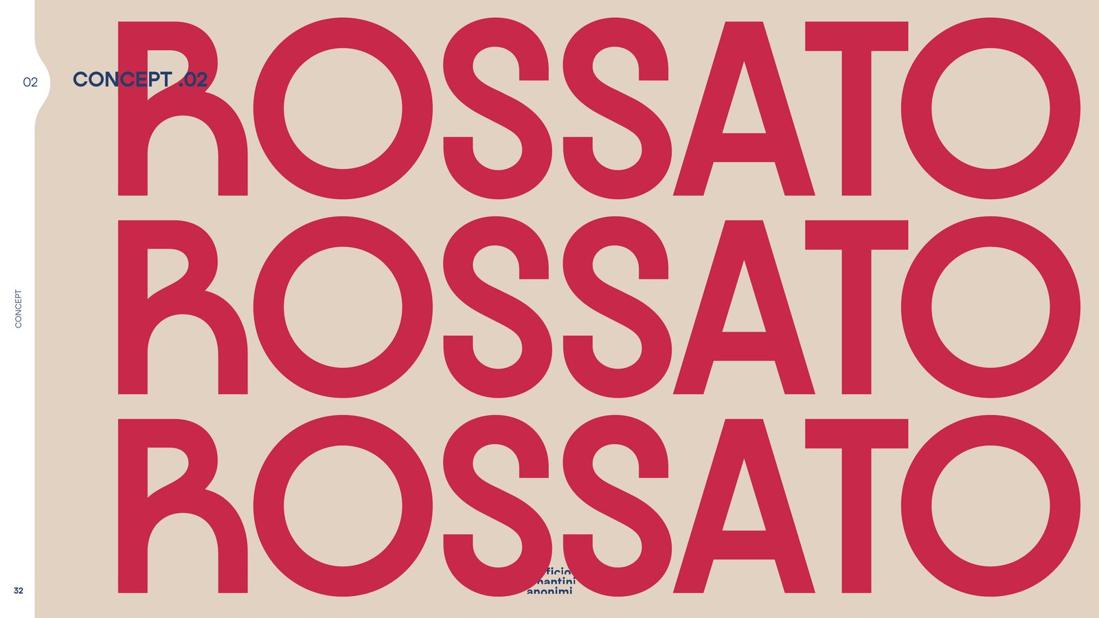
Among many shapes, one: the window. Which then becomes the R.
How many identities can a joinery have?
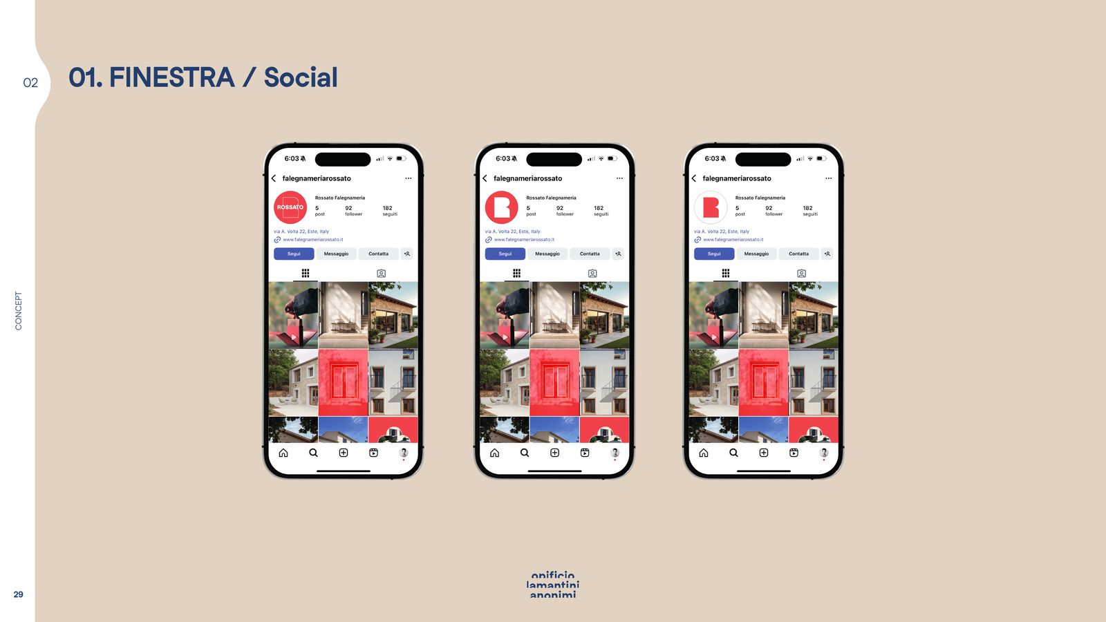
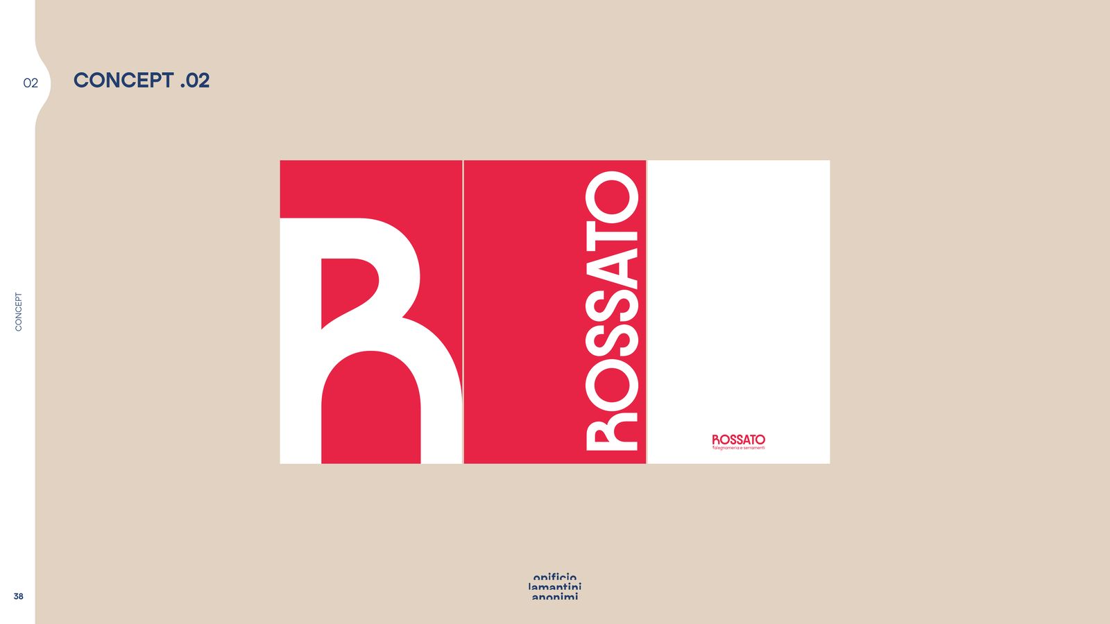
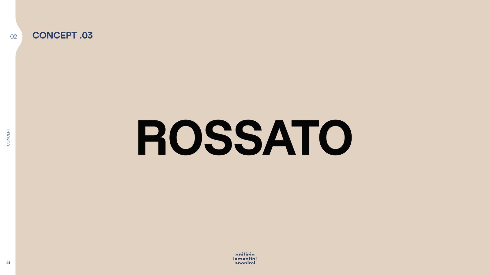
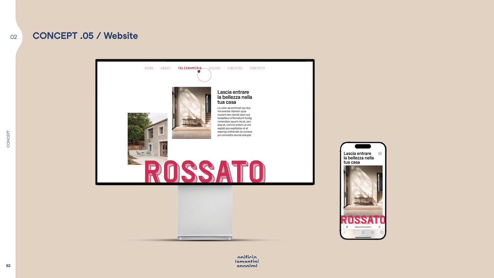
Five. We drew all of them right through to the website and the social feed, because a logo is judged when it is working.
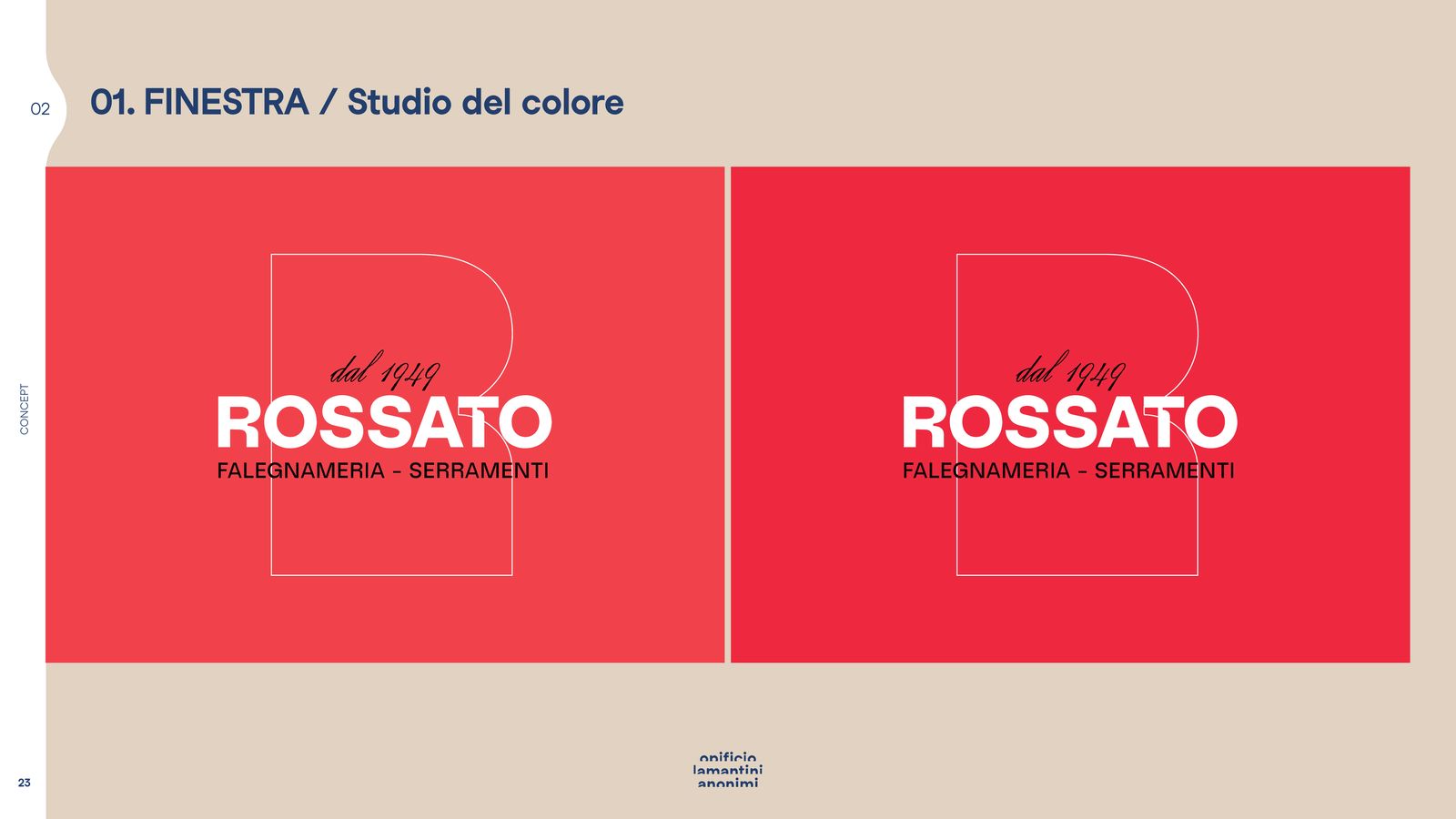
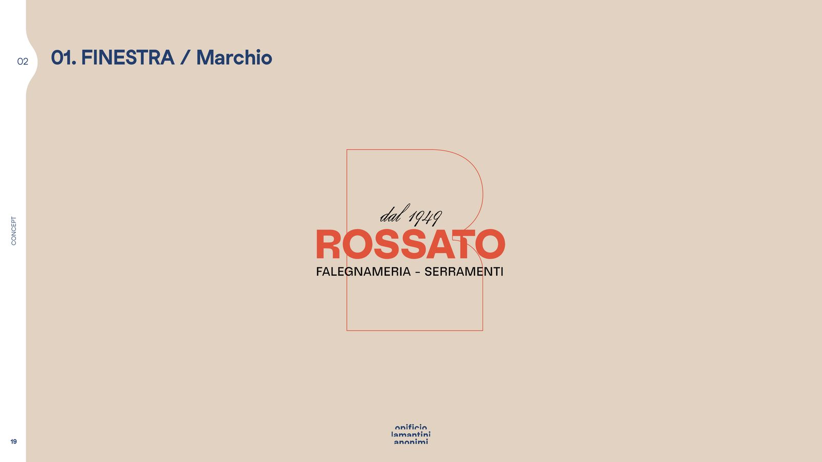
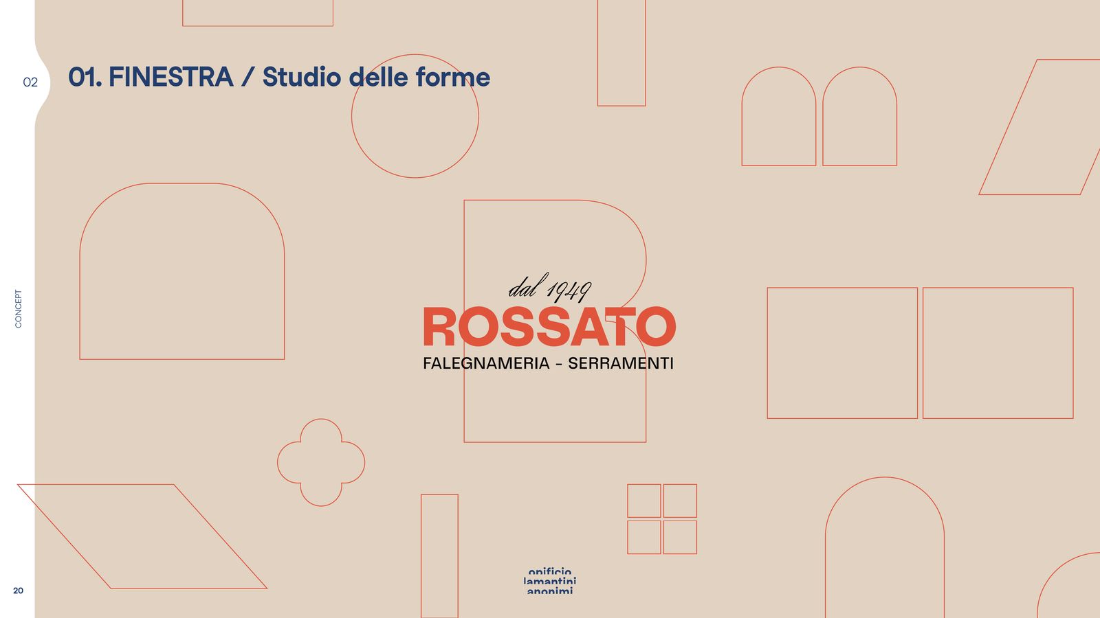
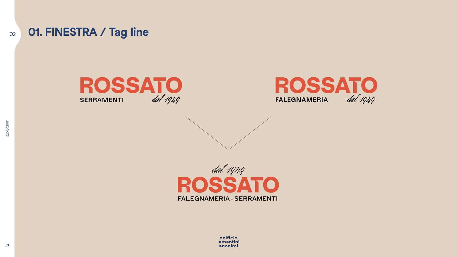
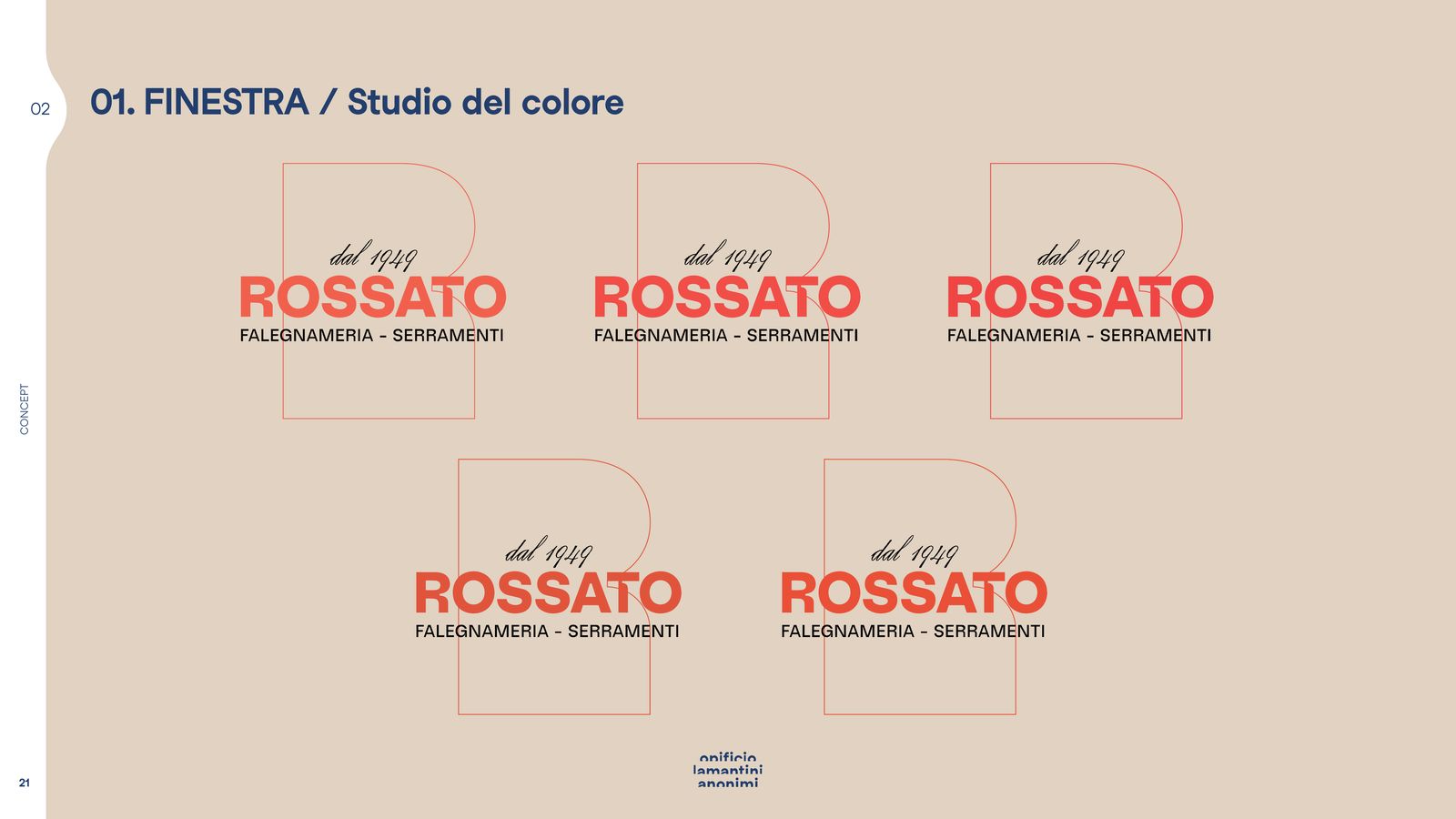
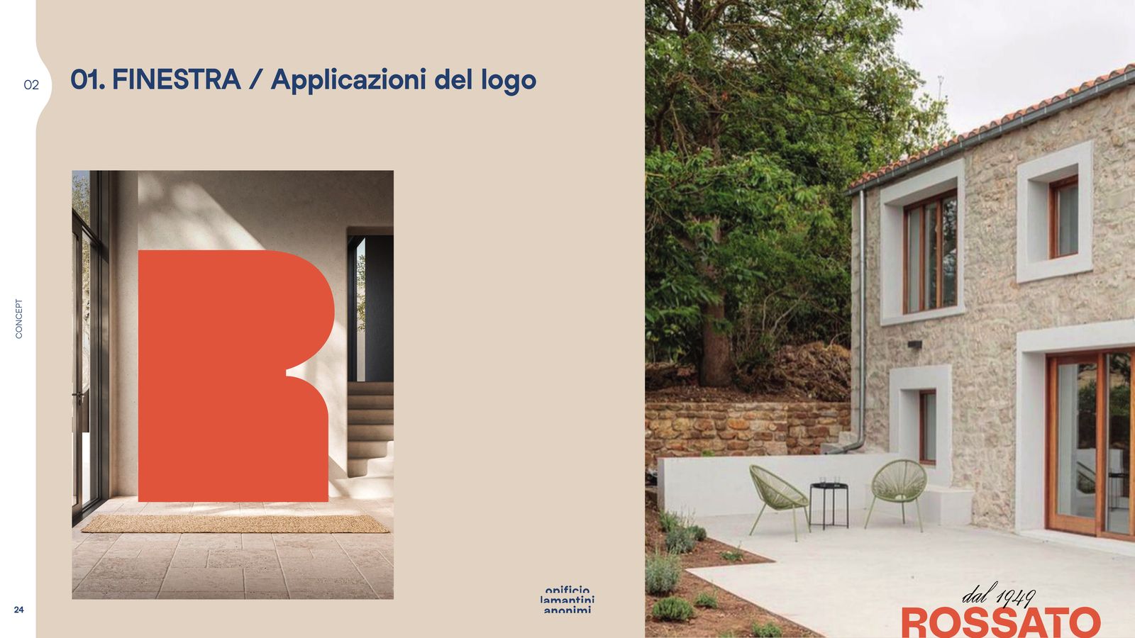
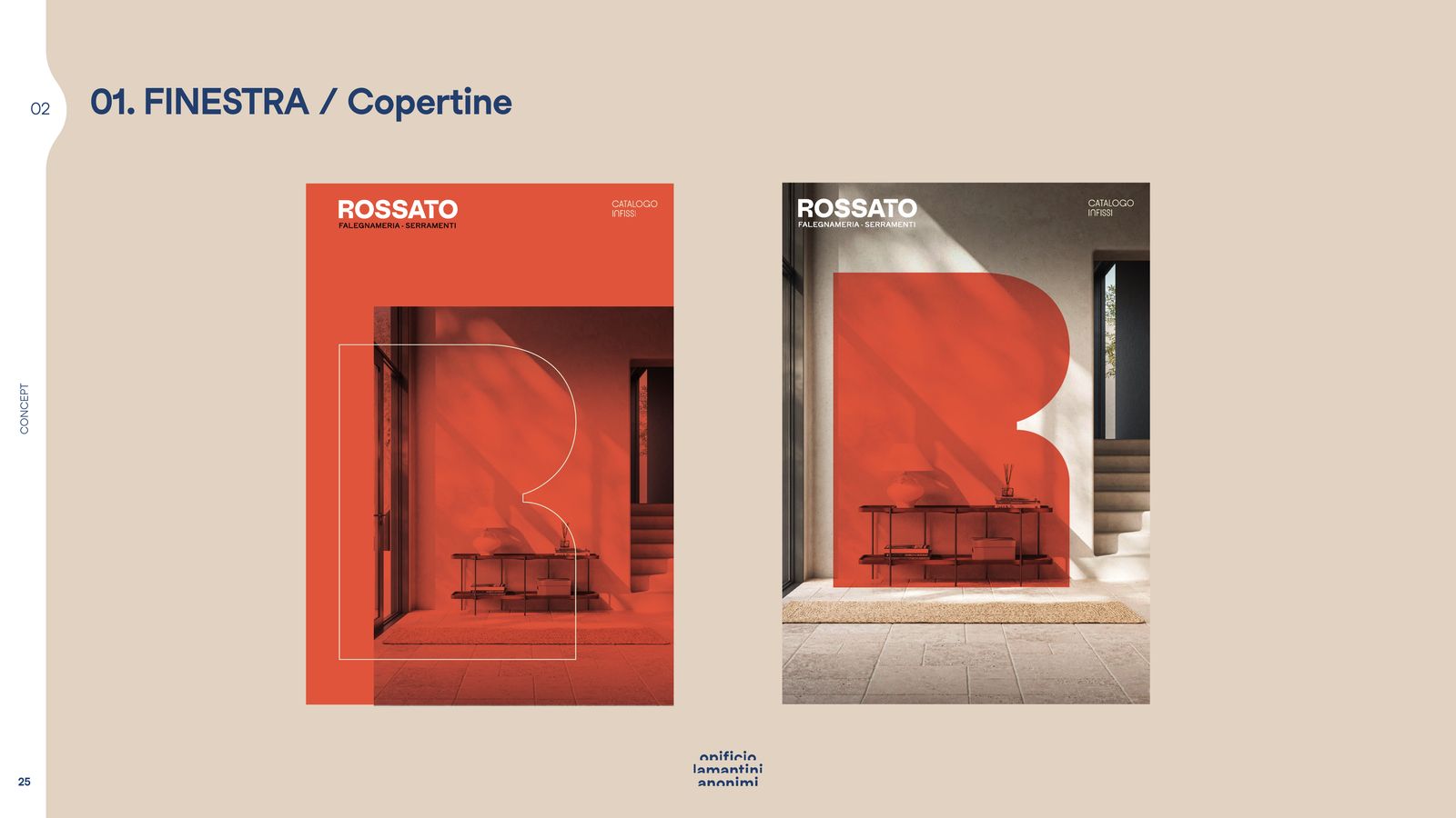
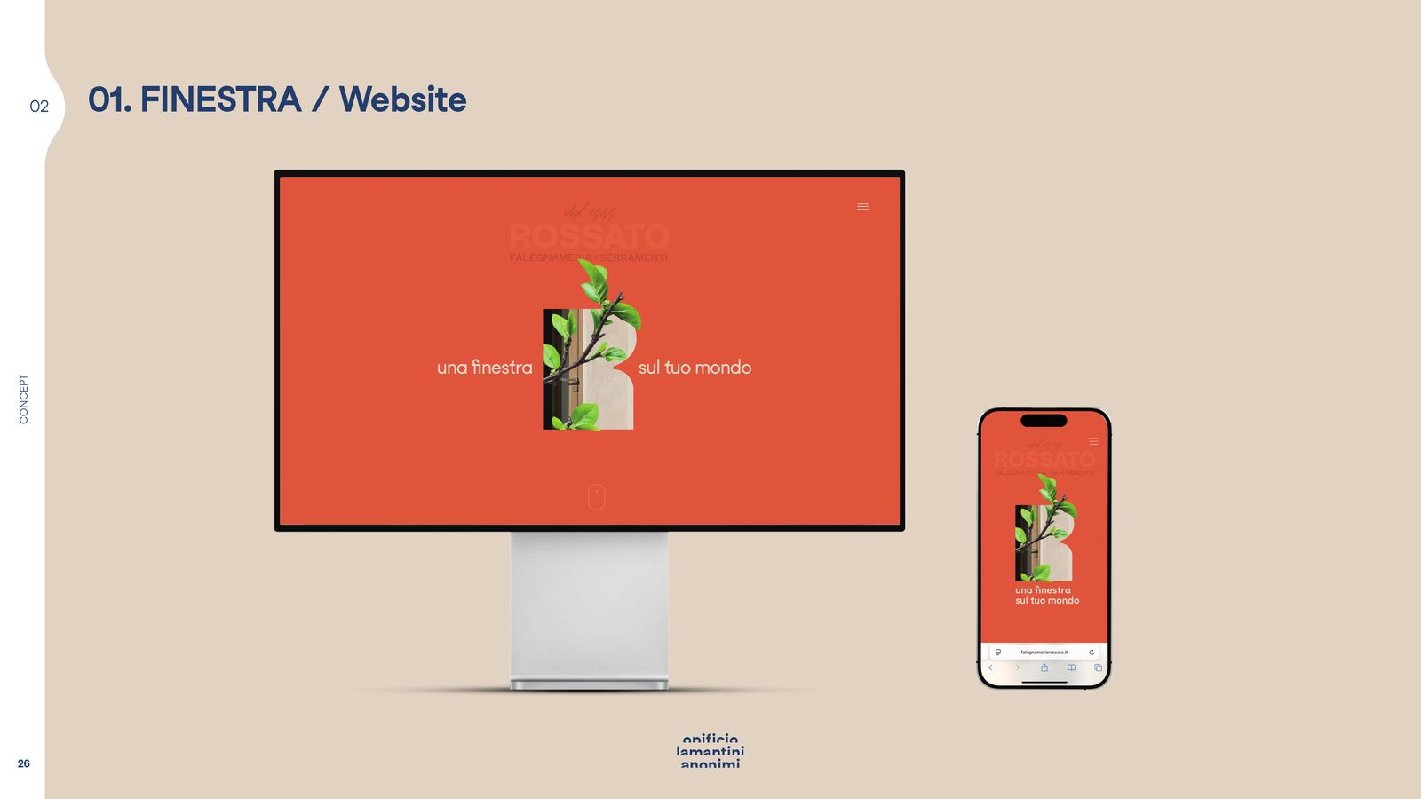
The first concept, a window, starts from the monogram: the R opens up and becomes an opening. Around it, a study of shapes, of colour, of applications.
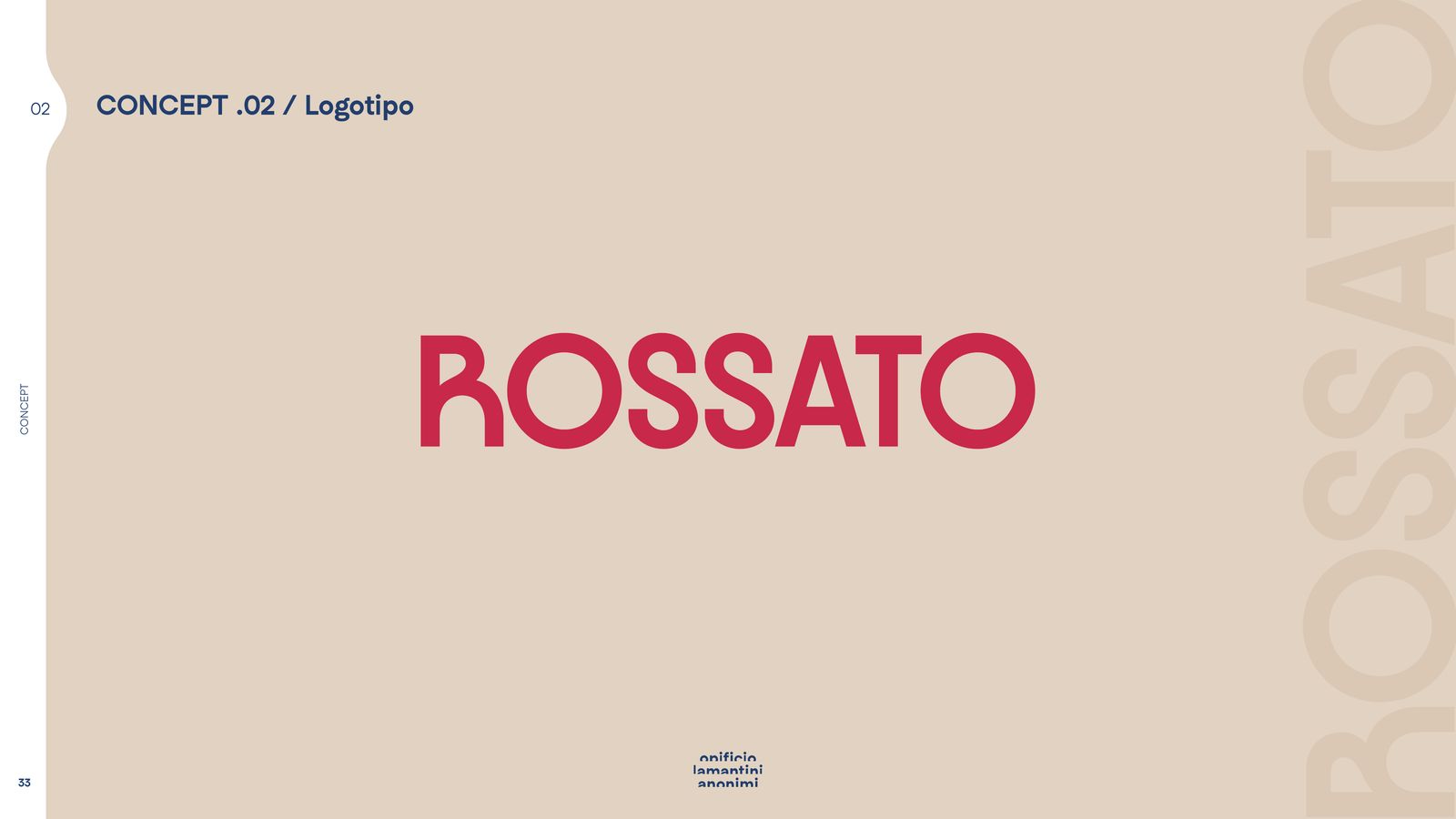
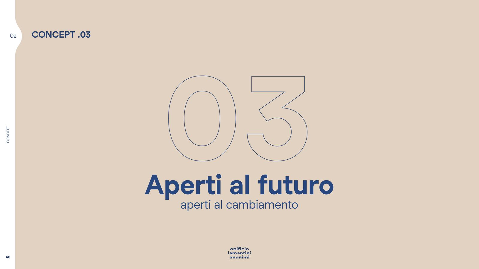
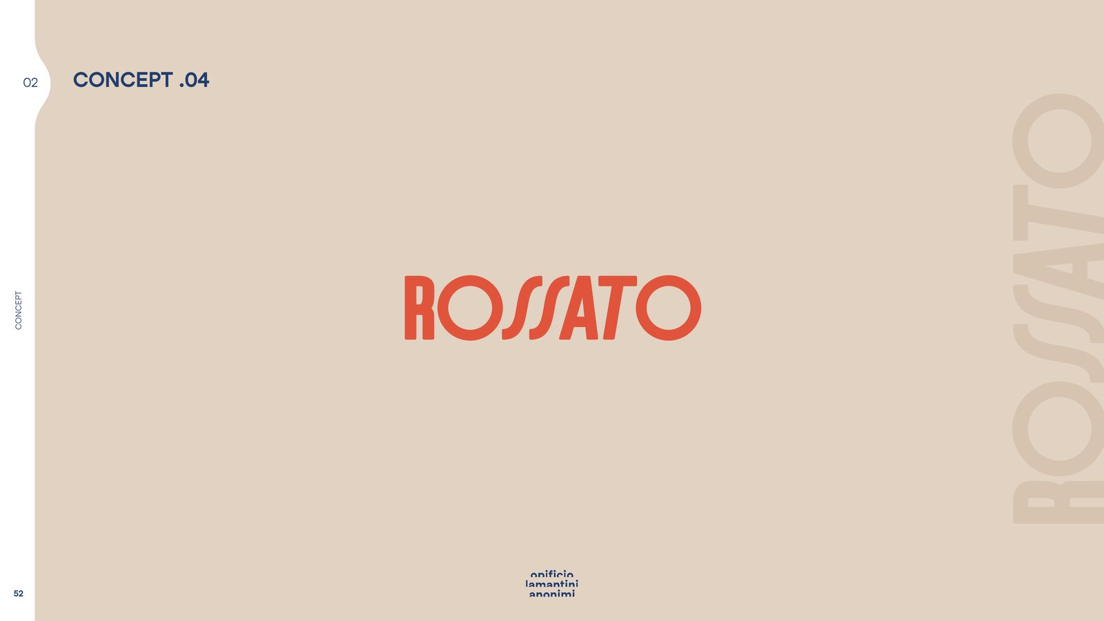
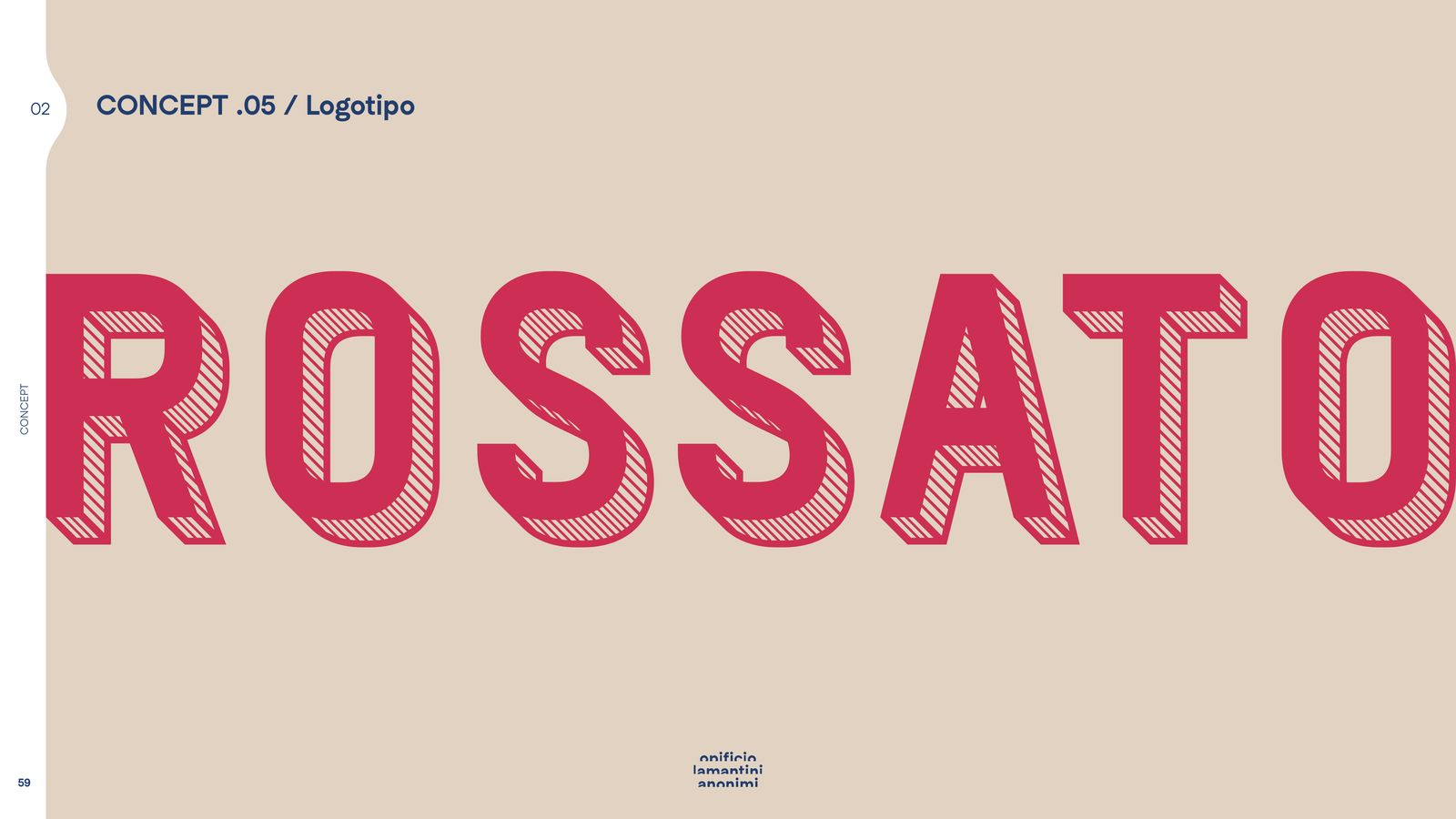
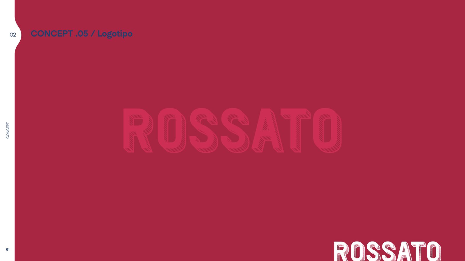
The other four take different routes: Serramenti, seriamente goes for a solid logotype; Aperti al futuro for pared-back lettering; Retro modern for a vintage feel; Tecnico con stile builds the mark like a technical drawing.
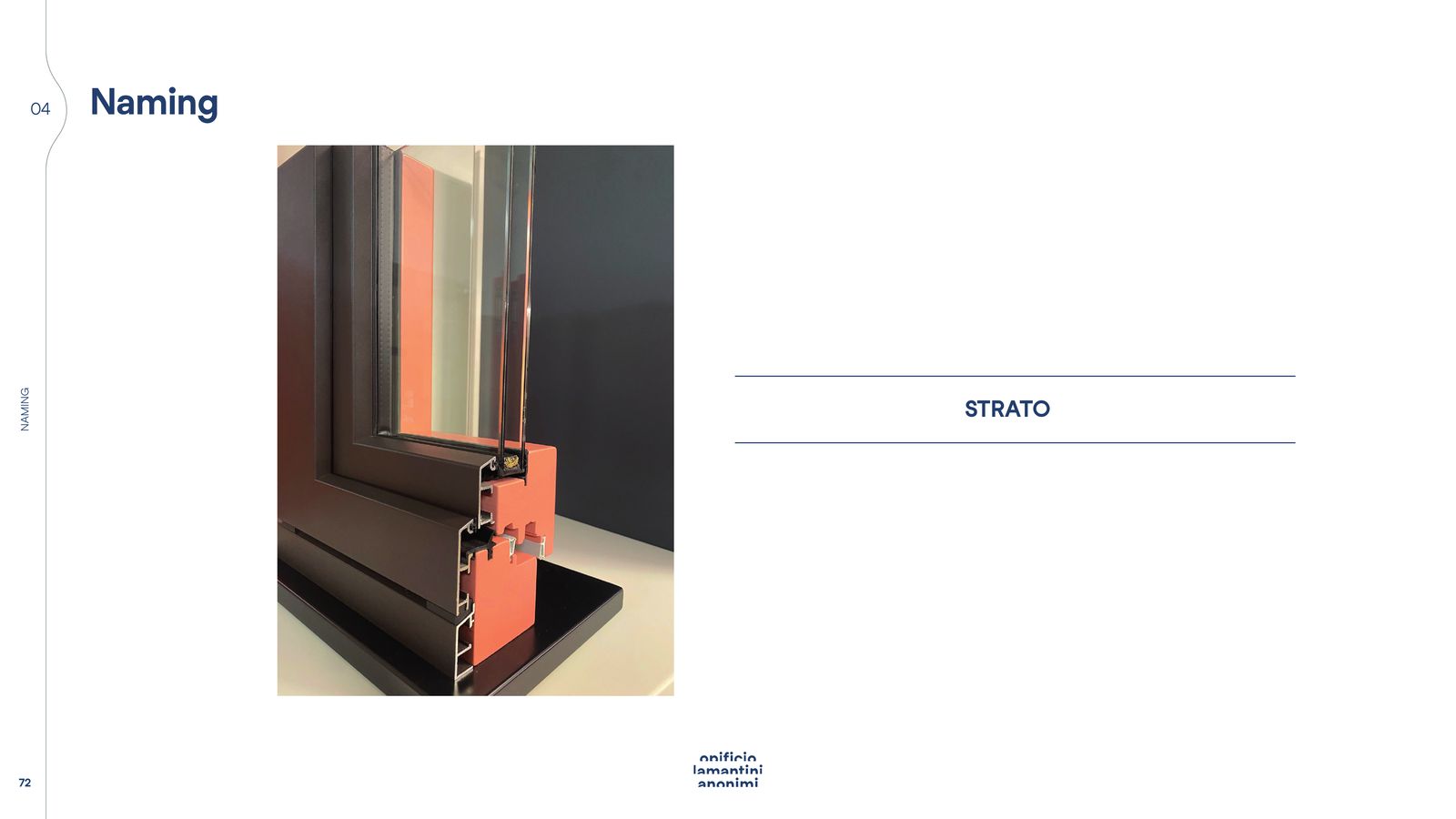
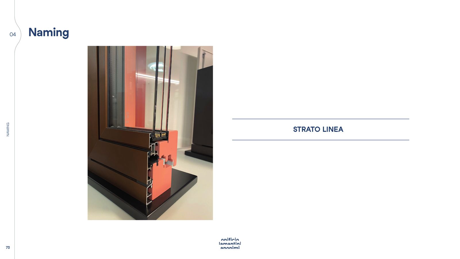
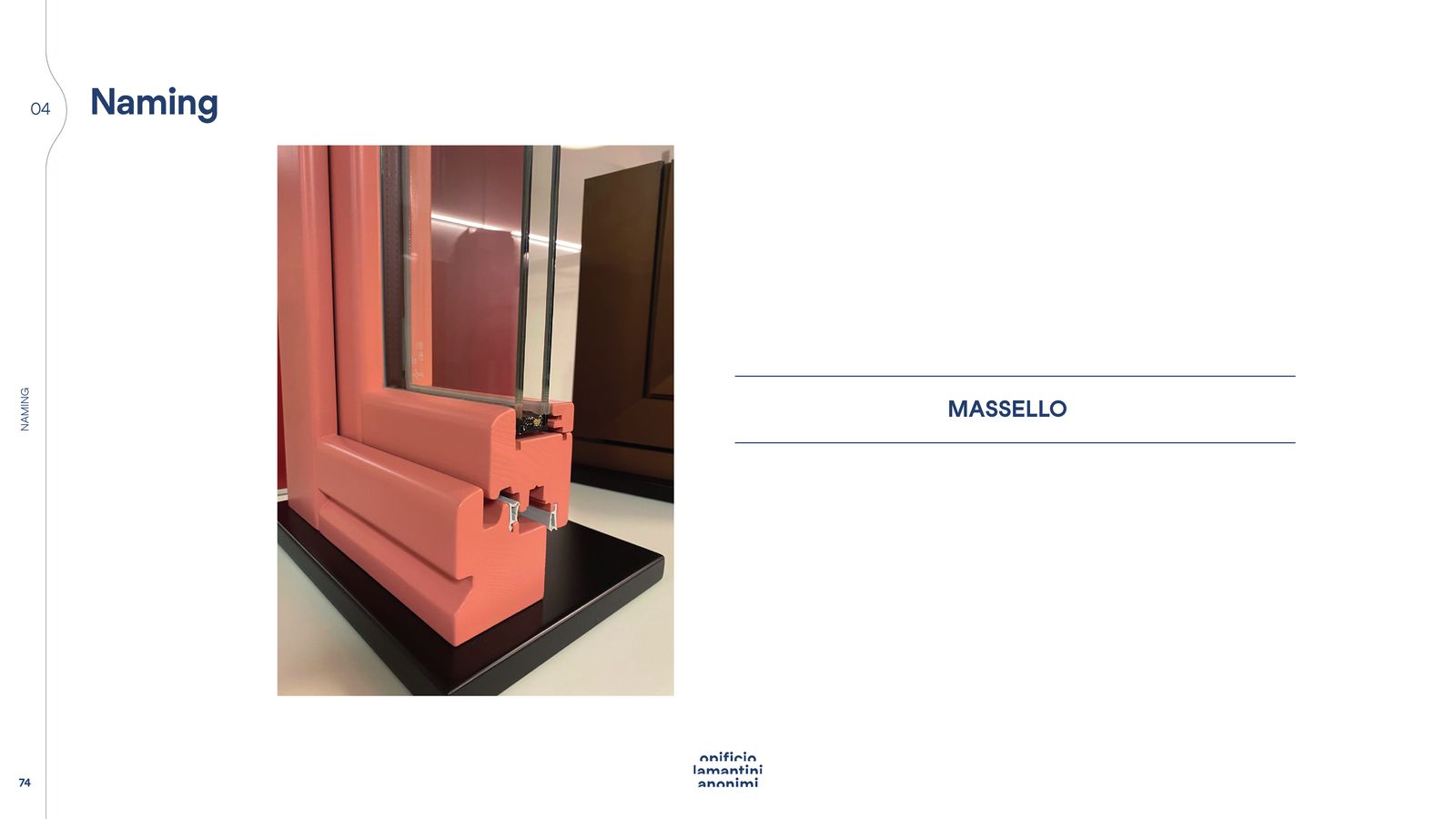
At the end, the taglines lined up and three naming proposals for a product line: Strato, Strato Linea, Massello.
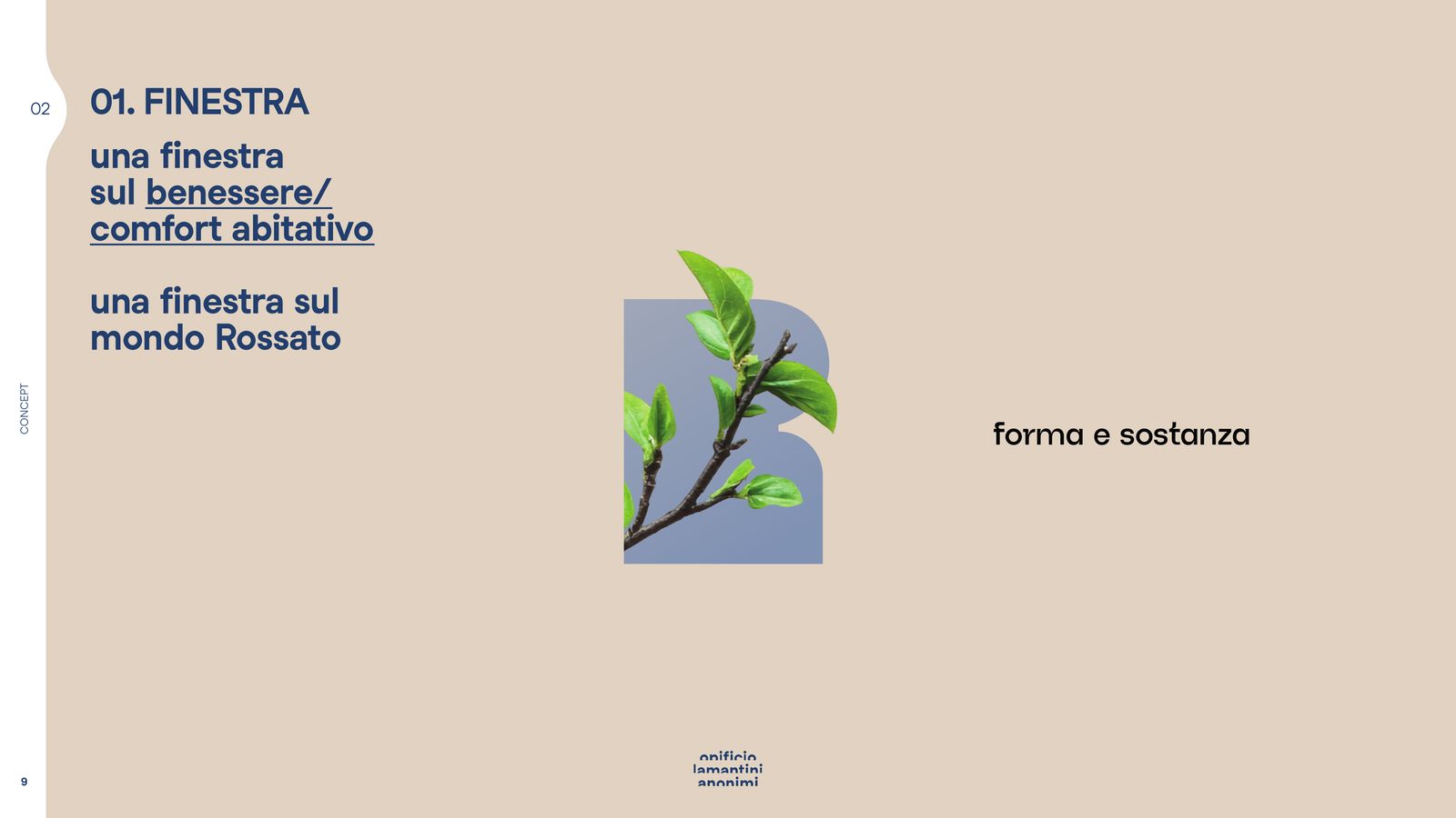
Concept .01 — A window
Monogram, shapes, colour, applications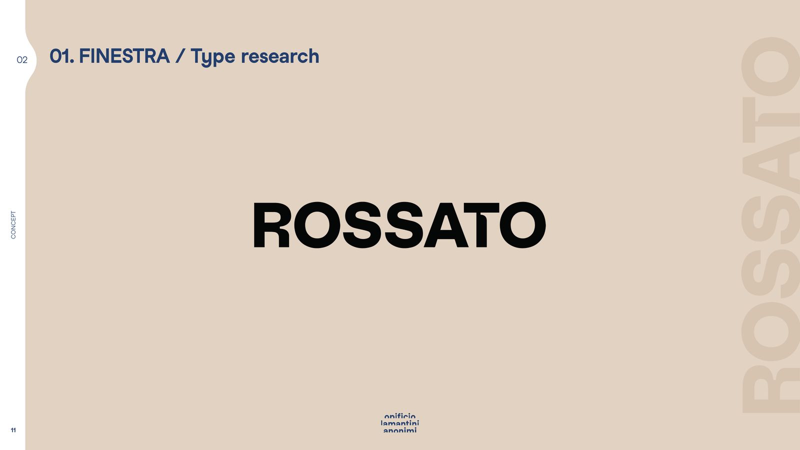
The other four routes
Serramenti seriamente · Aperti al futuro · Retro modern · Tecnico con stile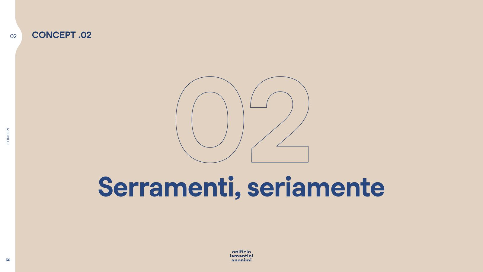
Taglines and naming
Proposals, to be chosen together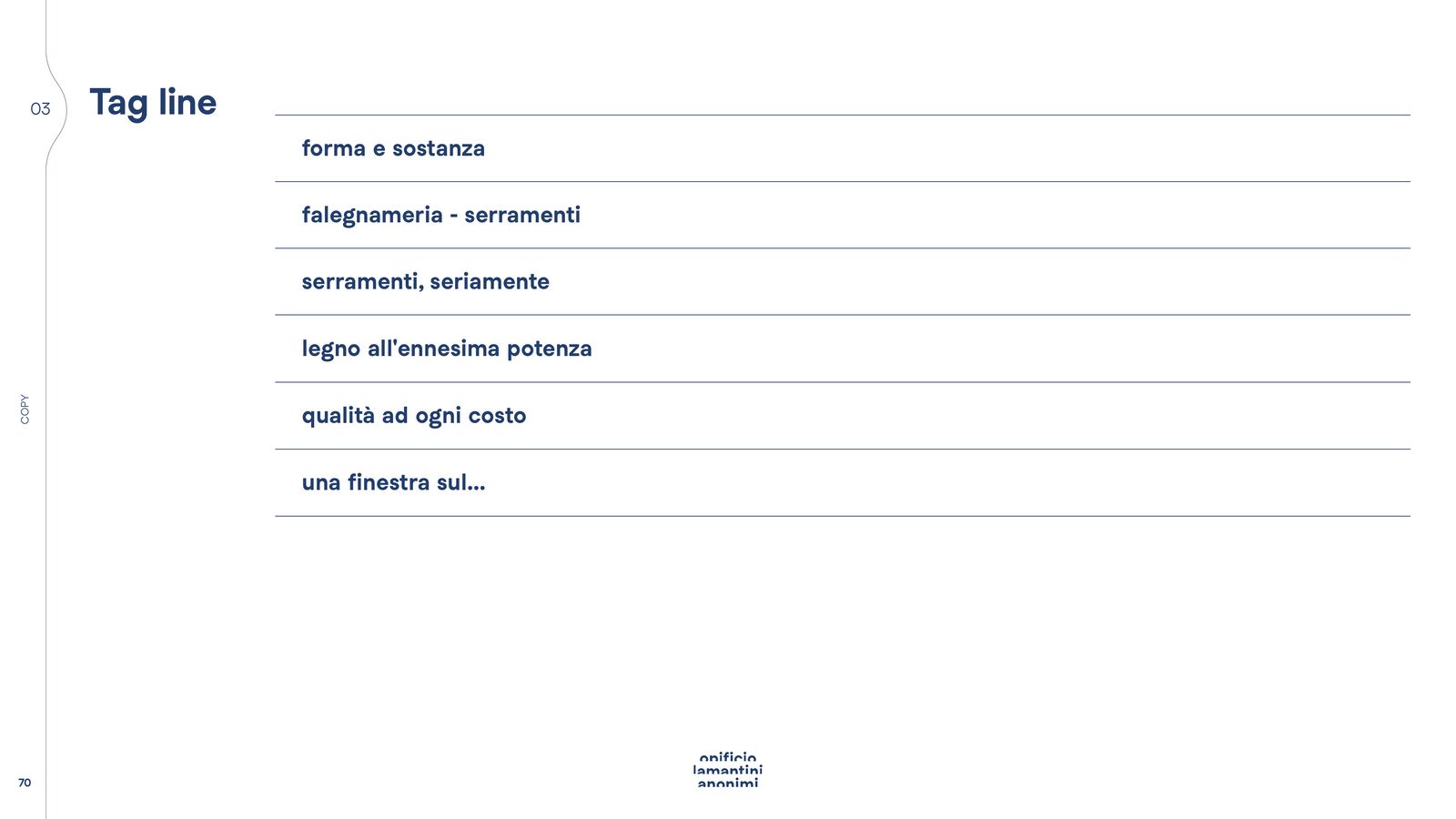
How much does a logo change when it doesn’t look like it’s changing?
Nine micro adjustments of the same logotype, side by side. That is where the last millimetre is decided.
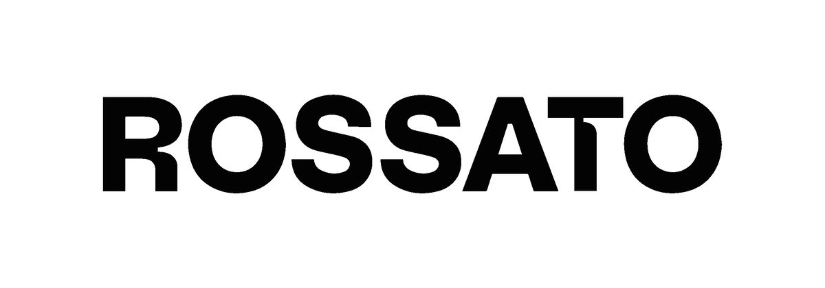
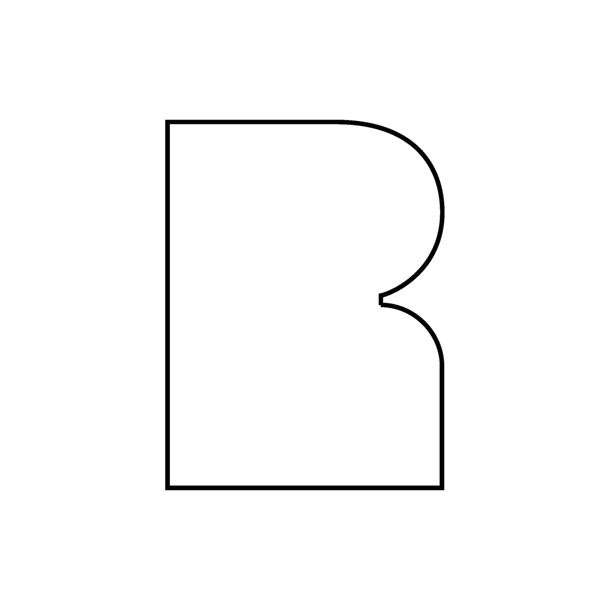
A whole presentation to look together at the smallest variants of the chosen logotype: spacing, weights, proportions. Then the versions of the mark: extended logotype, outlined R monogram, solid R monogram.
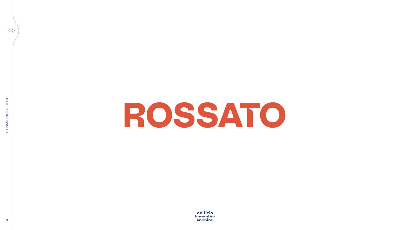
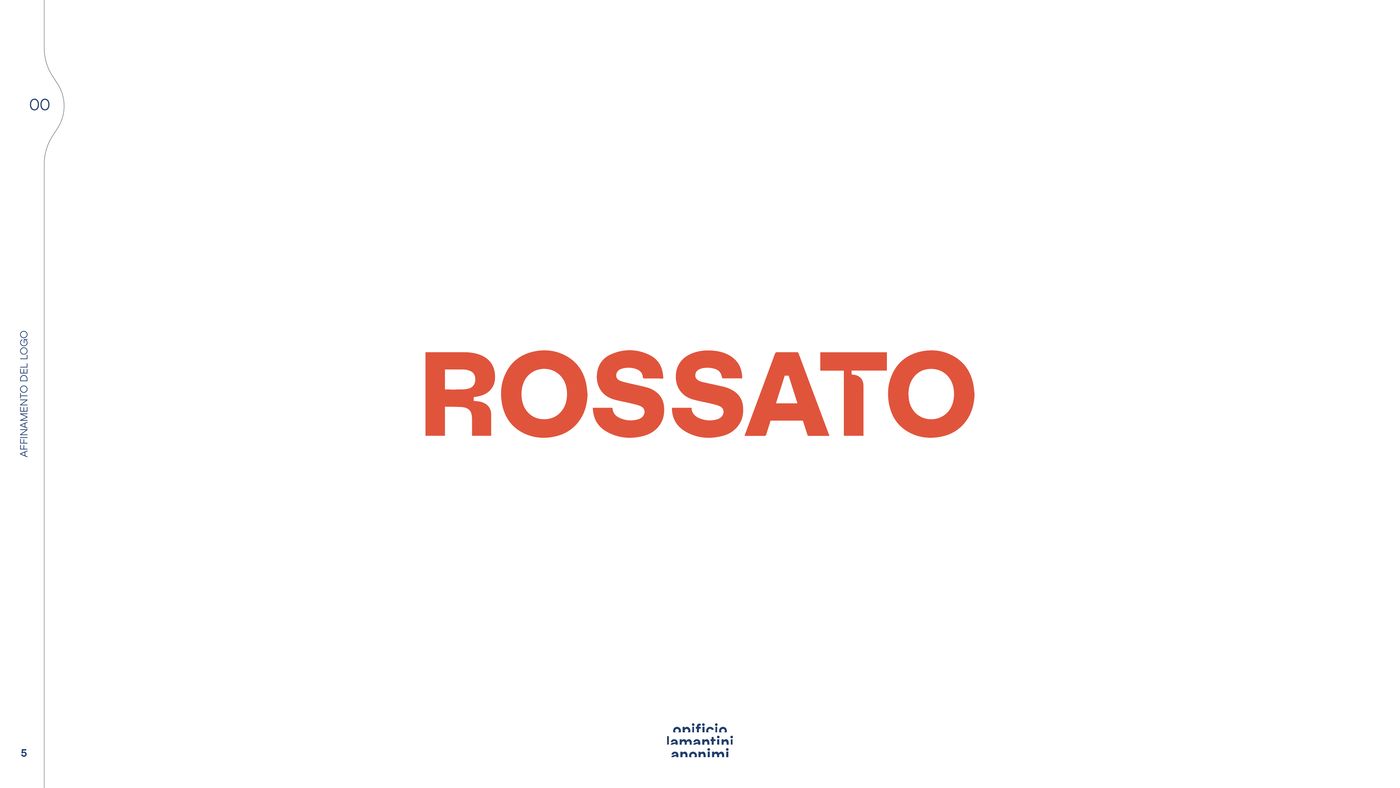
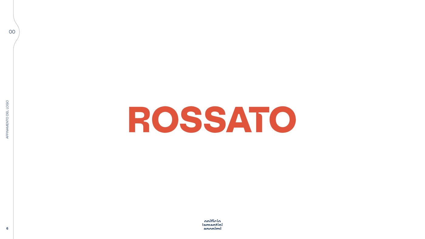
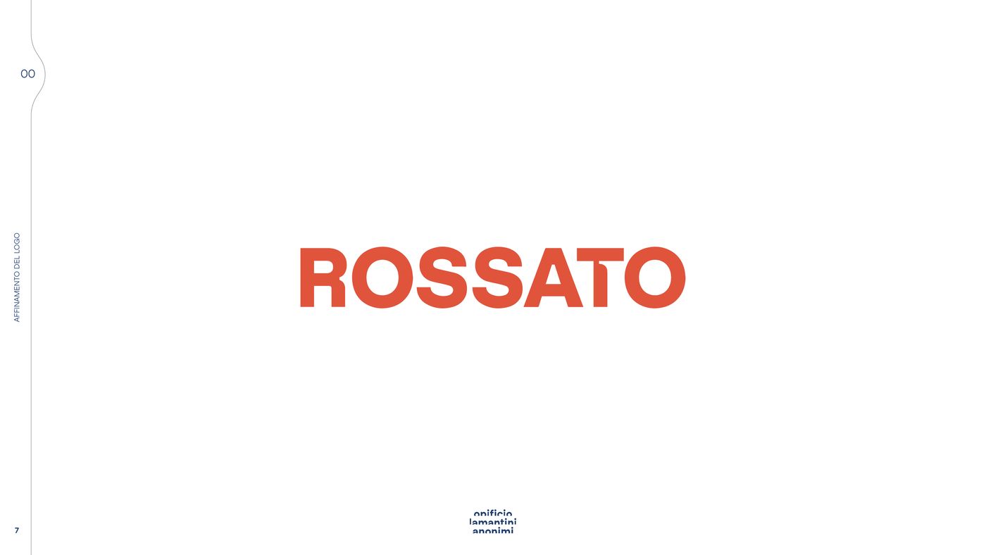
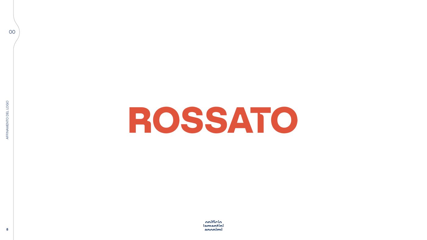
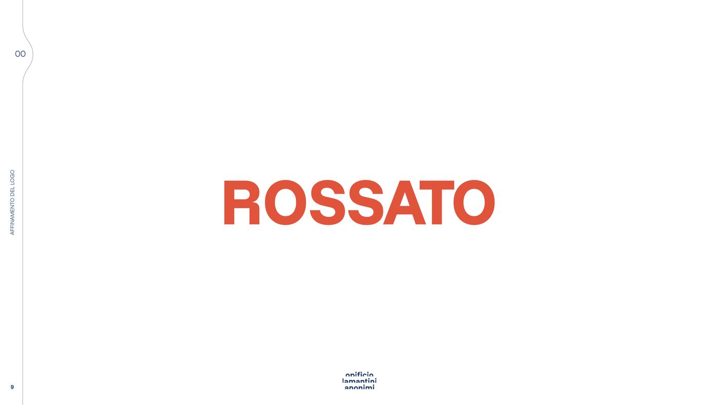
Six of the nine variants presented. You only see the difference when you put them side by side.
The versions of the mark
Logotype, outlined monogram, solid monogram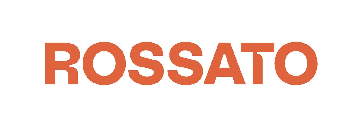



How do you get an architect inside a joinery without making them travel here?
With the making, the timbers and the steps of the service. And with an area meant only for them.
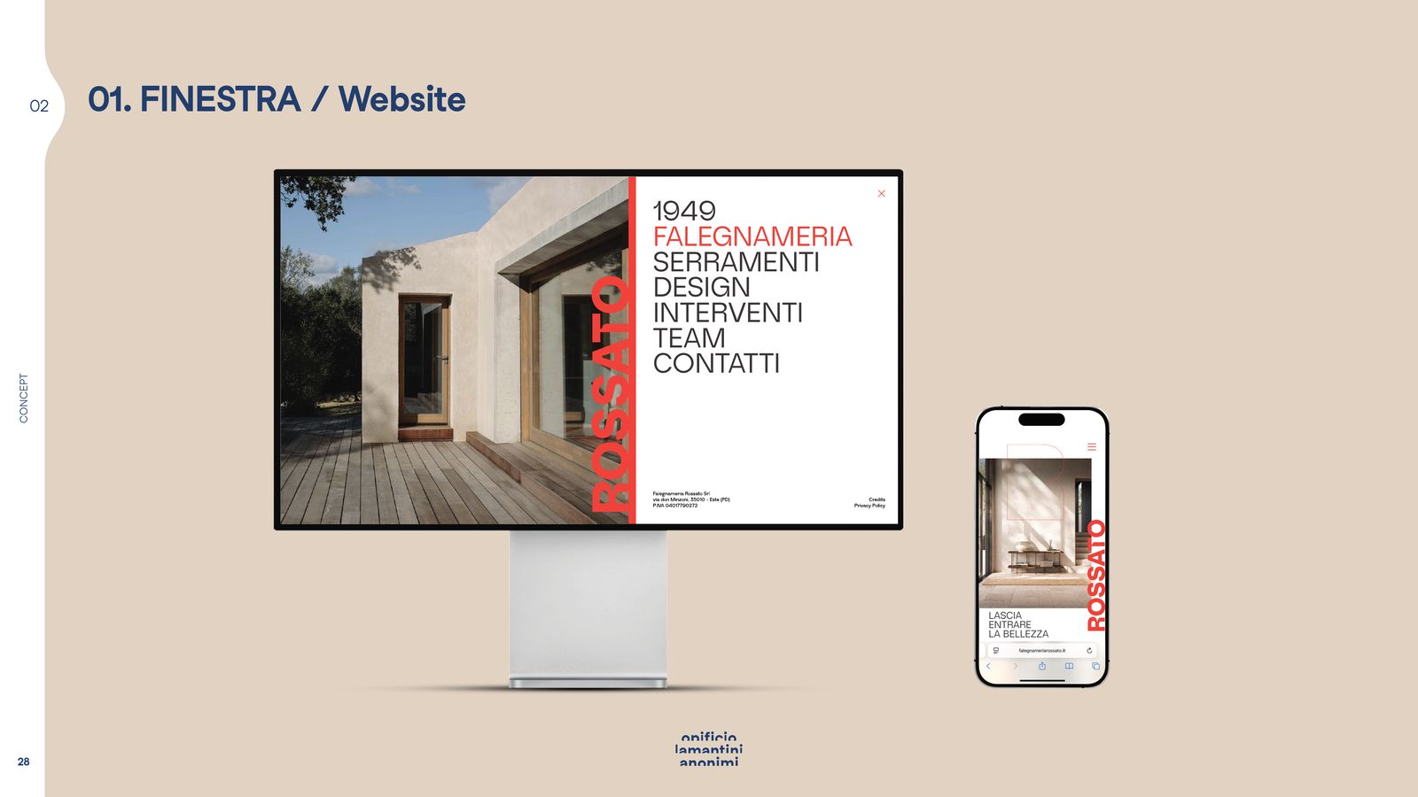
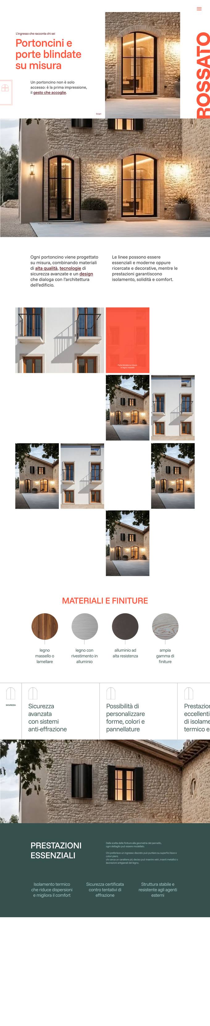
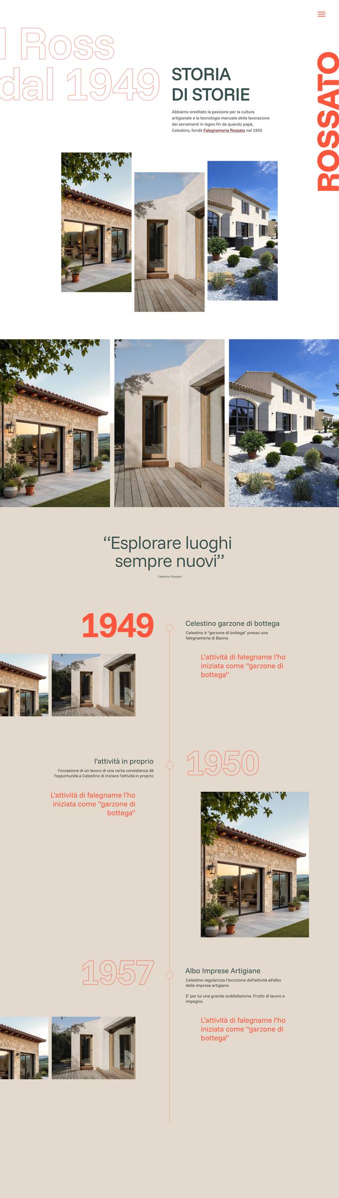
The site map follows the way the work is done: the workshop, the six families of windows and doors, bespoke furniture, the services, the timbers, the history. And a professionals’ area reserved for those who design.
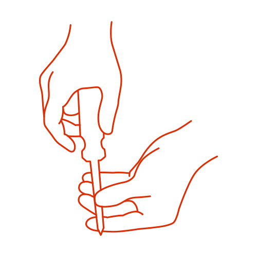
The six steps of the service — survey, design, making, installation, aftercare, satisfaction — have a set of hand-drawn illustrations: hands measuring, drawing, fitting, shaking.
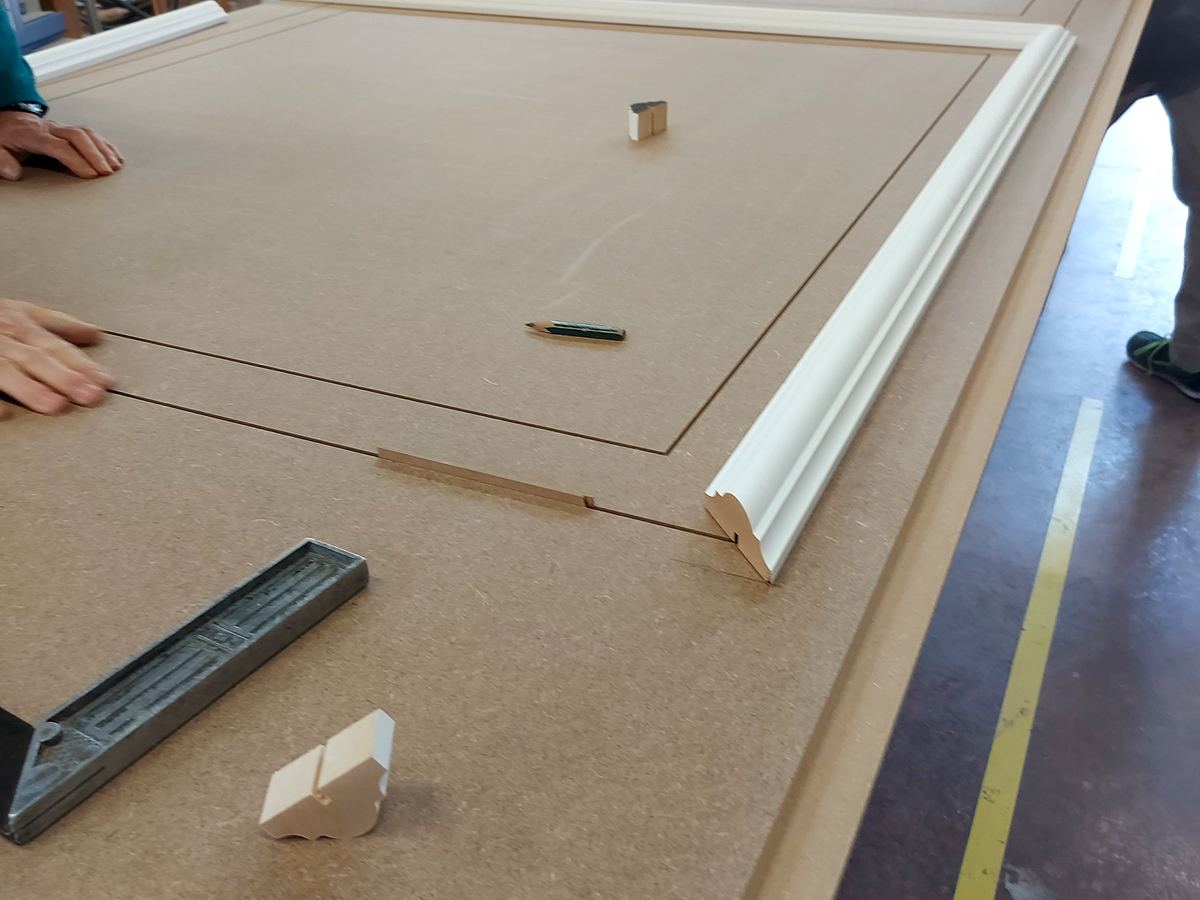
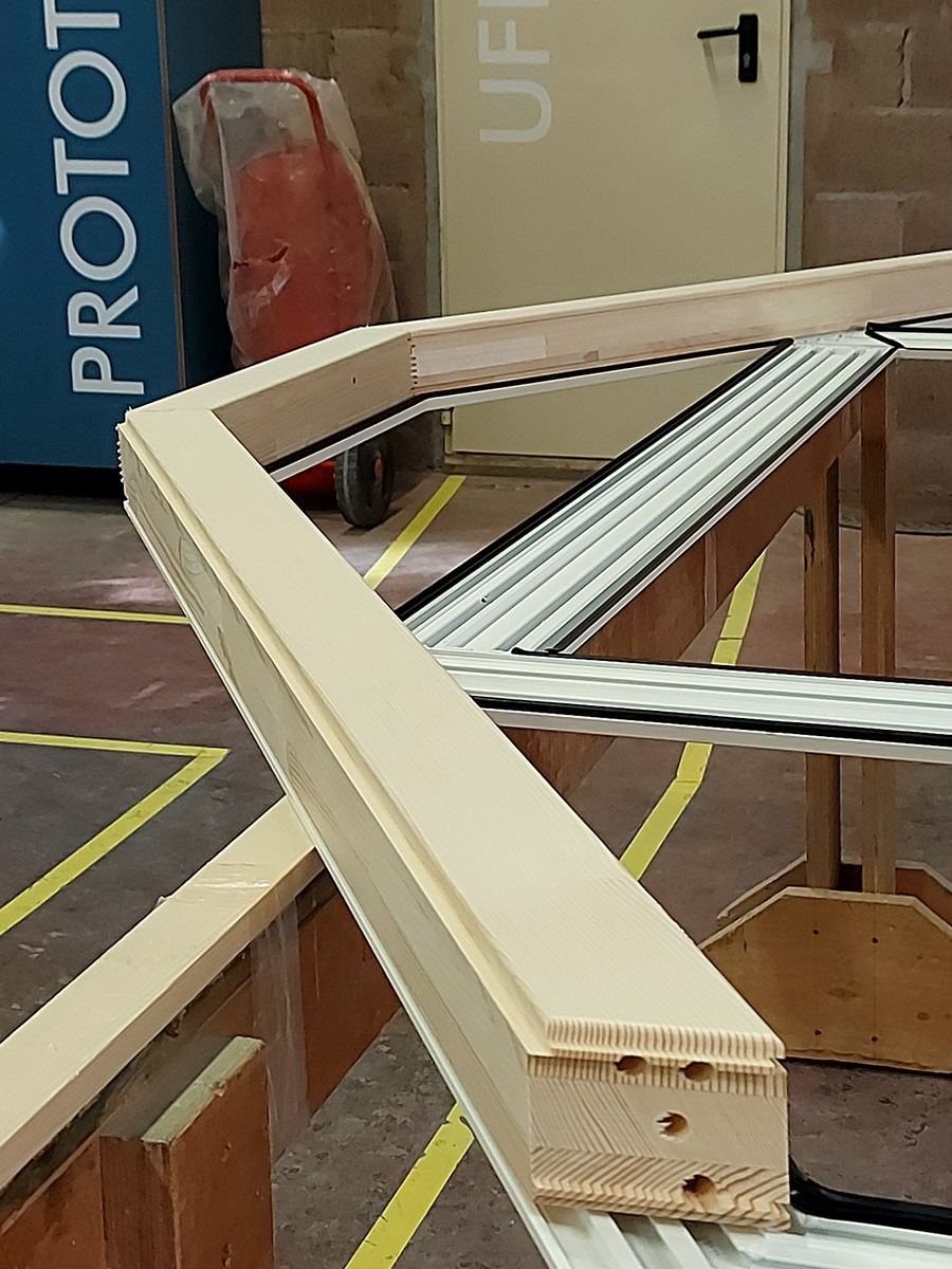
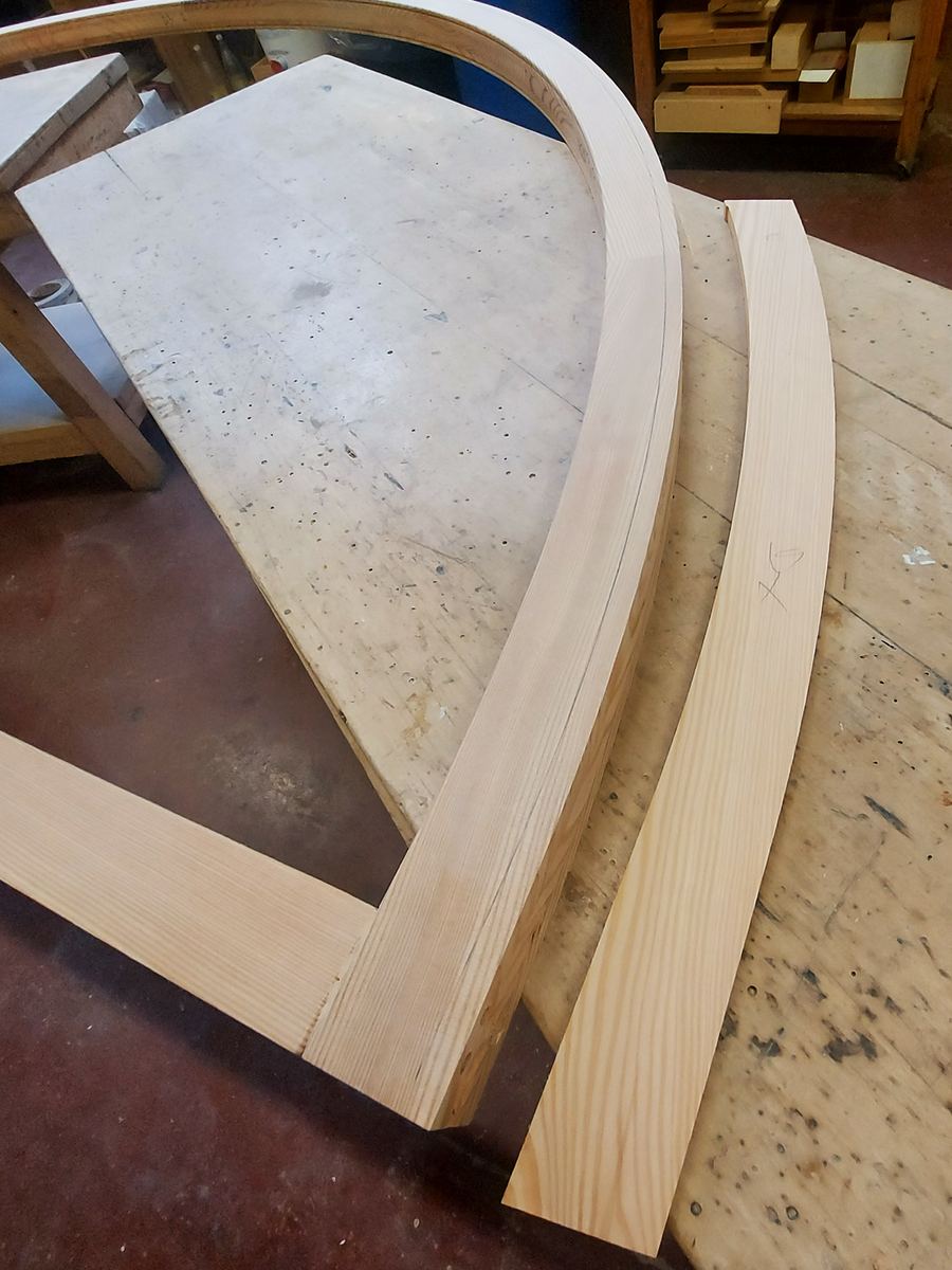
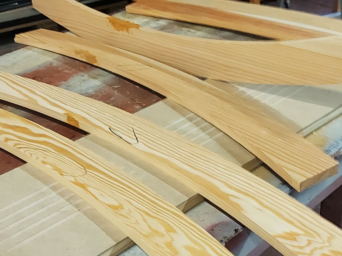
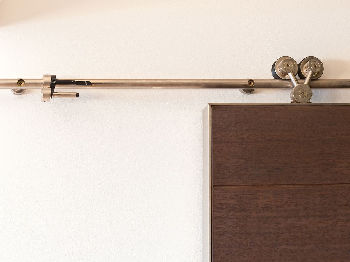
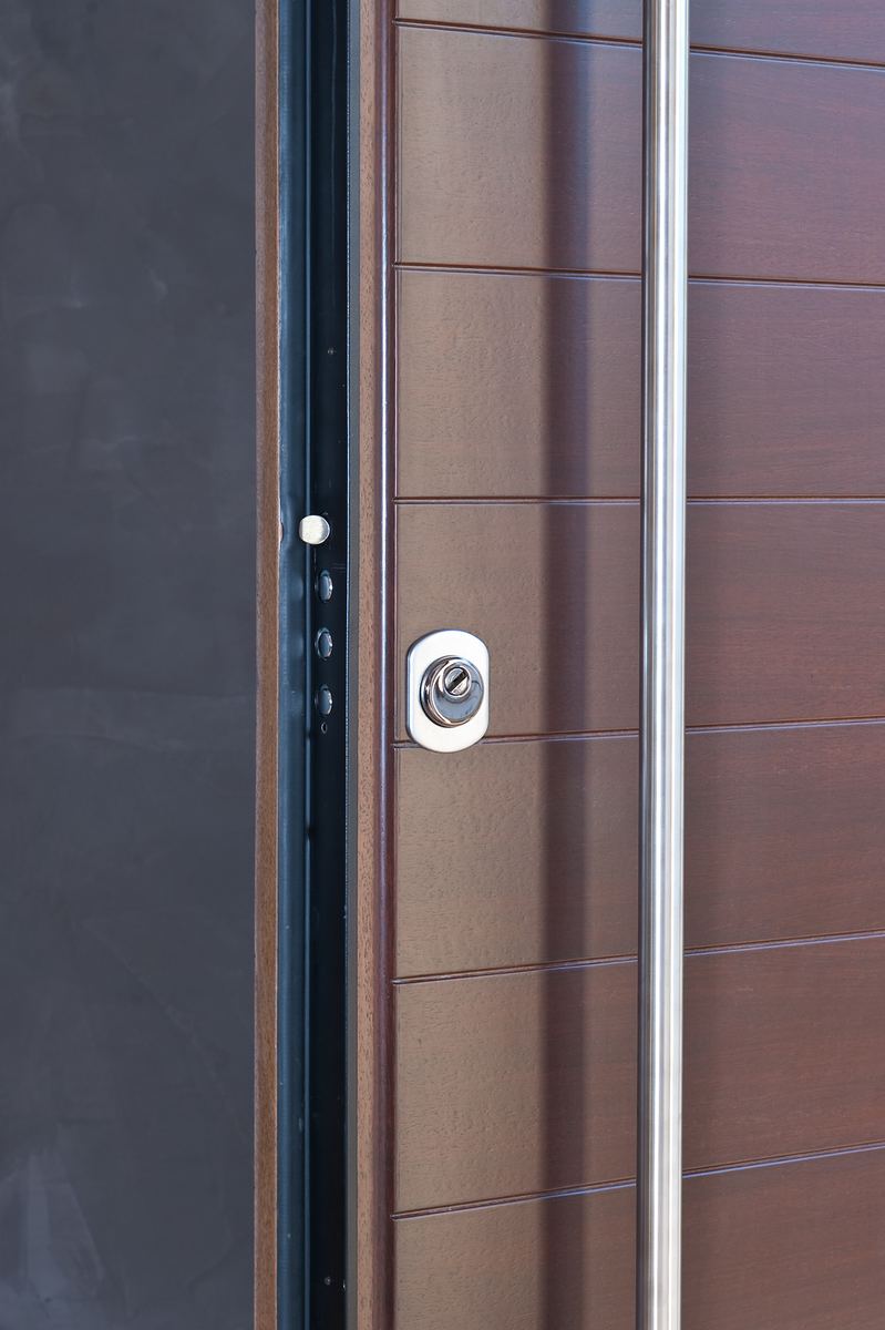
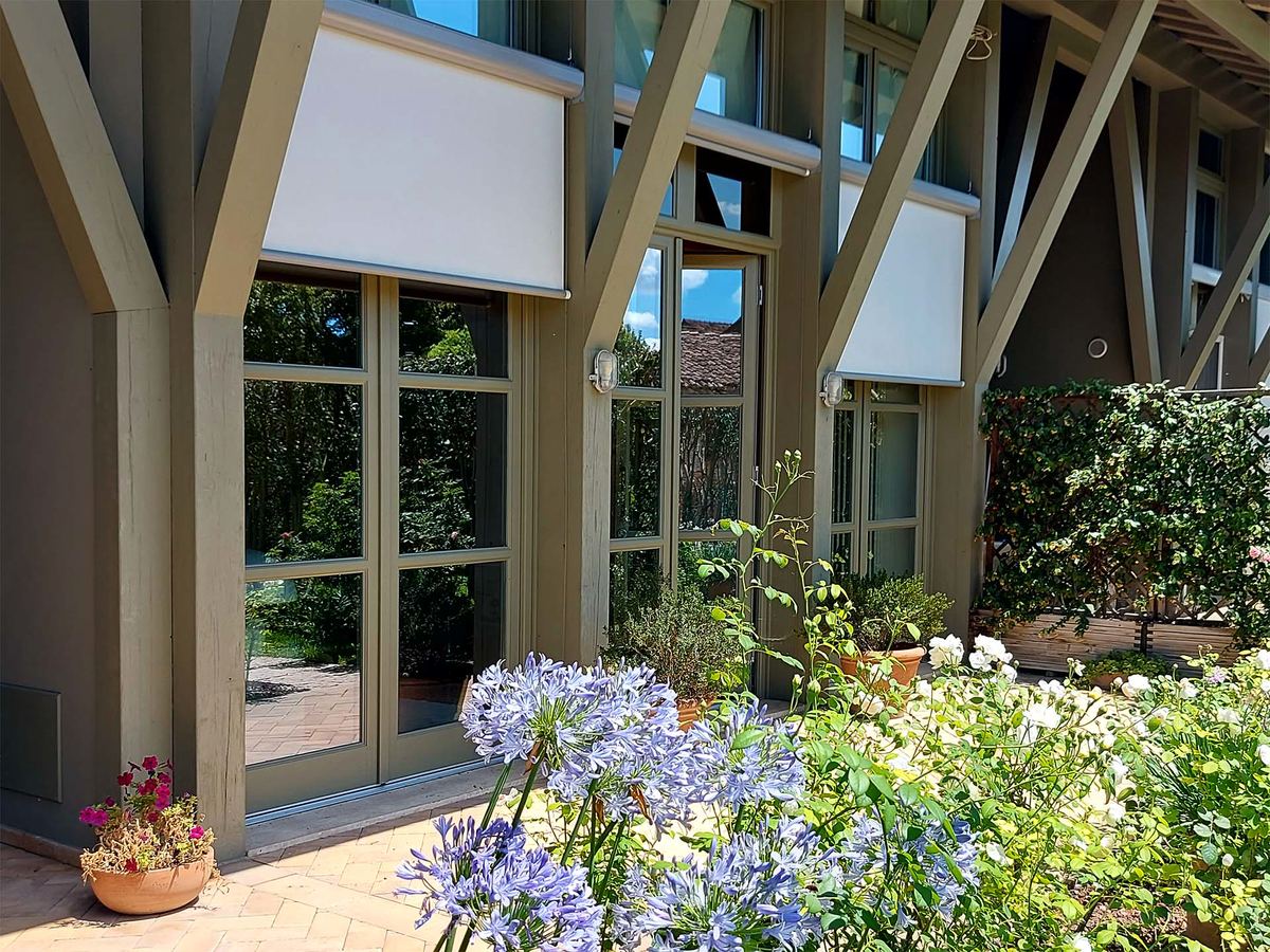
The ten timbers in the catalogue get a page of their own. And the photo selection brings into the site what you can normally only see by walking into the workshop.
The website design
Hover over a page to scroll it

The six steps of the service
A set of hand-drawn illustrations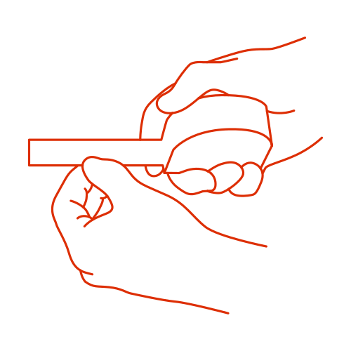




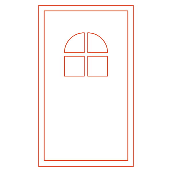
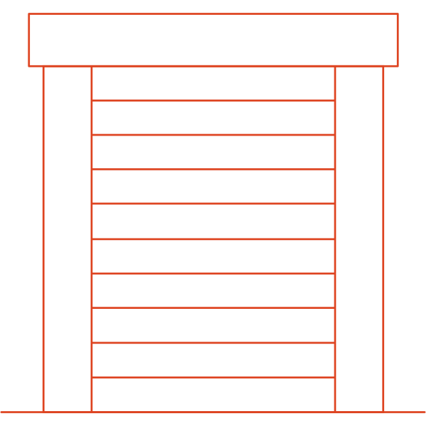
The product icons
Six families of windows and doors, plus furniture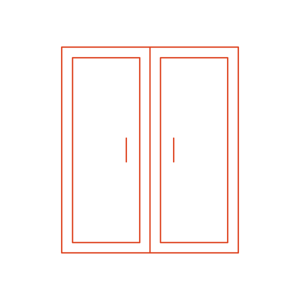




The ten timbers
From spruce to oak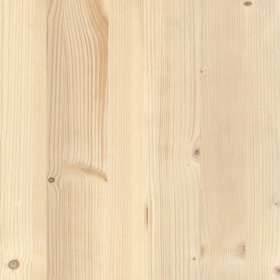
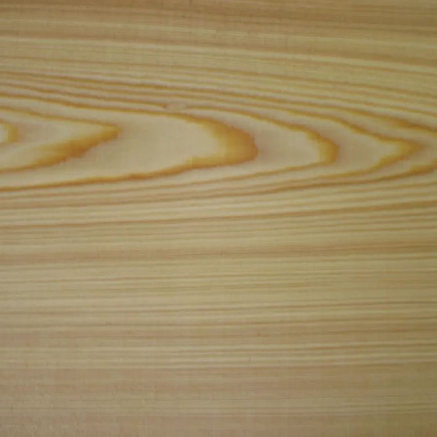
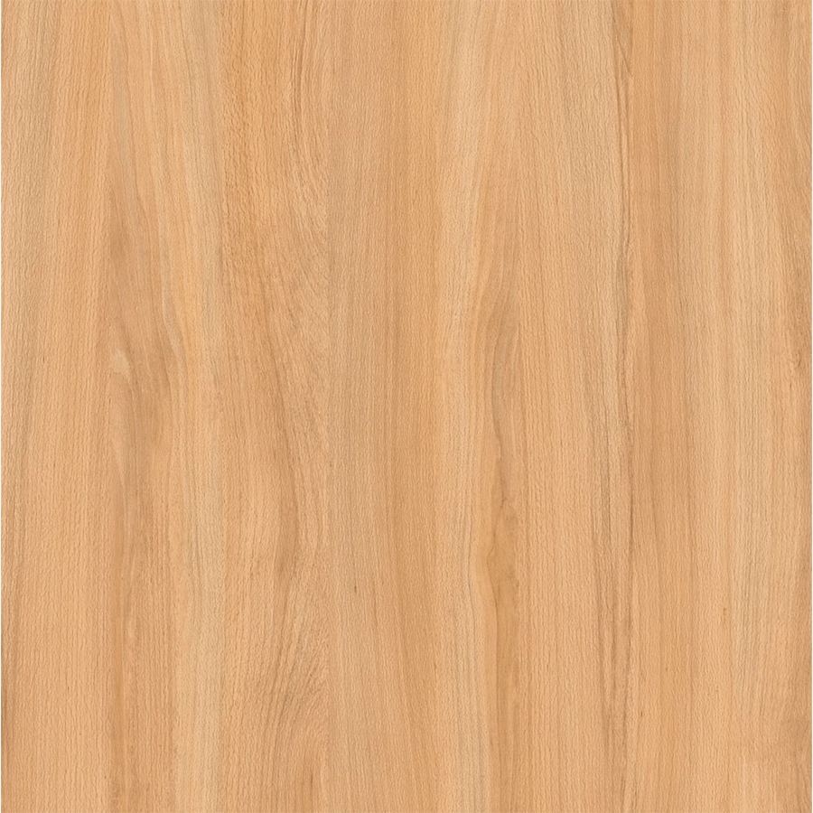
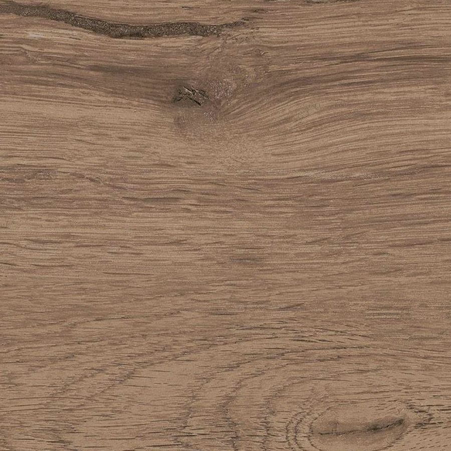
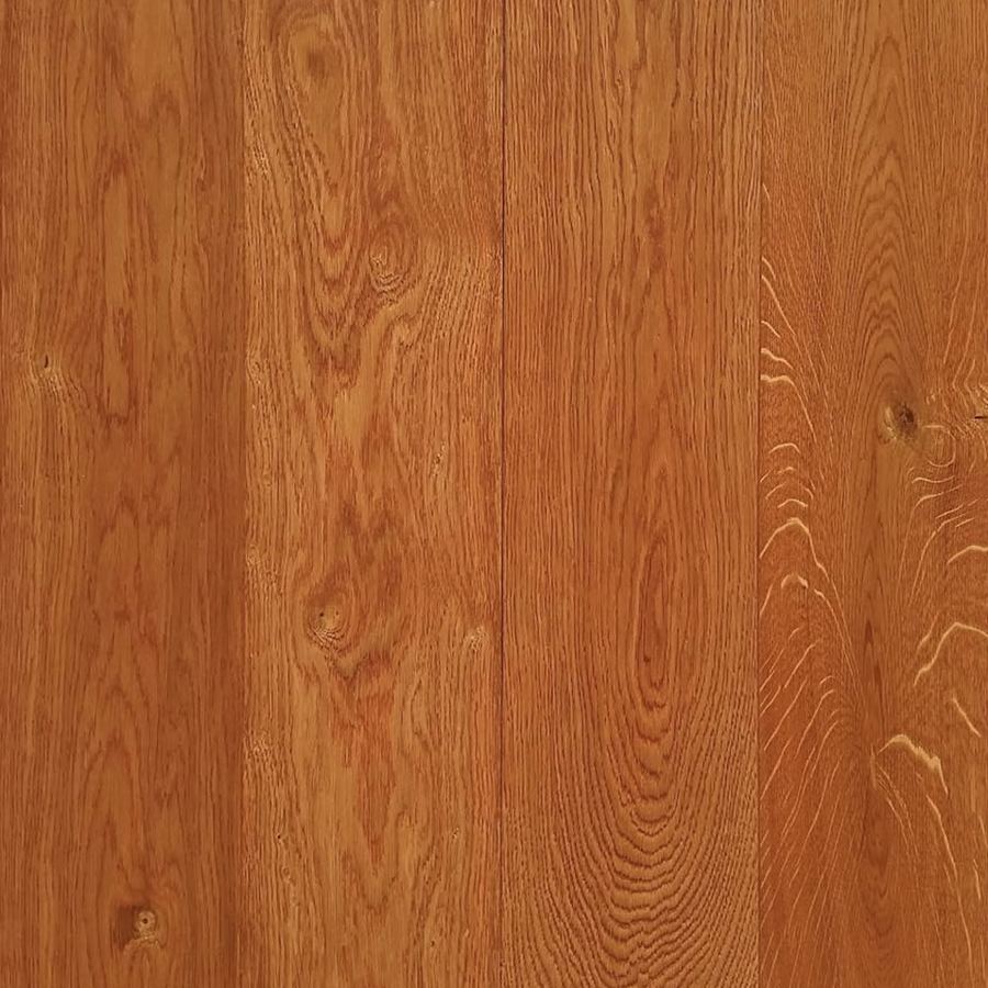

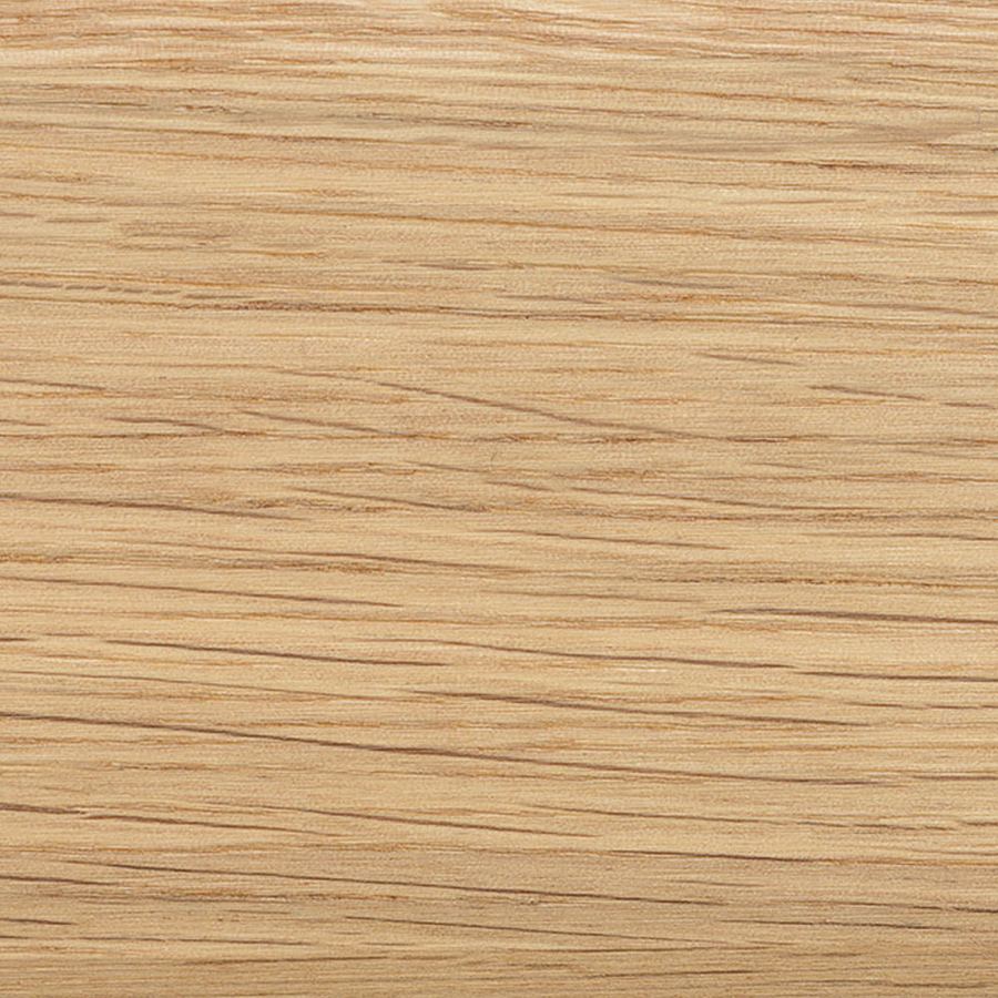
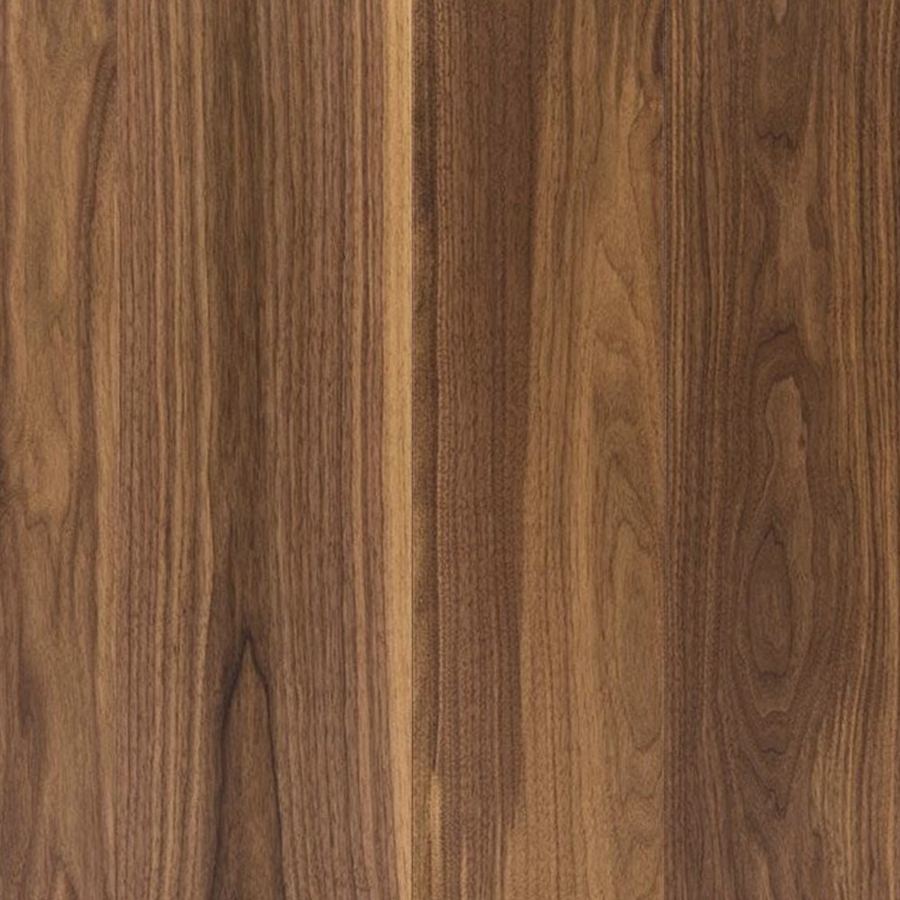

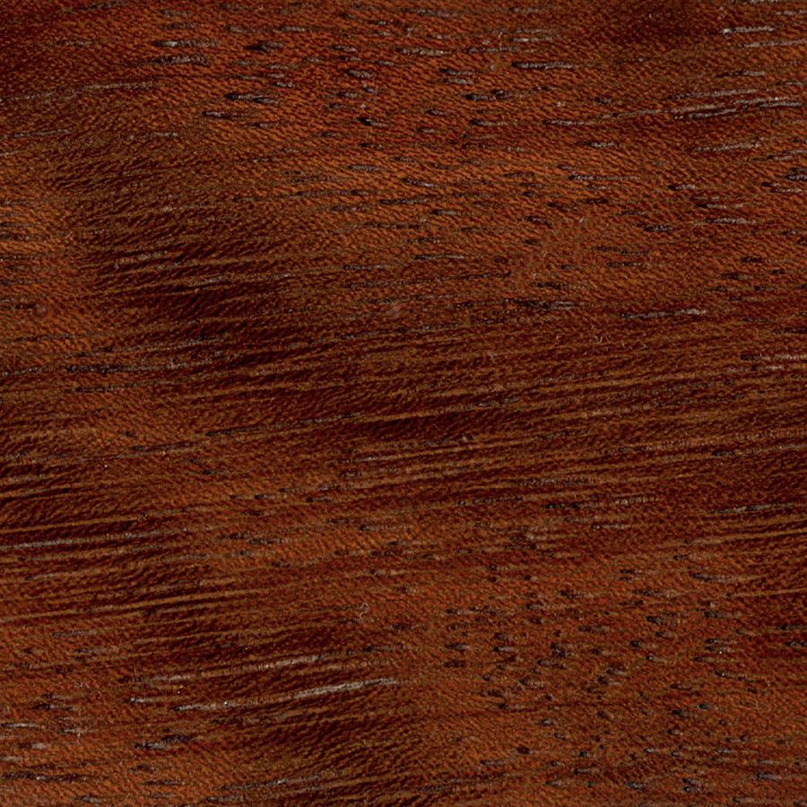
The photo selection
The workshop, the prototypes, the windows and doors · scroll →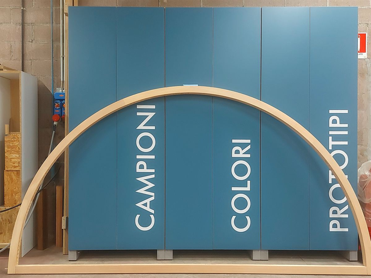
Frequently asked questions
Rossato and Opificio, in short.
What did Opificio Lamantini Anonimi do for Falegnameria Rossato?
The brand analysis, the positioning strategy, the tone of voice, five visual identity concepts, the naming of a product line, the icon design and the design of the new website.
Since when has Opificio Lamantini Anonimi worked with Falegnameria Rossato?
Since 2025. The work is still under way.
What positioning was chosen for Falegnameria Rossato?
The trusted craftsman: a partner for architects and designers that brings together hands-on craft, design and support at every stage of the job.
Why did Falegnameria Rossato want to speak to architects?
Because designers directly influence the choice of supplier and, if they are happy, can become ambassadors for the brand.
What is perceptioning?
It is the method Opificio Lamantini Anonimi uses to identify the underlying perceptions a brand is recognised by, and to keep them constant over time.