

Alfasystem: a brand for the people who move the stage
Logo, website, corporate identity, stand and video for a company in Este that has been designing stage machinery since 1987. A mark built with the same rules as its machines.
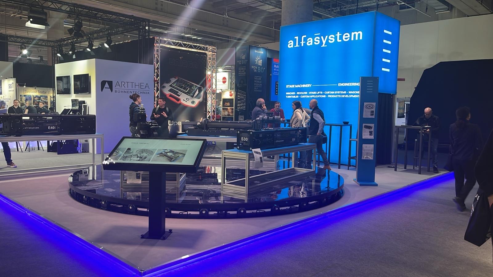
In short
Alfasystem (Alfa System S.a.s.) is a family-run company in Este, near Padua in Italy, founded in 1987, which designs and builds stage machinery for theatres, sets and events. Between 2023 and 2026 Opificio Lamantini Anonimi redesigned its logo and handled the brand book, corporate identity, website, trade fair stand and videos.
Project facts
- Client
- Alfa System S.a.s. — Alfasystem
- Sector
- Stage machinery for theatres, sets and events
- Location
- Este (Padua, Italy)
- Period
- 2023 – ongoing
- Services
- Analysis and rebranding, brand book, corporate identity, website architecture, trade fair stand, video
- Website
- stagesystem.it
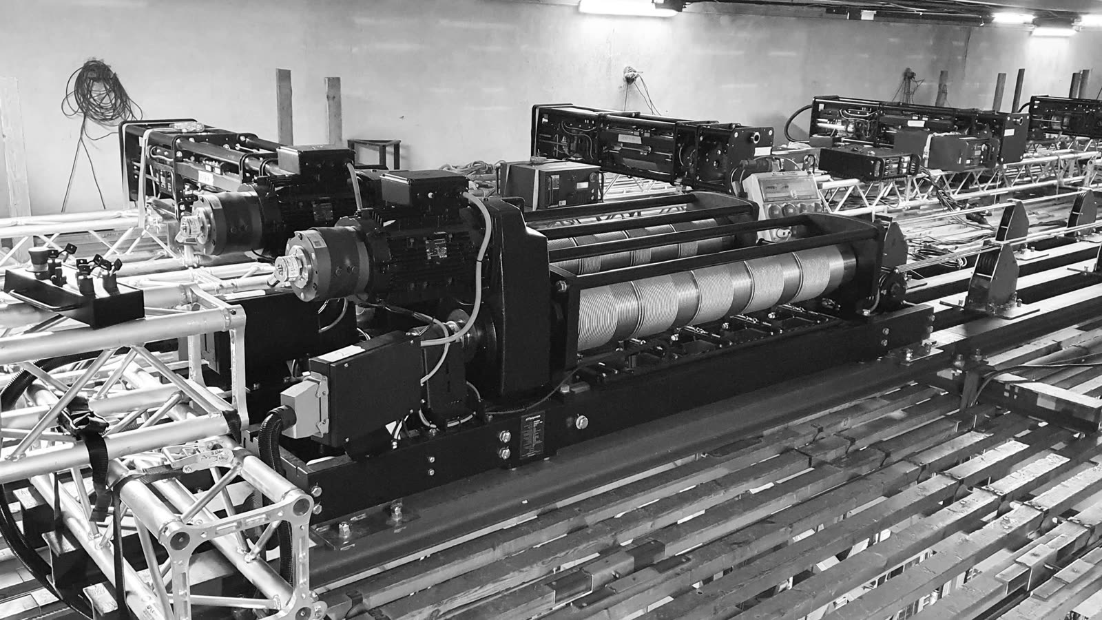
When a stage opens, rises or turns, there is a winch behind it. Alfasystem has been building them since 1987, in Este, for theatres and productions in Italy and abroad. Its trade is not being noticed. Its logo, though, had fallen behind even for the people who were supposed to notice it.
The starting point
Where was Alfasystem starting from?
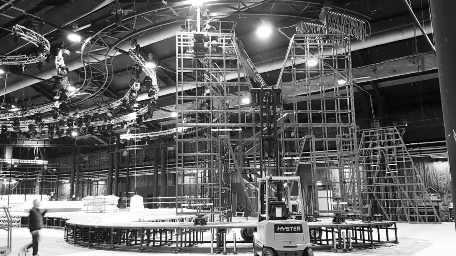
A family-run company that since 1987 has built winches, revolves, wagons and platforms for theatres and sets, in Italy and abroad. Highly specialised clients, used to comparing stage machinery with audio and lighting, where engineering and design move faster.
The channels, in 2023
From the presentation of 16 June 2023- 01Website and Google
- 02LinkedIn, Instagram, Facebook
- 03Trade fairs
- 04Word of mouth
- 05Online and offline advertising
It is important to have a logo that works in different orientations, with an element that can be pulled out and recognised on its own.From our presentation to Alfasystem, 16 June 2023
How do you renew a logo without throwing away what the company already is?
First you look at what is there, then at the market, then you choose what is worth keeping.
The brief arrived on two tracks: a dedicated brand for the rental line, and a more cautious renewal of the historic brand, the one behind permanent installations in theatres.
We looked at the existing material, mapped the competitors in both worlds and wrote down what nobody had written down yet: the values, the tone of voice, the imagery.
Two worlds, one company
From the presentation of 16 June 2023Products for hire, in front of an audience that compares stage machinery with audio and lighting, where engineering and design standards are higher.
Made-to-measure machines for theatres, where what counts is the right solution for that particular stage, technically and financially.
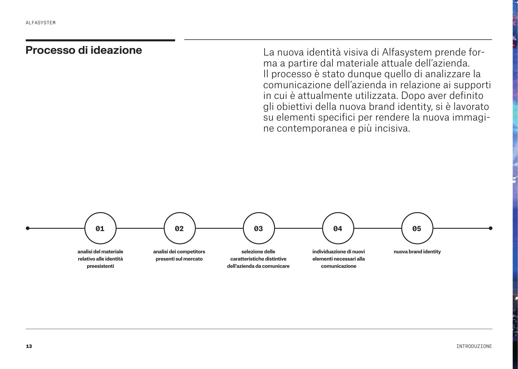
The process, in five steps
As it is written in the brand book- 01Analysis of the existing identity material
- 02Analysis of competitors on the market
- 03Selection of the distinctive features to communicate
- 04Identification of the new elements needed
- 05New brand identity
The tone of voice
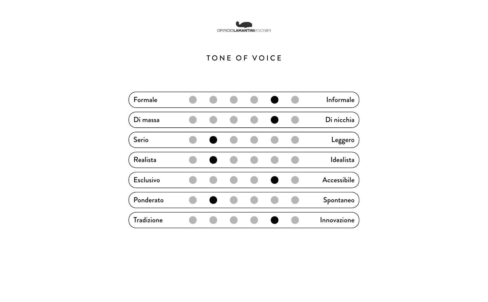
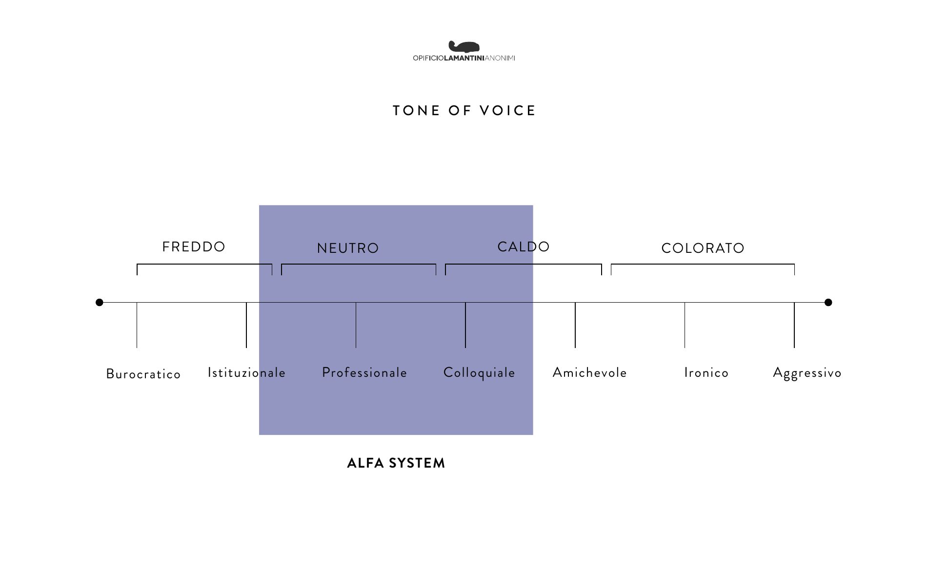
Where Alfasystem sits, between cold and colourfulProfessional, dynamic, tenacious, evocative but solid, contemporary and forward-looking.
The values, written down
From the brand bookFlexibility
Experience
Expertise
Reliability
Safety
Innovation
Quality
The analysis slides
June – October 2023 · scroll →
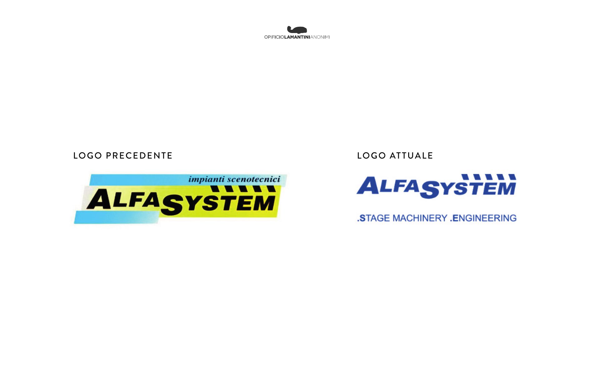
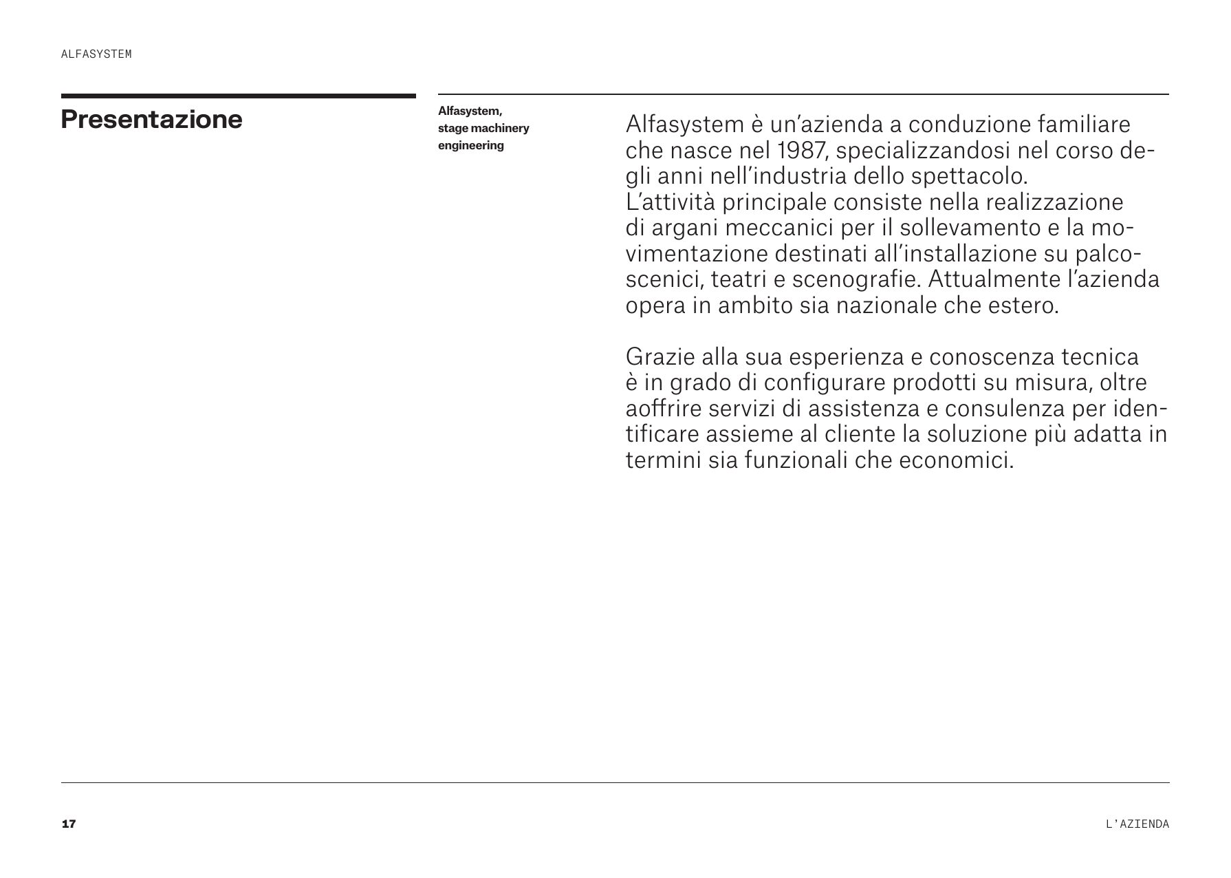
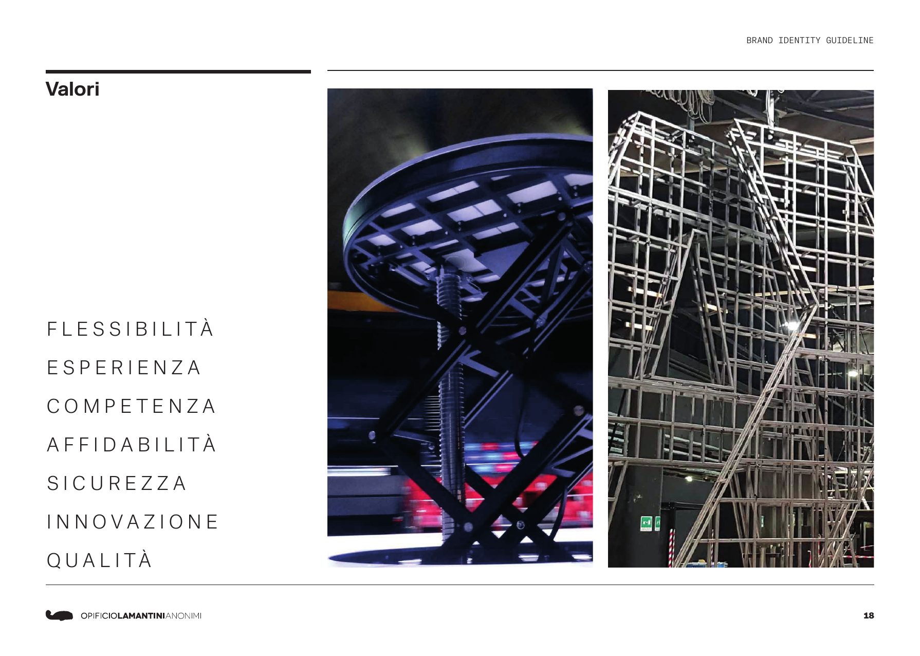
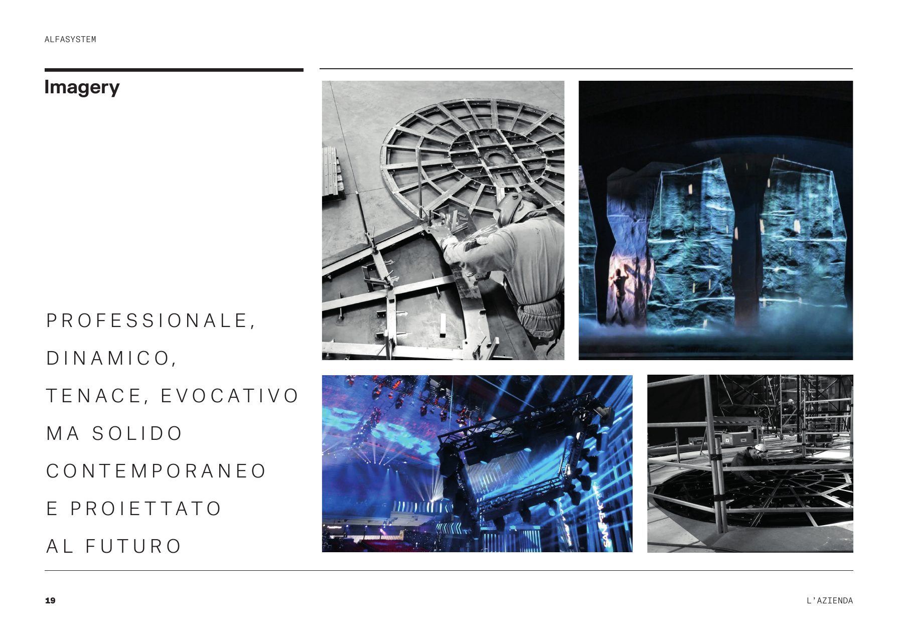
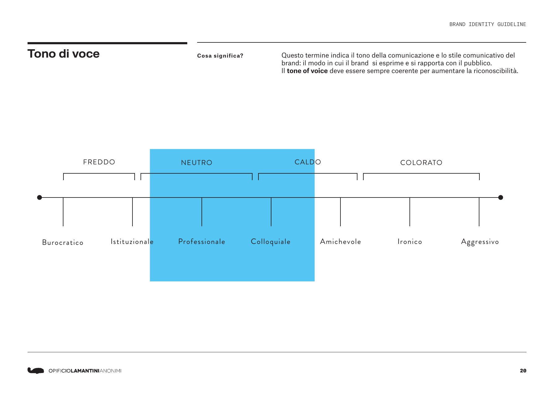
The same things later went into the opening pages of the brand book.
How do you design a logo using the rules of a machine?
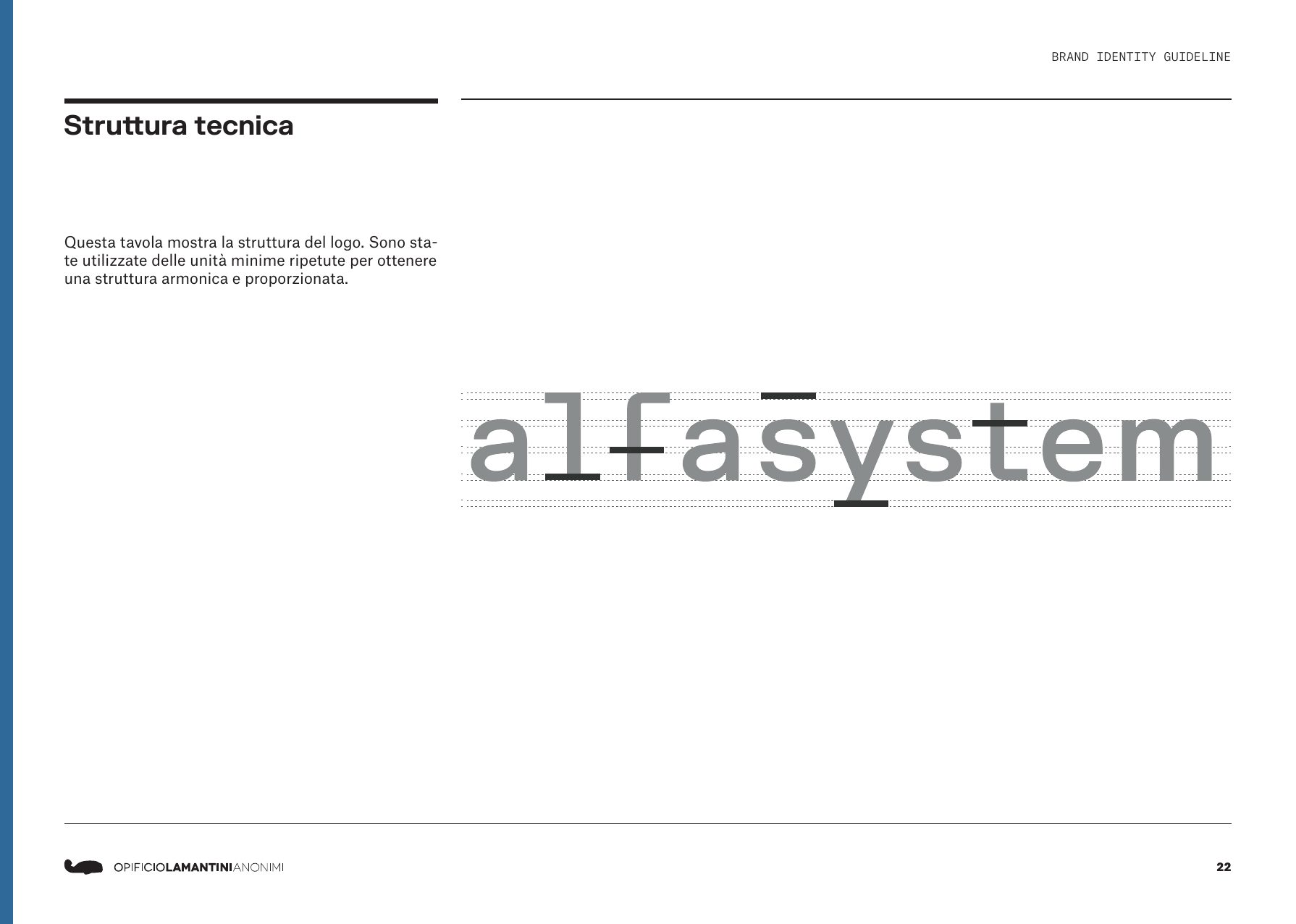
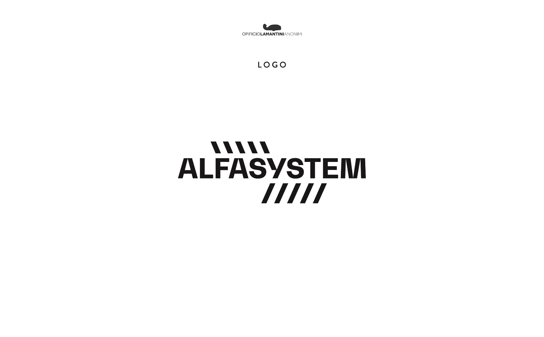
Repeated minimal units. The same logic used to build a winch, applied to a logotype.
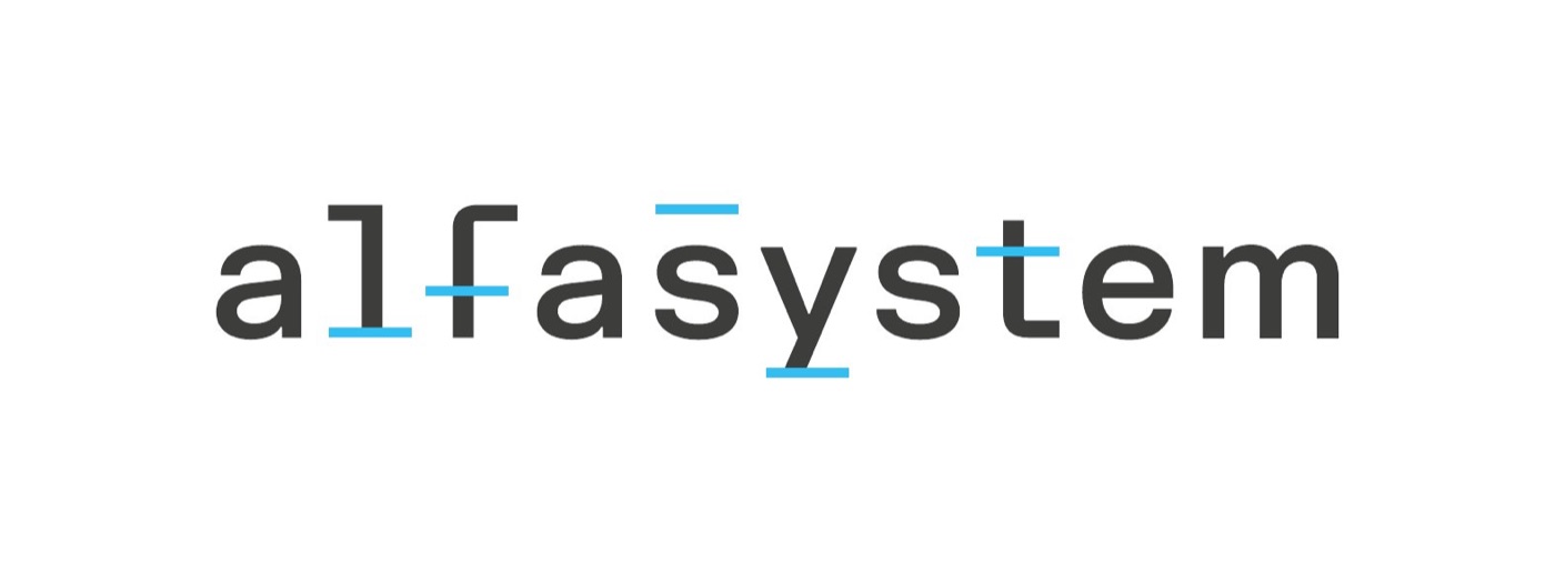
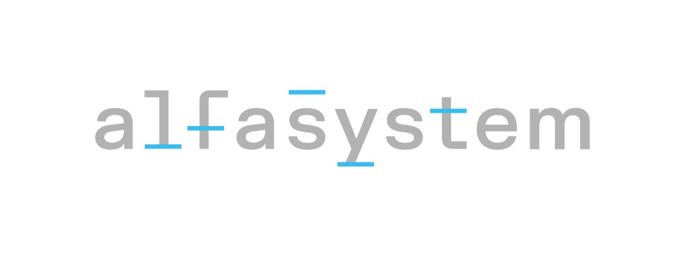
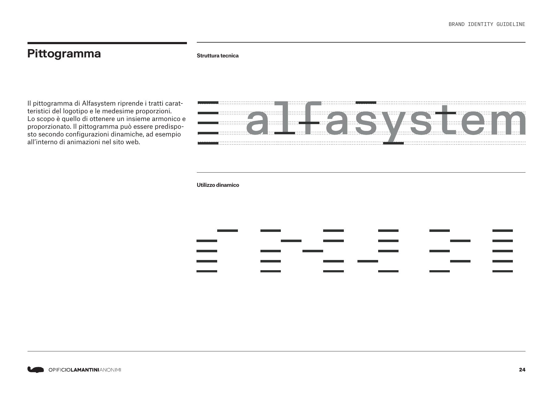
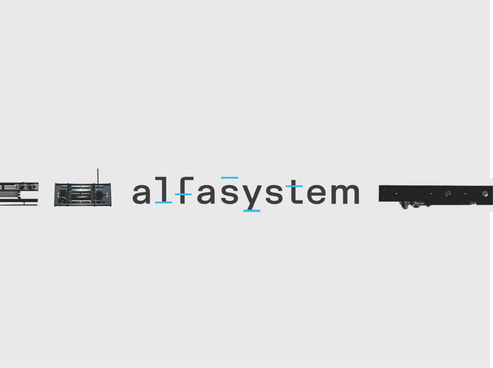
The alfasystem logotype is built from repeated minimal units, for a balanced structure. Inside it there are five marks: the moving planes of a stage set, and at the same time the notches that show volume levels on a mixer.
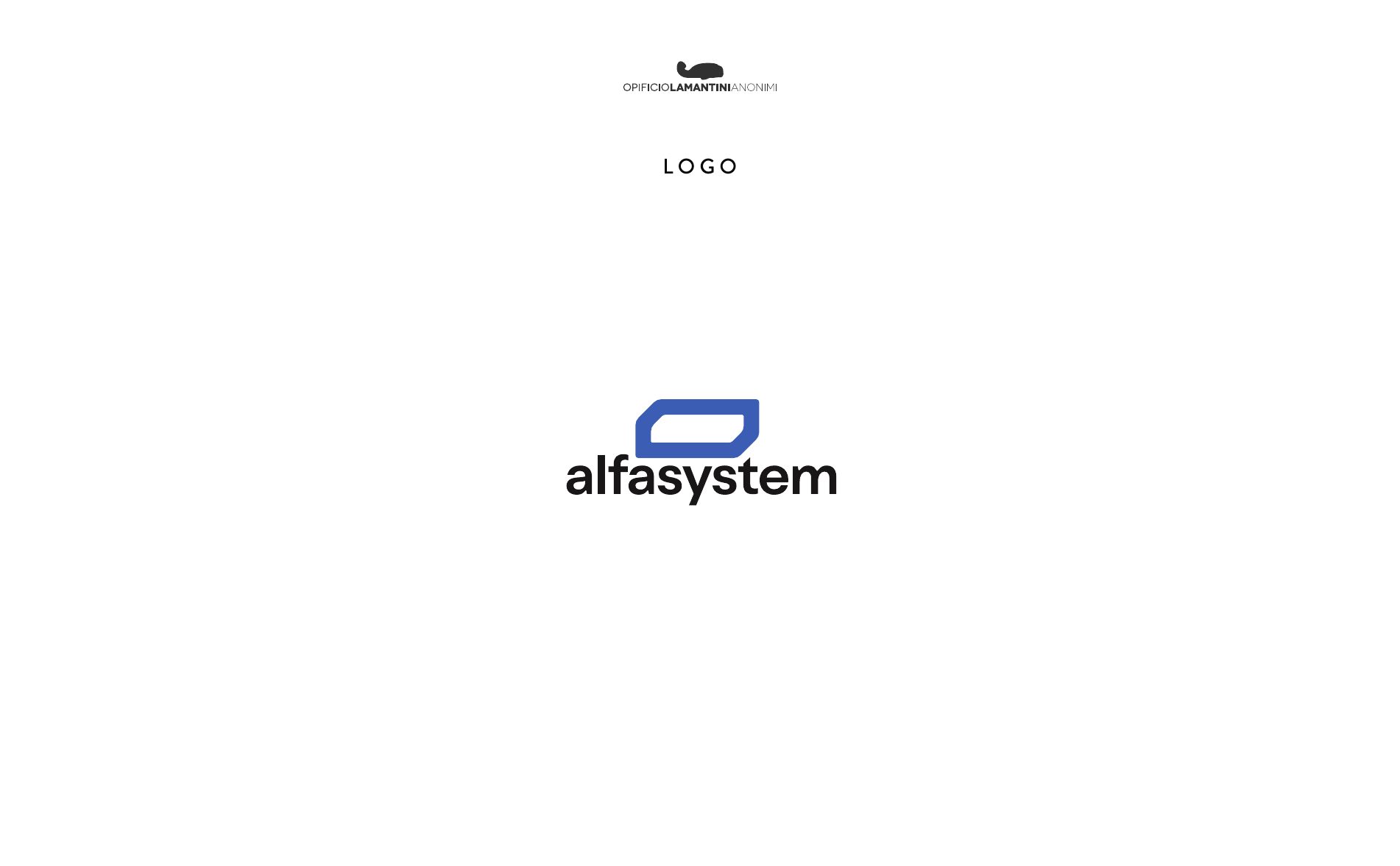
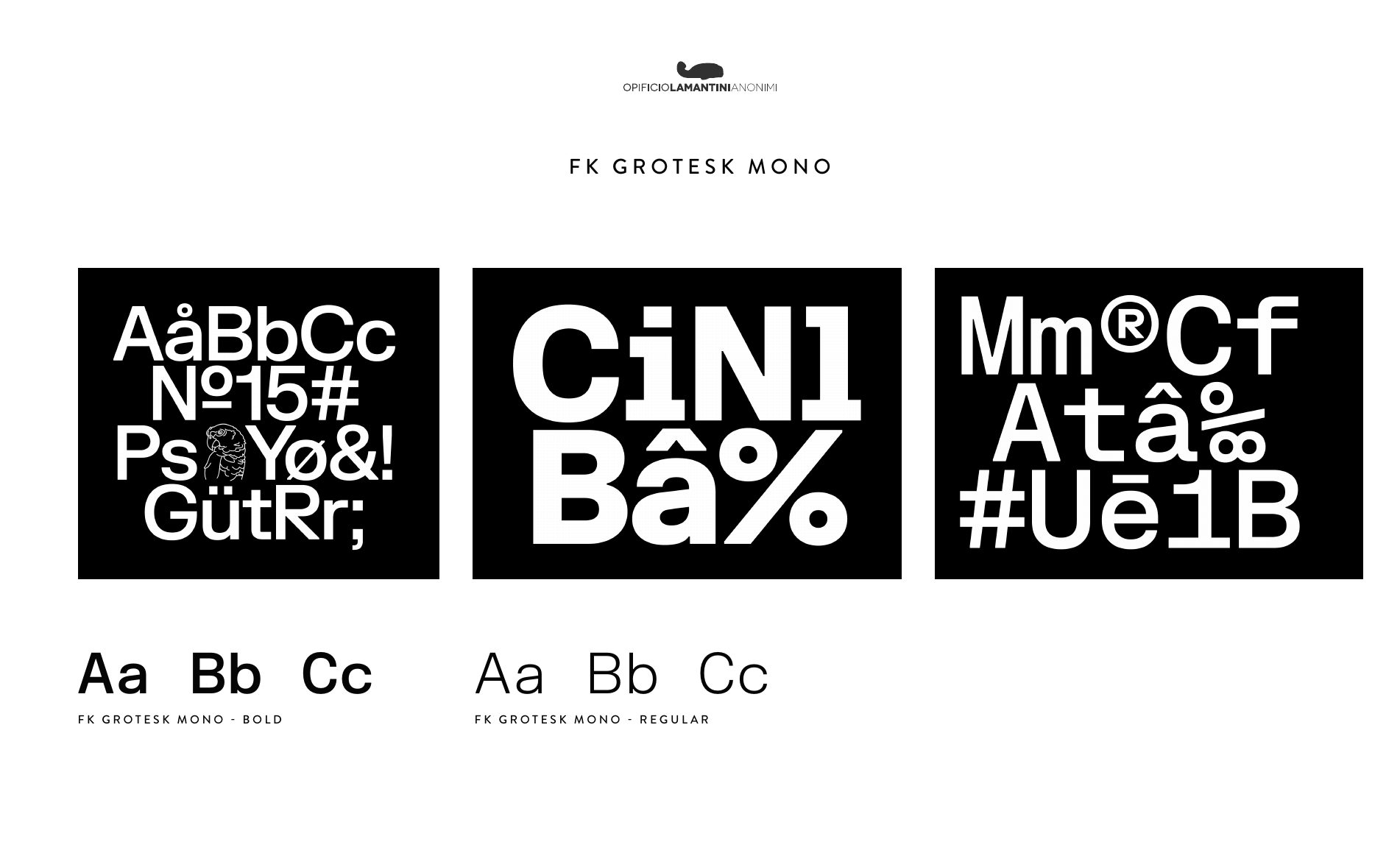
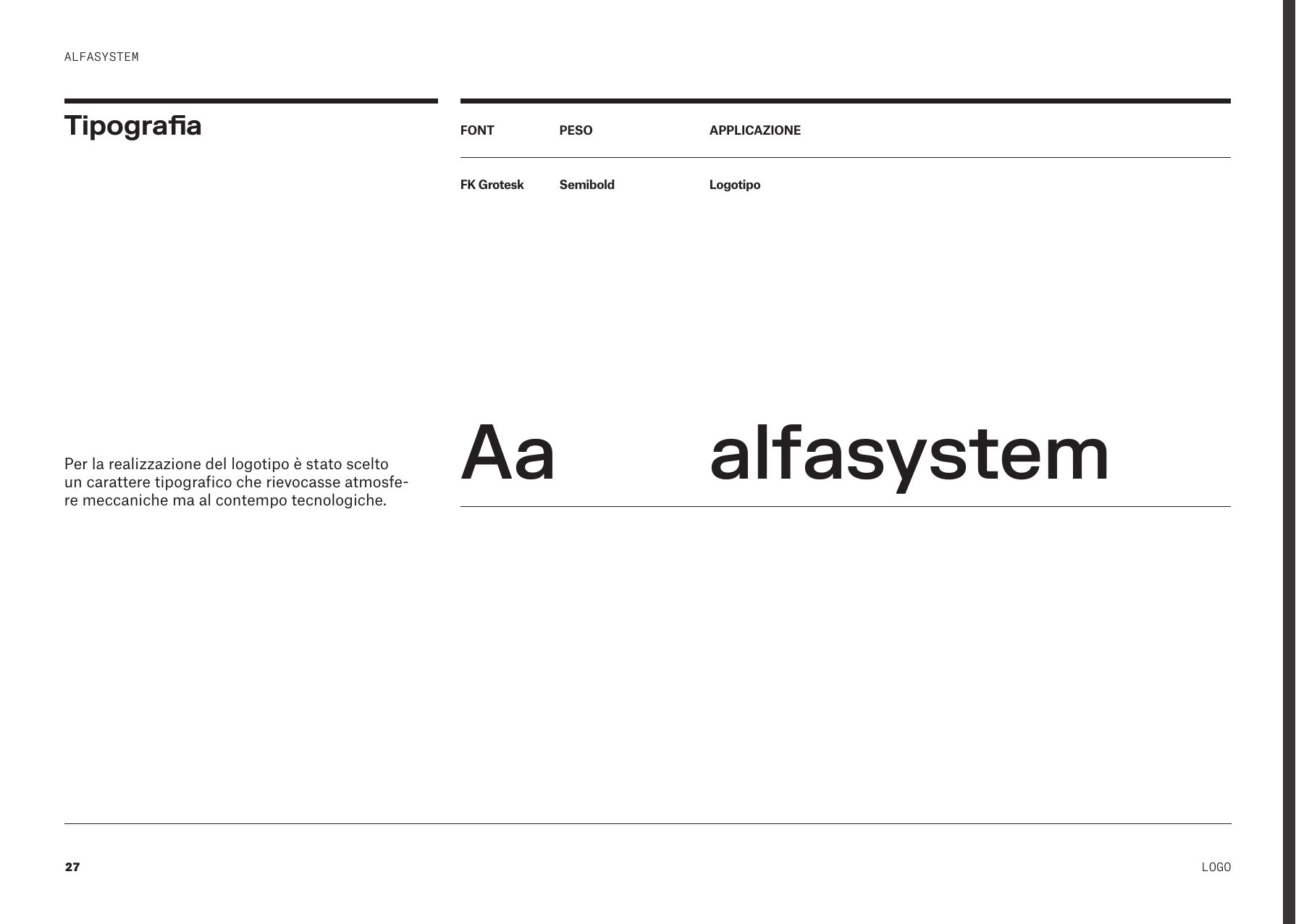
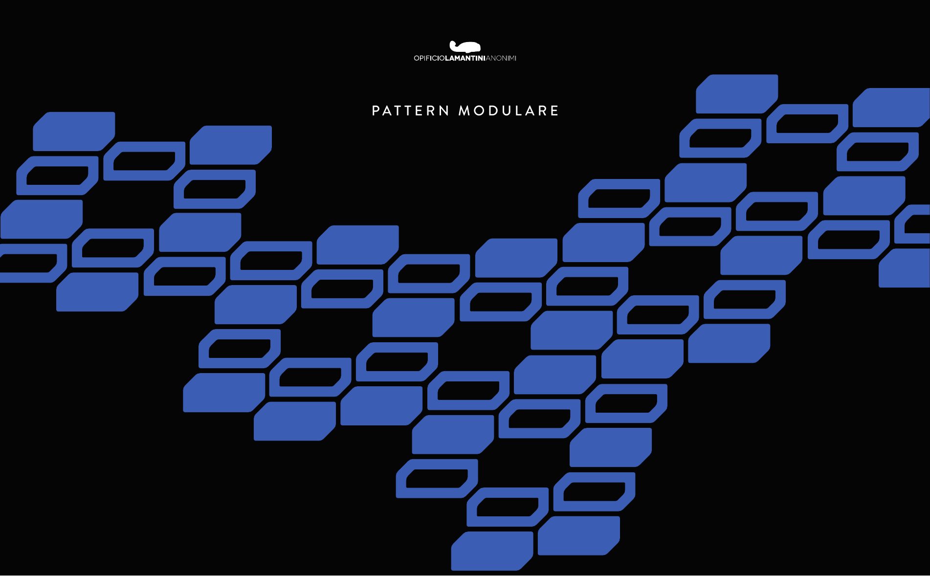
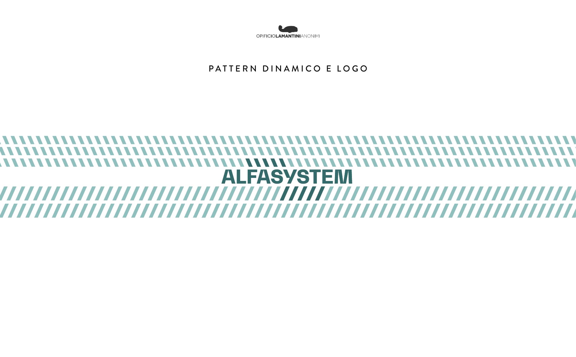
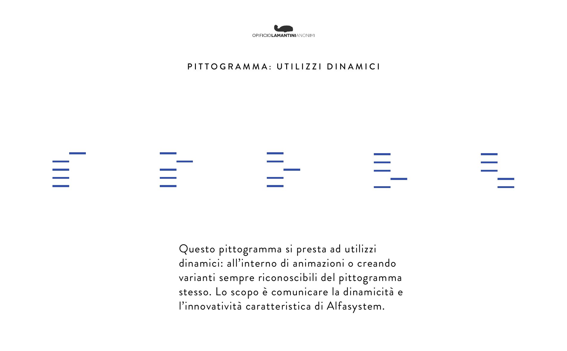
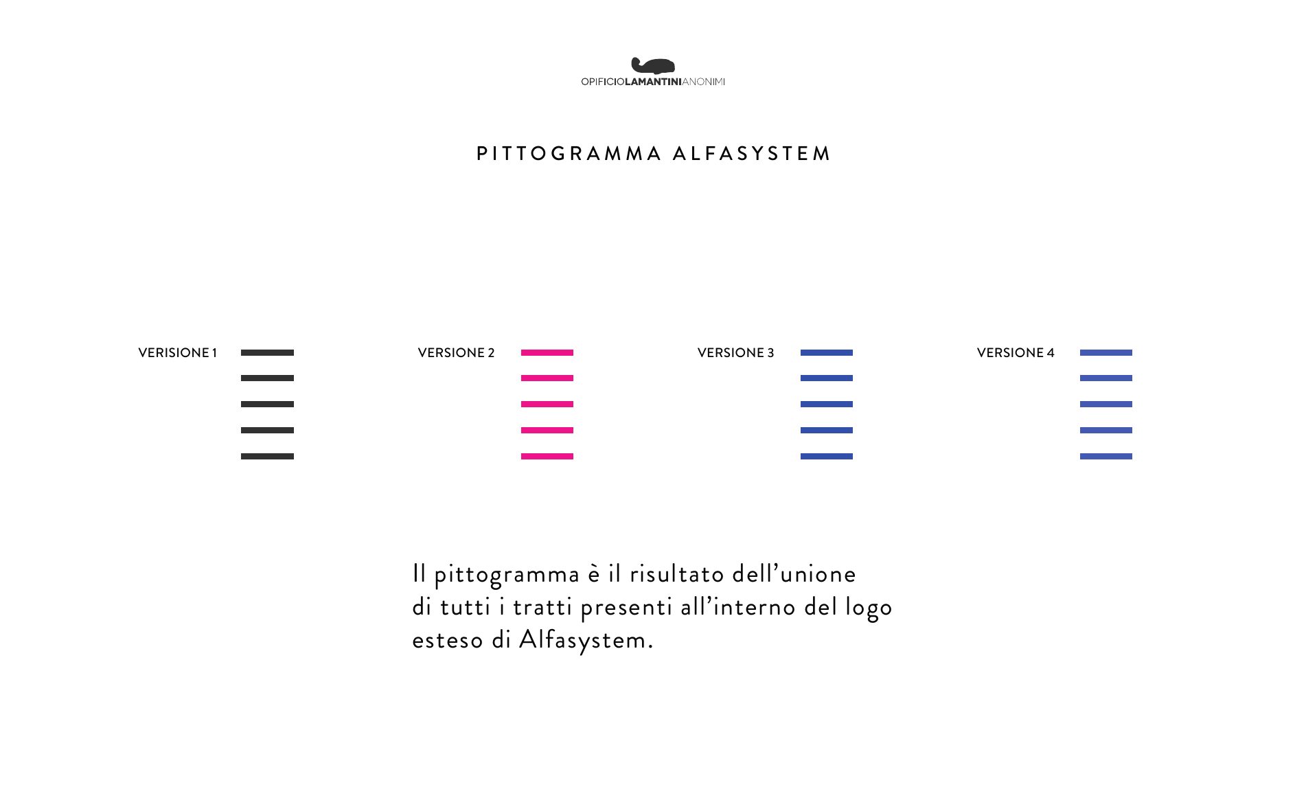
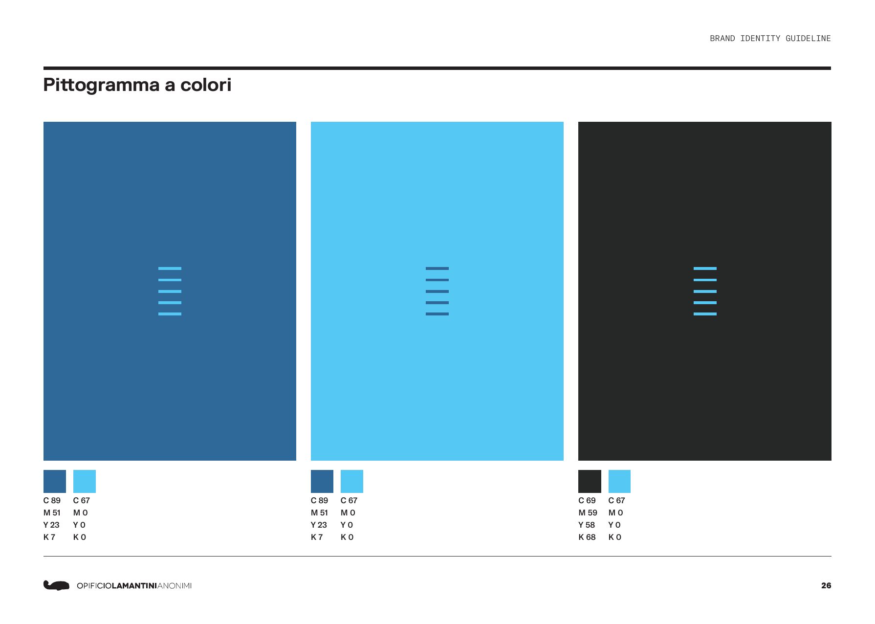
The typeface is FK Grotesk Semibold, chosen to evoke a mechanical and at the same time technological feel. The pictogram picks up the strokes of the logotype and its proportions, but it is made to move: animations, icons, interfaces, patterns.
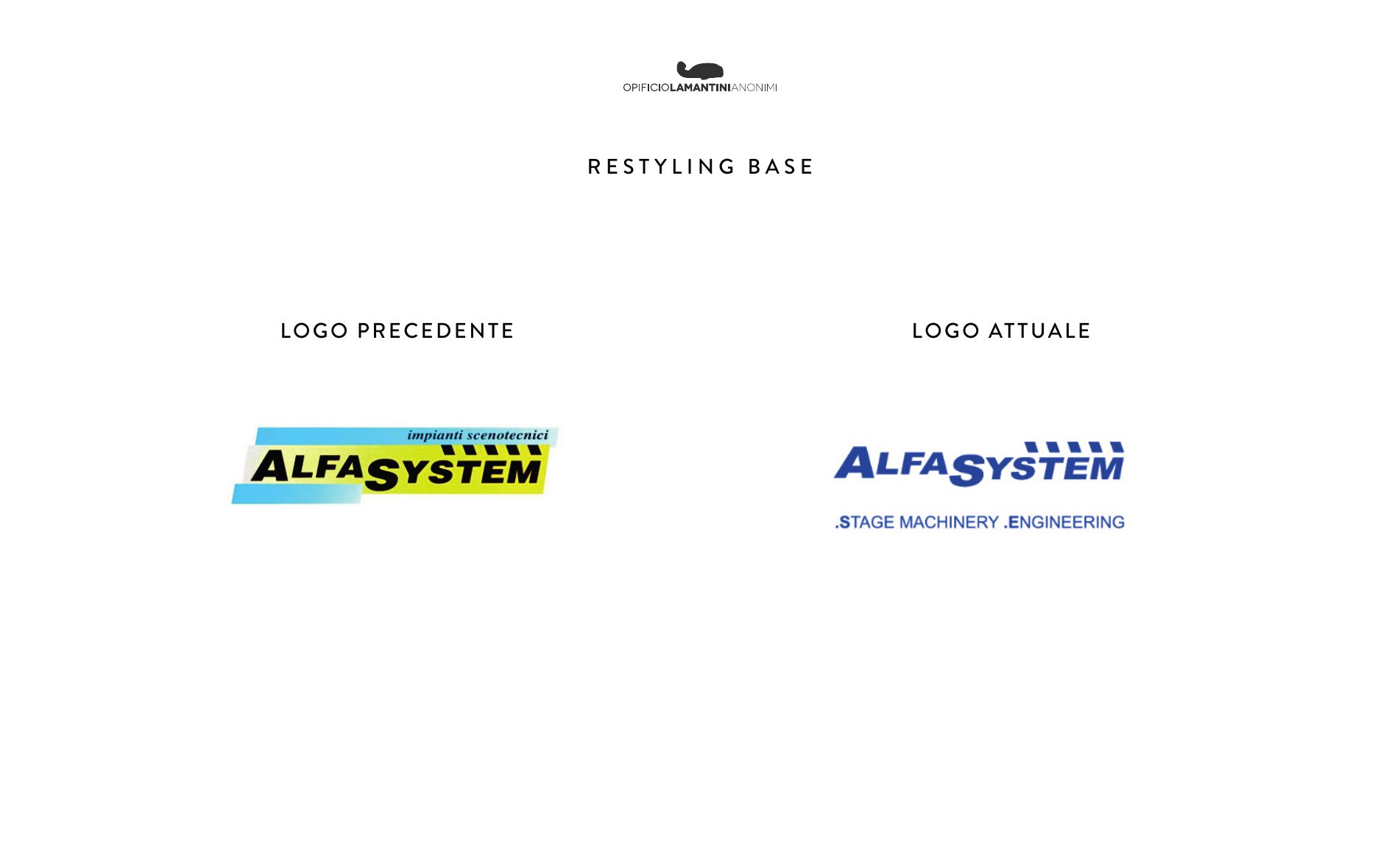
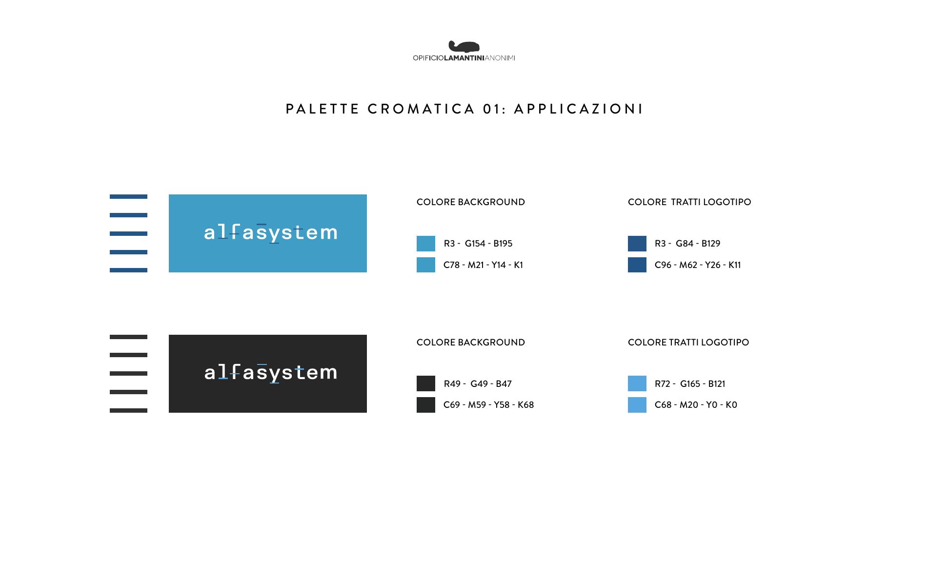
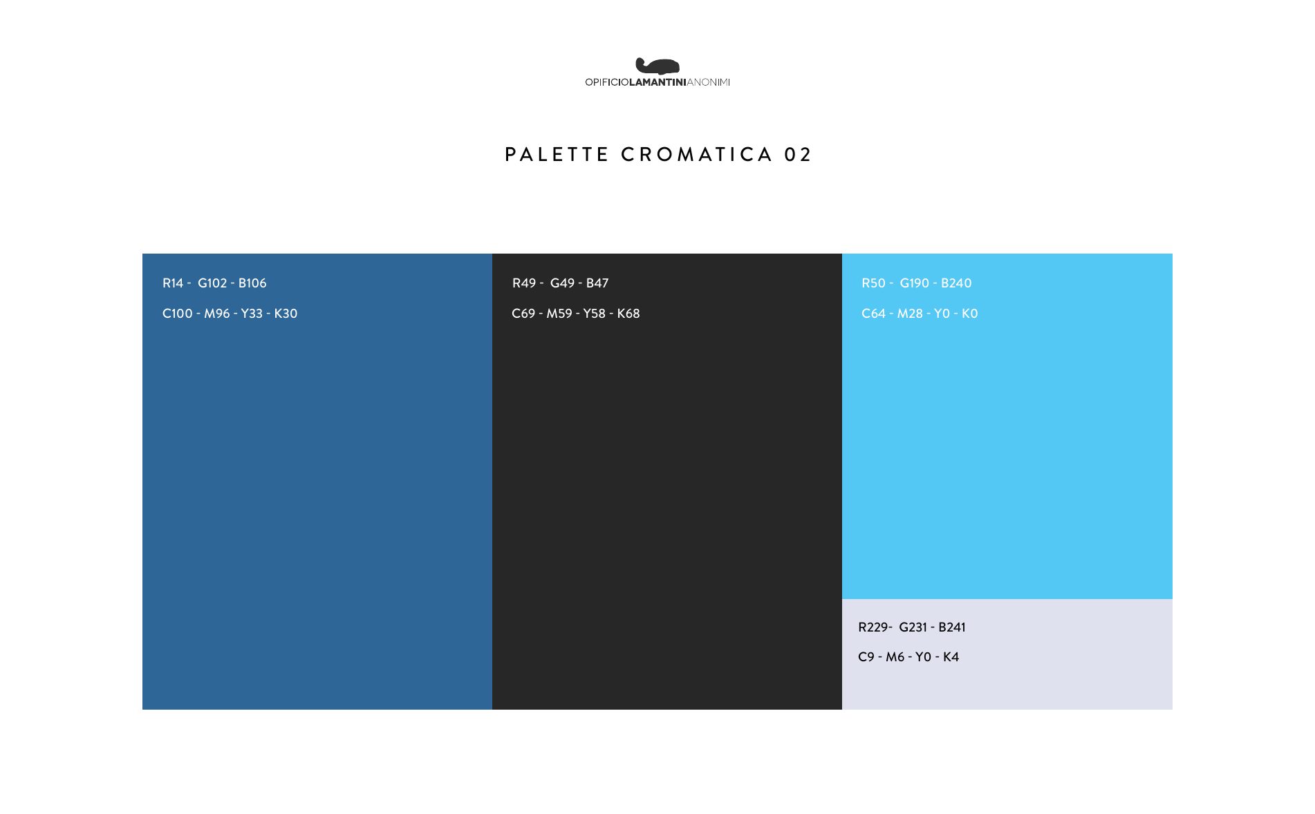
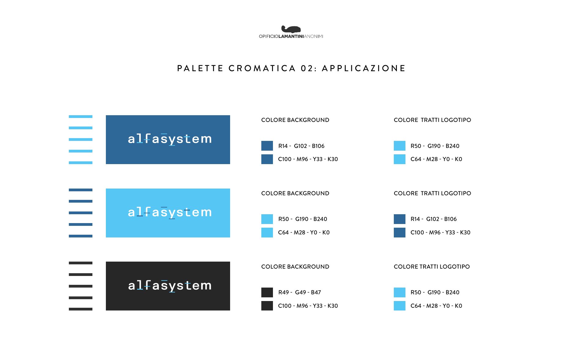
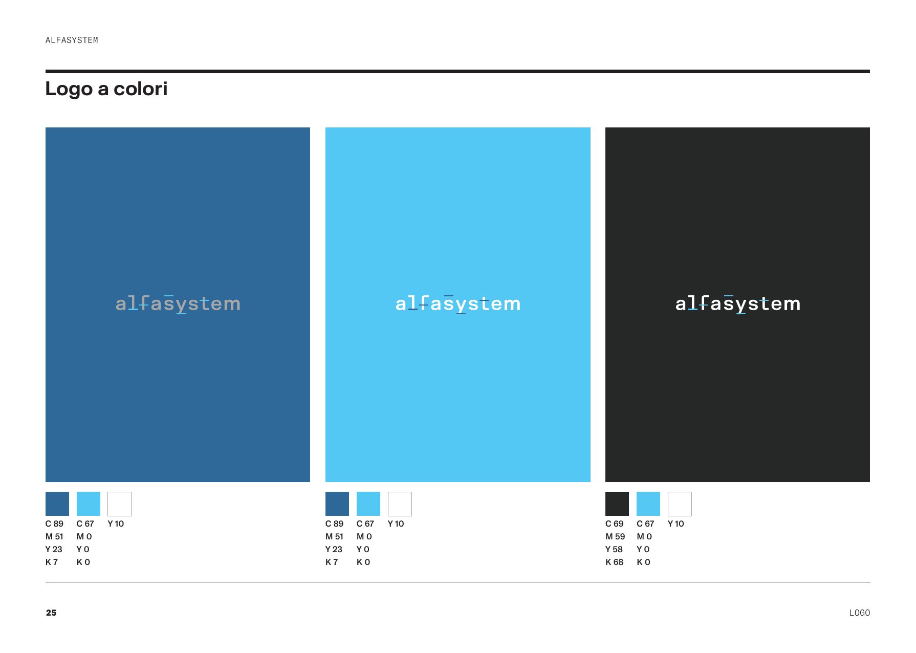
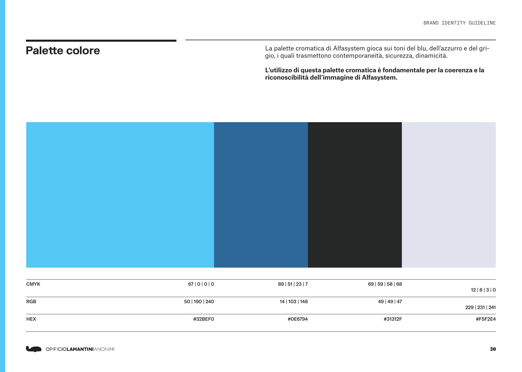
Colour took three rounds. It ended at the blue, cyan and grey of the brand book closed in March 2024, with the tagline stage machinery engineering.
The routes we tried
From the presentation of 13 October 2023
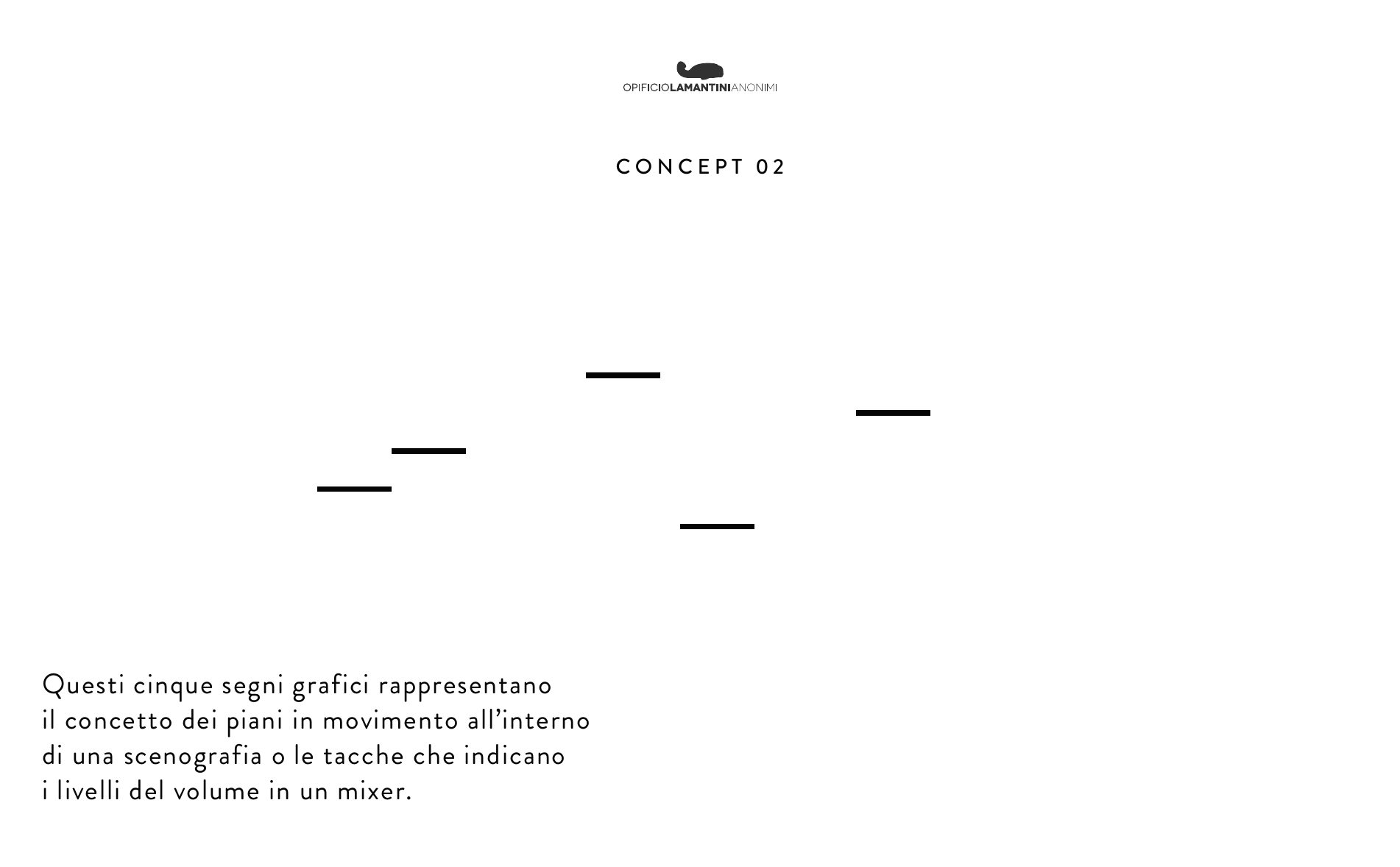
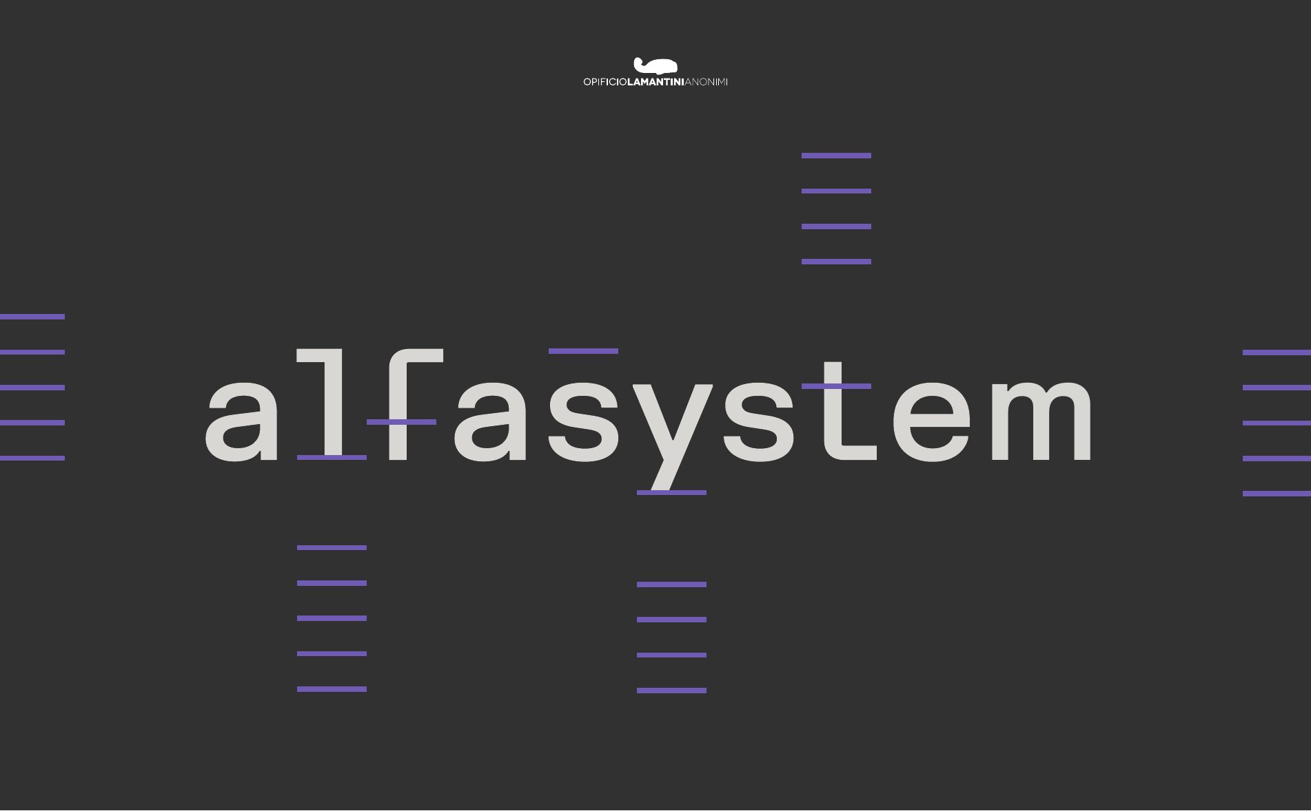
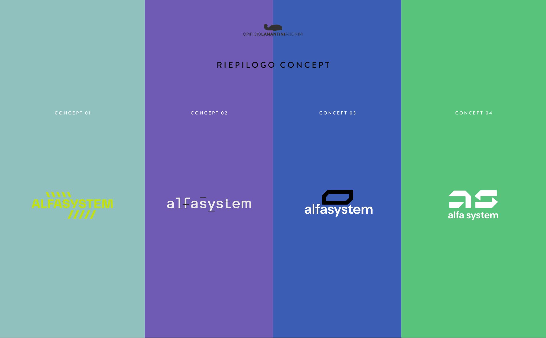
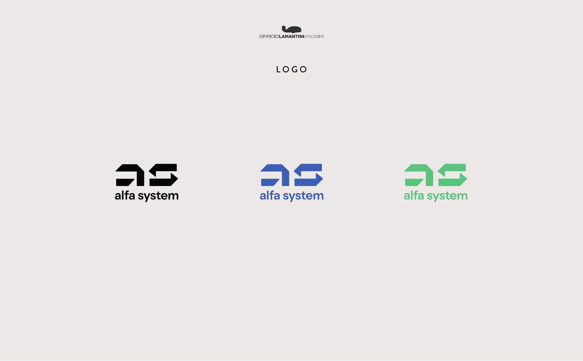
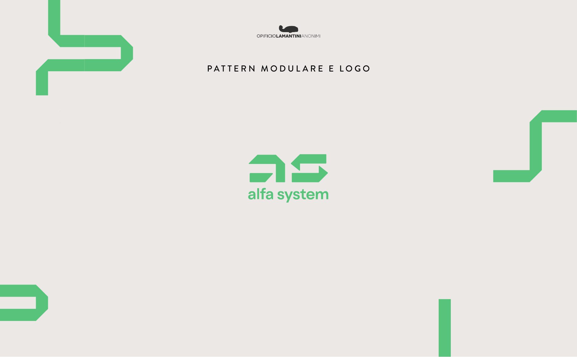
Every concept was tried in positive and in reverse, and in more than one colour, before the choice was made.
The pictogram, made to move
Modular patterns, icons, interfaces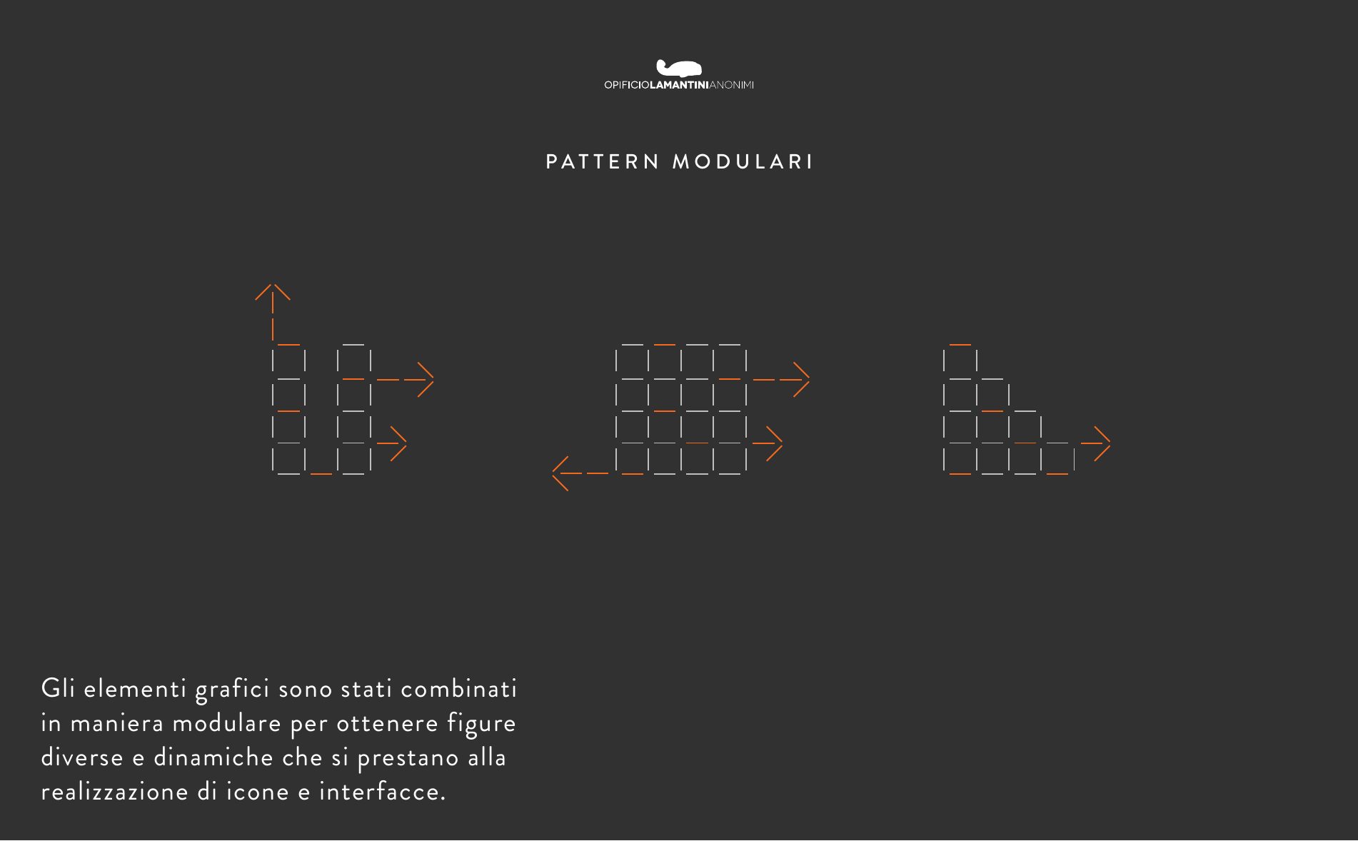
Three rounds on colour
Nov 2023 – Jan 2024 · scroll →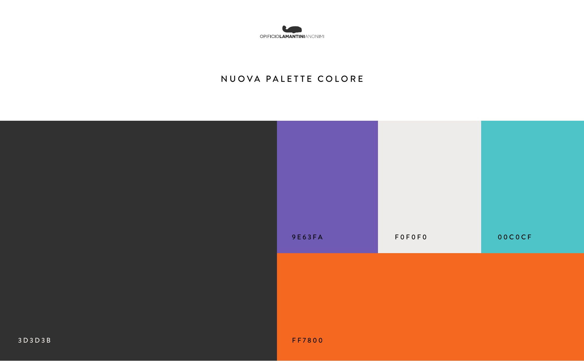
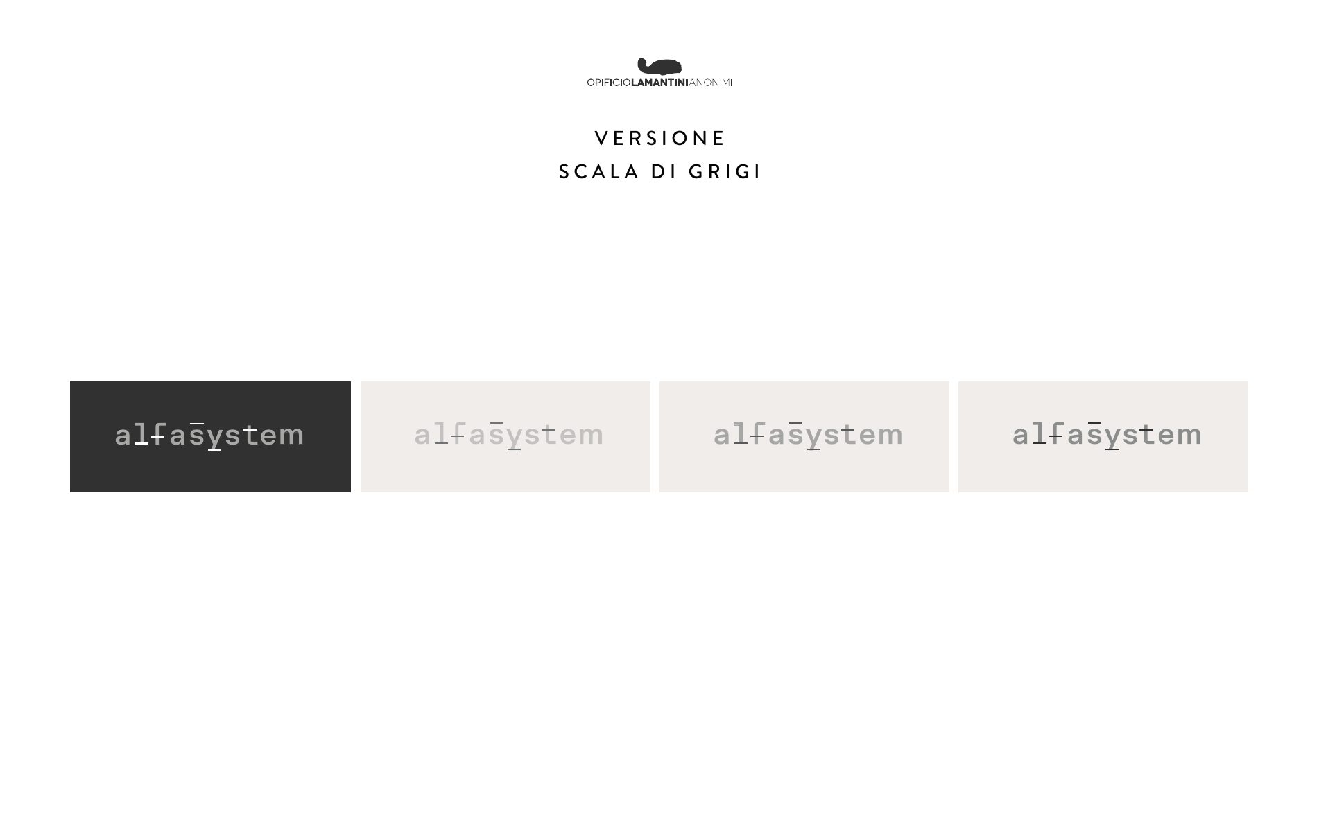
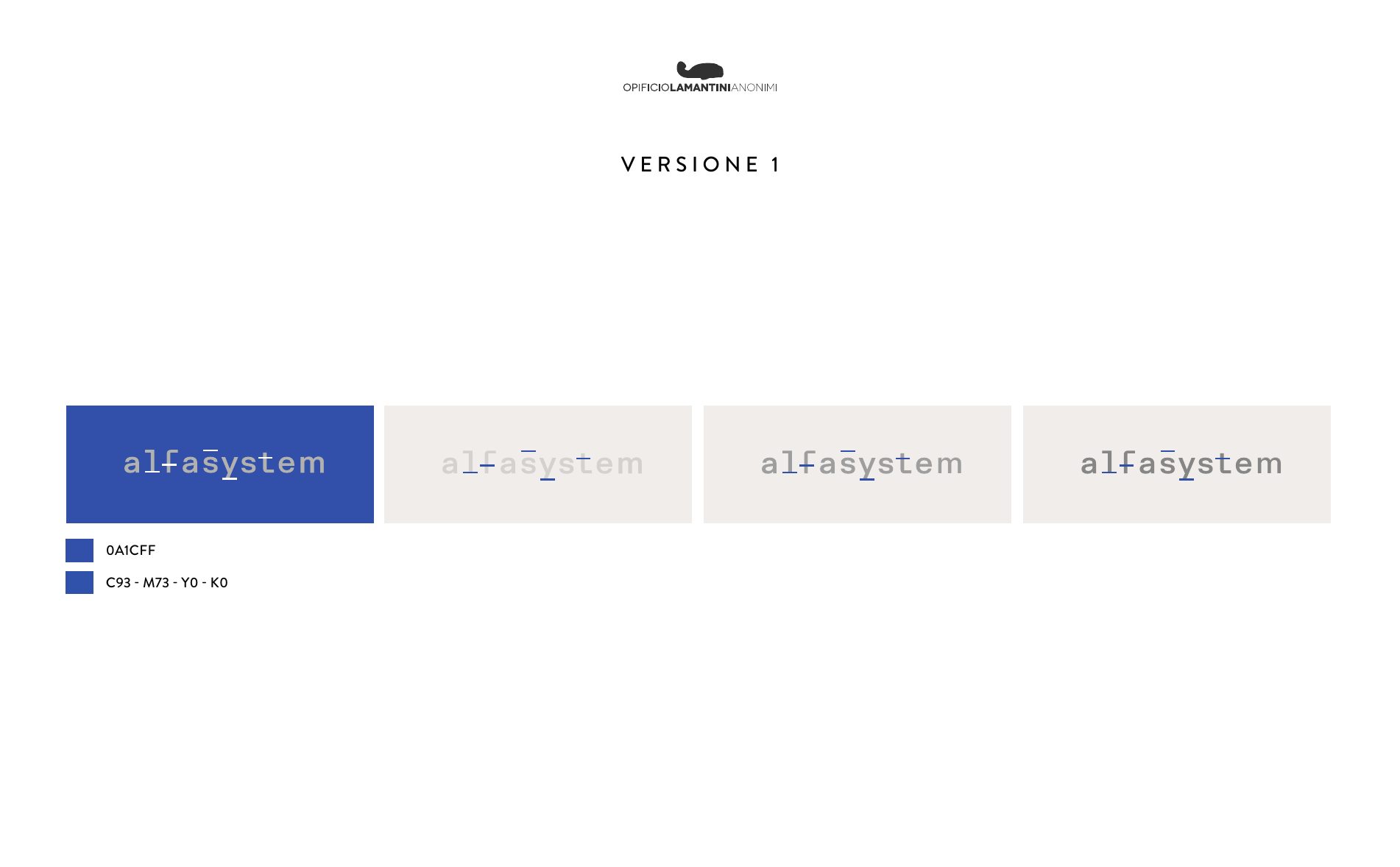
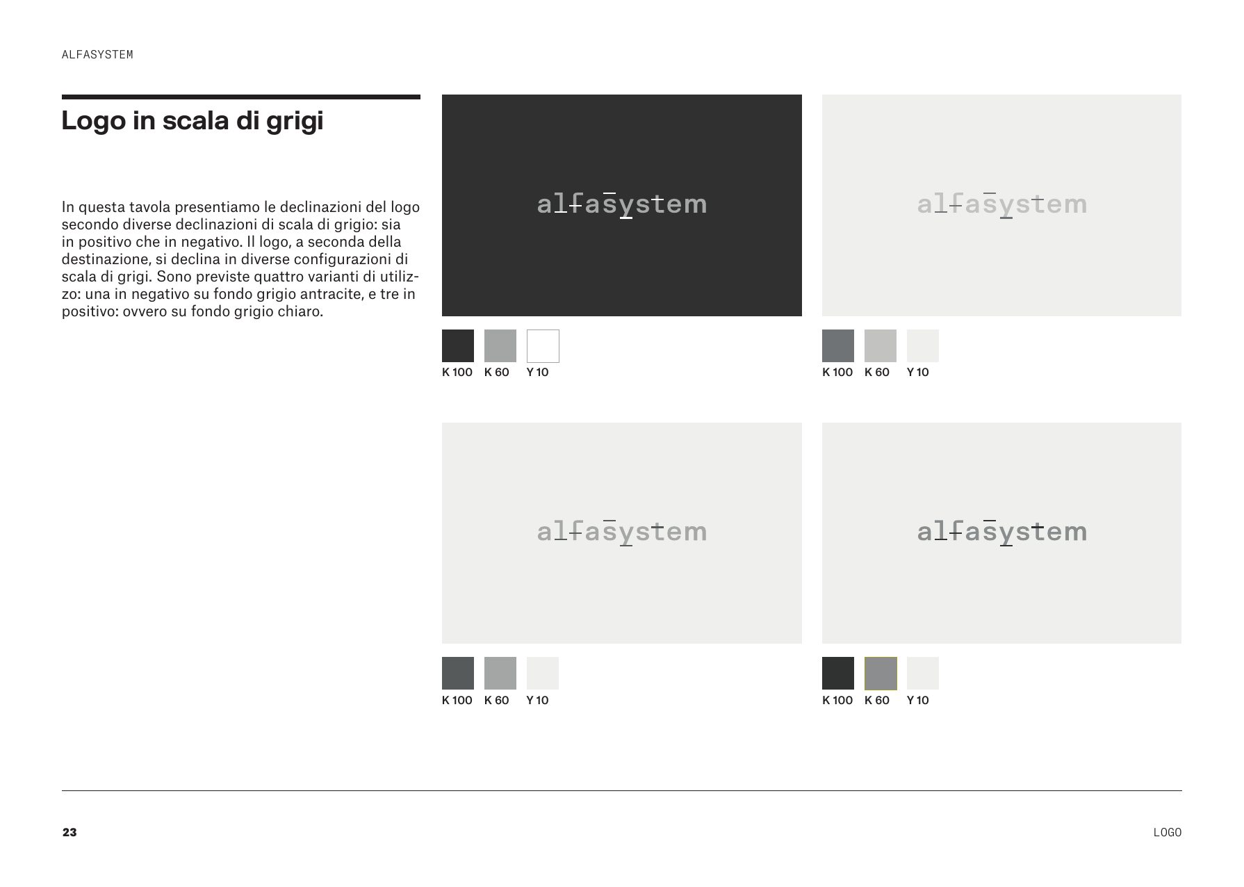
The brand book
Five releases, closed in March 2024 · scroll →
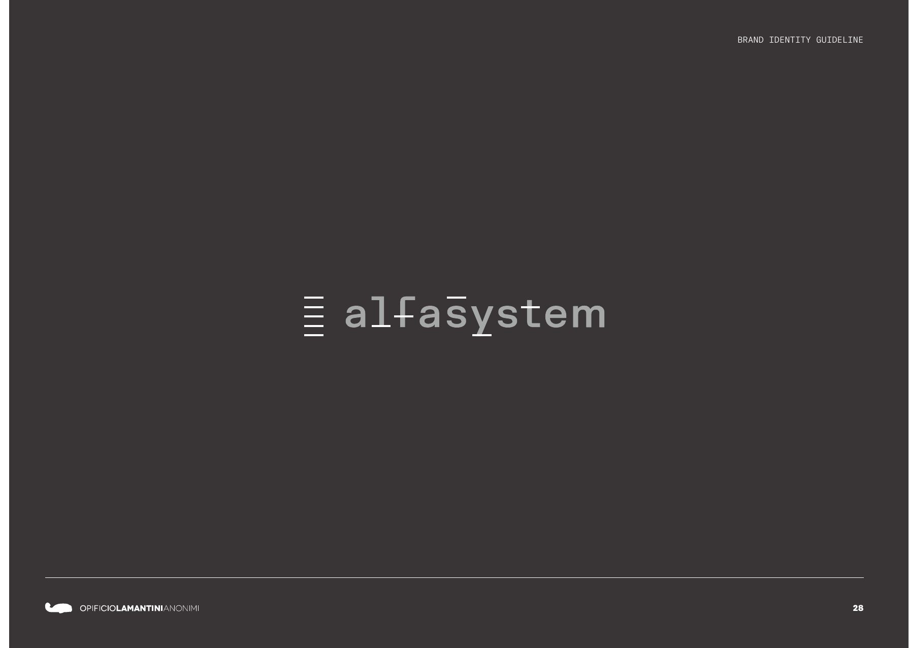
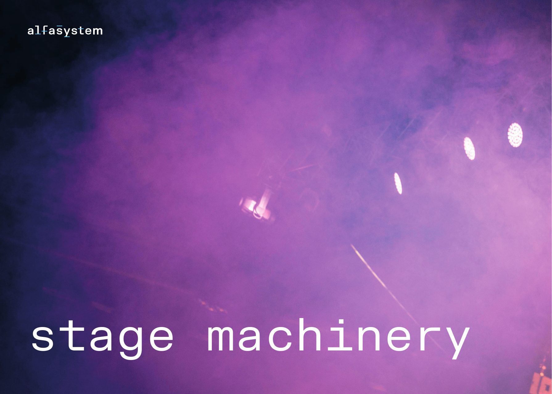
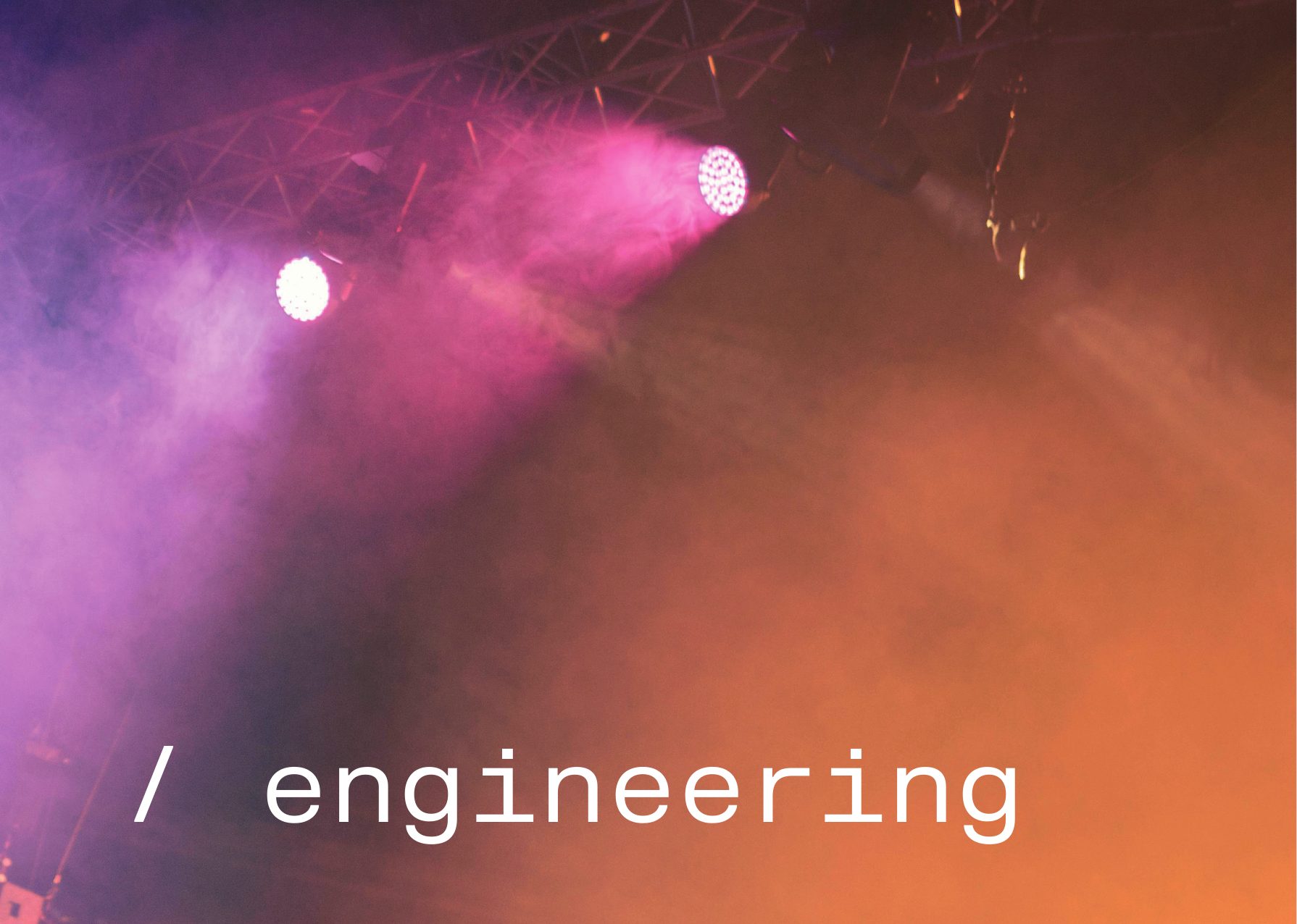
The tagline, split across two pages: stage machinery / engineering.
What happens to a brand when it leaves the brand book?
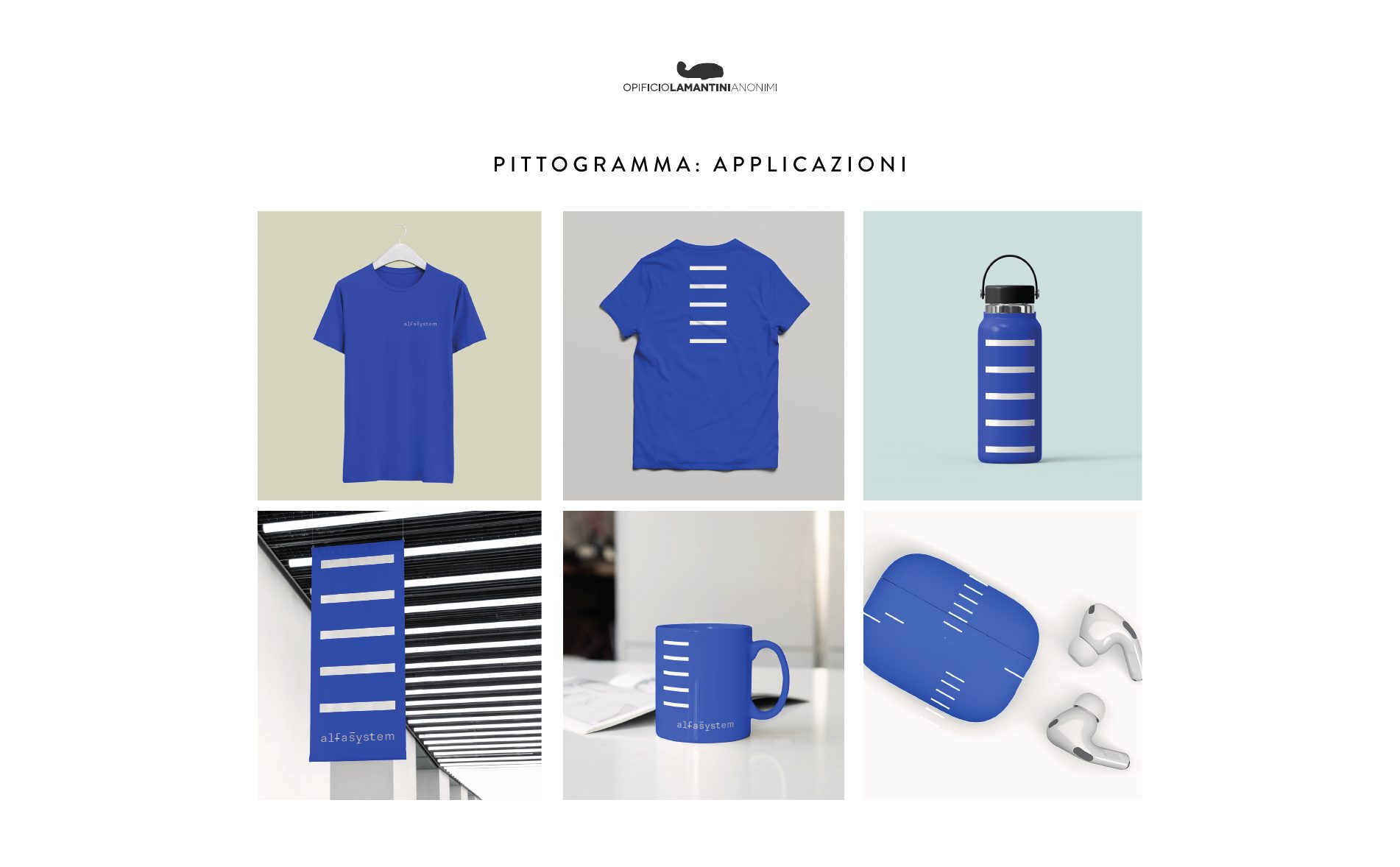
It ends up on a business card, on a T-shirt and in a website menu. That is where you find out whether it holds.
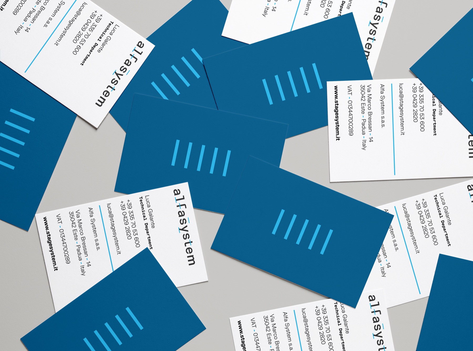
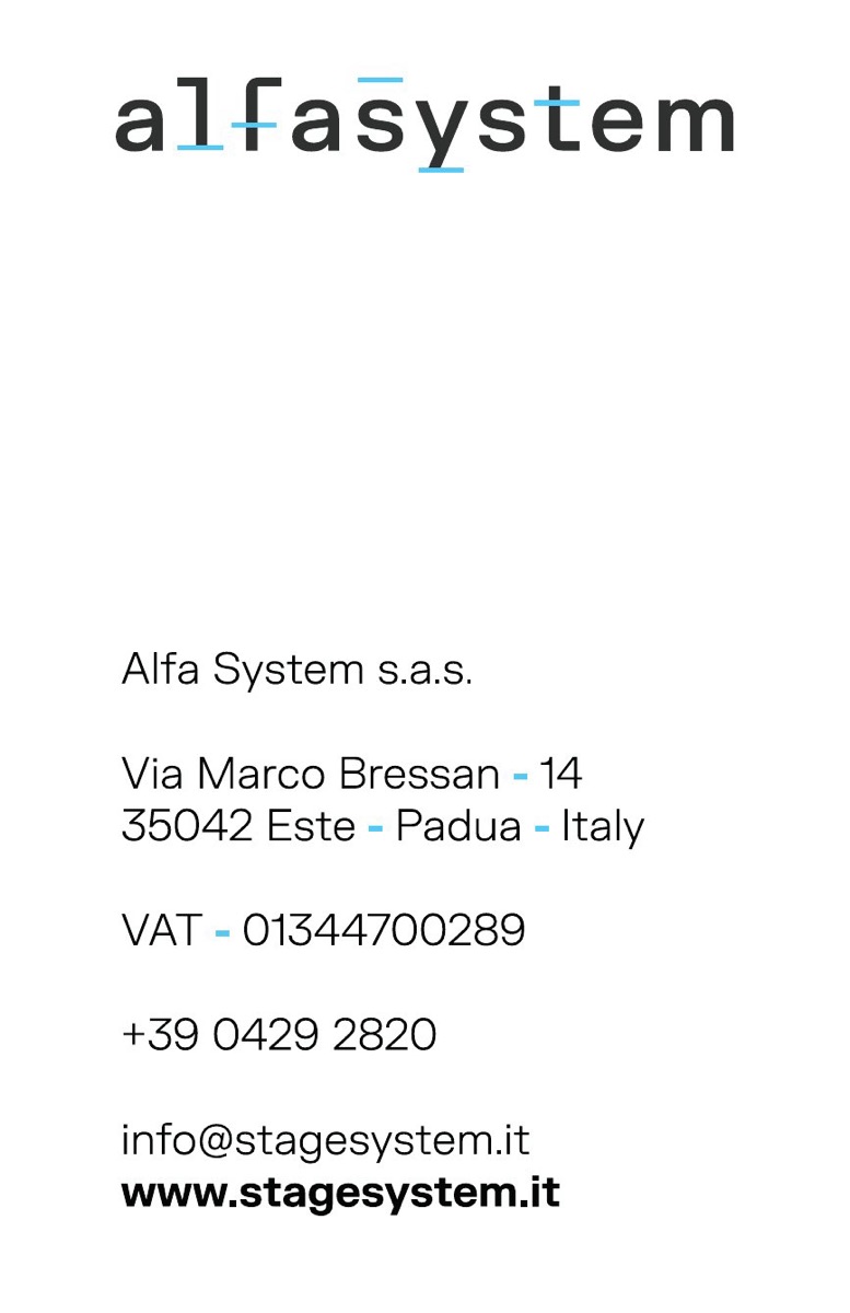
Business cards in two releases: the pattern on the front, the details on the back. Then the pictogram on objects, and the logo on screen.
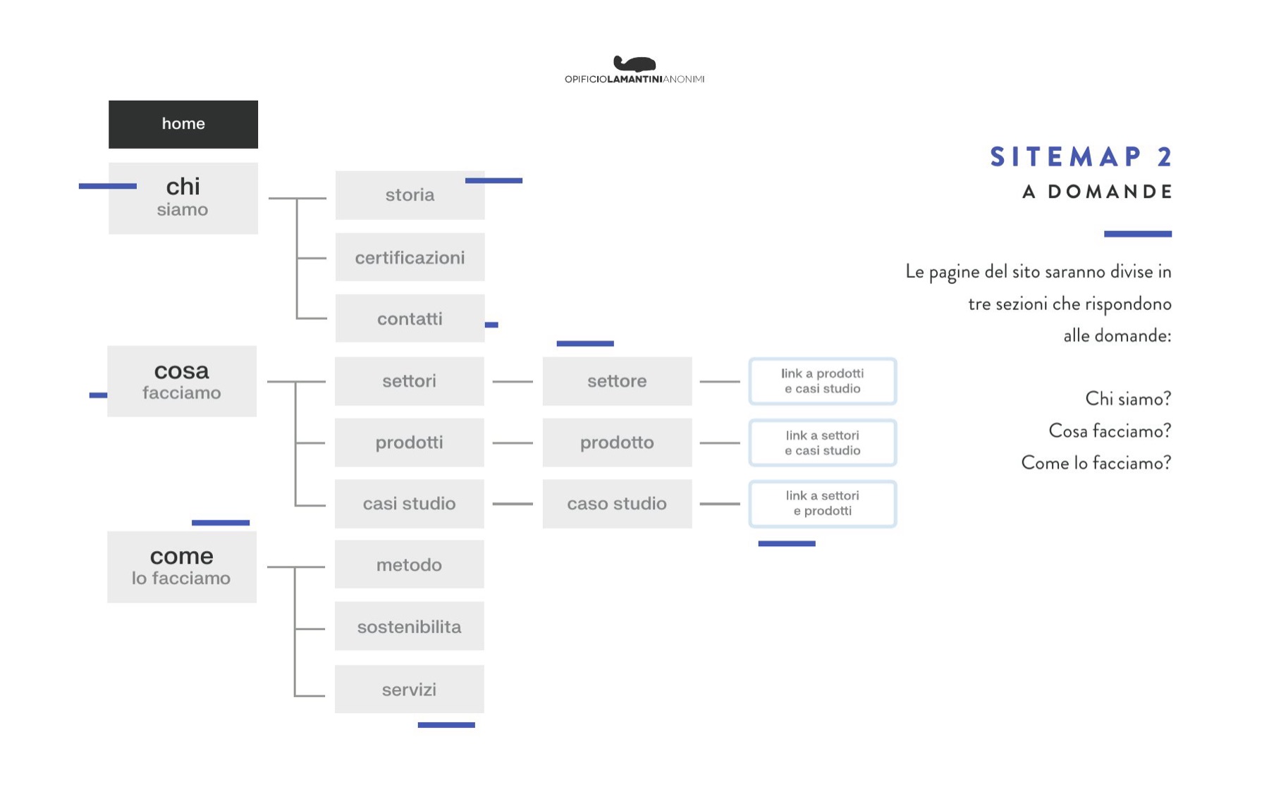
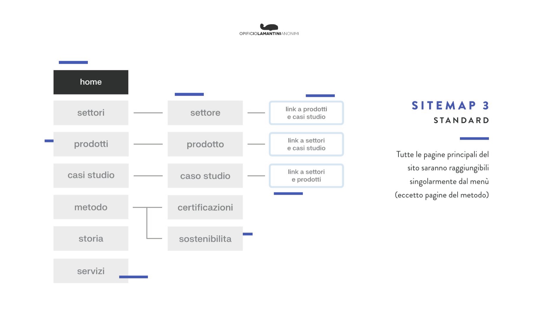
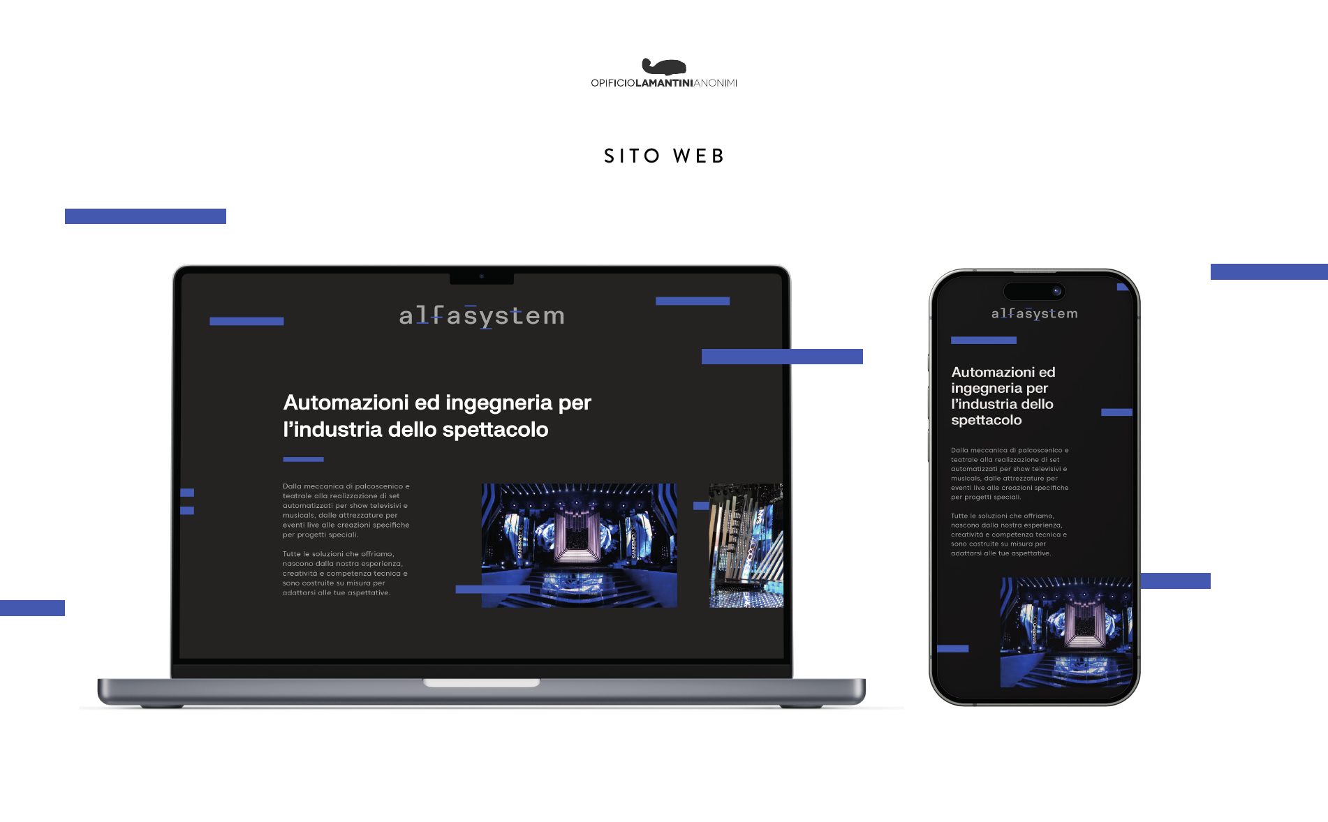
On 21 December 2023 we took three site maps to Alfasystem: one gathered around a single about area, one built on questions — who we are, what we do, how we do it — and one with every main page reachable from the menu. The website is online, in Italian and English.

Three maps for one website
Presented on 21 December 2023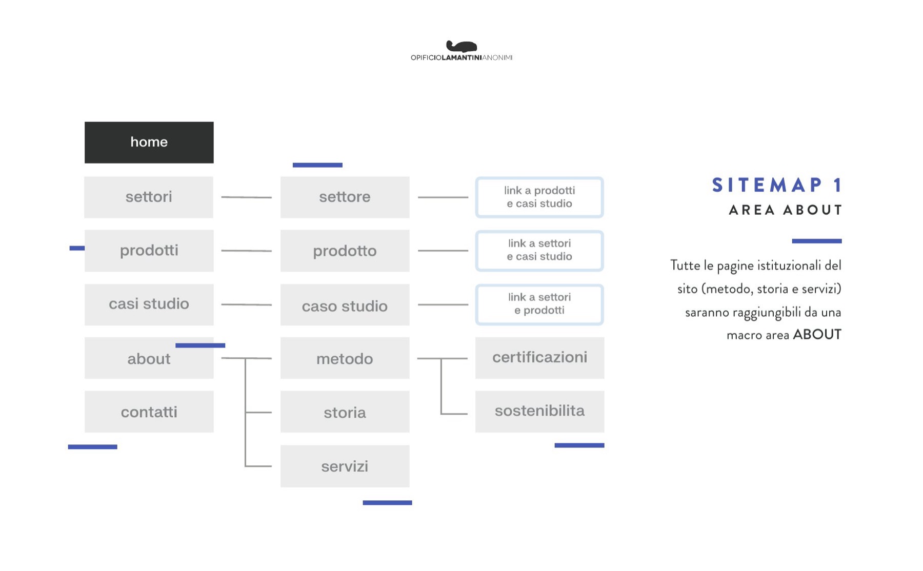
How do you fill a space when the product weighs a tonne?
At a fair Alfasystem brings real machines. The graphics had to hold their own next to a winch, not cover it.
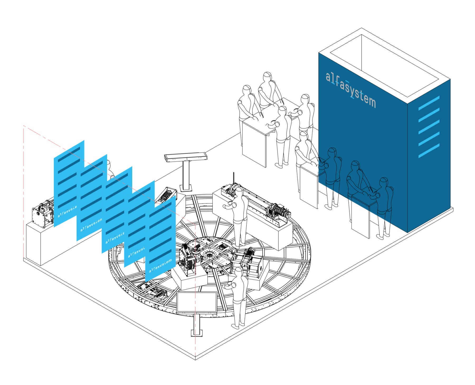
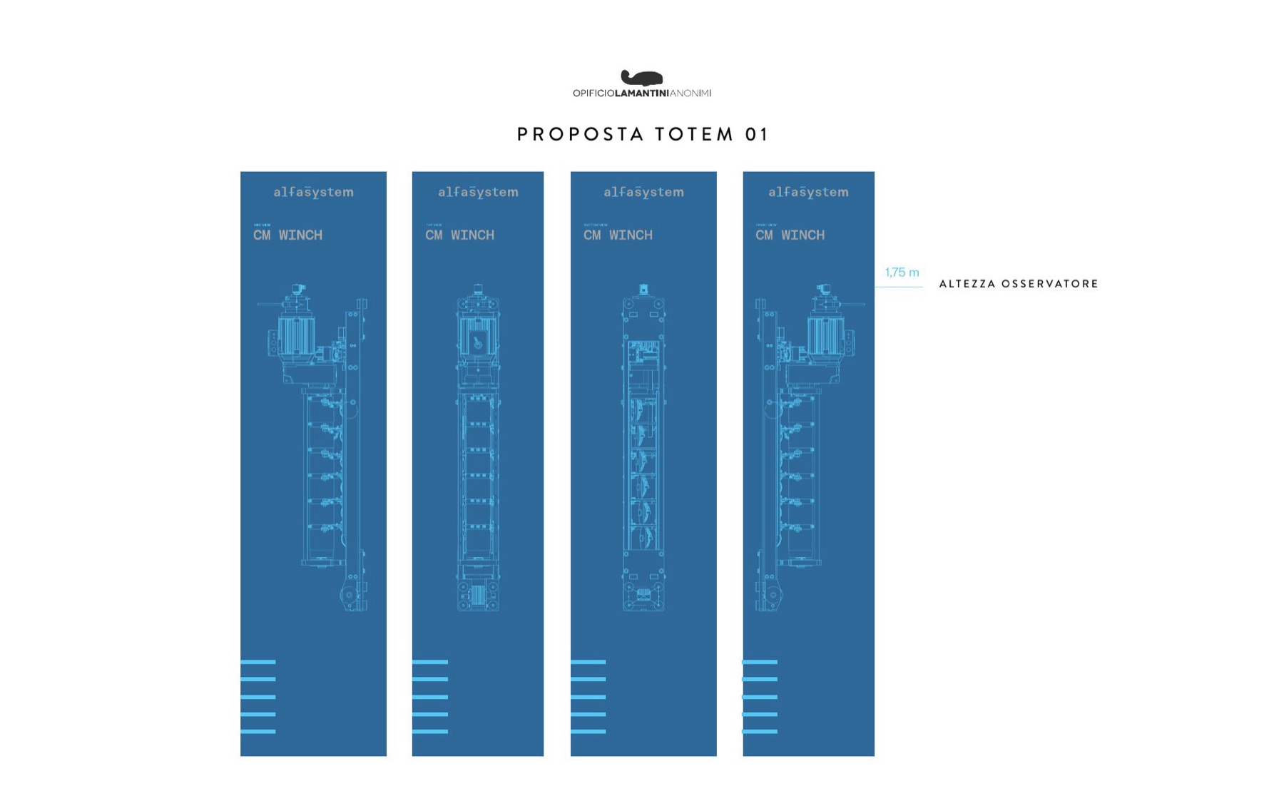
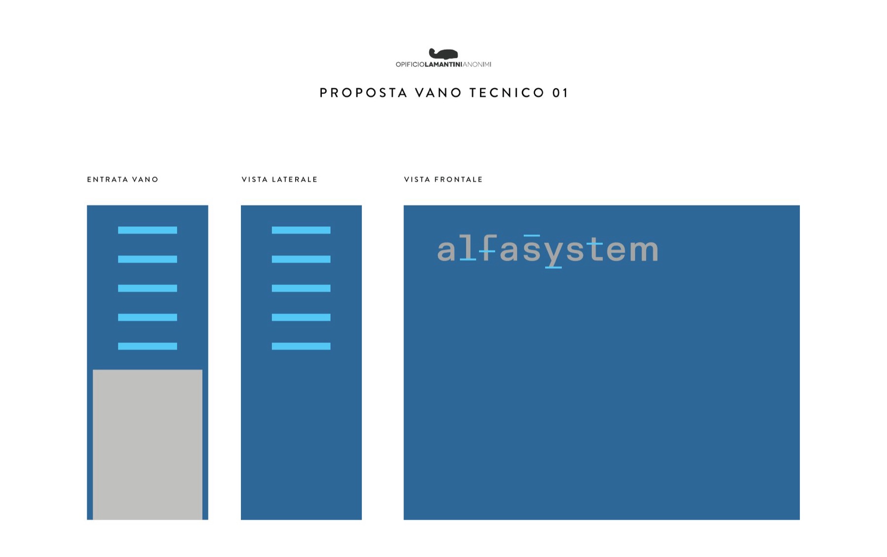
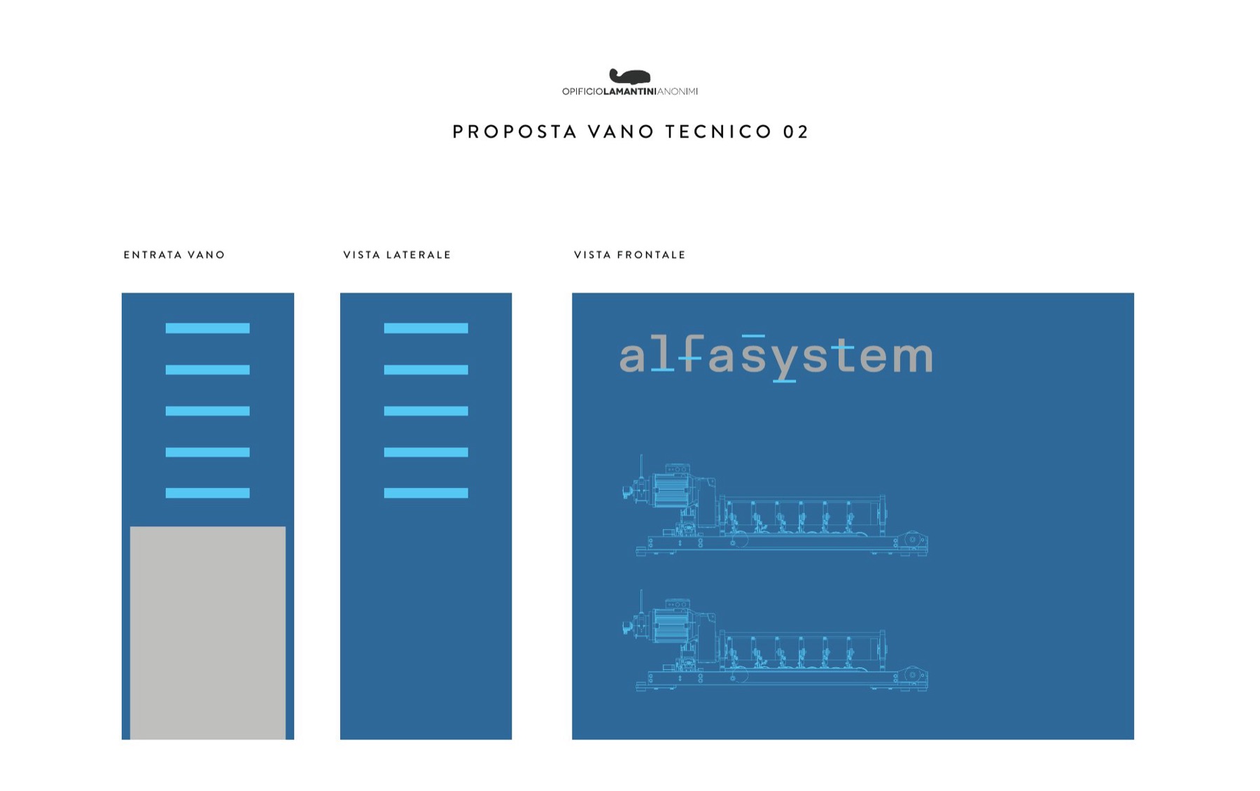
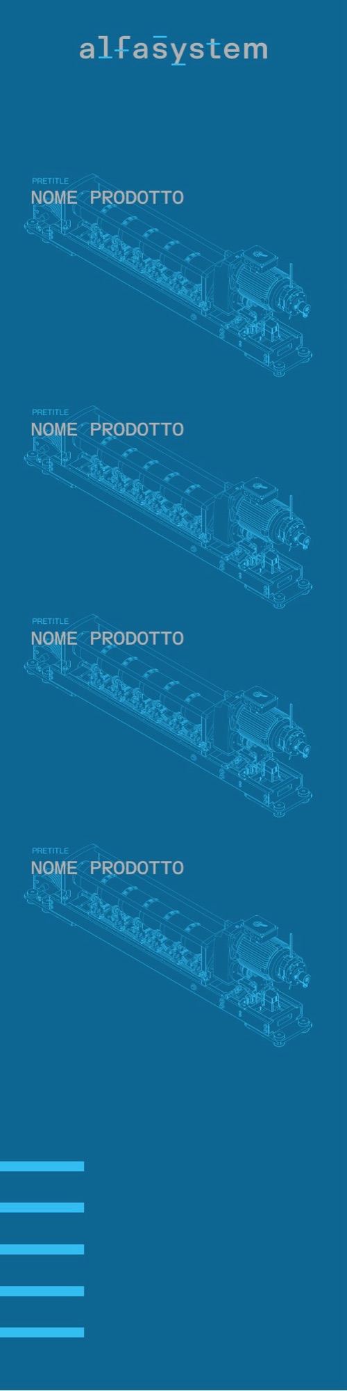
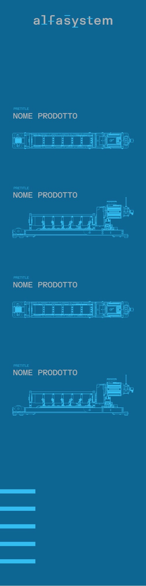
On 10 February 2024 we presented the stand in four chapters: totem, banner, technical bay, stand. The vertical totems carry technical drawings of the machines, reversed out of blue, one per product. The technical bay — the part usually hidden — becomes the wall that lists what the company can do.
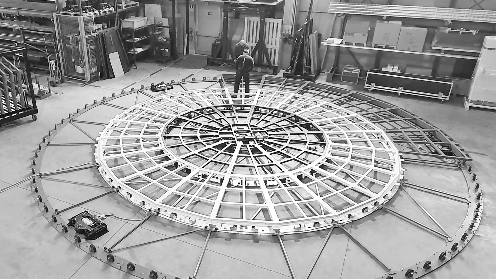
At the centre of the stand, a real revolving stage, turning.
The proposals
Totem, banner, technical bay · scroll →
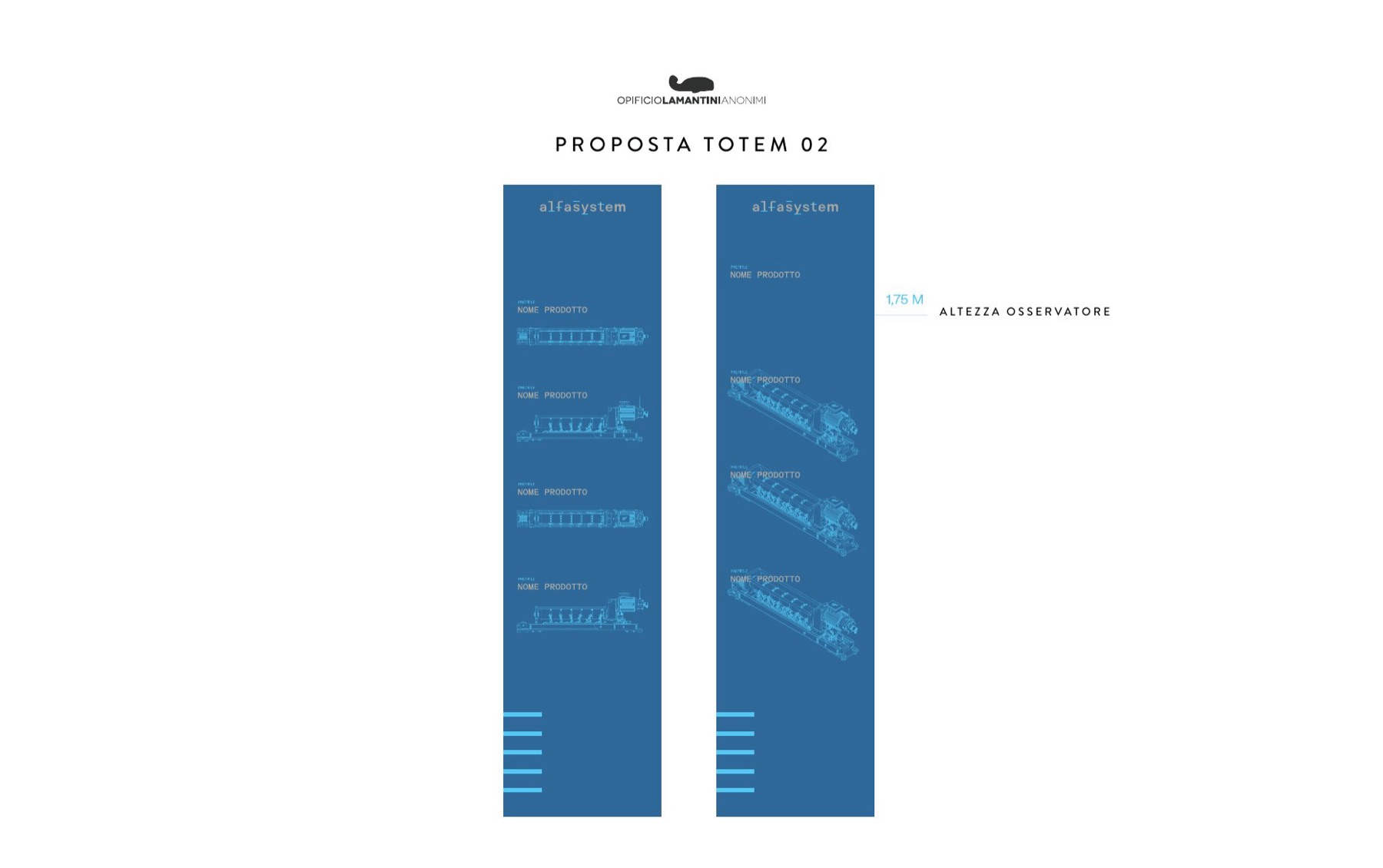
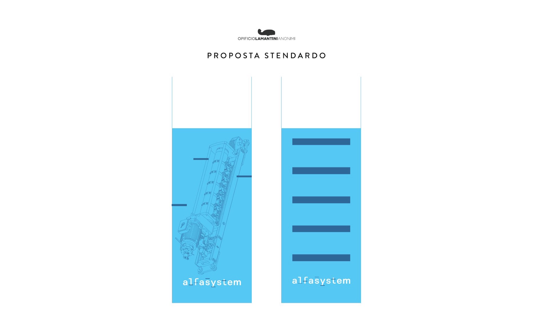
The totems
One technical drawing per machine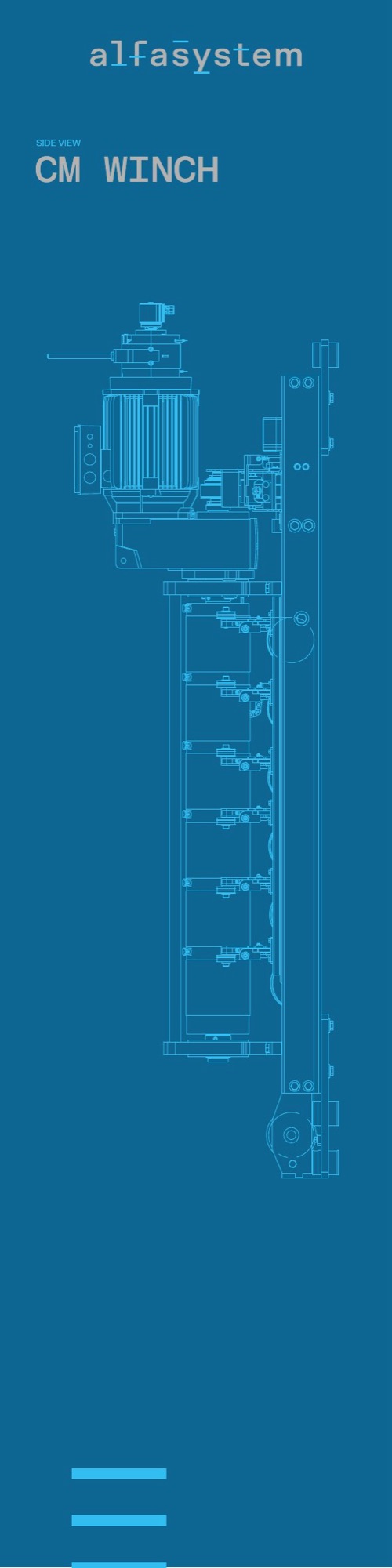

The technical bay
The part that is usually hidden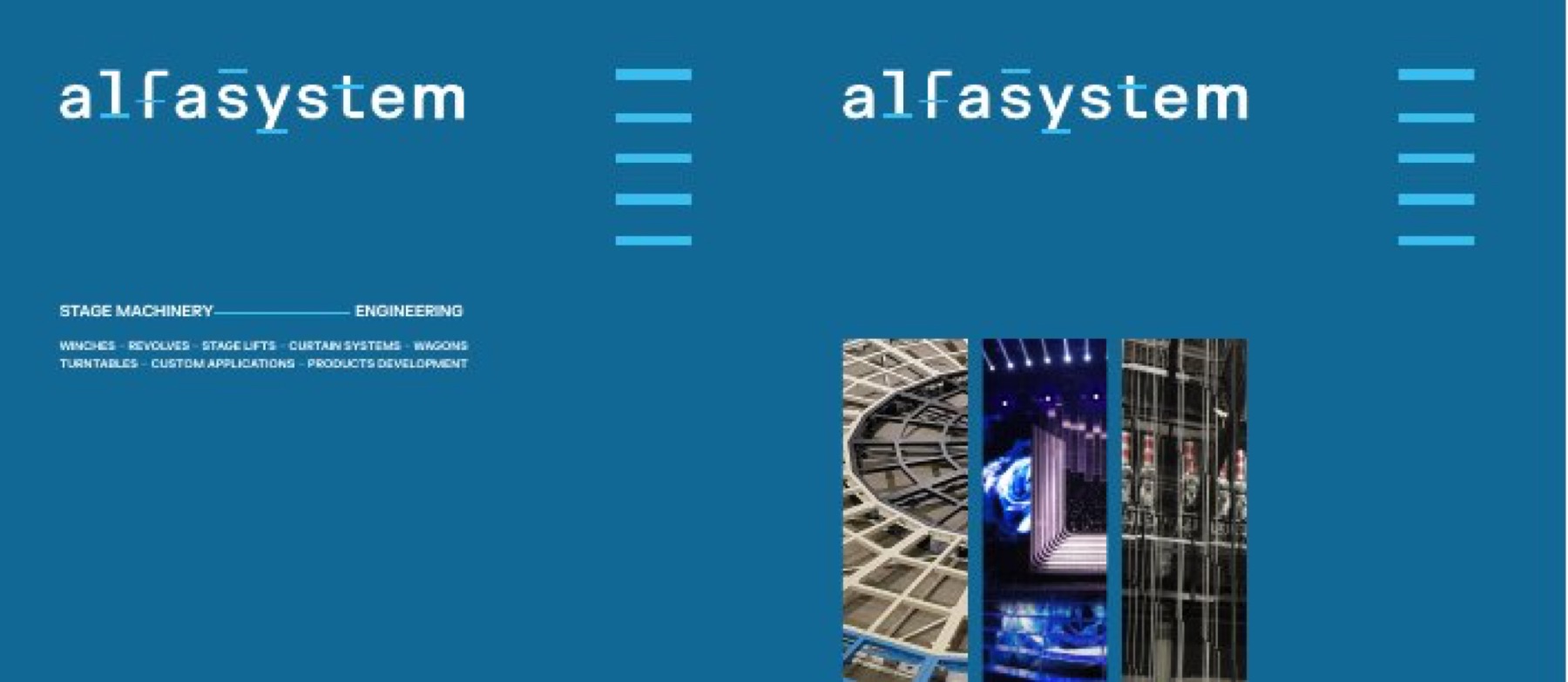
The stand as built, March 2024.
How do you tell the story of a machine that stands still at a fair?
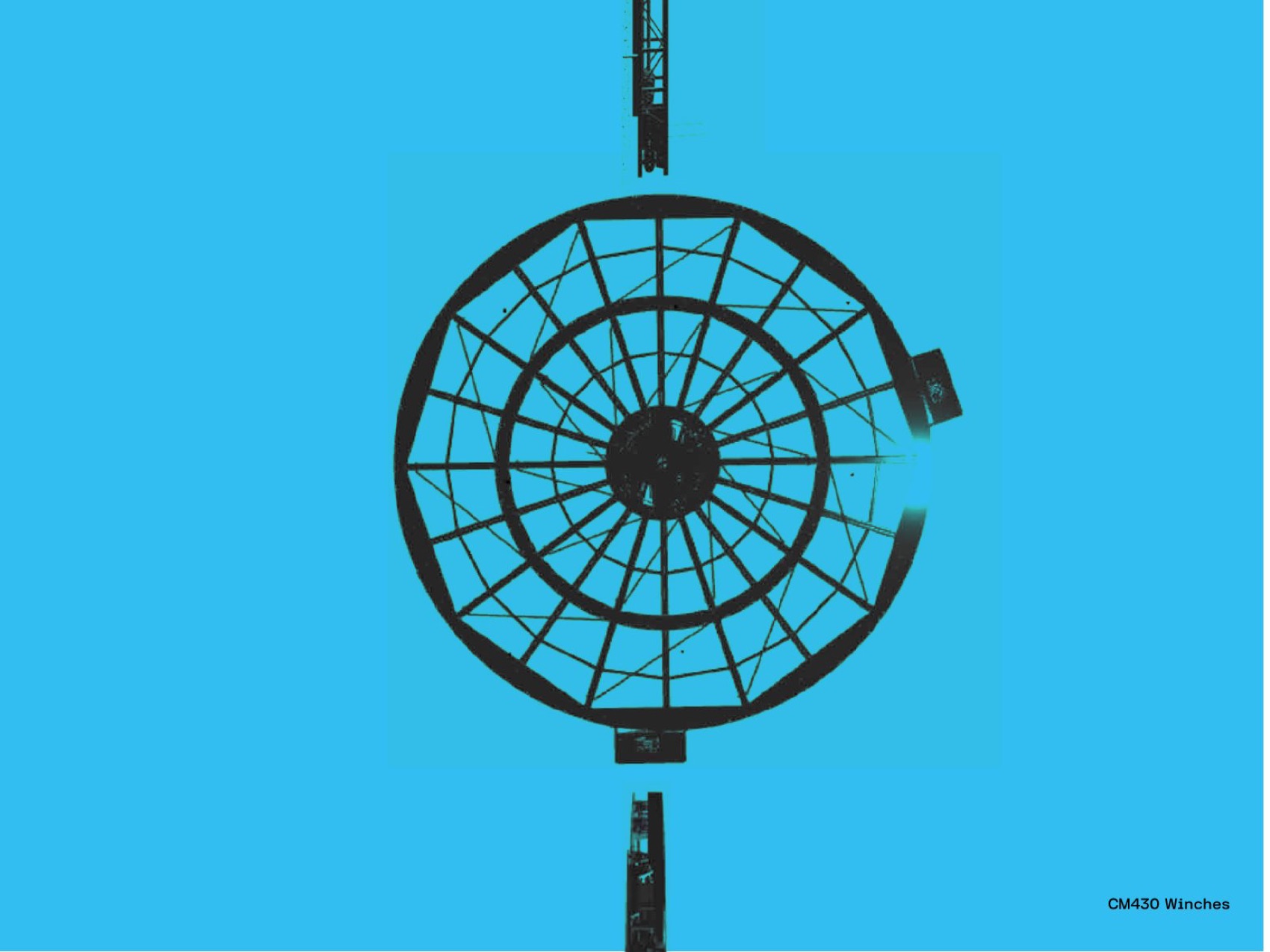
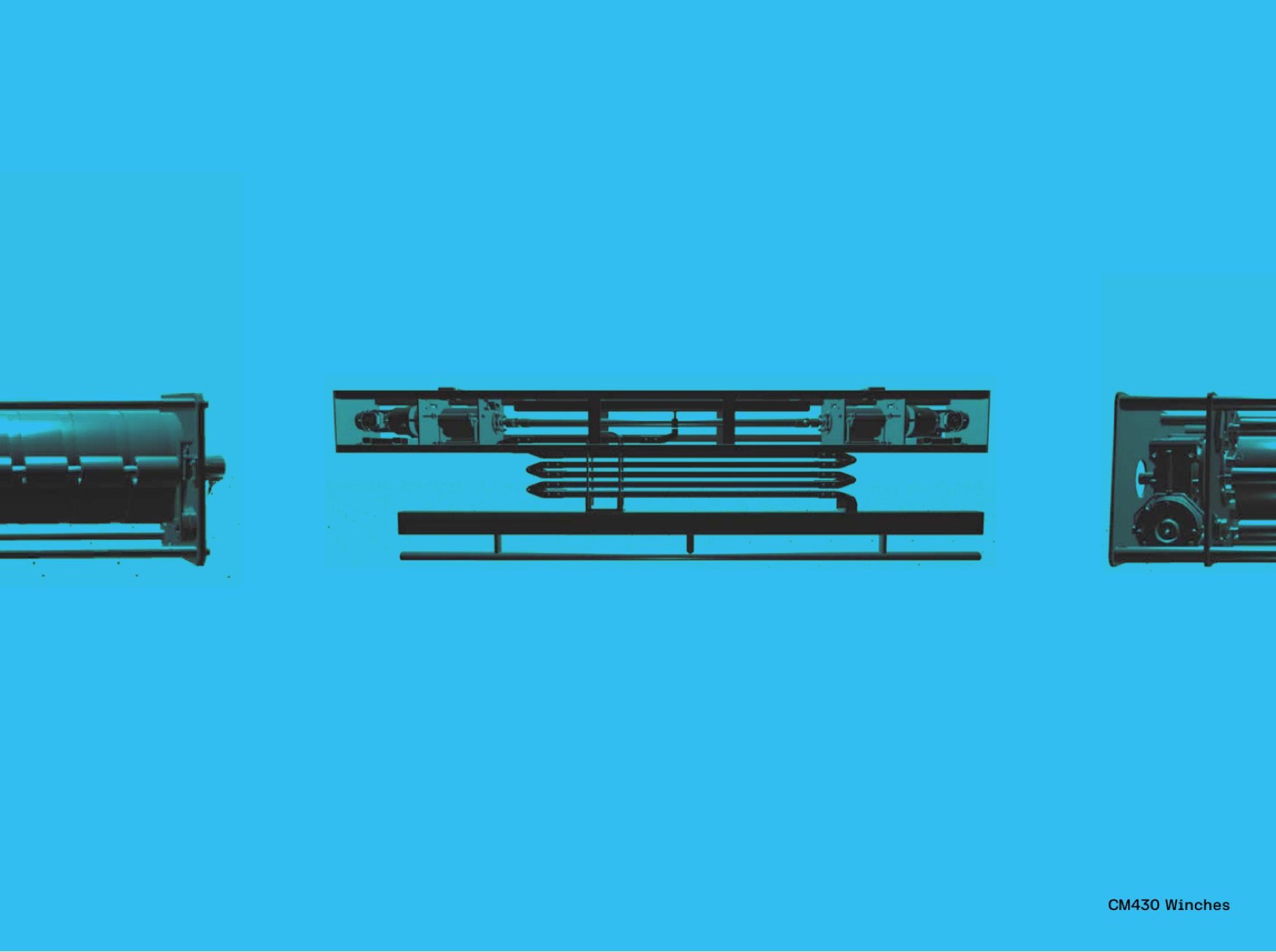
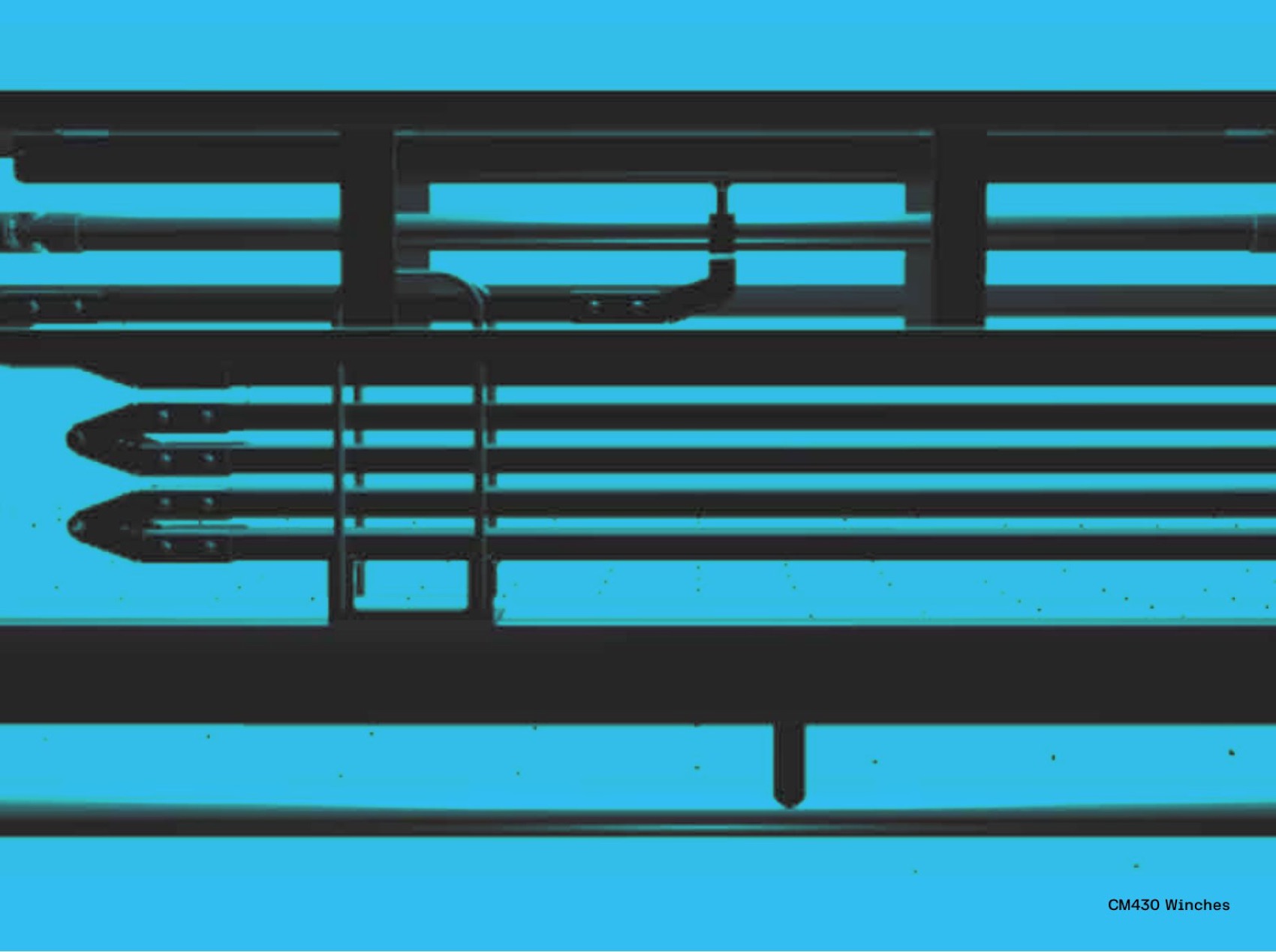
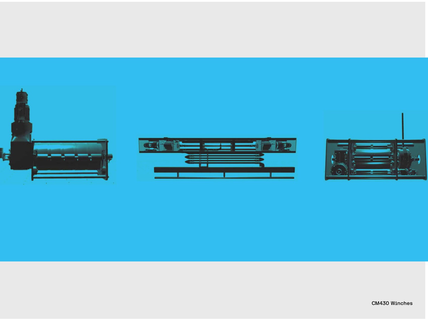
By making it move somewhere else. On the stand screens, where the technical drawing becomes movement.
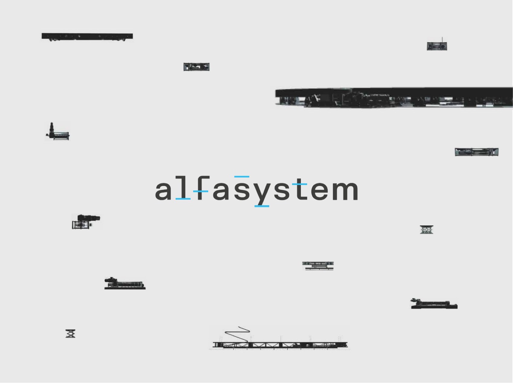
The storyboard starts from the technical drawings: the revolve turning, seen from above, the winches sliding past, the logotype assembling itself from the strokes of the machines. Cyan and black, nothing else.
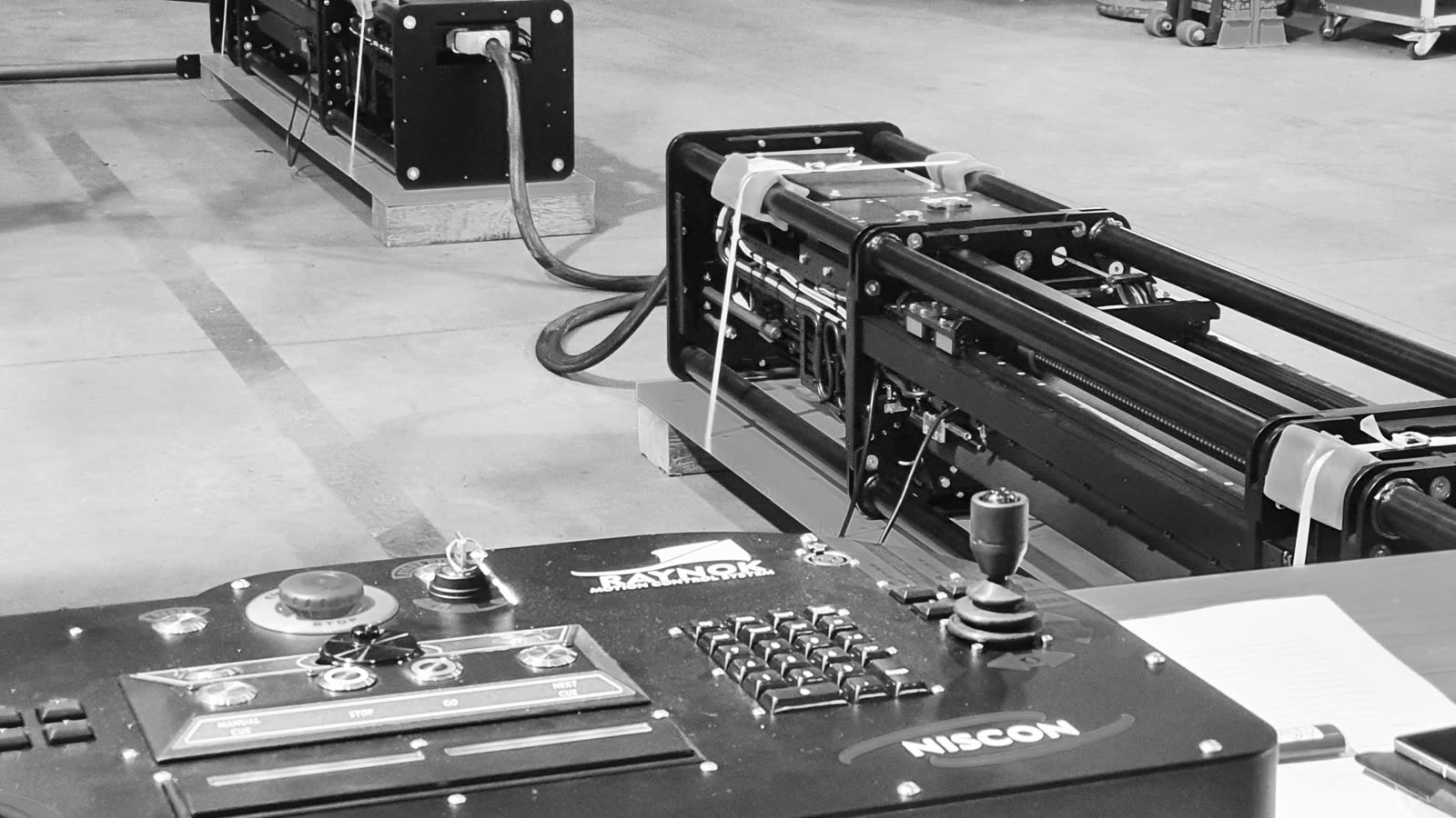
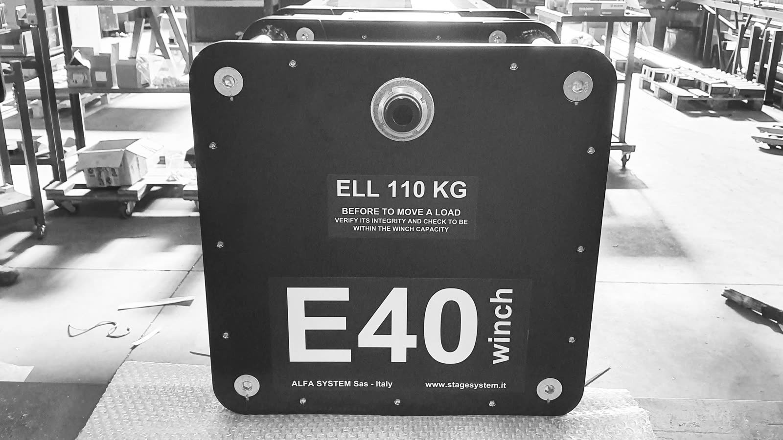
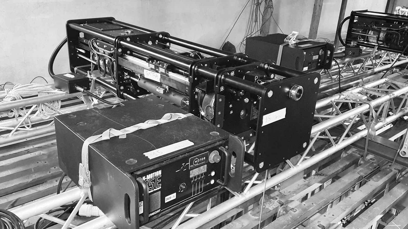
Alongside, a set of black and white slides with cyan accents: the workshop, the flight cases, the theatres. In 2026 the set was remade for the new edition.
The storyboard
2025 trade fair video · scroll →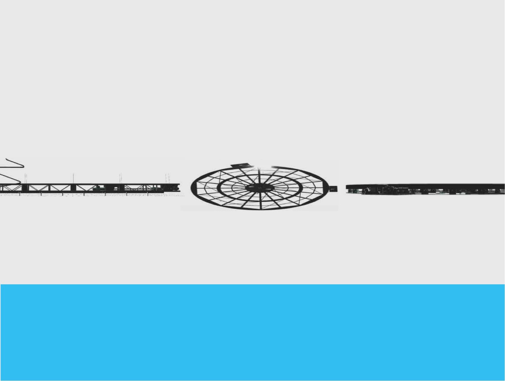
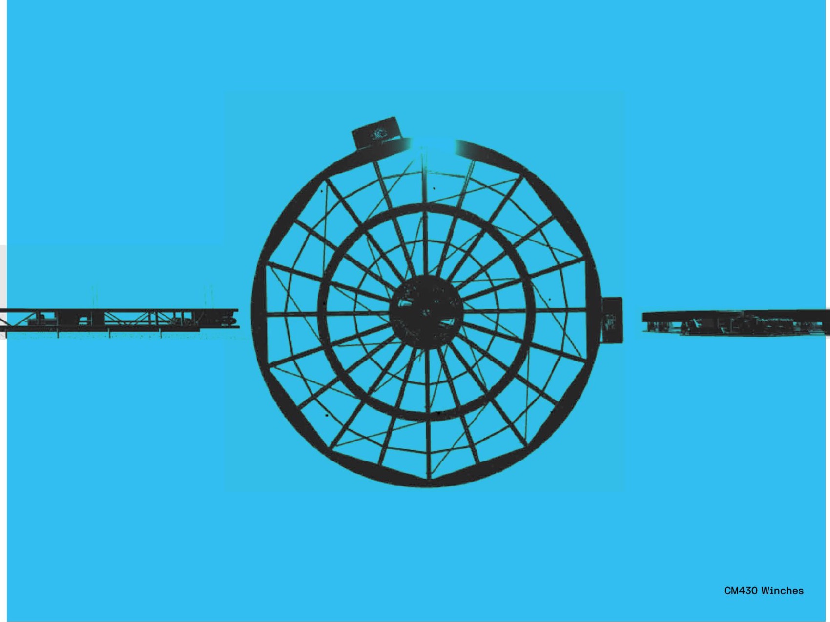


The slides for the screens
Black and white, cyan accents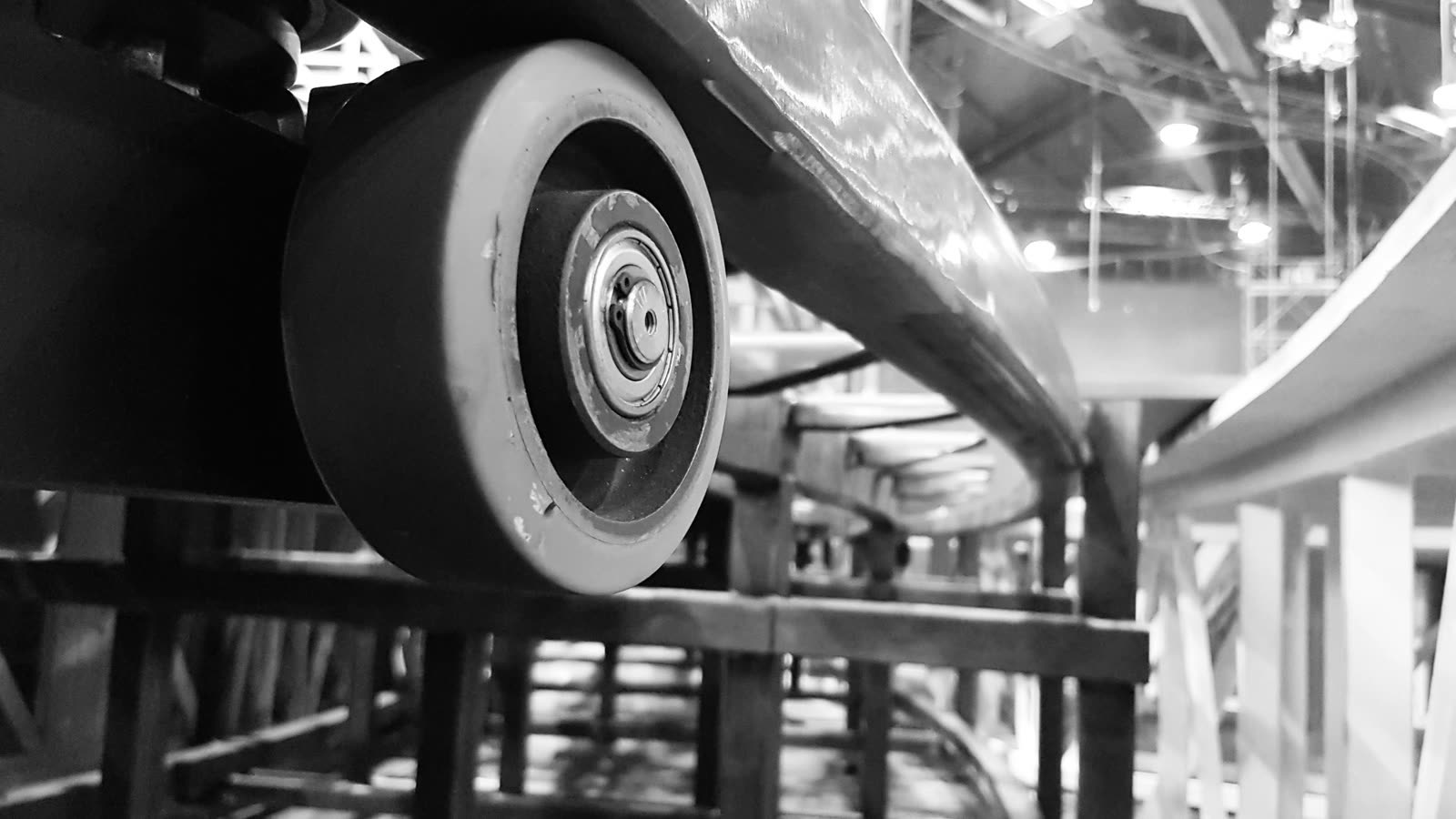
Frequently asked questions
Alfasystem and Opificio, in short.
What did Opificio Lamantini Anonimi do for Alfasystem?
The rebranding, the brand book, the corporate identity, the website architecture, the trade fair stand with totems and banners, and the videos for the fair screens.
Who designed Alfasystem’s current logo?
Opificio Lamantini Anonimi, between 2023 and 2024, with the tagline stage machinery engineering.
What does Alfasystem do?
Alfa System S.a.s. is a family-run company in Este, near Padua in Italy, founded in 1987, which designs and builds stage machinery for theatres, sets and events.
Which typeface does the Alfasystem logo use?
FK Grotesk Semibold, chosen to evoke a mechanical and at the same time technological feel.
Does Opificio Lamantini Anonimi also design trade fair stands?
Yes. For Alfasystem it designed the stand, the totems, the banners and the videos for the screens.