

Ottomura: showing the method, not the houses
Digital strategy, website, campaigns and social media for an estate agency in Padua that worked well but told its story like everyone else.
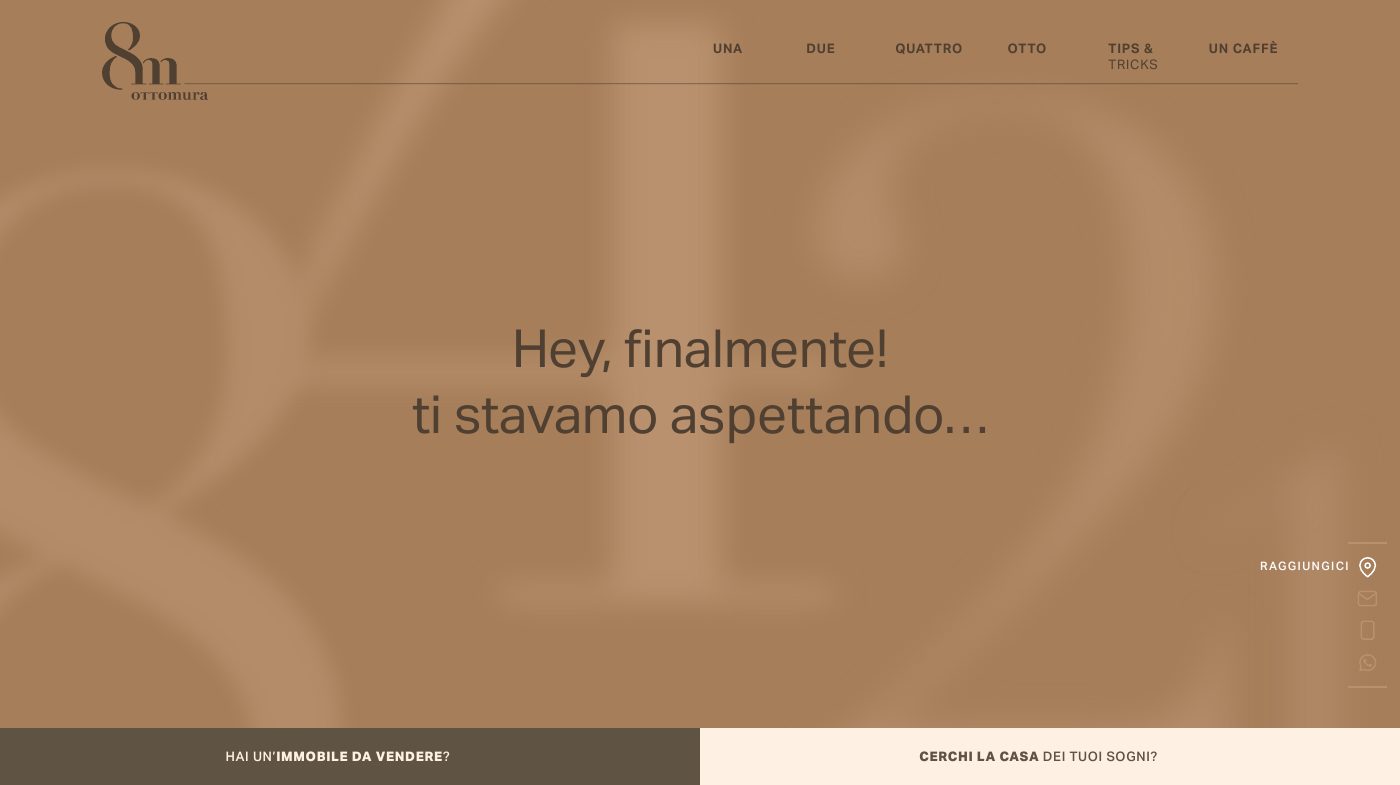
In short
Ottomura is an estate agency in Padua, Italy, dealing with the sale, purchase and valuation of property in Padua and its province. Since 2025 Opificio Lamantini Anonimi has looked after its digital strategy: identity analysis, content hierarchy, the ottomura.it website, advertising campaigns, billboards and the Instagram editorial plan.
Project facts
- Client
- Ottomura S.r.l.s.
- Sector
- Estate agency
- Location
- Padua, Italy
- Period
- 2025 – ongoing
- Goal
- Making the way of working visible
- Services
- Identity analysis, digital strategy, content hierarchy, website, landing page, advertising campaigns, billboards, Instagram editorial plan and posts
- Website
- ottomura.it
Ottomura sells homes in and around Padua. It works on a sole-agency basis, runs no auctions to the highest bidder, photographs every property properly. Online, though, none of that showed. That is where we started, in April 2025, with a questionnaire and not a single design file open.
The starting point
Where was Ottomura starting from?
From an agency with a name that is easy to remember, two partners who put their faces to it and a fairly strict way of working. And from digital communication that let almost none of this come through.
Three premises
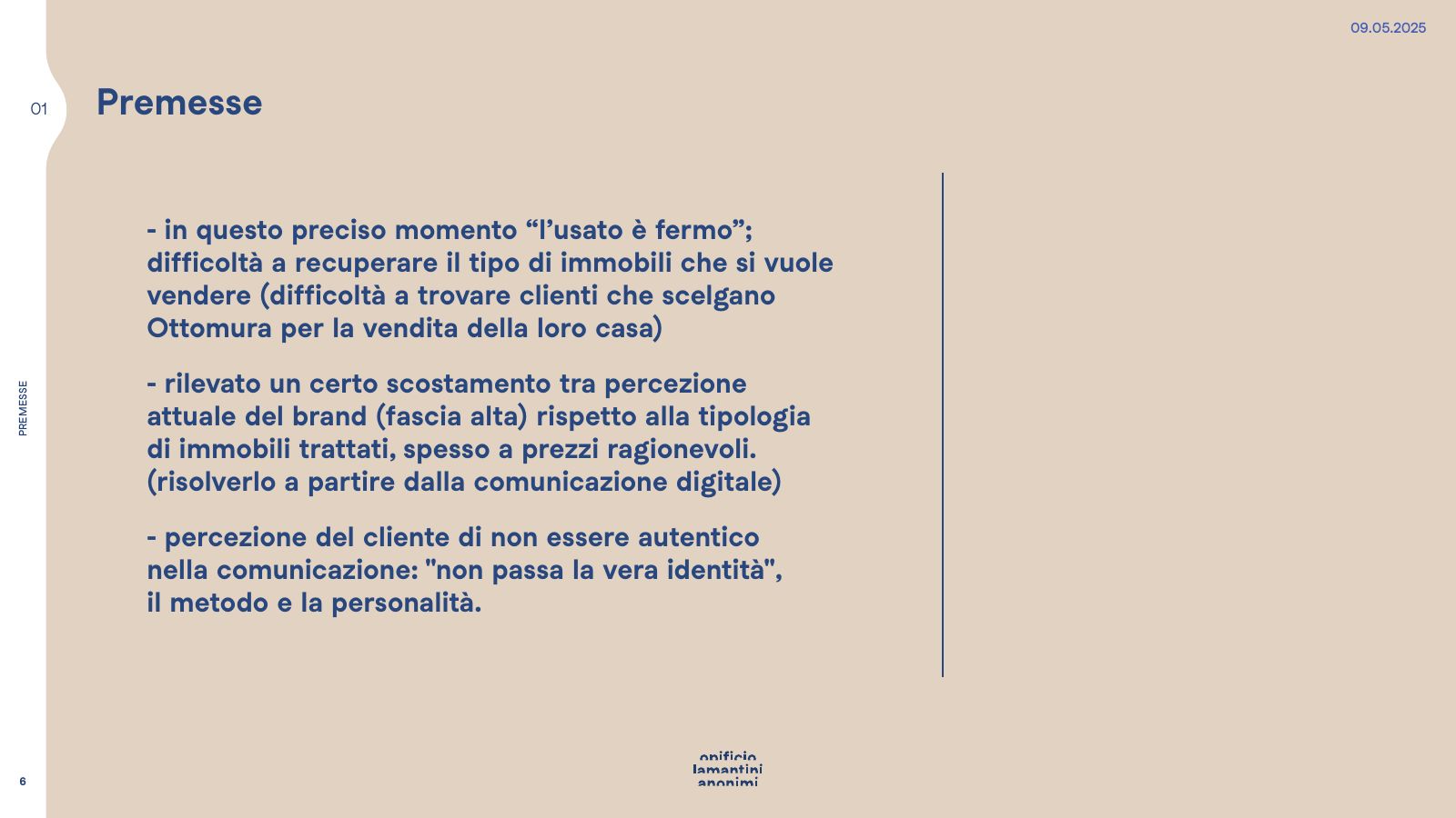
From our presentation, May 2025It was hard to find people who chose Ottomura to sell their home.
The brand read as high-end, while the properties on the books were often reasonably priced.
The partners’ method and personality stayed outside the communication.
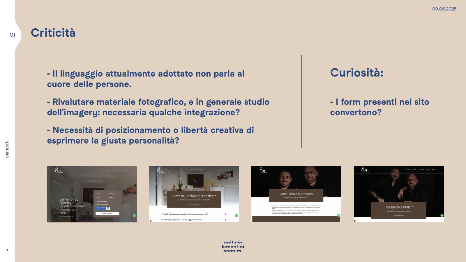
The language in use today does not speak to people’s hearts.From our presentation to Ottomura, 9 May 2025
Where do you start when a brand no longer recognises itself?
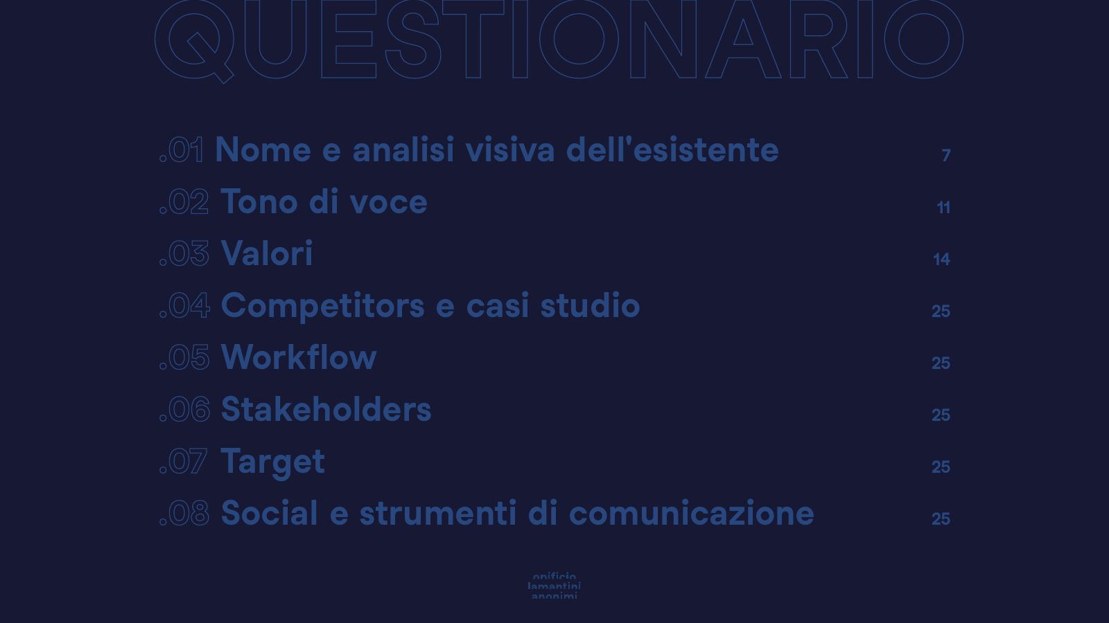
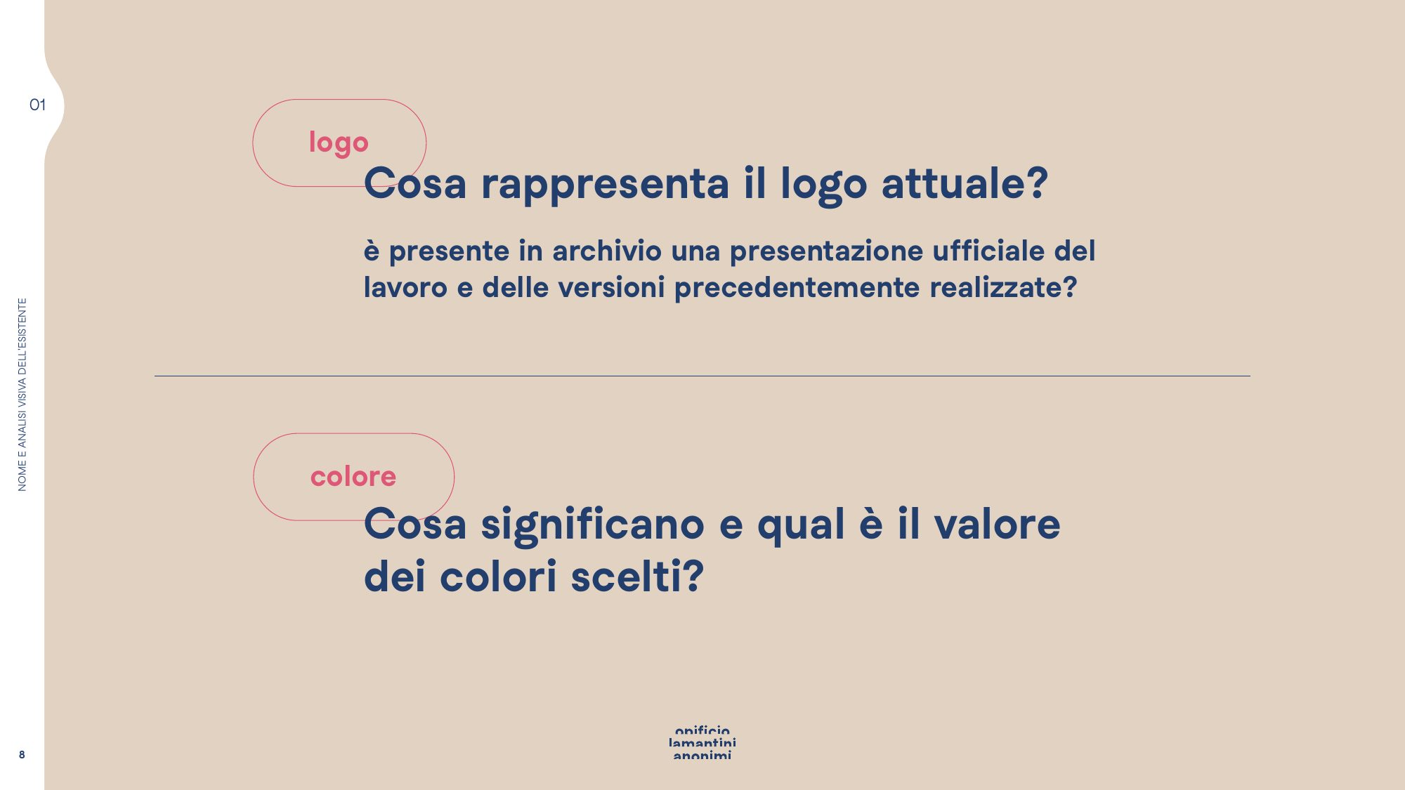
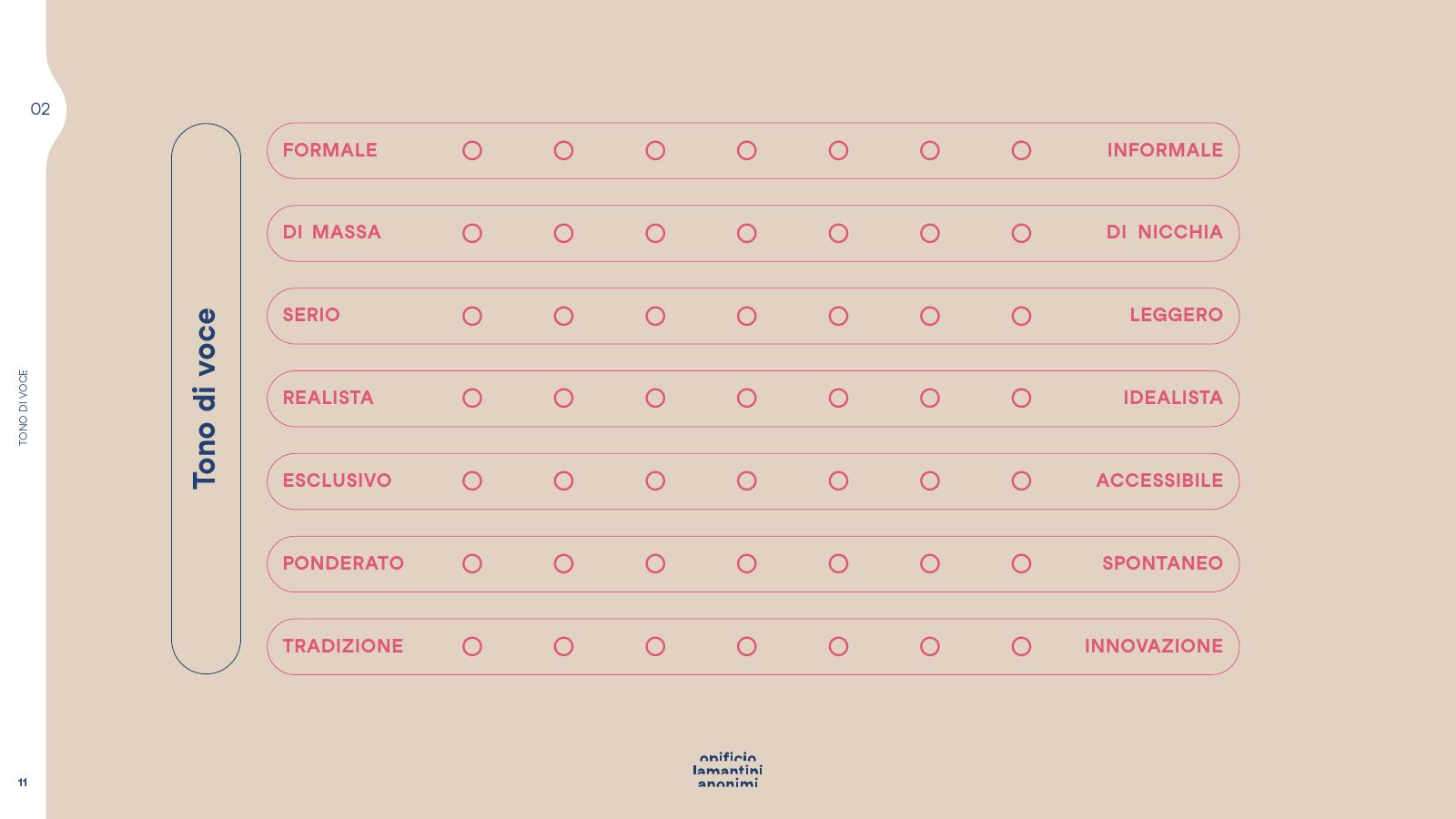
From a questionnaire, not from a design file. Eight areas, and a few awkward questions.
On 16 April 2025 we sent Ottomura a qualitative questionnaire on its existing identity. It had two jobs: to understand the company, and to understand what the company no longer wants to be.
- 01Name and visual analysis of what exists
- 02Tone of voice
- 03Values
- 04Competitors and case studies
- 05Workflow
- 06Stakeholder
- 07Target
- 08Social media and communication tools
The awkward questions
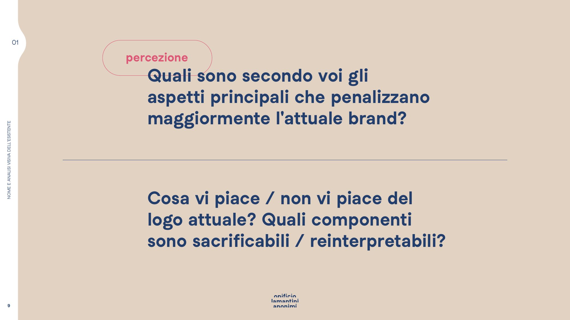
From the questionnaireWhich aspects hold your current brand back the most?
Which meanings do you not want attached to your brand?
If one of your clients had to describe you in a single word, what would it be?
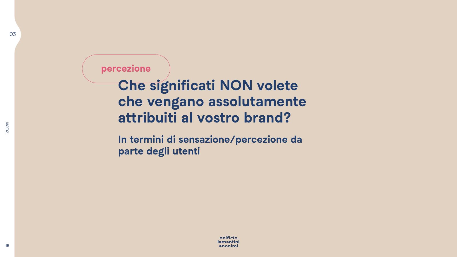
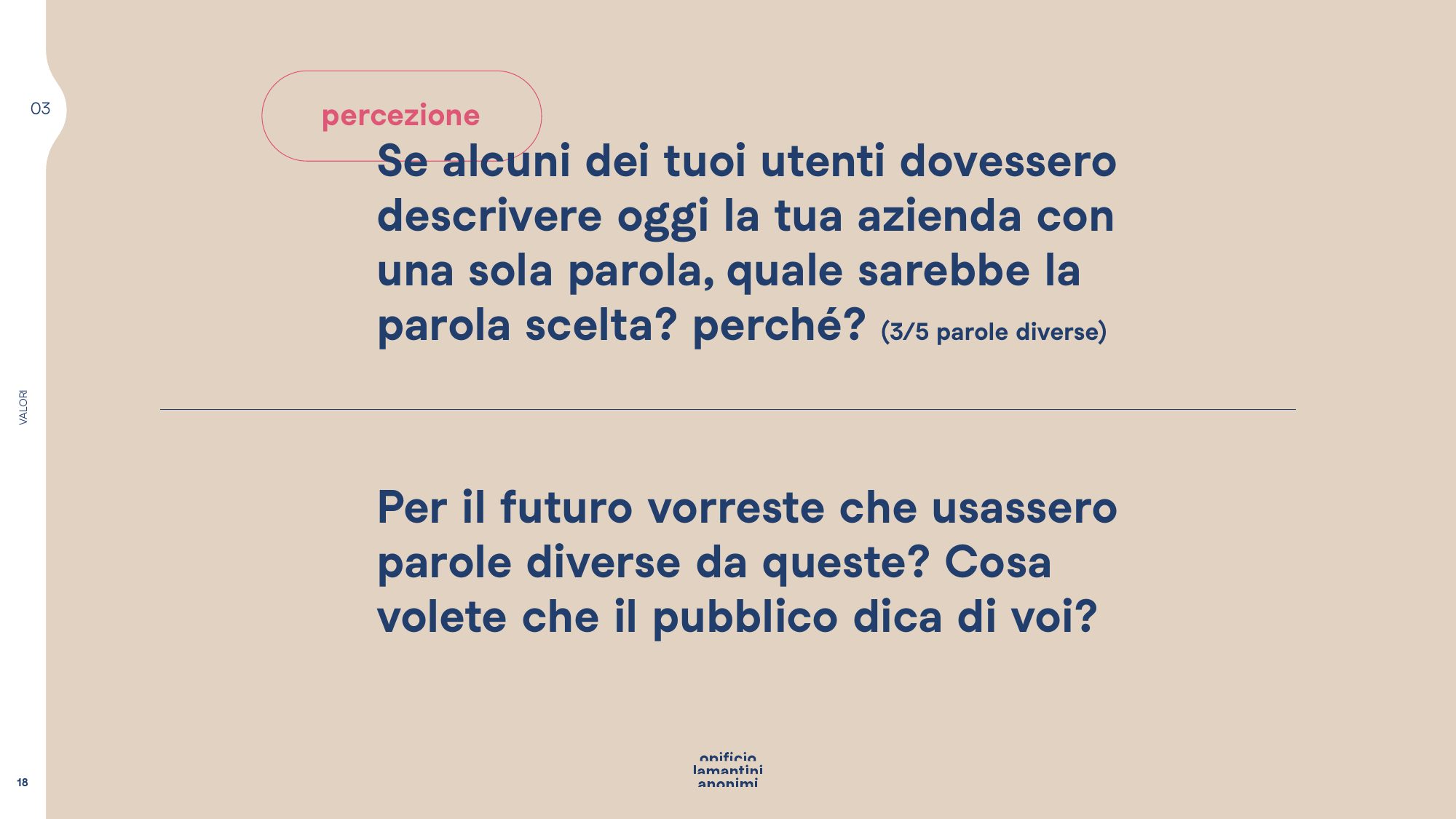
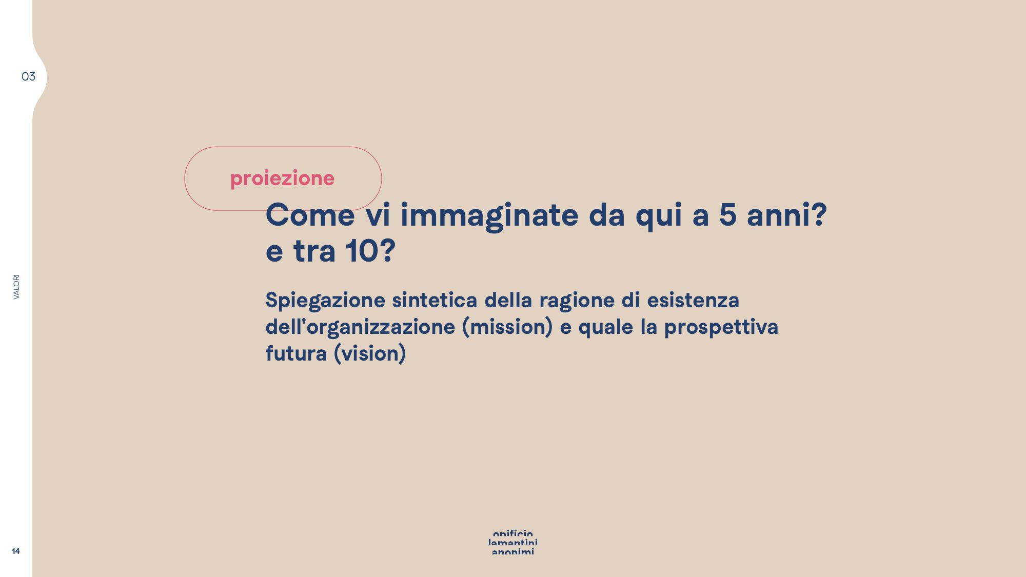
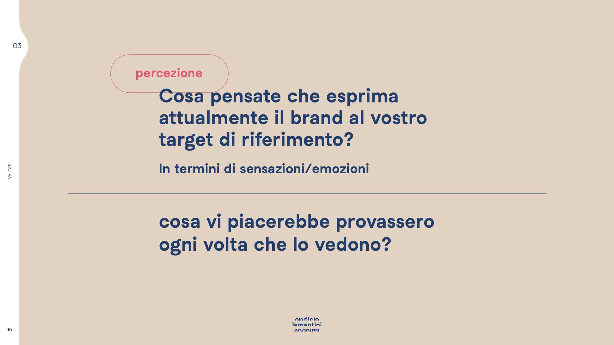
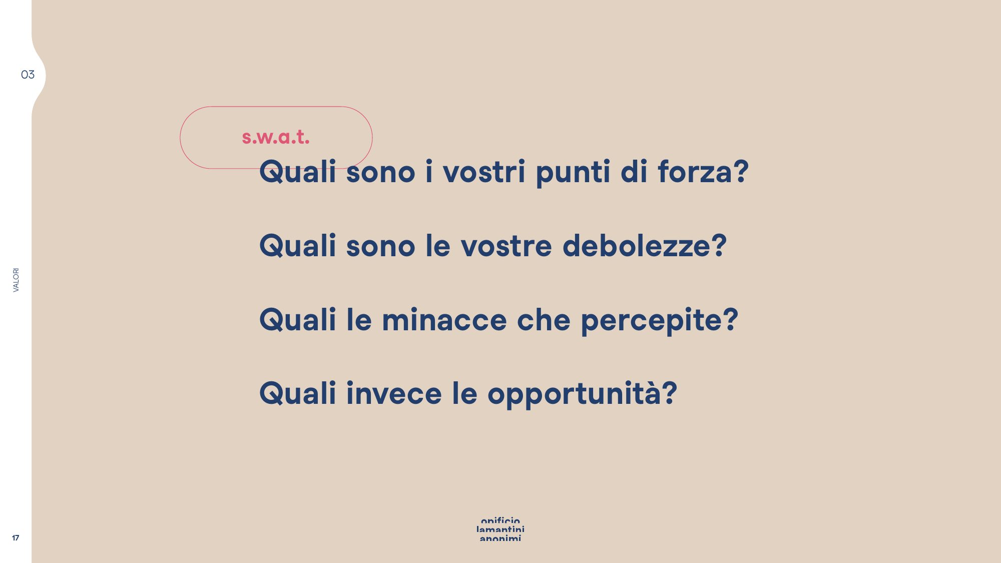
Values, projection, perception
The other areas of the questionnaire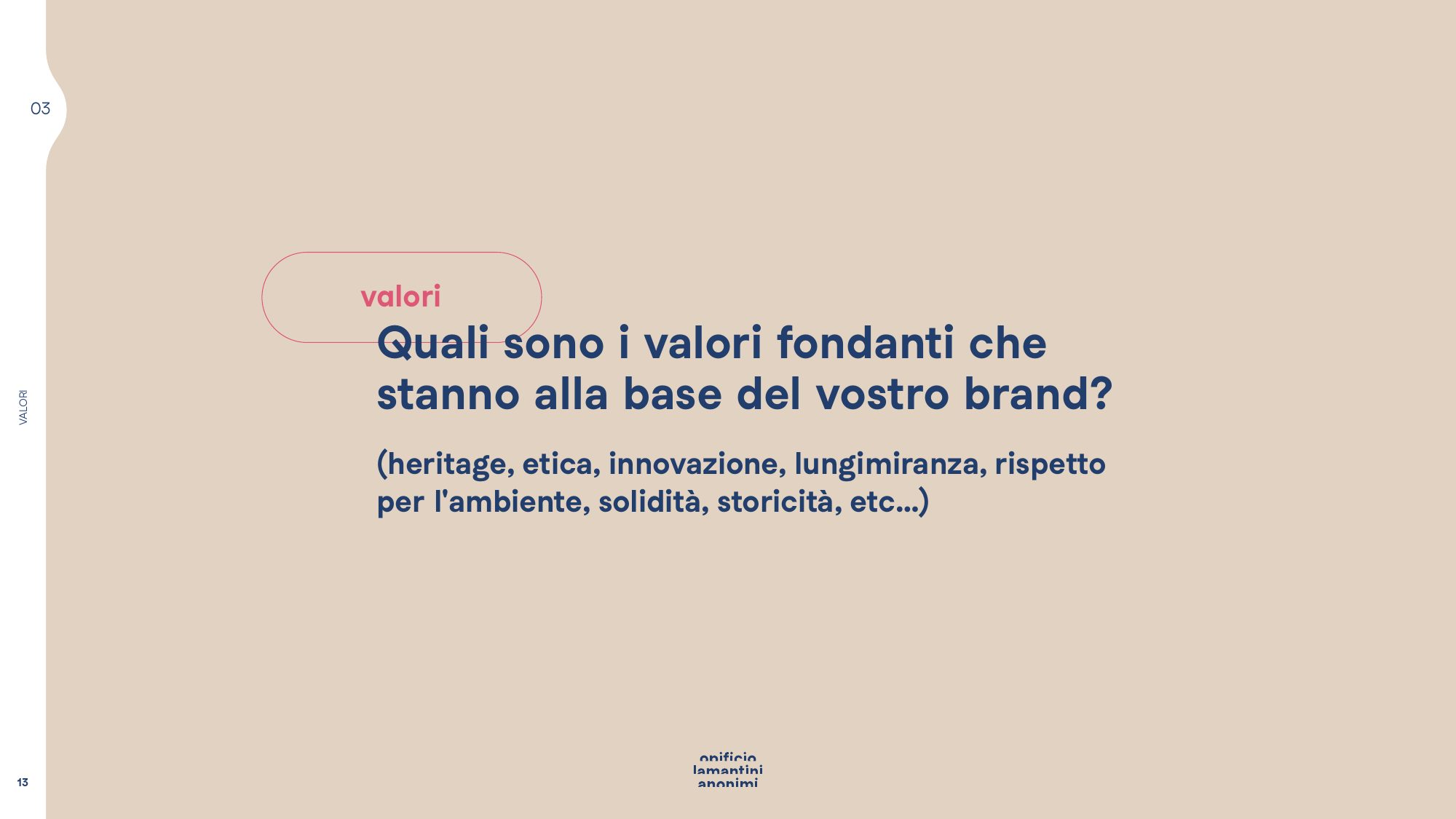
Who are we actually talking to?
Three audiences, not one. Those who must sell, those who want to buy and sell, those who only want to buy.
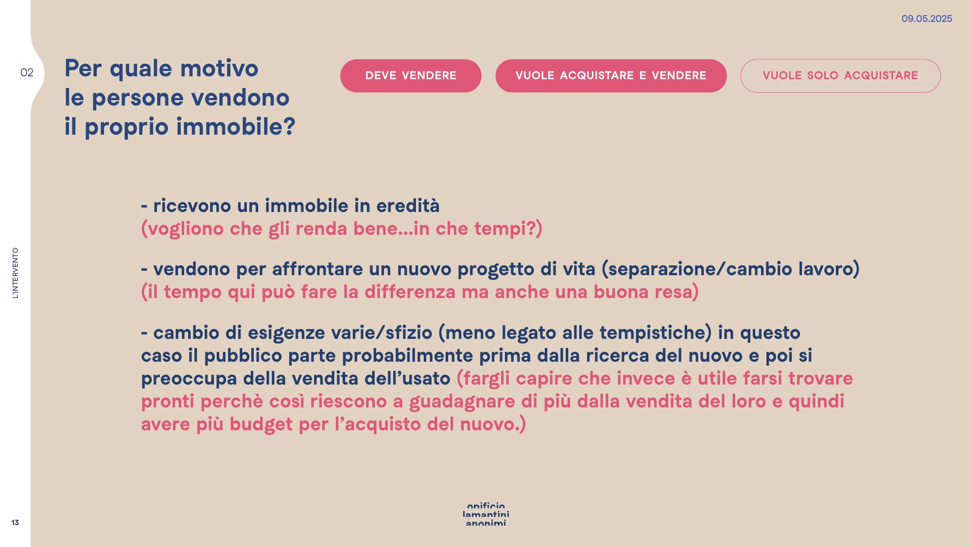
The answers turned into a presentation on strategy and content hierarchy. First we separated the audiences and the reasons a person puts a home on the market: an inheritance, a change of life, a change of needs. Then we lined up what Ottomura has to say to each of them.
The visual concept came from the name. 8mura — eight walls — already carries a sense of completeness on its own: from there came a scale that reads backwards, from eight to one.
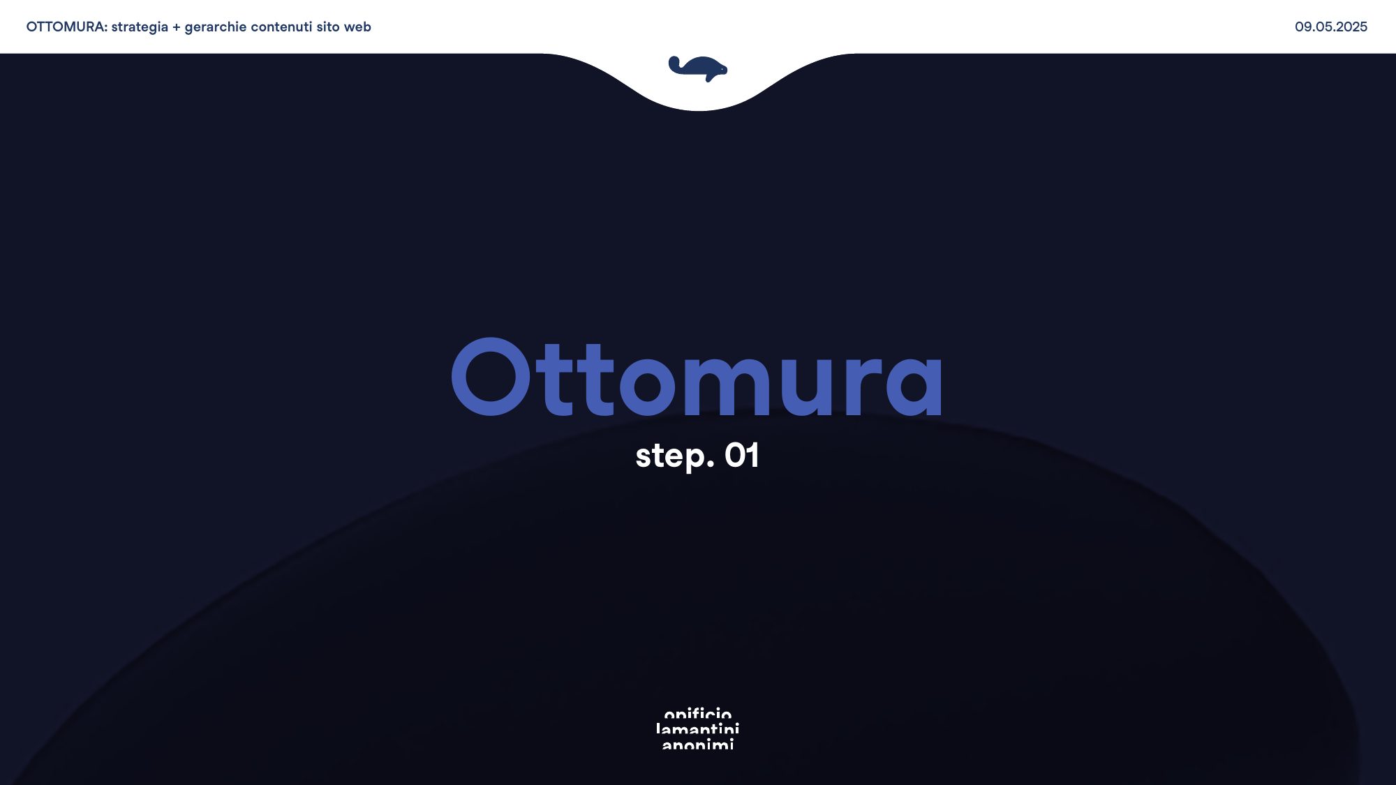
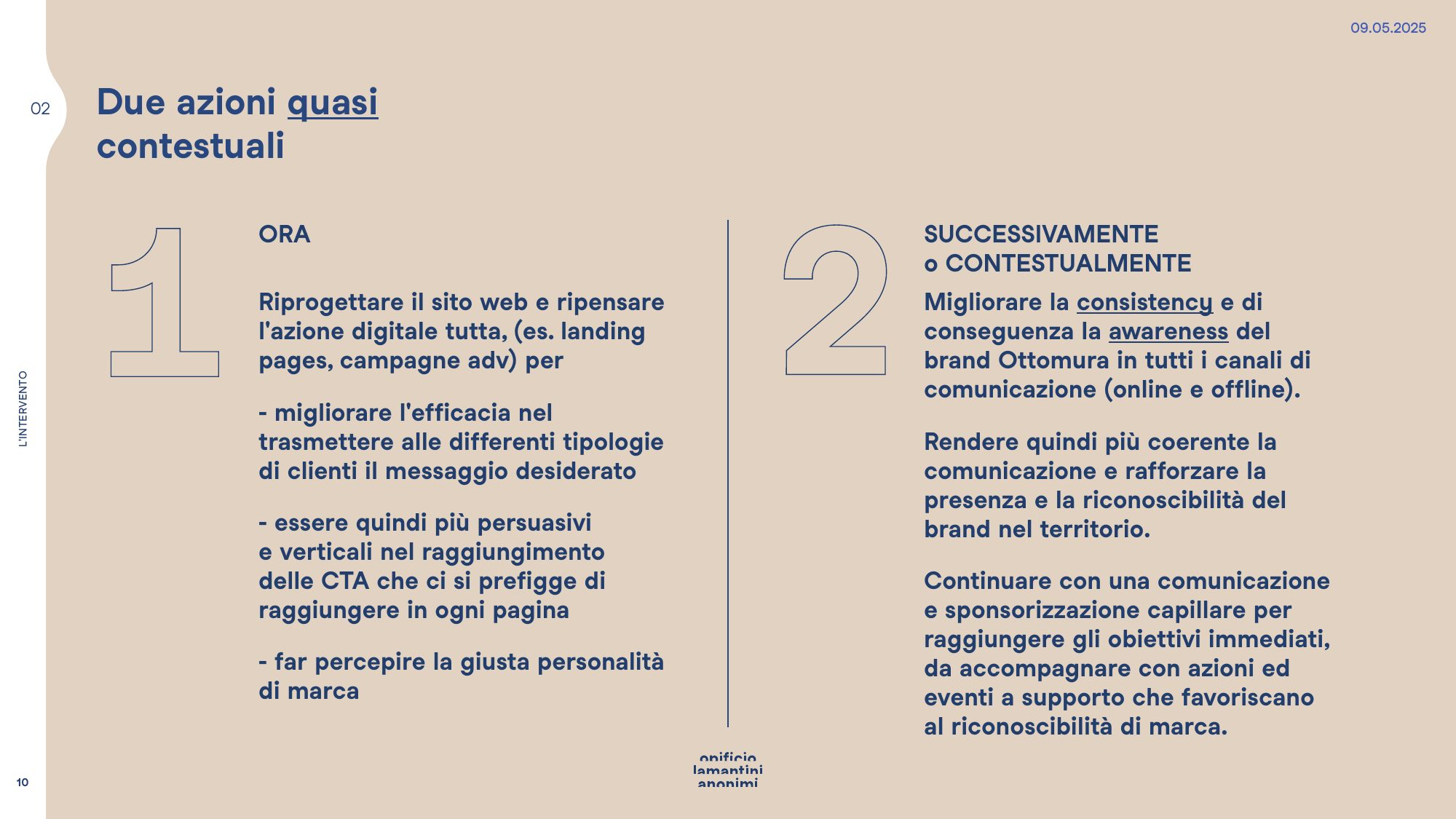
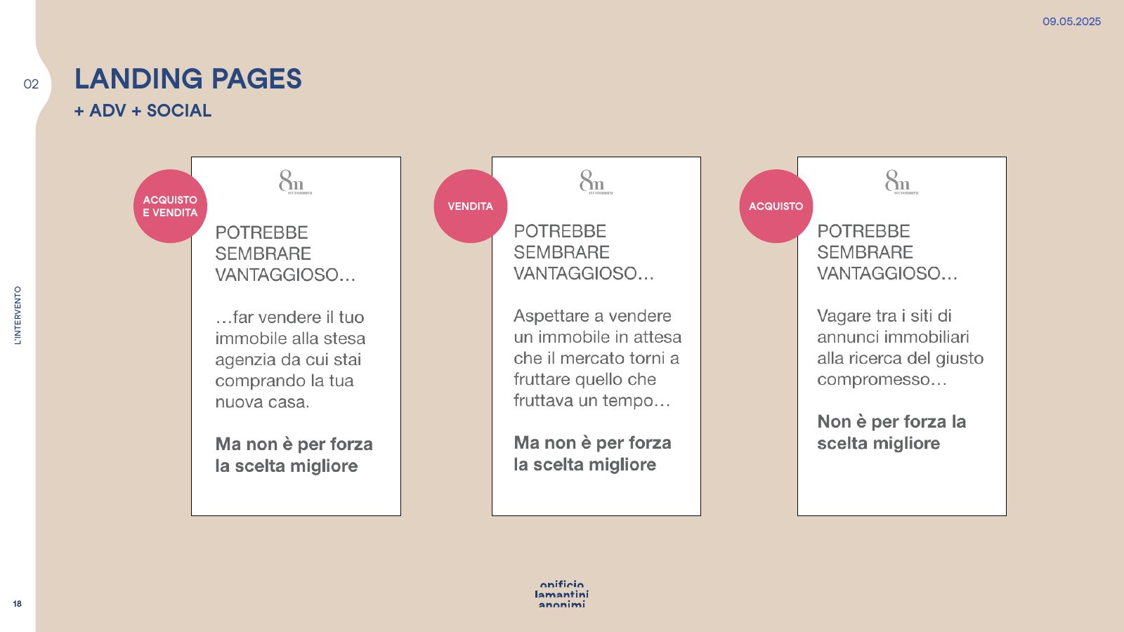
Three audiences, three urgencies
From the strategy presentation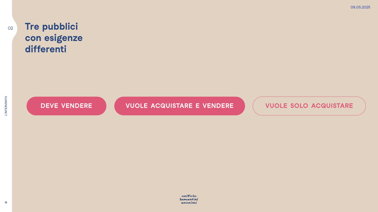
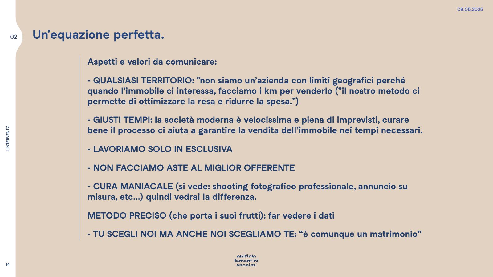
A perfect equation
What to say, and in which order- 01Any area: when the property is right, the miles get covered
- 02The right timing: looking after the process to sell when it matters
- 03Sole agency only
- 04No auctions to the highest bidder
- 05Obsessive care: a proper photo shoot and a made-to-measure listing
- 06A precise method, with the data to hand
The tone of voice
Five words, no superlativesgenuine, straight-talking, sincere, competent, solid.
From the name to the mark
Visual concept and headlines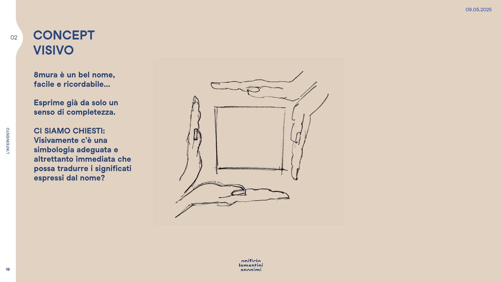
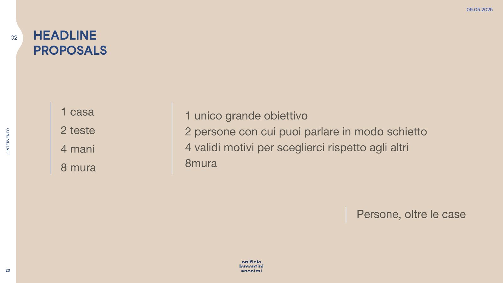
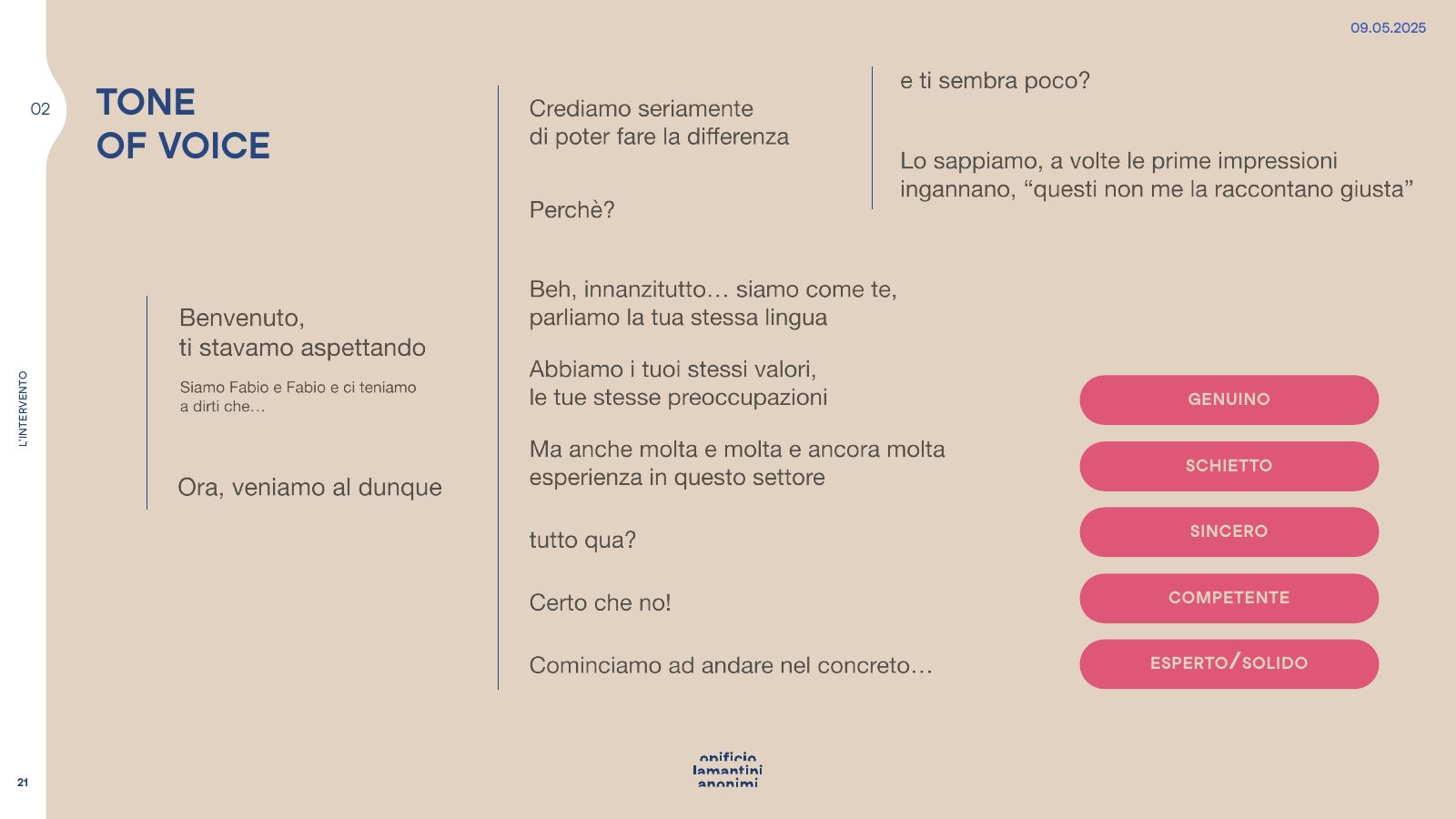
The scale reads backwards: it starts at eight and ends with a single house, yours.
The content hierarchy
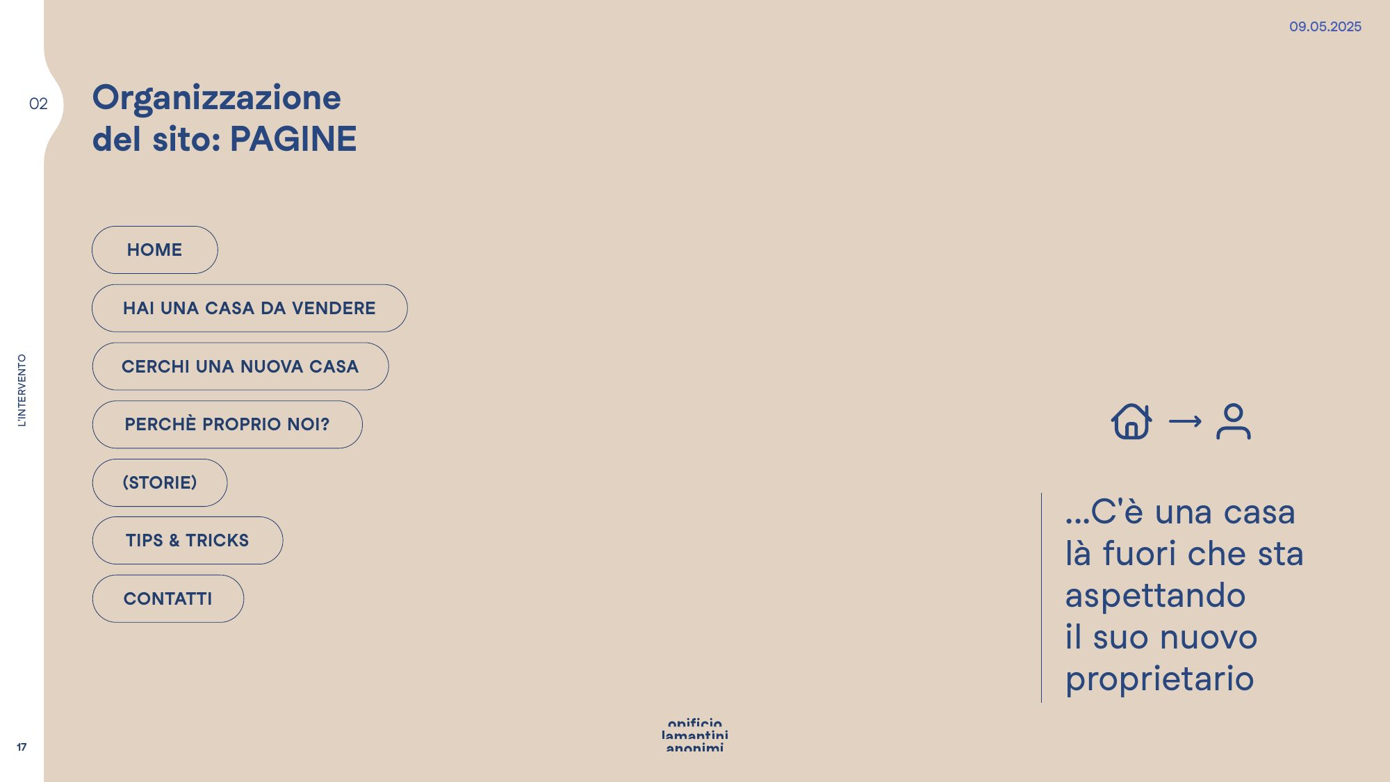
Homepage, pages, landing pages, social media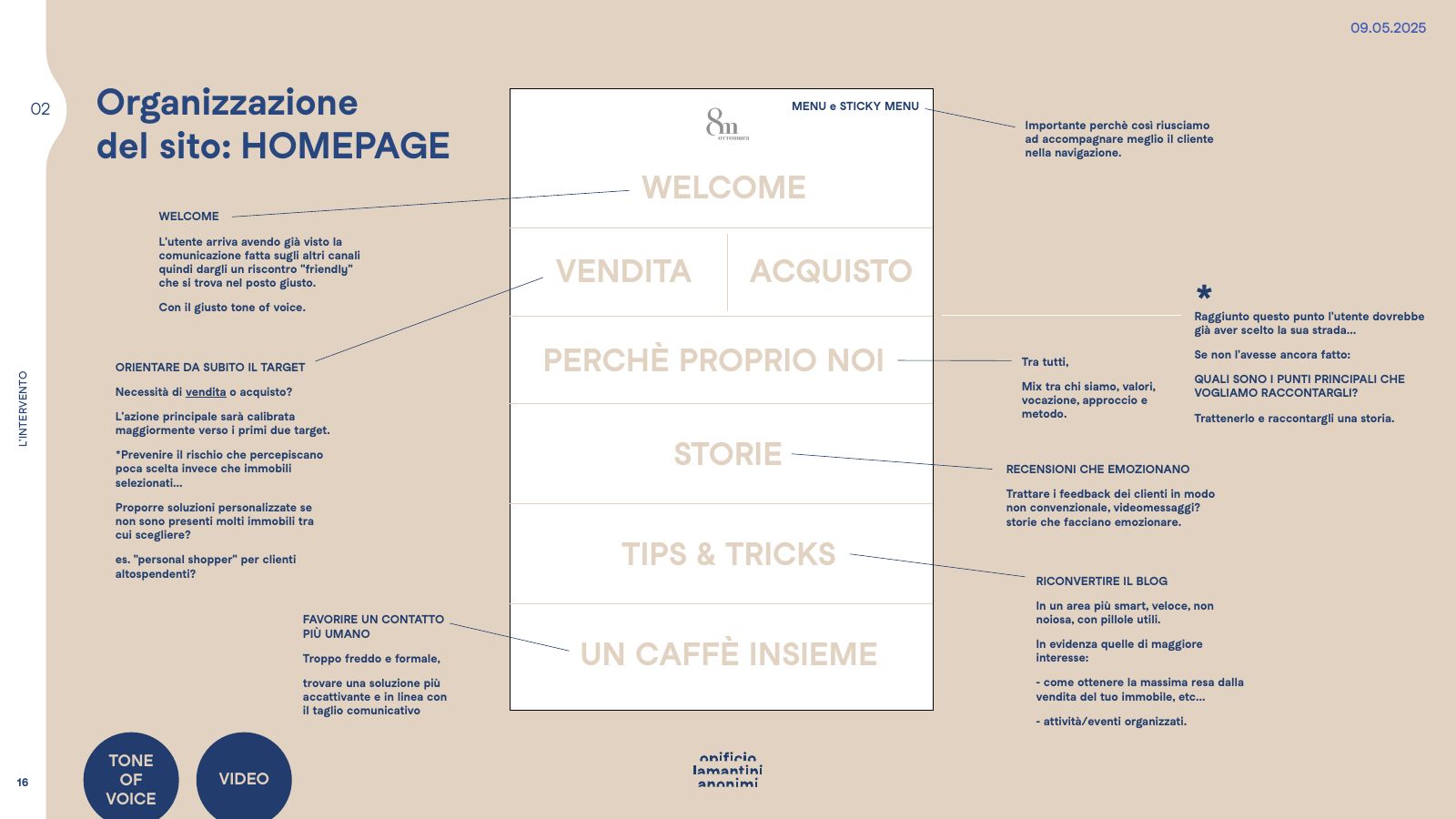
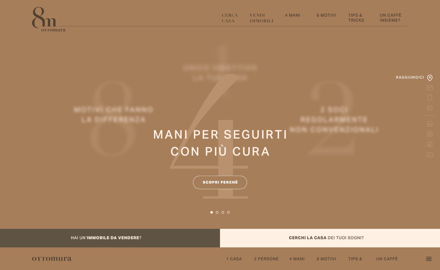
How do you walk someone into a method through a screen?
The website does not open with the houses. It opens with a question: are you selling, or are you looking?
The menu became the scale: one house, two people, four hands, eight reasons, choices upon choices, coffee together? Not one item is called “about us” or “news”.
The blog is Scelte, scelte — choices, choices: these are not news items, they are decisions. The contact page is Prendiamoci un caffè — let’s have a coffee: the coffee is only a detail, the listening is what makes the difference. Inside: filtered search, property pages with map and floor plan, landing pages and a monthly newsletter.
The pages, in full
Hover over a page to scroll it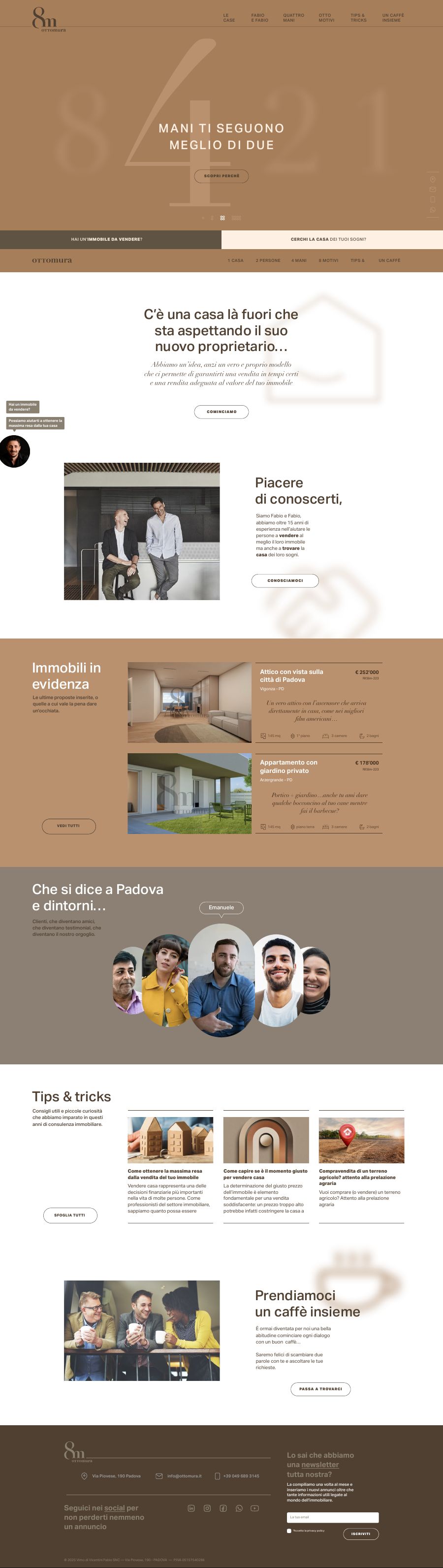
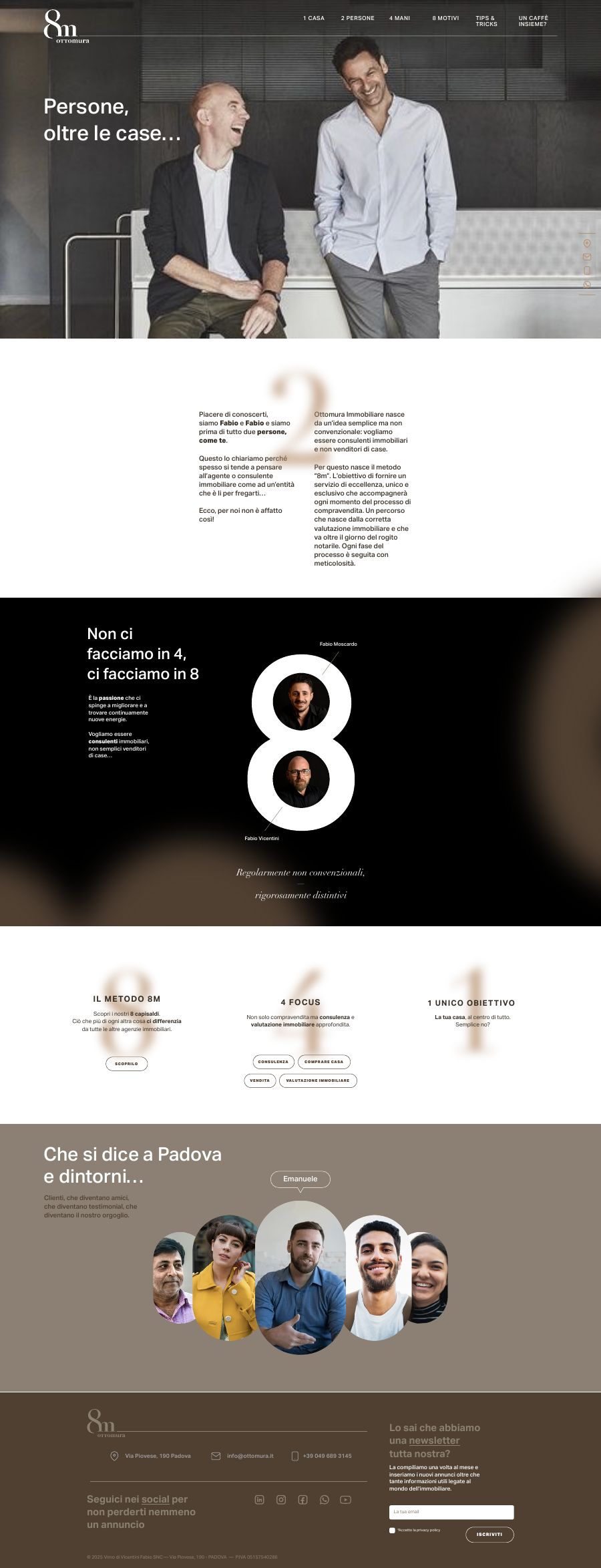
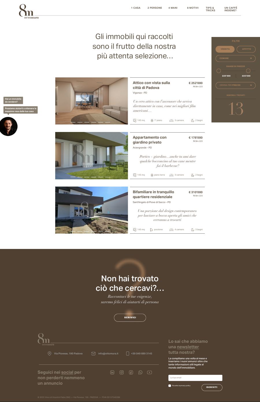
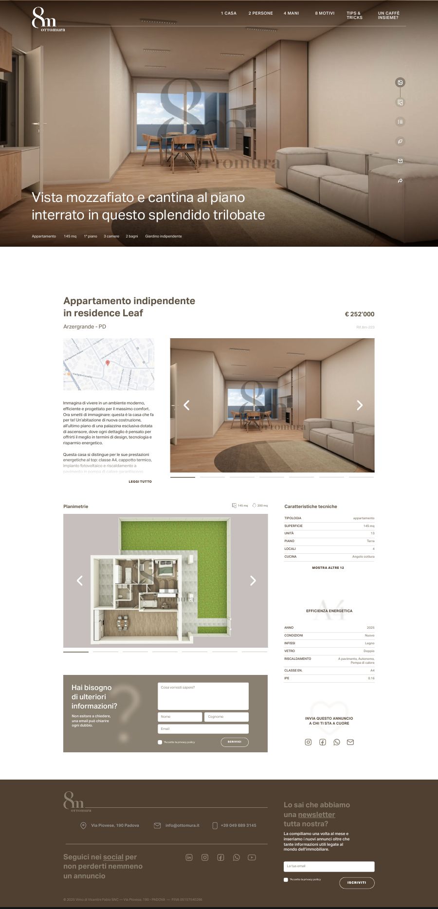
On the phone
Opening, menu, filters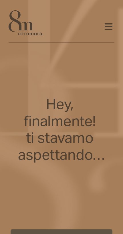
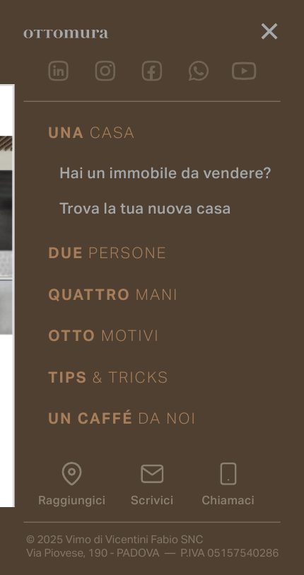
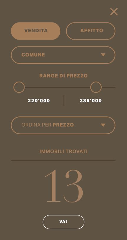




What is left of a brand when you meet it for three seconds?
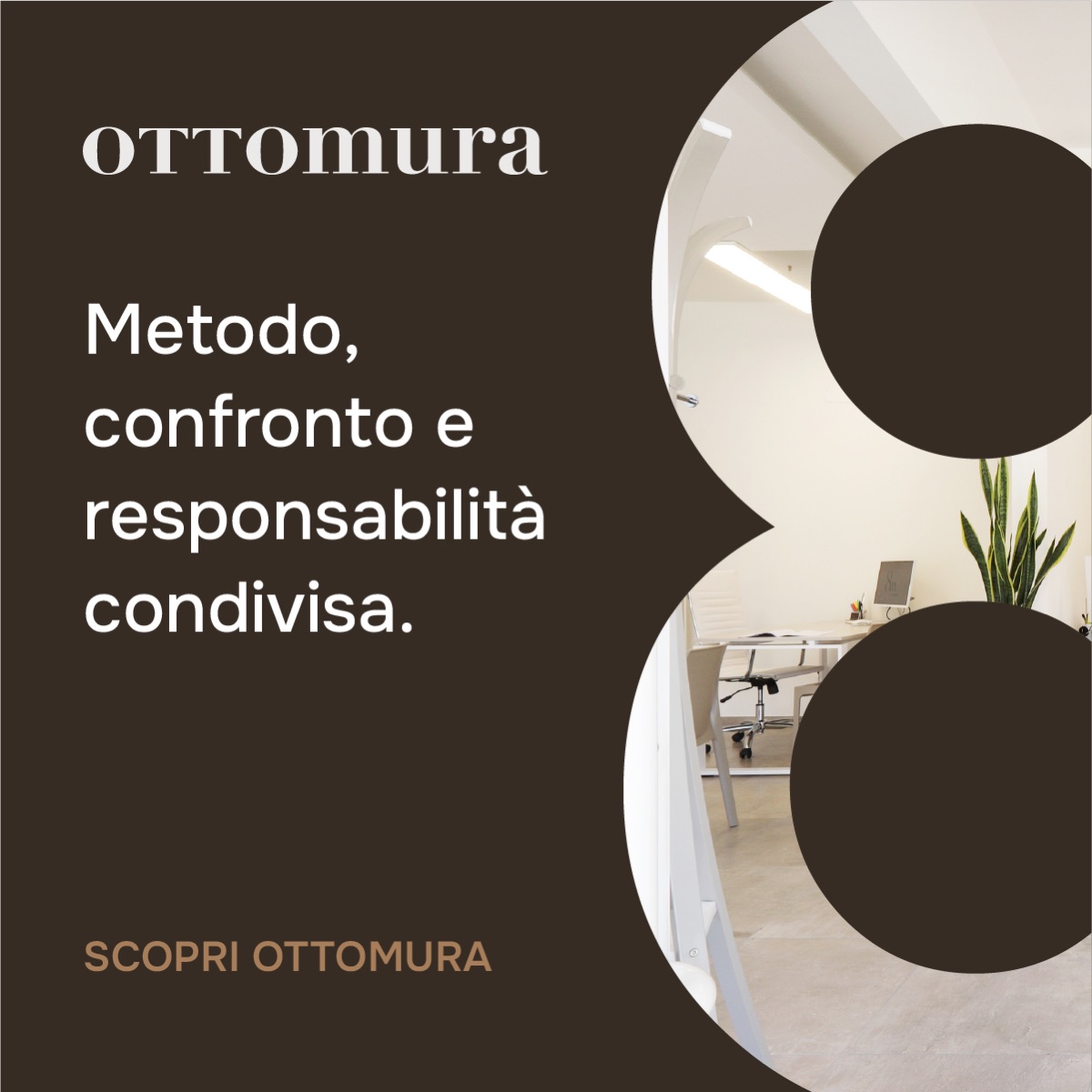
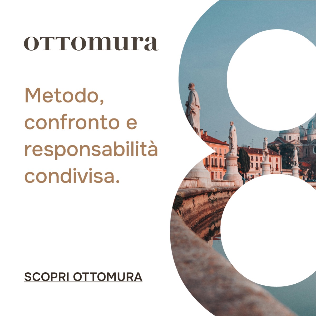
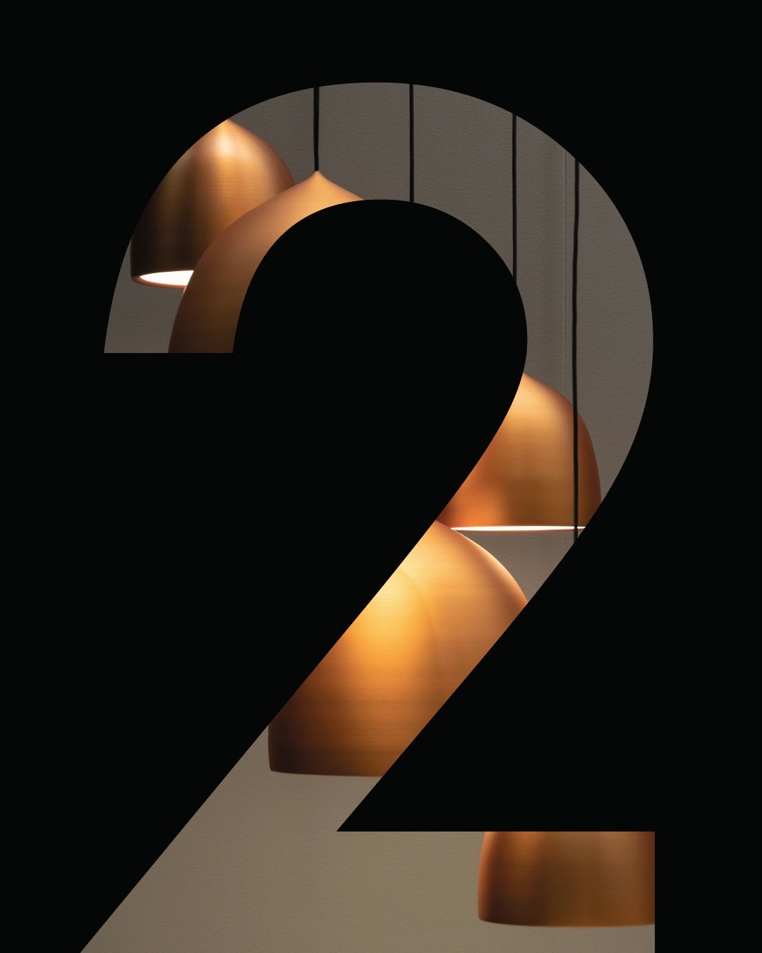
A number and a line. The eight becomes a window: inside it you put the city, the office, the house.
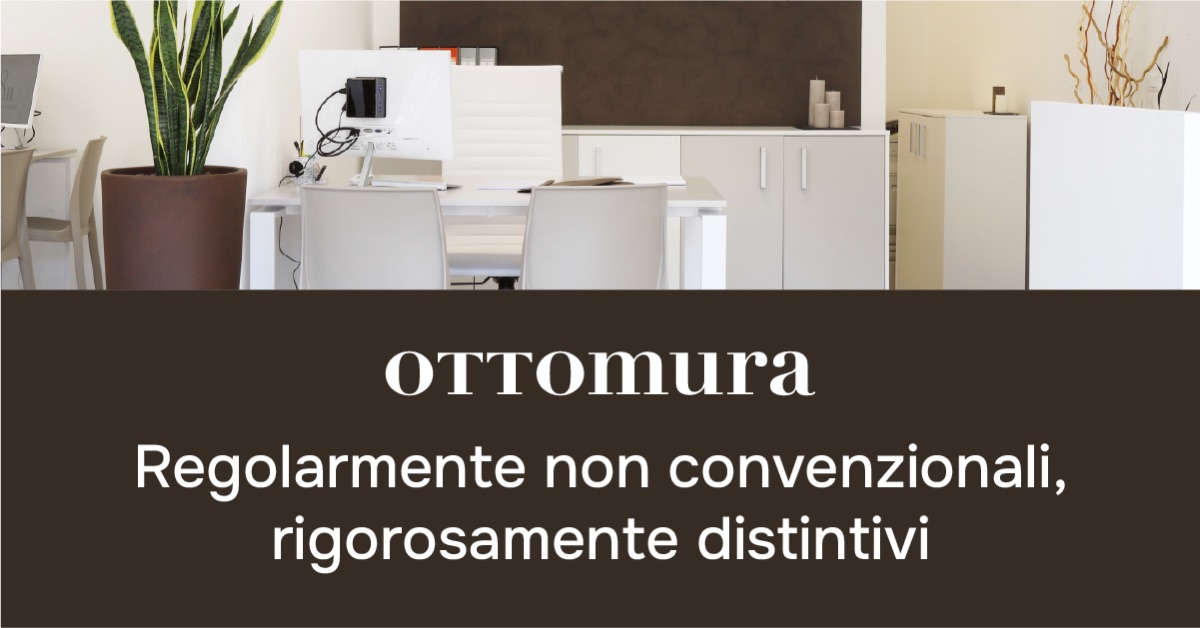
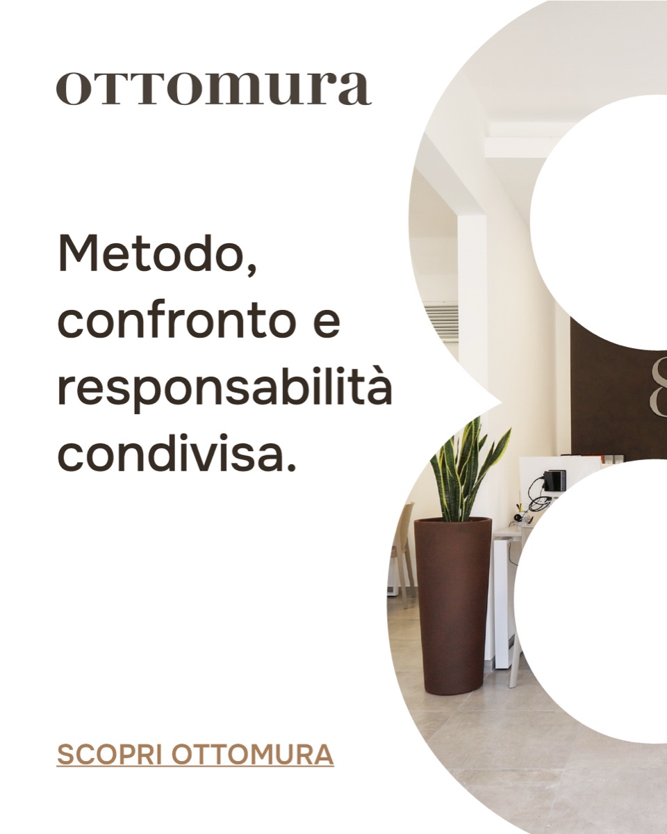
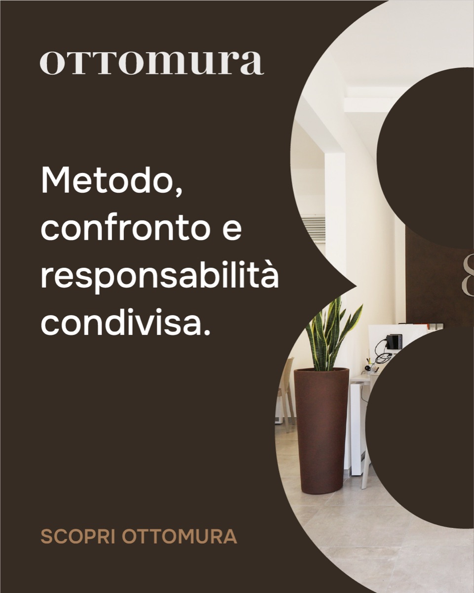
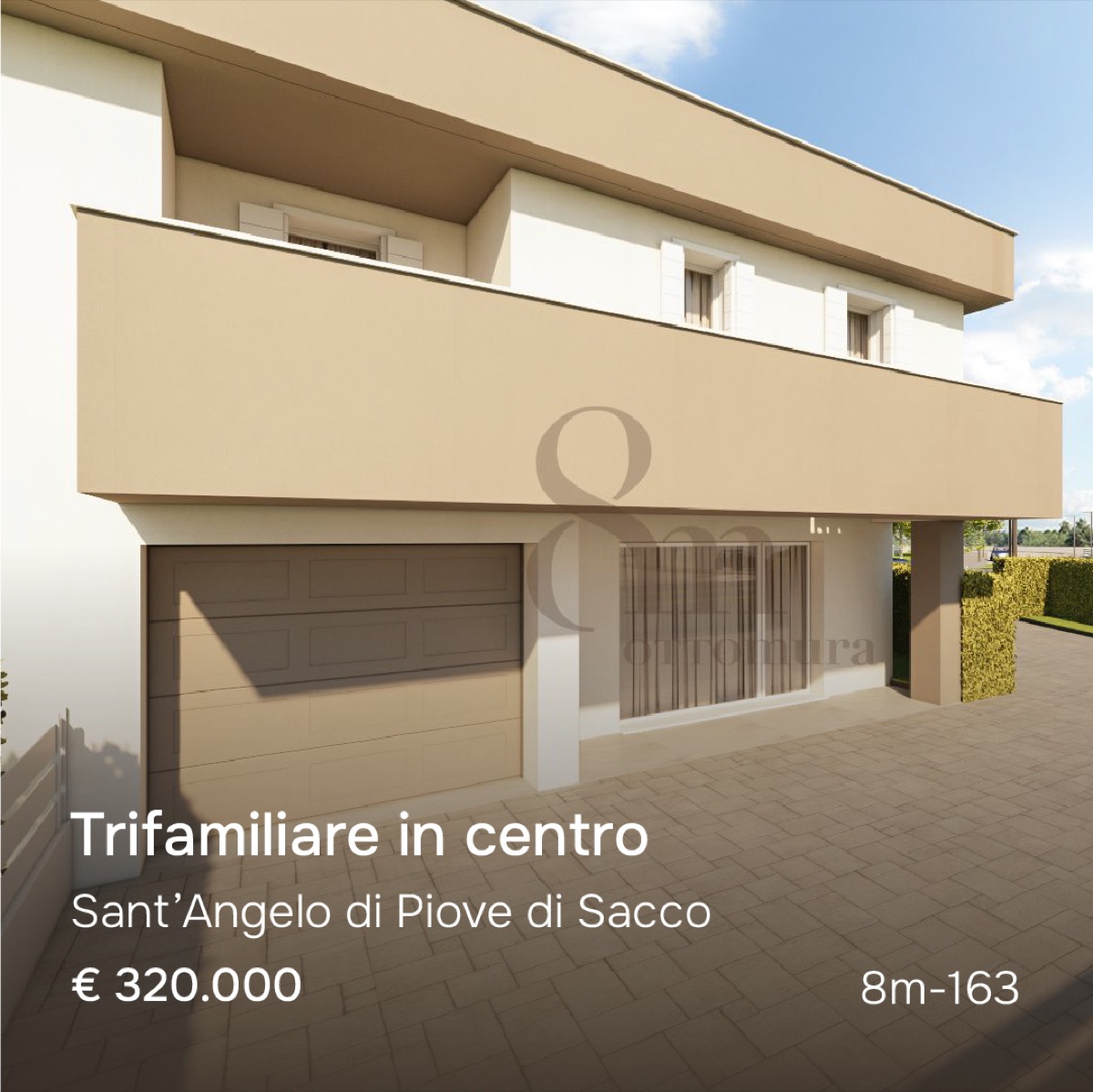
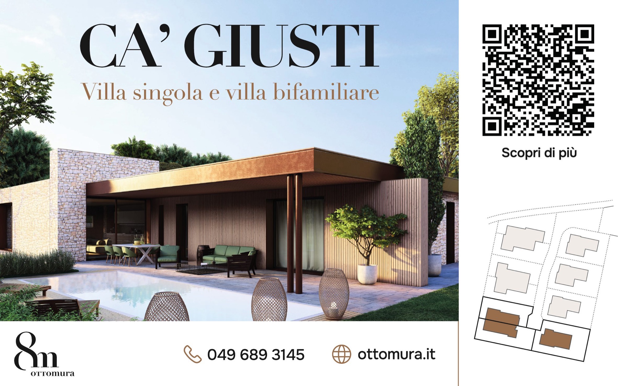
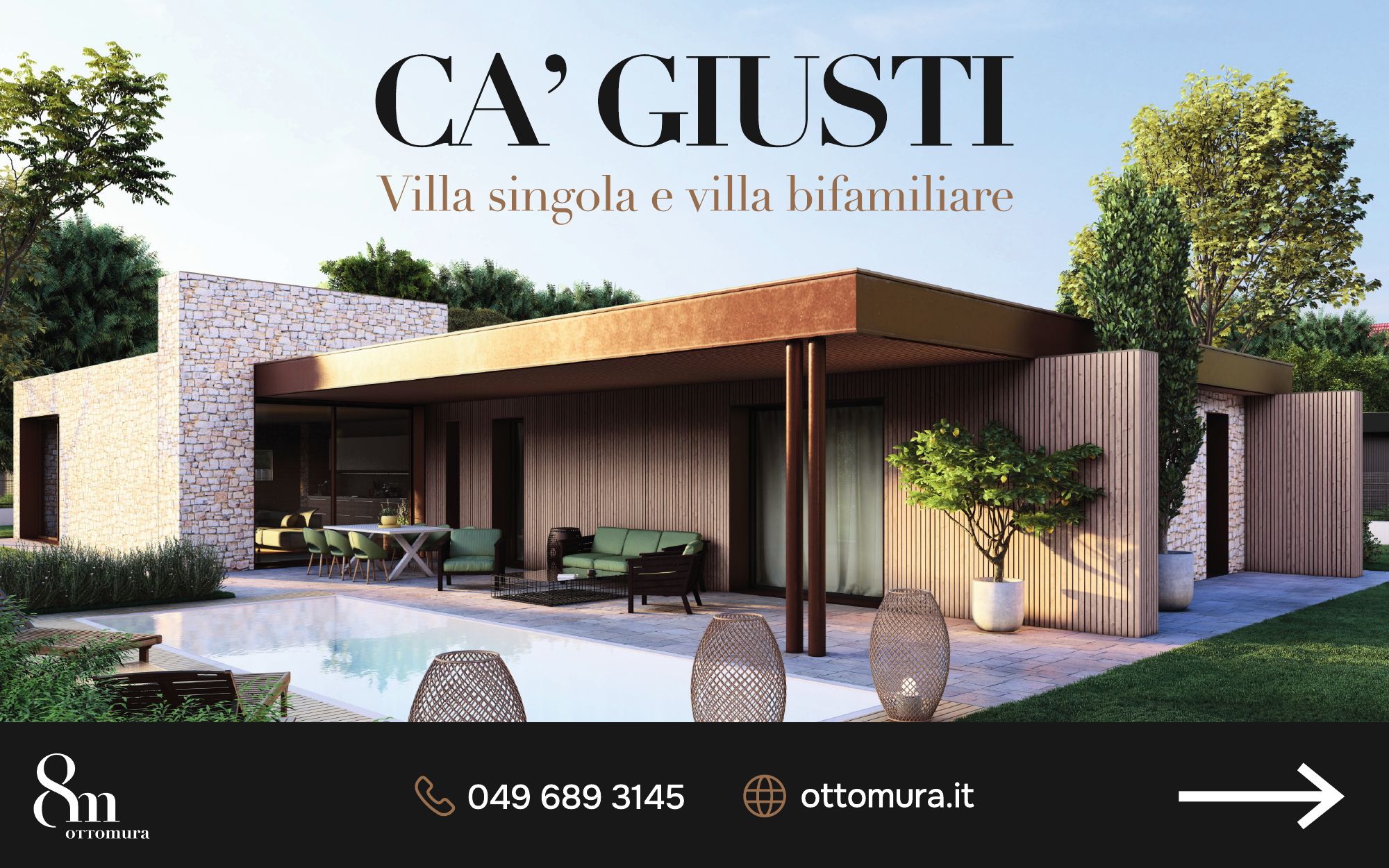
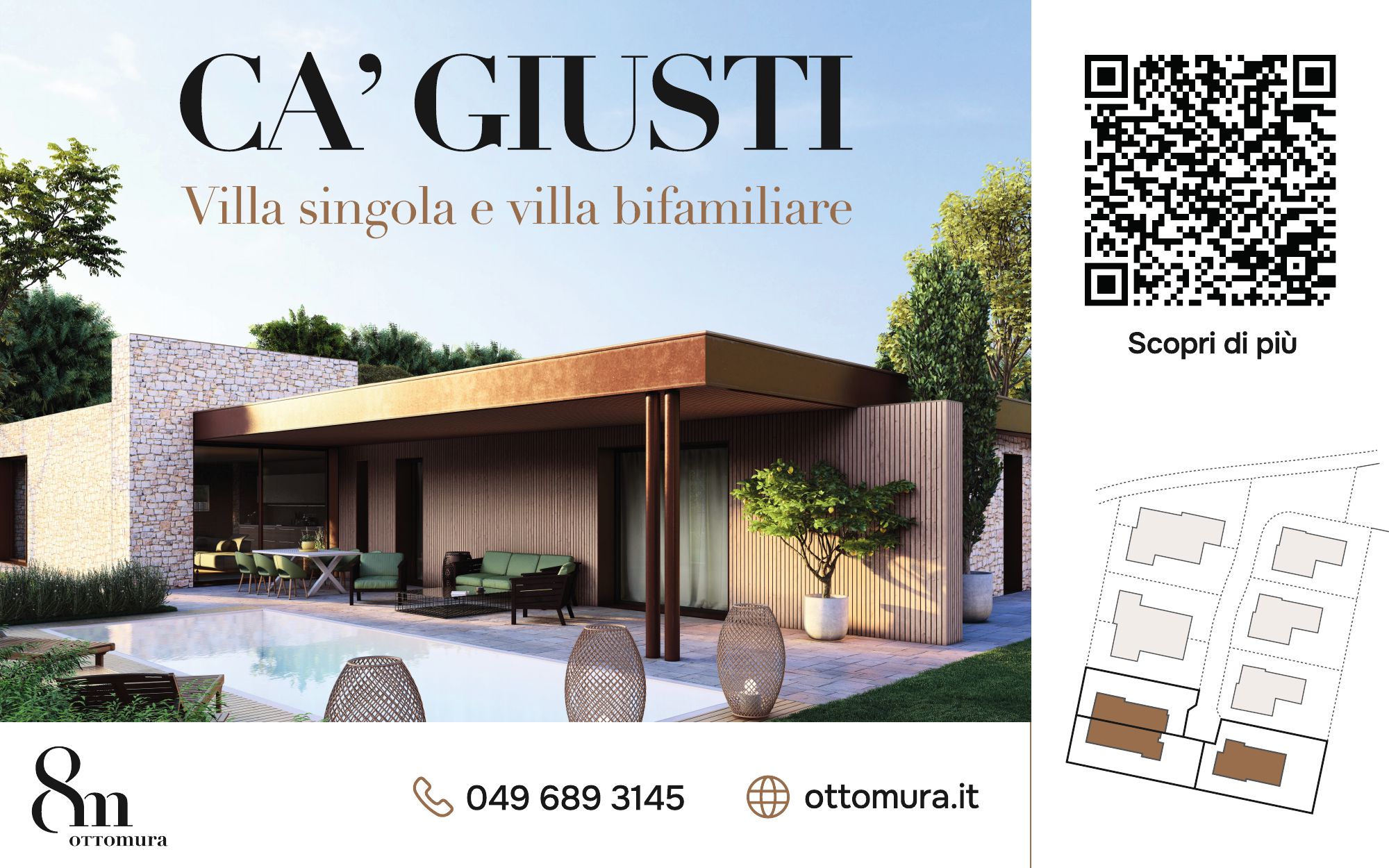
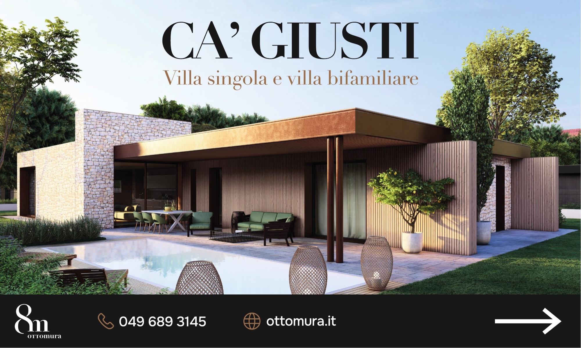
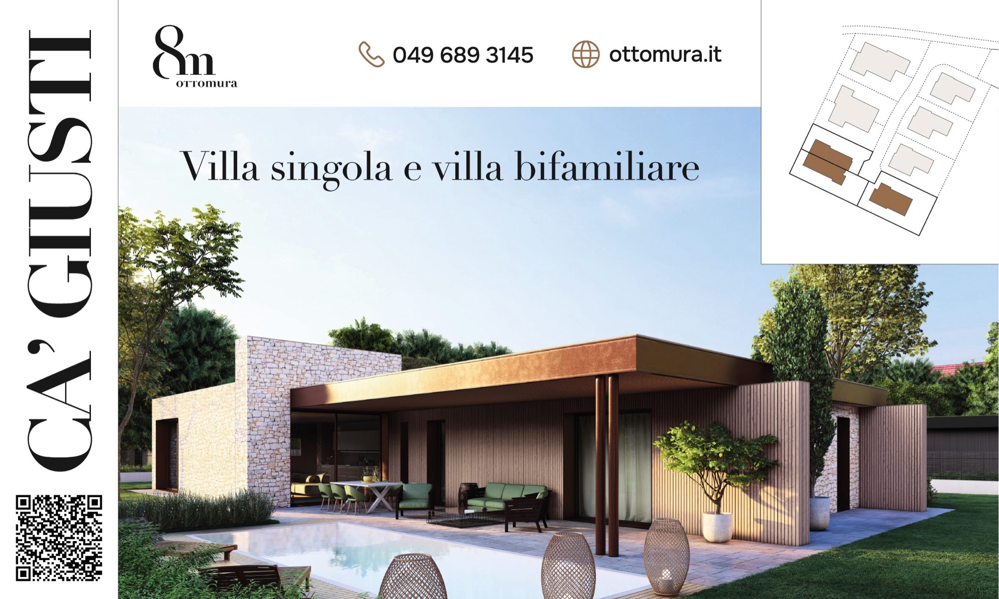
A campaign in three formats and several colour options, a fixed format for the property listings, the billboards for the Ca’ Giusti development and a landing page for people who need to sell.
The campaign
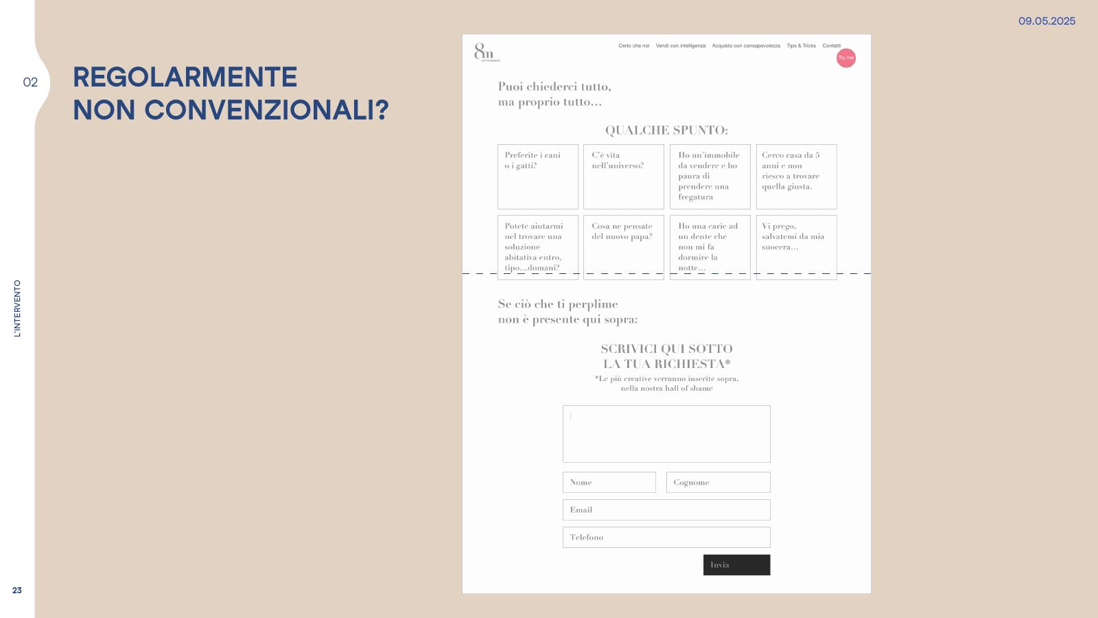
Regularly unconventional, rigorously distinctive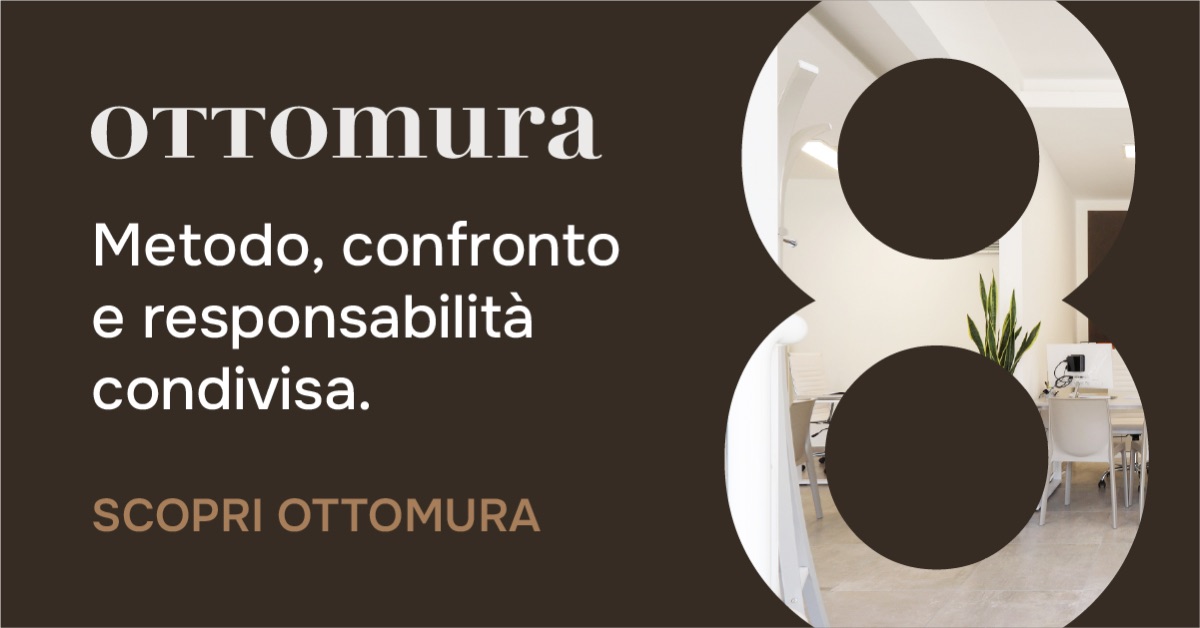
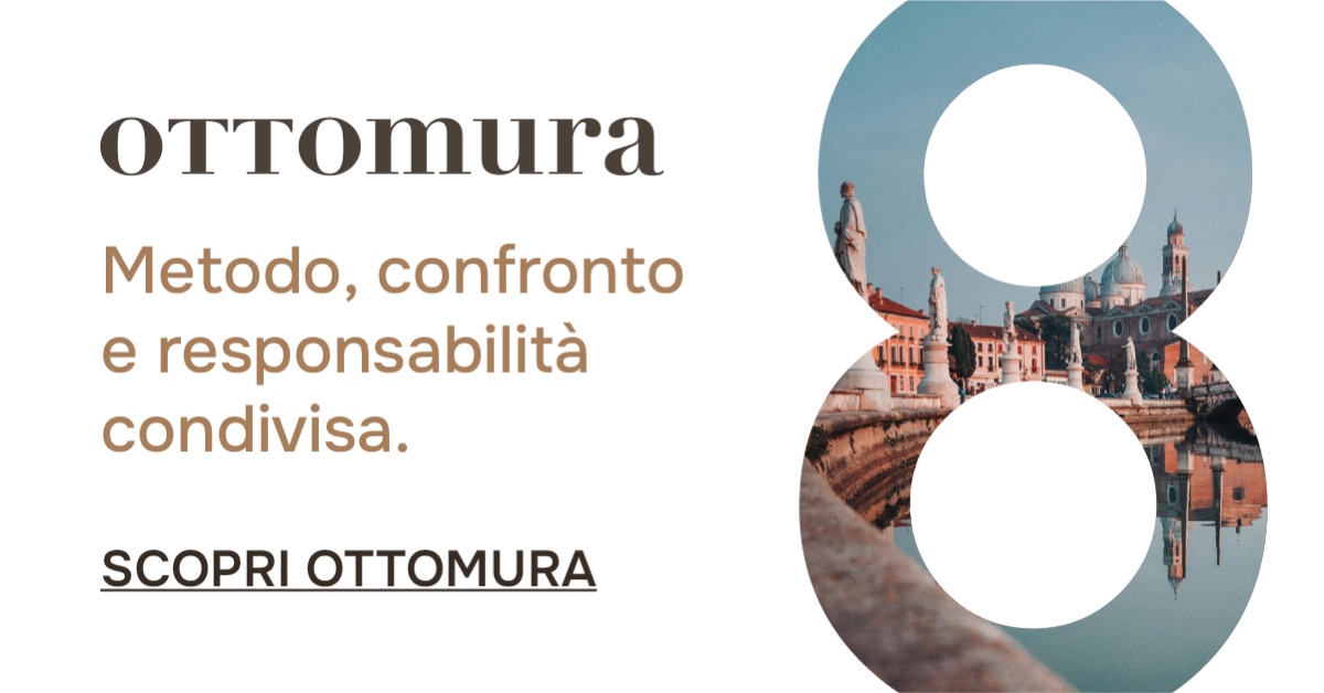
The other formats
Vertical and square · scroll →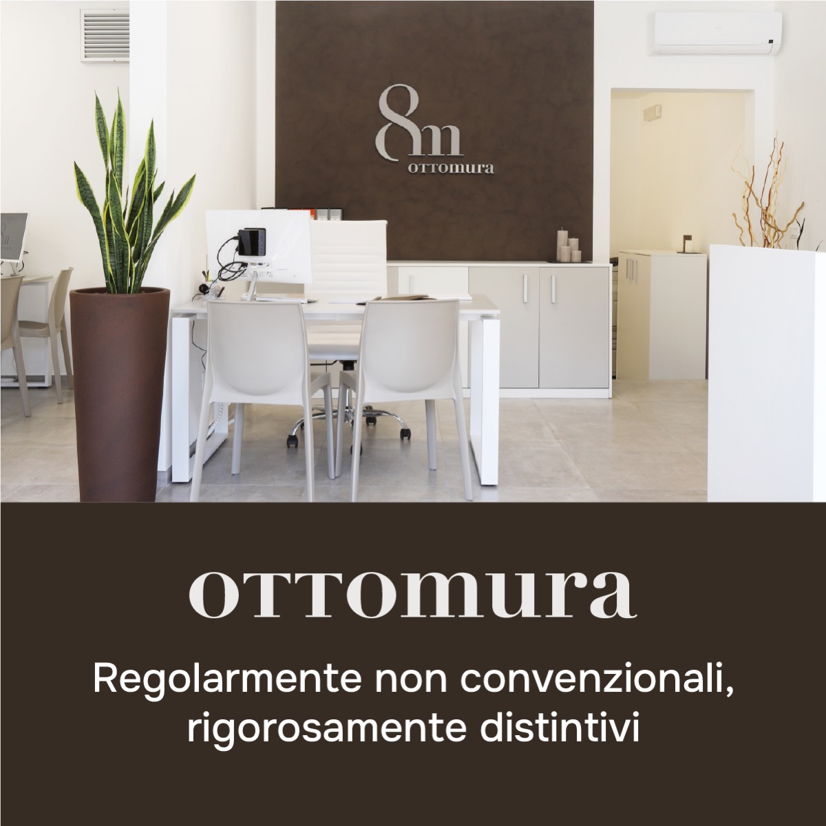
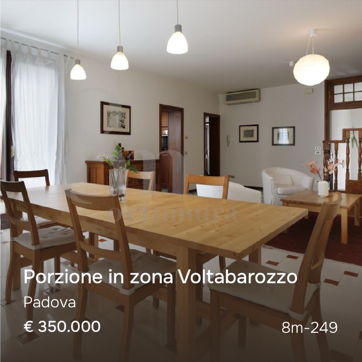
The listings
Photo, town, price, reference · scroll →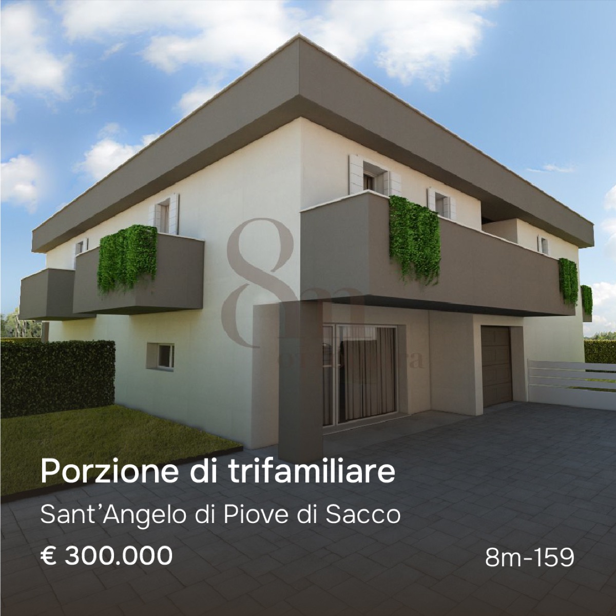
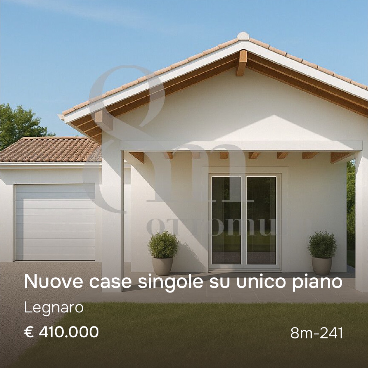
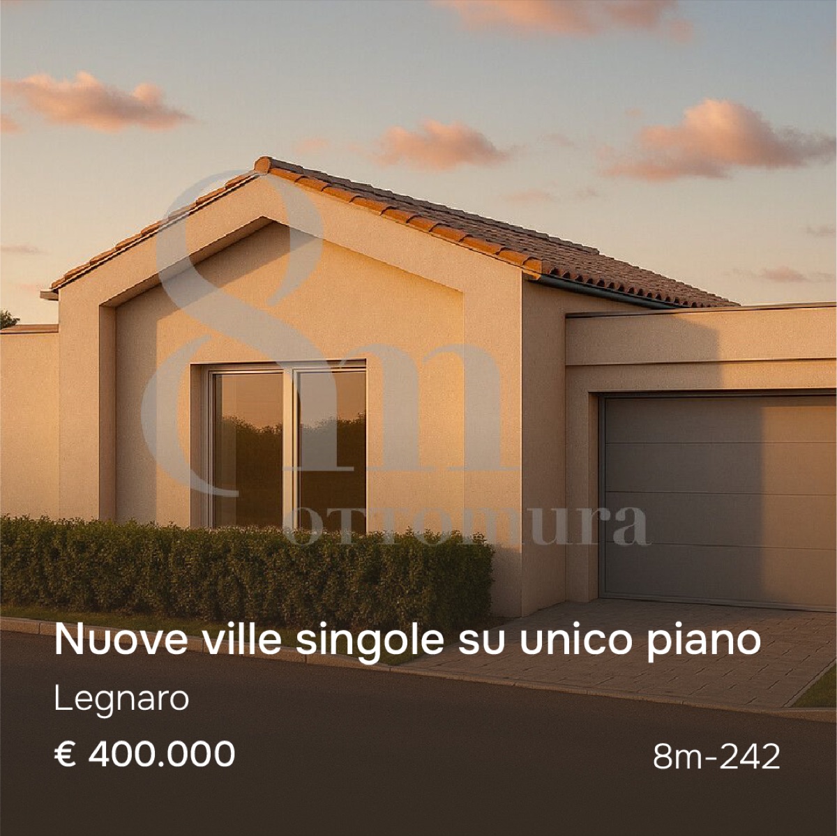
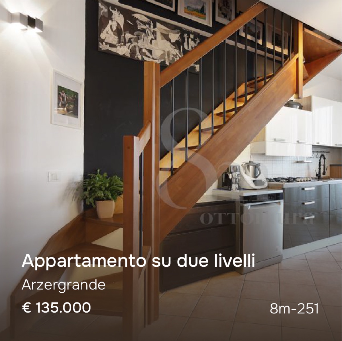
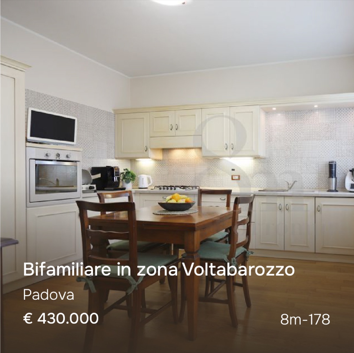
Ca’ Giusti
Site hoardings, three releases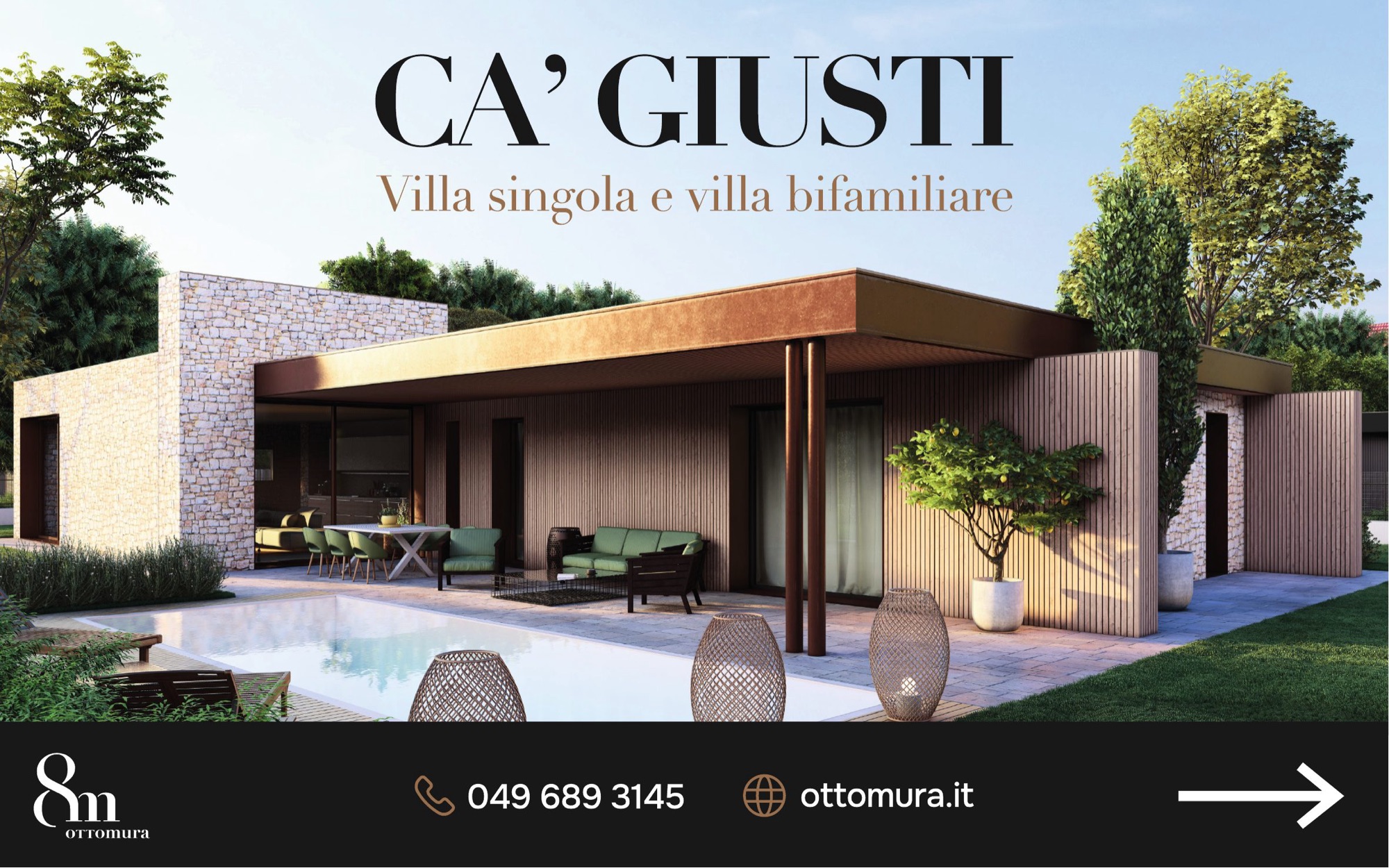
The landing page for sellers
Hover to scroll it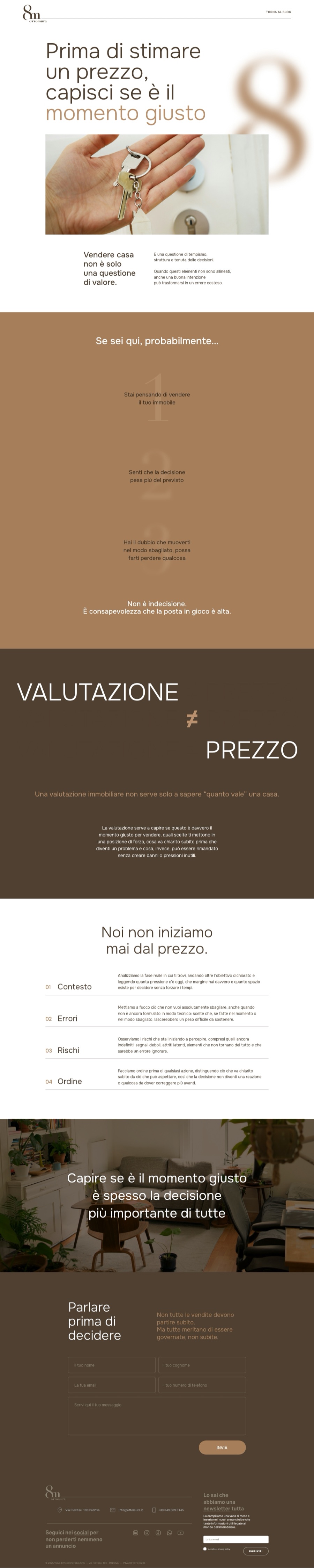
What do you publish when you have nothing to sell?
A perimeter, not a list of ideas. If a piece does not fit one of the strands, it does not go out.
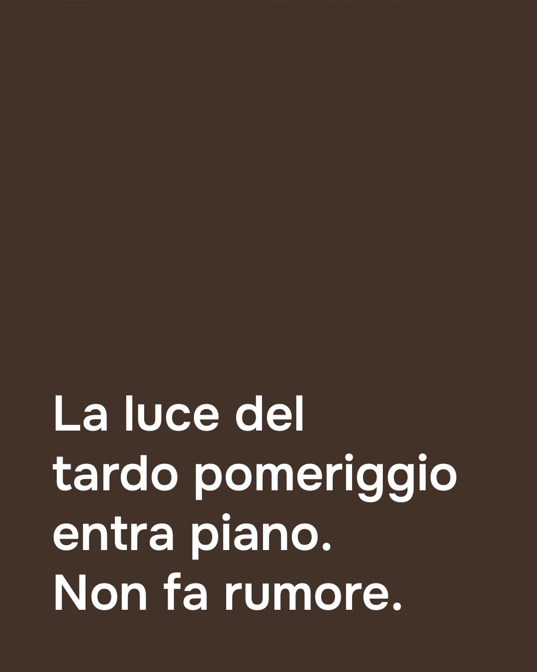
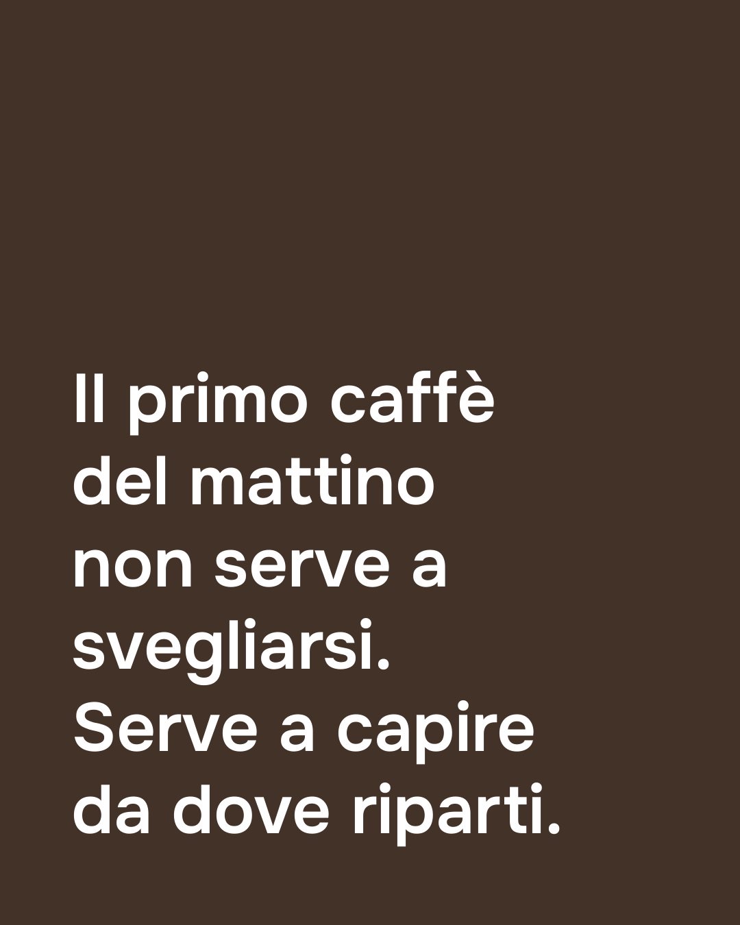
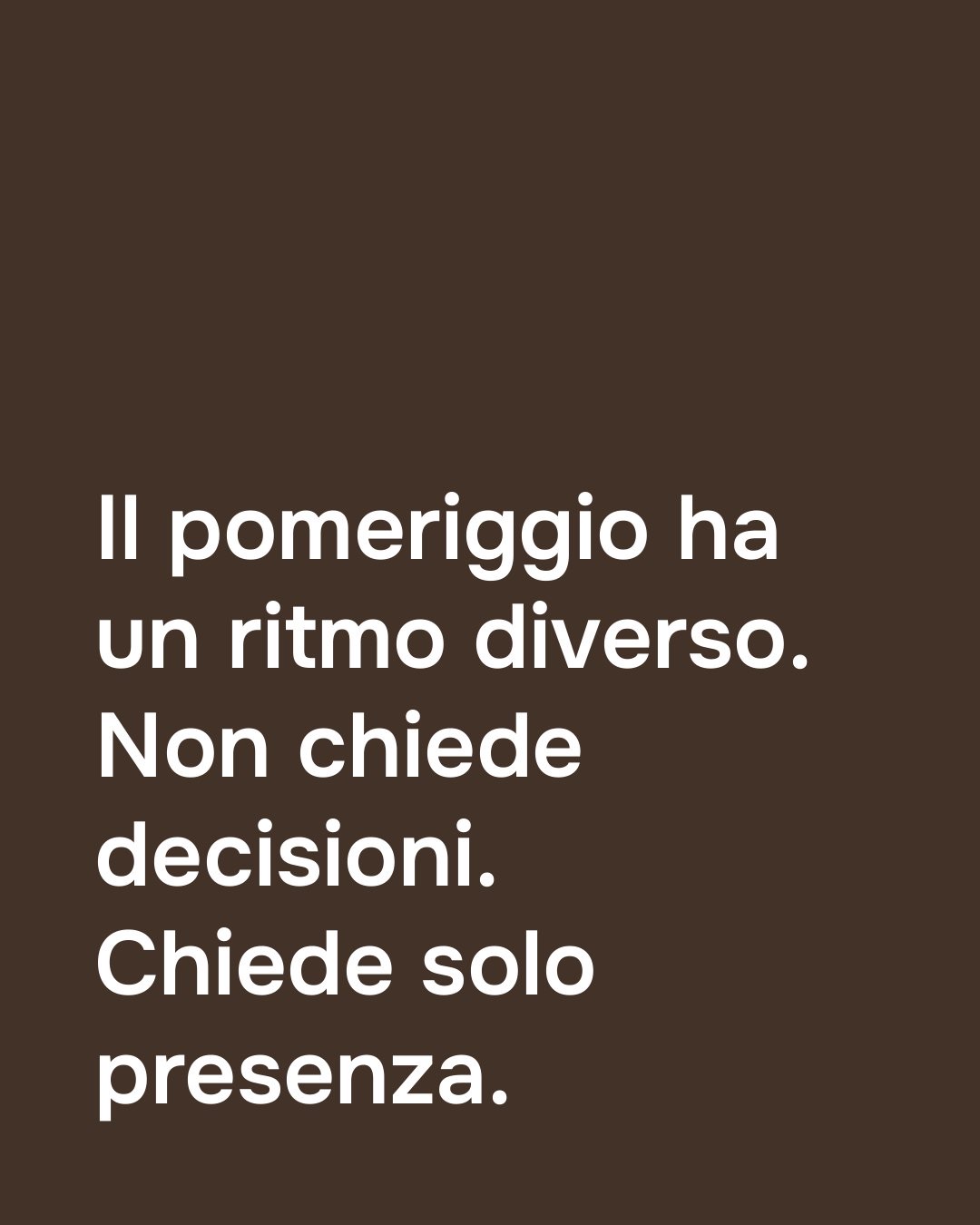
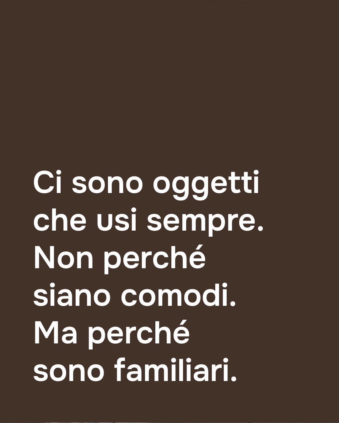
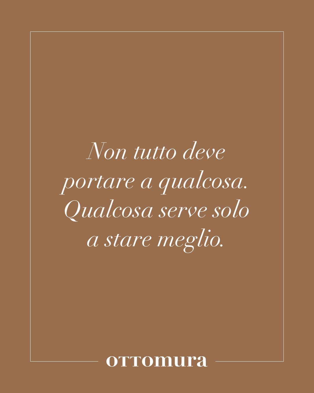
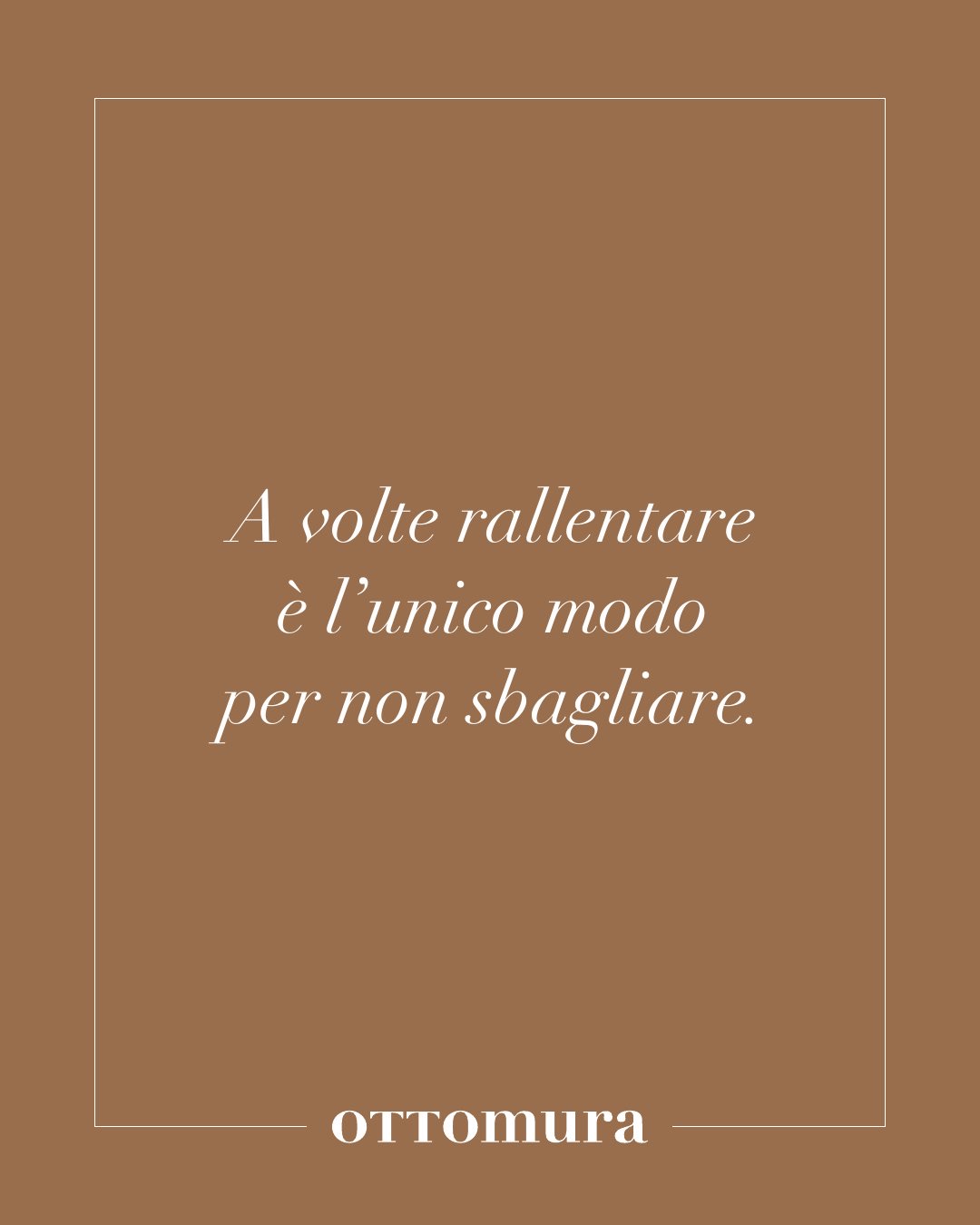
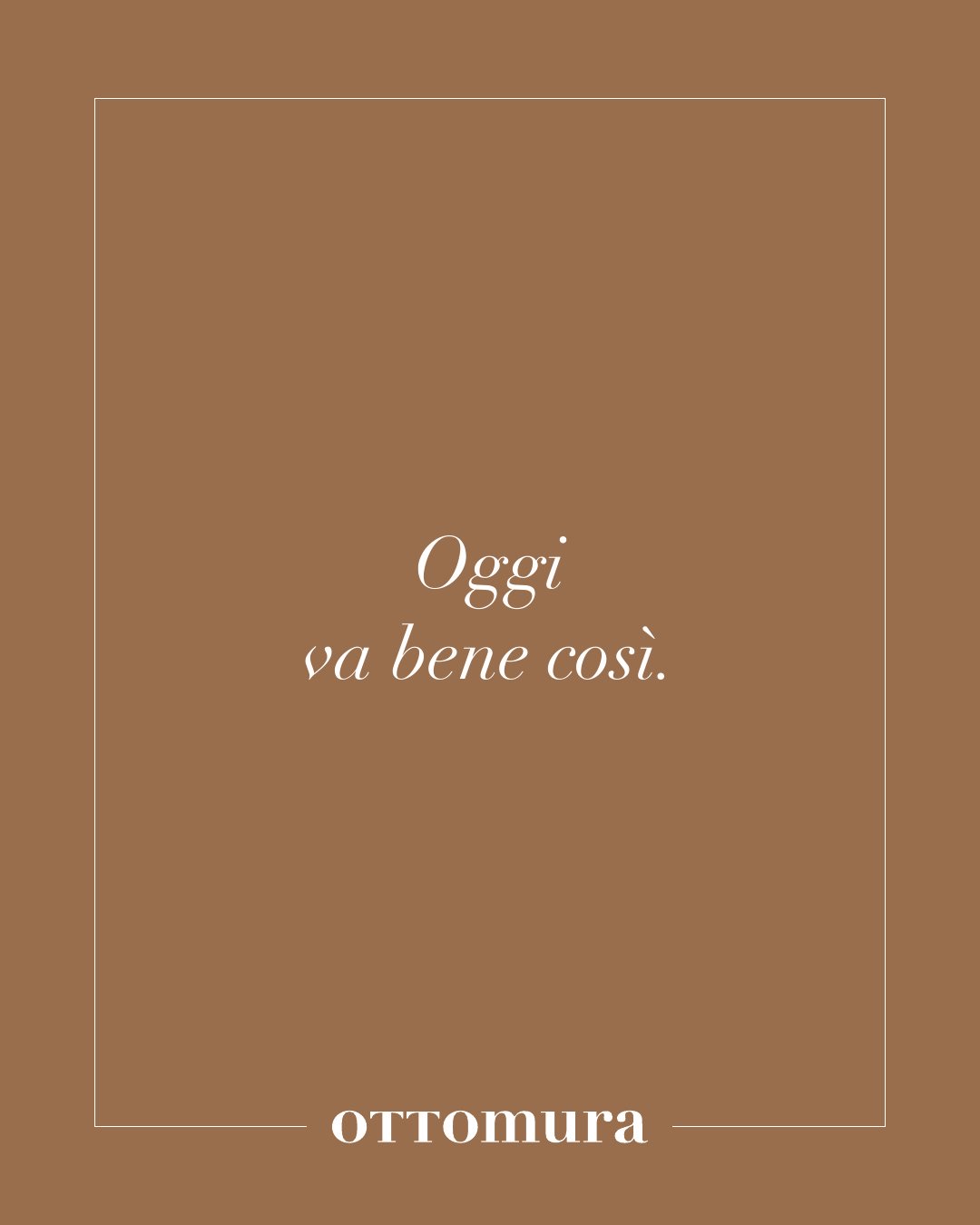
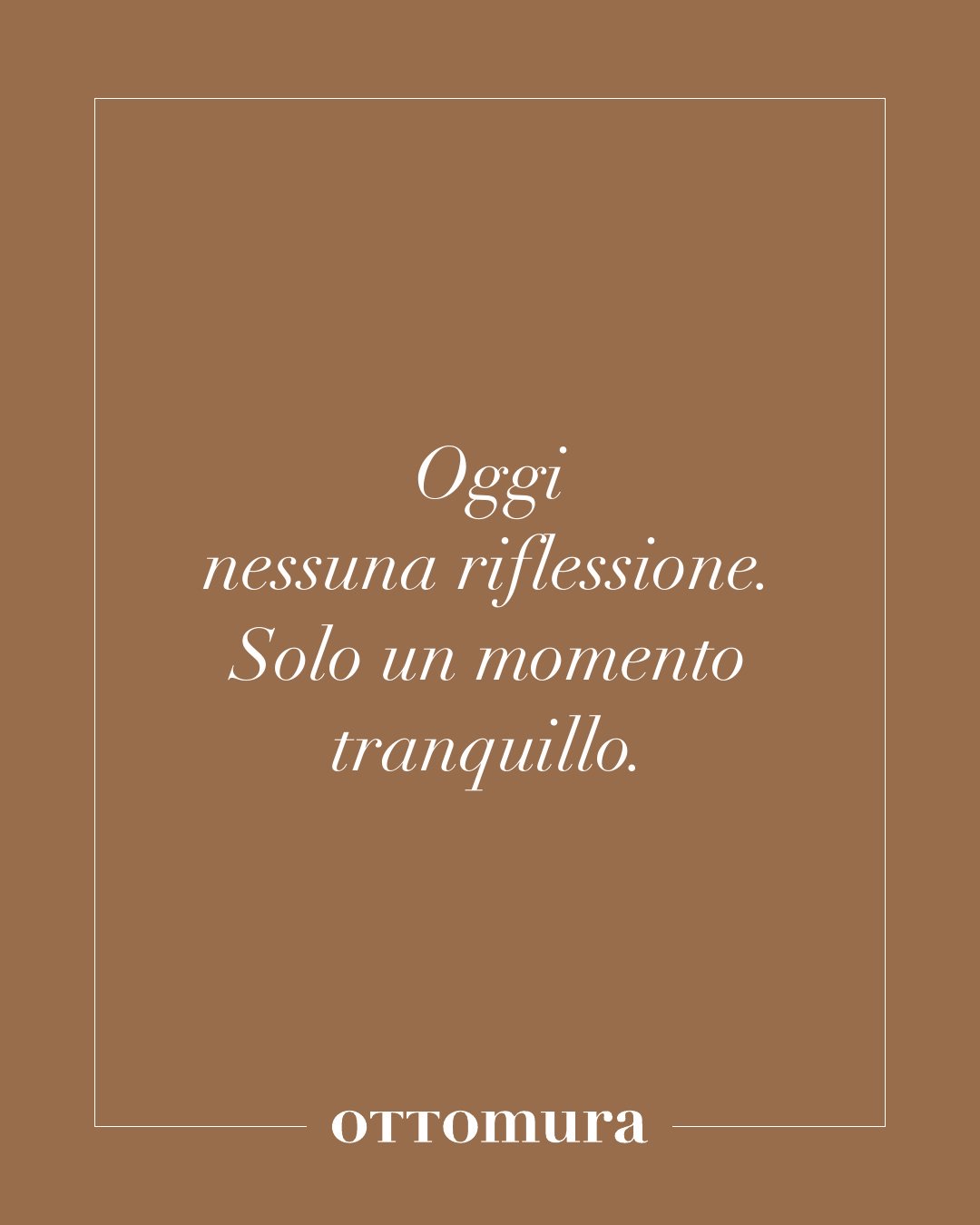
The Instagram editorial plan was written as a territory: nine narrative strands, each with what it is really about. The coffee is not the coffee: it is rhythm, calm, decisions taking their time.
Alongside the main plan we wrote a second one, soft, which neither guides nor explains: it keeps you company. No calls to action, minimal visuals. An eight-week calendar alternates the two voices, with a single rule: never two loud voices on the same day.
- 01Coffee and breaks
- 02Light and shade
- 03Tables and shared moments
- 04Everyday objects
- 05Windows, doors, thresholds
- 06Slow time
- 07Invisible order
- 08Duality
- 09Pauses and silences
The feed, designed
Twenty-one posts, two voices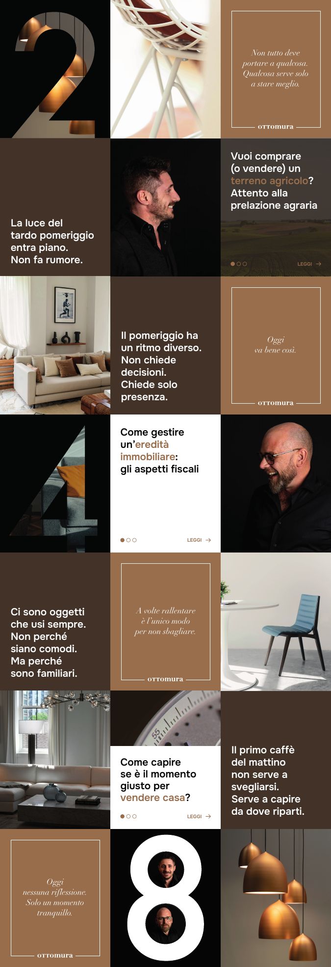
This is Ottomura when it has nothing to prove.From the soft editorial plan, 2026
The posts
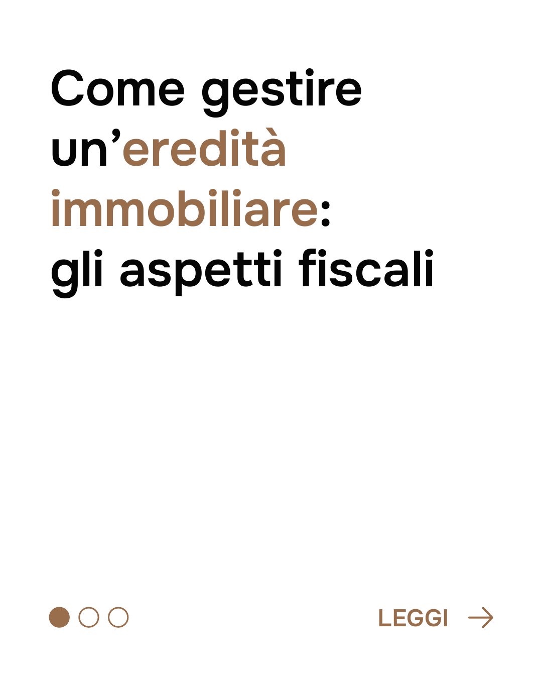
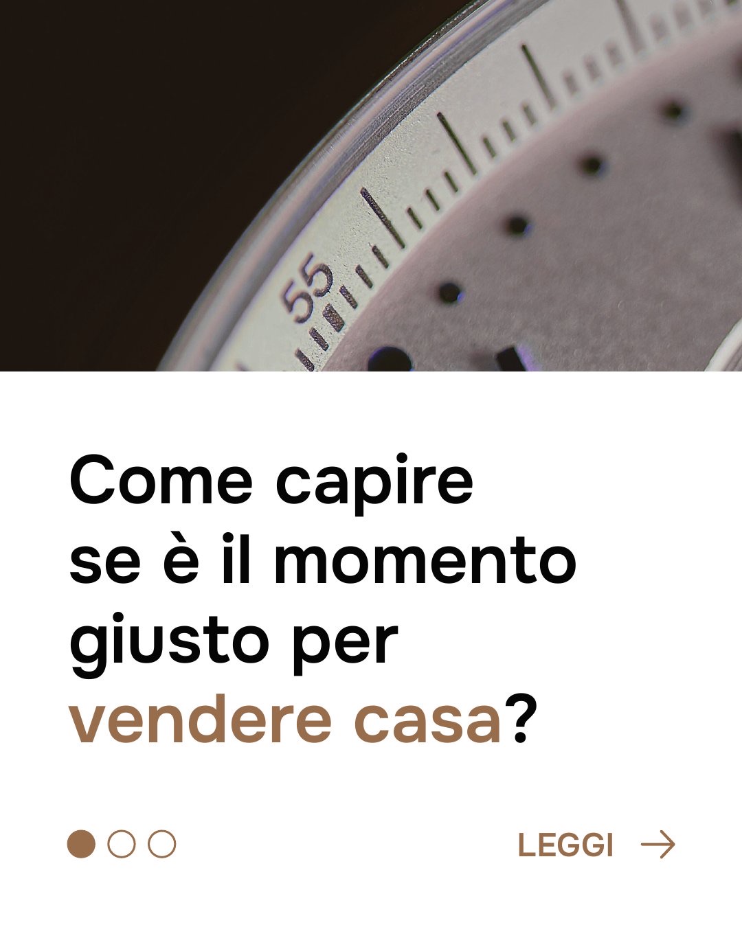
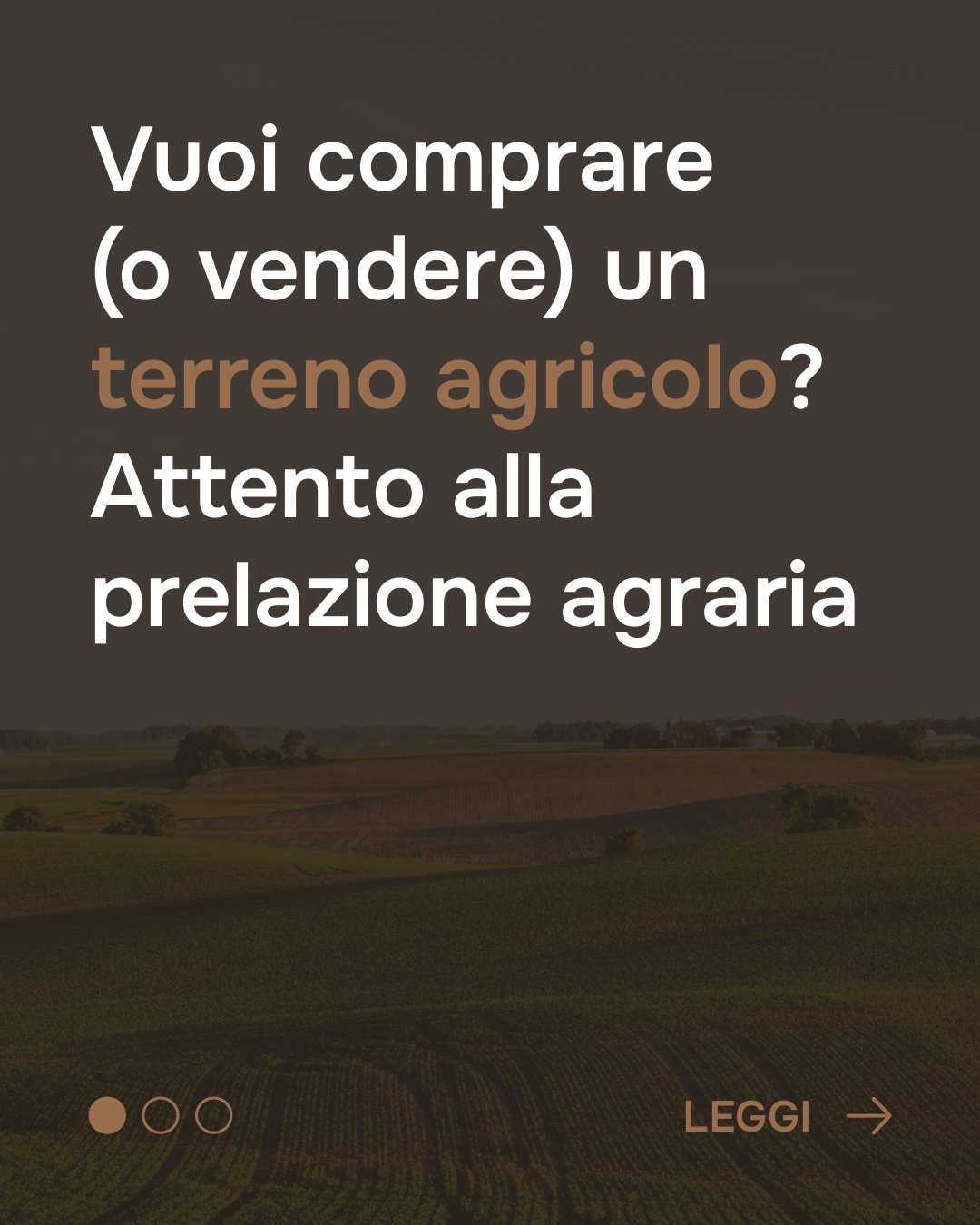
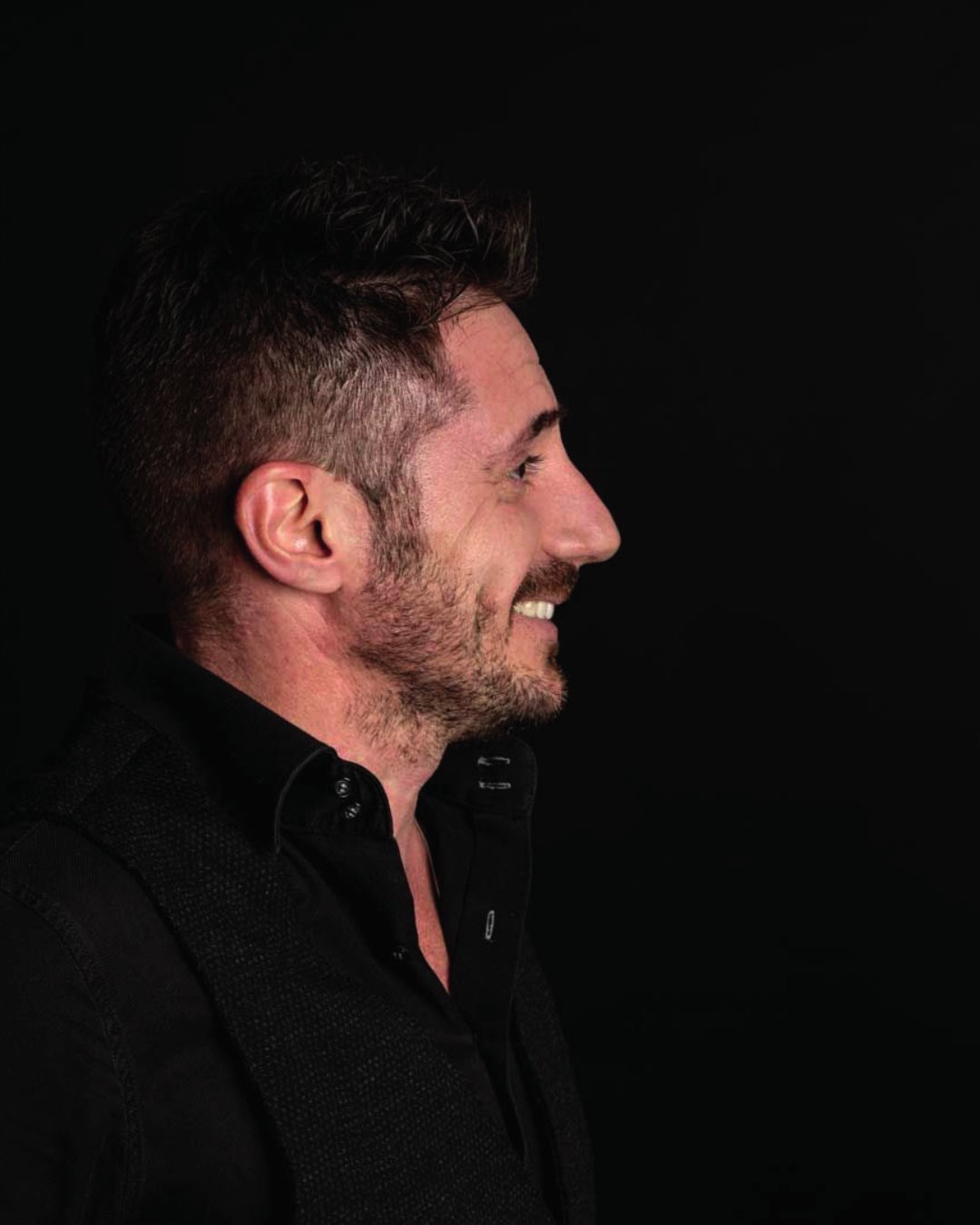
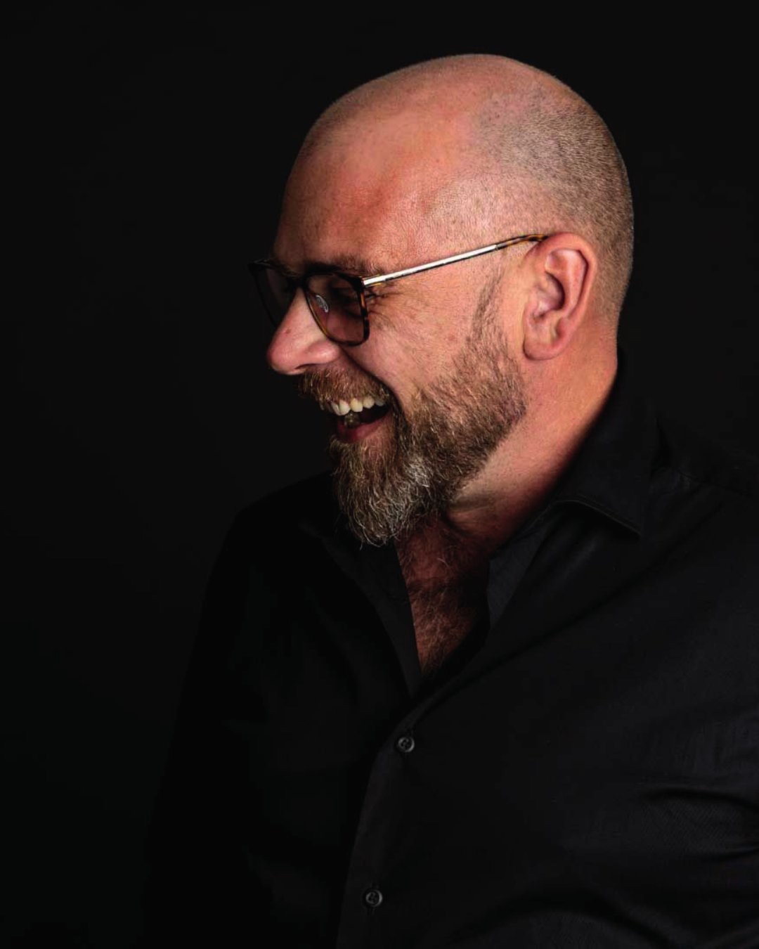
Typographic, articles, portraits · scroll →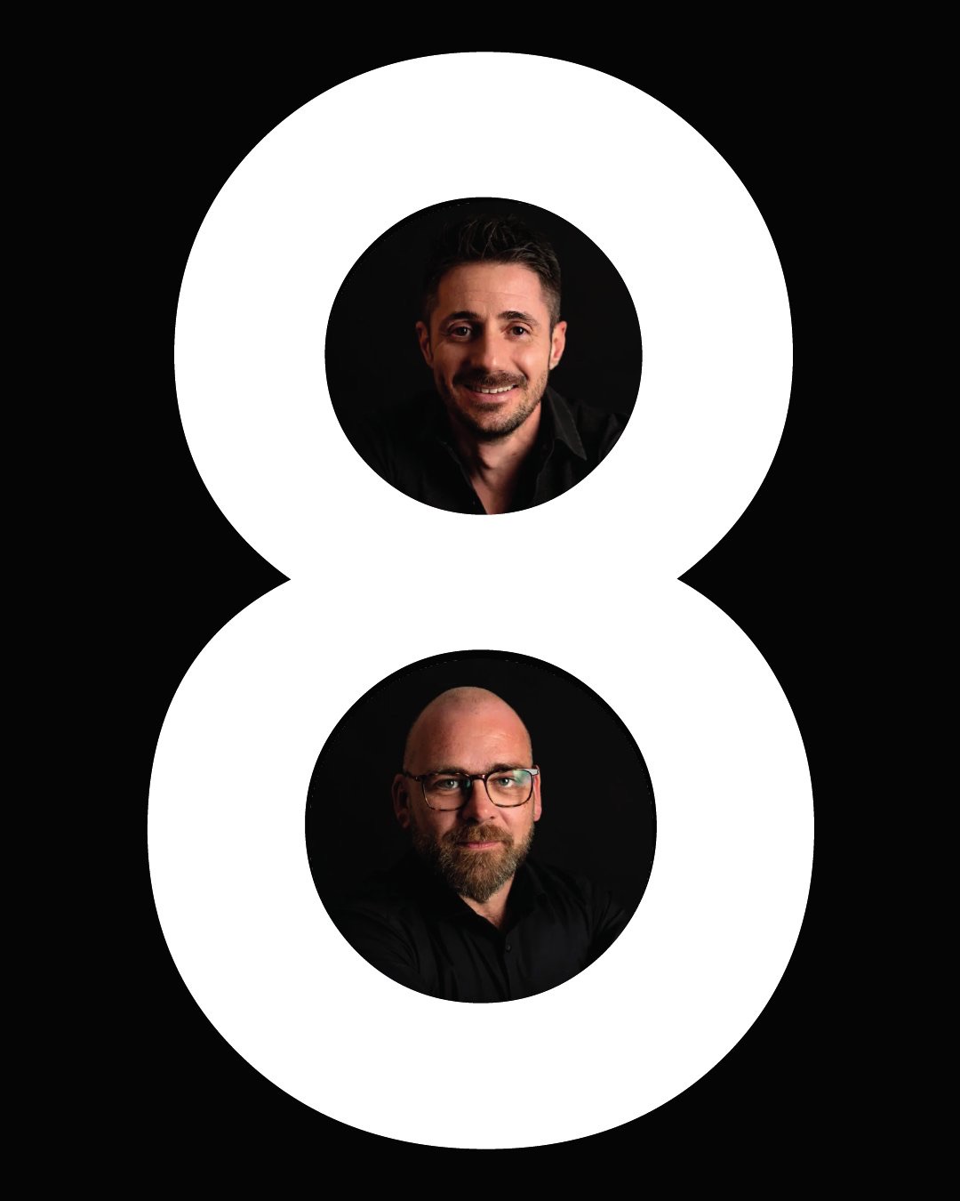

Frequently asked questions
Ottomura and Opificio, in short.
What did Opificio Lamantini Anonimi do for Ottomura?
The digital strategy, the content hierarchy, the ottomura.it website, the landing pages, the advertising campaigns, the billboards and the Instagram editorial plan.
Who made the Ottomura website?
Opificio Lamantini Anonimi, from 2025 onwards. The credit is in the footer of ottomura.it.
Did Opificio Lamantini Anonimi design the Ottomura logo?
No. The logo already existed: Opificio Lamantini Anonimi worked on the strategy, the website and the communication.
Where does a digital project by Opificio Lamantini Anonimi start?
From an identity questionnaire and an analysis of the audiences, before opening a single design file.
Does Opificio Lamantini Anonimi work with estate agencies?
Yes. Ottomura, in Padua, is one example.