

Nasoterapia: a colour for every duet
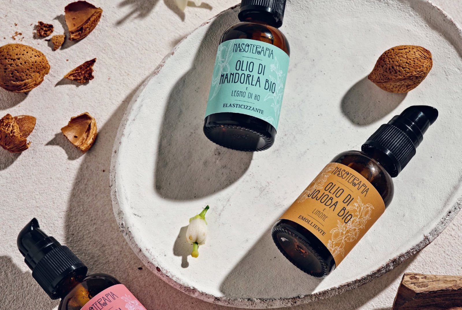
The labels of the Duetti line and the countertop display. Three organic vegetable oils, three essential oils, one system you read in a second.
In short
Nasoterapia, the essential oil workshop of HP Italia in Arre (Padua), has a line of organic vegetable oils enriched with essential oils: the Duetti (duets). Opificio Lamantini Anonimi designed the line’s packaging: the labels of the three duets, each with its own colour, and the countertop display for the point of sale.
Project facts
- Client
- Nasoterapia (HP Italia srl)
- Sector
- Essential oils and aromatic cosmetics
- Location
- Arre (Padua), Italy
- Line
- Duetti: organic vegetable oils with essential oils
- Services
- Labels, countertop display
- Website
- nasoterapia.it
Almond oil with Ho wood. Argan oil with mandarin. Jojoba oil with lemon. Three pairs, three functions, one small bottle. Our job was to make them easy to tell apart without reading them twice.
The starting point
How do you tell three oils apart in the same bottle?
Same amber glass, same pump, same size. What changes is the content and the function. The label has to say three things, in this order: the brand, the pair of oils, what it is for.
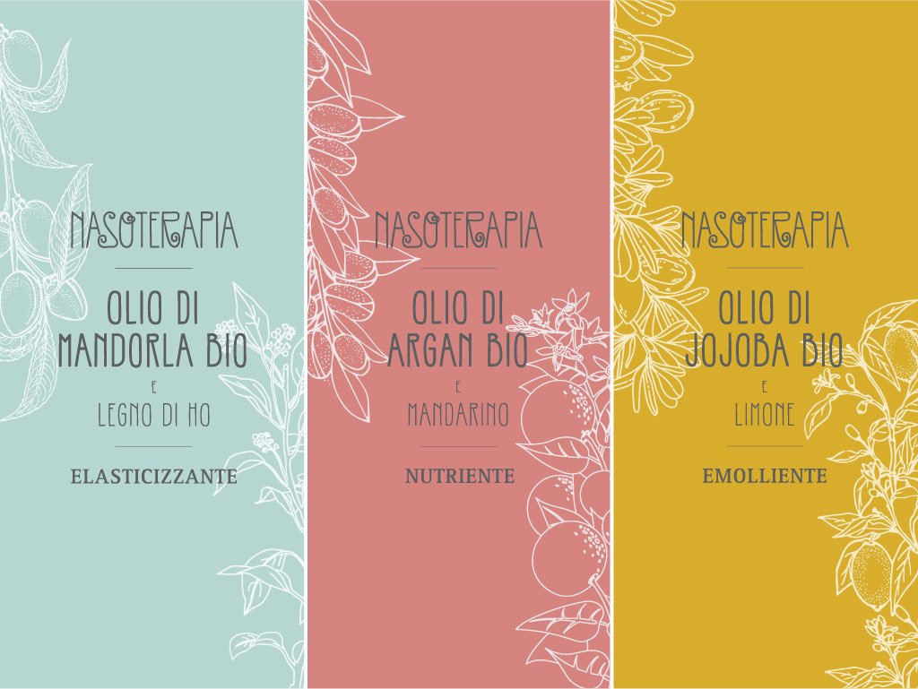
How do you read a duet?
From top to bottom: the brand, the vegetable oil, the essential oil, the function.
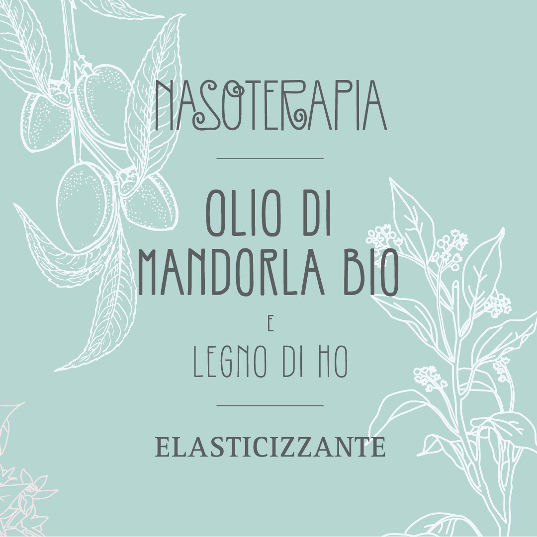
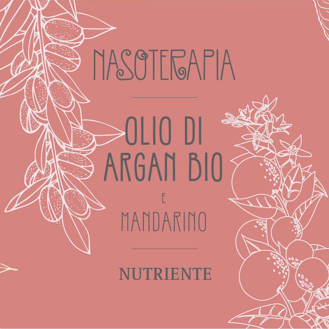
The three labels share the same grid. At the top, the Nasoterapia name. Below it, large, the vegetable oil. After a small «e» (and), the essential oil. At the bottom, between two rules, the function: elasticising, nourishing, emollient.
What tells them apart is colour. Along the edges, in white line work, the plants the two oils come from: almond and Ho wood, argan and mandarin, jojoba and lemon.
Three duets, three colours
As written on the labelsBrand, vegetable oil, essential oil, function. The same for all three.
Organic almond oil and Ho wood. Elasticising.
Organic argan oil and mandarin. Nourishing.
Organic jojoba oil and lemon. Emollient.
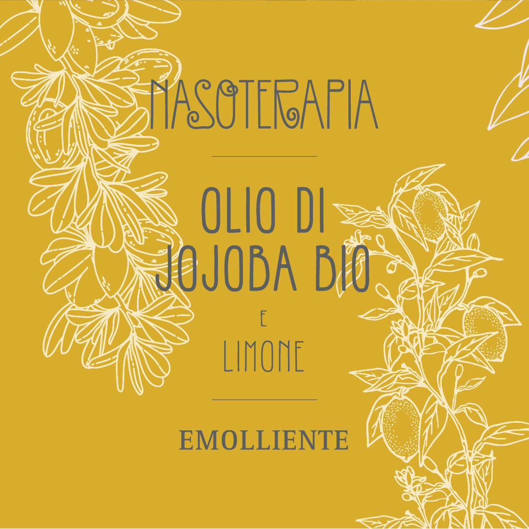
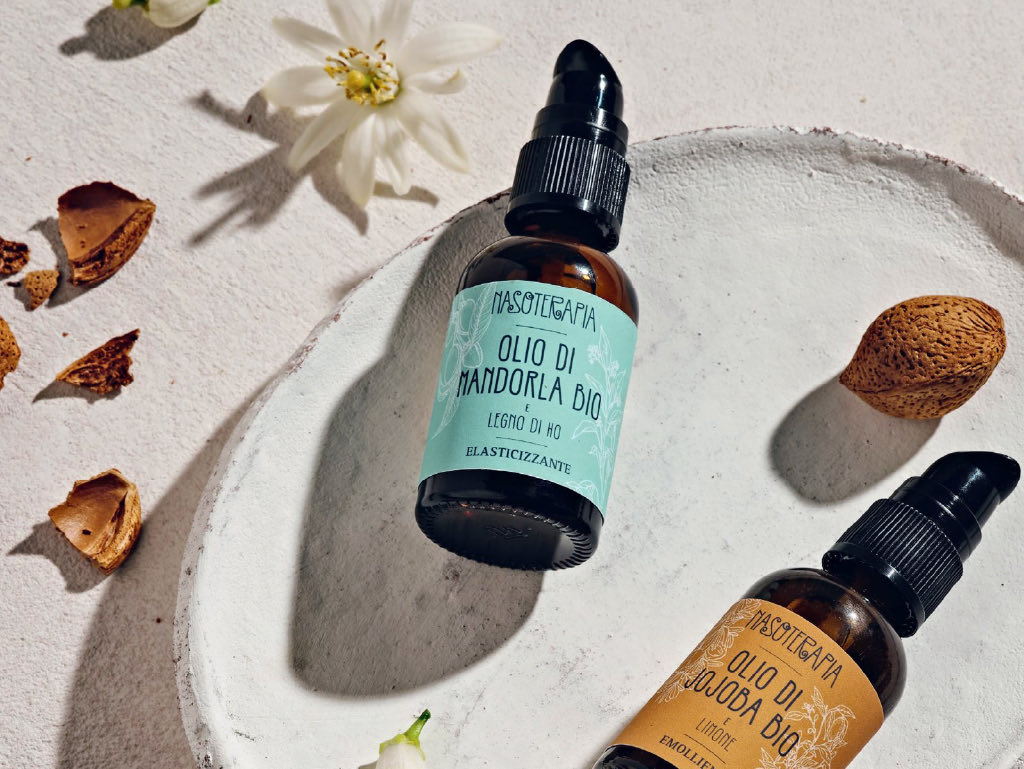
The labels on amber glass.
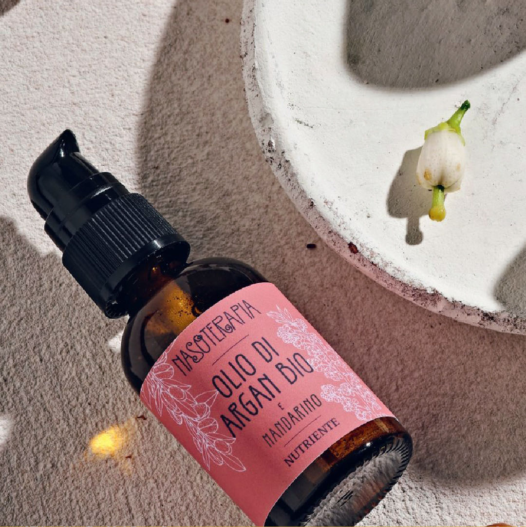
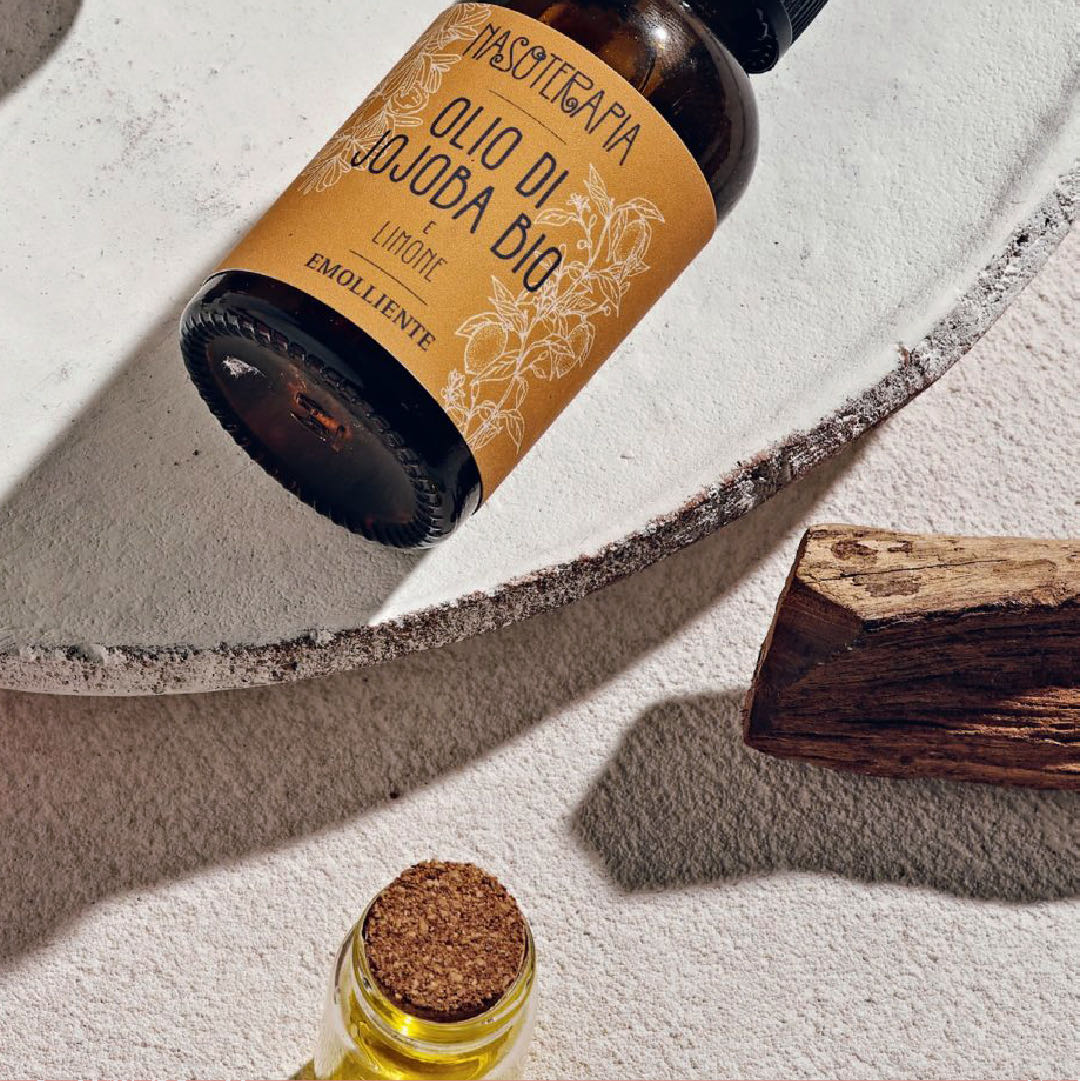
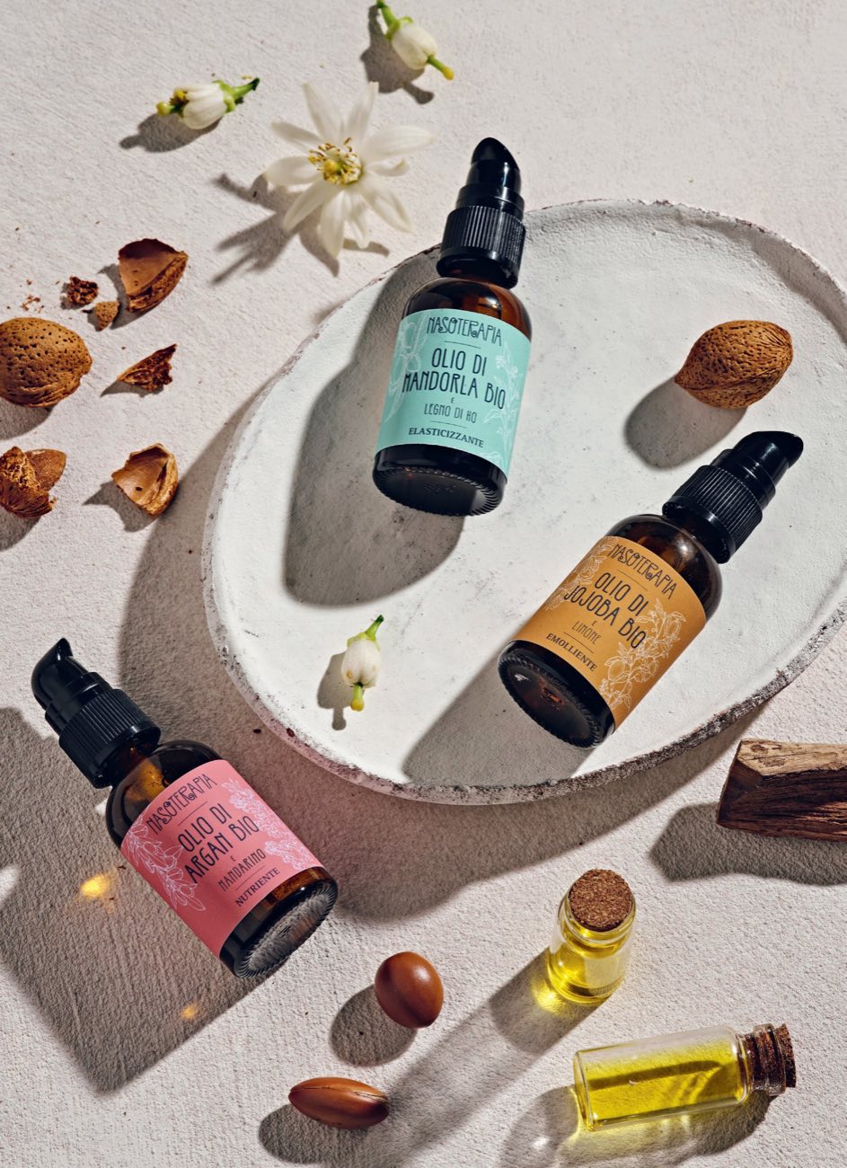
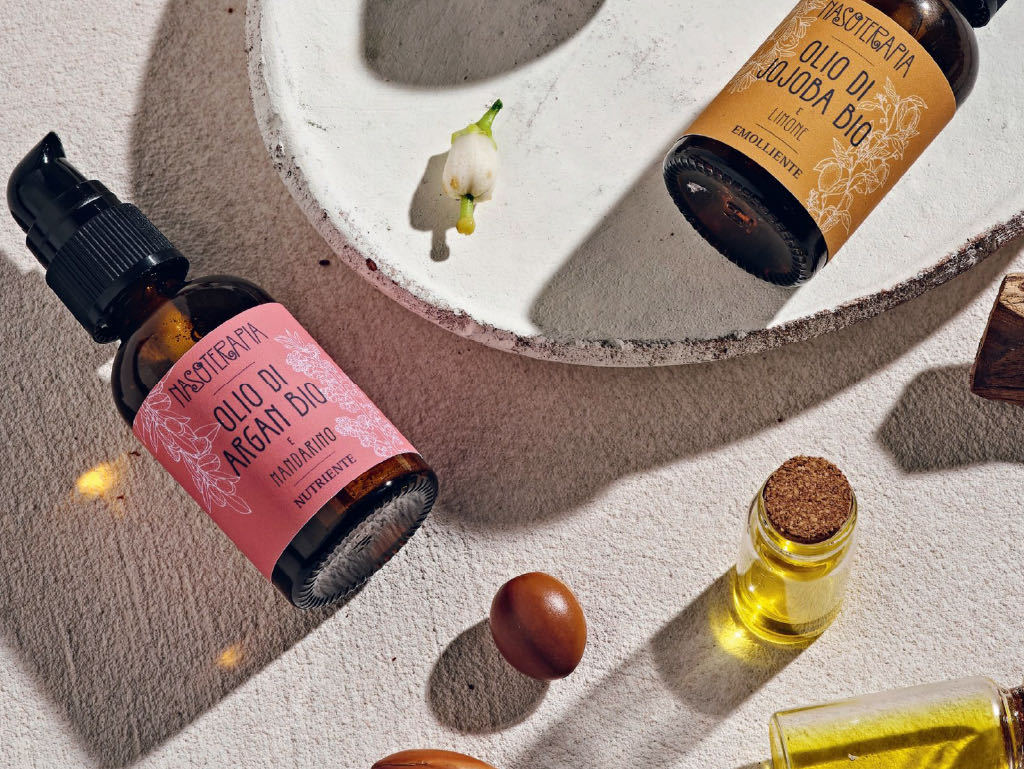
The raw materials beside the bottle: almonds, argan seeds, flowers, wood.
How does a line show up on the counter?
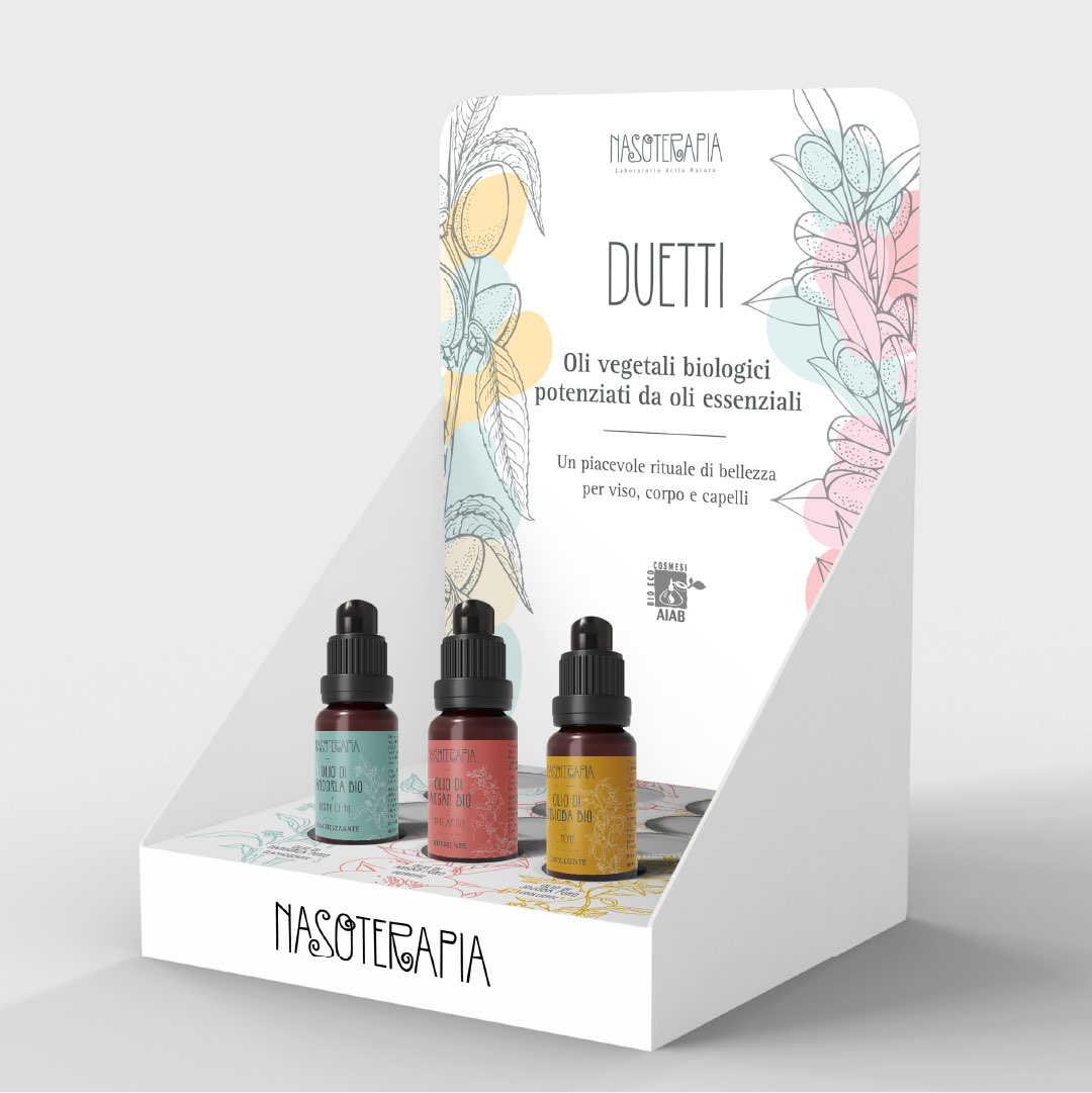
All together. Three colours in a row get noticed before a single bottle.
For the point of sale we designed a countertop display. On the header card, the name of the line, Duetti, and the line that explains it: organic vegetable oils boosted by essential oils. Below it, the use: a pleasant beauty ritual for face, body and hair.
The plants from the labels return on the header card, in grey line work, with patches of the three colours. At the base, the holes for the bottles and the Nasoterapia name, readable from a distance.
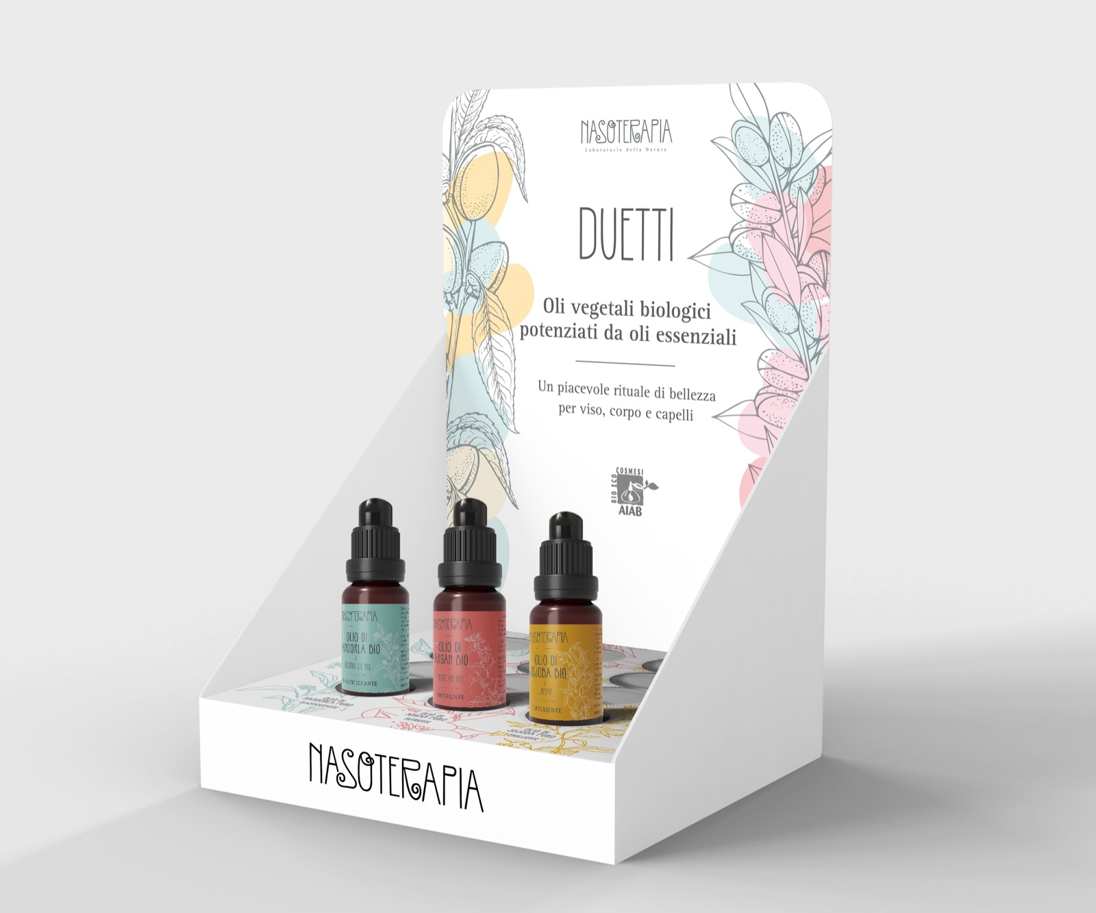
The design model of the display.
Frequently asked questions
Nasoterapia and Opificio, in short.
What did Opificio Lamantini Anonimi design for Nasoterapia?
The packaging for the Duetti line: the labels of the three duets and the countertop display for the point of sale.
What are Nasoterapia’s Duetti?
Organic vegetable oils enriched with an essential oil, for face, body and hair: almond oil and Ho wood, argan oil and mandarin, jojoba oil and lemon.
Why does each Duetti label have a different colour?
Because the three duets share the same bottle, size and label structure. Colour, together with the plant illustrations, lets people tell them apart at a glance.
Are Nasoterapia and Neavita the same company?
They belong to the same company, HP Italia srl of Arre (Padua). Opificio Lamantini Anonimi has worked for both brands.