

Multistore: an O that makes room for everything
The rebranding of the camping and outdoor shop in Jesolo, near Venice. Type and colour that adapt to every medium, from the sign to the tourist map.
In short
Multistore is the camping, outdoor and open-air living shop in Jesolo Lido, near Venice. In 2022 Opificio Lamantini Anonimi handled its rebranding: a wordmark with a stretched O that becomes a window, a frame and a connecting element, and a type and colour system applied to the sign, catalogue, tourist map and business cards.
Project facts
- Client
- Multistore s.r.l. unipersonale
- Location
- Jesolo Lido (Venice, Italy)
- Sector
- Retail — camping, outdoor, boating, garden, barbecue
- Period
- 2022
- Payoff
- Camping Life
- Services
- Rebranding, graphic system, sign, catalogue, tourist map, business cards
At the heart of the project is a letter. The O in MULTISTORE, which stretches, opens up and becomes a window. From there, a whole system: the same red, the same type, from the sign to the business card.
The starting point
What does a shop that sells many different things need?
Multistore is where people camping in Jesolo go: motorhomes, caravans, awnings, barbecues, outdoor gear, boating, garden. Many categories under one roof, in a resort full of signs. It needed a mark that could hold them together and be seen from a distance.
How do you make a shop recognisable in a resort full of signs?
With a bold red and a letter that stretches. From a distance, among all the others, it stands out.
In the MULTISTORE wordmark the O stretches out like a capsule. Around it, bold, compact type and a solid red on white.
Underneath, the tagline Camping Life: not a shop full of items, but a way of life.
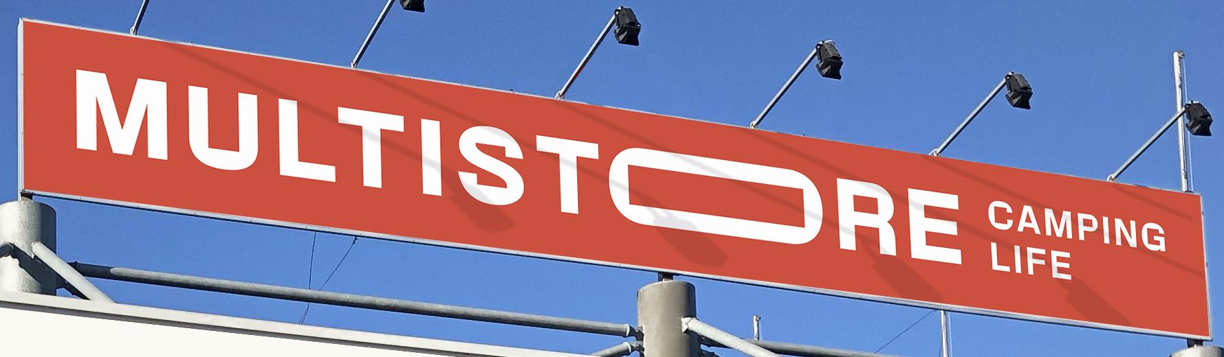
The sign on the roof of the Jesolo Lido shop.
How do you make a brand that adapts to everything?
By giving it clear rules and letting it move. The O stretches, holds, connects. The brand stays.
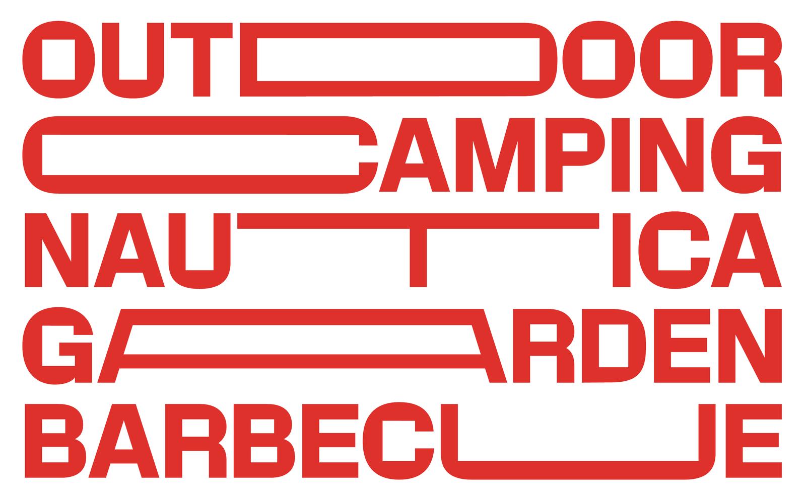
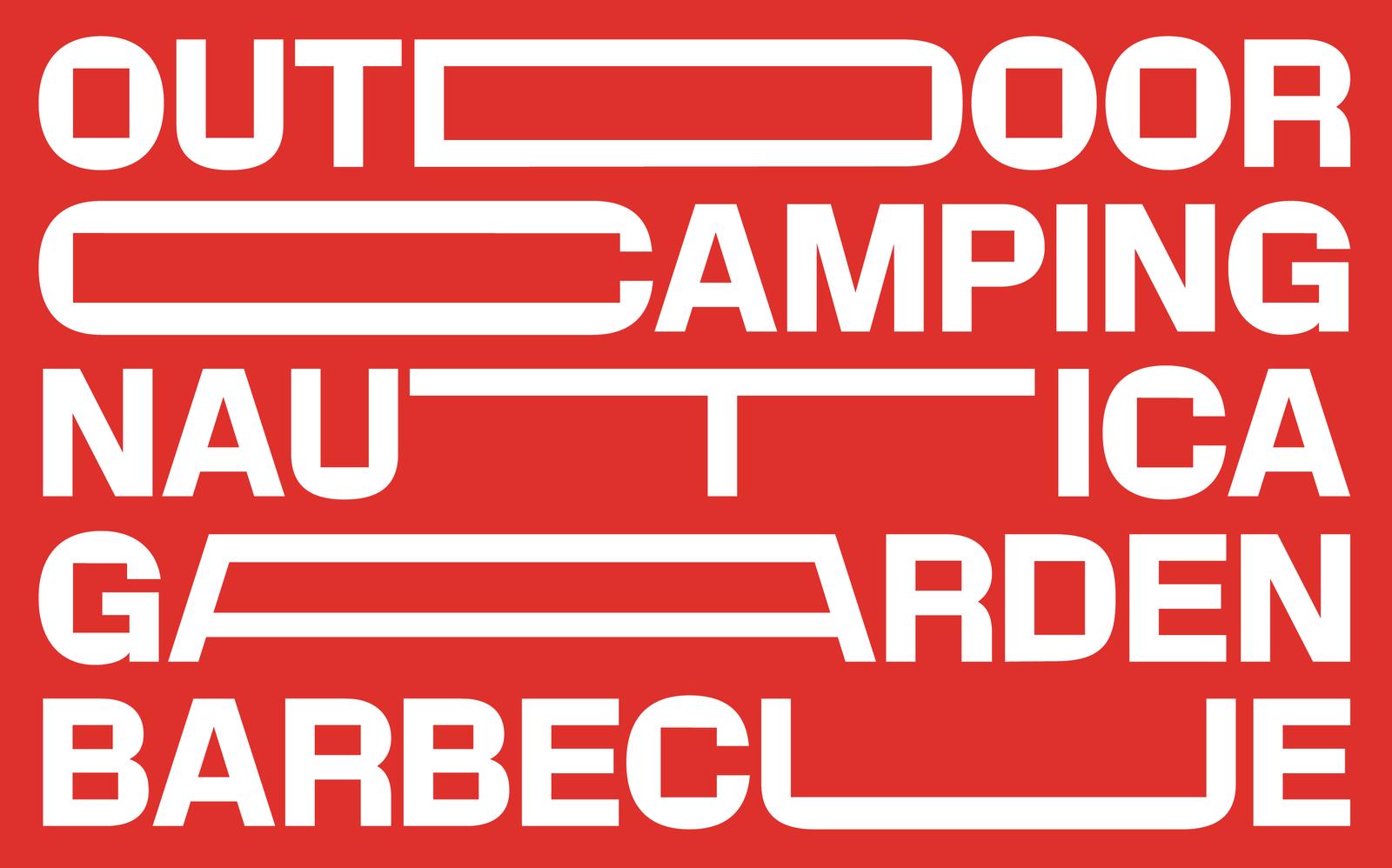
The O is not the only letter that stretches. In the same type, the T in nautica, the A in garden and the U in barbecue stretch too. Every word finds its elastic point.
Type and colour become rules, not constraints: a window for images, a frame, a link between the categories.
The business cards
May 2022 · front and back
On the door too
The entrance window graphics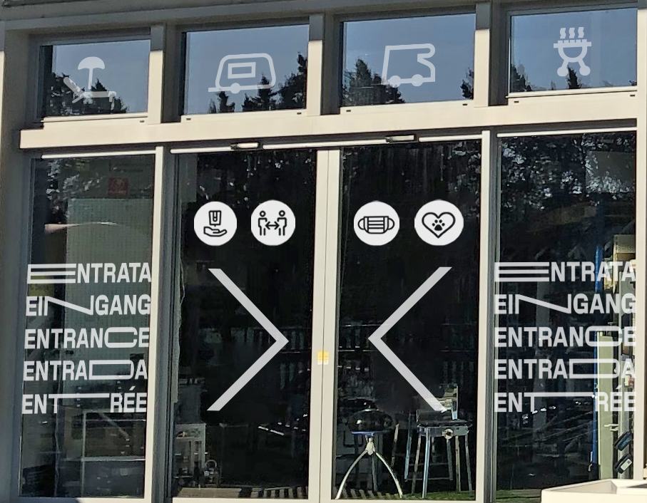
Entrata, eingang, entrance, entrée: in every language there is a letter that stretches.
Where does a shop’s brand live?
On the front of the shop, on the catalogue, on the map customers take to the beach. Wherever they go.
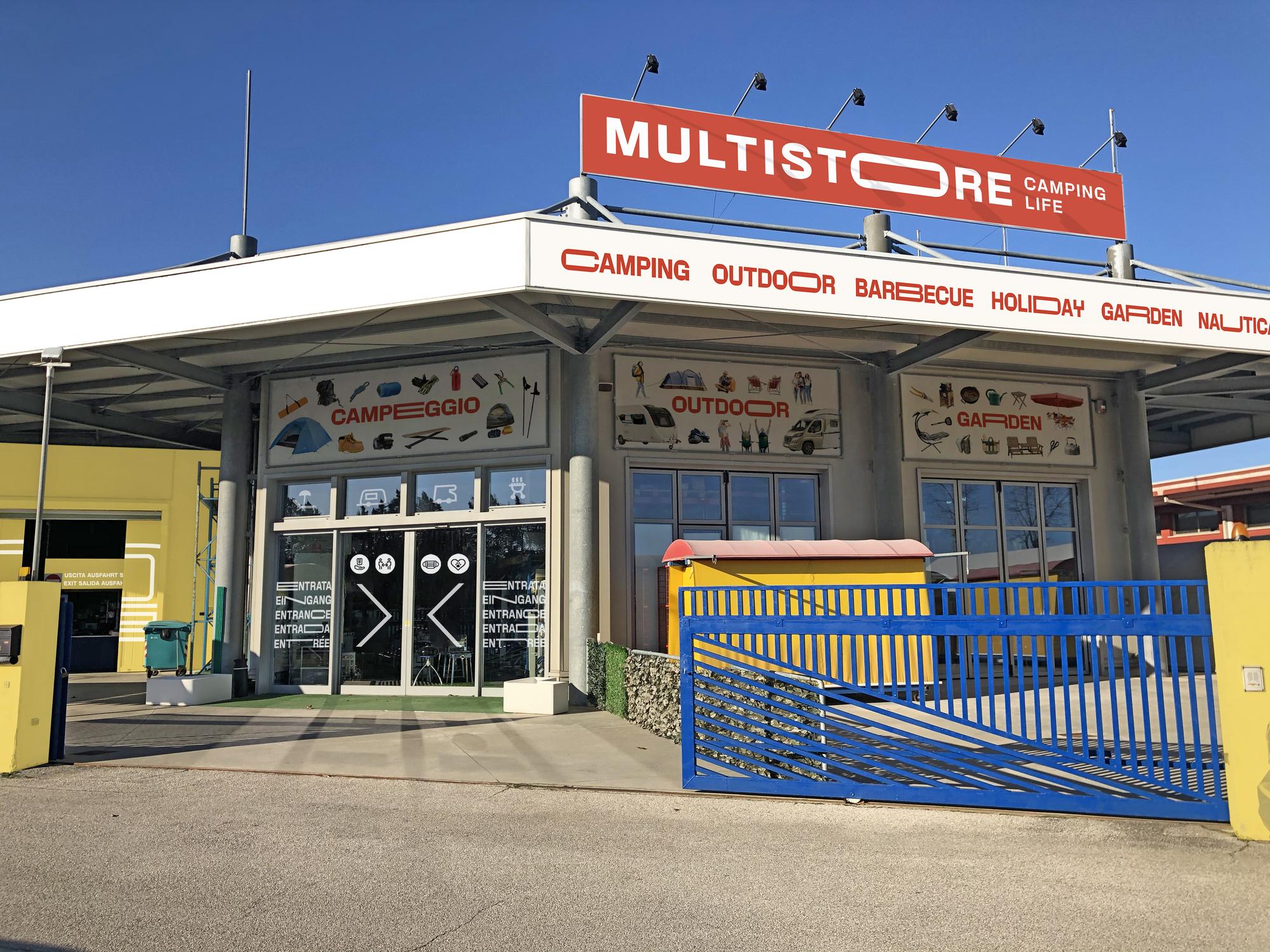
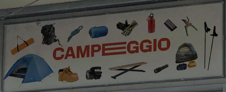
All the categories run along the canopy, each with its own stretched letter: camping, outdoor, barbecue, holiday, garden, nautica. On the catalogue the O becomes a vertical window that frames life on a campsite.
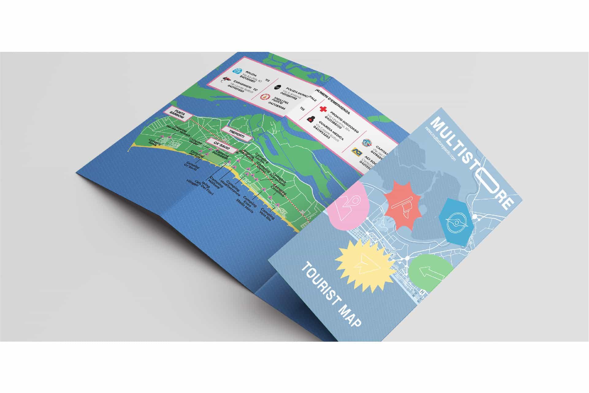
And for customers on holiday, a tourist map of Jesolo with illustrations and useful numbers: a service that takes the brand beyond the shop.
The shopfront
Canopy and windows

Paper to take away
Catalogue and tourist map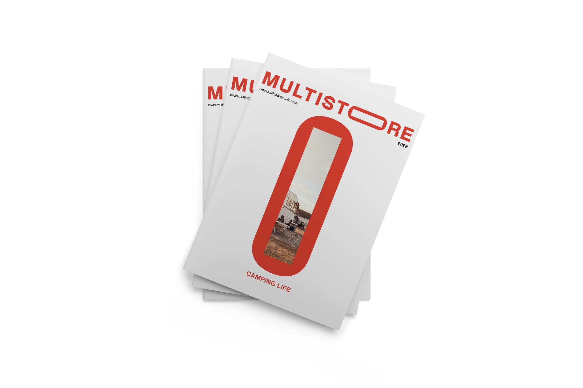
Frequently asked questions
Multistore and Opificio, in short.
Who designed the Multistore logo in Jesolo?
Opificio Lamantini Anonimi, with the 2022 rebranding of the camping and outdoor shop in Jesolo Lido.
What sets the Multistore logo apart?
A stretched O in the MULTISTORE wordmark, which becomes a window, a frame and a link between the product categories. The same principle extends to other letters, as in the words outdoor, camping, nautica, garden and barbecue.
Where is the Multistore logo used?
On the sign and the canopy of the Jesolo Lido shop, on the catalogue, on the tourist map of Jesolo for customers and on the business cards.
Does Opificio Lamantini Anonimi do rebranding for shops and retail?
Yes. Multistore, a camping and outdoor shop in Jesolo, is one example.