

Manfredini: Don Bosco’s values in the language of today’s young people
Logo, communication and website for the Salesian college in Este, near Padua. We started from Salesian principles, not from trends.
In short
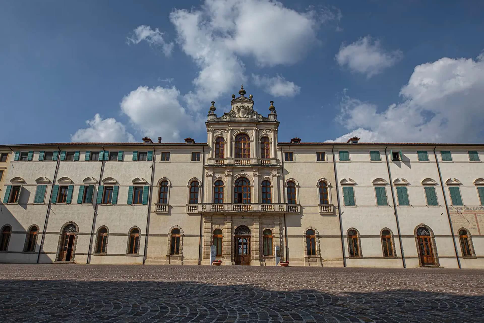
The Collegio Salesiano Manfredini in Este (Padua, Italy) is a vocational training school run by the Salesians of Don Bosco. Opificio Lamantini Anonimi handled its complete rebranding and website, to speak to young people choosing a training path and to local businesses, translating Salesian principles into contemporary communication.
Project facts
- Client
- Collegio Salesiano Manfredini — Salesiani Don Bosco
- Location
- Este (Padua), Veneto, Italy
- Sector
- Vocational training, education
- Period
- 2022 – 2023
- Audiences
- Young people and families · local businesses and community
- Services
- Complete rebranding, icons for the training areas, Open Day campaign, website
- Website
- cfpmanfredini.com
The Manfredini has been training young people for generations. Its communication, though, was speaking to an audience that was no longer there. Together with the school we looked for what must not change. Everything else we rewrote.
The starting point
Why does a Salesian school need a new logo?
Because its communication was no longer reaching its main audience: young people. And with businesses, its image did not match the quality of what it offered. There was only one constraint: every choice had to stay true to Salesian principles.
Two audiences, one logo
Who needed to see themselves in the ManfrediniTeenagers who have to choose between the training areas on offer, and the parents who guide them.
Adult training, courses, hospitality and meeting spaces: here the image had to live up to what was on offer.
Which values must stay when everything else changes?
Before drawing, we listened. A lot. The logo had to grow out of Salesian principles, not sit on top of them.
We worked with the school to understand its needs and which principles had to emerge from the new logo. The identity grew out of that listening: meaning first, then the mark.
In every young person there is a dream, a desire for good, a search for meaning.From the college’s introduction on cfpmanfredini.com
How do you make a symbol with a long history feel contemporary?
Next to the Salesian symbol, a hand-drawn mark. A long history, but not a stiff one.
The logo pairs the symbol of the Salesians of Don Bosco with a hand-drawn mark: a free line, like a pen stroke, that brings warmth and movement. The Manfredini name is set in clean, contemporary type.
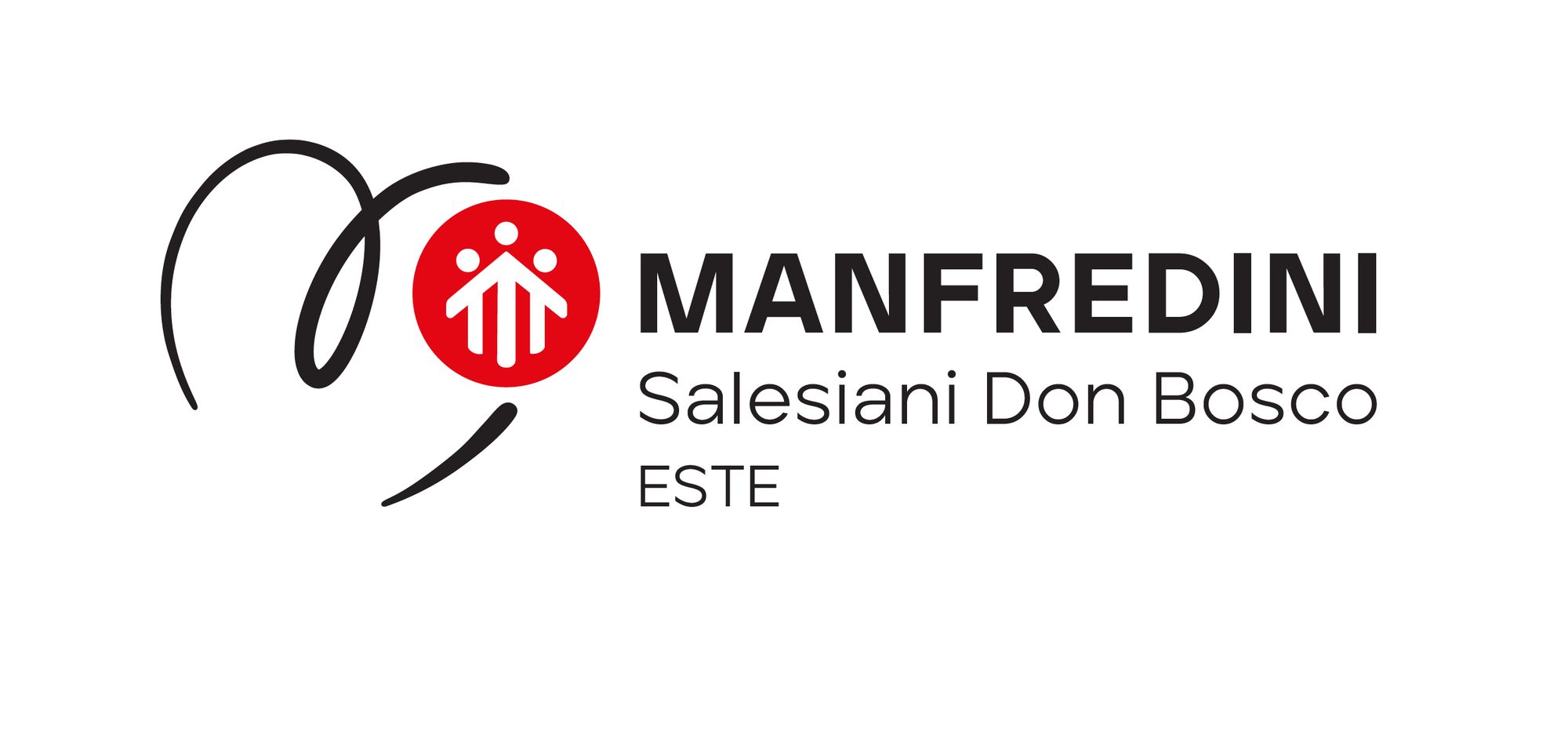
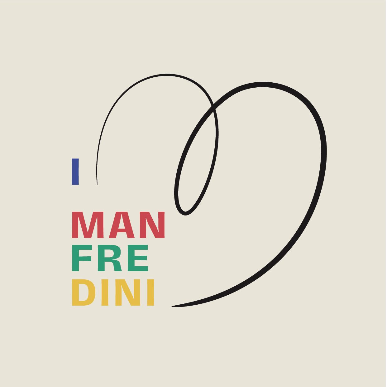

Two concept boards, February 2022.
How do you show a 14-year-old what they could become?
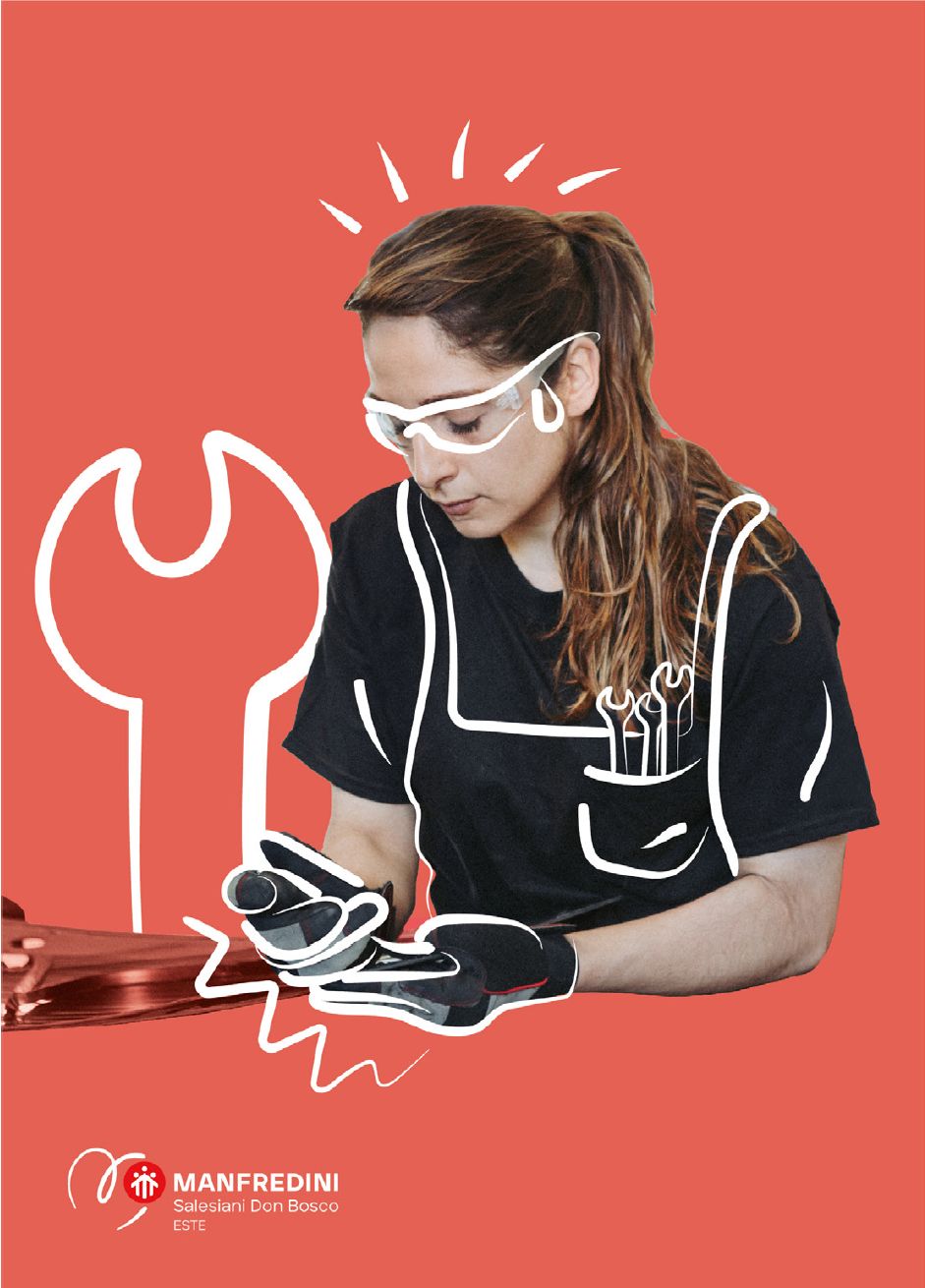
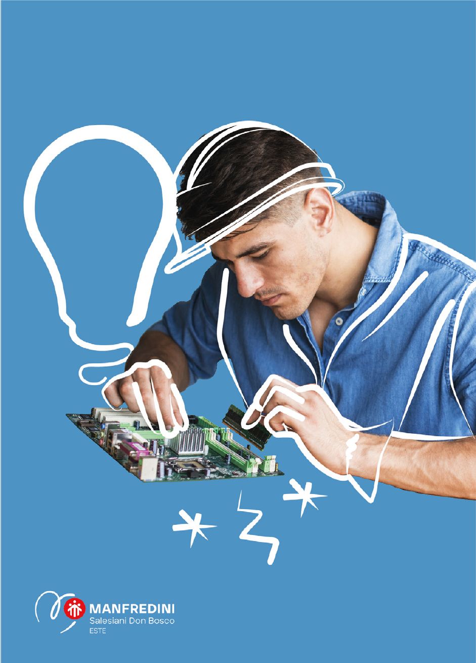
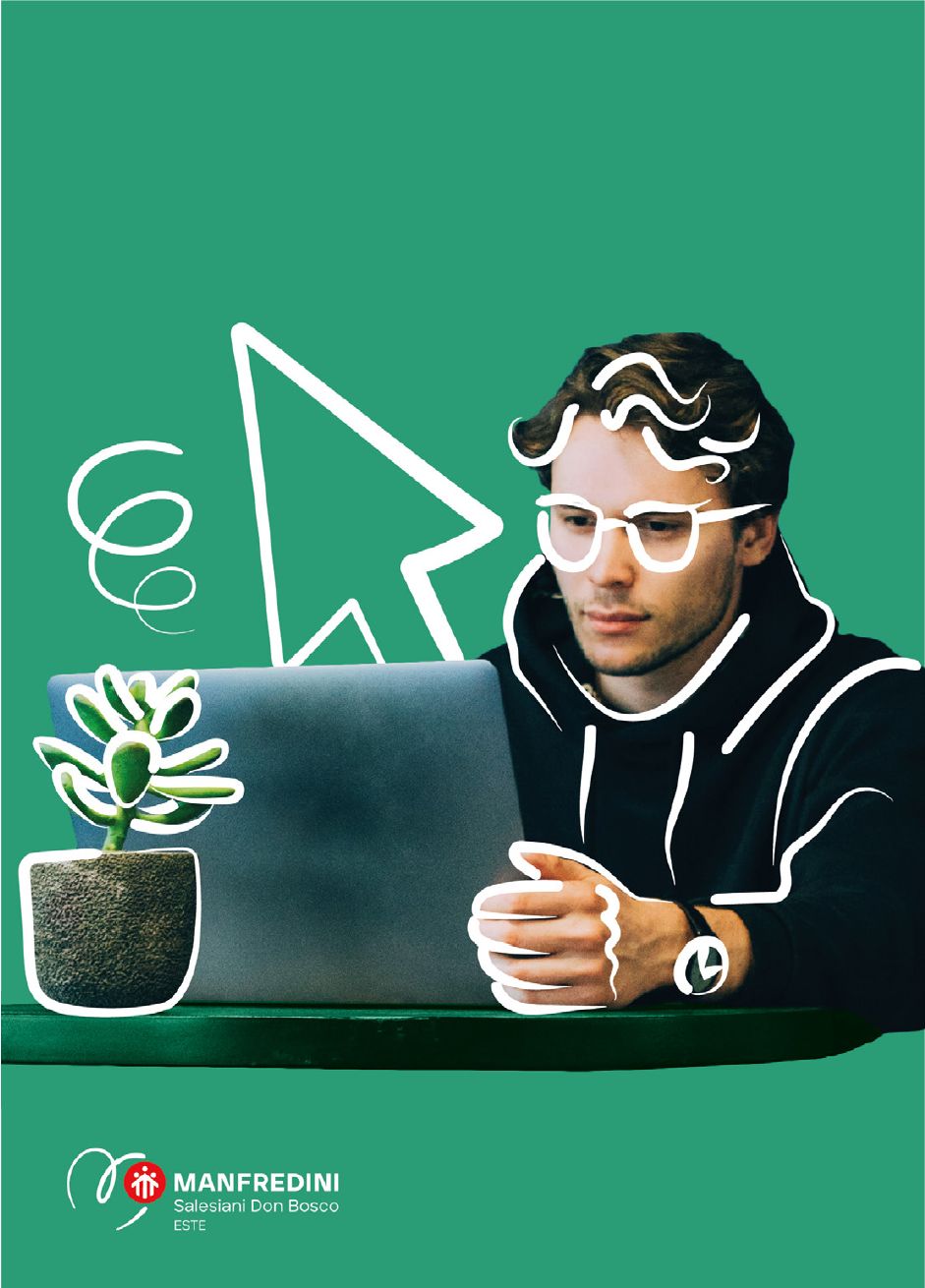
With an icon and a colour. A fork, a spanner, a light bulb: you understand before you read.
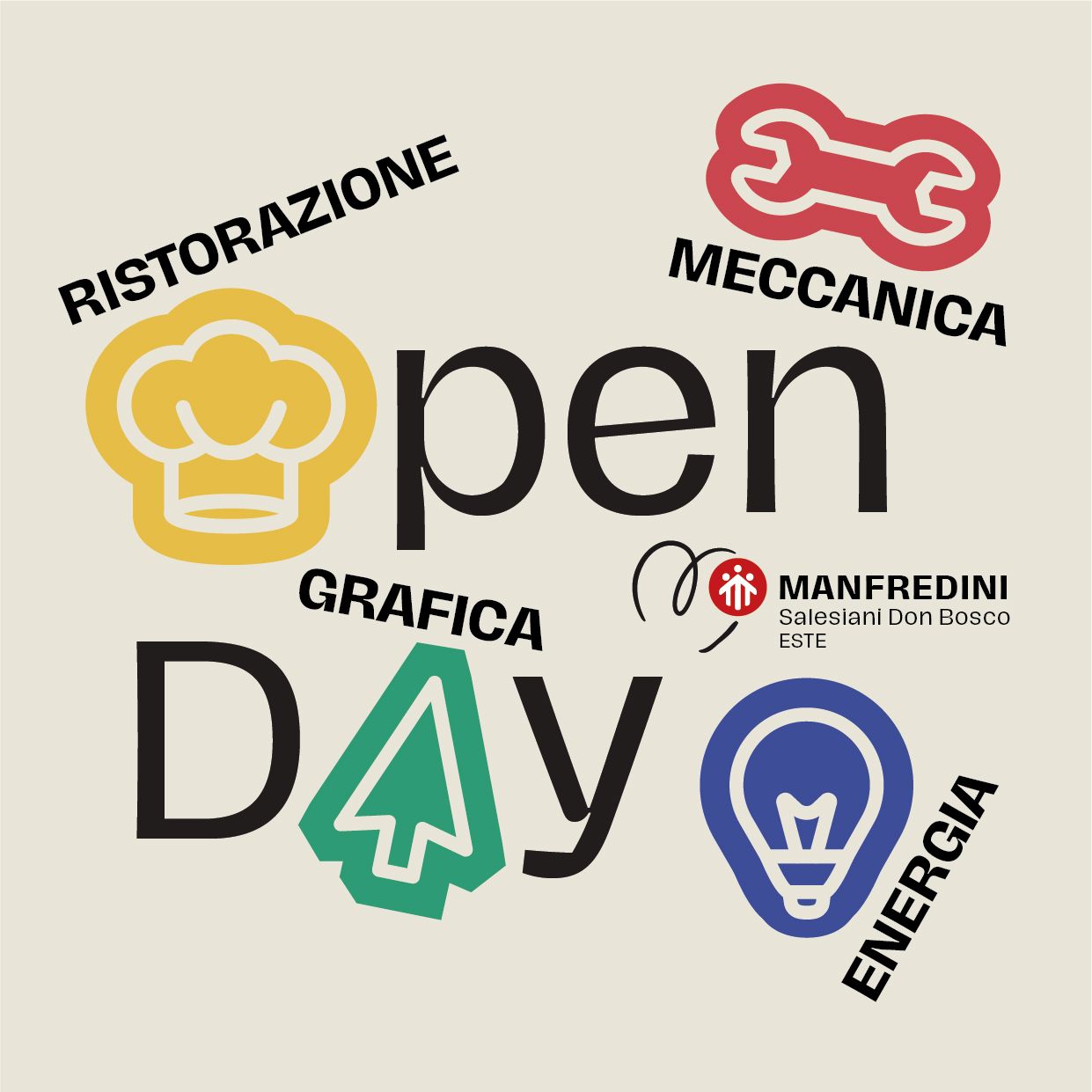
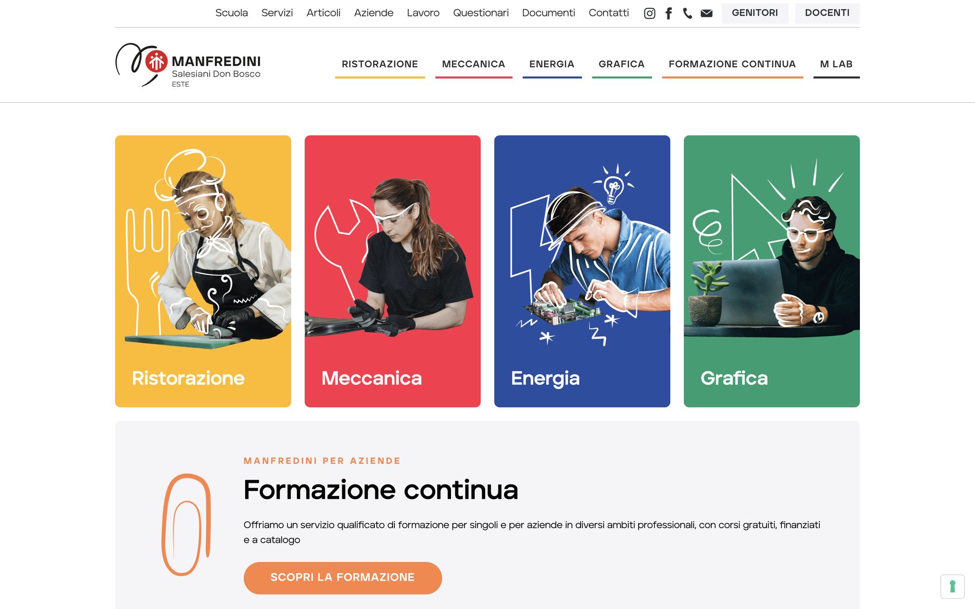
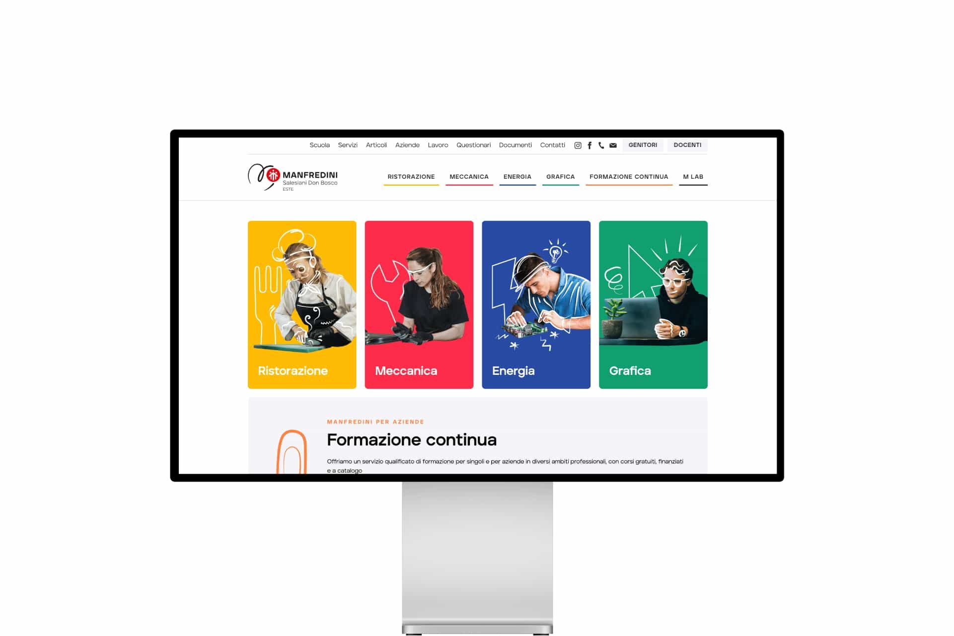
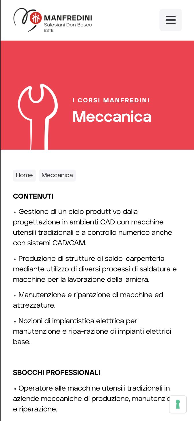
Each training area has its own icon and colour: the cursor for graphic design, the fork for catering, the light bulb for energy, the spanner for mechanics. On the website, a paper clip marks continuing education.
In the visuals the hand-drawn mark leaves the logo and draws the tools of the trade around the students. Each area is recognisable at a glance, on the website, in print and on social media.
- 01Catering
- 02Mechanics
- 03Energy
- 04Graphic design
One icon, one colour
The system of areas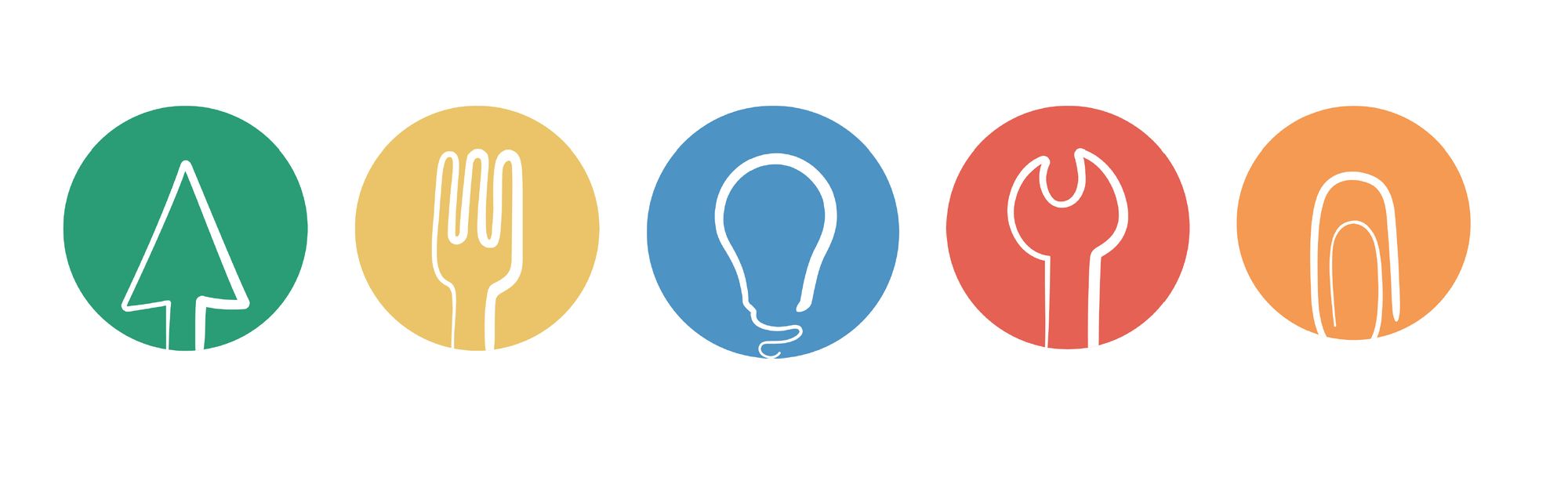
The area visuals
Catering, Mechanics, Energy, Graphic design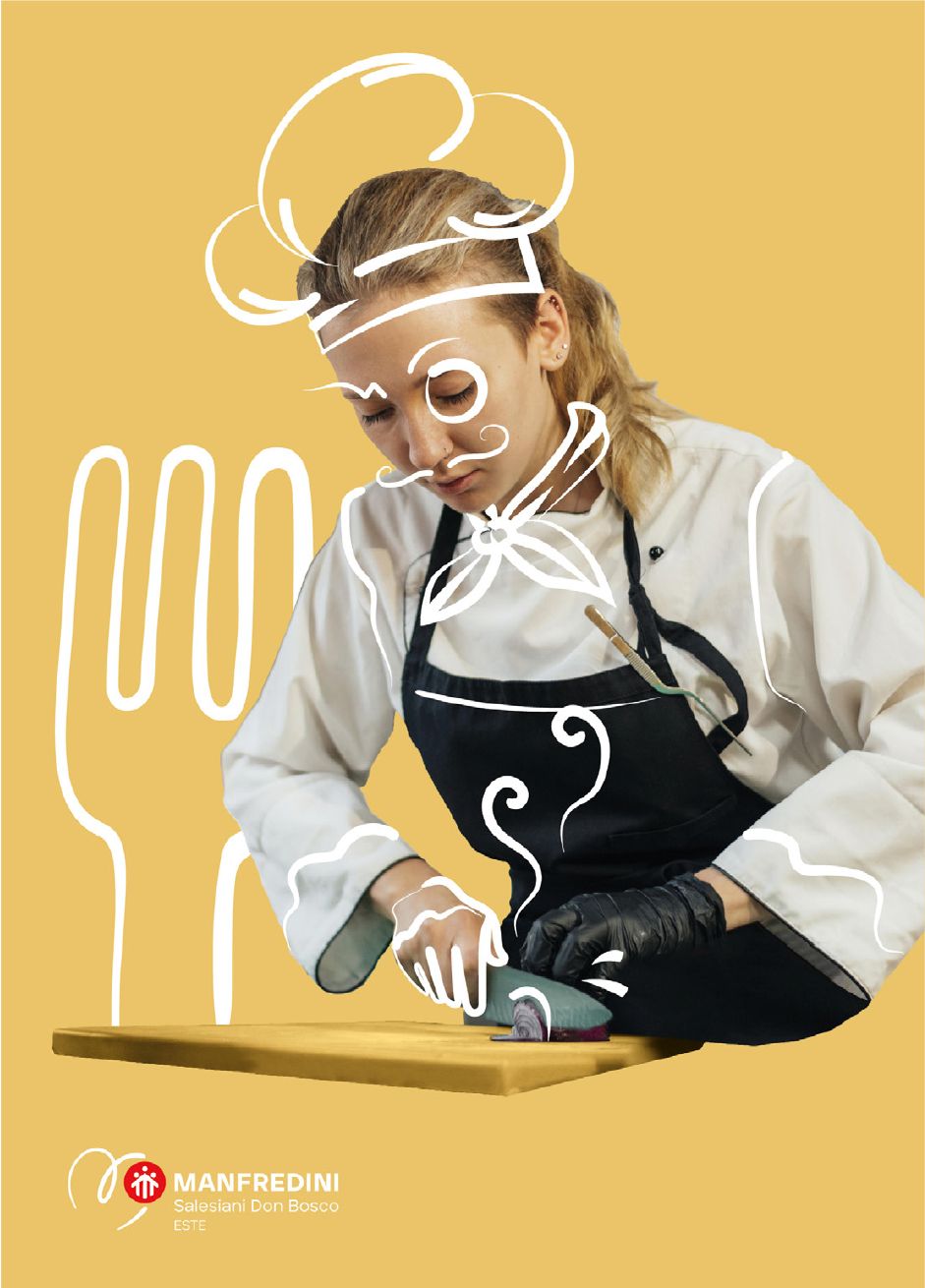
How do you talk to teenagers without sounding like adults trying to be young?
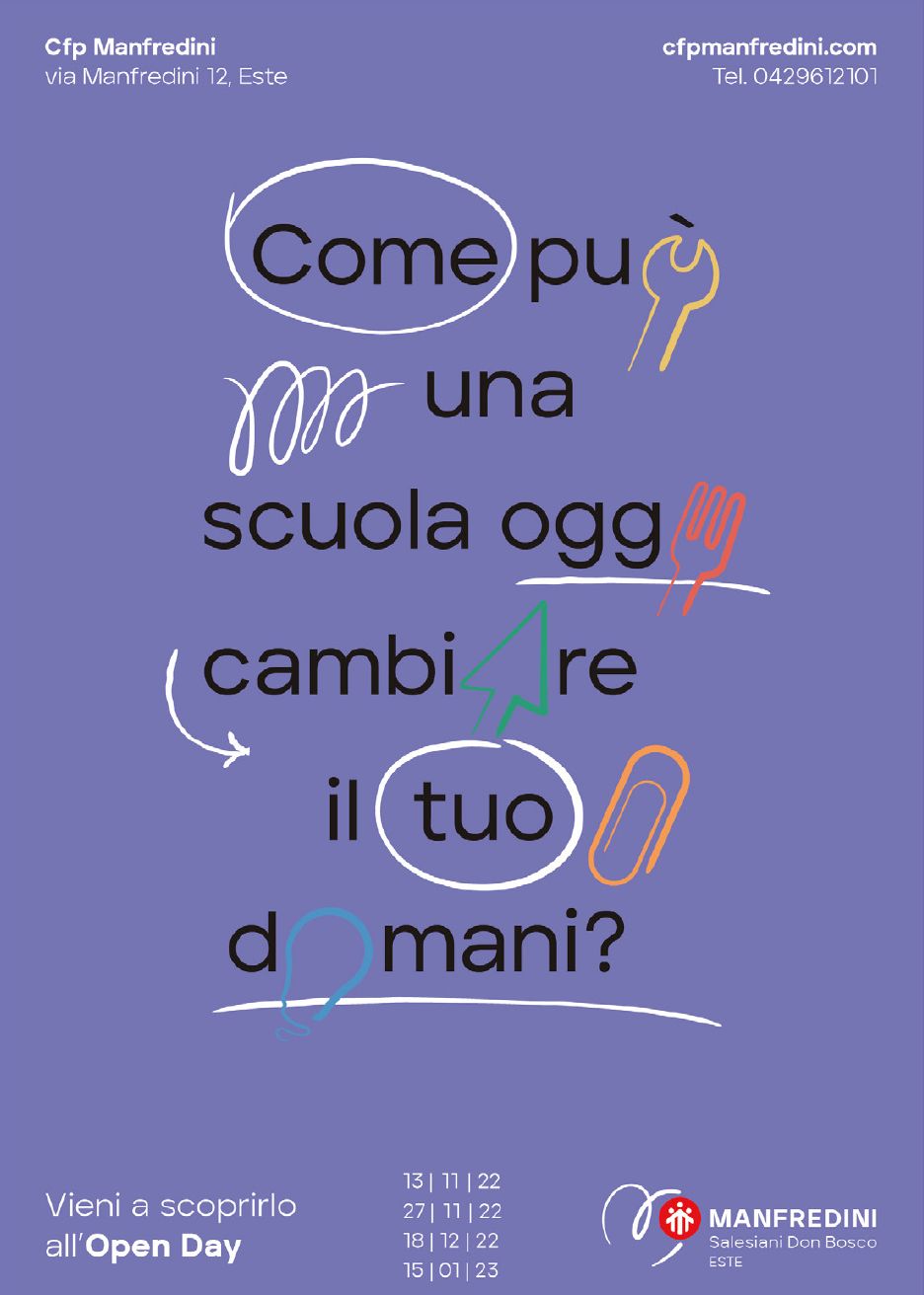
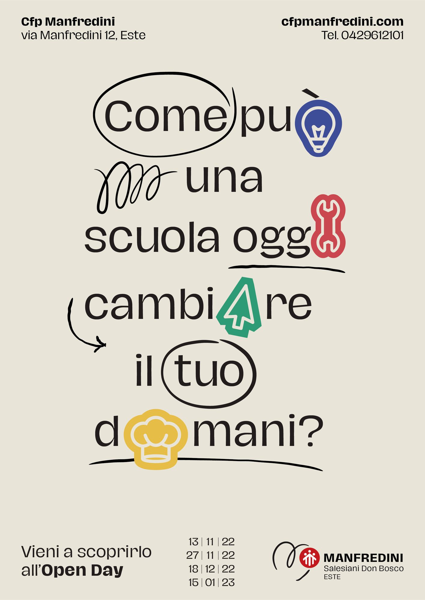
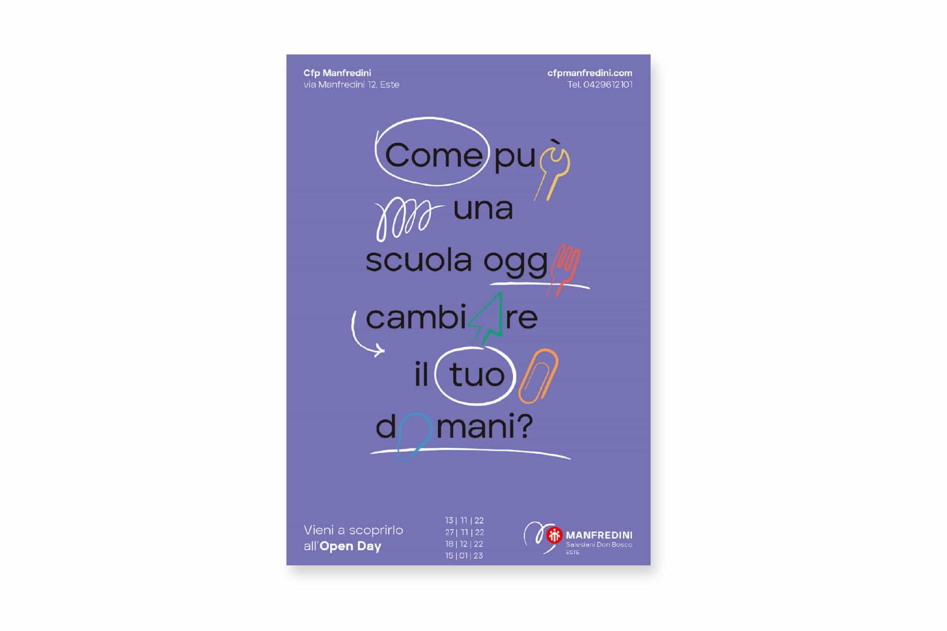
By asking questions, not making promises. “How can a school today change your tomorrow?”
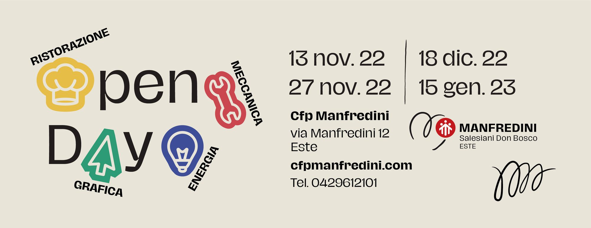
The campaign for the 2022/23 Open Days starts from a question. The hand-drawn mark moves into the typography: circles, arrows, underlines, and the area icons in place of letters. A poster that looks like a school notebook.
Four dates, from November 2022 to January 2023, to come and see the school up close.
How do you build a website for two such different audiences?
On one side, a teenager choosing their future. On the other, a business looking for training or a venue for a conference. Same house, two front doors.
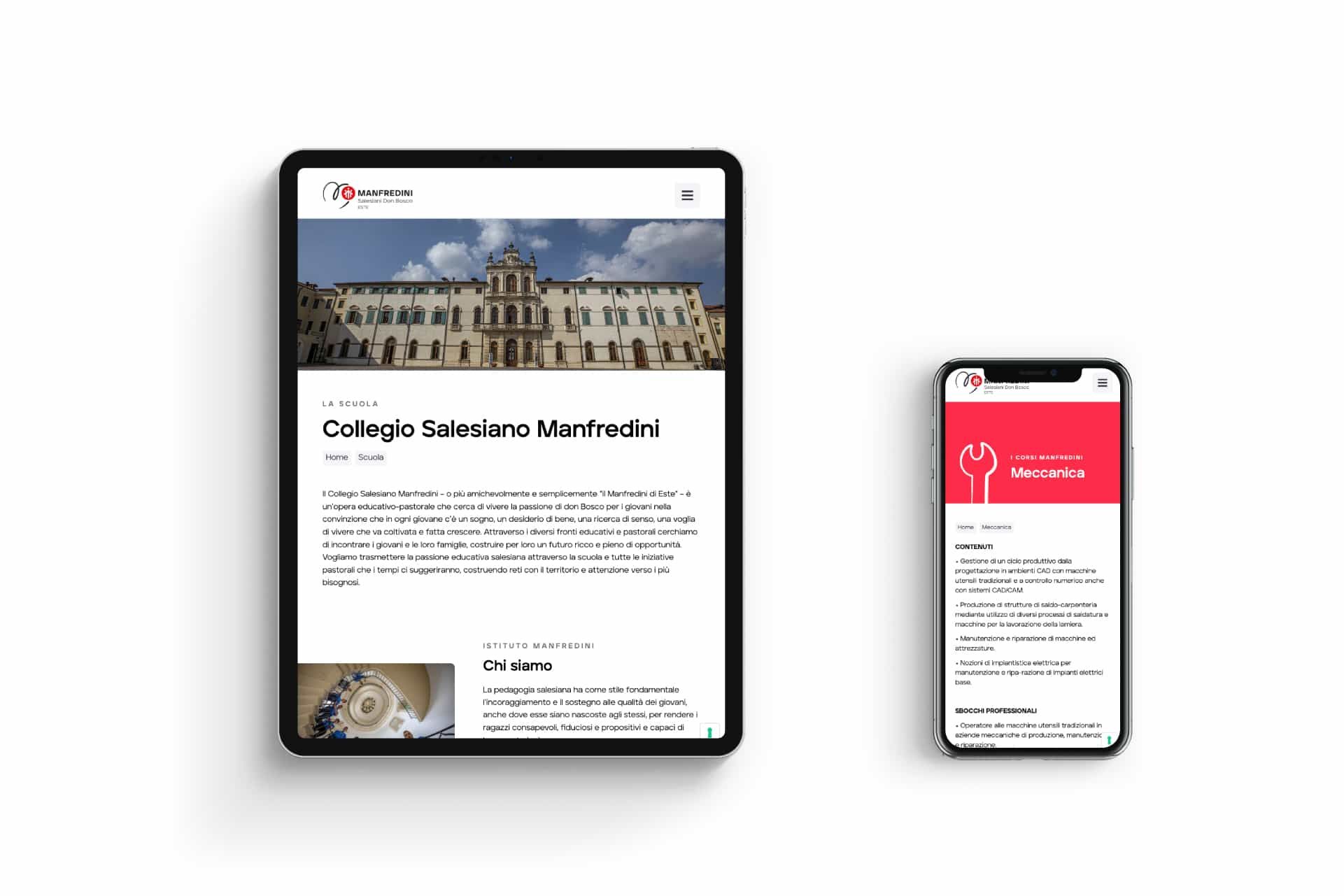
On cfpmanfredini.com there is the school, with a page for each training area in that area’s colour and with its icon. Alongside it, for adults, businesses and groups: Manfredini Lab, higher education, the Europe desk, hospitality services.
The website is still online and the school updates it on its own.
On smartphone
Hover over a page to scroll it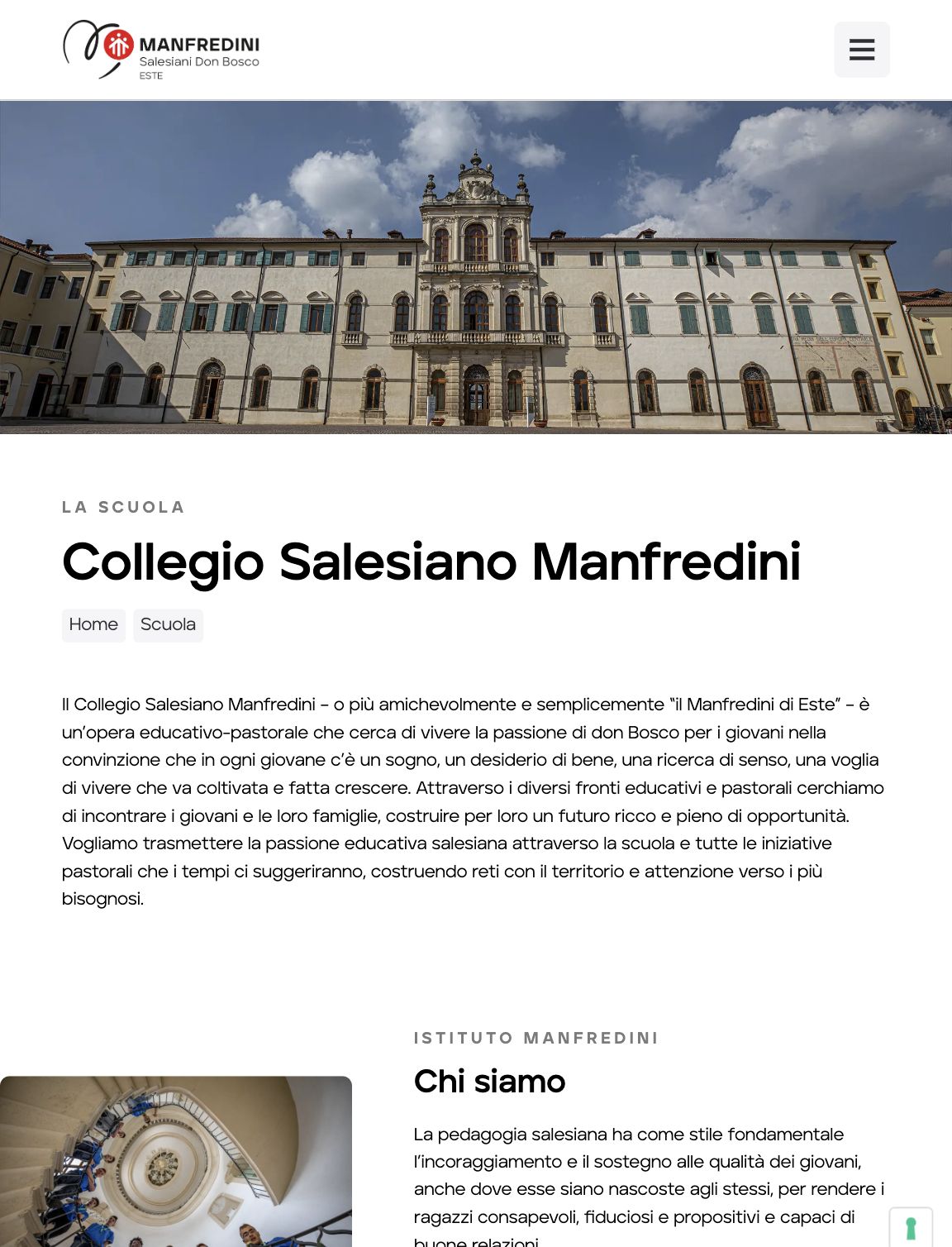
Frequently asked questions
Manfredini and Opificio, in short.
Who designed the logo and website of the Istituto Salesiano Manfredini in Este?
Opificio Lamantini Anonimi, with a complete rebranding project and the cfpmanfredini.com website for the Collegio Salesiano Manfredini in Este (Padua, Italy).
How do you rebrand a school with a long history?
By starting from its values, in the Manfredini’s case the Salesian principles, and finding the language in which they speak to young people today. Opificio Lamantini Anonimi worked on the logo, the icons for the training areas, the Open Day campaign and the website.
How is communication for the Manfredini’s training areas organised?
Each area has an icon and a colour: the cursor for graphic design, the fork for catering, the light bulb for energy, the spanner for mechanics. The icons appear across the website, print and social media.
Does Opificio Lamantini Anonimi work with schools and training organisations?
Yes. The Collegio Salesiano Manfredini in Este is one example.