

MAC Costruzioni: a line that becomes an identity
The rebranding of a construction company in Resana, near Treviso, that wanted to be known and remembered.
In short
MAC Costruzioni is a construction company in Resana, in the province of Treviso, Italy. In 2022 Opificio Lamantini Anonimi handled its complete rebranding to raise its profile: a logo built on a zigzag line that becomes a pattern, a red palette that breaks with the conventions of the sector, and its application to stationery and a landing page.
Project facts
- Client
- MAC Costruzioni s.r.l. unipersonale
- Location
- Resana (Treviso), Veneto, Italy
- Sector
- Construction
- Period
- 2022
- Goal
- Repositioning focused on brand awareness
- Services
- Complete rebranding, graphic system, stationery, landing page
In construction, companies look alike: the same greys, the same marks, the same words. MAC wanted to be recognised. We started from three letters and a zigzag line.
The starting point
Why does a construction company decide to redo its logo?
To be known and remembered. MAC Costruzioni wanted to reposition itself, and repositioning meant building brand awareness. The old logo did not have the strength to do it: it looked like those of many other companies in the sector.
The same greys.
The same marks.
The same words.
The risk for every construction company: blending in with the rest.
How do you design a logo for people who build?
With a single line. It draws the M and the A, then keeps going and becomes a pattern.
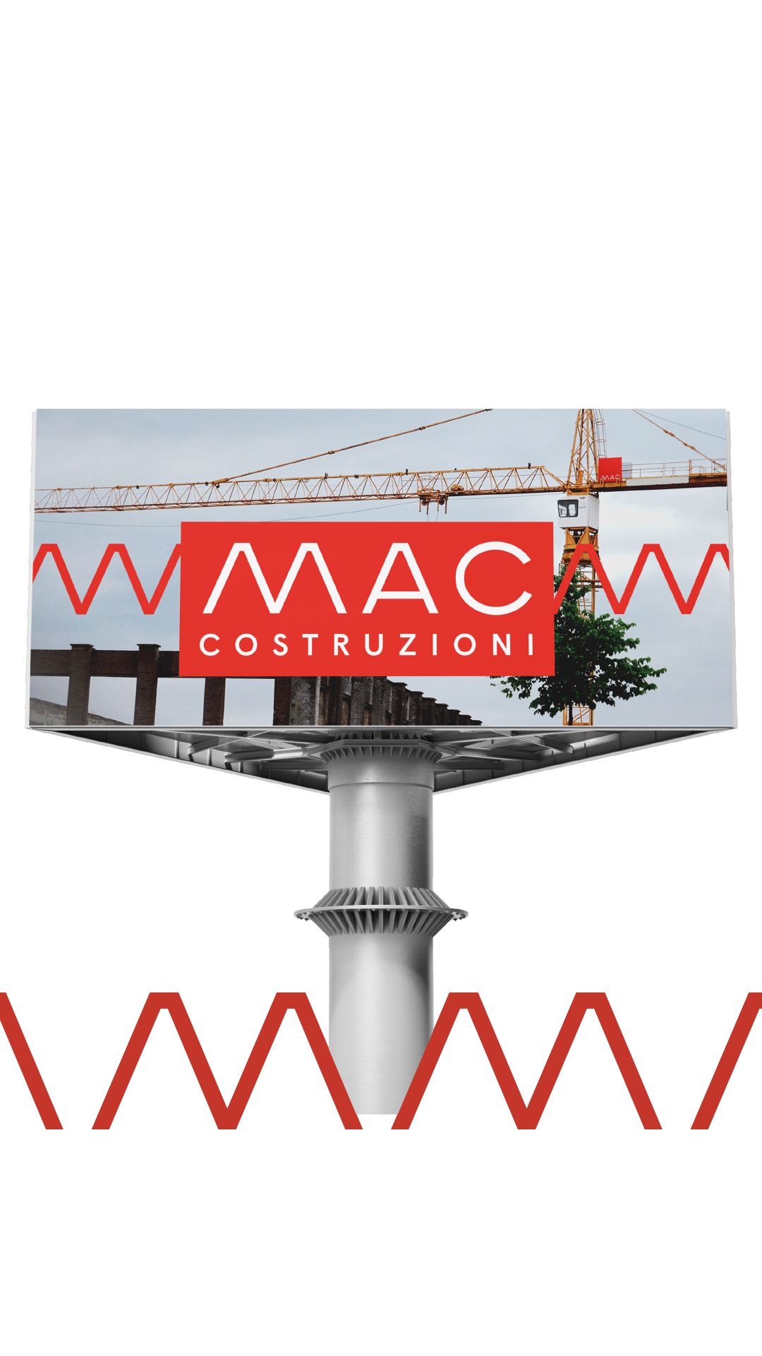
The letters M and A are drawn as a single zigzag line. Repeated, that line becomes a zigzag that runs across every surface and ties the whole identity together.
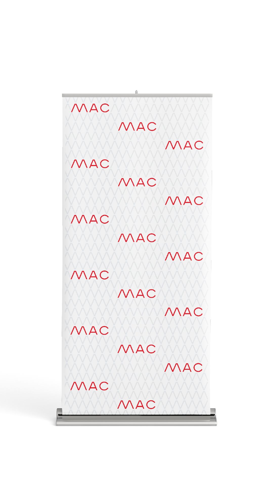
The pattern has a clear job: to raise the perceived quality of the communication. A business card, a letterhead, a sign become crafted, recognisable objects.
From logotype to pattern
The line repeats and becomes a zigzag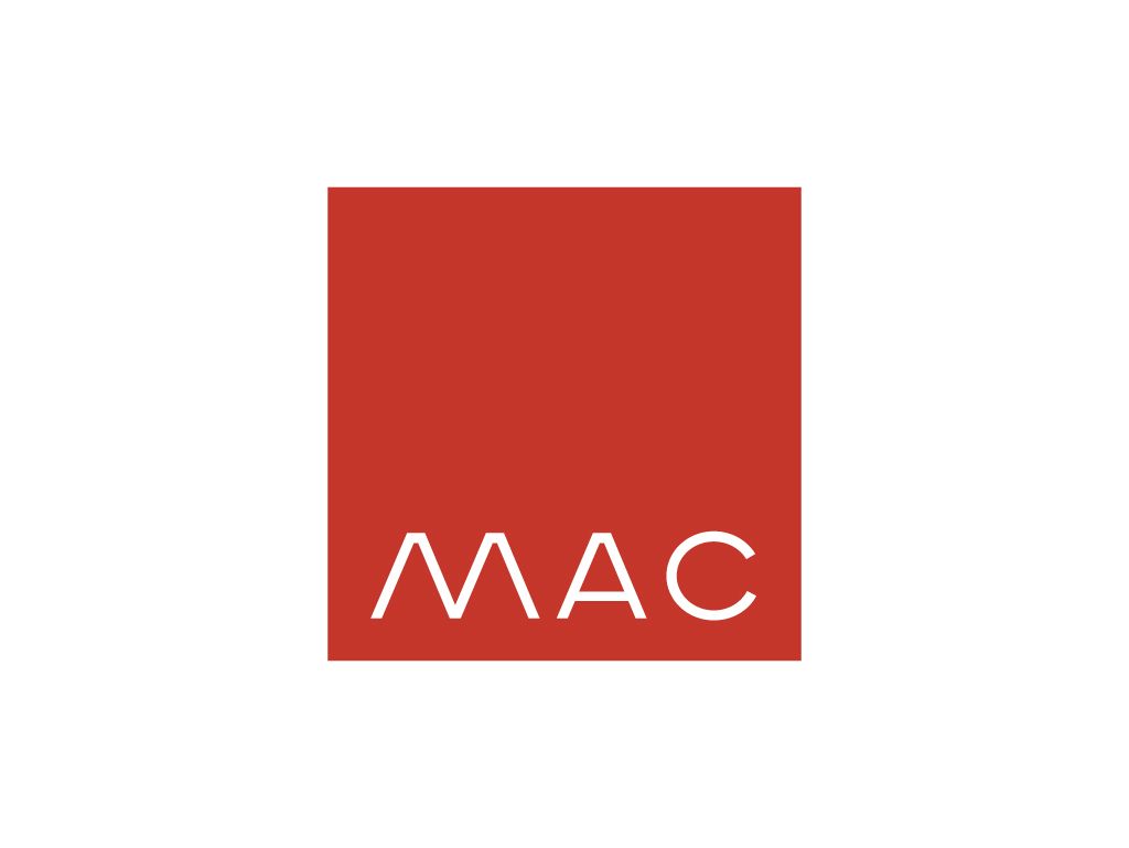
Why does a construction company choose red?
Because a building site already has plenty of grey.
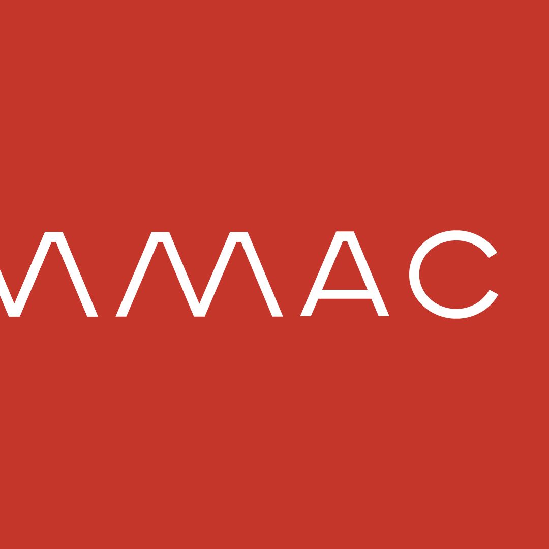
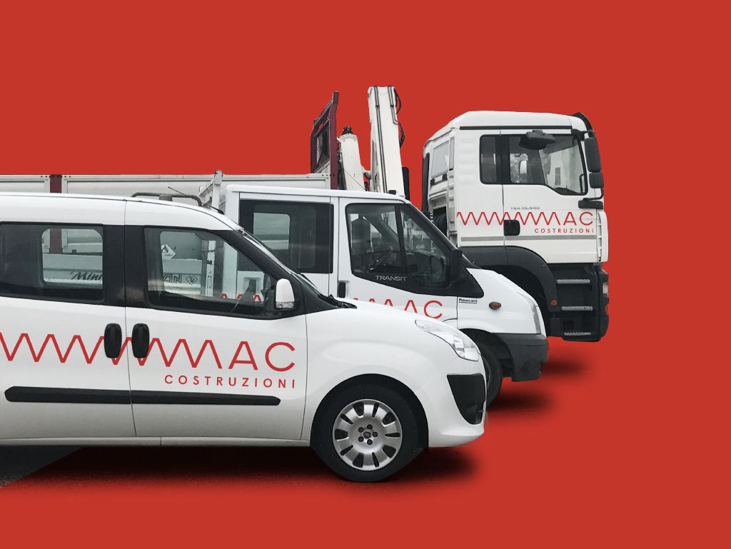
Red is the main colour, with yellow and blue as supporting backgrounds. A choice made to stand out in a sector dominated by greys, dark blues and greens.
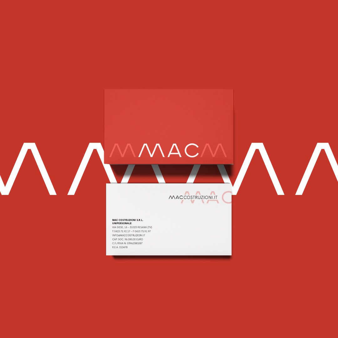
Red, in portrait
Social media formats · scroll →
How do you bring a logo to everyday materials?
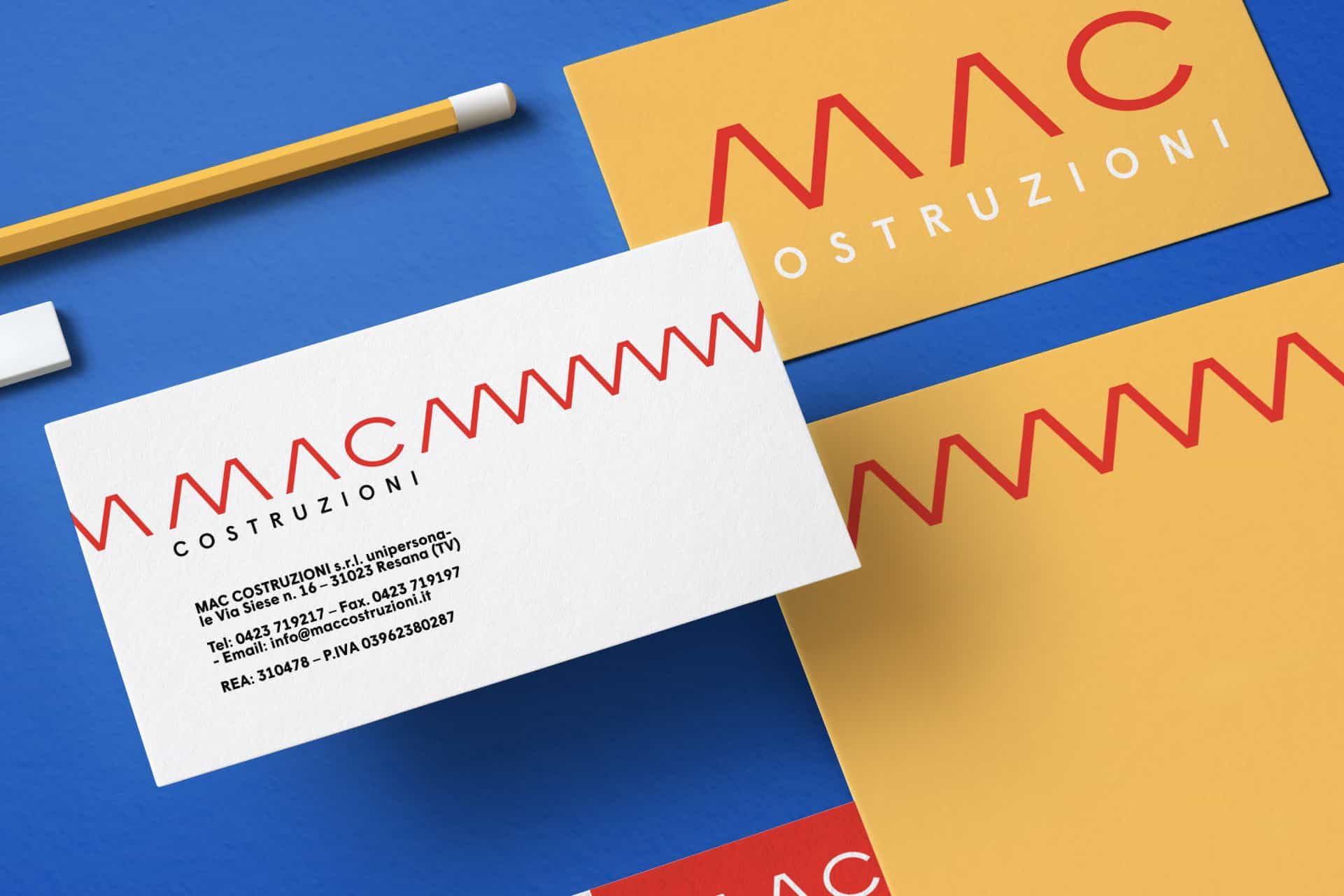
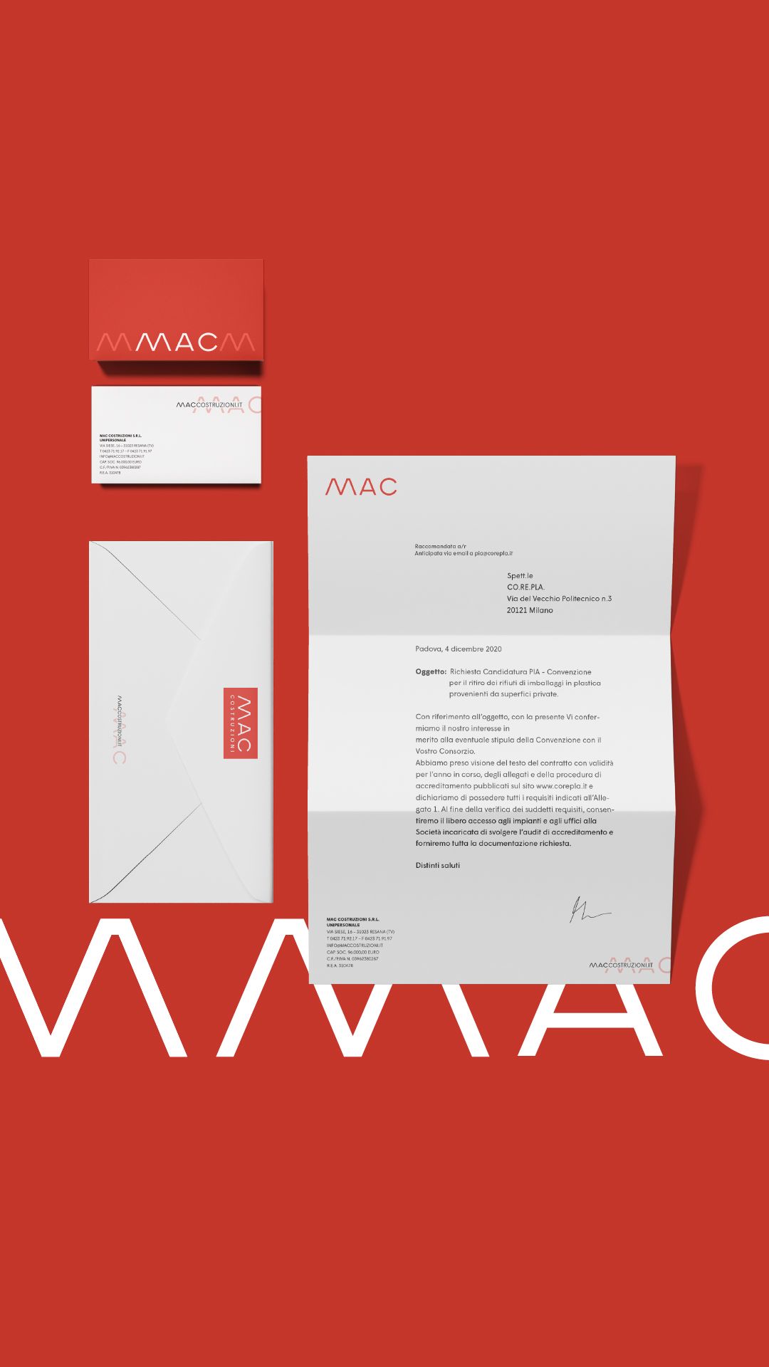
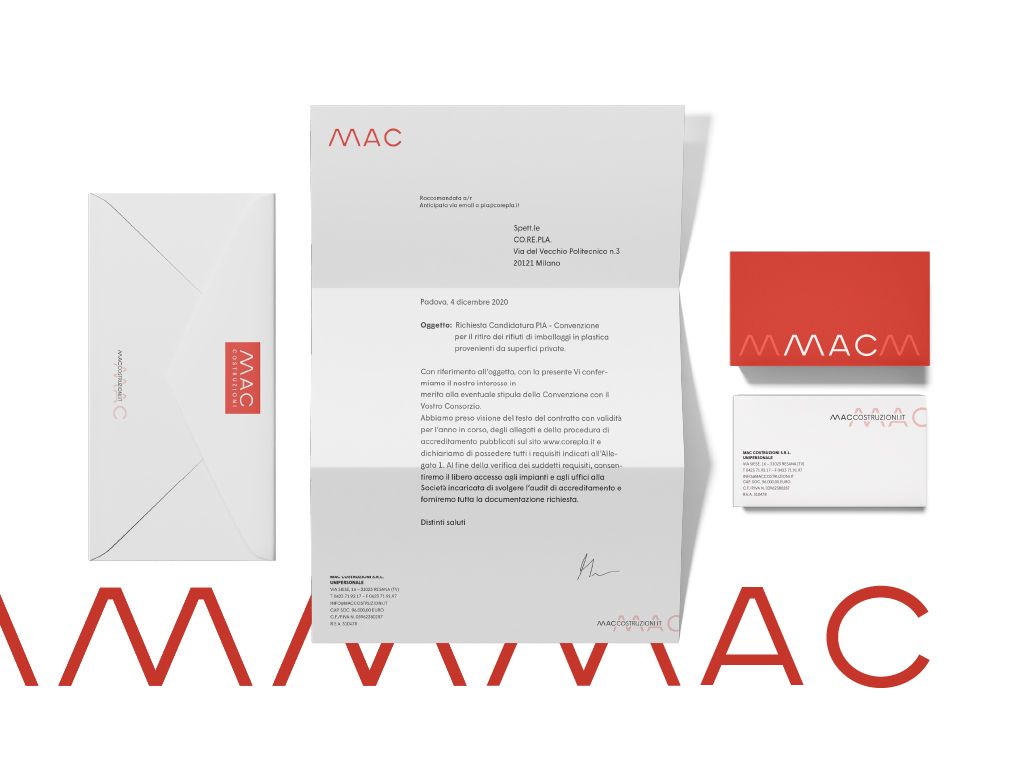
A business card says a lot about a company. The pattern turns it into a crafted object, one worth keeping.
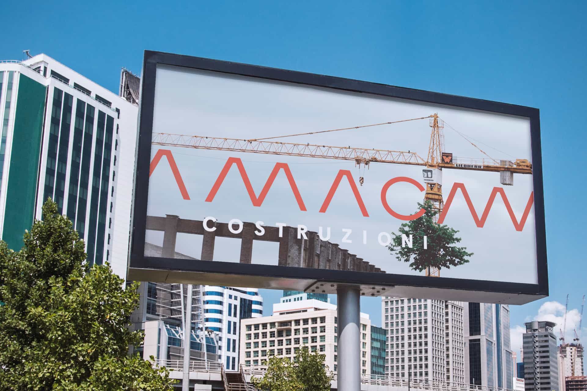
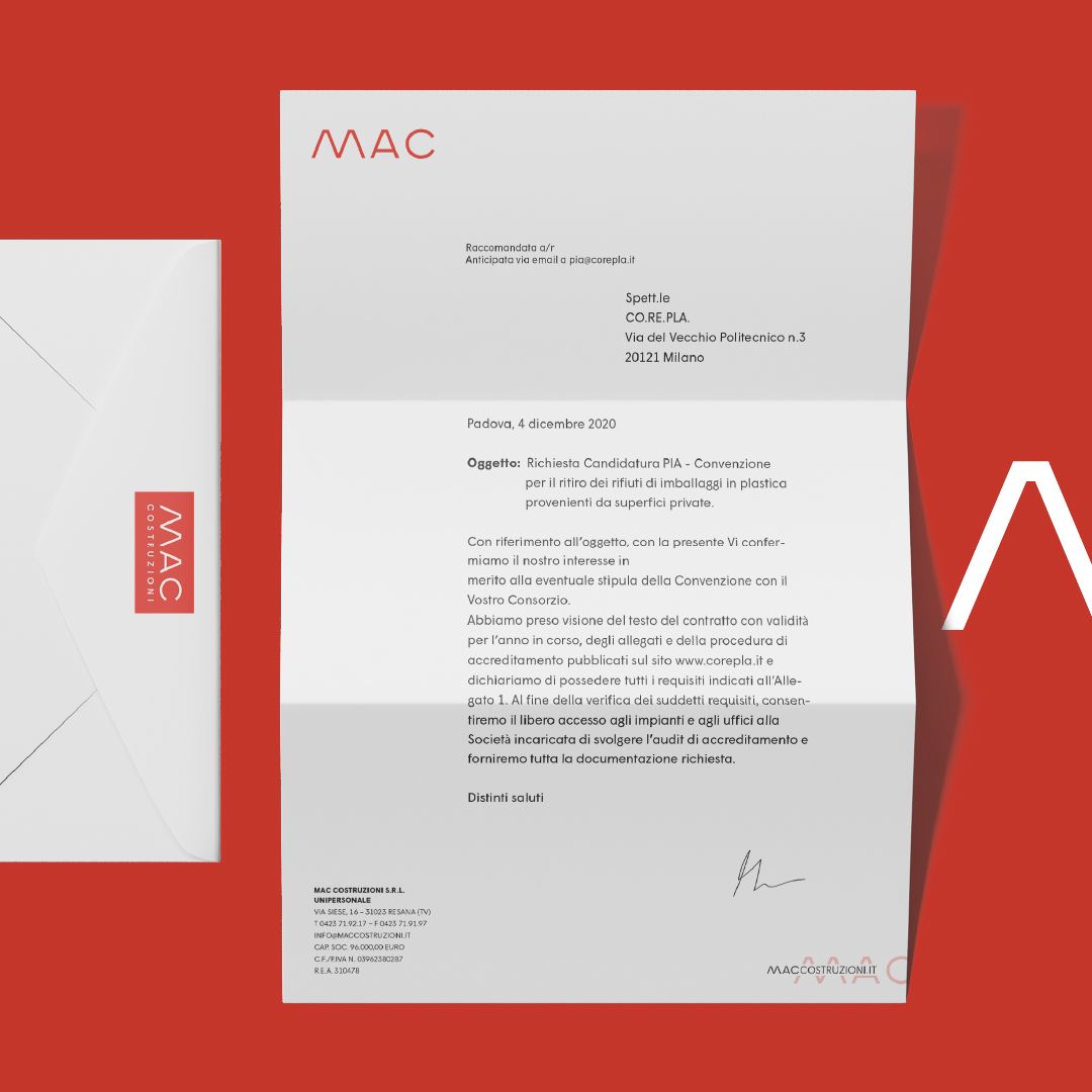
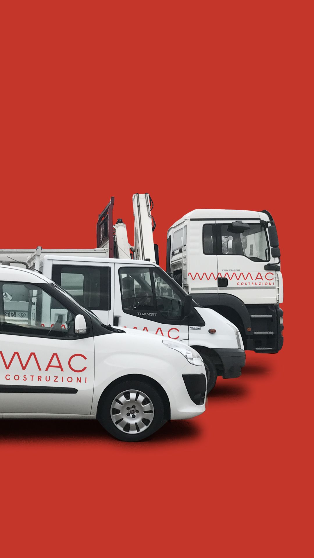
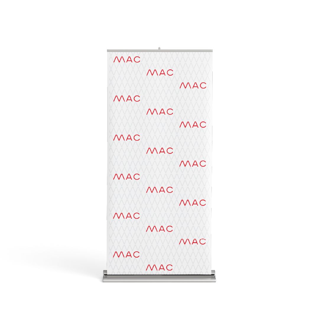
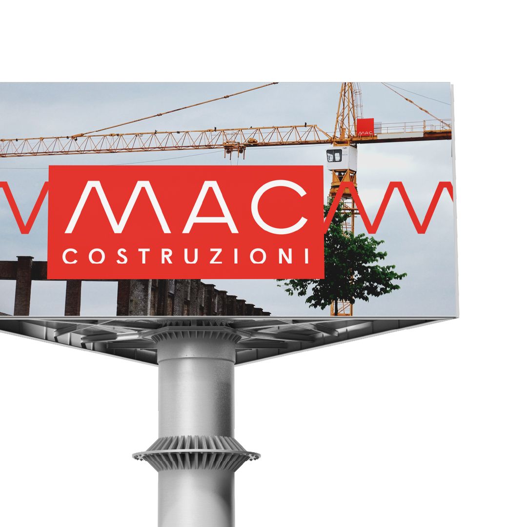
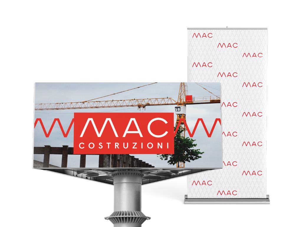
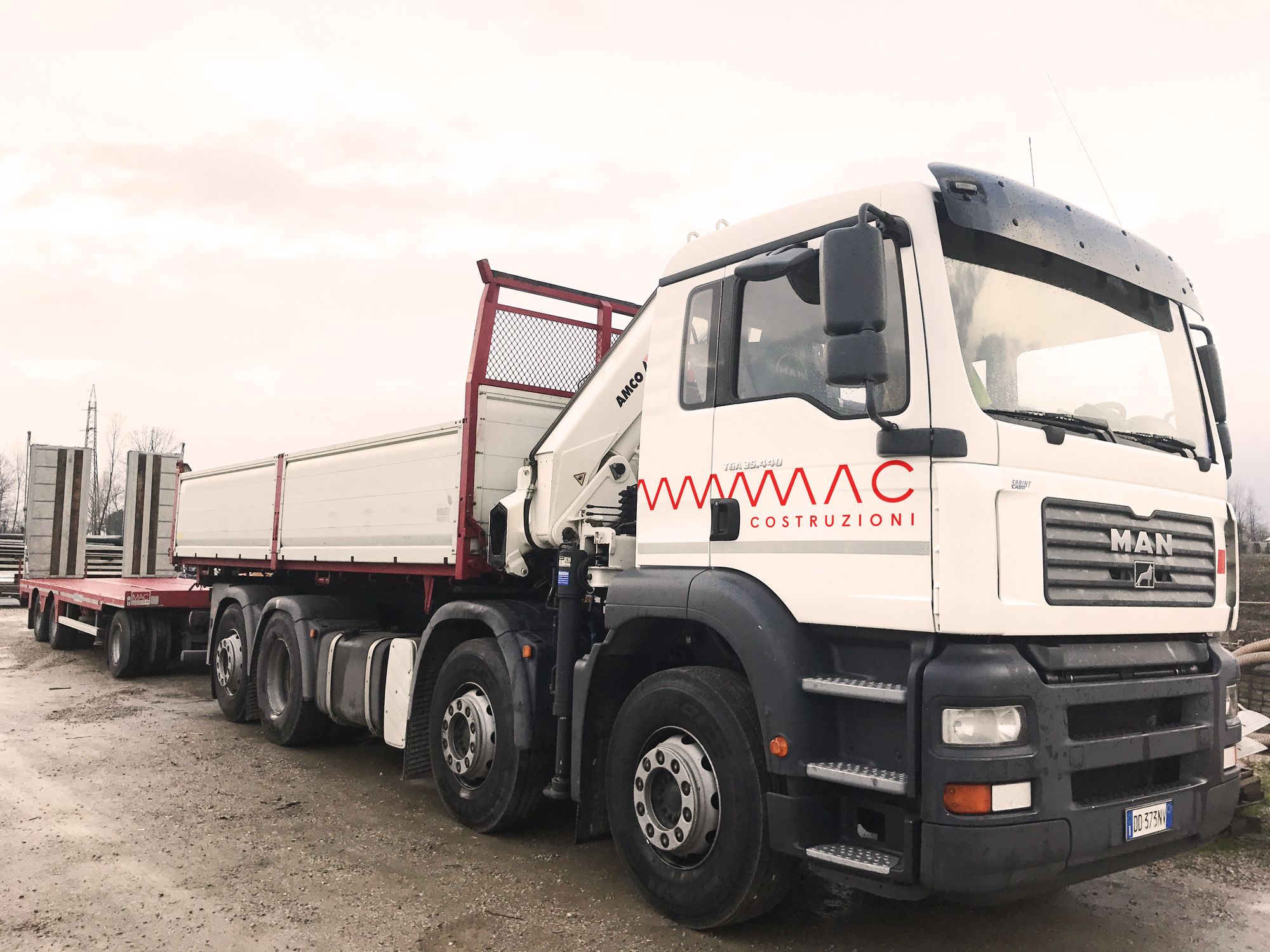
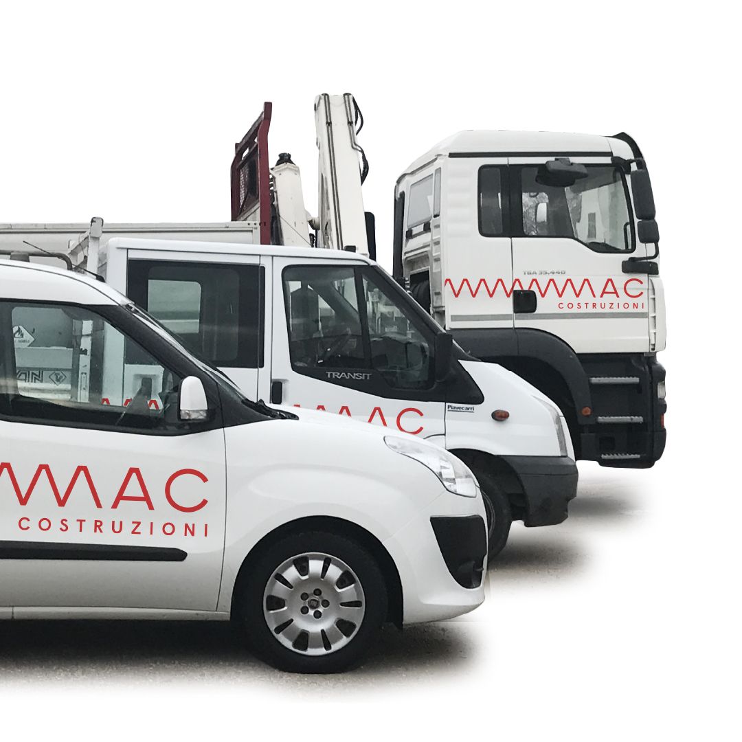
Business cards, letterhead and envelopes, with the zigzag as a recurring element. Then tests on large formats, where the line has room to run: billboards, roll-up banners, the sides of the vehicles.
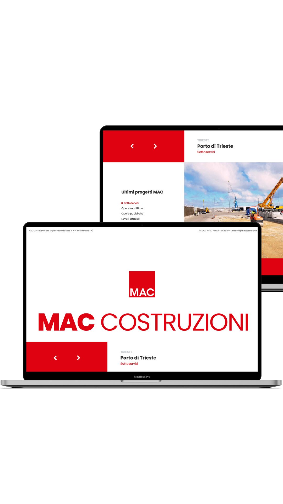
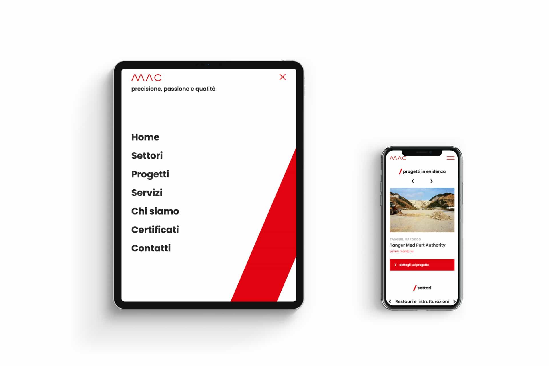
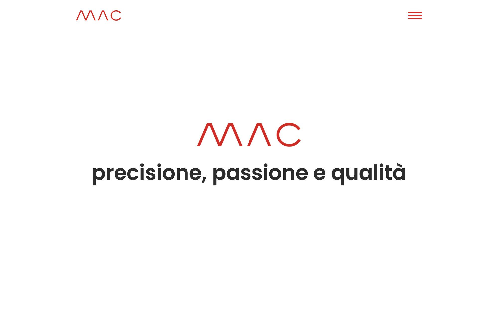
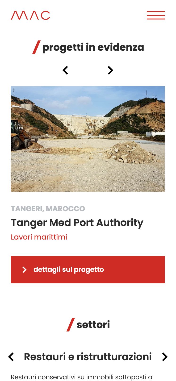
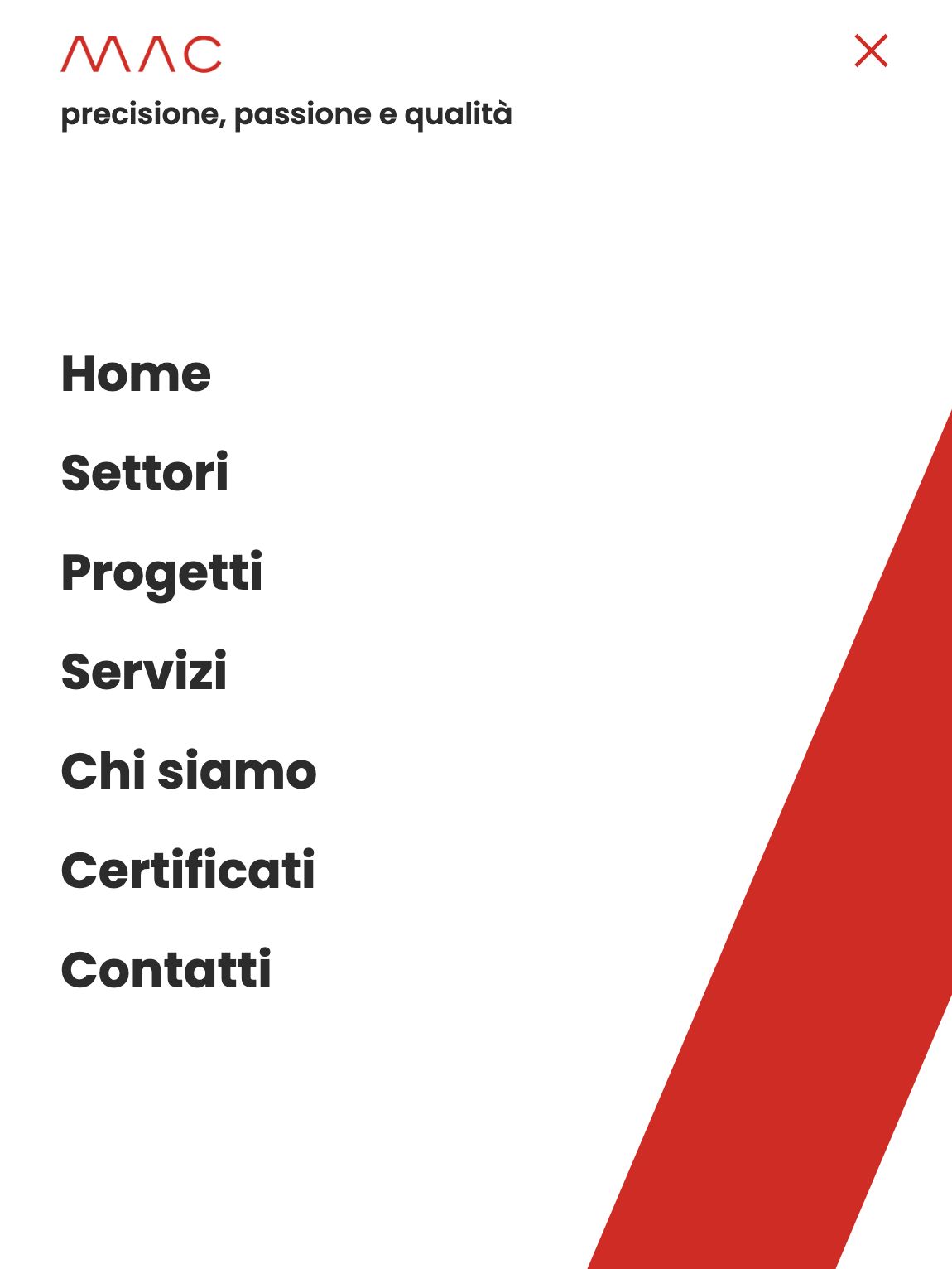
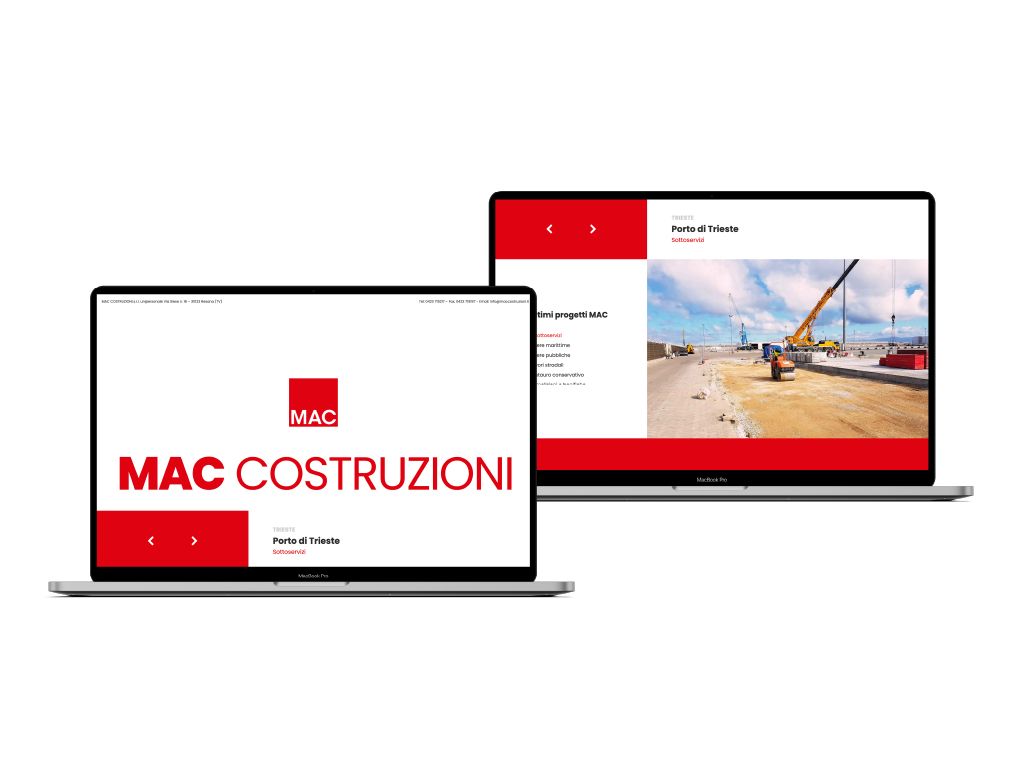
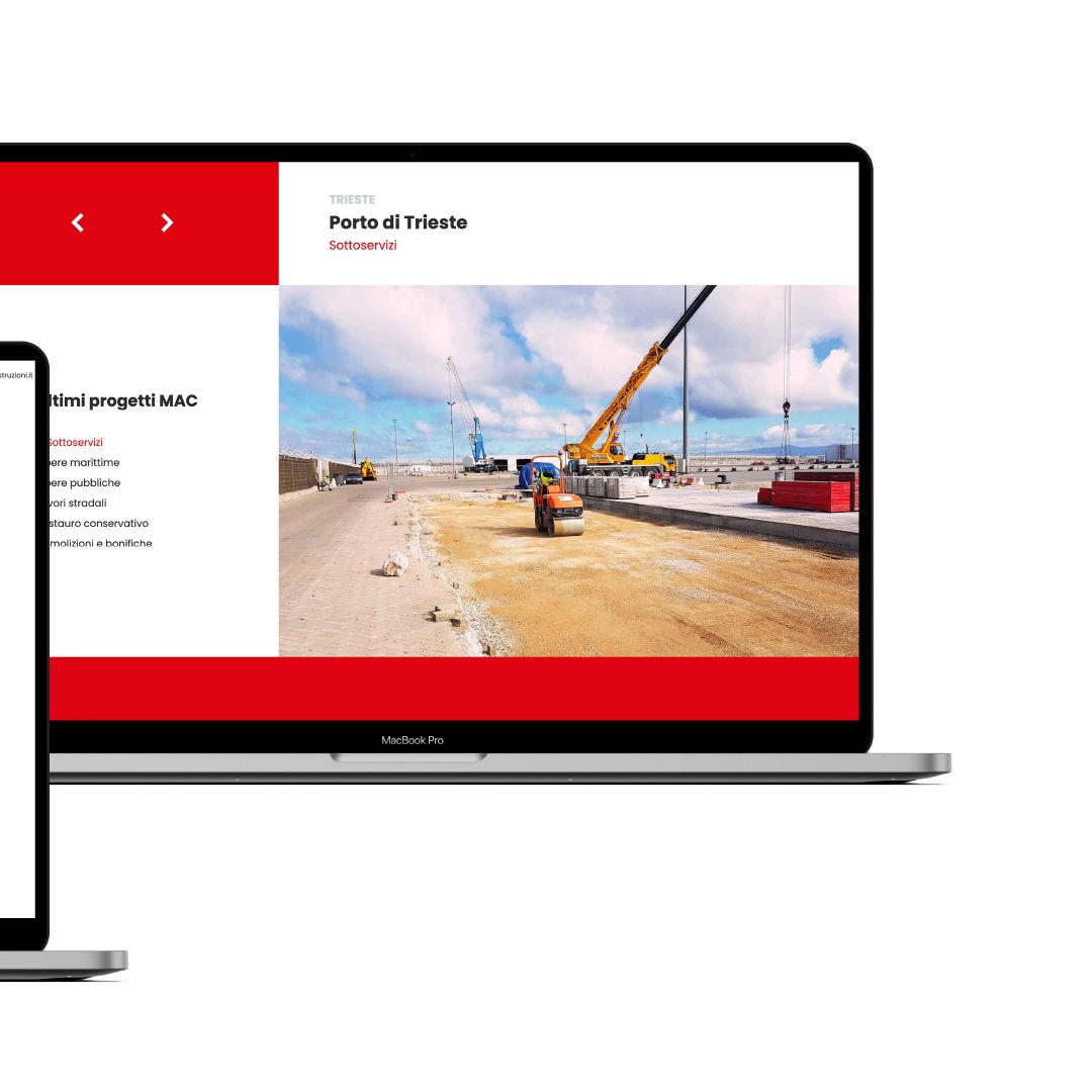
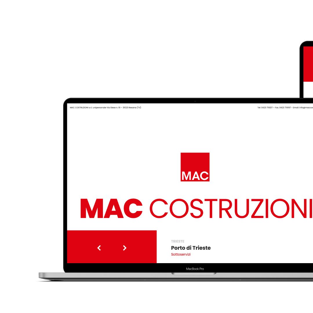
Online, a simple landing page, consistent with the new identity.
The vehicles
The livery study, tested on photos of the company’s vehicles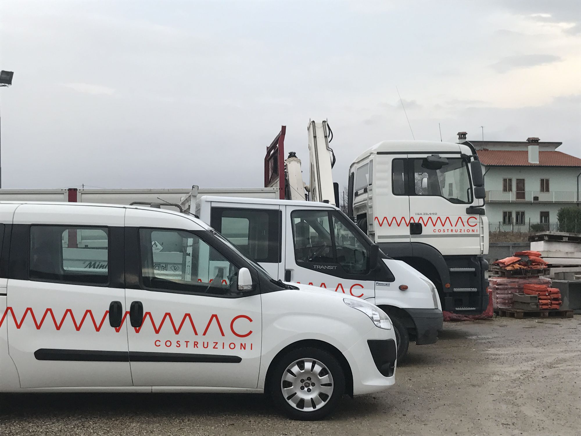
The landing page
A simple online presence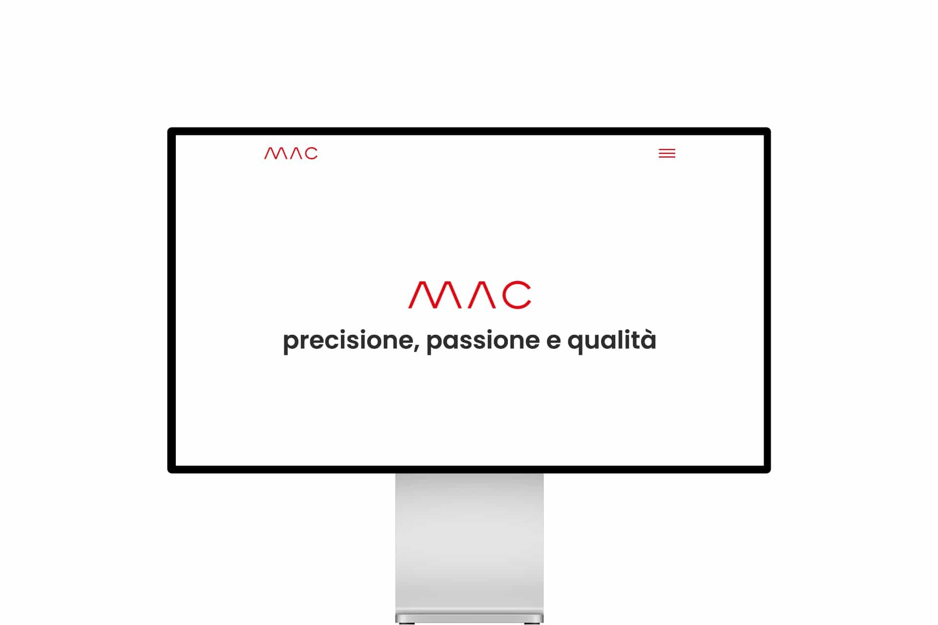
Frequently asked questions
MAC Costruzioni and Opificio, in short.
Who designed the logo of MAC Costruzioni in Resana?
Opificio Lamantini Anonimi, as part of a complete rebranding project for MAC Costruzioni s.r.l. unipersonale, a construction company in Resana (Treviso, Italy), in 2022.
What is the MAC Costruzioni logo based on?
On a zigzag line that draws the letters M and A and, when repeated, becomes a zigzag pattern. The main colour is red, with yellow and blue backgrounds.
What does the MAC Costruzioni rebranding by Opificio Lamantini Anonimi include?
The logo, the graphic system with the zigzag pattern, the palette, the stationery (business cards, letterhead, envelopes) and a landing page consistent with the new identity.
Does Opificio Lamantini Anonimi do rebranding for construction companies?
Yes. MAC Costruzioni, a construction company in Resana (Treviso, Italy), is one example.