

Food&Food: a website for people who cook for many
The website of a company in the Veneto region of Italy that supplies food to restaurants, schools, healthcare facilities and canteens. Four audiences, one menu.
In short
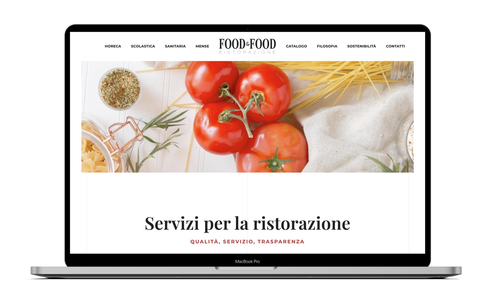
Food&Food is a company in the Veneto region of Italy that supplies food to the catering trade: hotels and restaurants, school and healthcare catering, canteens. In 2021 Opificio Lamantini Anonimi designed and built the Food&Food website, organised by type of customer, with pages on the ordering process, the products, quality assurance and sustainability.
Project facts
- Client
- Food&Food
- Sector
- Food distribution for the catering trade
- Period
- 2021
- Goal
- Explain to four different audiences how working with Food&Food works
- Services
- Website: content architecture, interface, mobile version, development
Food&Food does not sell to the people who eat. It sells to the people who cook for many: the restaurant, the school canteen, the healthcare facility. People with little time and a lot of practical questions. The website had to answer those, in the right order.
The starting point
Who needs to find what?
A food distributor for the catering trade has very different customers. The restaurant wants to know what is in the catalogue. The school canteen and the healthcare facility want to know how to order, when the goods arrive, who picks the suppliers. Same questions, different weight. The website had to bring them to the surface without making anyone dig.
How do you organise a website for four different audiences?
By putting the audiences before everything else.
To the left of the logo, the four audiences: Horeca, Schools, Healthcare, Canteens. To the right, what applies to everyone: catalogue, philosophy, sustainability, contacts. Visitors first choose who they are, then what they are looking for.
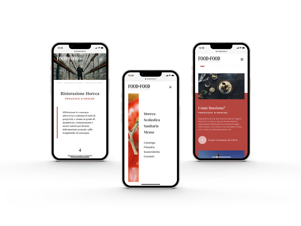
On a phone the menu opens full screen. The audiences large, the rest below, smaller. The hierarchy stays the same.
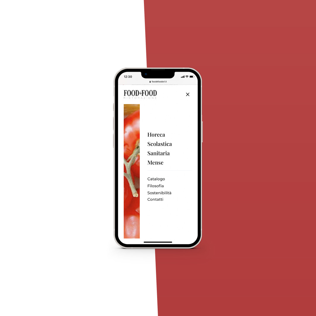
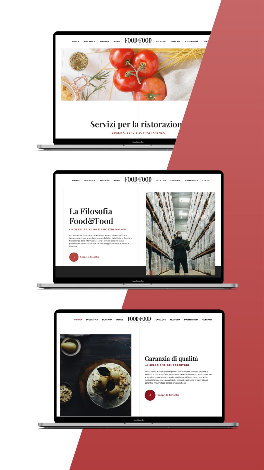
First who you are, then what you are looking for.
What does a buyer want to know, even before the products?
How the goods arrive. And when.
For someone running a kitchen, delivery matters as much as the product. That is why the How it works? section sits on the home page, on the brand’s brick red, and leads to a full page on the ordering process.
There Food&Food explains how an order becomes a delivery: the link between management systems, the sales agents across the region, the company’s own trucks tracked on the road. A few sentences, one per screen.
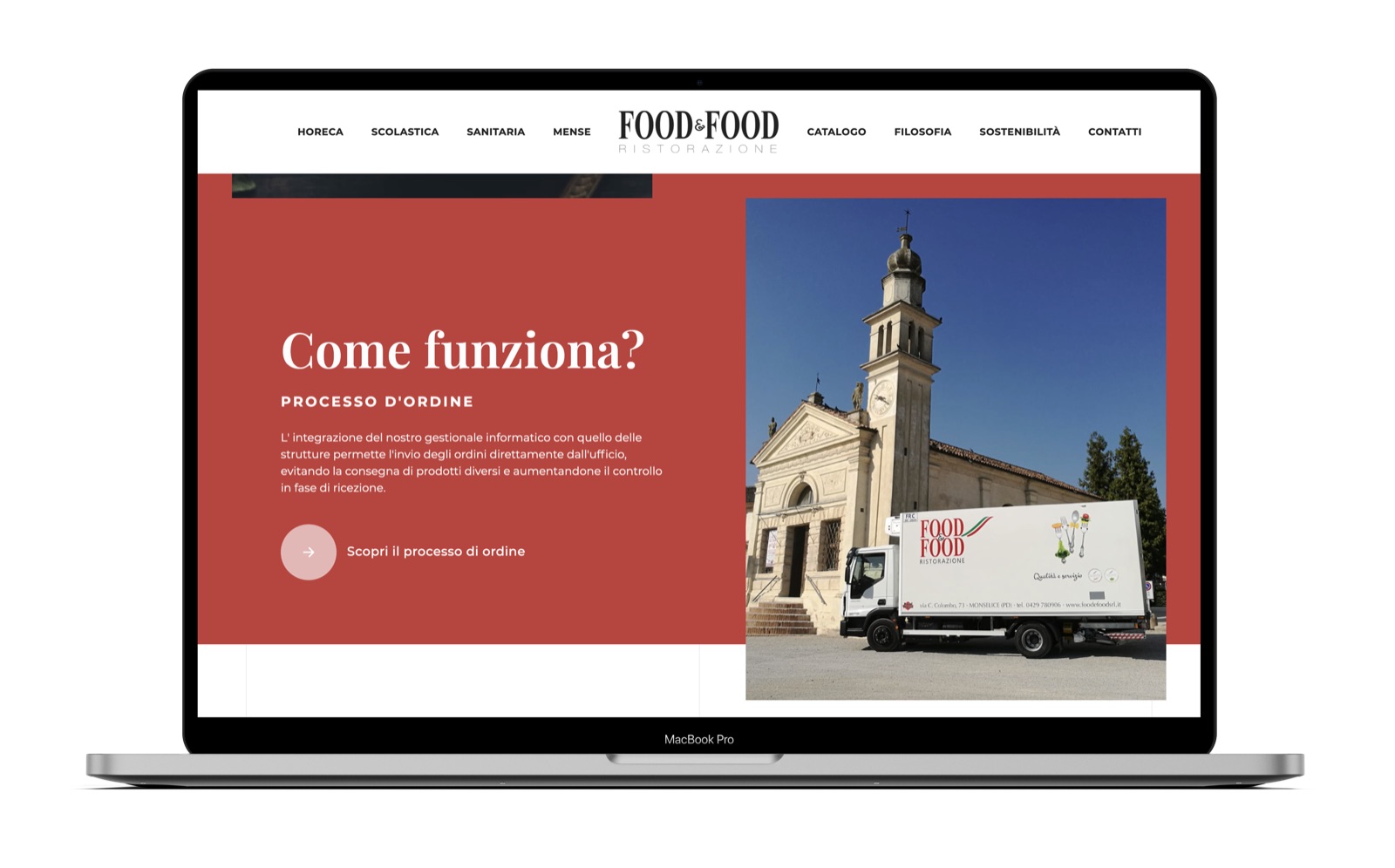
How it works, on the home page. The truck in the photo already carries the Food&Food logo.
On a phone
Ordering process and Horeca page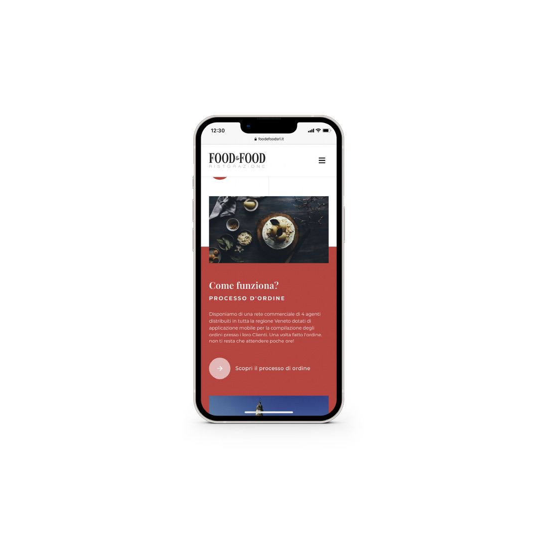
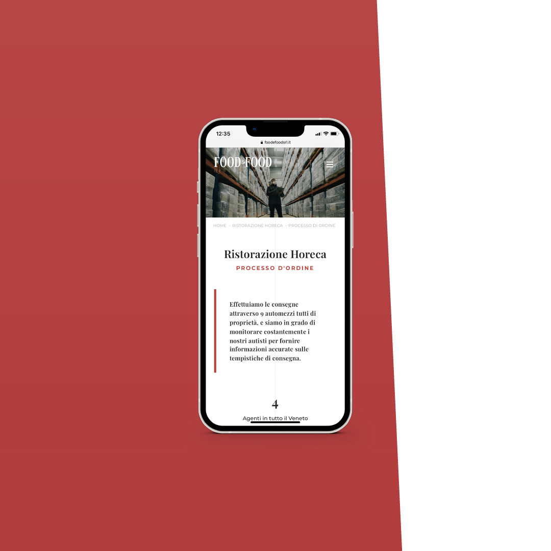
One sentence per screen, with a red rule marking the point.
How do you present a catalogue without turning it into a price list?
By product family, with the reasons for each choice alongside.
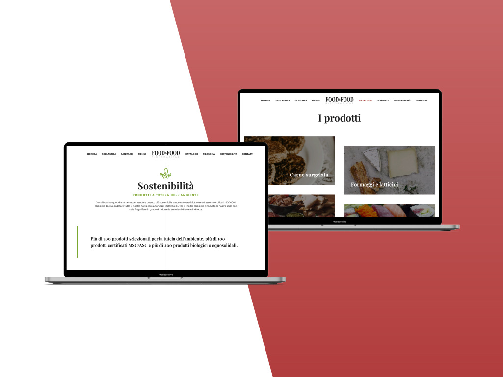
The products are browsed by family: frozen meat, cheese and dairy, and so on. A large image and a name, no product codes.
Next to the catalogue, the pages that explain why you can trust it: Quality assurance, meaning how suppliers are chosen, and The Food&Food philosophy. Then Sustainability: the only page where red gives way to green, so the products chosen with the environment in mind stand out at a glance.
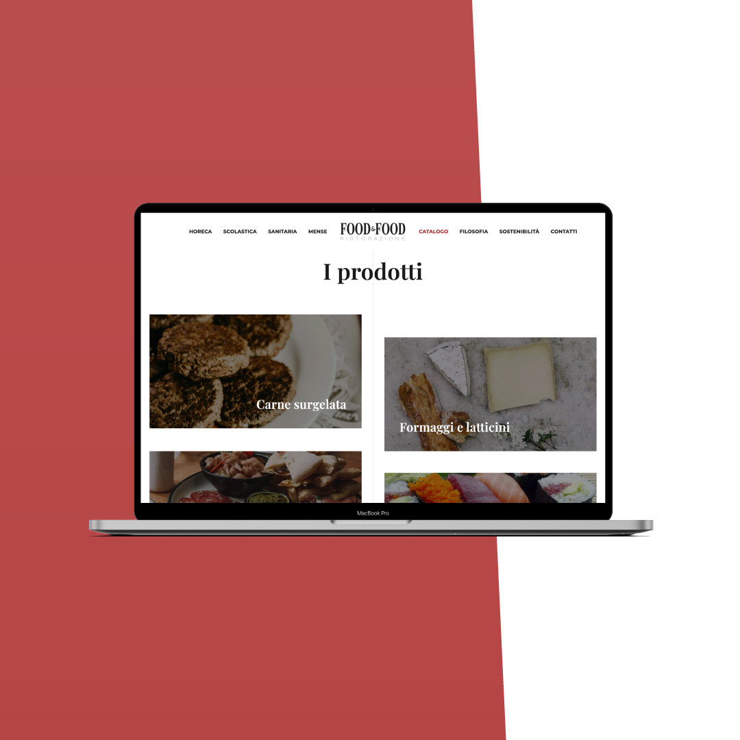
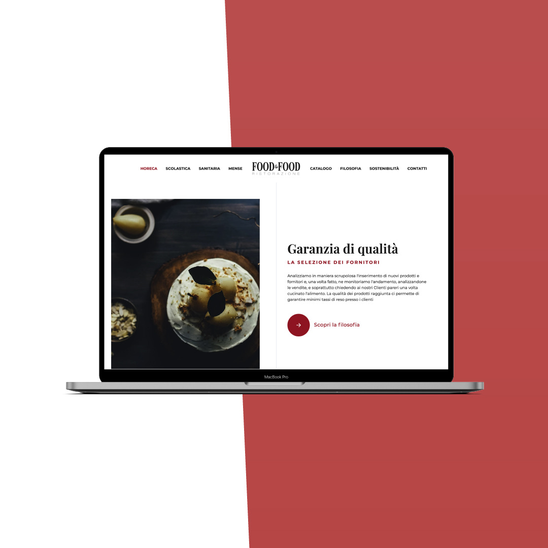
The catalogue and the reasons behind it.
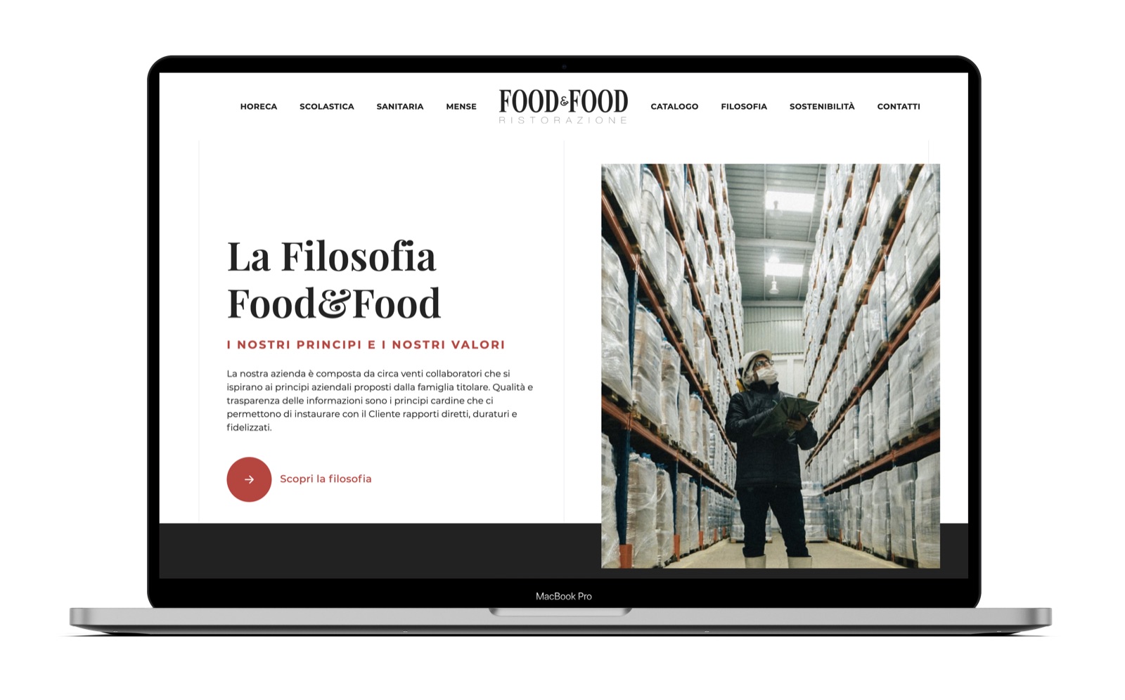
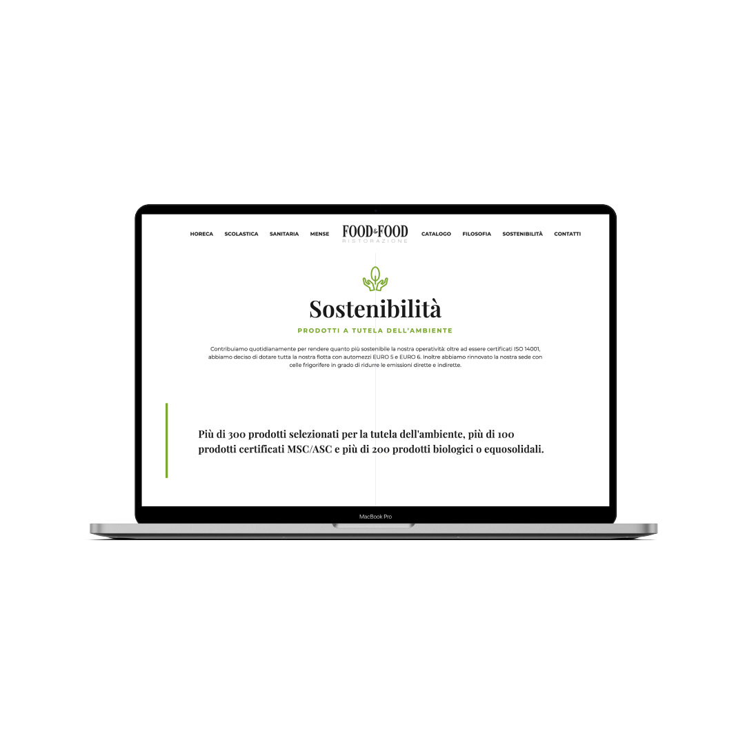
Philosophy and sustainability: same layout, a different colour.
Frequently asked questions
Food&Food and Opificio, in short.
What did Opificio Lamantini Anonimi do for Food&Food?
It designed and built the Food&Food website, organised by type of customer (hotels and restaurants, schools, healthcare, canteens), with pages on the ordering process, the products, quality assurance and sustainability, for desktop and mobile.
What kind of company is Food&Food?
Food&Food is a company in the Veneto region of Italy that supplies food to the catering trade: restaurants and hotels, school and healthcare catering, canteens.
Did Opificio Lamantini Anonimi design the Food&Food logo?
This case covers the website. The Food&Food logo was already in use: it appears on the delivery trucks photographed for the site.