

Contraqua: a brand born from the mountains
A spa, a scattered hotel, a restaurant, in the heart of the Valle Vertova. An identity found with the founder, on foot.
In short
Contraqua is a hospitality project in the Valle Vertova, in northern Italy, that brings together a spa, a scattered hotel and a restaurant. Opificio Lamantini Anonimi worked with the founder, a mountaineer, on the brand identity and its applications: the logo and its variants, the stationery, the key cards and room door hangers, a set of icons.
Project facts
- Project
- Contraqua: spa, scattered hotel, restaurant
- Location
- Valle Vertova (Bergamo), Lombardy, Italy
- Client
- The founder, a mountaineer
- Sector
- Mountain hospitality and wellbeing
- Services
- Brand identity, logo variants, stationery, in-room materials, iconography
Before drawing anything, we walked the trails of the Valle Vertova with the founder. Silence, water, wind. That’s where the brand surfaced.
The starting point
What is missing from a project that is already fully planned?
A plot of land, an idea, a precise plan. And a mountaineer founder with a clear vision: experiencing the mountains in an authentic, slow, restorative way. Silence, water, wind. Deep wellbeing, not surface luxury.
What was missing was the language to tell it.
How do you understand what a place really is?
By walking it. The best ideas came on the way uphill.
We listened to the founder and his mountaineering spirit, and we walked the valley’s trails with him. One question guided us through the whole project: what is this place, really?
The answer was not a logo. It was a way of being in the mountains.
What shape does a brand that smells of the woods take?
Wood, stone, concrete left raw. And water, which gives everything its name.
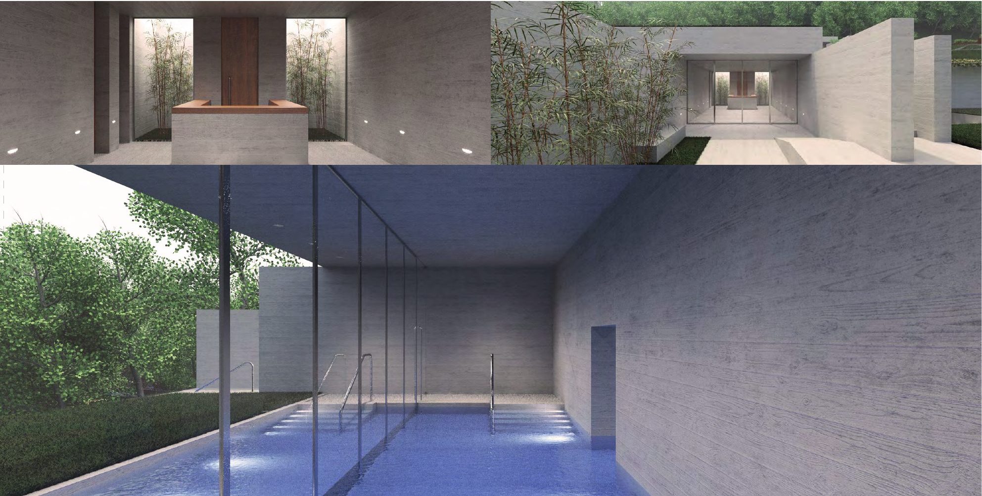
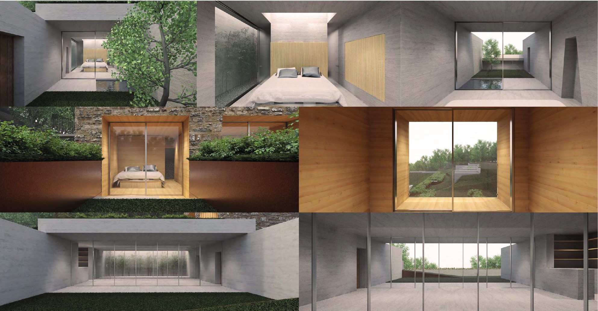
The materials became the language of the brand. Local wood, natural stone, raw concrete. Light as a raw material. Water as a symbol of renewal.
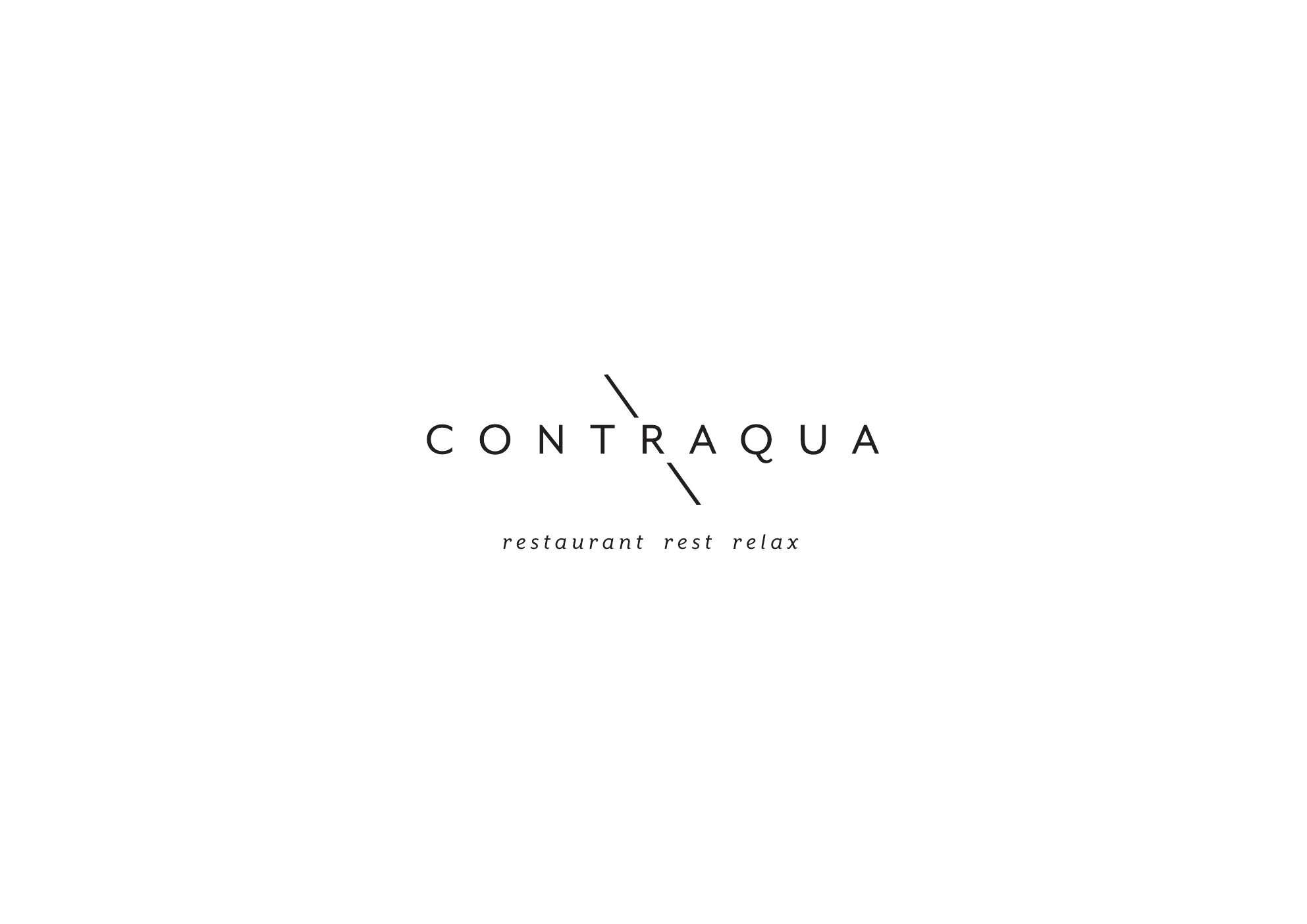
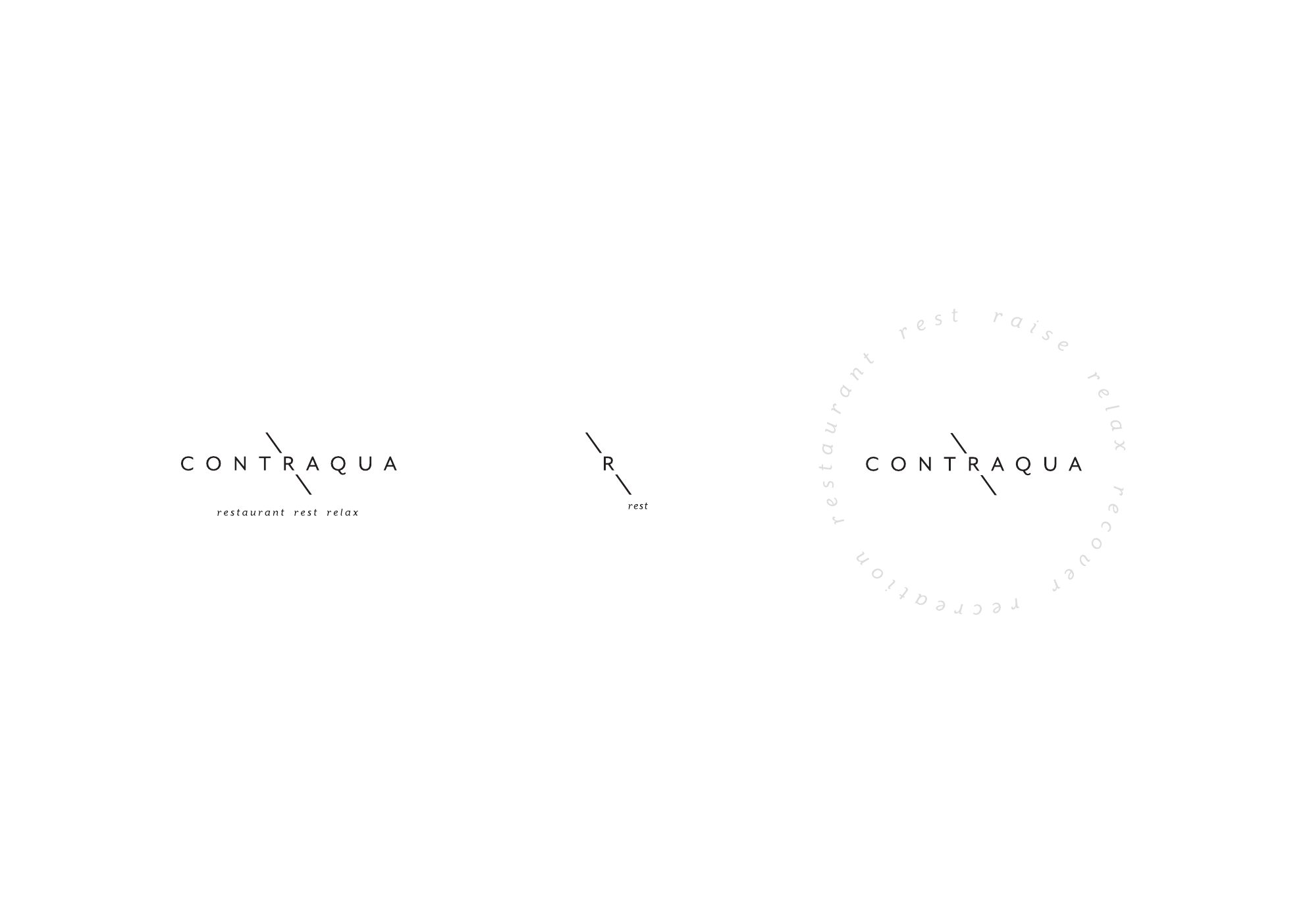
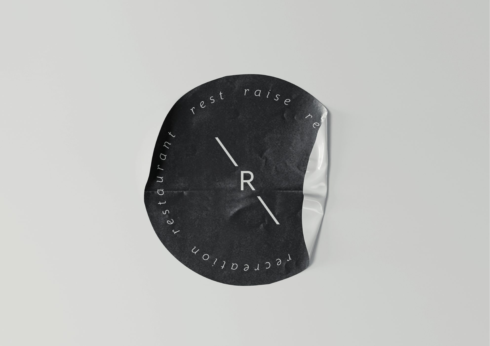
The logo is a widely spaced logotype, crossed by a thin line, with three words beneath it: restaurant, rest, relax. Alongside it, a monogram and a circular version for small formats.
- 01Local wood
- 02Natural stone
- 03Raw concrete
- 04Light
- 05Water
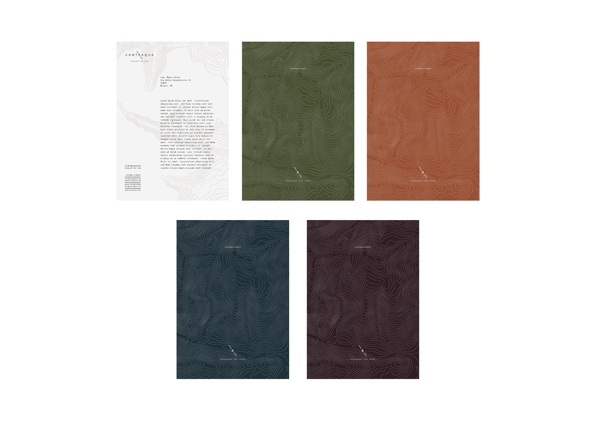
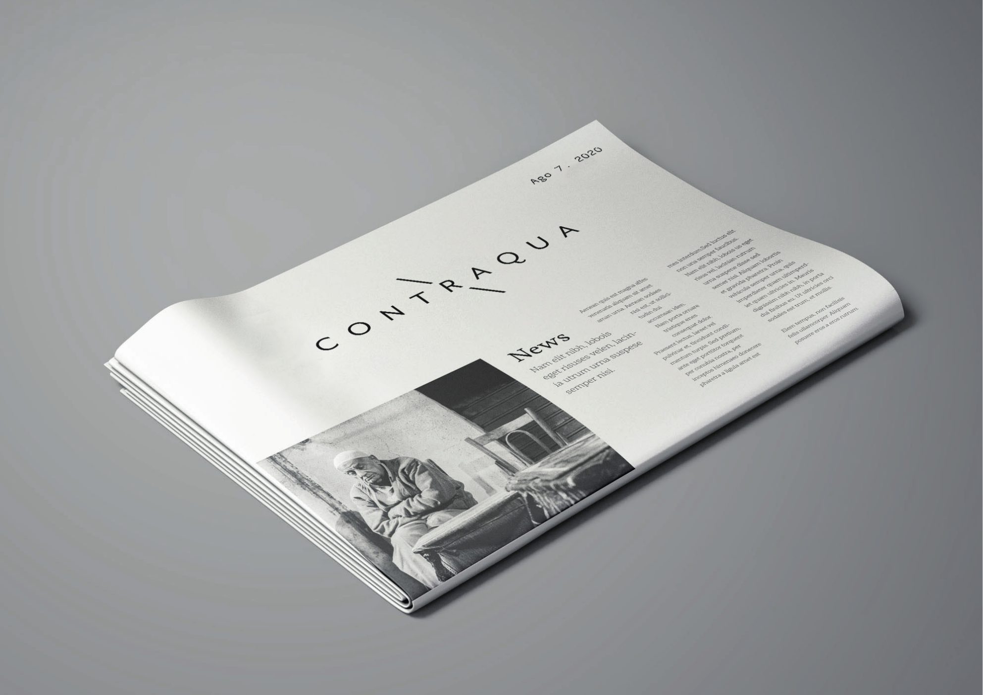
The texture on the paper recalls the contour lines of the land.
How do you bring a brand into the rooms?
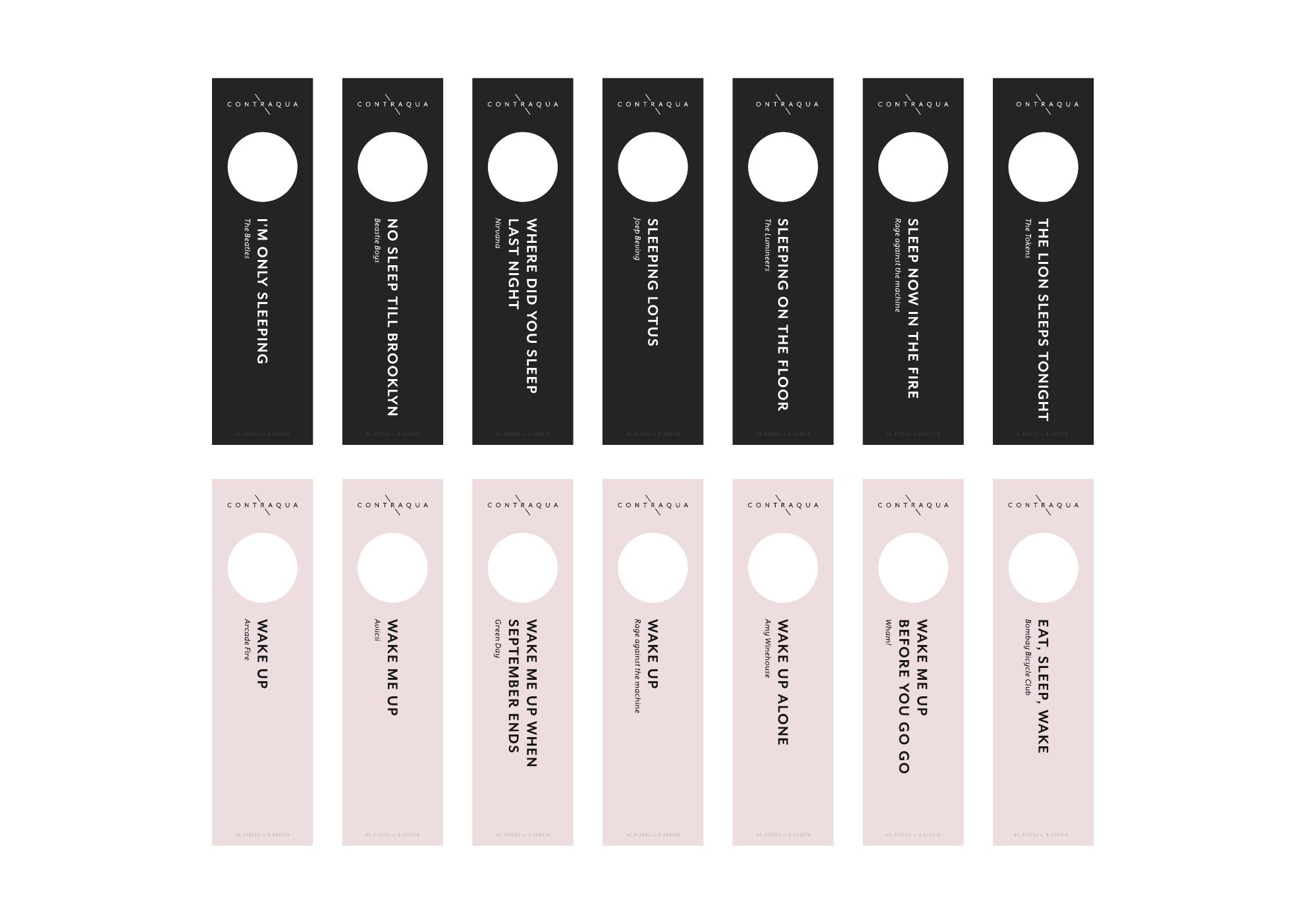
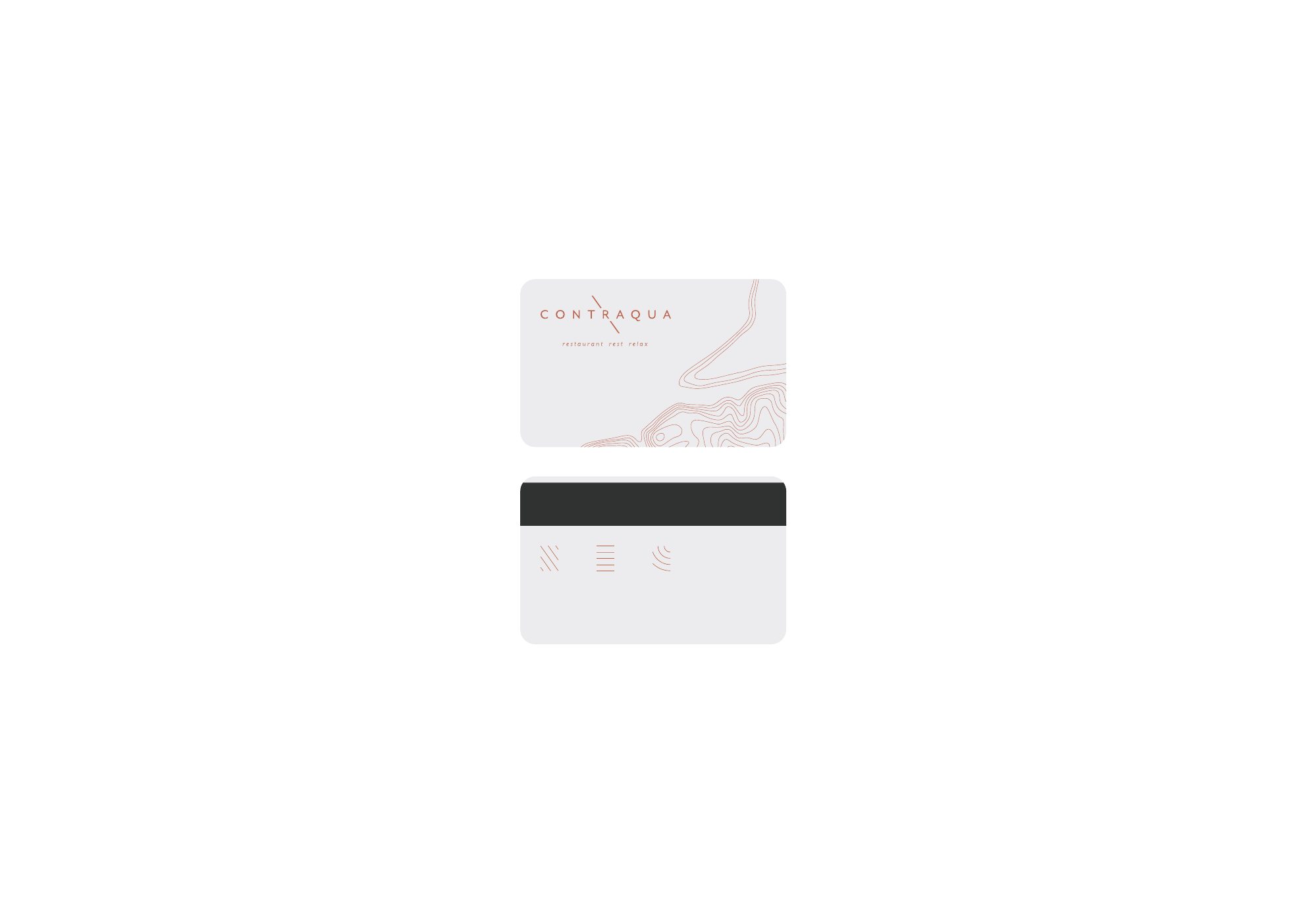
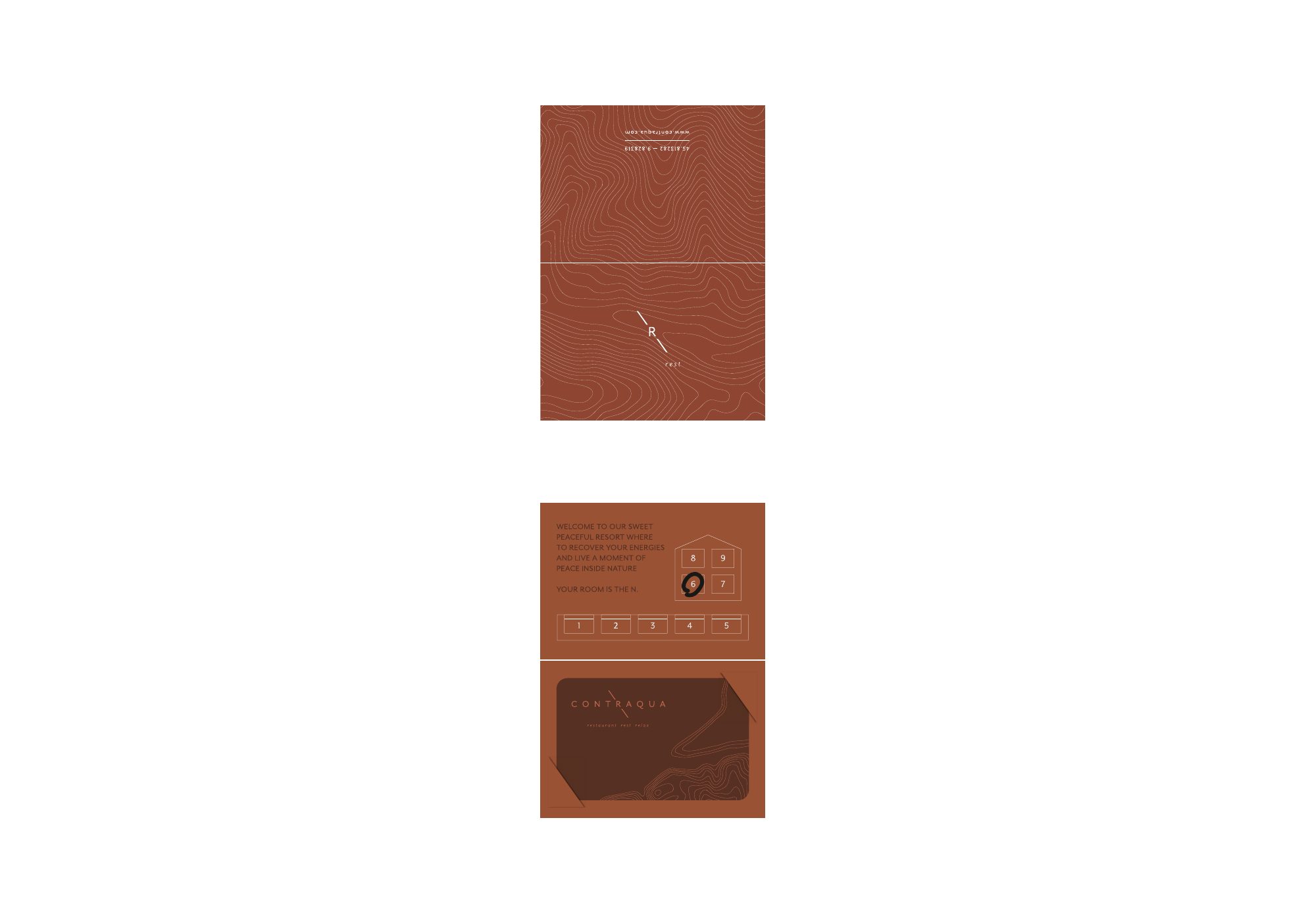
Through the objects you touch. You feel a brand before you even see it.
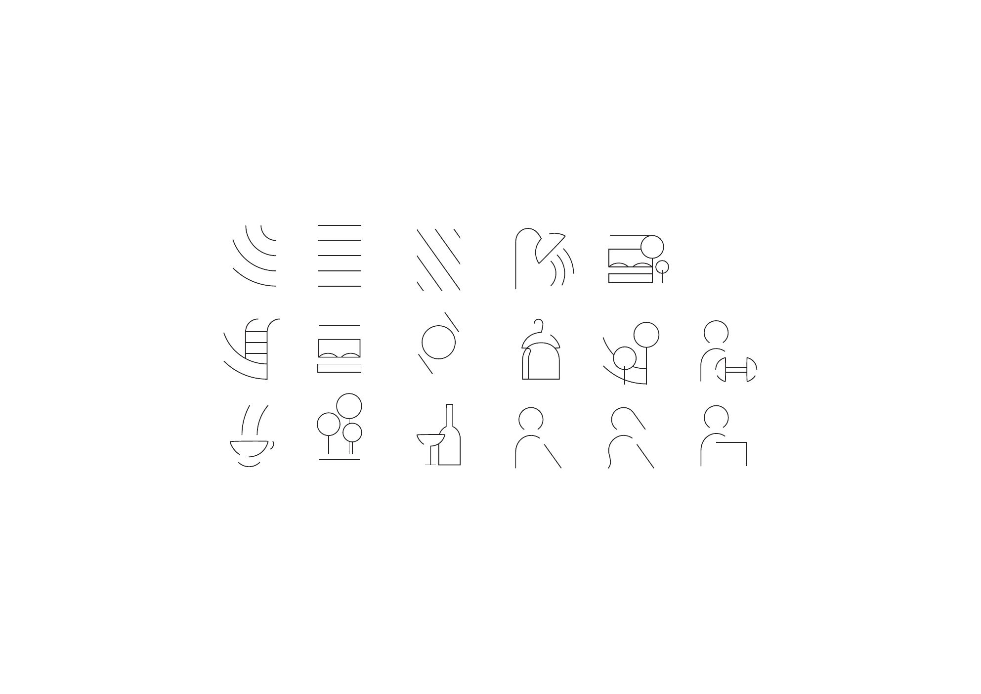
The key card and its holder. The room door hangers, in seven versions. Seventeen icons. Small things that guests hold in their hands.
What place does the Contraqua brand describe?
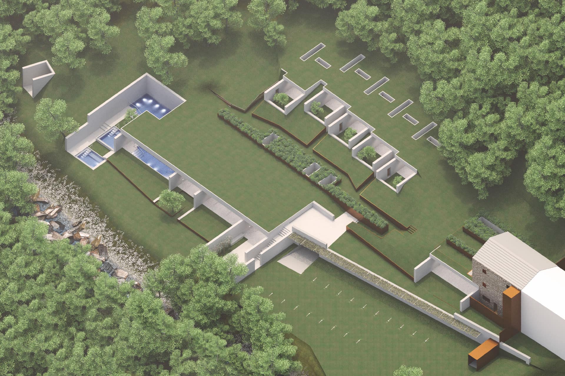
A spa, a scattered hotel, a restaurant. Between the stream and the woods.
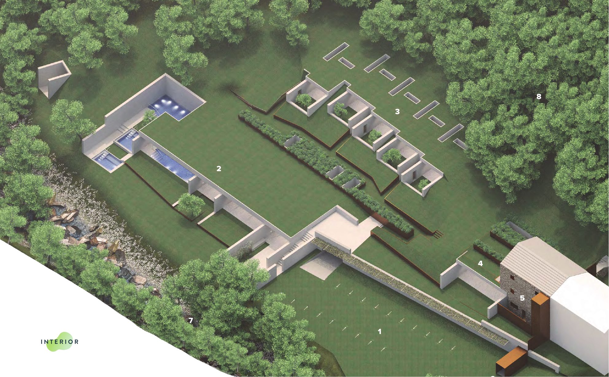
The complex stretches along the slope: the spa with its pools, the rooms at the edge of the woods, the restaurant and the bed & breakfast in the stone building.
The key
From the aerial view of the complex- 01Car park
- 02Spa
- 03Rooms at the edge of the woods
- 04Restaurant
- 05Bed & Breakfast
- 06Accessible entrance
- 07Stream
- 08Woods
The project boards
Scroll →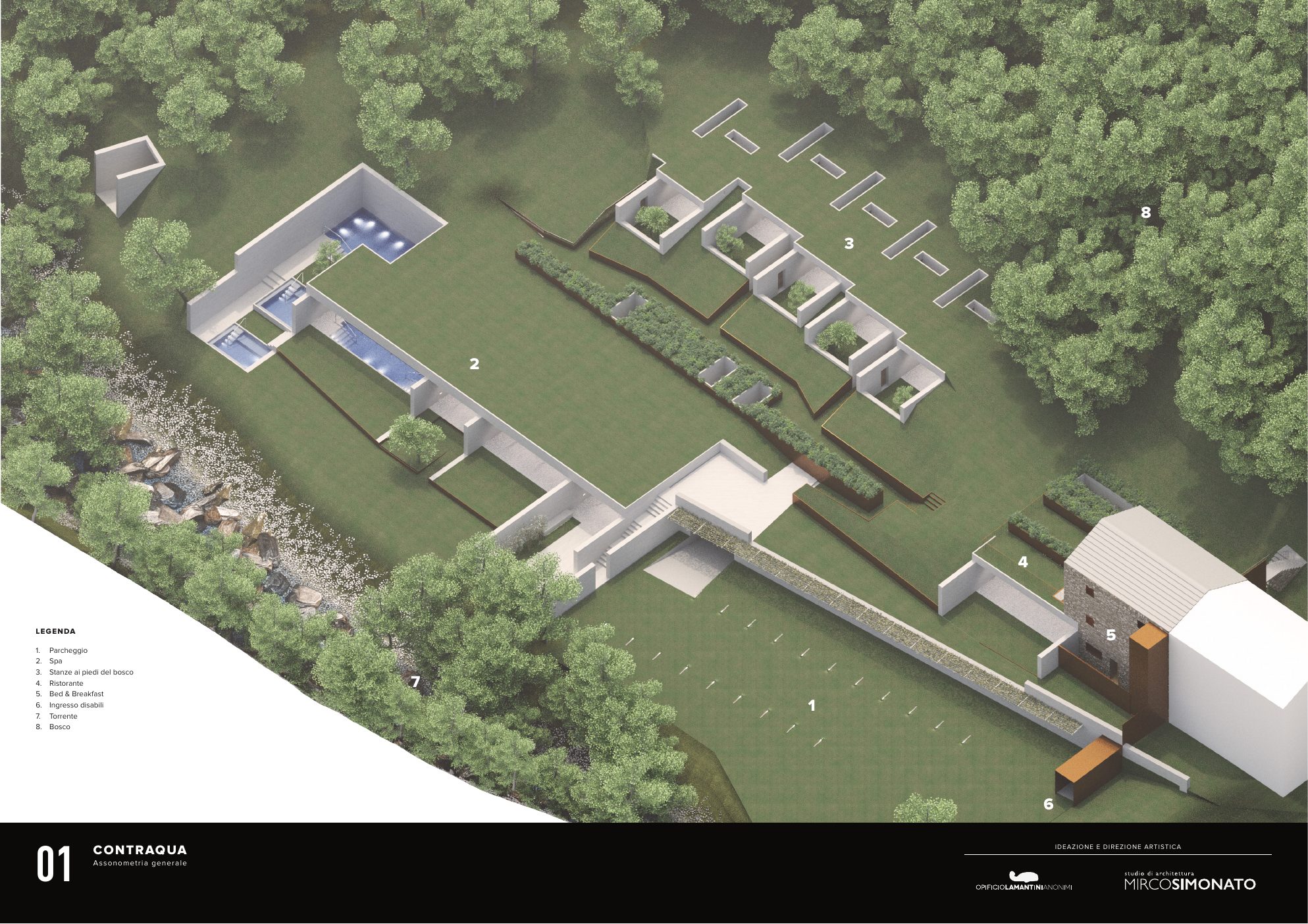
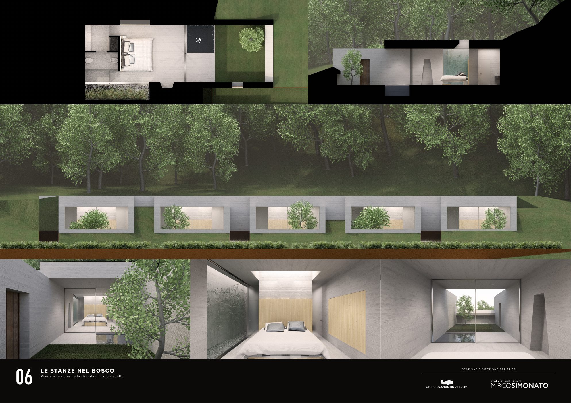
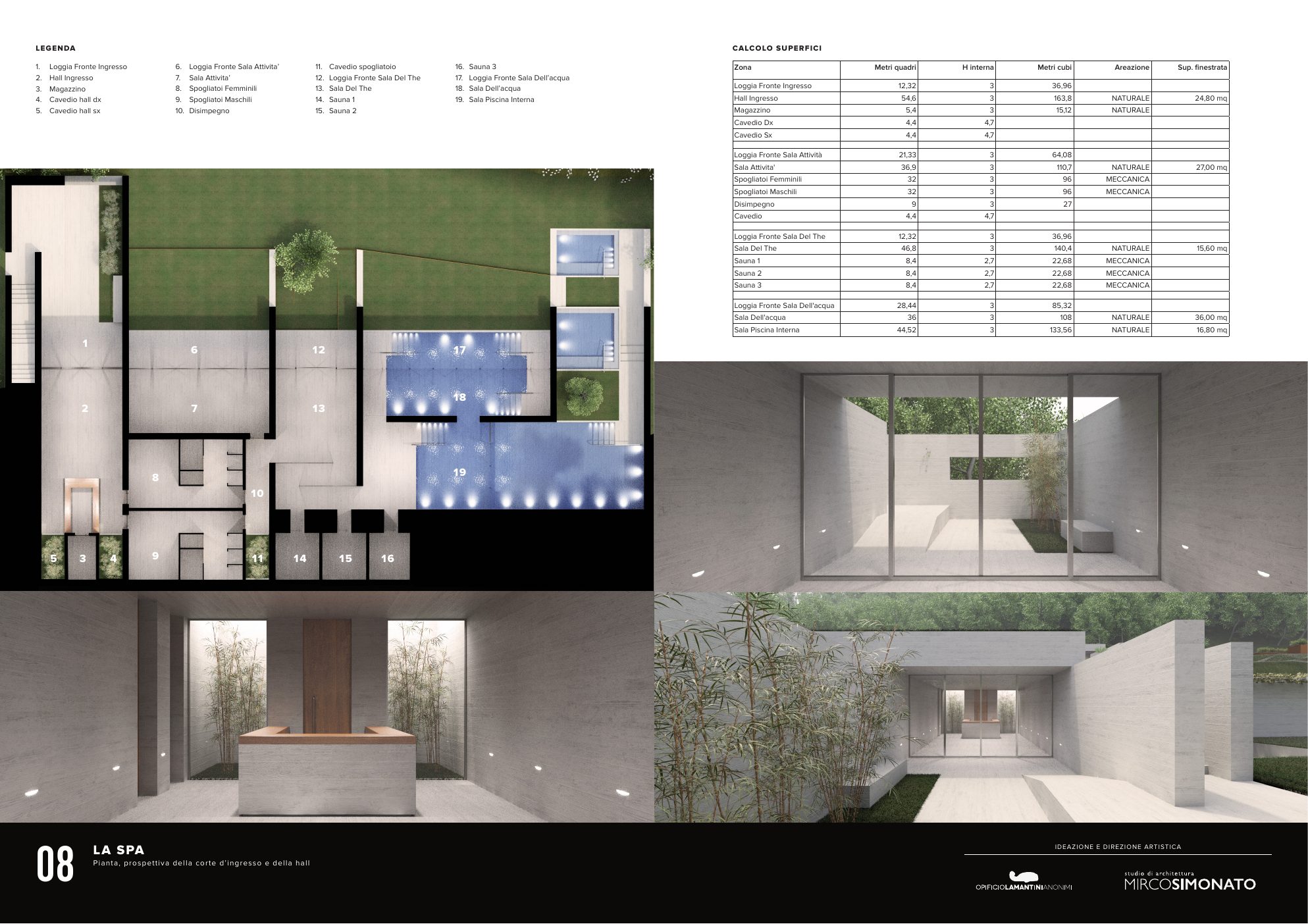
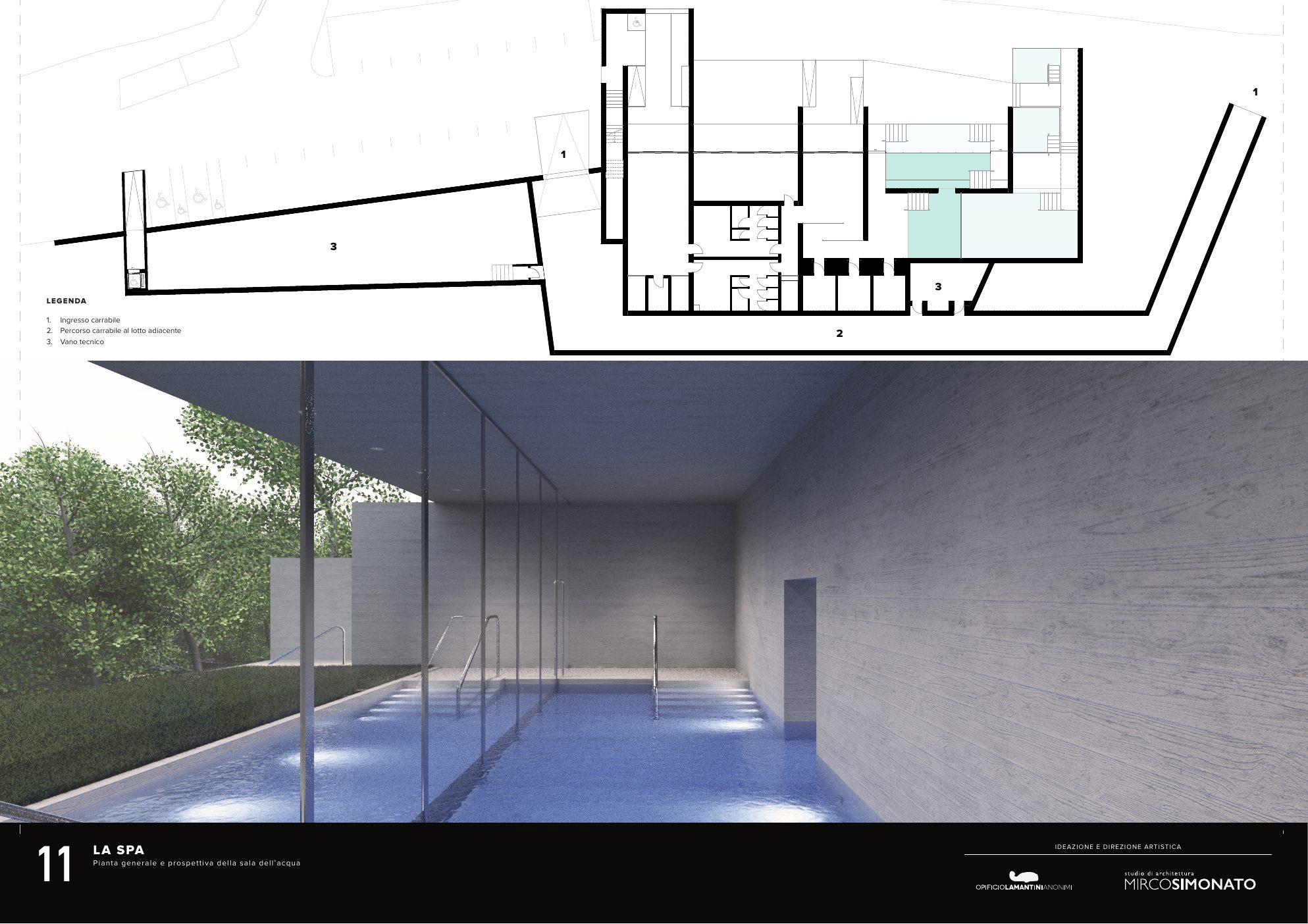
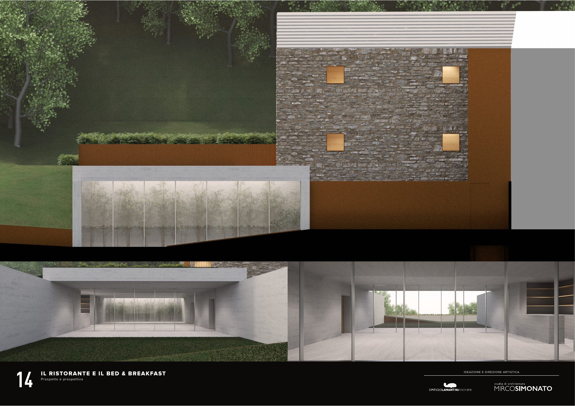
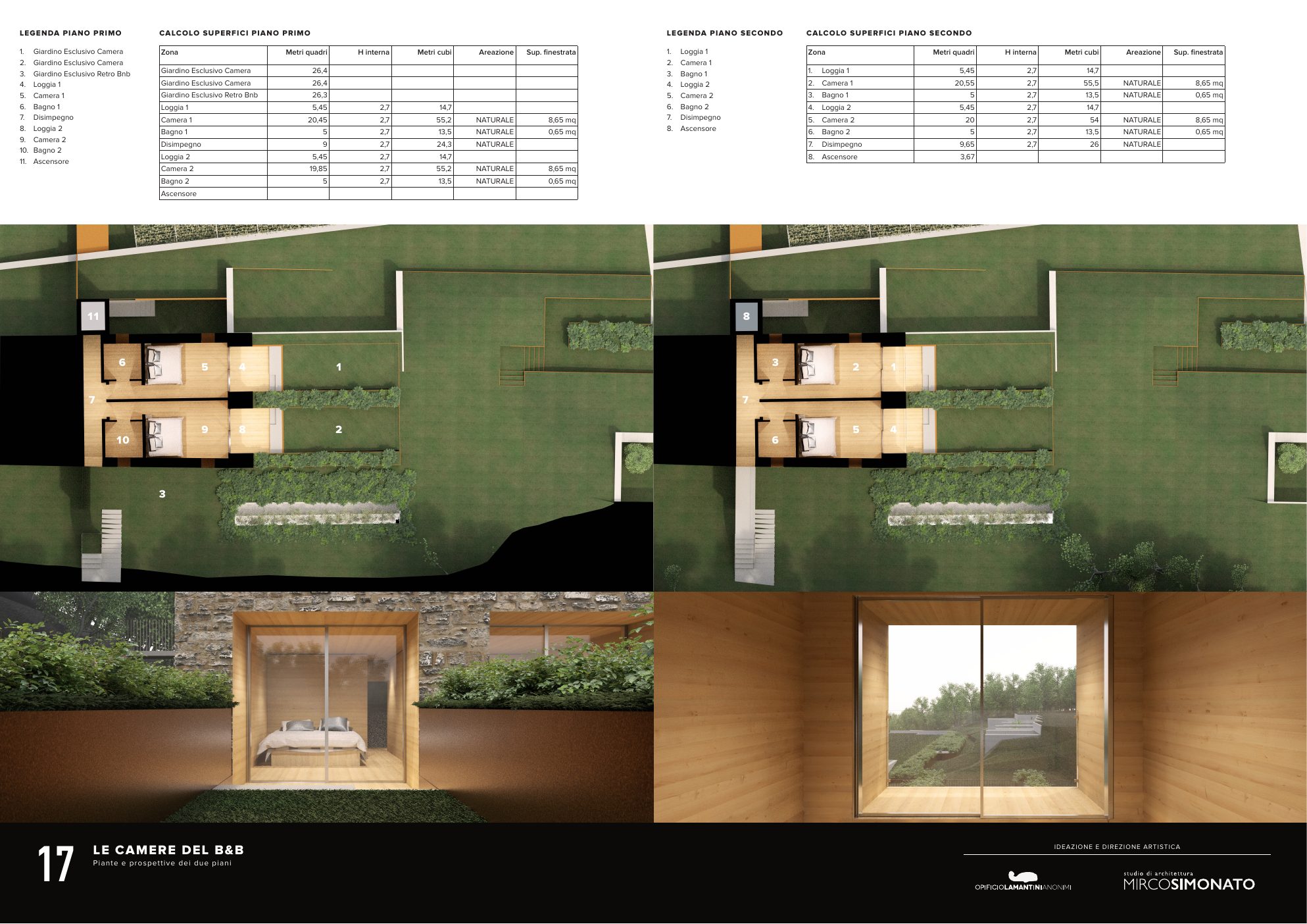
Boards produced with the architecture studio Mirco Simonato.
Frequently asked questions
Contraqua and Opificio, in short.
What is Contraqua?
Contraqua is a hospitality project in the Valle Vertova that brings together a spa, a scattered hotel and a restaurant, designed for experiencing the mountains in a slow, restorative way.
What did Opificio Lamantini Anonimi do for Contraqua?
Opificio Lamantini Anonimi created the Contraqua brand identity and its applications: the logo with its variants, the letterhead, the key cards with their holders, the room door hangers and a set of icons.
Where did the work on the Contraqua brand start?
From listening to the founder, a mountaineer, and from walking the trails of the Valle Vertova with him. The guiding question was: what is this place, really?
How do you turn a mountain place into a brand?
For Contraqua, Opificio Lamantini Anonimi used the materials of the place as its language: wood, stone, raw concrete, light as a raw material and water as a symbol of renewal.