

Brisighello: the logo was already in the archive
Rebranding, identity system, website and printed material for a medicinal herb company in Solesino, Italy, trading since 1866. We started from its own papers.
In short
Pietro Brisighello S.r.l. is a company in Solesino (Padua, Italy) that has imported and processed medicinal plants since 1866, for the herbal, extraction, food and pharmaceutical industries. Opificio Lamantini Anonimi handled its rebranding, brand book, illustration direction, the brisighello.it website and its printed material.
Project facts
- Client
- Pietro Brisighello S.r.l.
- Sector
- Wholesale herbalism, medicinal plants
- Location
- Solesino (Padua, Italy)
- Trading since
- 1866
- Period
- 2023 – 2025
- Services
- Brand analysis, rebranding, brand book, icon design, illustration direction, website, corporate identity, catalogues and print
- Website
- brisighello.it
The logo in use was a tracing of a tracing: irregular curves, no grid, a pictogram with no rule behind it. In the company’s own archive, though, were an engraving, a monogram and an oval crest drawn well over a century ago. That is where we started.
The starting point
Where was Brisighello starting from?
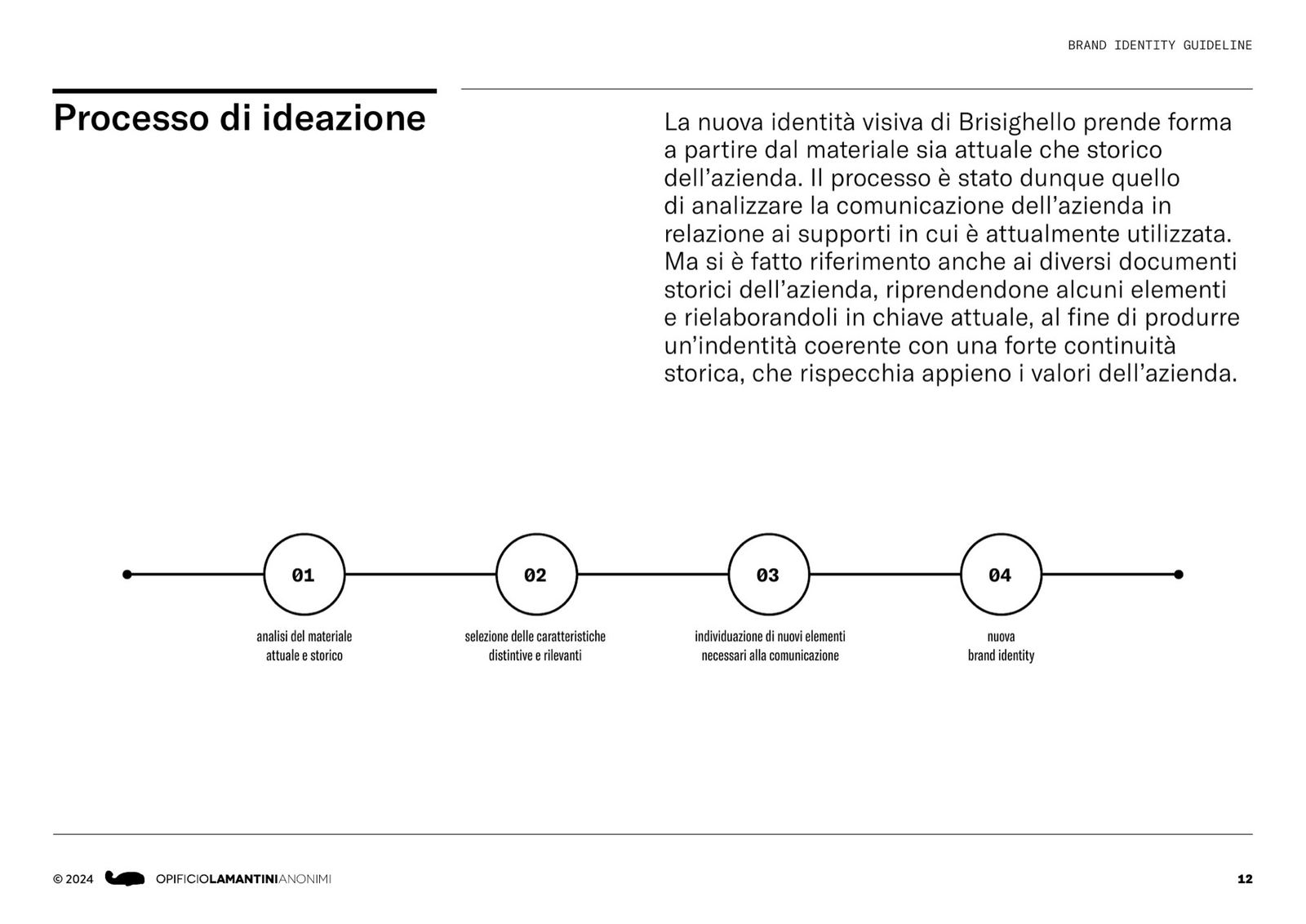
More than 150 years in wholesale herbalism, one of the few Italian companies that imports and processes herbs directly. Four markets: herbal, extraction, food and pharmaceutical. And a logo that could not stand up to the archive it came from.
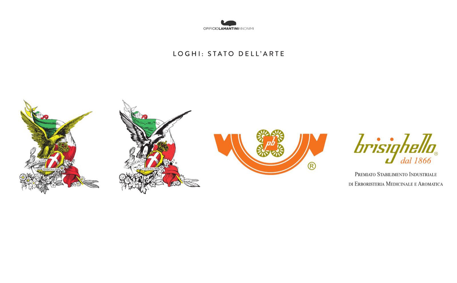
As it stands, the logo comes from a poor-quality tracing: the shapes are irregular and follow no precise geometry.From our presentation to Brisighello, 7 July 2023
What do you look at before touching a 150-year-old logo?
First the company, then the market, then the archive. The logo comes last.
A qualitative questionnaire across eight areas, a map of the Italian wholesale herb competitors and a set of case histories: how other long-standing Italian brands, from food to culture, had renewed themselves.
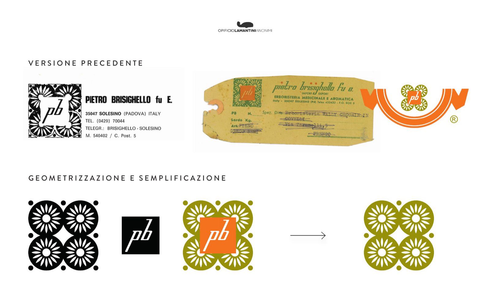
Then the archive: nineteenth-century illustrations, a 1980s logo, a ribbon pictogram, a 1937 purchase ledger, letterheads, cartouches, advertising inserts. All of it material the company already had.
- 01Naming and analysis of the existing logo
- 02Tone of voice
- 03Values
- 04Competitors
- 05Management and workflow
- 06Stakeholders
- 07Audience
- 08Communication tools
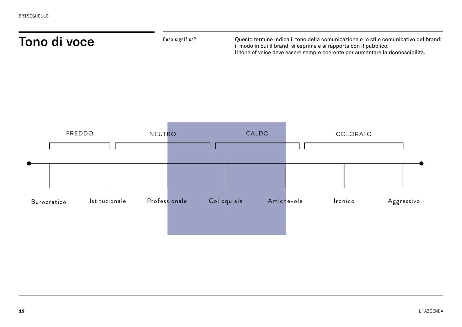
The tone of voice
Where Brisighello sits, between cold and colourfulprofessional, confident, decisive, forward-looking, expert but warm.
The values
From the presentation of 14 June 2023- 01History
- 02Tradition
- 03Passion
- 04Innovation
- 05Competence
- 06Experience
- 07A focus on quality
The archive
What the company already had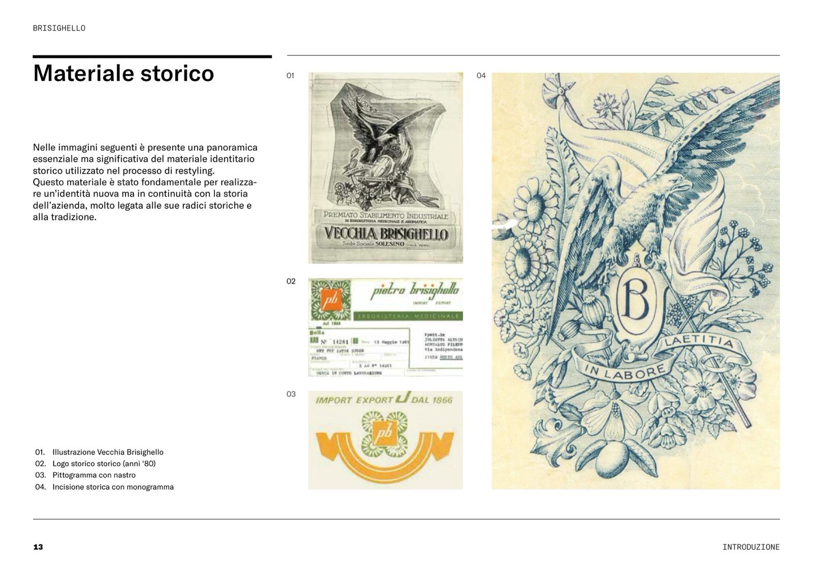
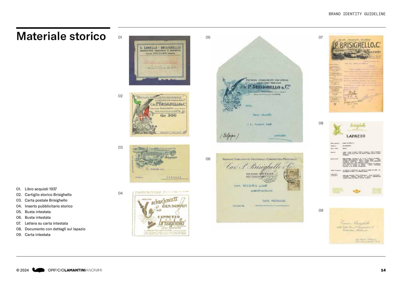
Engravings, letterheads, cartouches, a 1937 purchase ledger: the historic material used in the restyling.
How many routes does a restyling have?
Four, from the most cautious to the most decisive. We lined them up and looked at them together.
The first route was recalibration: the same logo, redrawn on a construction grid. The colour was recalibrated too, adding yellow to the earlier optical white to warm the composition up.
Then two new lettering proposals, one bolder and one more minimal, the latter in continuity with versions found in the archive material. Finally the radical restyling, with an entirely new logotype.
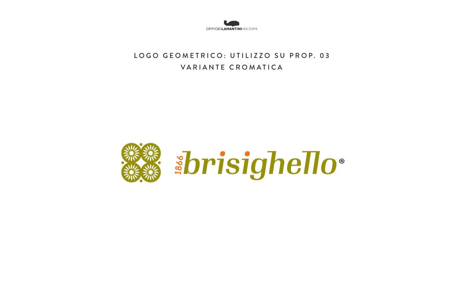
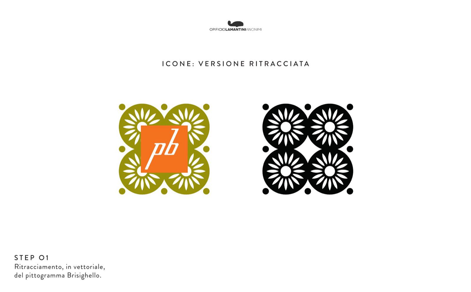
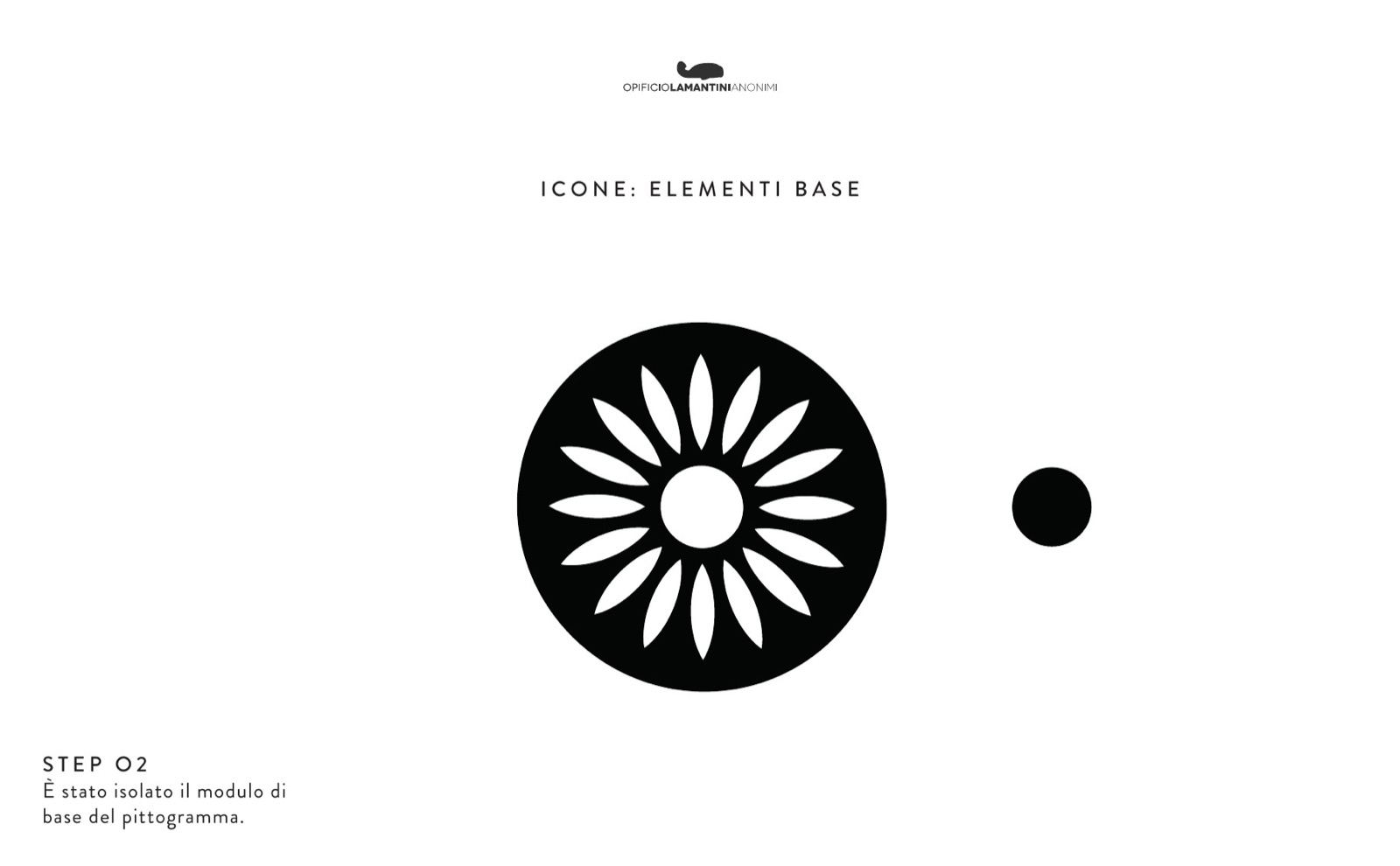
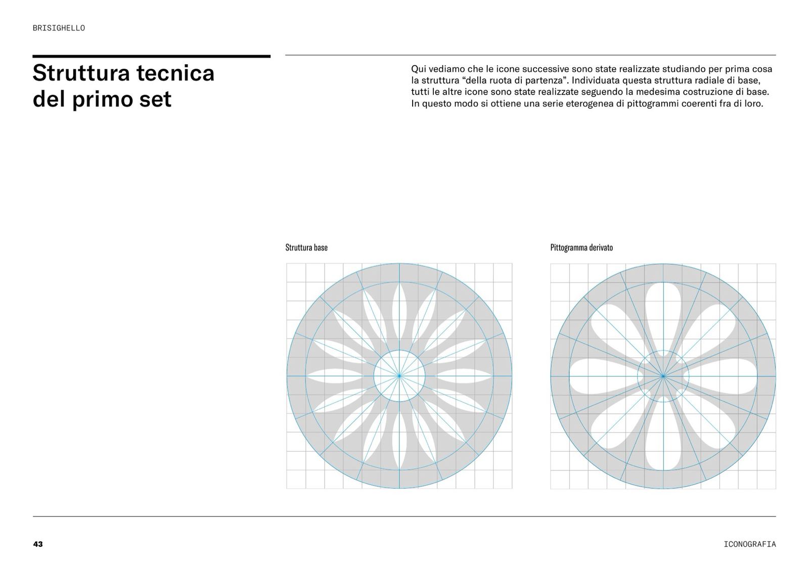
In parallel we rebuilt the old pictogram geometrically, cutting it back to its base module, and tested the first examples of the graphic language on labels and colour bands.
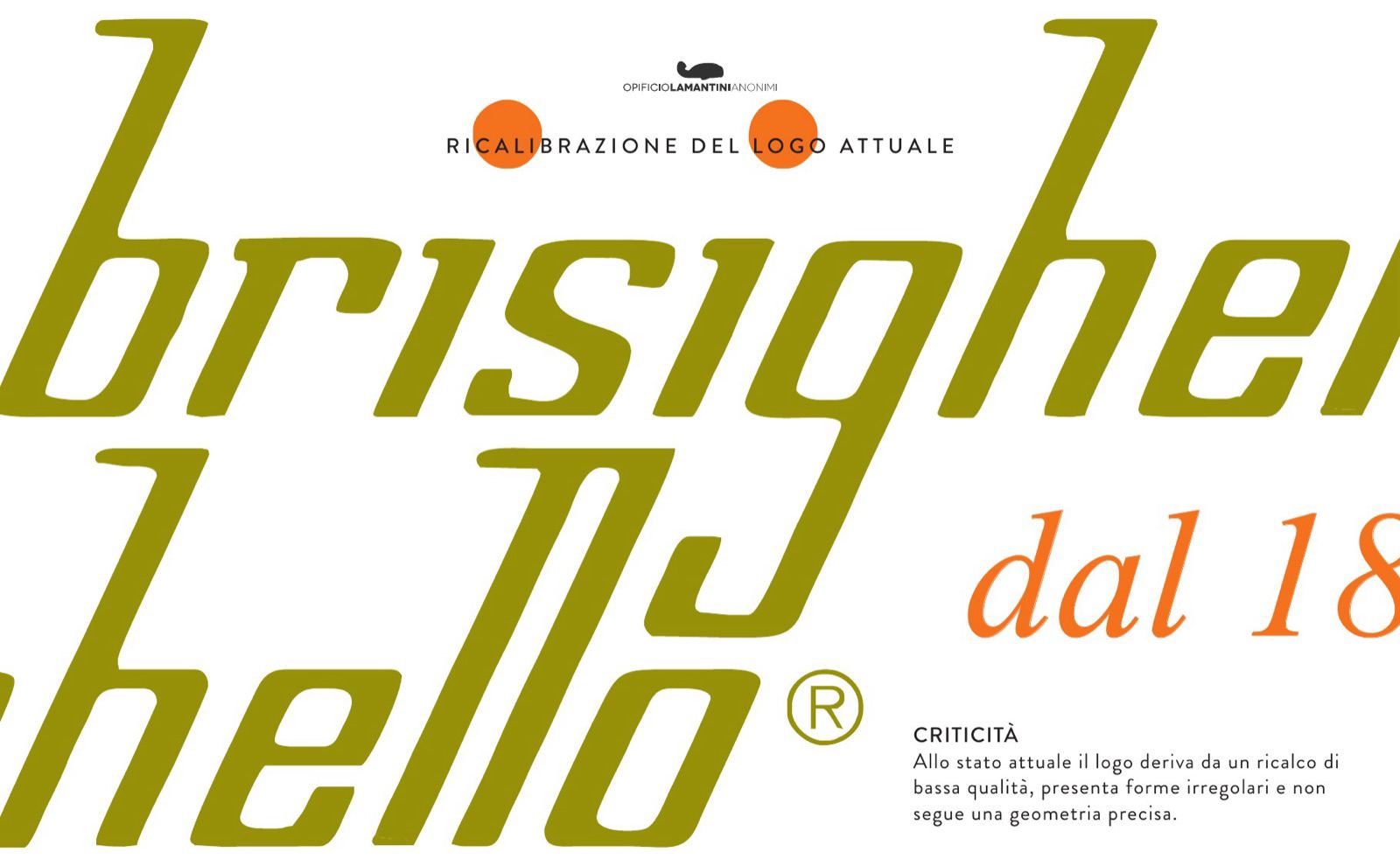
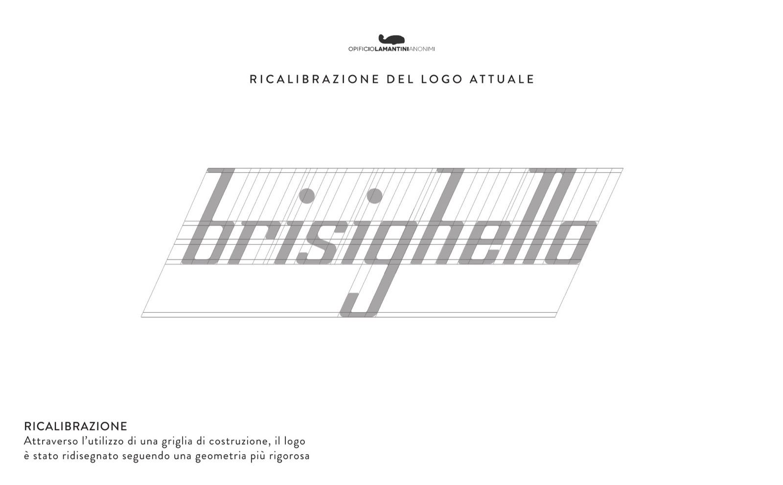
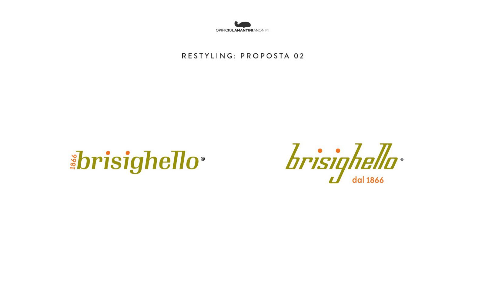
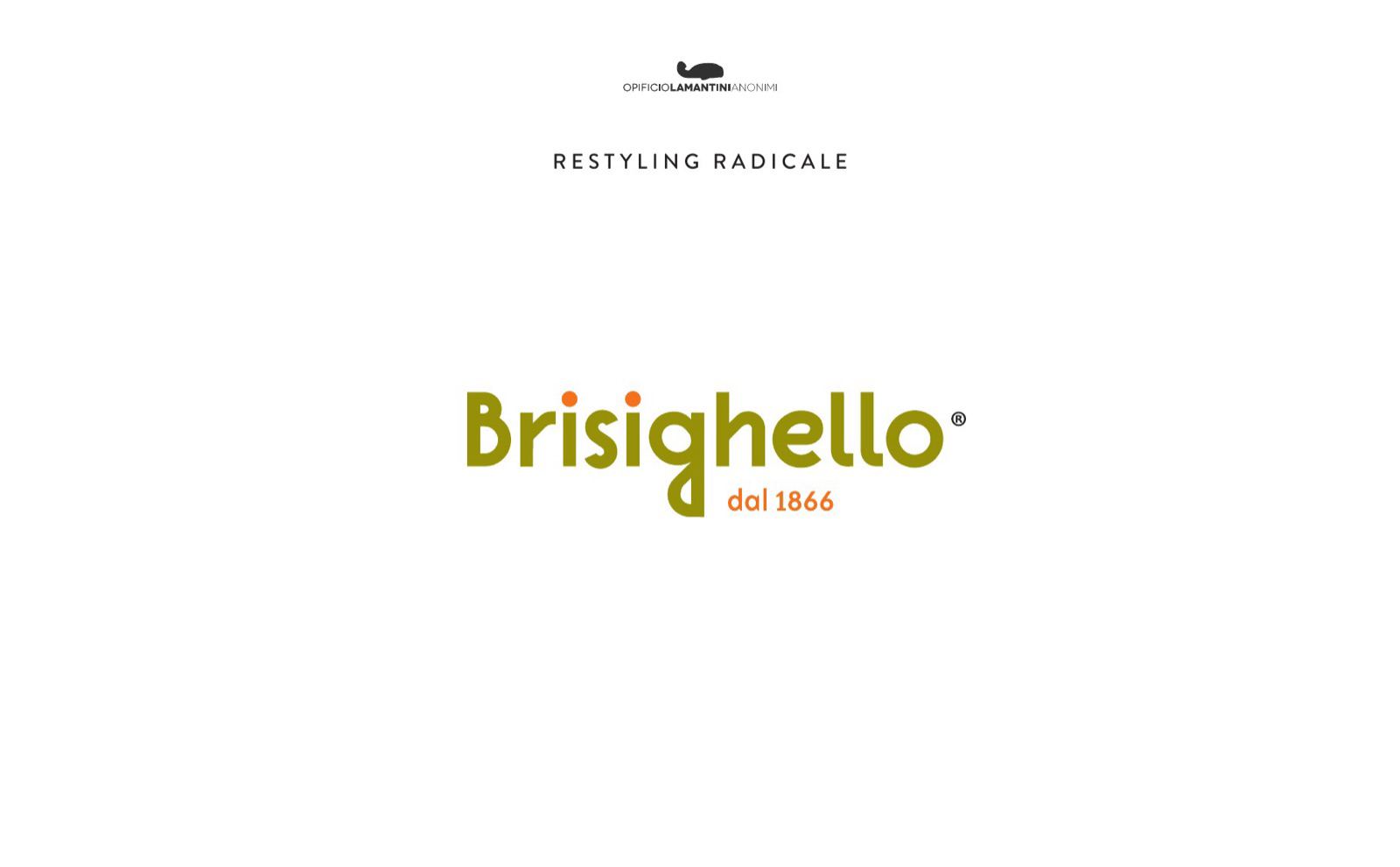
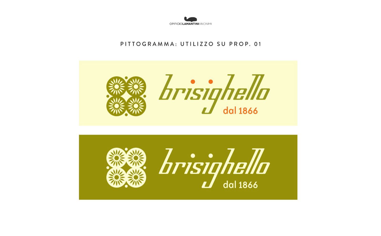
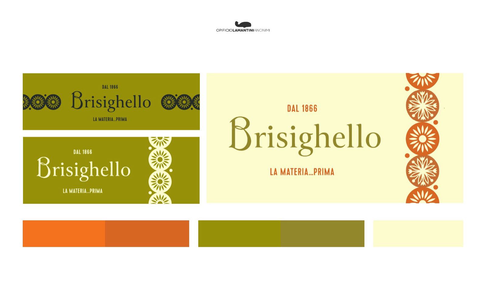
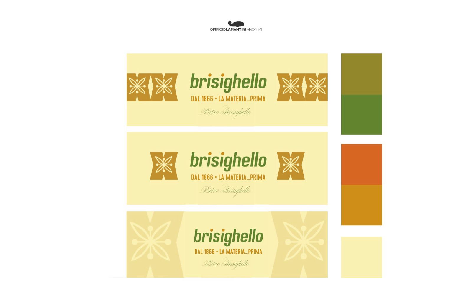
From recalibration to radical restyling, with the pictogram cut back to its module.
What do you keep from a 150-year-old brand?
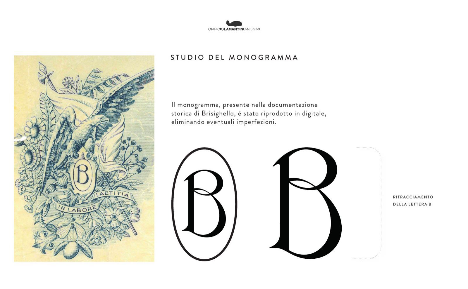
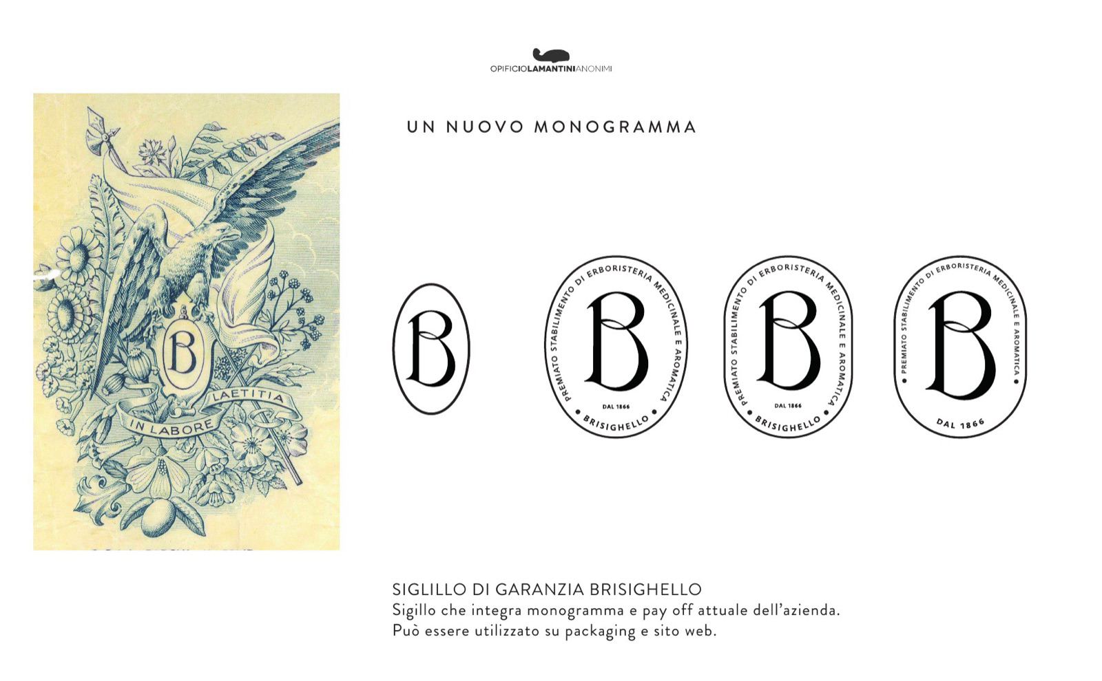
The monogram was already there, in an engraving from the archive. We redrew it, we did not reinvent it.
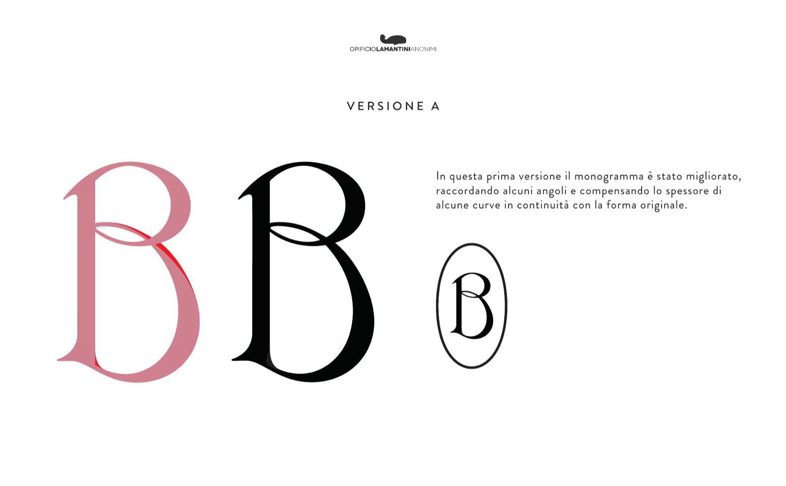
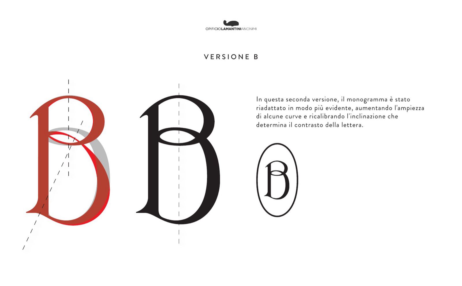
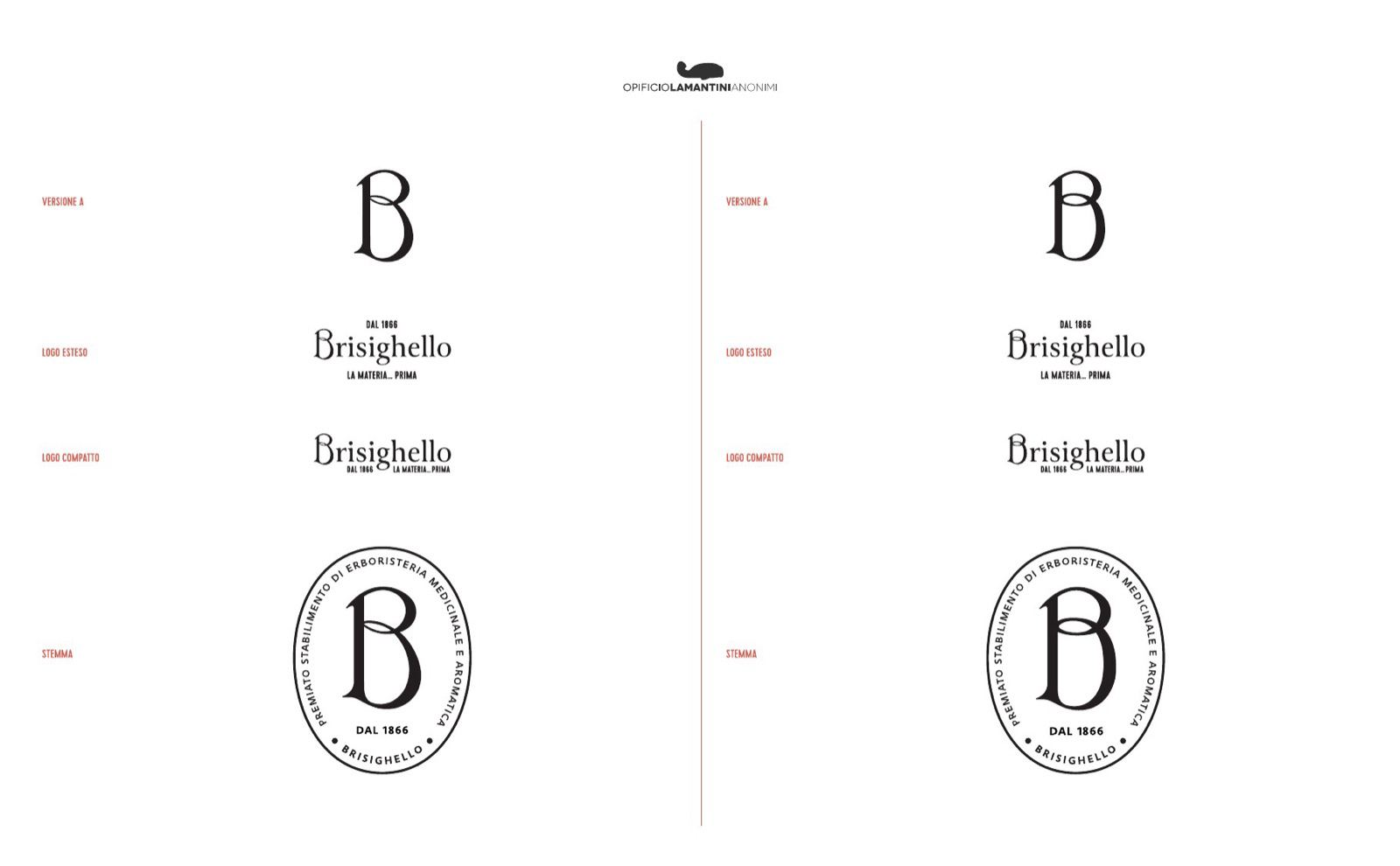
The B found in the historic documents was reproduced digitally and cleaned of its flaws. Two versions came out of it: the first rounds the joints and compensates the stroke weights while staying faithful to the original shape, the second widens the curves and recalibrates the axis that gives the letter its contrast.
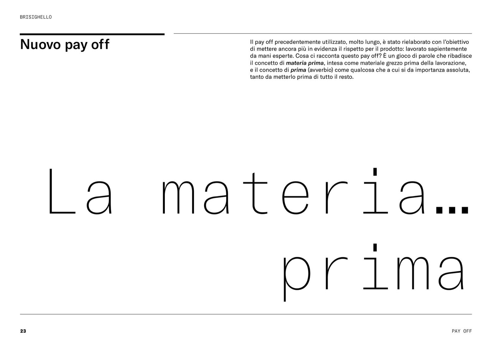
The historic tagline — Premiato stabilimento di erboristeria medicinale e aromatica, an award-winning maker of medicinal and aromatic herbs — stayed on for secondary uses. Beside it came the new one: La materia… prima, an Italian pun between the raw material to be processed and what comes before everything else.
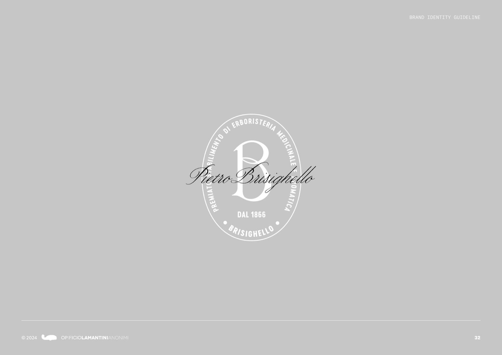
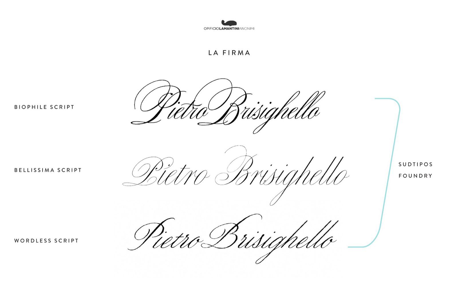
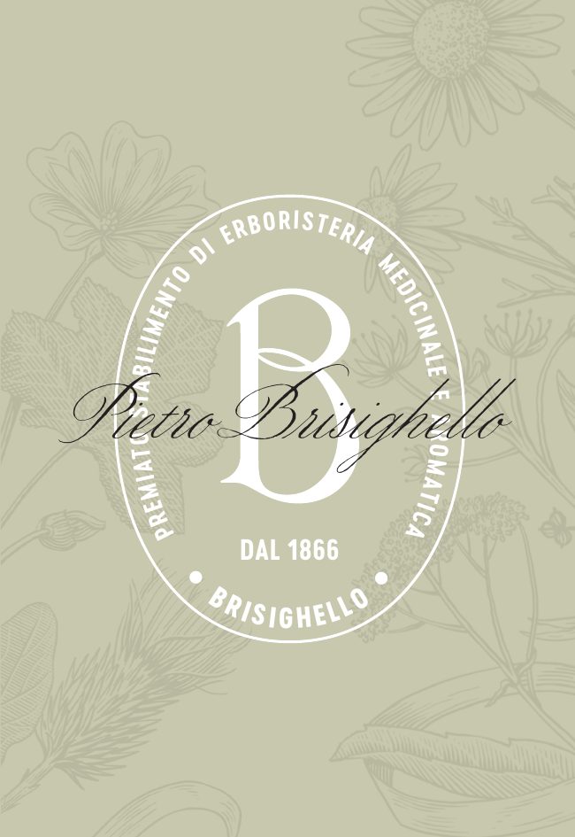
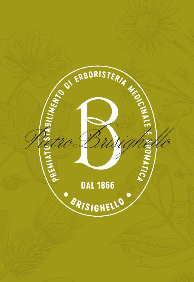
The seal takes the shape of the oval crests in the historic illustrations. The signature is Pietro Brisighello’s own. The typography — Canto for the logotype, Cervo Neue for the tagline, Wordless Script for the signature — was chosen to sit beside the B from the archive.
The monogram
From the engraving to the letter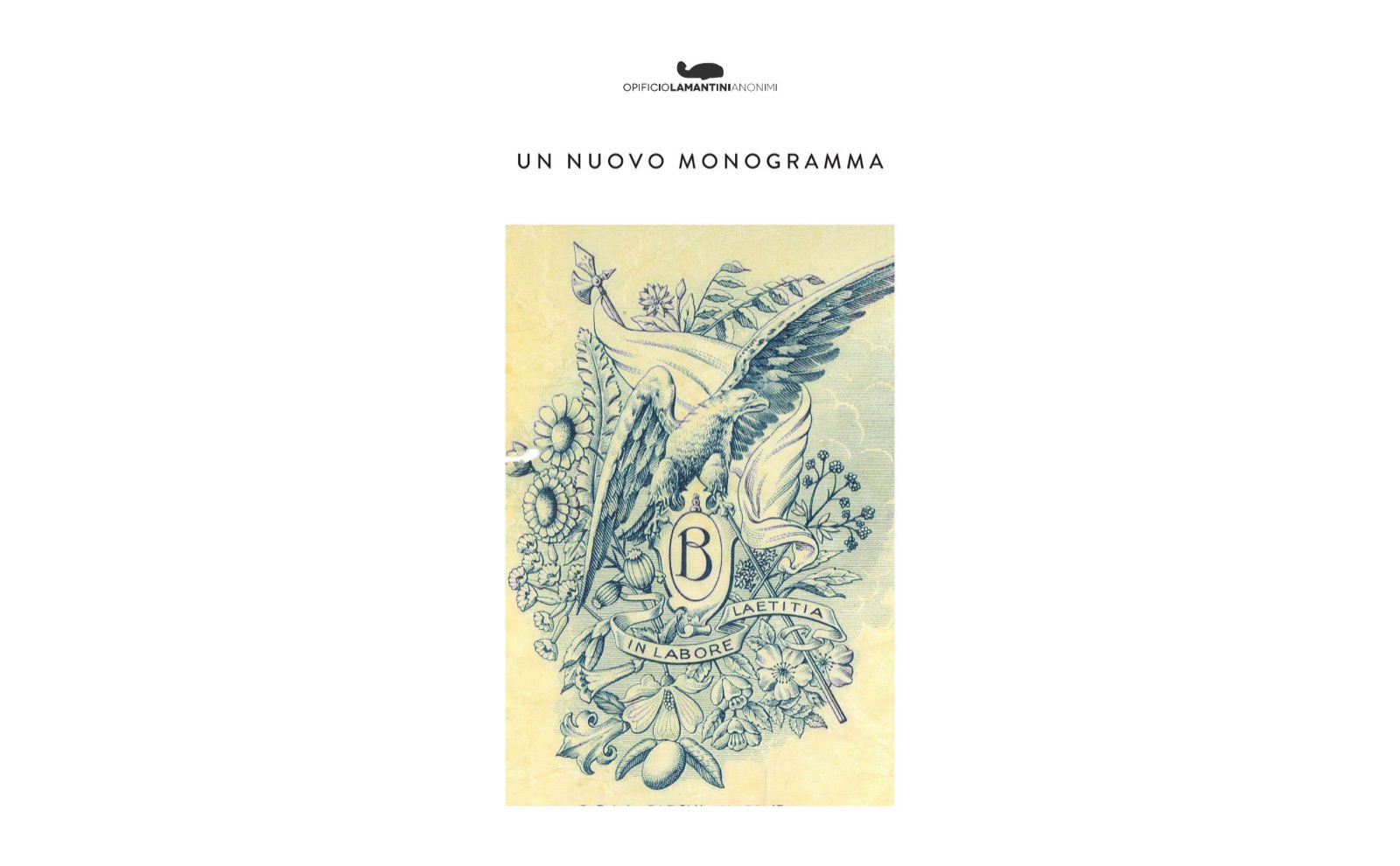
The tagline
The historic one stays, for secondary uses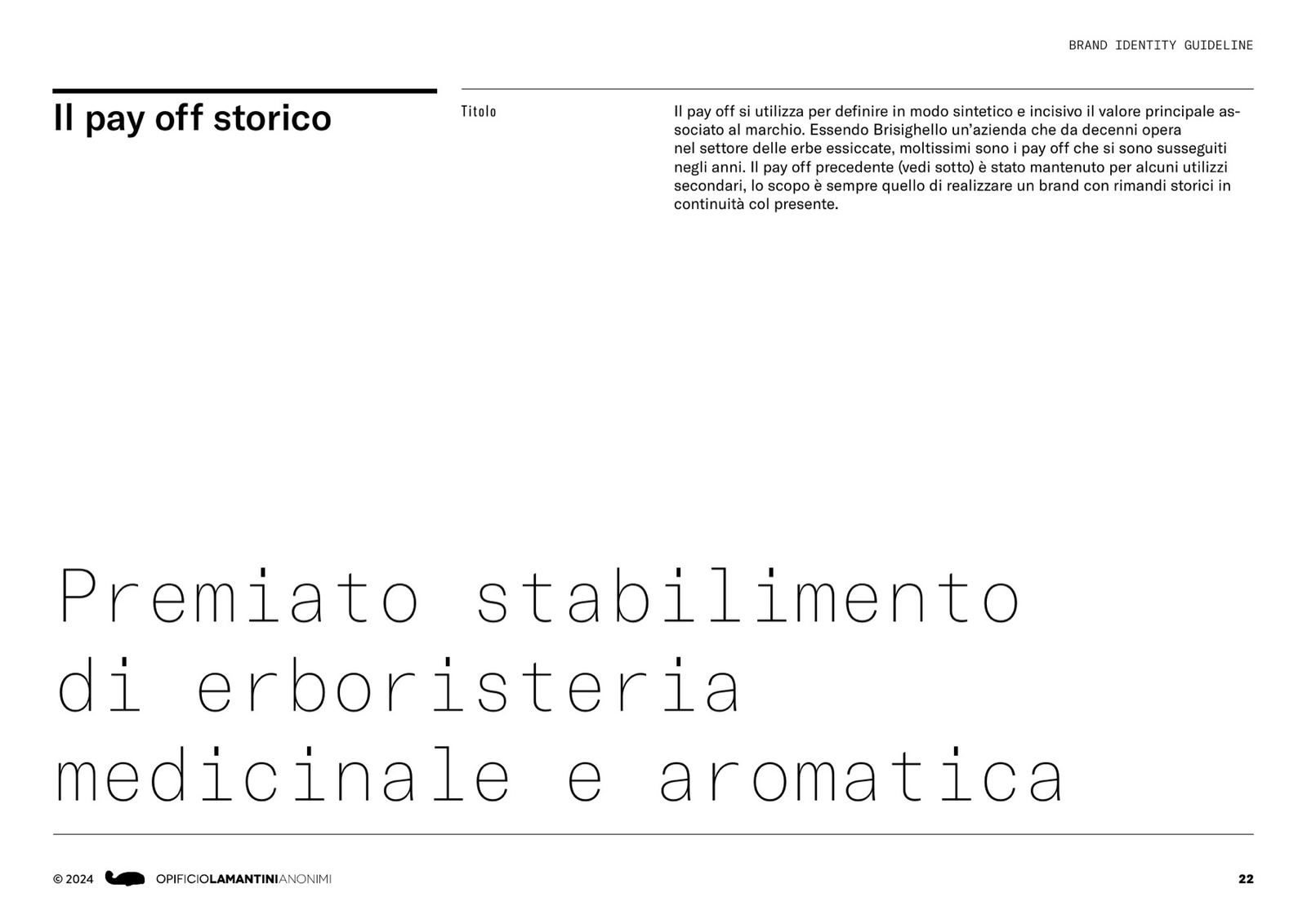
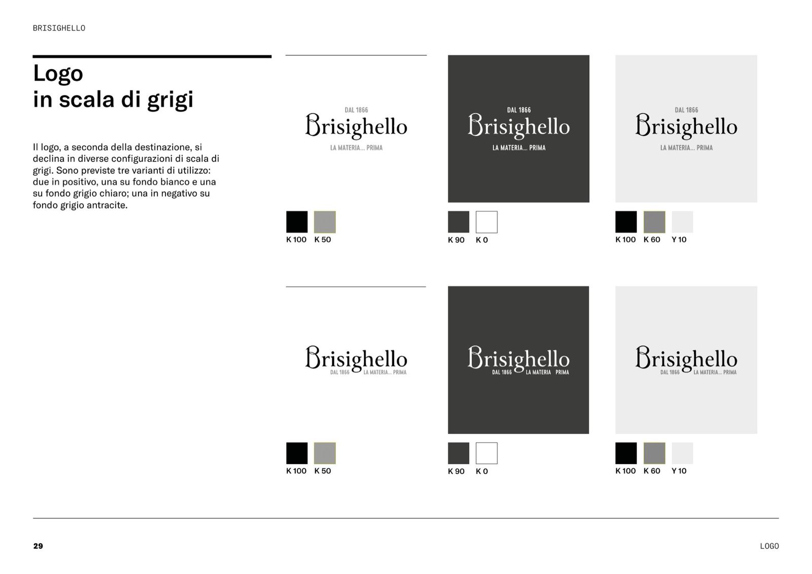
The logo
Extended version and compact version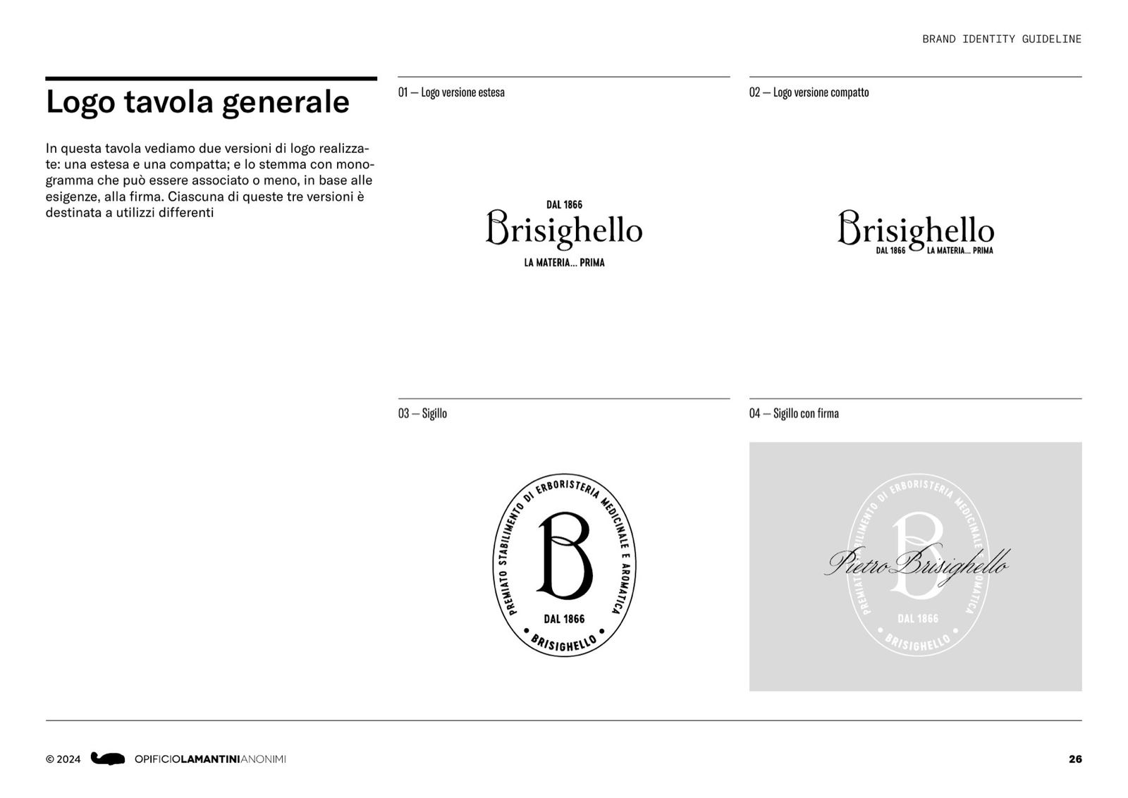
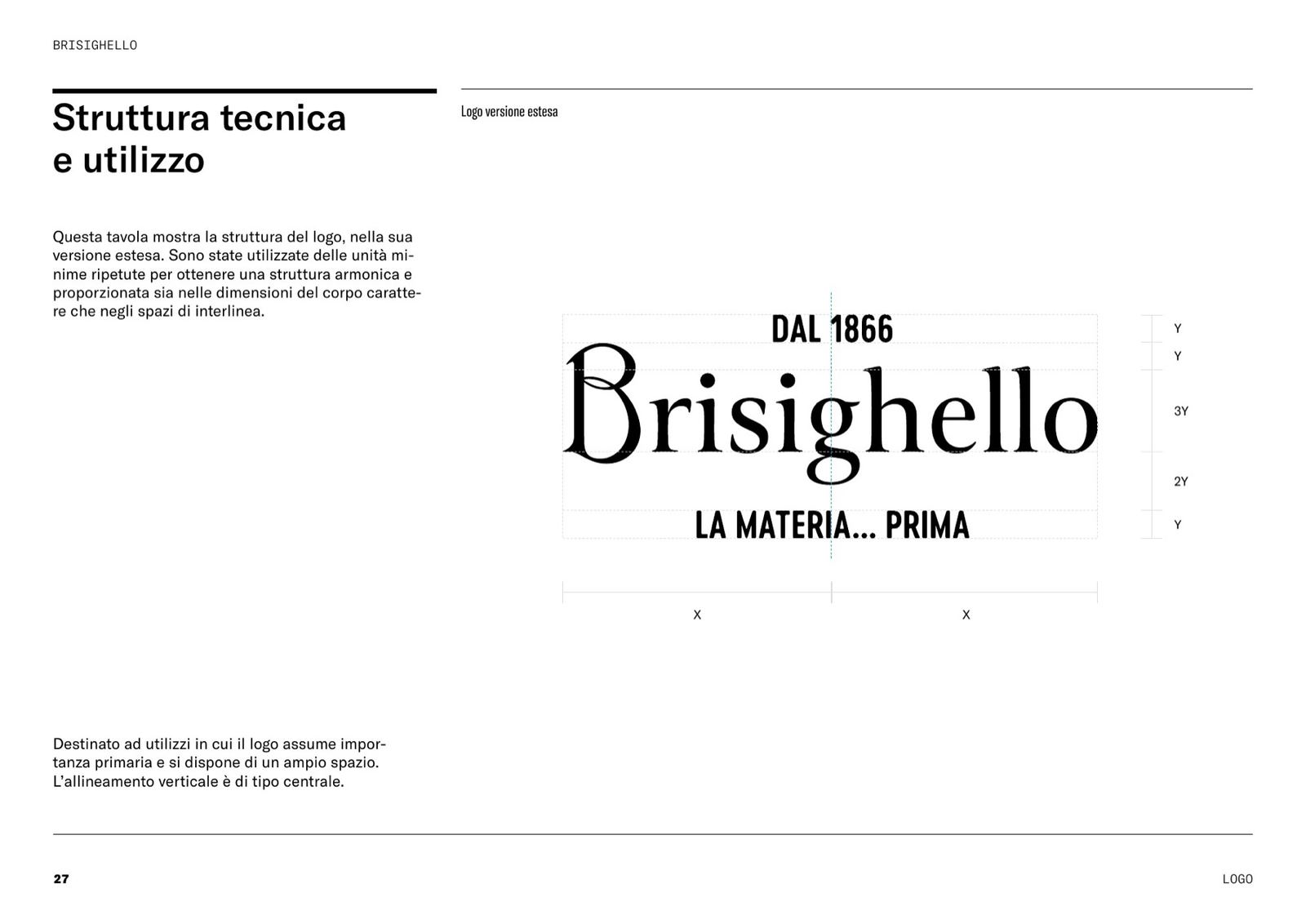
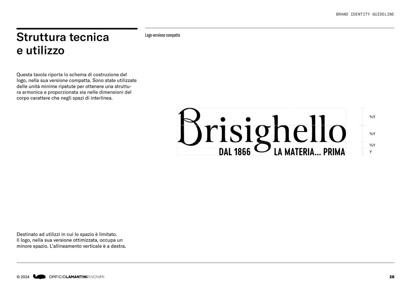
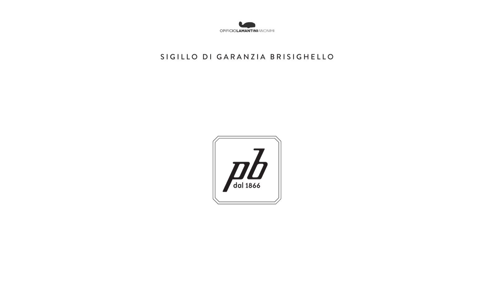
The seal and the signature
For packaging and for the website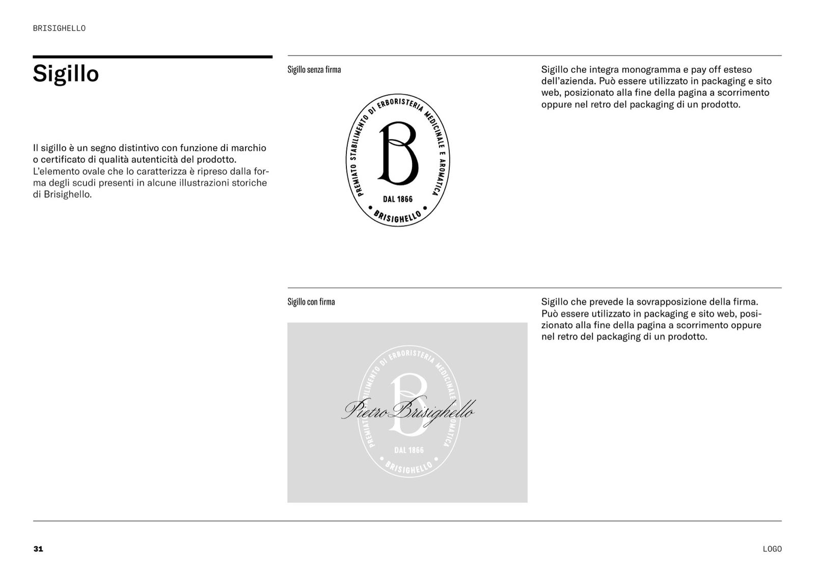
Type and colour
Canto, Cervo Neue, Wordless Script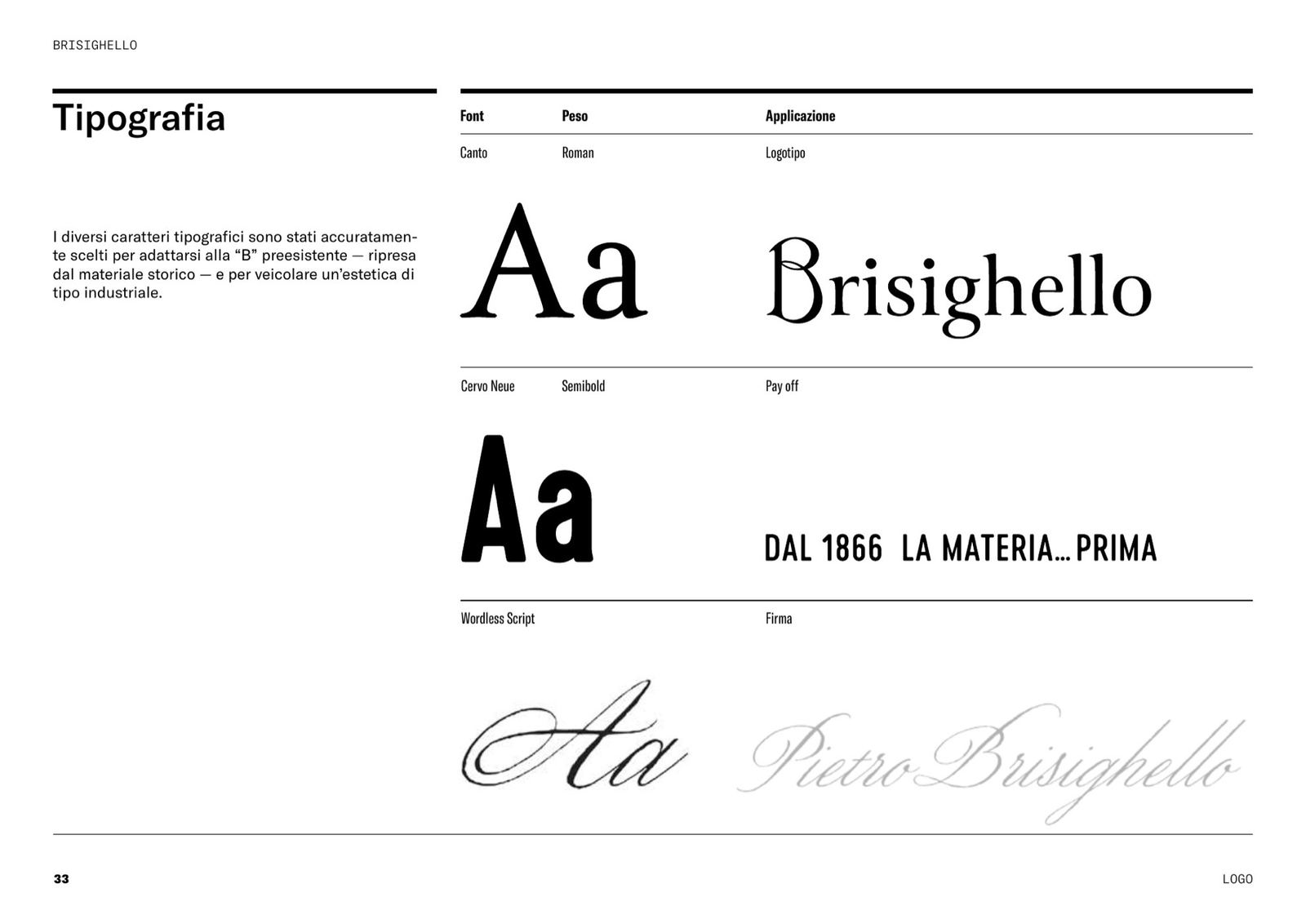
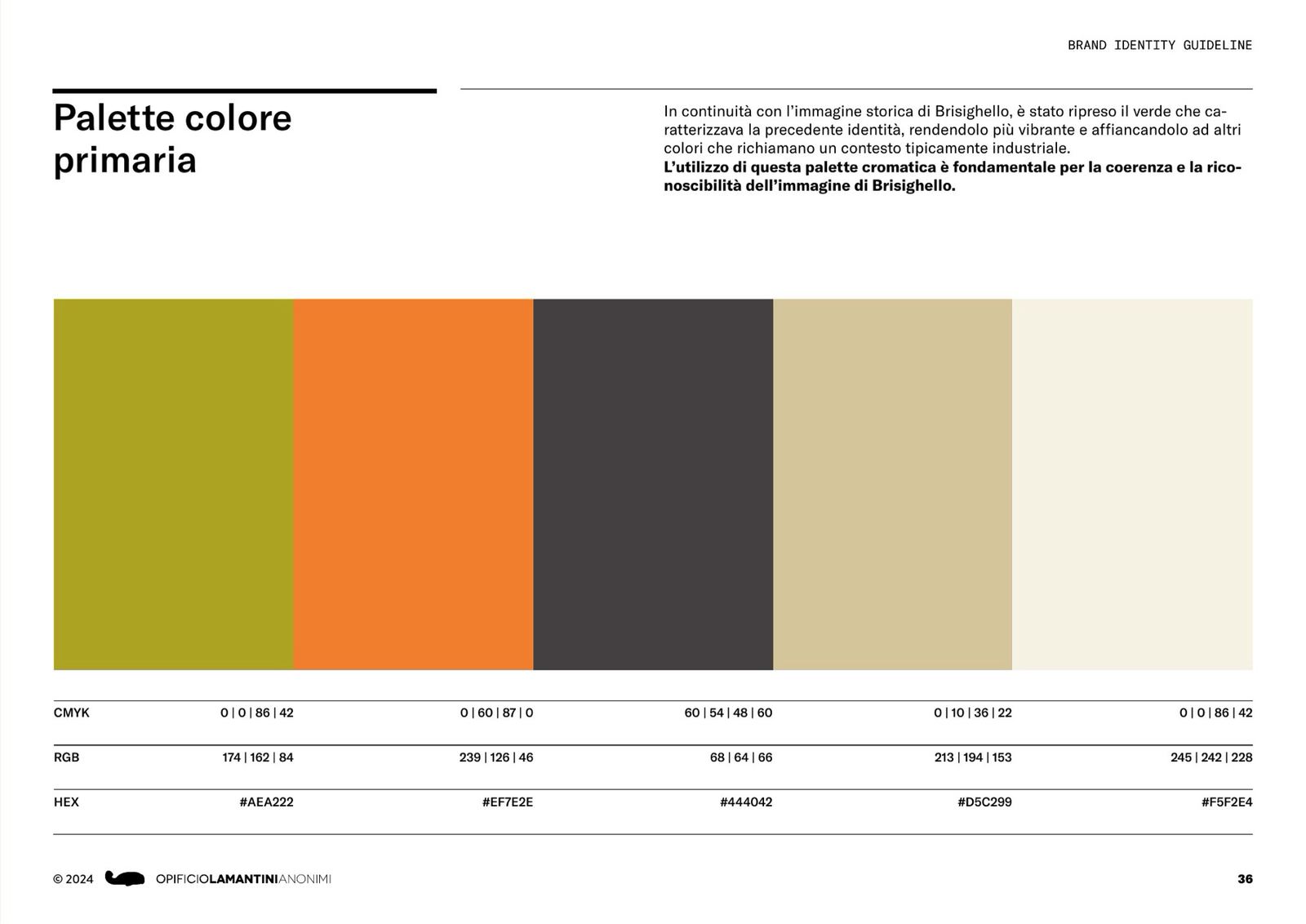
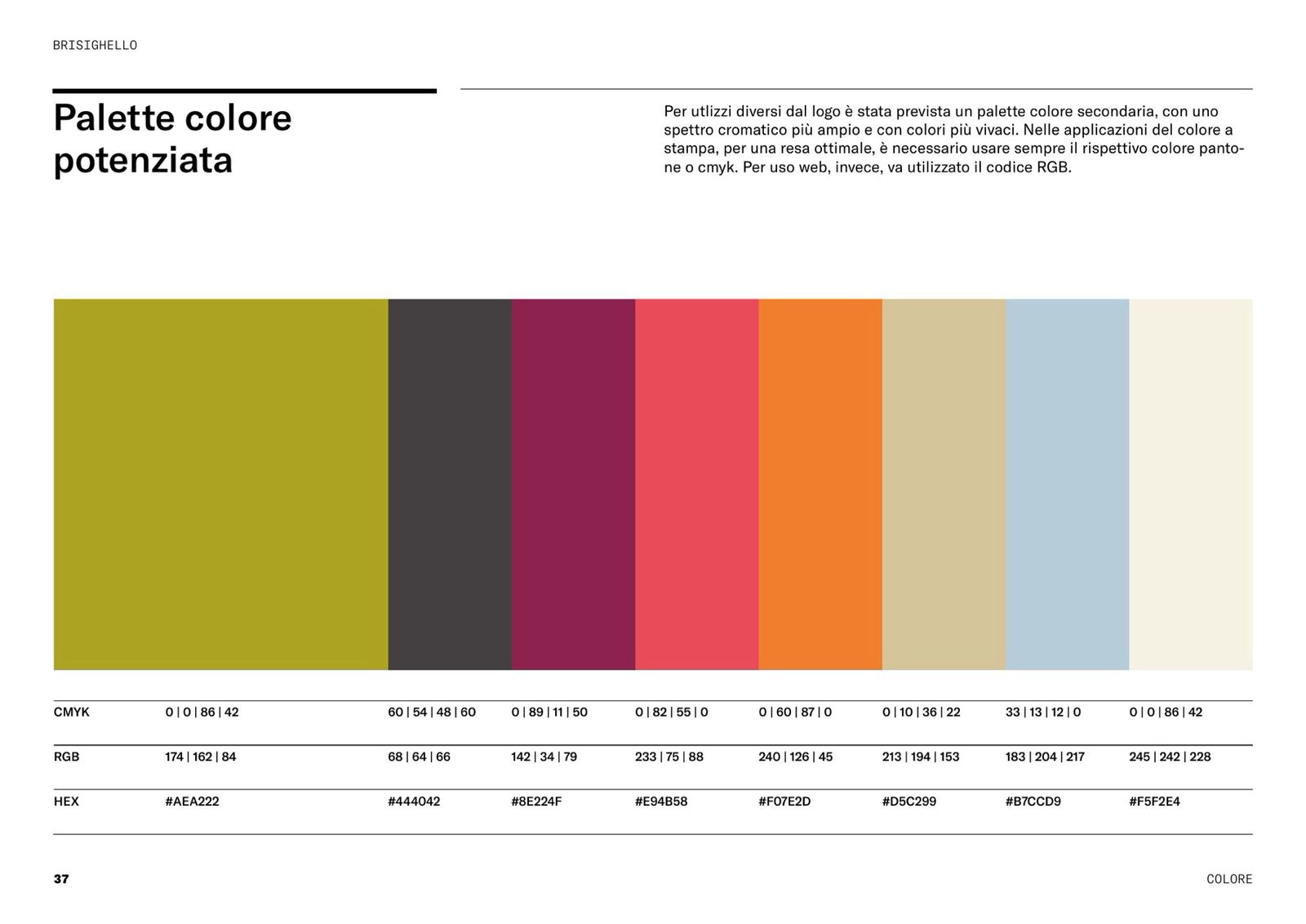
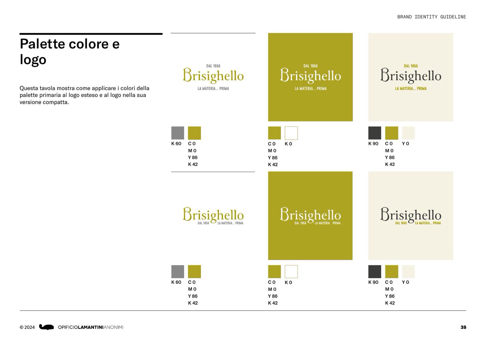
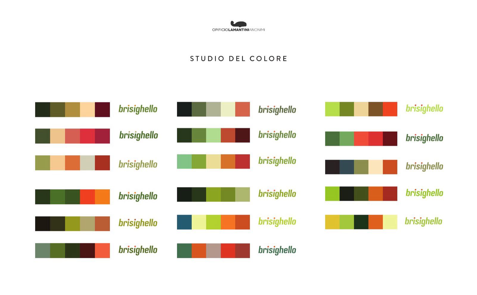
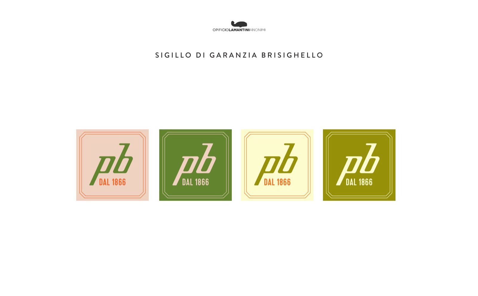
The green of the previous identity, made more vibrant, beside colours from an industrial setting.
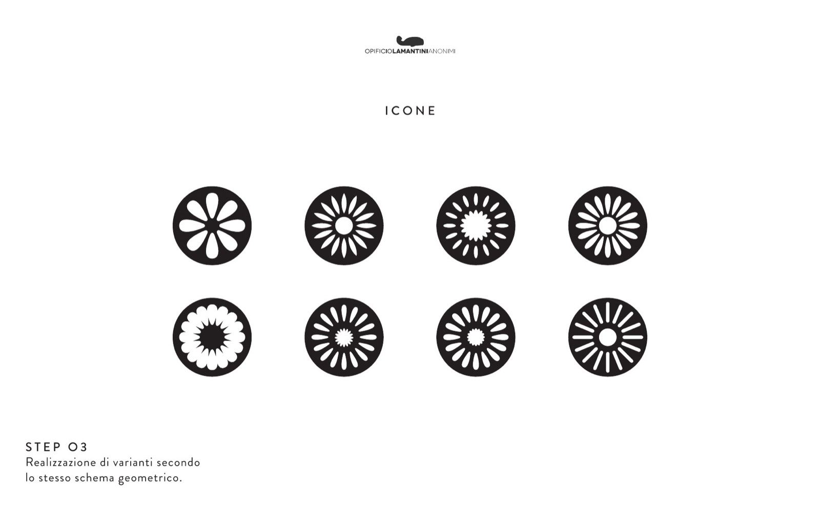
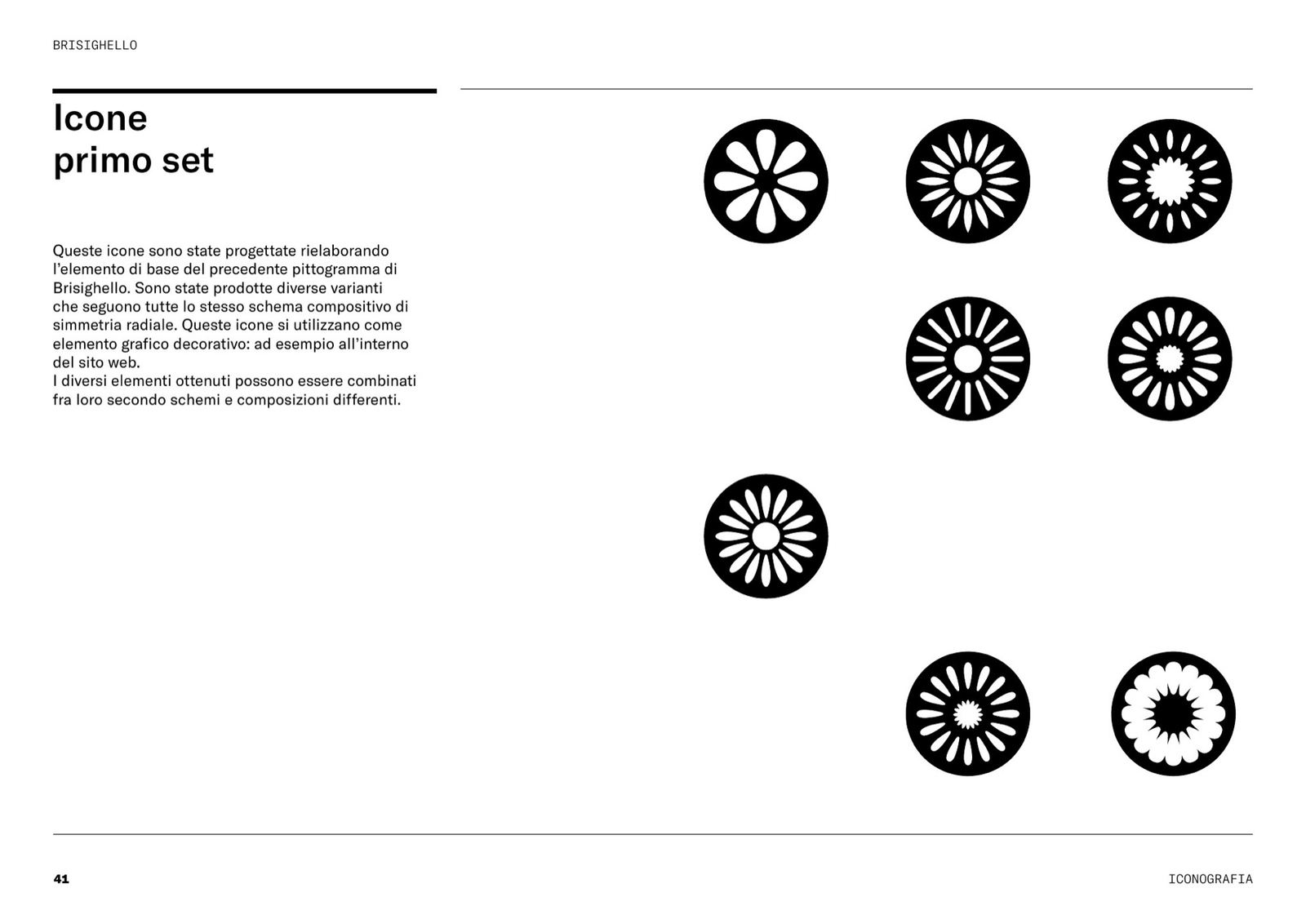
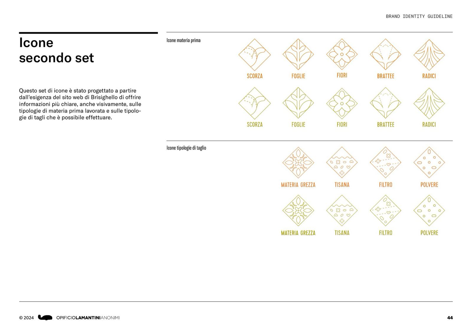
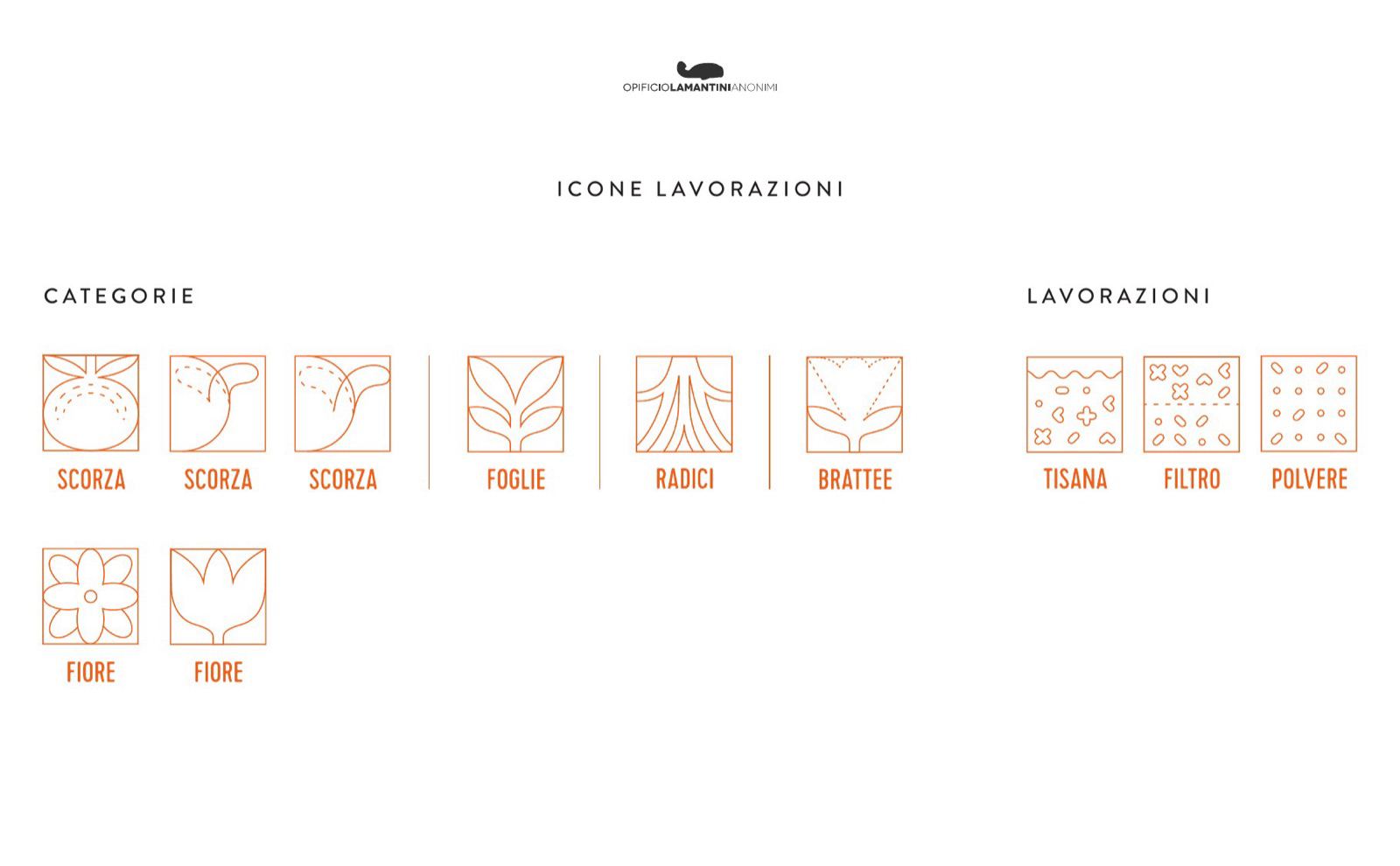
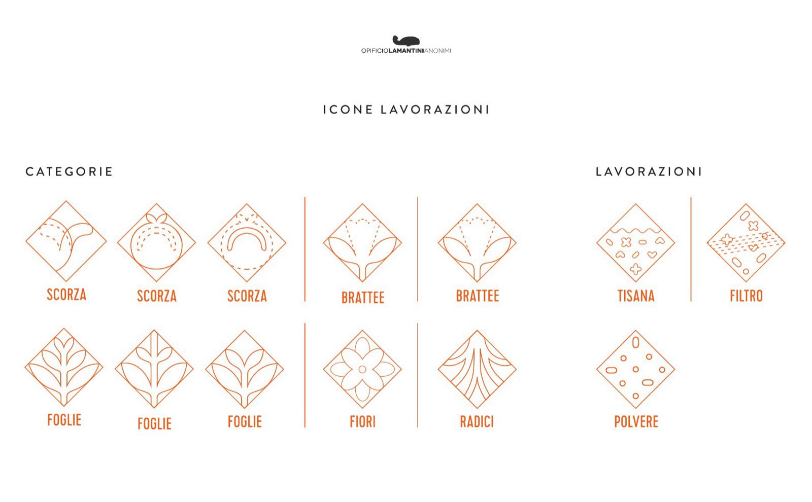
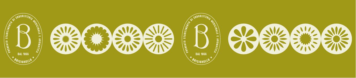
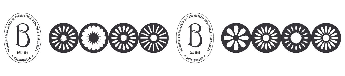
The icons
From the old pictogram to two sets · scroll →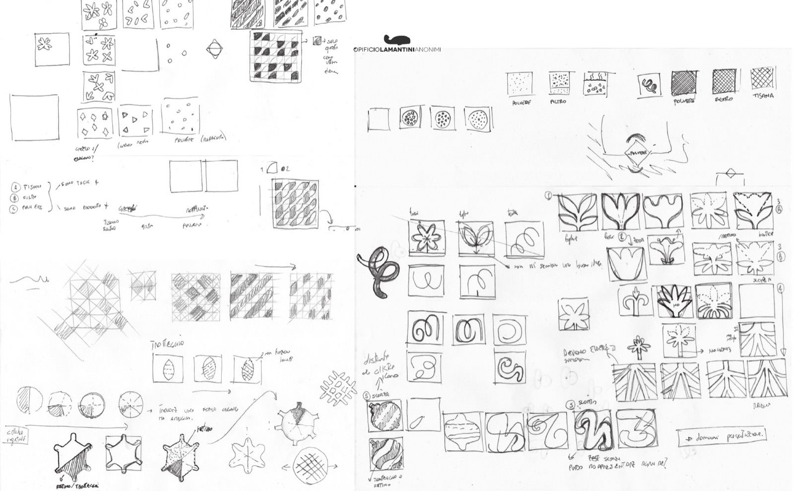
The brand book
Introduction, company, tagline, logo, colour, icons, illustration
Why would a herb company need an engraving?
Because that is how it spoke about itself a century ago. It needed updating, not replacing.
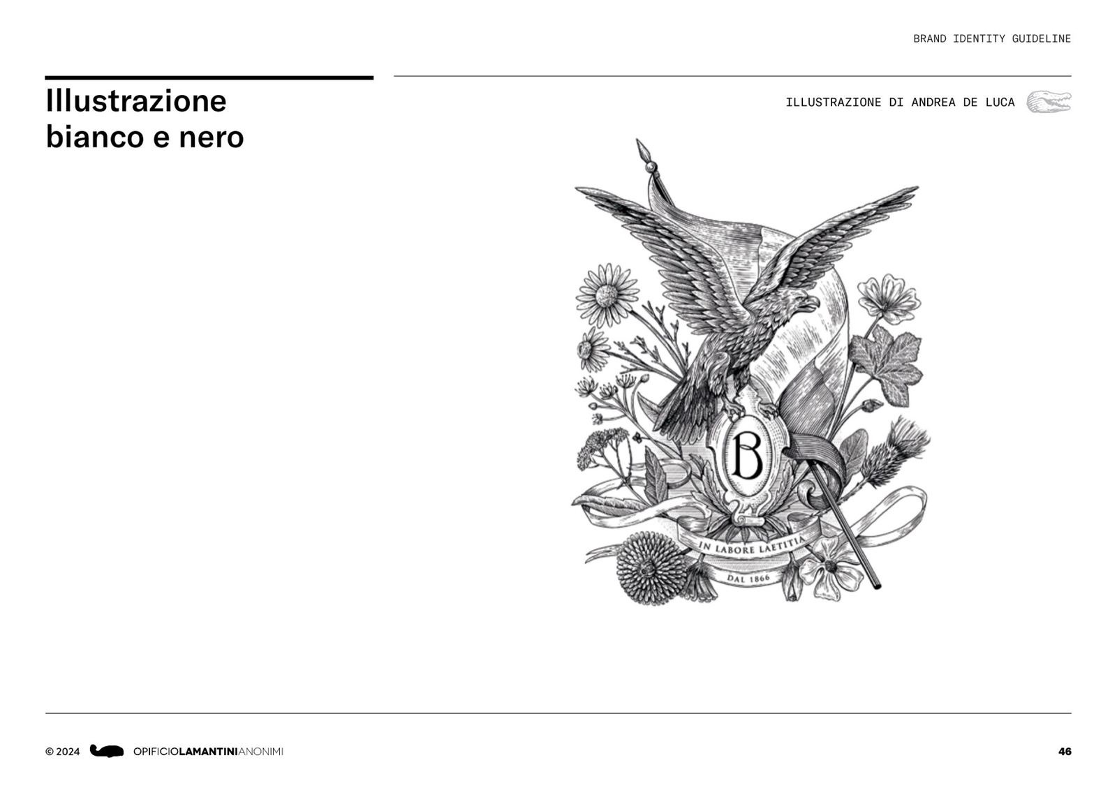
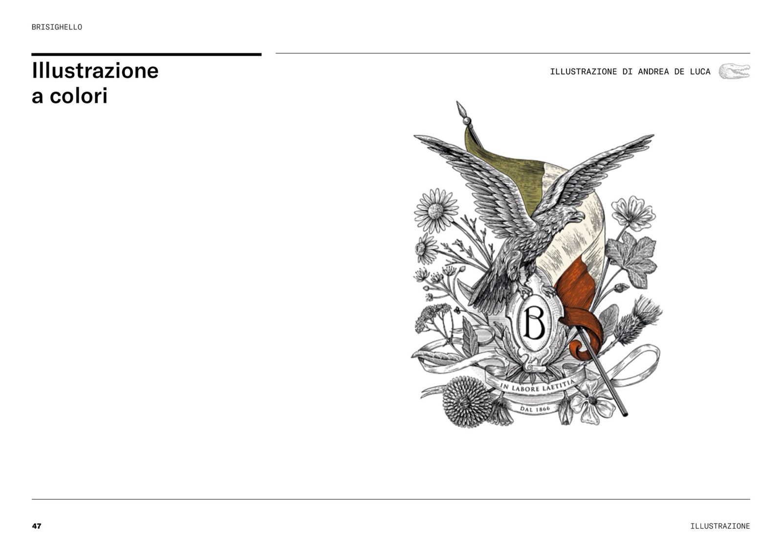
The direction is modern engraving: contemporary illustrations that draw on engraving and fine-art printing. We chose the illustrator Andrea De Luca and handed him the drawing.
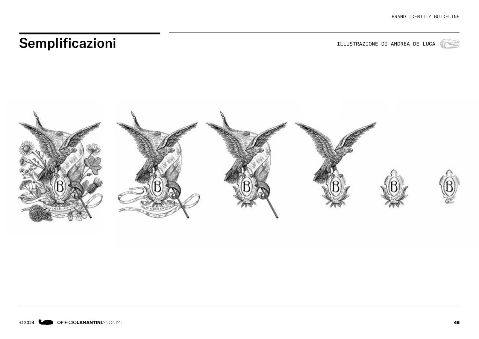
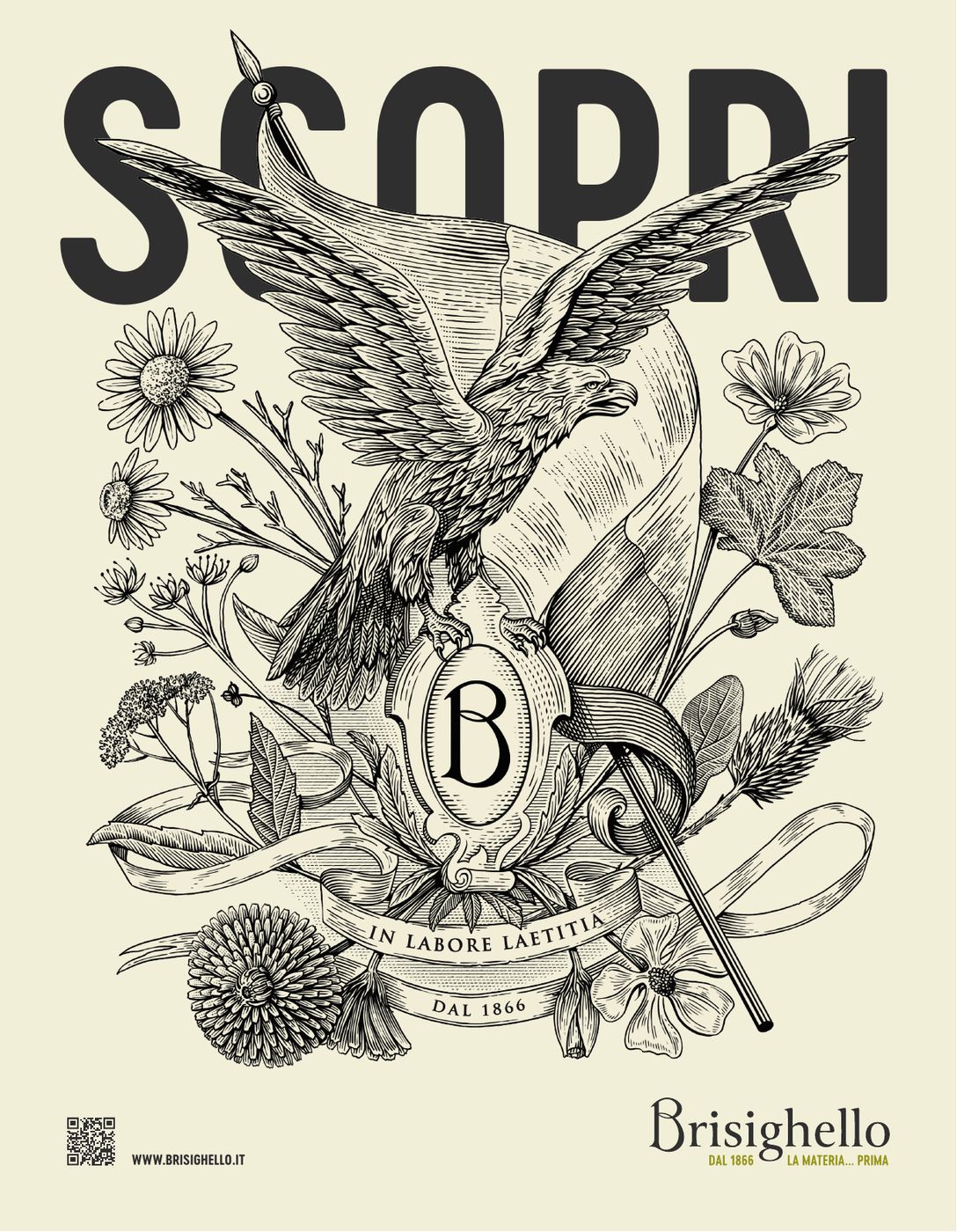
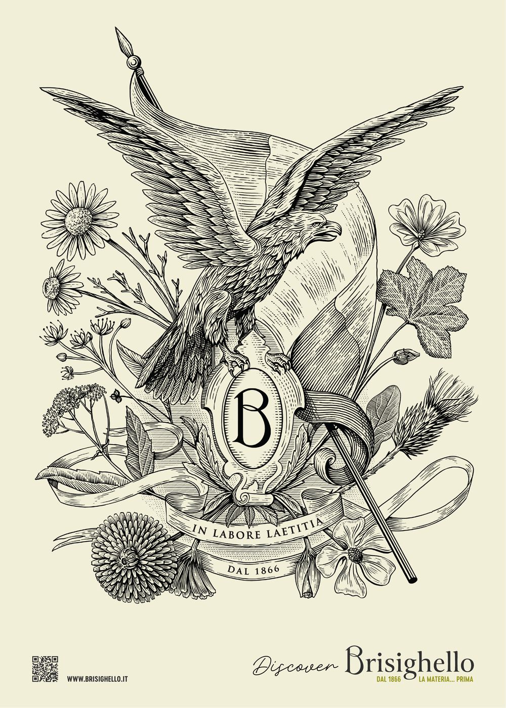
The full illustration holds the whole company: the eagle, the B monogram on the crest, the medicinal plants, the scroll reading In labore laetitia and the date, 1866. From it we derived the black and white version, the colour version and progressively simpler ones, down to the crest alone.
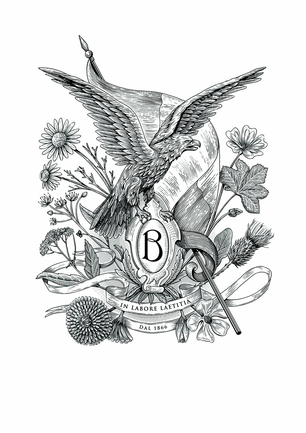
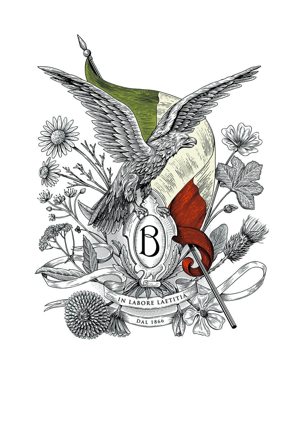
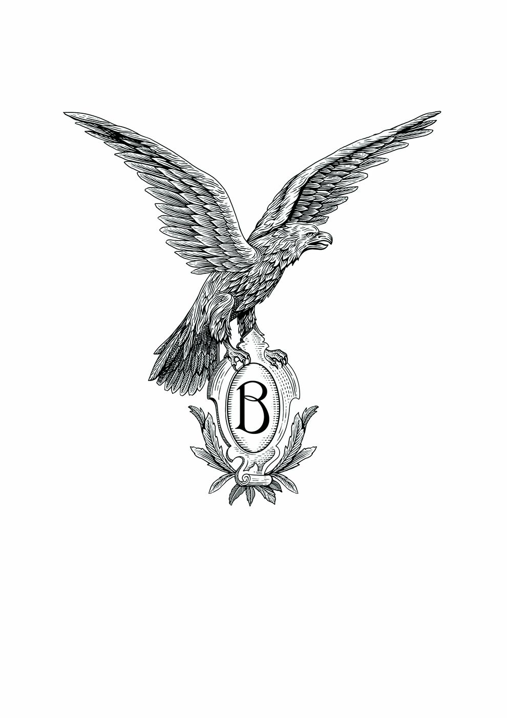
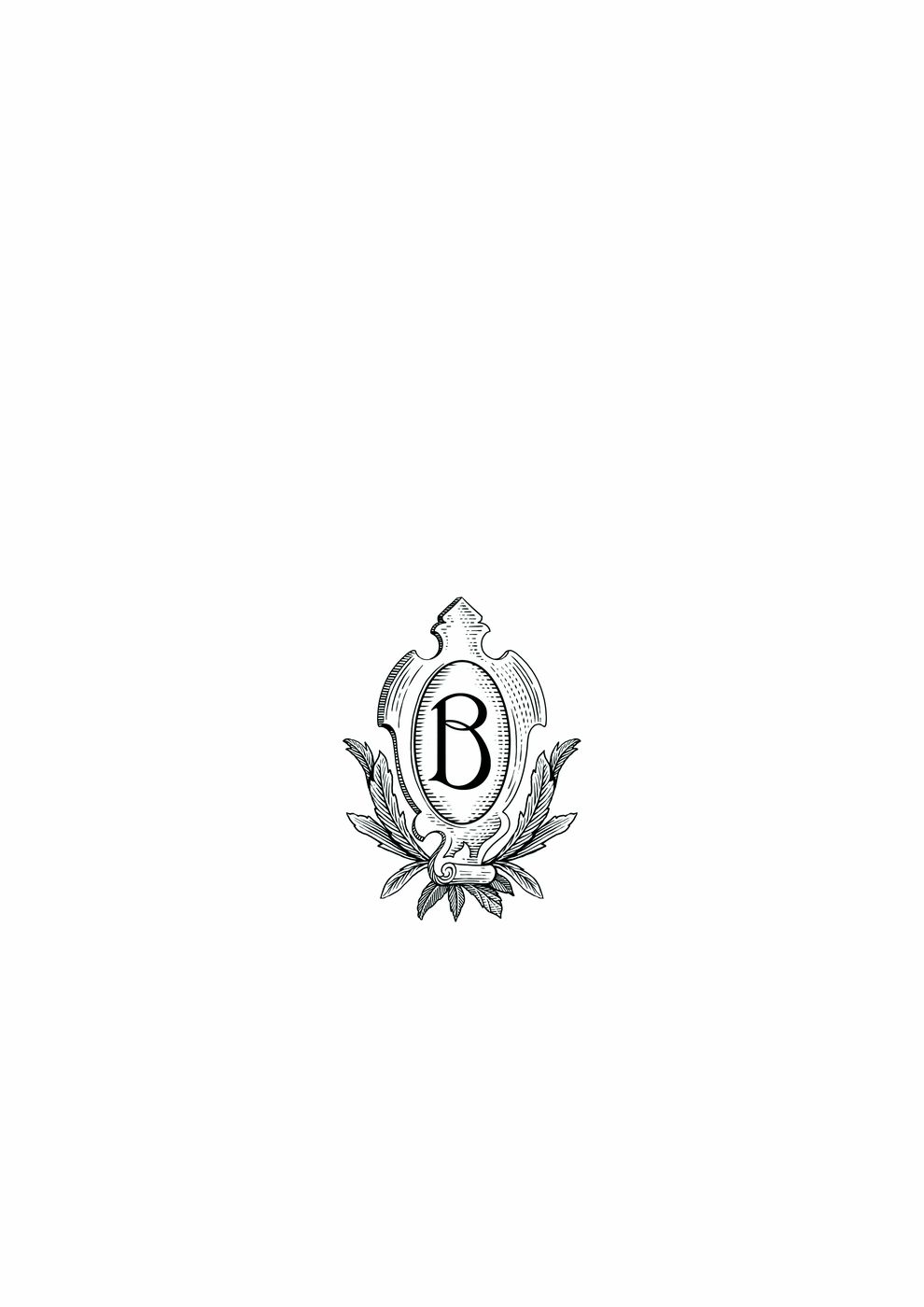
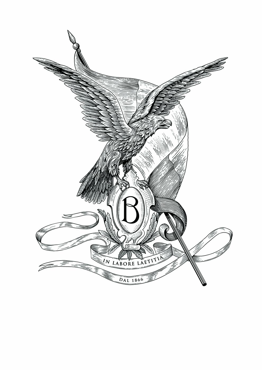
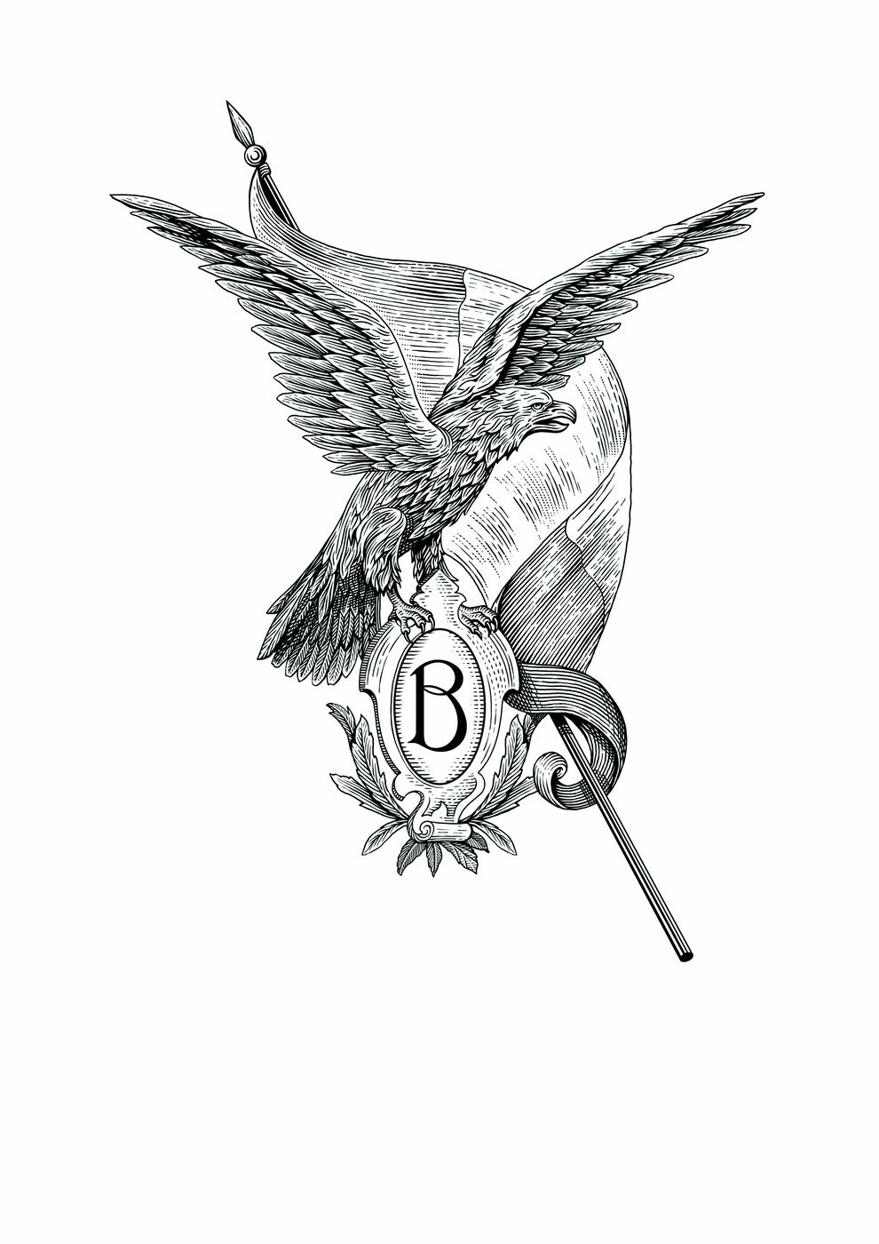
Illustrations by Andrea De Luca, art-directed by us.
What happens to an identity when it leaves the brand book?
It ends up on a box, on a ribbon, in a shop window and on a screen. That is where you find out whether it holds.
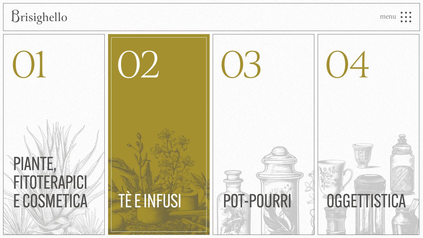
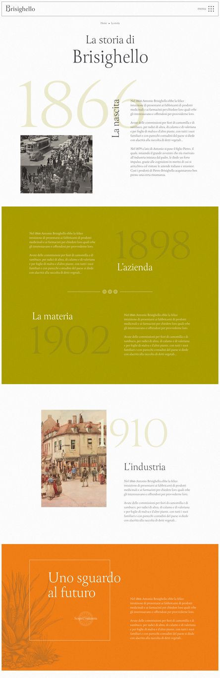
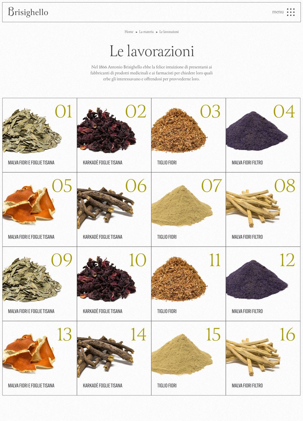
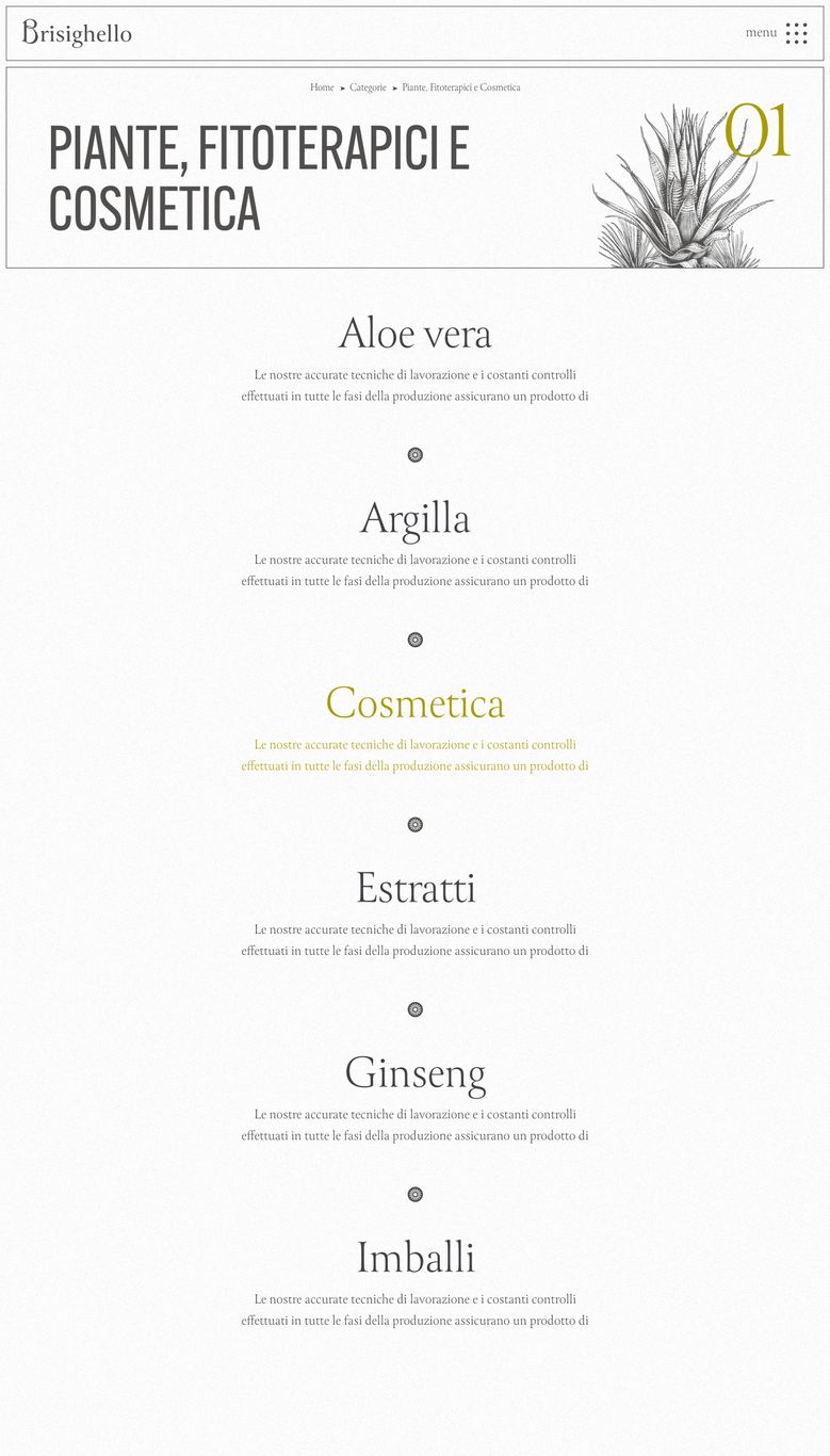
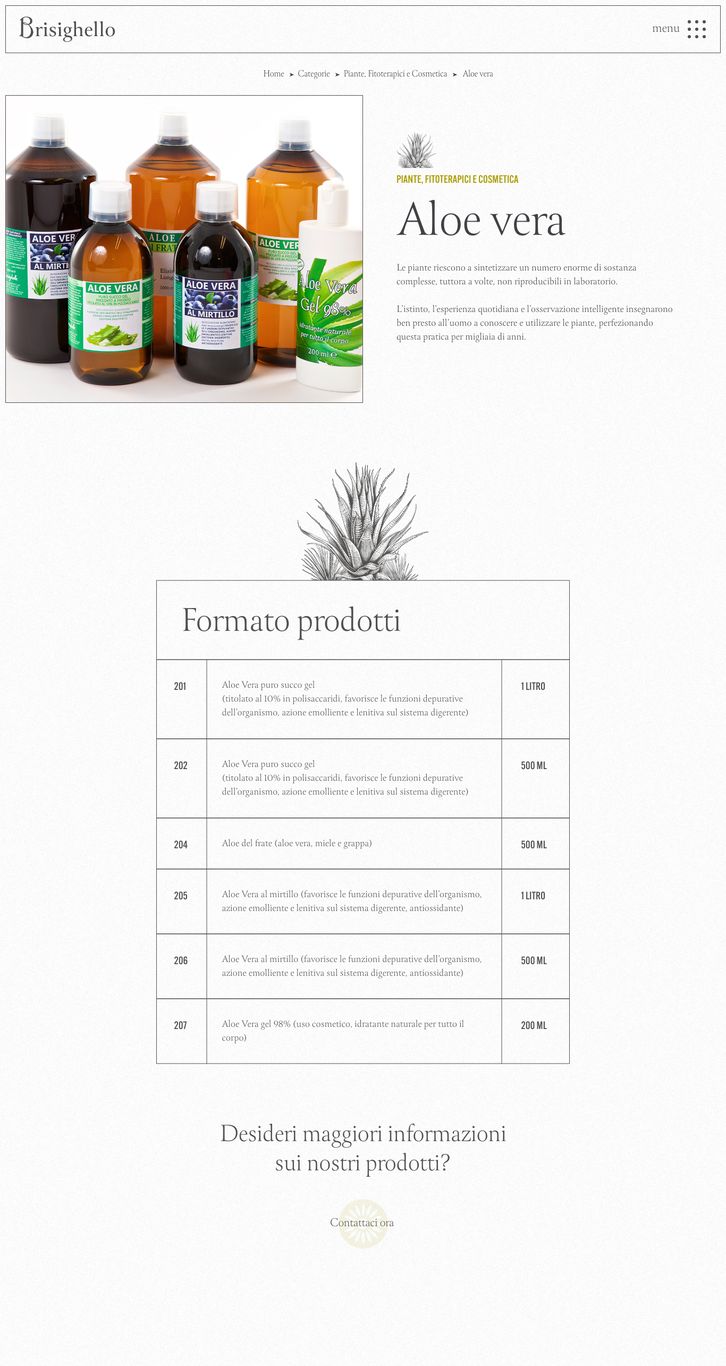
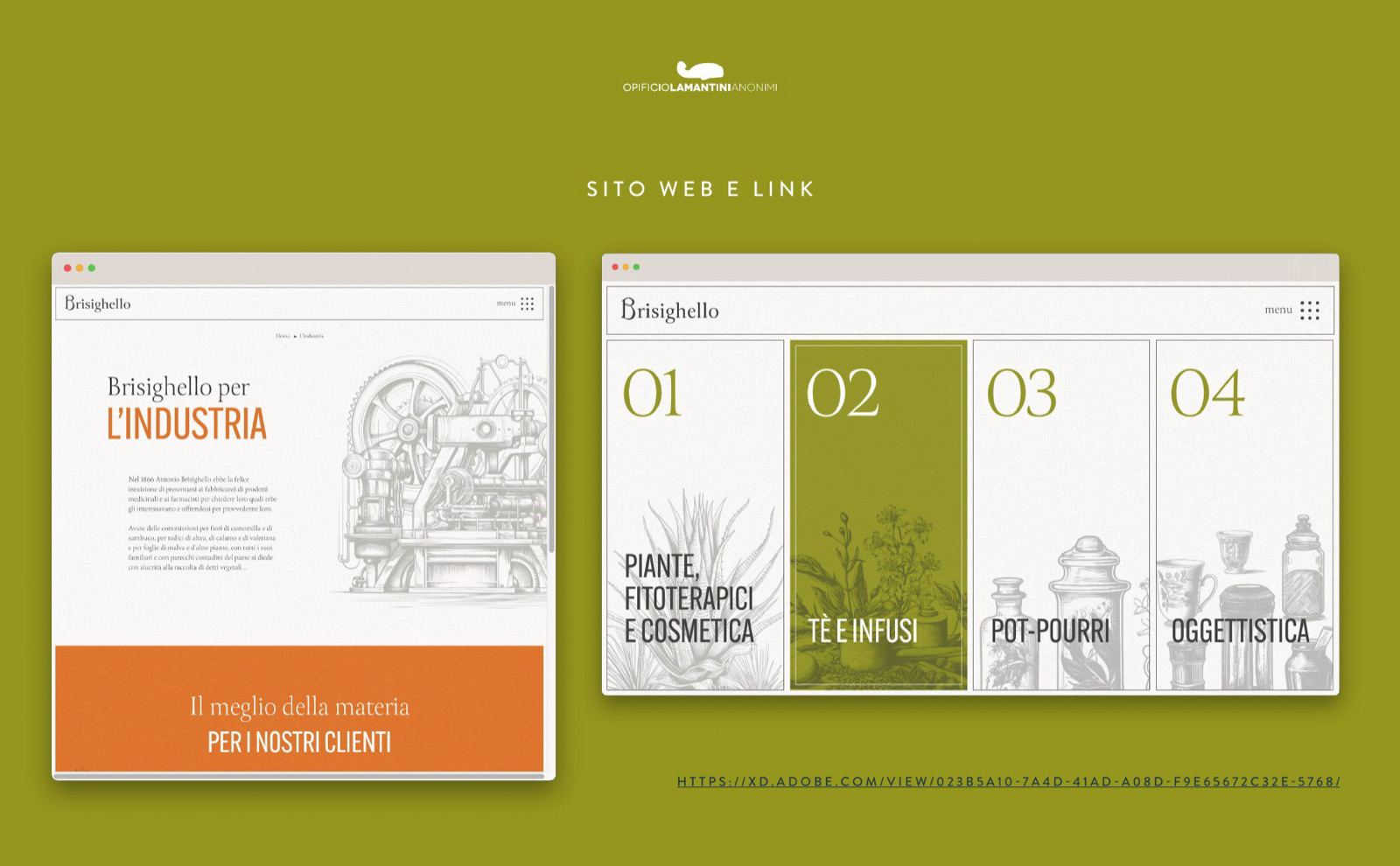
The brisighello.it website covers the four product categories, the company’s history and the way the herbs are processed. The second icon set explains raw materials and cut types at a glance: on the old site, that was the part that came across least clearly.
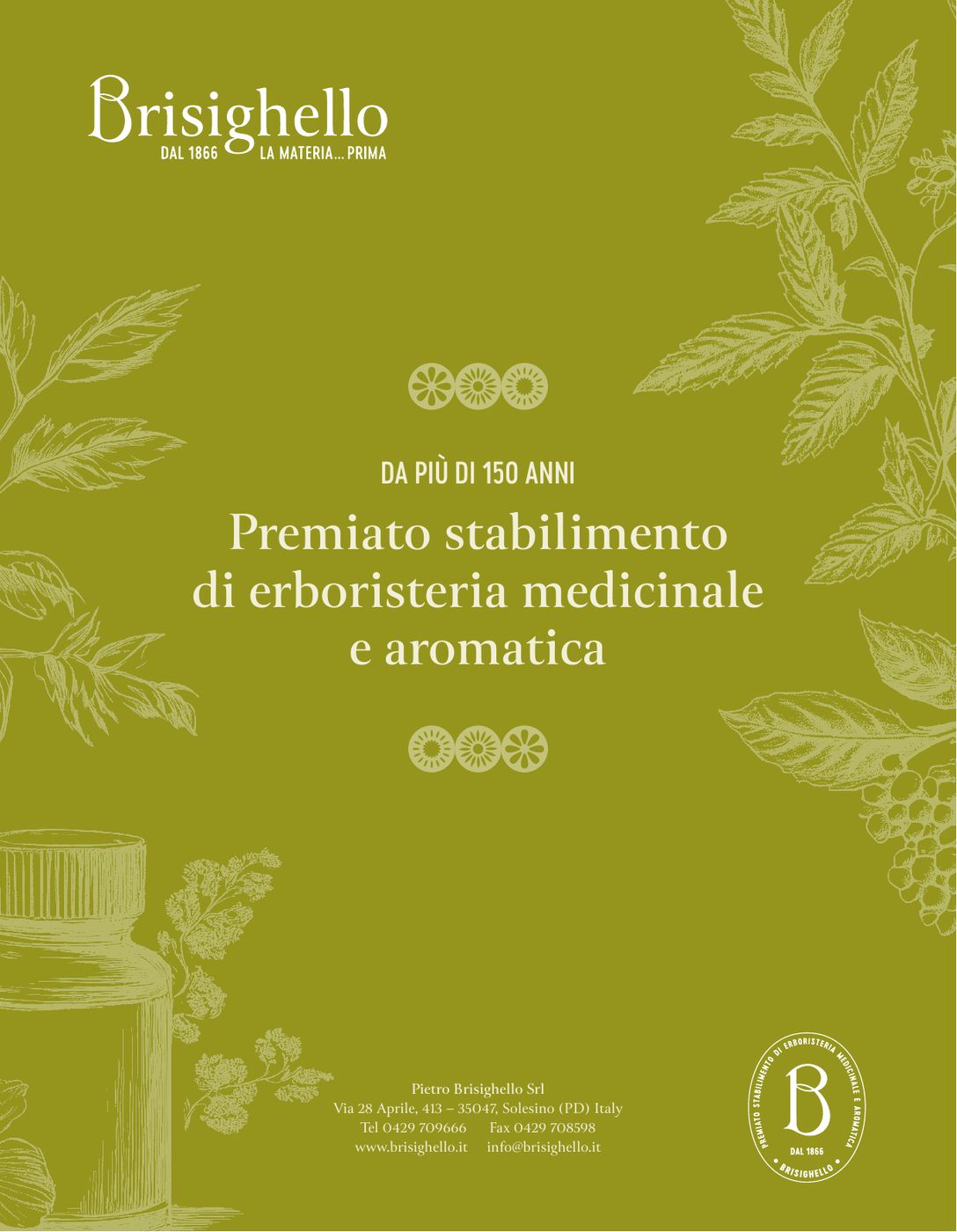
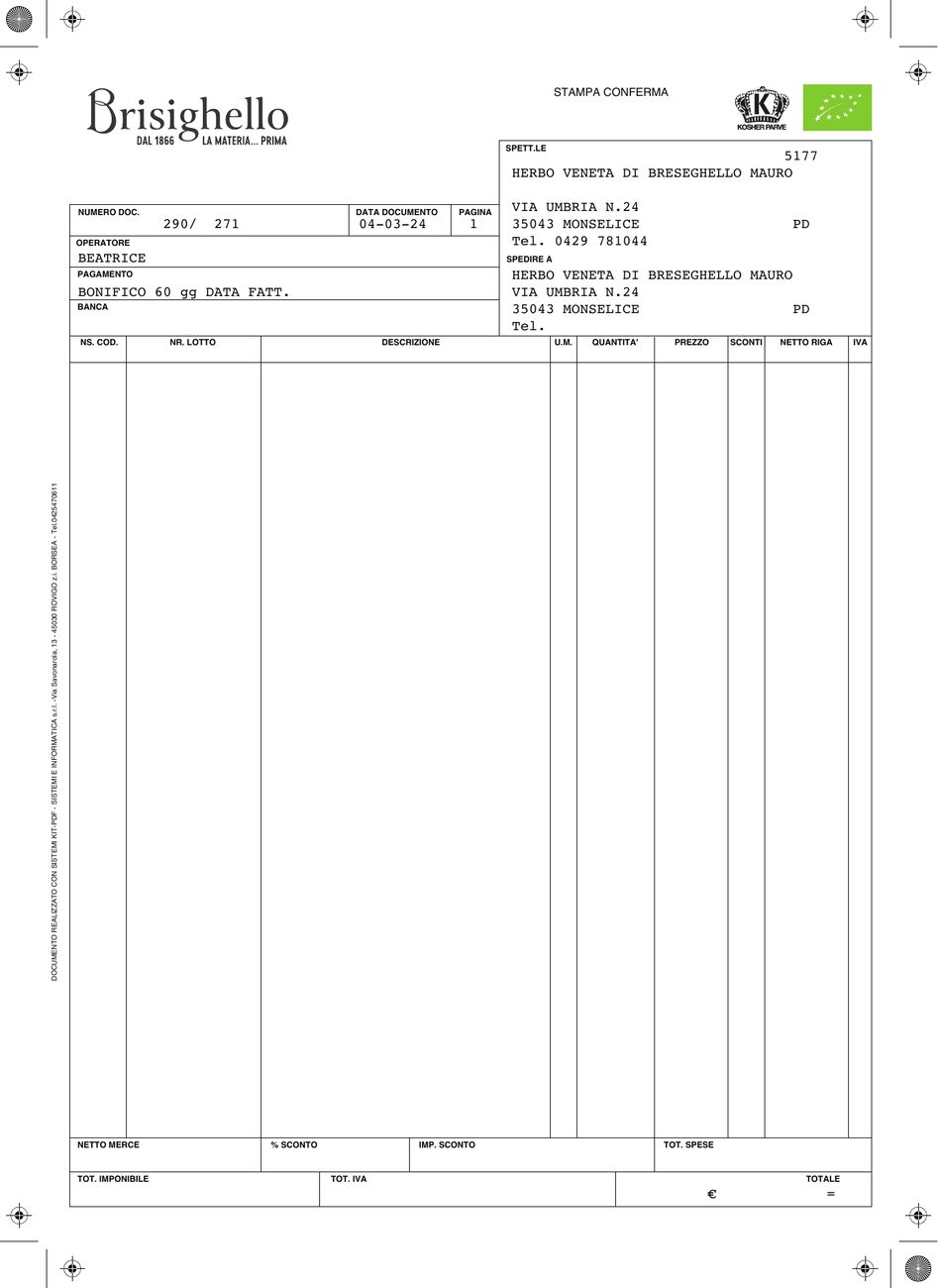
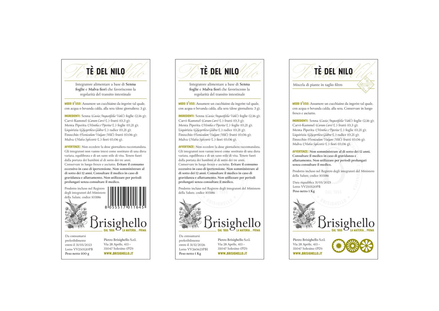
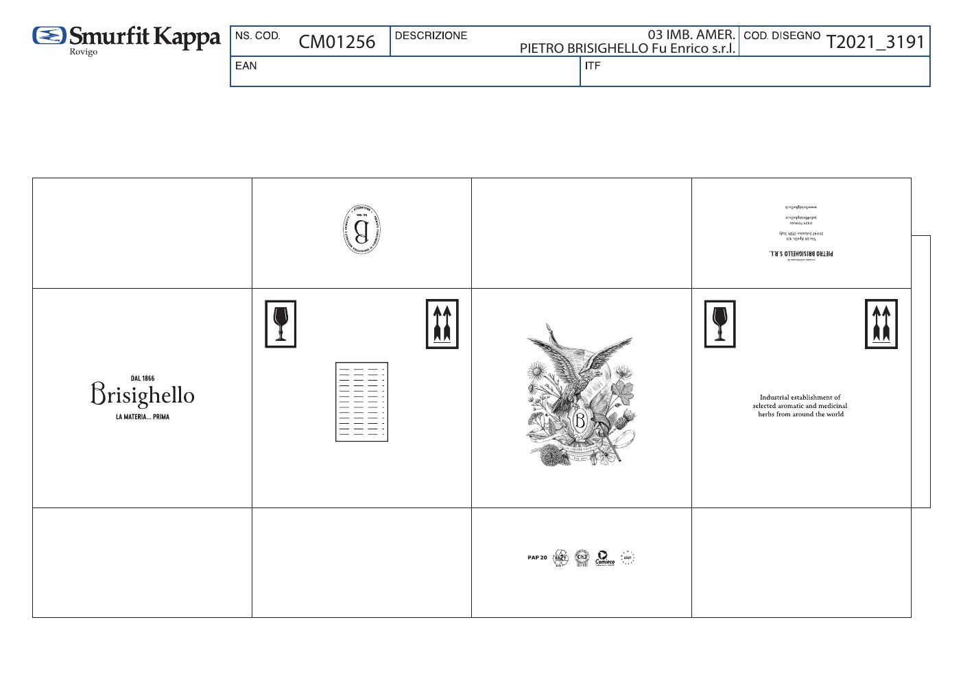
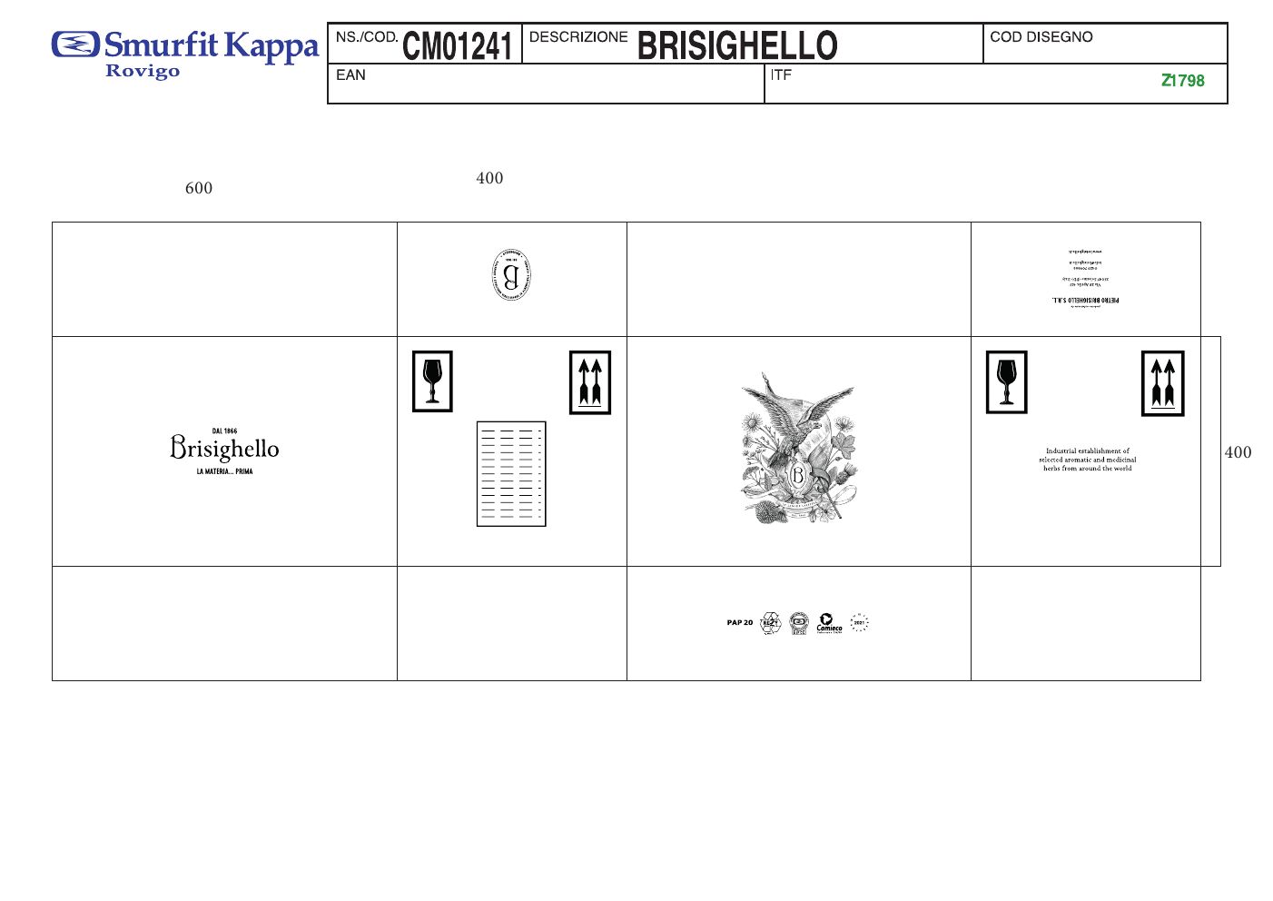
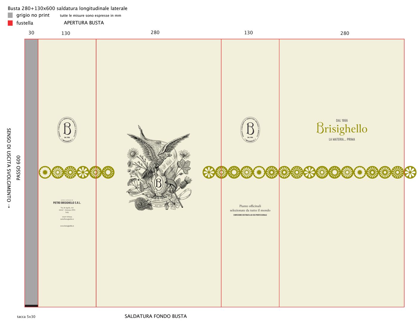
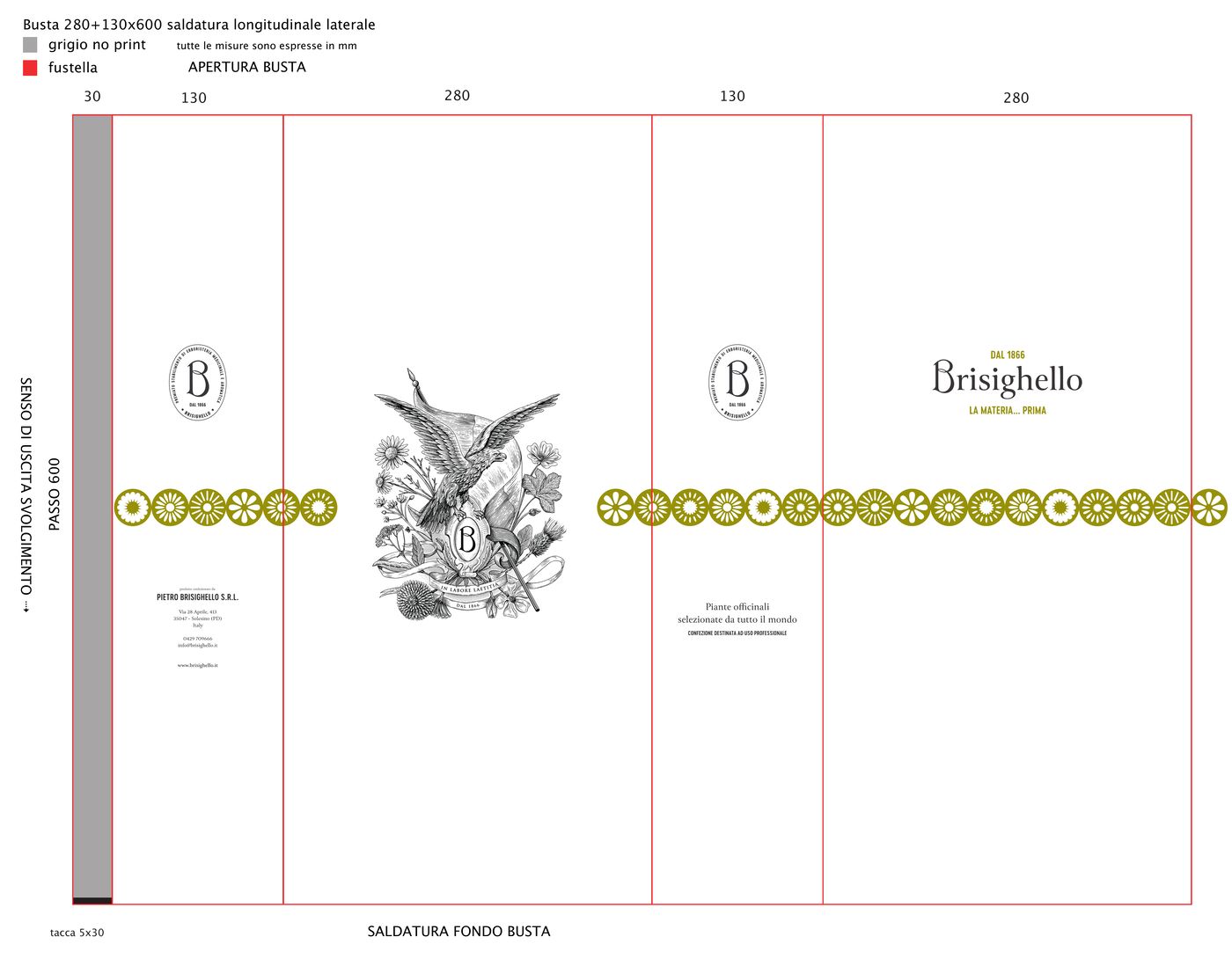
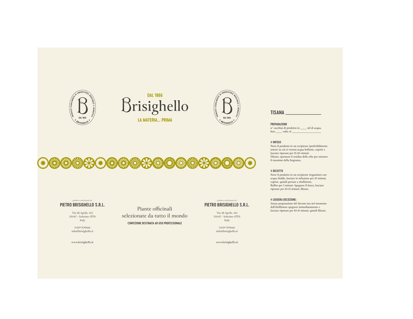
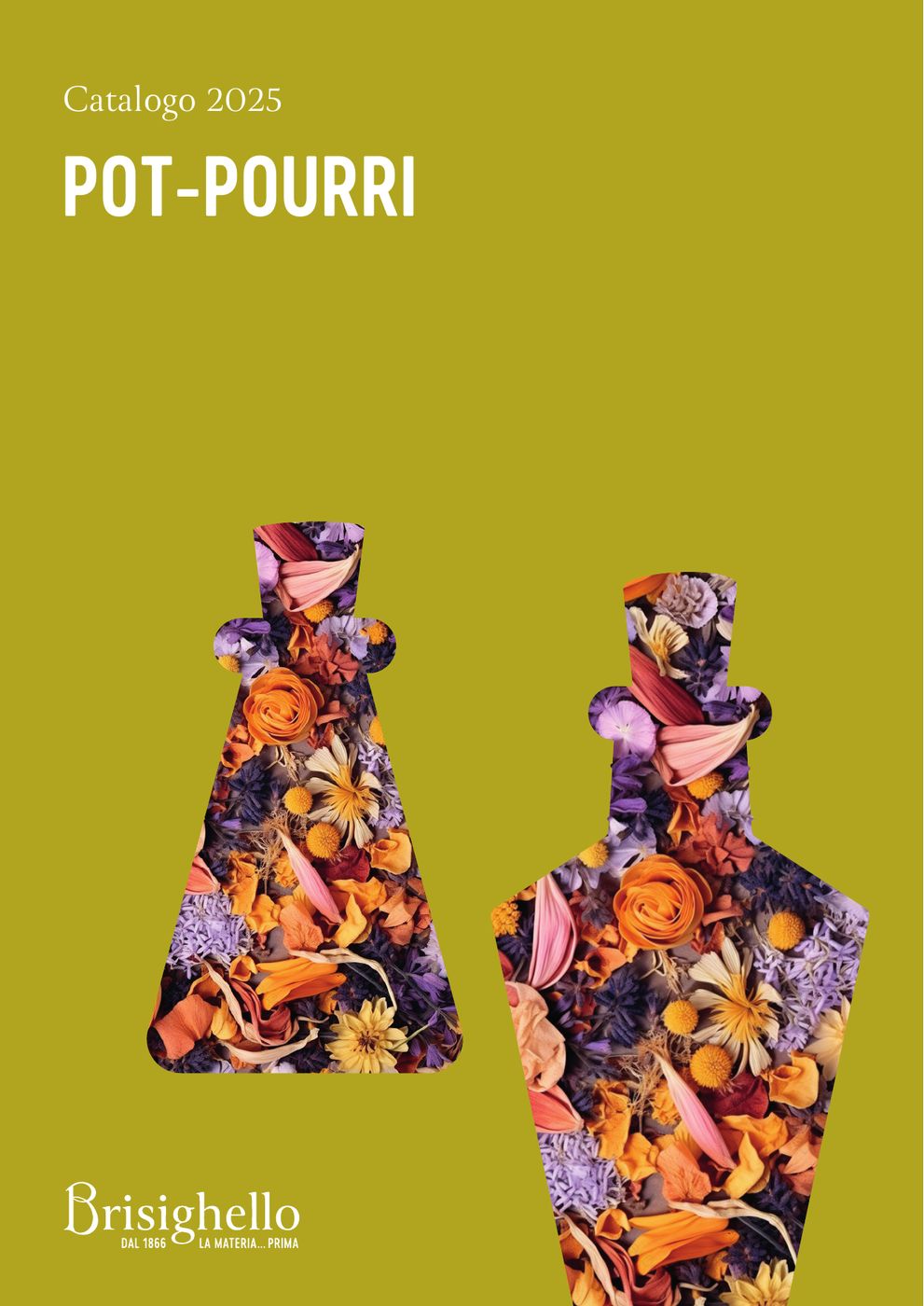
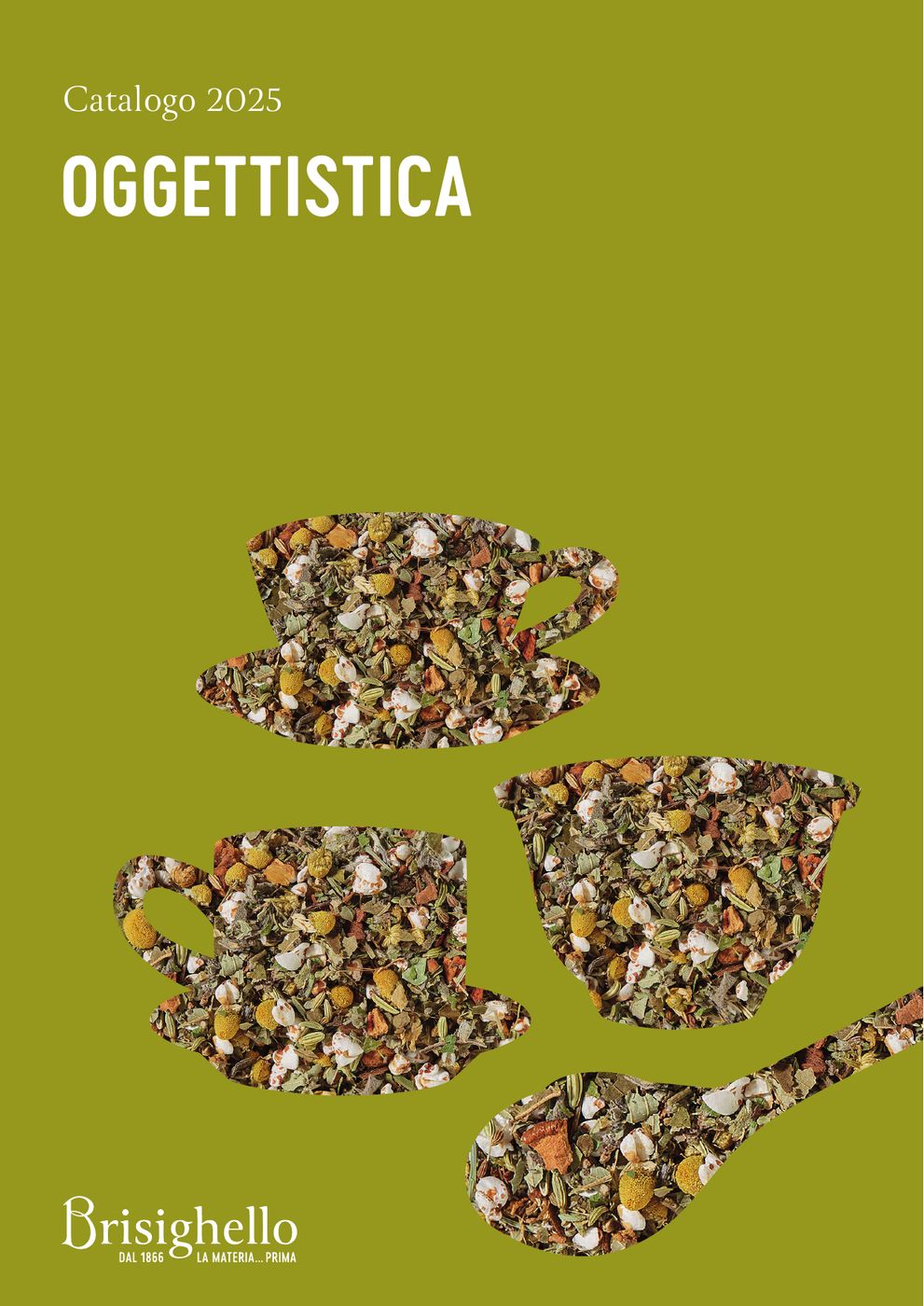
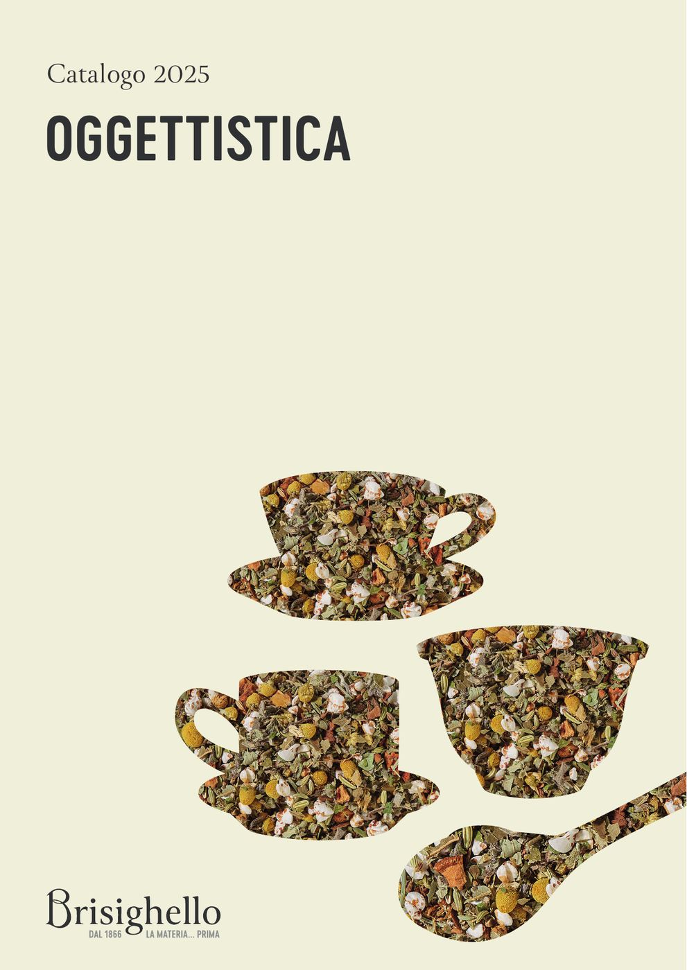
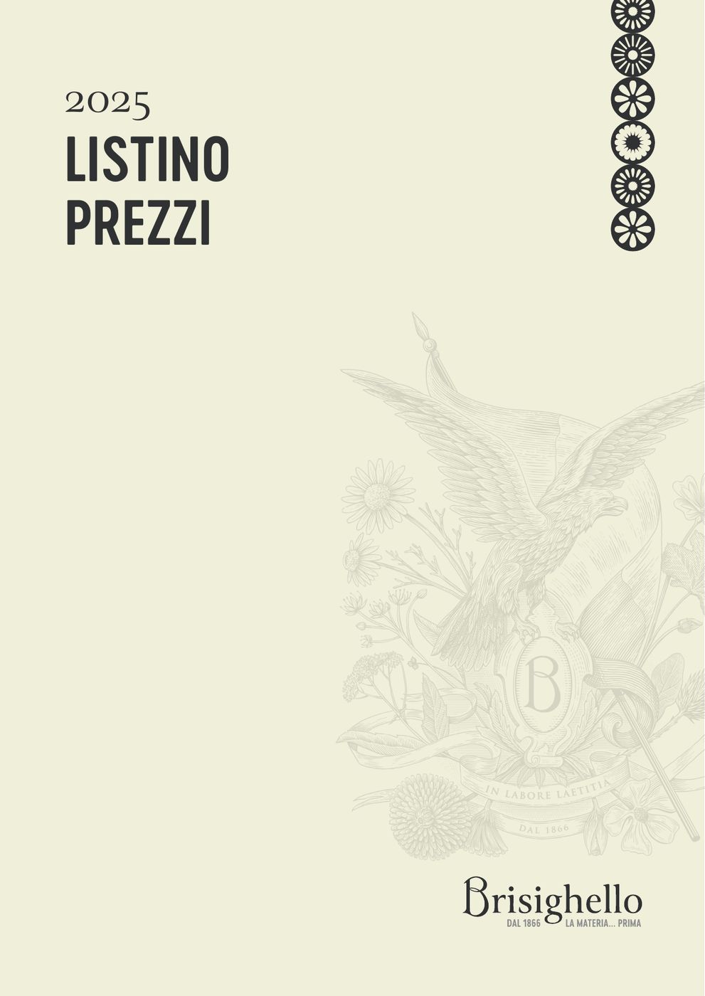
Then the paper: business cards, letterhead, invoice, boxes in three sizes, bags, ribbon, labels. And the seasonal catalogues — Il tempo del tè, Pot-pourri, Oggettistica — with the price list and the window cards.
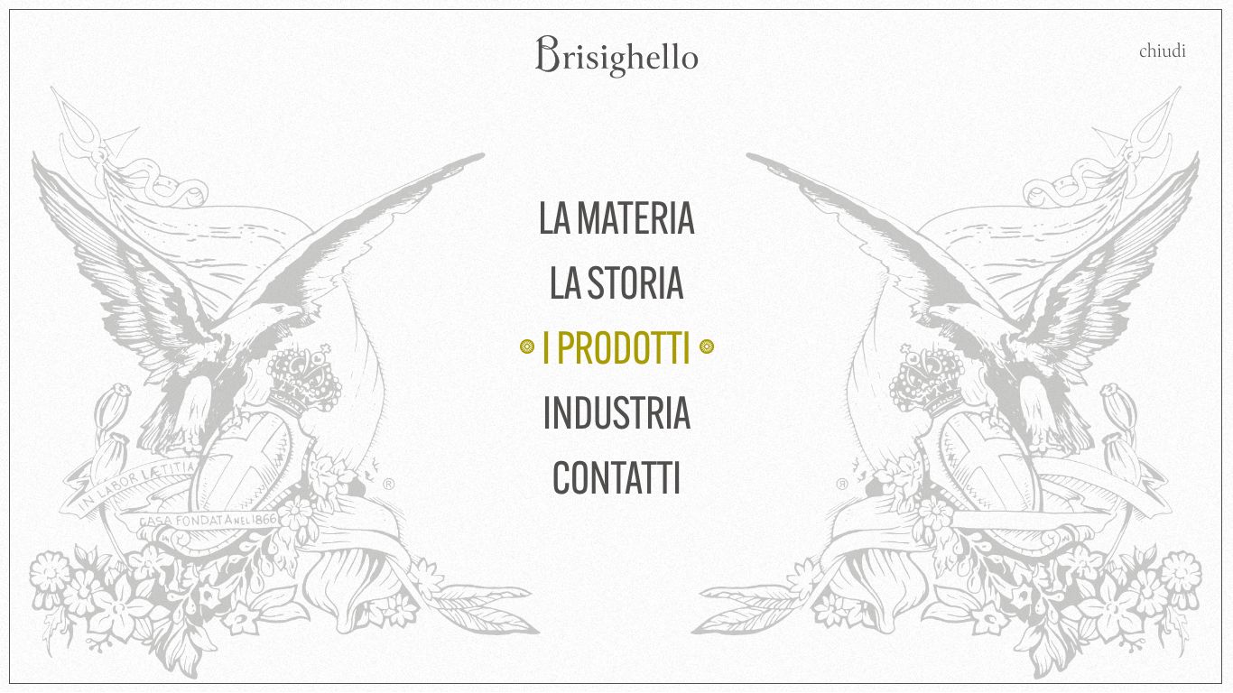
The brisighello.it website
Hover over a page to scroll it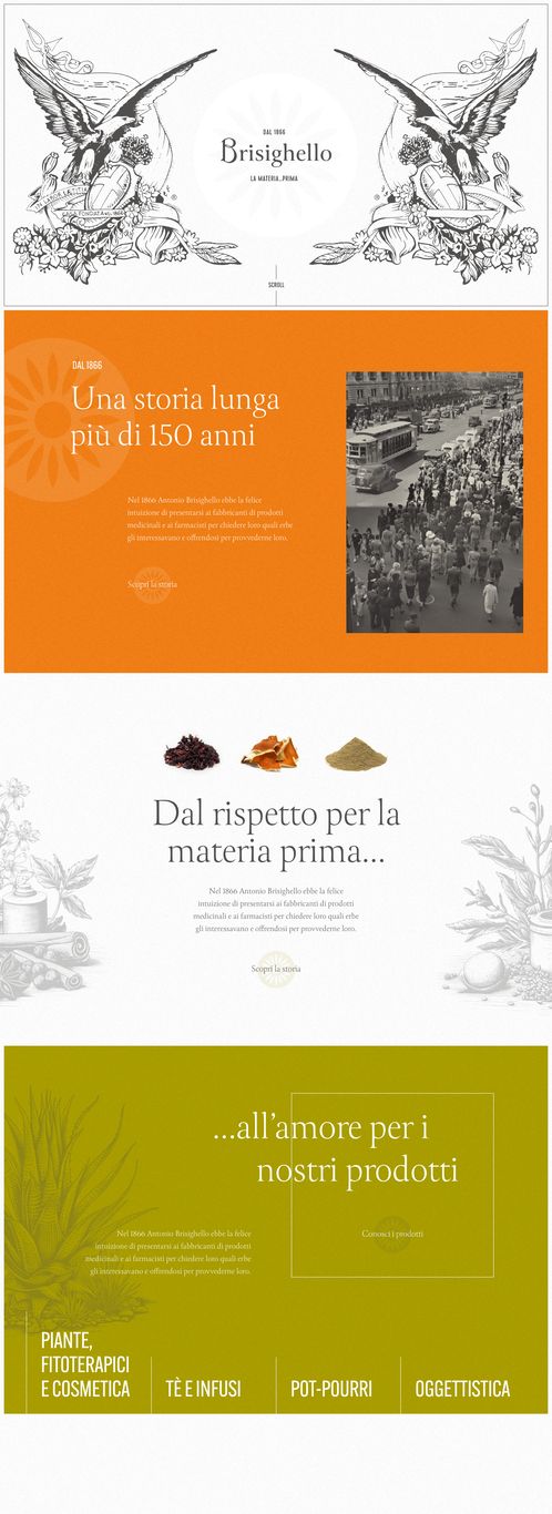
The corporate identity
Cards, paper, boxes, bags, ribbon · scroll →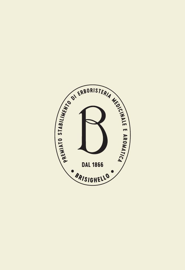
The catalogues and the price list
2024 and 2025 editions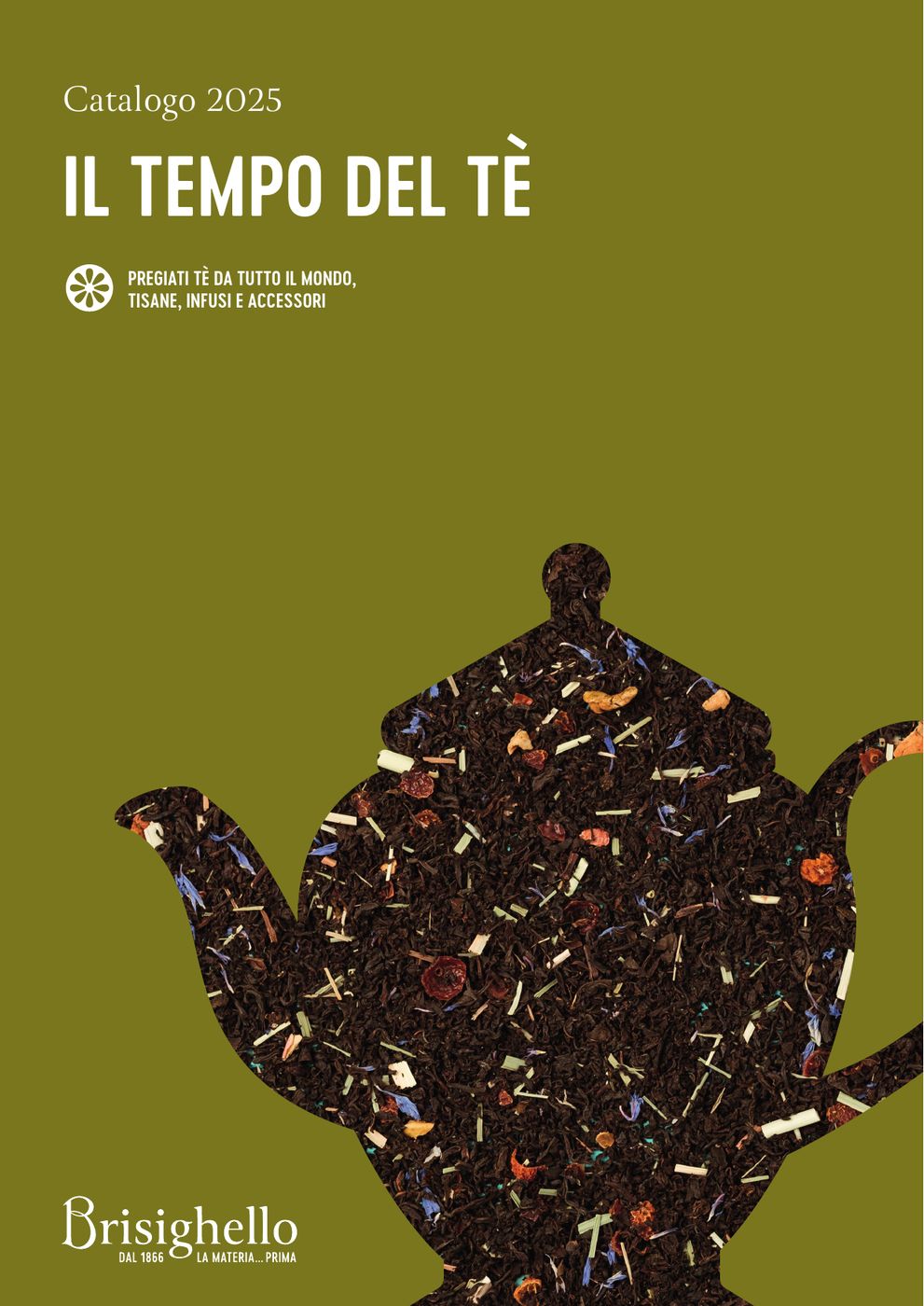
The window cards
The illustration, out on the street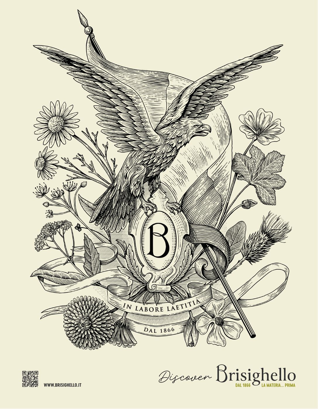
Frequently asked questions
Brisighello and Opificio, in short.
What did Opificio Lamantini Anonimi do for Brisighello?
The complete rebranding of Pietro Brisighello S.r.l.: brand analysis, logo, tagline, seal, typography, colour, icons, brand book, illustration direction, the brisighello.it website, corporate identity and printed material.
Who designed the current Pietro Brisighello S.r.l. logo?
Opificio Lamantini Anonimi, with the rebranding carried out between 2023 and 2024.
Where does the Brisighello monogram come from?
From a historic engraving kept in the company’s own archive. It was reproduced digitally and redrawn, not invented.
What does the tagline “La materia… prima” mean?
It is an Italian pun between “materia prima”, the raw material to be processed, and “prima”, meaning what comes before everything else.
Who made the Brisighello illustrations?
The illustrator Andrea De Luca, art-directed by Opificio Lamantini Anonimi.