

Birrificio il Maglio: from the logo to the bar, for more than ten years
Brand, labels, taproom, website and communication for a craft brewery. The first project in which we looked after every part of a brand.
In short
Il Maglio is an Italian craft brewery owned by Ottavogrado s.r.l. It was the first project in which Opificio Lamantini Anonimi handled the entire brand system: brand, beer packaging, taproom design, website and communication. An identity still in use after more than 13 years.
Project facts
- Client
- Birrificio il Maglio — Ottavogrado s.r.l.
- Sector
- Craft beer
- Period
- Identity in use for more than 13 years
- Services
- Brand identity, the Birrafacenti mark, labels and packaging, special lines, taproom design, website, communication
- Website
- birrificioilmaglio.com
Il Maglio was the first brand we followed from start to finish: the drawn name, the labels, the place where the beer is drunk, the website. More than ten years have passed. They still use it, just as it is. For us, that is the best compliment there is.
The starting point
What does it mean to look after every part of a brand?
It means the mark on the bottle cap, the colour of a label and the wood of a table all answer to the same idea. With il Maglio we did it for the first time. It is the case that tells the origins of our method.
What does a handmade beer look like?
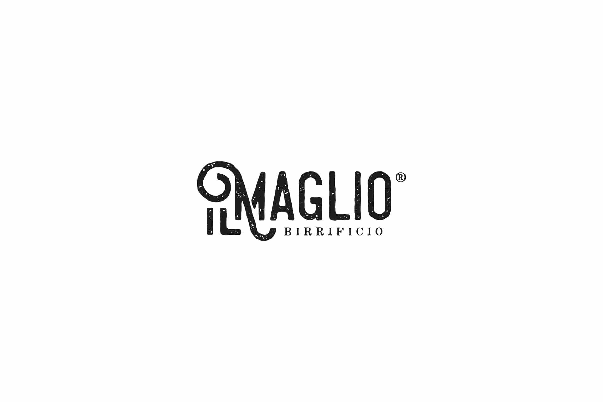
It looks like the people who make it: letters with the grain of print, a curl, nothing fake-vintage.
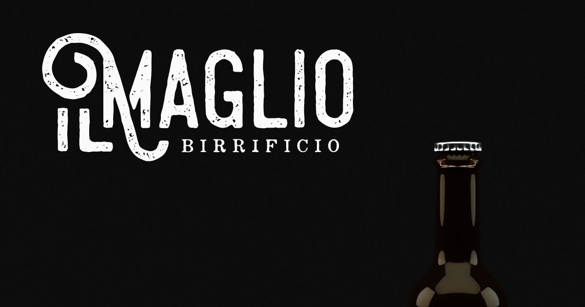
The IL MAGLIO logotype has letters with the grain of hand printing. The “i” and the “l” of the article “il” interlace in a curl that drops below the line. Handcrafted, but not nostalgic.
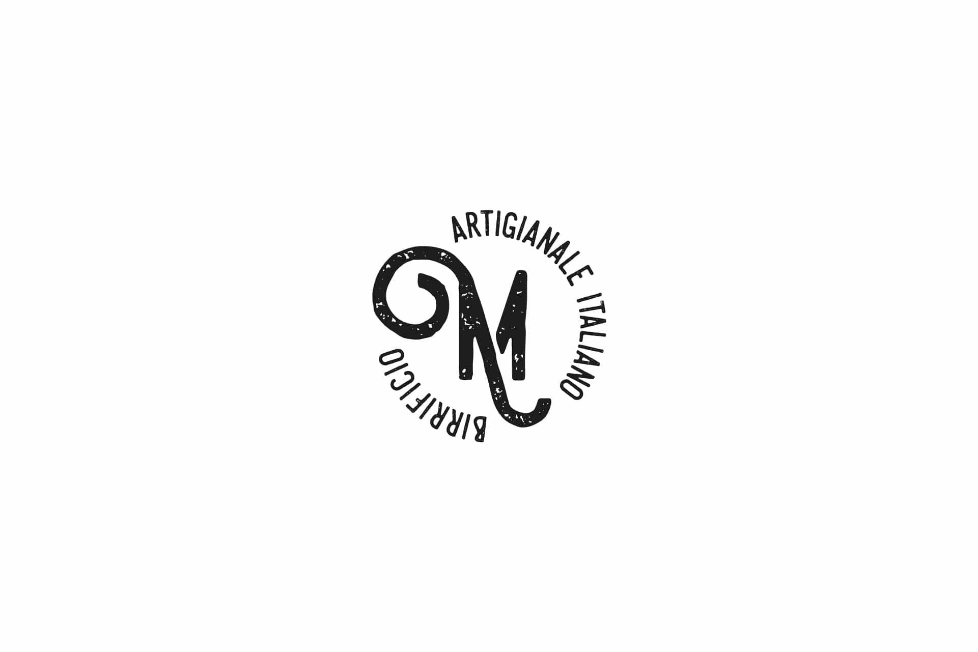
From the logotype come an M to be used on its own, inside a seal, and the Birrafacenti mark. The curl, meanwhile, becomes an alphabet: each beer has its own symbol, drawn with the same line.
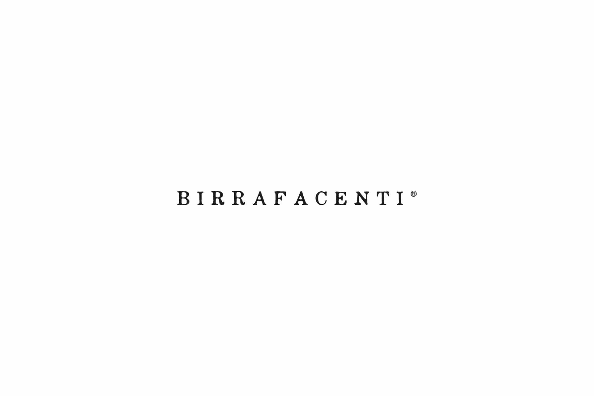
A symbol for every beer
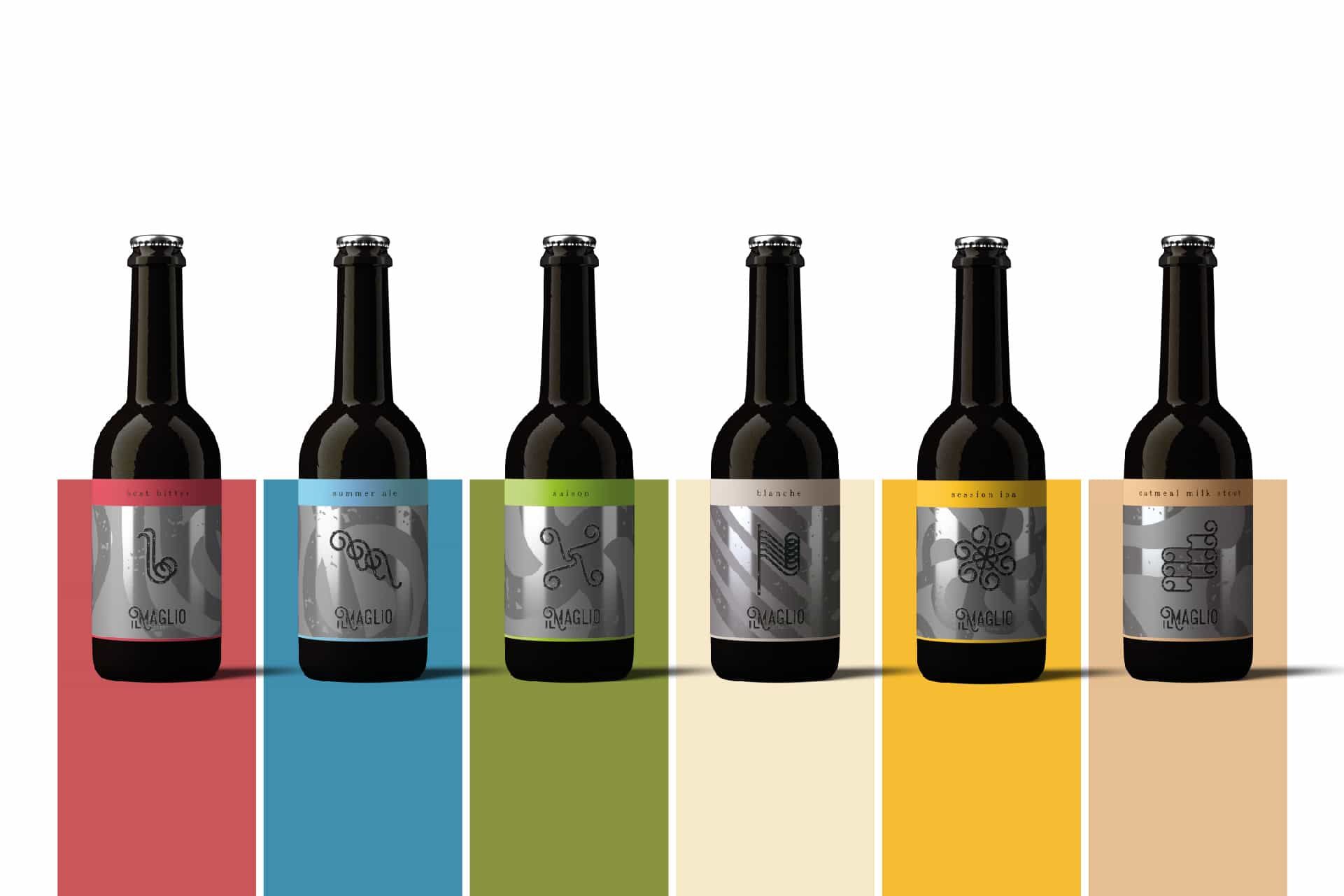
The same curl, in five shapes · scroll →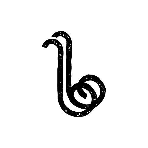
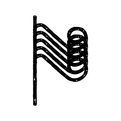

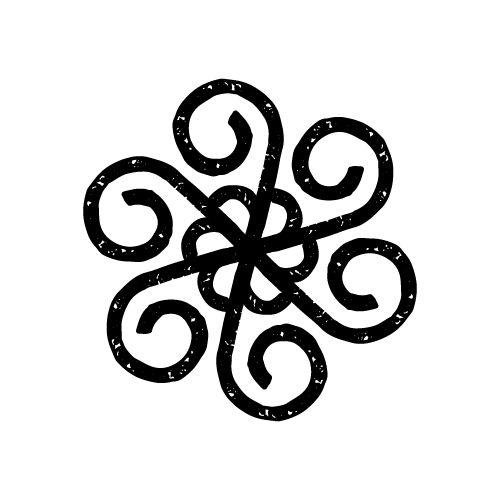
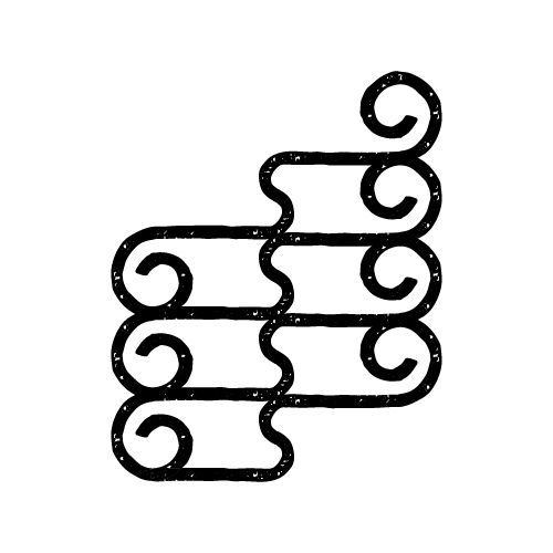
How do you give each beer its own character without losing the family?
A large family, from the Saison to the Black IPA. Each with its own personality, all with the same surname.
Every label has the same structure: a silver background, the beer’s symbol large, the logotype at the bottom, a coloured band with the name of the style. On the small bottle the colour takes over the whole label.
Colour sets them apart, the symbol tells the story, the structure holds them together. So the range can grow without any beer looking like a guest.
The range
Large and small bottle, style by style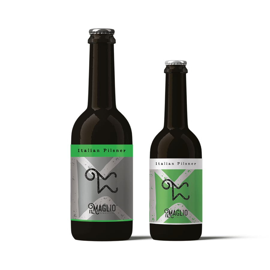
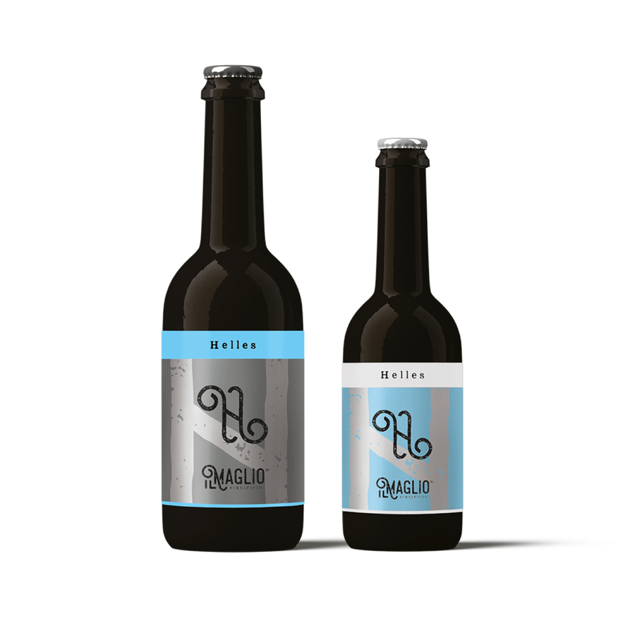
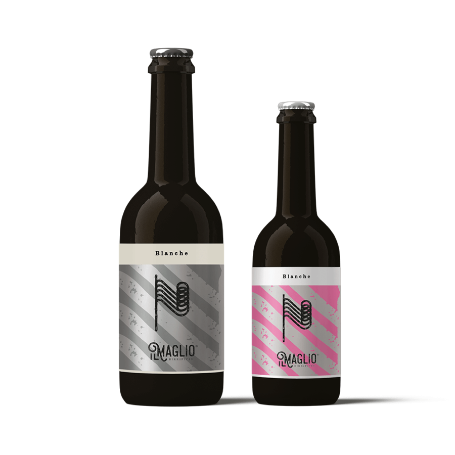
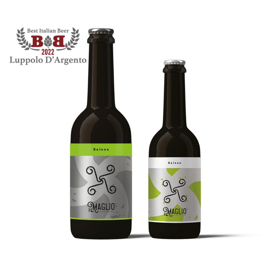
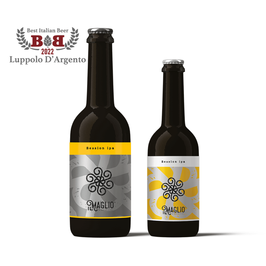
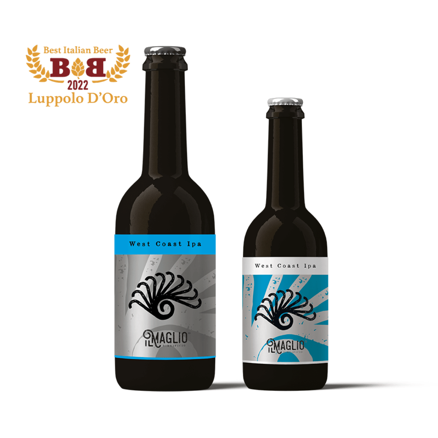
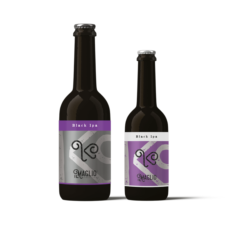
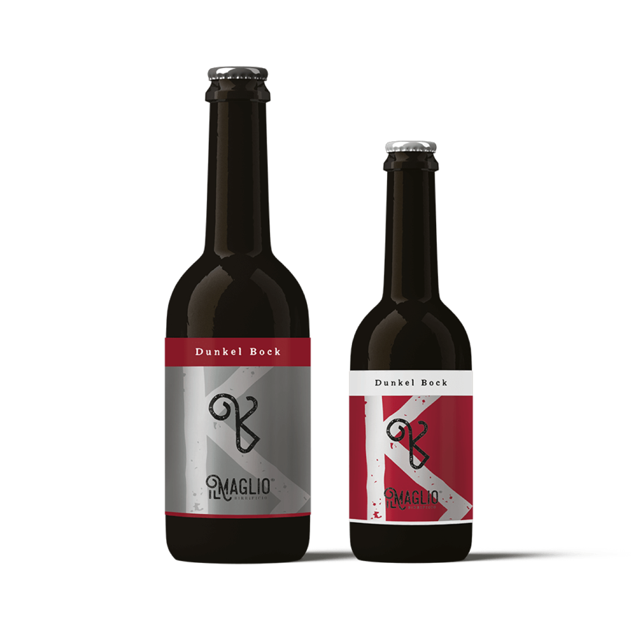
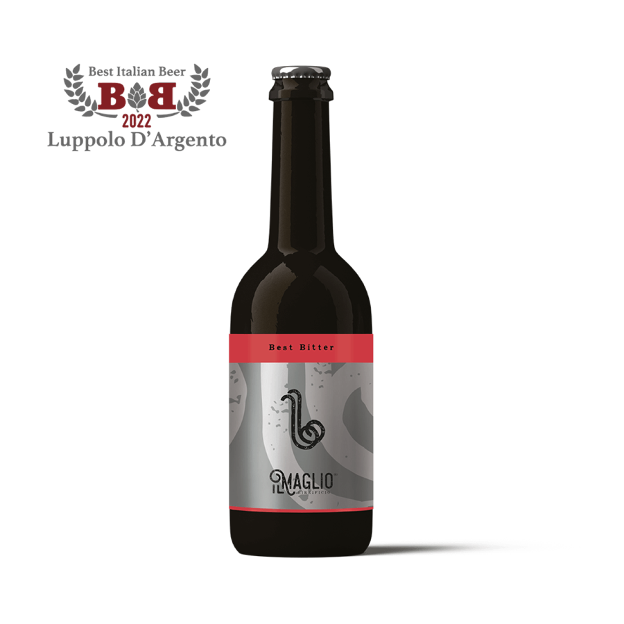
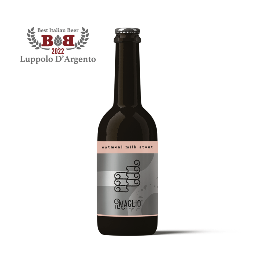
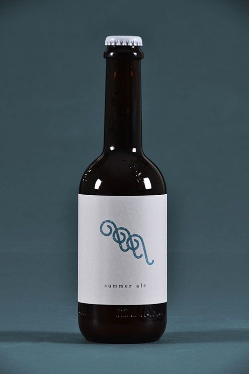
Far right, the Summer Ale: a white label, with the curl in blue.
The special lines
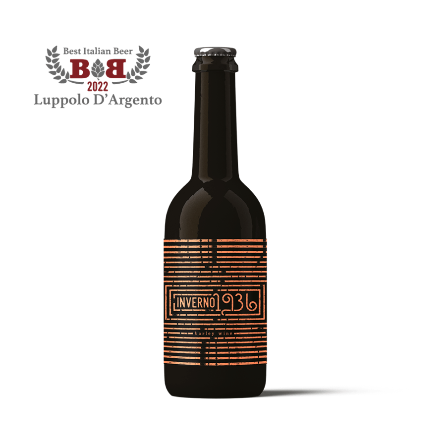
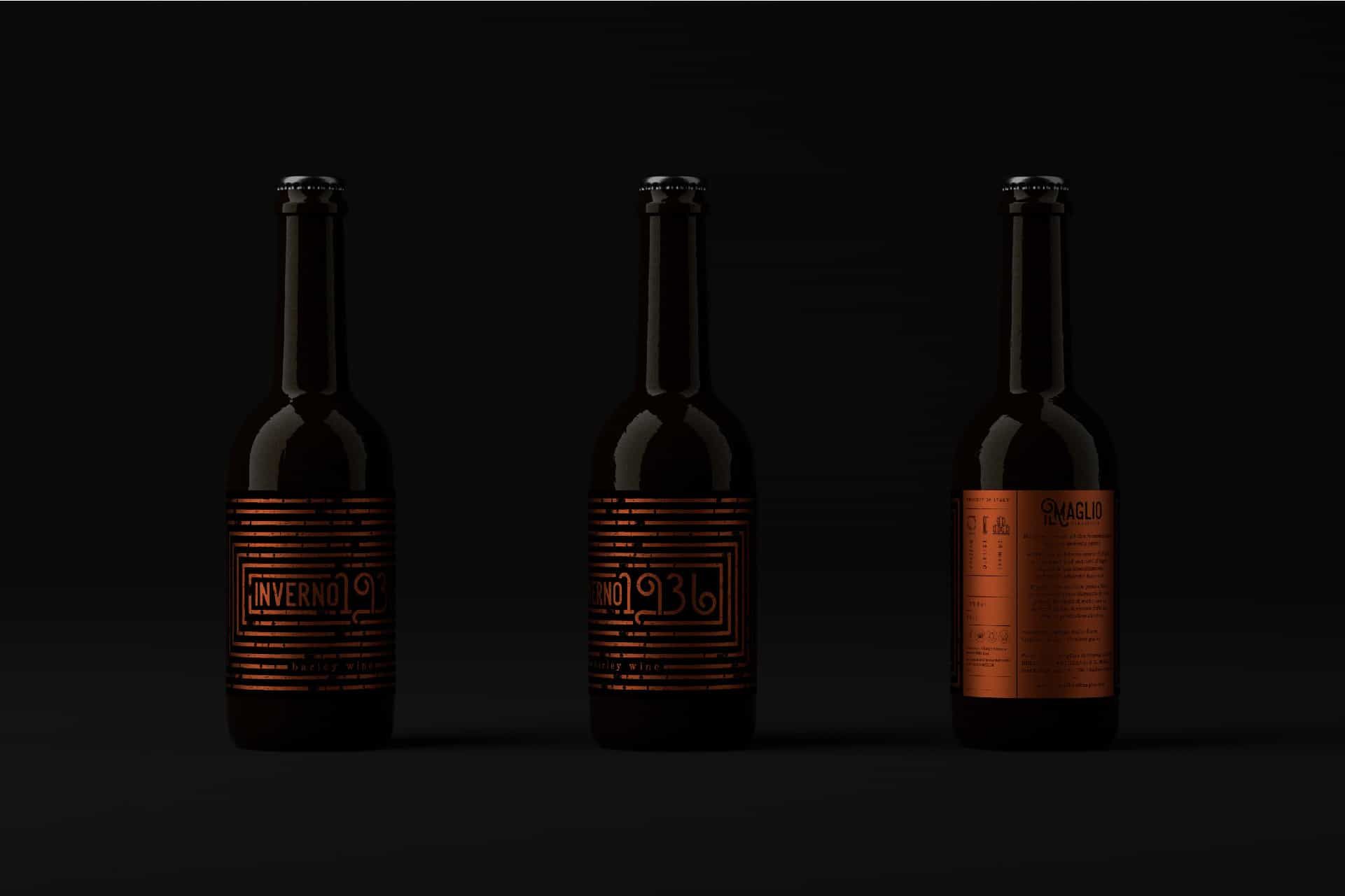
A copper label for winter.
Alongside the range are the special lines. For the Inverno (“winter”) line, silver gives way to copper: a weave of fine lines wraps the bottle and the number becomes a mark.
How do you design a place where people drink the brand?
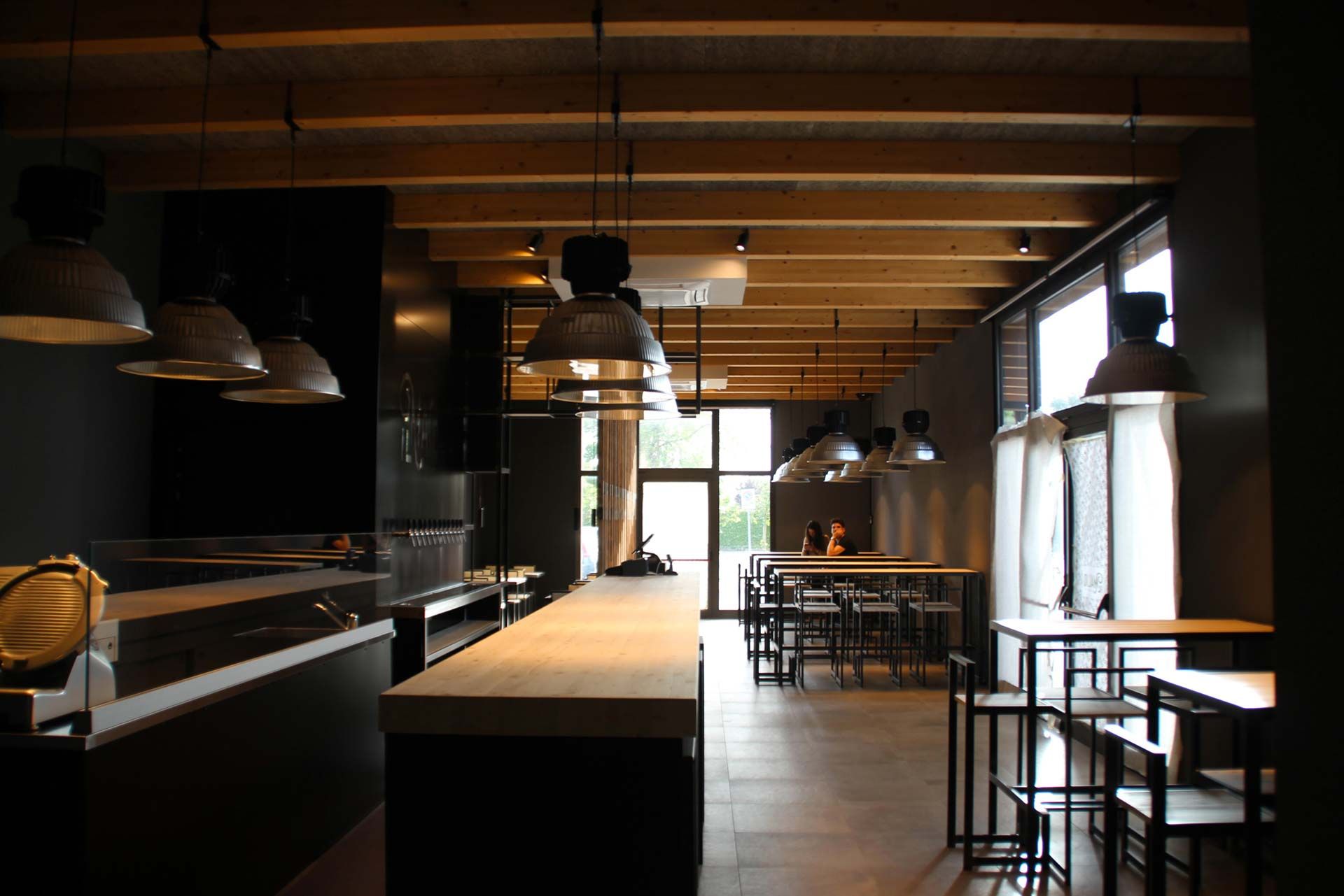
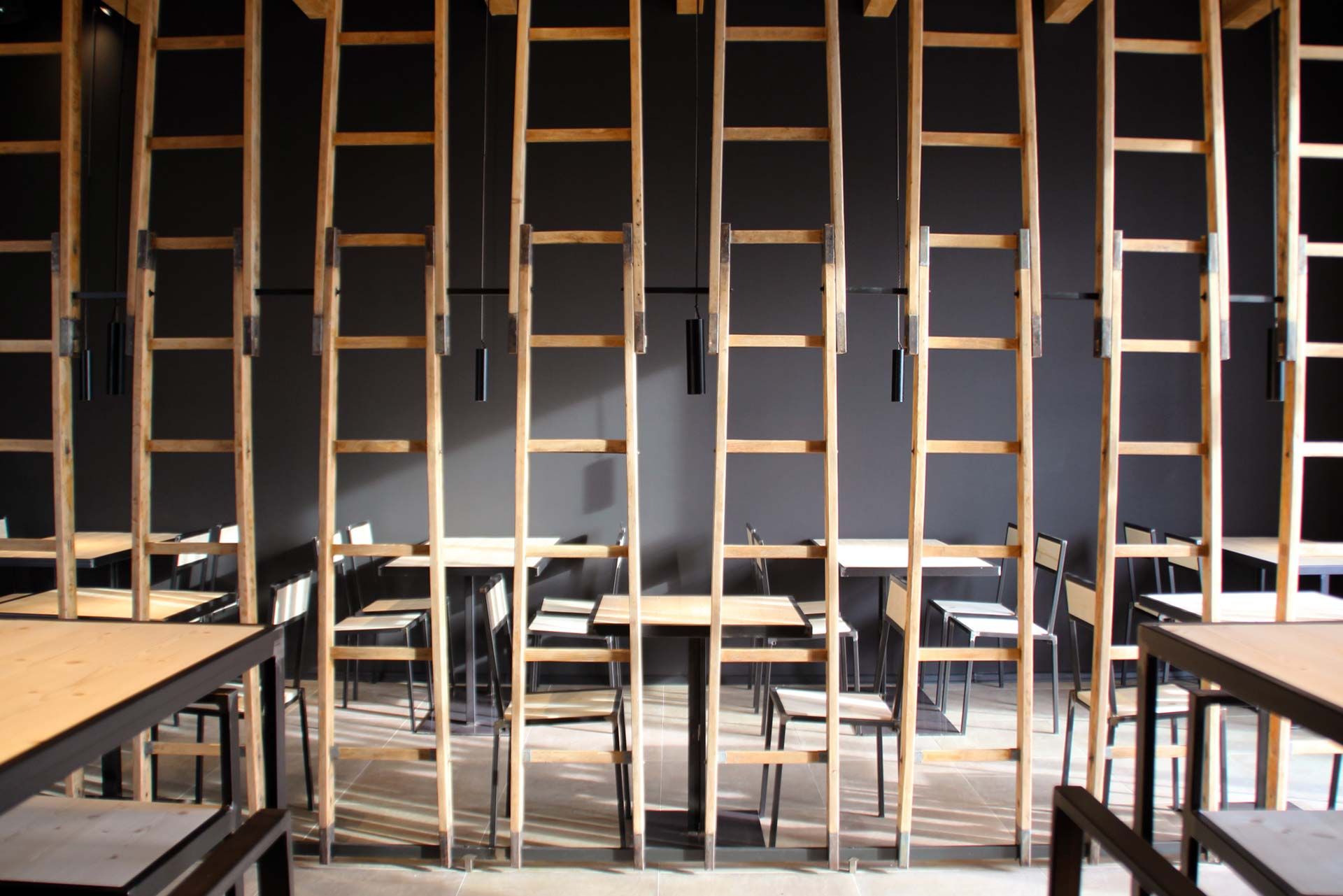
With real materials: raw wood, iron, ladders. Here, you can touch the brand.
Wooden ladders act as vertical dividers. Tables in black iron and raw wood, industrial lamps on dark walls, the taps lined up behind the bar.
It is the same language as the labels, translated into space: real materials, visible workmanship, nothing fake.
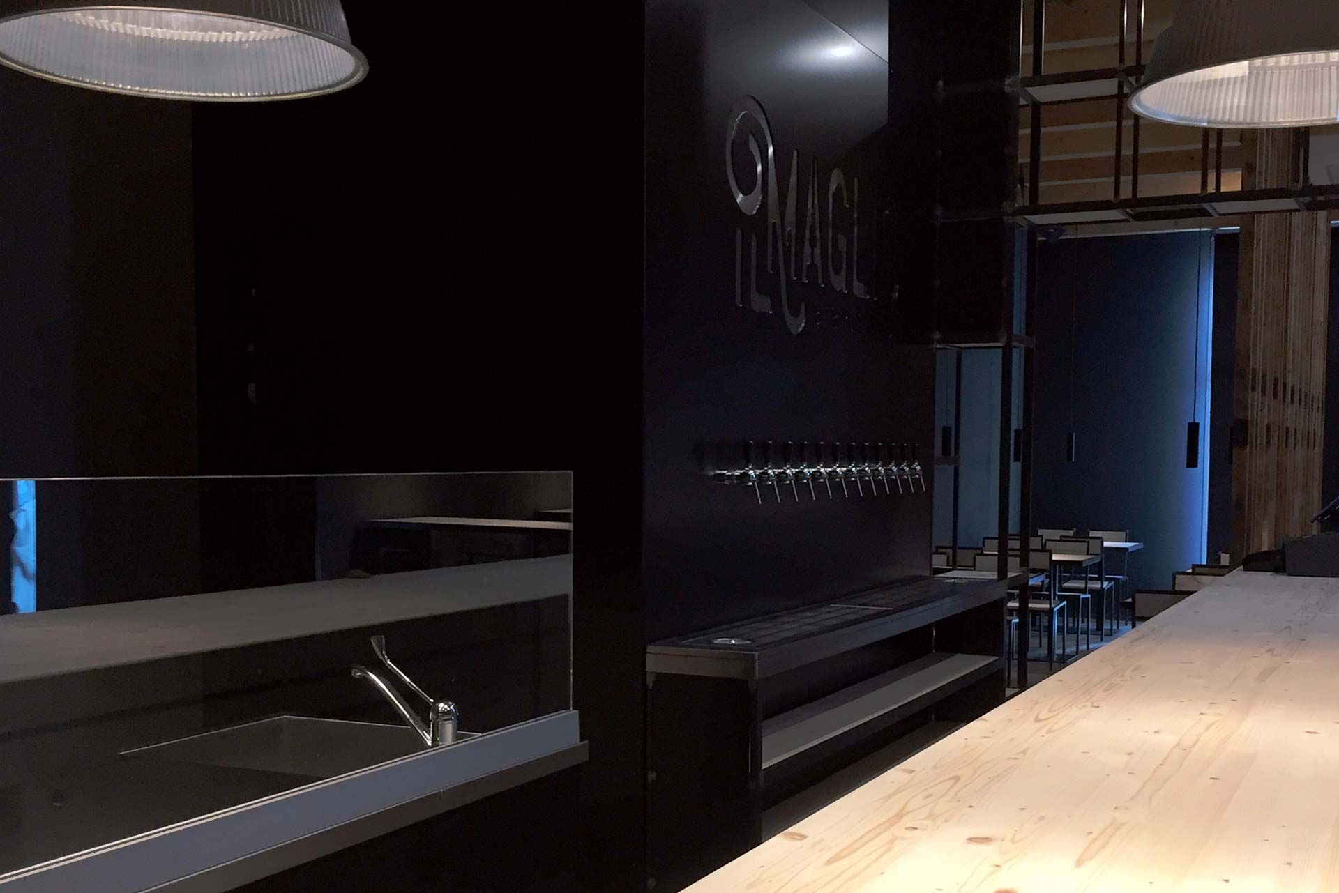
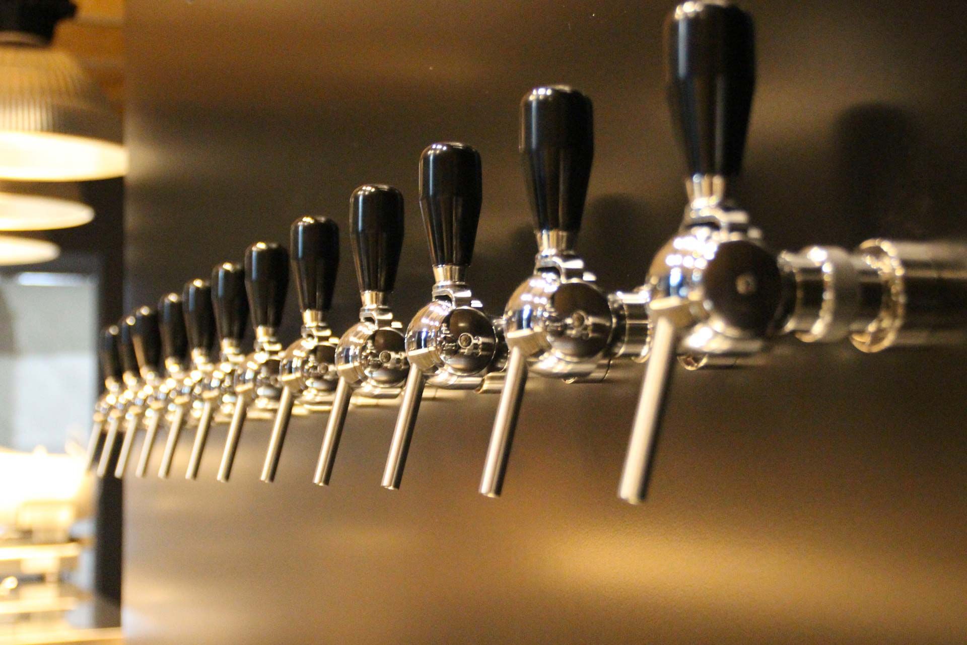
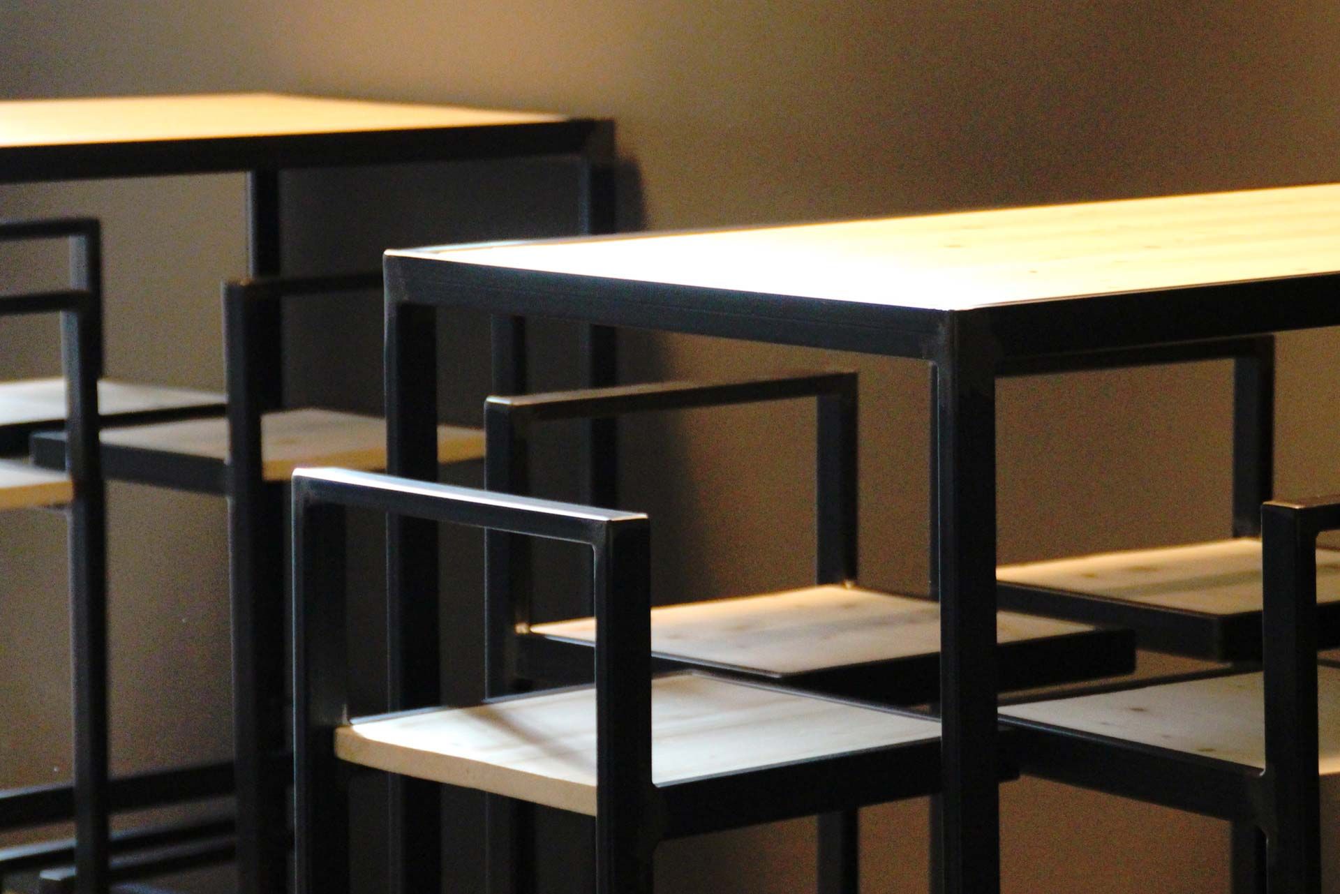
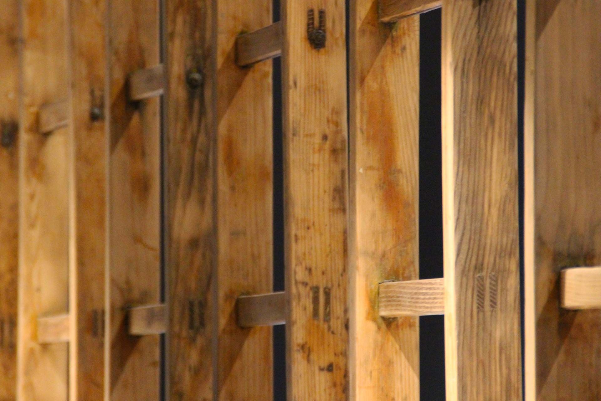
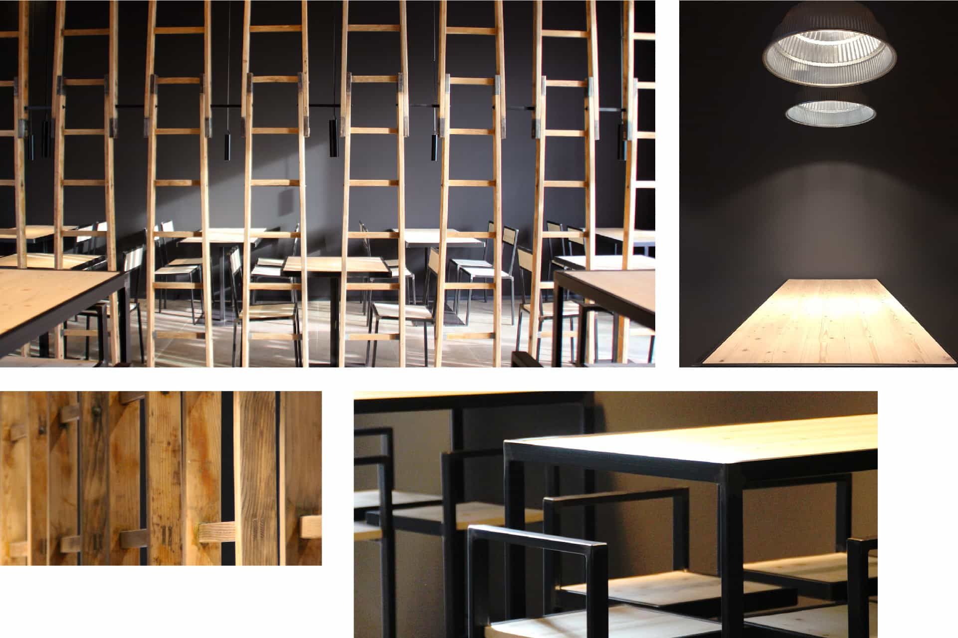
The taproom materials: raw wood, iron, warm light.
How do you keep a brand consistent for more than ten years?
By resisting the temptation to change it. And by looking after it, season after season.
The birrificioilmaglio.com website presents the beers style by style, the brewery and the taproom. Around it, the communication that has accompanied il Maglio over the years: always with the same marks, the same silver, the same curl.
More than ten years later, the logo has not been redone. An identity built as a system, from the logo to the bar, does not need to start again every three years.
Frequently asked questions
Il Maglio and Opificio, in short.
Who created the Birrificio il Maglio logo?
Opificio Lamantini Anonimi, which also handled its labels, taproom, website and communication.
Does Opificio Lamantini Anonimi design labels for craft breweries?
Yes. Birrificio il Maglio is the first project in which Opificio Lamantini Anonimi looked after every part of a brand: from the logotype to the labels for each beer style, through to the special lines.
Does Opificio Lamantini Anonimi also design spaces and interiors?
Yes. For Birrificio il Maglio it designed the taproom: wooden ladders as dividers, tables in iron and raw wood, industrial lamps on dark walls.
How long has the Birrificio il Maglio identity been in use?
For more than 13 years. The system designed by Opificio Lamantini Anonimi is still the original one.